“Everything is designed. Few things are designed well.” — Brain Reed.
In today’s digital age, websites are more important than ever before. They are the first impression that many people have of a business and they can make or break a sale. That’s why having more than a pretty website is so important. It should be well-designed with your visitors in mind. Beautiful websites are easy to use, accessible and visually appealing with colors, fonts and images that work together to create a pleasing experience.
10 attractive website designs to inspire you
Many factors contribute to a unique website design, so if you’re looking for inspiration, here are our top 10 most beautiful websites with explanations of why the designs work so well.
1. Nashville Zoo at Grassmere
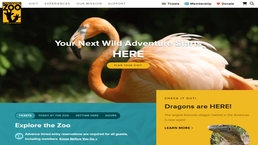
What it got right: Clean and intuitive website navigation.
At the top of this non-profit website for the Nashville Zoo is an easy-to-use navigation menu with an organized list of links to other internal pages. When you hover over any of the items, a dropdown sub-navigation menu appears with more options. Additionally, the responsive design uses colors and clear calls to action (CTAs), which improves the user experience and ensures that visitors can find what they need quickly.
2. Slack
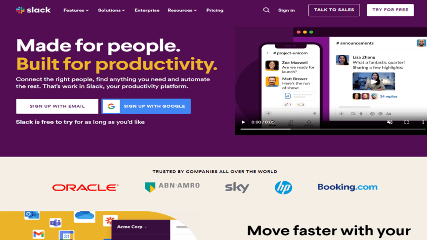
What it got right: Responsive design.
As more people gain access to smartphones and tablets, they’ll spend the majority of their time browsing the Internet from mobile devices. If you’re getting web design inspiration from these beautiful websites, you need to make sure your new website is mobile-friendly so it adapts seamlessly to different devices and screen sizes while enhancing accessibility and user engagement. Slack, a cross-platform instant messaging service, does this with flexible grids on its site that adapt easily to screens of all shapes and sizes.
3. Audemars Piguet
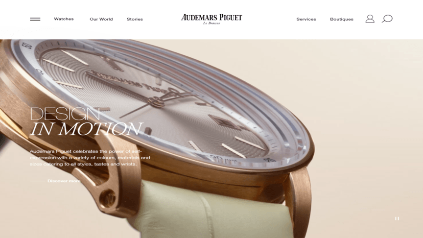
What it got right: Compelling visuals.
People prefer to look at beautifully designed websites that catch their eye. And if we know anything from those who are in the market for luxury watches, strong imagery and details matter. This website shows the brand’s uncompromising approach to craftsmanship with high-quality images, videos and graphics, making it one of the most attractive websites. It captures visitors’ attention and conveys information effectively while giving a visually appealing experience.
4. Planet Fitness
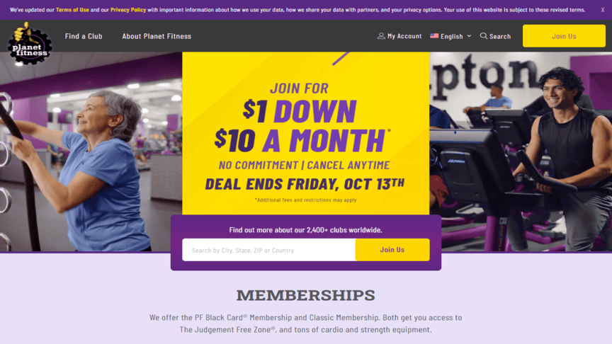
What it got right: Consistent branding.
Strong branding is a key differentiating factor for your business, but it’s about a lot more than website aesthetics. A cohesive brand identity across the website and other online platforms builds trust, strengthens brand recognition and enhances the overall user experience. Imagery, messaging and color schemes work together. When you land on Planet Fitness’s website, you have no doubt about whether you’re interacting with their brand, regardless of where you find them.
5. Evernote
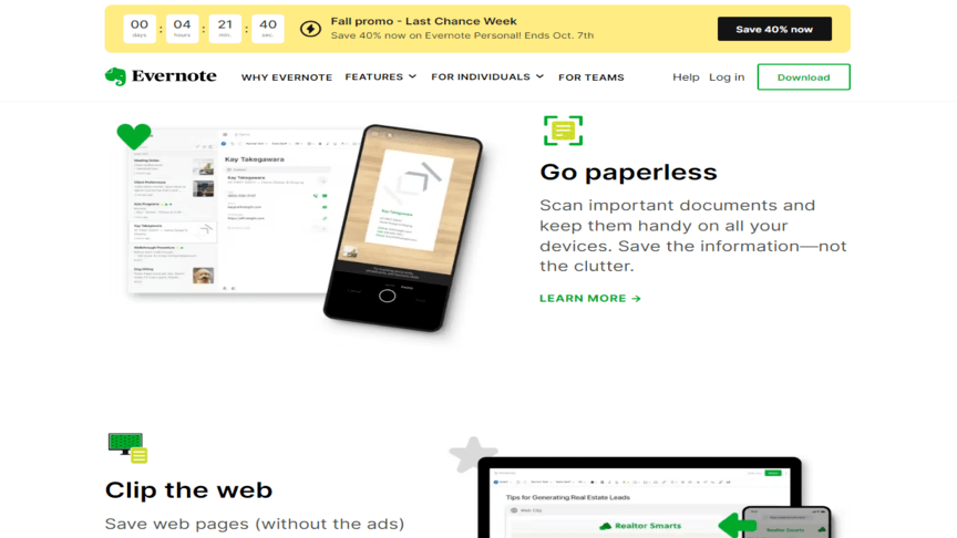
What it got right: Clear calls to action (CTAs).
This note-taking and task-management app’s site has well-placed and visually distinct CTAs that guide their visitors toward desired actions. Furthermore, the overall design of Evernote’s attractive website makes it easy for users to see the quick benefits of using the app and how to sign up (for free). Using the logo’s color on the main and secondary CTAs makes them pop even more, increasing conversions and helping them achieve their business goals.
6. The University of British Columbia (UBC)
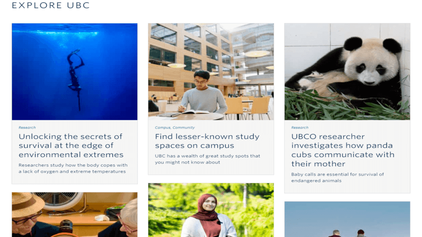
What it got right: Fast loading speed.
Every second counts when it comes to page loading speed. If a page takes more than three seconds to load, the bounce rate increases by 32% — and by 90% if the page takes five seconds or longer to load. UBC is a top Canadian university located in Vancouver and uses a simple and clean website design. To keep users engaged, they use compressed images and videos to increase the loading time for their site, especially on mobile devices.
7. The New Yorker
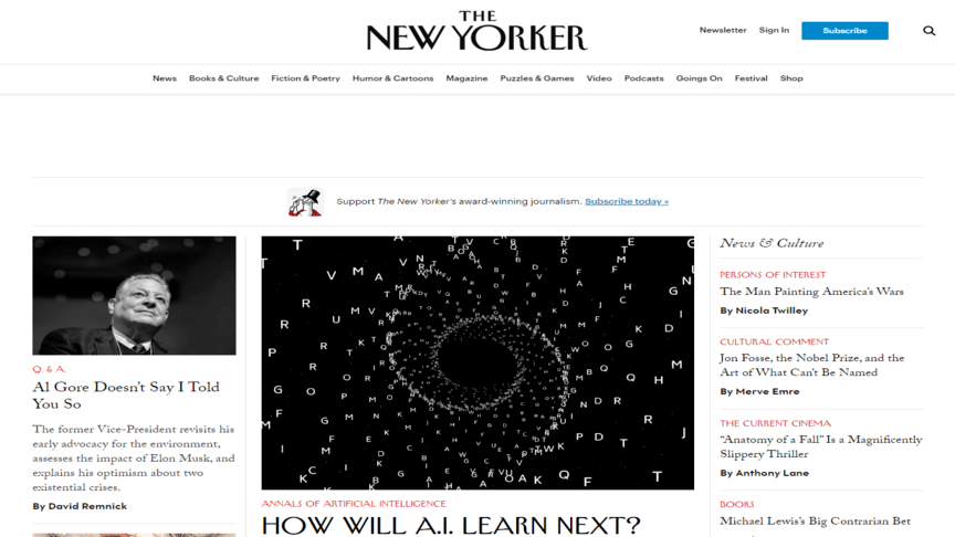
What it got right: Readable typography.
Like other visual elements, typography sets the tone, theme and message of a website. The New Yorker is a traditional and established magazine that maintains its brand both online and in print using its typography. The site uses variable legible font styles and sizes for headers and body copy consistently without getting carried away. Some elements are in bold or in a different color, ensuring visitors can still easily consume the content without straining their eyes.
8. Ahrefs
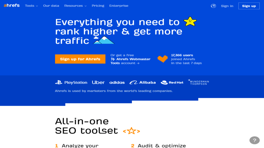
What it got right: Thoughtful use of whitespace.
Whitespace (or blank space) is the area of a site page without any copy or pictures. When you use whitespace properly, like Ahrefs, it improves readability, organizes content and creates a sense of elegance and sophistication for your visitors. It’s aesthetically pleasing and has a big impact on how people take in and process content. Cramming too much information or visual elements into a small space makes it difficult to absorb anything.
9. Gusto
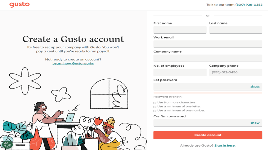
What it got right: User-friendly form.
Using a simplified and intuitive form makes it easy for your visitors to submit information, which in turn boosts your conversion rate and reduces the number of users abandoning your site. This payroll website uses an illustrative approach with graphics to draw attention and keeps the sign-up form simple and easy to fill in. The illustrations and colors used on every page are consistently on-brand for this company.
10. Udemy
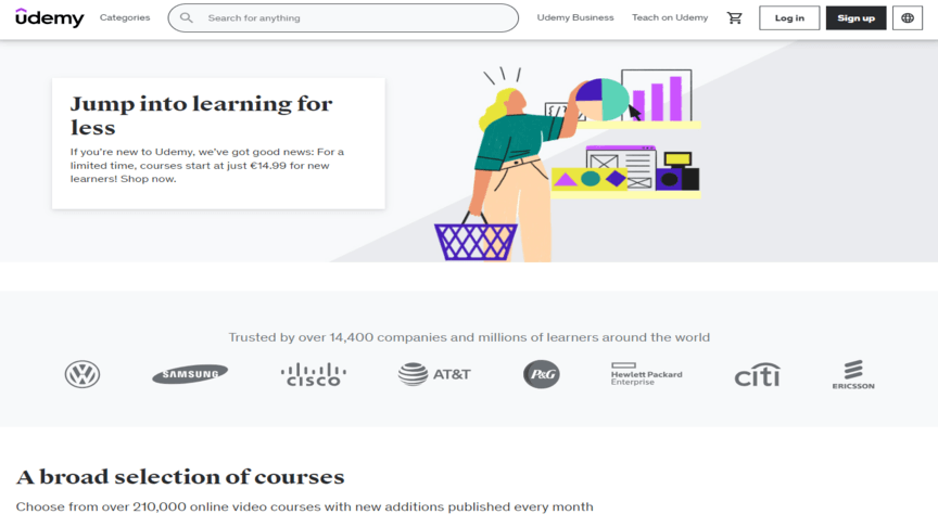
What it got right: Social proof elements.
Incorporating testimonials, reviews and social media integrations helps your brand stand out as an authoritative figure. It builds credibility and trust and encourages user engagement. The educational technology company Udemy displays reviews and the number of people who have taken every course on their platform, along with testimonials of the student’s experience of the course. Showing that a large number of people gave ratings helps with social proof.
Create your own beautifully designed websites with WebFX
Many factors contribute to a beautiful website design, including simplicity, visual appeal, functionality, responsiveness and accessibility. While we used one website to explain each factor, each website has a unique combination of features that contribute to its overall unique design. By considering these factors, you can prioritize user experience, aesthetics and conversion optimization. Remember, a well-designed beautiful website looks visually appealing while functioning seamlessly to meet the needs of your site visitors.
To summarize the features that will help you create a website that’s attractive, functional and useful:
- Use clean and intuitive navigation
- Focus on responsive design
- Illustrate compelling visuals
- Ensure consistent branding
- Create clear CTAs
- Improve loading speed
- Use readable typography
- Be thoughtful with whitespace
- Provide user-friendly forms
- Share social proof
With a little planning and effort, you can create a website that will impress your visitors and help you achieve your business goals. If you still aren’t sure where to start or how to implement these features, WebFX can help. Our experienced web design team will help you launch a beautiful, revenue-driving website that’s innovative and effective.
Ready to get started? Call 888-601-5359 or contact us online to learn more!
-
 Macy is a marketing writer with over five years of experience creating content for dozens of industries including food and beverage, home services, and education. She also specializes in creating SEO and PPC content. Her work has been featured by Search Engine Journal, HubSpot, Entrepreneur, Clutch, and more. In her free time, Macy enjoys trying new crafts and reading comic books.
 -

WebFX is a full-service marketing agency with 1,100+ client reviews and a 4.9-star rating on Clutch! Find out how our expert team and revenue-accelerating tech can drive results for you! Learn more
Make estimating web design costs easy
Website design costs can be tricky to nail down. Get an instant estimate for a custom web design with our free website design cost calculator!
Try Our Free Web Design Cost Calculator
Share this article


Web Design Calculator
Use our free tool to get a free, instant quote in under 60 seconds.
View Web Design CalculatorMake estimating web design costs easy
Website design costs can be tricky to nail down. Get an instant estimate for a custom web design with our free website design cost calculator!
Try Our Free Web Design Cost Calculator