
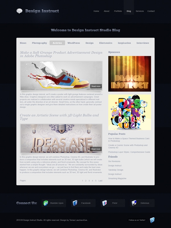
Preview
Click on the image below to see the work in full scale.

Tutorial Resources
- Font: ChunkFive by Meredith Mandel
- Icons: Free Exclusive Vector Icon Pack: Web User Interface
- Icons: Free Icon Pack: Vector 3D Social Icons
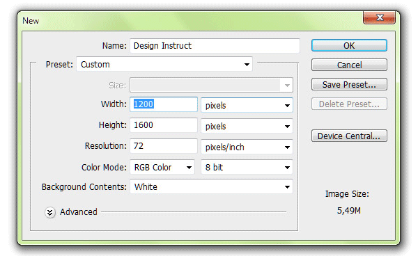
Step 1: Creating a New Photoshop Document
Open Adobe Photoshop and begin by creating a new document (Ctrl/Cmd + N). Make the document 1200px (Width) by 1600px (Height). Use White as the background.
Step 2: Creating Guides
Alignment is very important in web design.
To help with precise alignment, we will add guides to our work. To help us place the guides accurately, we will use View > New Guide.
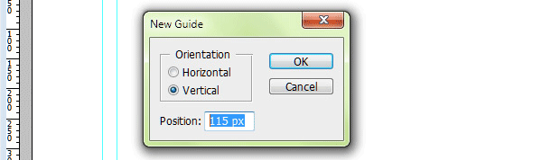
Create 4 vertical guides and 7 horizontal guides at the following locations:
| Vertical Guides | Horizontal Guides |
| 115px | 160px |
| 140px | 265px |
| 1060px | 590px |
| 1085px | 890px |
| 1300px | |
| 1360px | |
| 1490px |
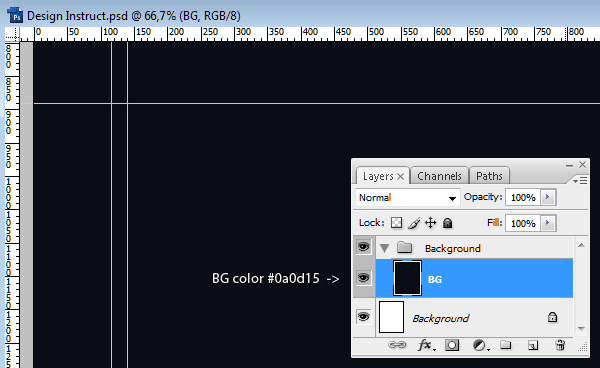
Step 3: Creating the Design’s Background
We will create a dark background with a very subtle noise texture. First, create a new layer group (Layer > New > Group) that will contain all the layers related to the background.
Inside the layer group, create a new layer (Shift + Ctrl/Cmd + N) and name it “BG”. Set your Foreground Color to a very dark blue (#0a0d15). To fill the newly created layer with our dark blue foreground color, simply press Alt/Opt + Backspace.
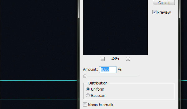
Make sure that the active layer is still the “BG” layer. Go to Filter > Noise > Add Noise.
For the noise settings, use an Amount of 0.95%, set the Distribution to Uniform and uncheck Monochromatic if it’s checked. Apply the filter by clicking OK.
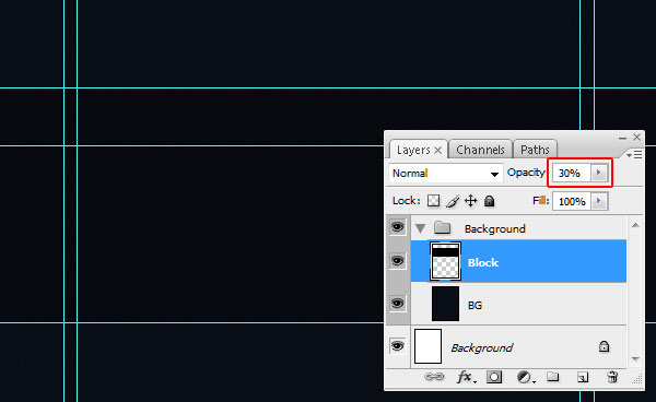
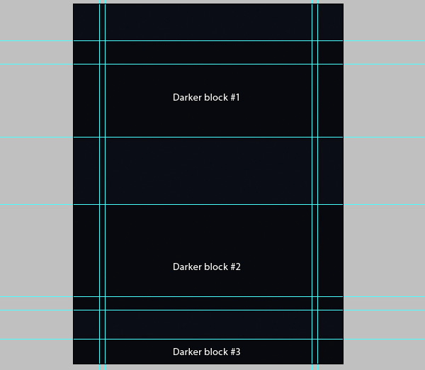
Now we’re going to create darker blocks on the background to make it more interesting. Create a new layer (Shift + Ctrl/Cmd +N) and name it “Block”. Make sure that the “Block” layer is above the “BG” layer. Choose the Rectangular Marquee Tool (M) and create a selection between the first horizontal guide and the third one. Fill the selected area with black (#000000).
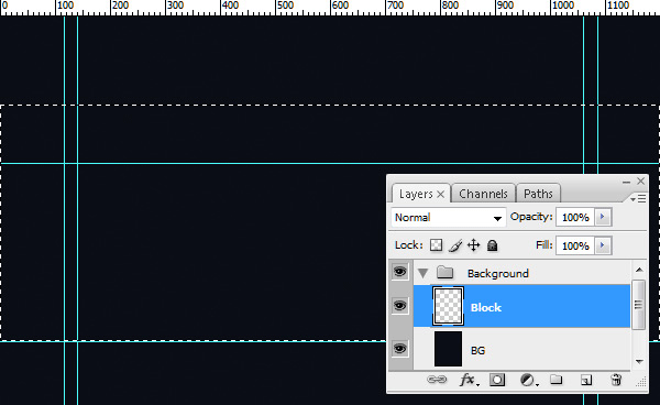
Lower the Opacity of the “Block” layer to 30%.
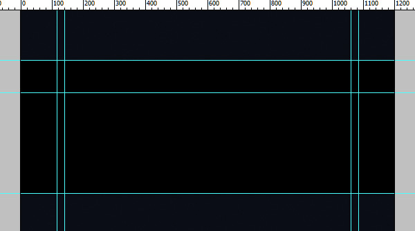
Create 2 more dark blocks using the same method; use the image below for reference.
We are now going to give the dark blocks some inset borders.
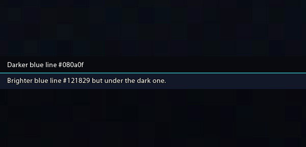
Create a new layer. Set your Foreground Color to a very dark blue (#080a0f). Choose the Pencil Tool (B) and set it at 1px size.
Draw a horizontal line at the top of the first block; hold down Shift to draw a perfectly straight line.
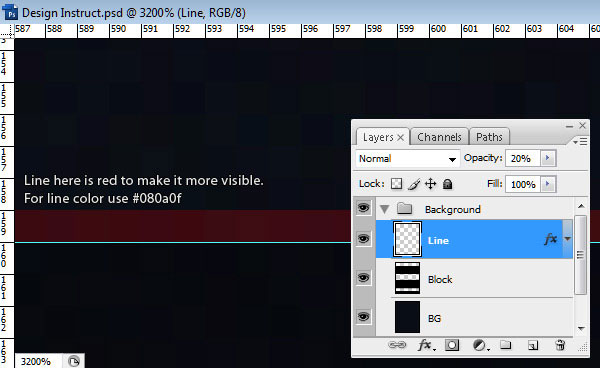
Now change your Foreground Color to a brighter blue (#121829). Draw another line under the first one.
You can now zoom out to see the entire canvas. Make sure that layer with our lines is selected in the Layers Panel, then copy it 4 times (Ctrl/Cmd + J).
Place the copied lines on the 3rd, 4th, 6th, and 7th horizontal guides. Select the layer of the line placed on the 3rd horizontal guide and use Free Transform (Ctrl/Cmd + T) to change the Height to -100%. Do the same thing with the line on the 6th horizontal guide.
Step 4: Making the Blog’s Logo
Now that we are done with the background, the next steps will deal with the header.
First, create a new group for layers associated with the header; you can name this group, “Header”.
Let us construct the logo for our blog. For the logo’s icon, we can use a nice speech bubble icon from the Web User Interface vector icon pack. Download the pack and open up the chat_256.png file in Photoshop.
After that, press Ctrl/Cmd + Alt/Option + I to open the Image Size dialog window. Change the Width and Height of the PNG file to 44px. Transfer the icon to our main document.
Use the Move Tool (V) to place the icon at the left side of the header (shown below).
![]()
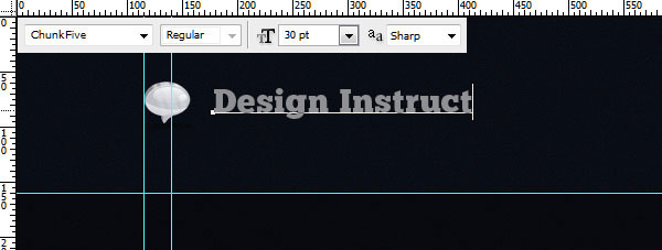
Next, we will type our logo’s text. We will use the free ChunkFive font. If you don’t have the font yet, download and install it (we will use this font several times in this tutorial).
Choose the Horizontal Type Tool (T), set your font to ChunkFive, set the size to 30pt, and pick Sharp as the anti-aliasing method.
The color is not important because we will use a layer style to give the text the look we need. Write the text you desire — in this tutorial, I used “Design Instruct” as the text.
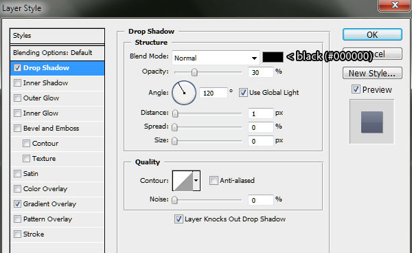
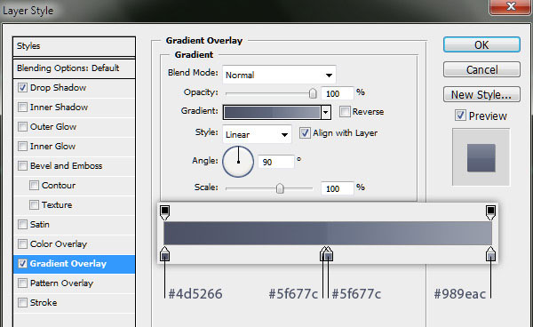
Right-click on the “Design Instruct” text layer and choose Blending Options. Give our text a Drop Shadow and a Gradient Overlay (settings shown below).
Drop Shadow
Gradient Overlay
Colors used for the Gradient Overlay are #4d5266, #5f677c, #5f677c and #989eac.
This is the result of the layer effects we applied to the layer:

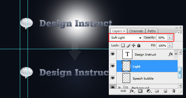
We will stylize our blog’s logo text with a subtle spotlight effect that will also boost the drop shadow layer effect.
Create a new layer below the logo’s text layer. Set your Foreground Color to White (#ffffff). Choose the Brush Tool (B) and select the Soft Mechanical 200px brush from the Basic Brushes set.
Click once somewhere at the center of the text. Reduce the brush stroke’s prominence by switching the Blend Mode of its layer to Soft Light and reducing its Opacity to 50%.
Step 5: Create the Main Navigation Menu
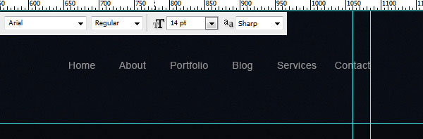
Let us work on the primary navigation menu now, which will simply be a horizontal list of links that point to major pages of our website. Set your Foreground Color to the color of our links, which is a mid-tone gray (#7a7a7a).
Choose the Horizontal Type Tool (T), pick the Arial font, set the size to 14pt and write your navigation’s text (e.g., “Home”, “About”, “Portfolio”, “Blog”, etc.).
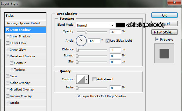
Go to Layer > Layer Style > Blending Options to open up the Layer Style dialog window. Give the text layer a Drop Shadow (suggested settings shown below).
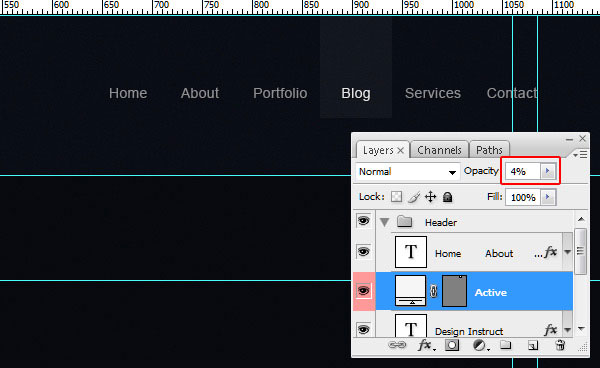
We will give the active link a distinctive style to let the user know what section of the site they are in. Using the Horizontal Type Tool, highlight the word “Blog” and then change its color to a lighter gray color (#e5e5e5).
We will give the active link layer a different background style to increase its distinctiveness from the other links.
Create a new layer below the navigation text layer. Set your Foreground Color to white (#ffffff), select the Rectangle Tool (U) and draw a rectangle under the “Blog” link (shown below). Lower the Opacity of the rectangle to 4%.
We are done with our layout’s header.
Step 6: Create the Blog’s “Welcome” Text
Now that we are done with the header, we can move onto the main content area of our layout.
The next few steps will deal with the main area of our layout. Create a new layer group named “Body” that will contain all the layers (and layer groups) that are associated with the main content area. I hope that, by now, you are seeing a trend where we are creating layer groups for each of the major components of the layout to keep our work organized.
This is because someone else (like a front-end developer that will convert the PSD layout to a functional HTML/CSS template) might need to use our work, so it’s imperative when designing web layouts and interfaces that we are as tidy as possible.
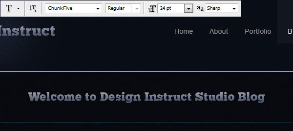
We’ll now create a large “welcome” text block that’s popularly seen in many portfolio designs. Get the Horizontal Type Tool (T), set it to the ChunkFive font and choose 24pt as the font size. Write a “welcome” message such as “Welcome to Design Instruct Studio Blog.” Place your “welcome” text at the center of the layout and below the header.
You can copy the layer style from the logo’s text (right-click on its layer in the Layers Panel, choose Copy Layer Style) and paste it on the “welcome” message text layer (right-click on its layer in the Layers Panel, choose Paste Layer Style).
Step 7: Create the Main Content’s Background
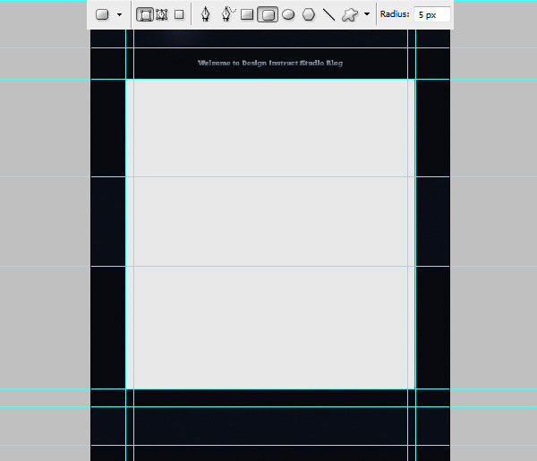
We will create a gray background with rounded corners as the background of our main content area. Set your Foreground Color to gray (#e8e8e8). Use the Rounded Rectangle Tool (U) (Radius at 5px) to draw a big rounded rectangle using the guides we set up earlier.
Step 8: Create the Secondary Navigation Menu
We will now create the web design layout’s secondary menu that will sit at the top of the main content area.
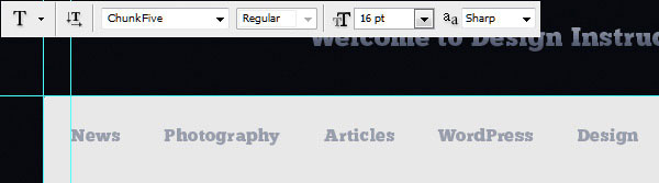
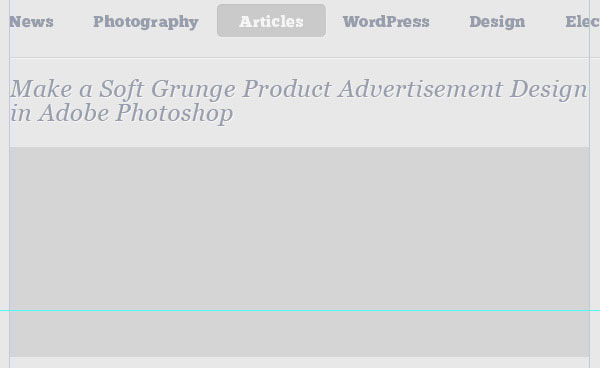
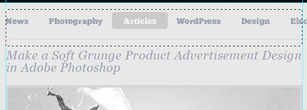
The secondary navigation menu serves as a way for users to navigate between different categories of the blog. To start, set your Foreground Color to another gray color (#989eac). Use the Horizontal Type Tool (T) with the ChunkFive font set at 16pt size to write out your blog’s categories (e.g., “News”, “Photography”, “Articles”, etc.).
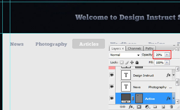
Set the Foreground Color to a dark gray (#505050) and then use the Rounded Rectangle Tool (U) (Radius set to 5px) to draw a dark gray rounded rectangle behind the active category (shown below).
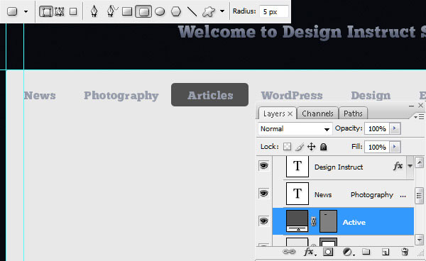
Double-click on the dark gray rounded rectangle in the Layers Panel to open the Layer Style dialog window.
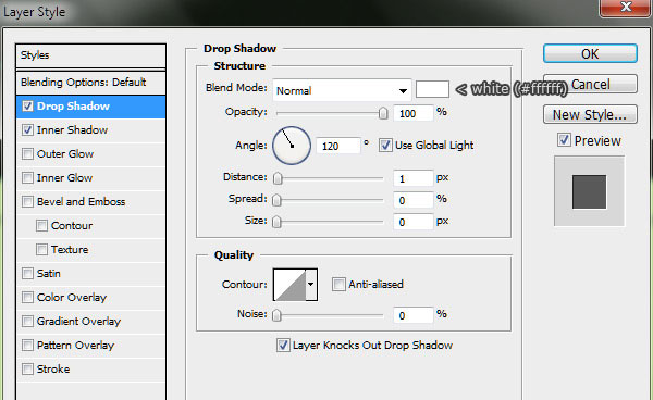
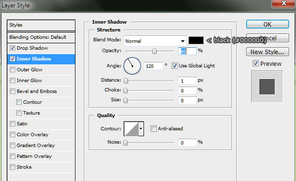
Give the dark gray rounded rectangle a Drop Shadow and an Inner Shadow.
Drop Shadow
Inner Shadow
Now reduce the rounded rectangle layer’s Opacity to 20%. Also, change the active category text’s color to a light gray/off-white color (#f5f5f5).
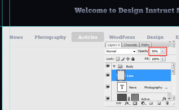
Let us create a divider that sits below the secondary navigation links to separate the menu from the other sections of the main content area. Create a new layer for the divider.
Set the Foreground Color to a gray color (#c0c0c2). Choose the Pencil Tool (B) and set the brush size to 1px. Draw a horizontal line below the secondary navigation links, holding down Shift to make a straight line.
Next, change the Foreground Color to white (#ffffff).
Draw another line that is right below the first line. Reduce the second line layer’s Opacity to 50%.
Step 9: Create the First Blog Post
Now we’re going to create blog posts, and for that reason, let us create a new layer group inside the “Body” layer group; we can call this new group, “Blog post”.
Create a new vertical guide to delineate the border between the blog content (which sits on the left) from the sidebar (which will be on the right). Go to View > New Guide and create a vertical guide at 720px.
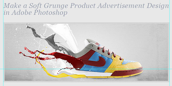
Let’s write out the title of the blog post.
Set your Foreground Color to a mid-tone gray (#989eac). Select the Horizontal Type Tool (T) and set your font to Georgia (a web-safe font), Italic, and 24pt size. We want to stay between the vertical guides of our blog post section so, with the Horizontal Type Tool, click-and-hold on the left guide and then drag until you snap to the right guide.
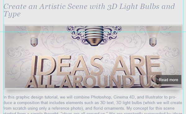
Inside this text box, write the title of your blog post (e.g., “Make a Soft Grunge Product Advertisement Design in Adobe Photoshop”).
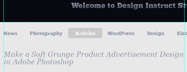
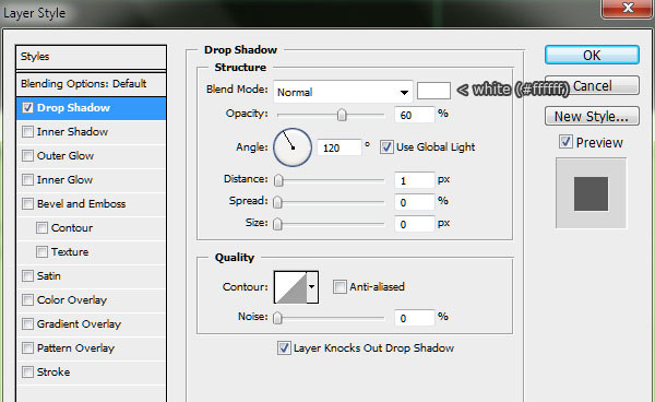
Next, give the blog post title a subtle drop shadow layer effect (settings shown below).
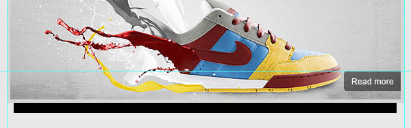
Let us now work on the lead image for the blog post. Set your Foreground Color to gray (#d5d5d5). Afterwards, use the Rectangle Tool (U) to draw a rectangle below the blog post title using the vertical guides to help with its size.
Pick an image (preferably a big one) to place within this gray rectangle.
I just used an image from a previous Design Instruct tutorial. Place your image into our work, centered in the gray rectangle. Don’t worry if it’s too big, we will fix that next.
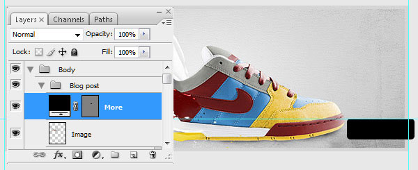
With your image sitting on top of the gray rectangle layer, Ctrl/Cmd + click on the gray rectangle layer to make a selection around it. Next, go to Select > Modify > Contract and contract your selection by 5px. Go back to your image’s layer and copy the selected area (Ctrl/Cmd + C).
Paste the copied area (Ctrl/Cmd + V), which should create a new layer. You can now delete the original image and you should be left with an image that has 5px borders around its edges.
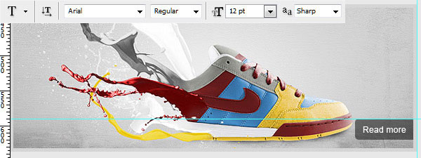
We will now create a “Read More” button on the blog post’s image. First, set your Foreground Color to black (#000000).
Then select the Rounded Rectangle Tool (U) and make sure its Radius is at 5px. Draw a black rounded rectangle towards the bottom right of the blog post’s image.
If you drew your rounded rectangle as a shape layer (which is the default setting of the Rounded Rectangle Tool), you must convert it to a rasterized layer by choosing Layer > Rasterize > Shape.
We now need to delete the areas of the button that spills out of our image. To do so, first create a selection around the image by holding down Ctrl/Cmd and then clicking on its layer in the Layers Panel.
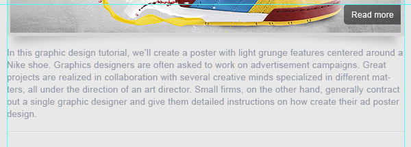
Afterwards, invert the selection (Shift + Ctrl/Cmd + I) and delete the selected area. You will see that our “Read More” button’s background now has a straight edge on the right, making it look as if it’s wrapping around the image. Reduce the Opacity of this layer to 50% to let some of the blog post’s image show through the button.
To finish our button, we just need to type out the “Read more” text.
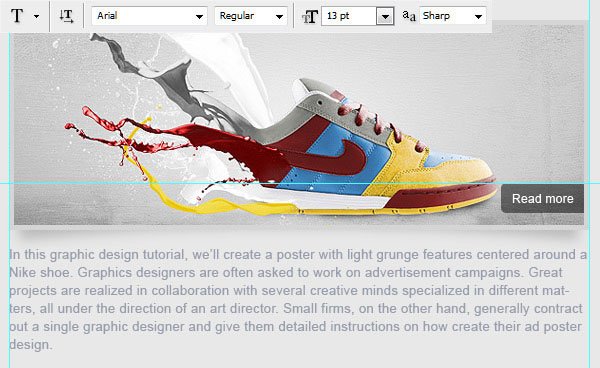
Set your Foreground Color to white (#ffffff) and then use the Horizontal Type Tool with the Arial font, Regular, size at 12pt to to write out the text, “Read more”, centered at our button.
We’re going to add a nice shadow under the blog post image. For that reason, let us create a new layer underneath the gray border. Set your Foreground Color to black (#000000) and use the Rectangle Tool (U) to draw a rectangle that’s slightly smaller in width than the gray border.
Rasterize the black rectangle’s layer (Layer > Rasterize > Shape), then go to Edit > Transform > Warp and transform the shape such that it curves in the middle (shown below).
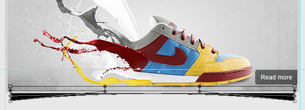
Next, go to Filter > Blur > Gaussian Blur.
Set the Radius of the blur to 6px and press OK to apply the Gaussian blur filter.
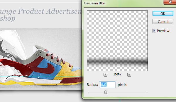
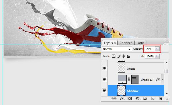
So that the shadow is not so strong, reduce the shadow layer’s Opacity to 20%. You may need to adjust the shadow’s location by moving it upwards a bit.
It’s time to add the blog post’s excerpt (also known as “teaser”). Set your Foreground Color to gray (#989eac) and, with the Horizontal Type Tool, write some text for the post’s excerpt below the post’s image.
I’ve used Arial at 13pt size.
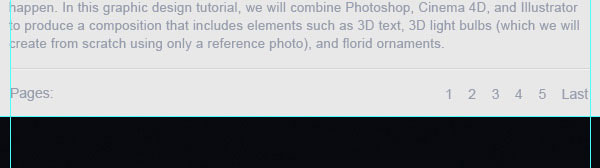
We need to copy the horizontal line that is below the secondary navigation menu to the bottom of the first blog post. First, use the Rectangular Marquee Tool (M) to make a selection around the horizontal line (use the vertical guides to help you make the appropriate selection).
In the Layers Panel, find the layer with the horizontal lines on it and click it to make it the active layer. Copy (Ctrl/Cmd + C) the line, go back to the “Blog post” layer group and paste the copied selection (this should automatically create a new layer for the lines).
Use the Move Tool (V) to move the horizontal line beneath the post’s excerpt. Reduce the Opacity of the layer to 50%.
Step 10: Create the Second Blog Post
Duplicate the “Blog post” layer group. Use the Move Tool (V) to move the contents of the duplicated layer group below the first layer group.
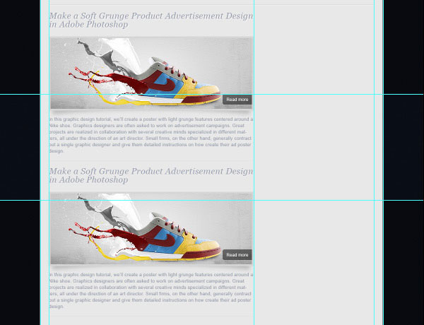
Change the blog post’s title, image and excerpt to make it look different from the first blog post.
For the image, I just used another previous Design Instruct tutorial.
Step 11: Create the Pagination Navigation
Pagination navigation is a popular design pattern for blogs that have a lot of content. In essence, it’s a quick way to navigate through older blog posts. You can see it in action at the bottom of the Design Instruct front page and category pages.
Let us create a new layer group (Layer > New > Group) for the pagination navigation.
Now set your Foreground Color to gray (#989eac). Use the Horizontal Type Tool (T) with Arial, Regular, and 14pt font size to write “Pages:”, aligned to the left guide. Then write the page numbers (“1 2 3 4 5”) as well as “Last”, aligned to the right guide.
Step 12: Create the Sidebar
Let’s make a new layer group (Layer > New > Group) for the sidebar.
We also need a new vertical guide to delineate the left edge of the sidebar’s content so that there is a bit of space between the blog post area and the sidebar area.
Create the new vertical guide (View > New Guide) at 760px.
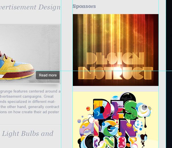
Use the Horizontal Type Tool (T) with a gray font color (#989eac) and ChunkFive font at 18pt size to write “Sponsors”. Align this text with the first blog post’s title. Copy the layer style from the blog post’s title and paste it into the “Sponsors” text layer to give it a very subtle drop shadow.
As a placeholder for banner ads, find a couple of 300x250px images and place them below the “Sponsors” text. I used images from previous Design Instruct tutorials, which you can navigate to here and here.
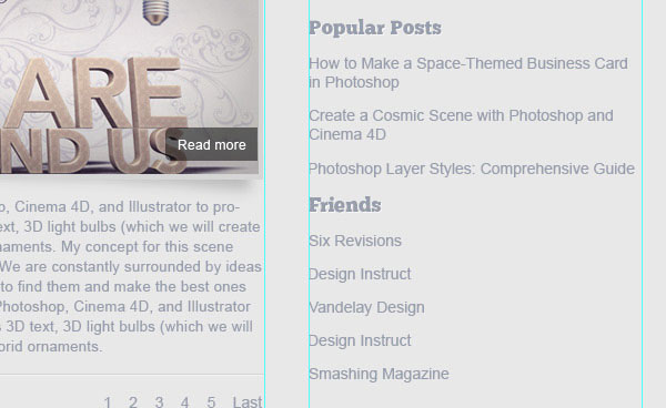
Beneath the banner ads, write the “Popular Posts” heading using the same style as the “Sponsors” heading.
Beneath the heading, use Arial, Regular at 14pt size to write a list of the most popular blog posts. Create another section, this time, with the heading of “Friends”. Below the “Friends” heading, write a list of blogs to be listed in your blog roll.
Step 13: Create Social Media Buttons
What’s a blog without social media? We will create buttons that will link to the blog’s social media accounts. We will place them below the main content area.
We will start by creating a new layer group (Layer > New > Group) for the social media text and buttons.
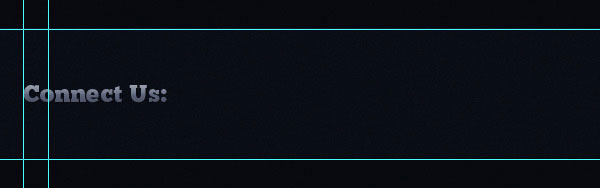
Write “Connect Us”, aligned to the left guide, using the ChunkFive font set at 24pt size. Copy the layer style from the “Welcome” text and paste it into this text layer.
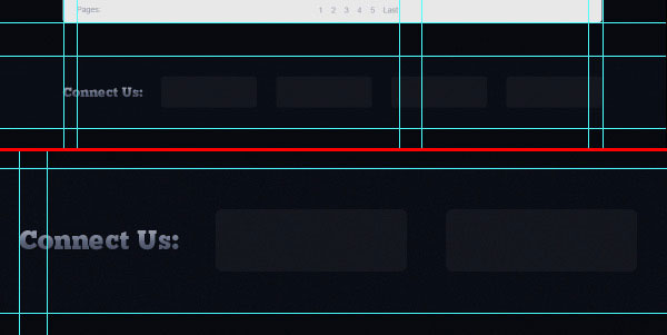
Let us now draw the backgrounds of the social media buttons. Set your Foreground Color to white (#ffffff) and then use the Rounded Rectangle Tool (U) to draw 4 rounded rectangles (shown below), and then reduce their layer Opacity to 4%.
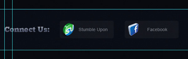
For the social media icons, I’ve used 4 icons from the awesome Vector 3D Social Icons icon pack.
Download the pack and then open 4 of your favorite social media icons in Photoshop. Resize the icons (Image > Image Size) to 42x42px. After resizing the icons, copy them into our document.
Place the icons on top of the rounded rectangles we drew just moments ago. Then type the name of the social media service (e.g., “Stumble Upon”, “Facebook”, etc.) on the right of the icons using a gray color (#989eac) and Arial, Regular at 14pt size.
Step 14: Create a Simple Footer
This is the last step of the tutorial. We will now create a simple footer that consists of copyright text and the designer’s information, as well as a “Follow us on Twitter!” call-to-action.
Let’s first create a new layer group (Layer > New > Group) for the footer layers.
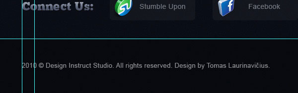
We’ll tackle the easier part first: the copyright text. Set your Foreground Color to gray (#8f9093) and type your copyright information using Arial at 13pt size.
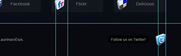
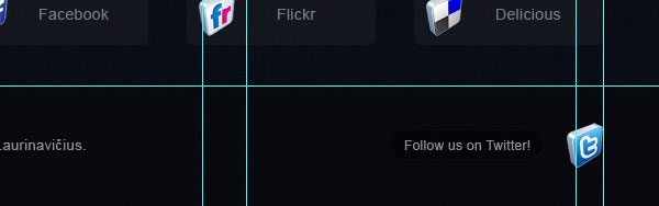
Select the Twitter icon from the Free Icon Pack: Vector 3D Social Icons that we downloaded earlier. Again, resize the image to 42x42px.
Place the icon at the footer area, aligned to the right guide (shown below).
Then with the same color as for the copyright text, write “Follow us on Twitter!” at the icon’s left side. Use the Rounded Rectangle Tool (U) with Radius set to 15px to create a black (#000000) background for the “Follow us on Twitter!” text.
Apply a Drop Shadow layer effect on the black rounded rectangle we’ve just drawn (settings shown below).
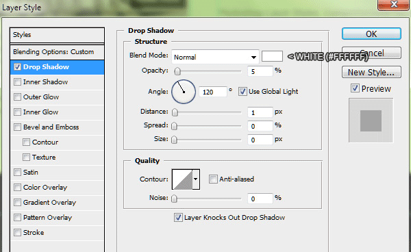
Reduce the black rounded rectangle’s layer to 40%, and you’ll notice that our background produces a subtle “pressed in” effect.
Tutorial Summary
We’ve finally finished our blog design, congratulations! We covered several popular techniques for web designers in this Photoshop web design tutorial.
First, organization-wise, you would have noticed that we created plenty of layer groups, which really helps compartmentalize our PSD file and make it easier to work with. We also used guides with precise locations, which are important for keeping our design elements properly aligned. We discussed several techniques such as using layer styles to style text layers, creating subtle light effects (seen in the creation of the site’s logo), inset dividers, and quick-and-simple web buttons.
I hope you found this tutorial useful, and you are encouraged to leave your thoughts and questions in the comments.
Download Source Files
- modern_sleek_blog (ZIP, 2.69 MB)
-
 Trevin serves as the VP of Marketing at WebFX. He has worked on over 450 marketing campaigns and has been building websites for over 25 years. His work has been featured by Search Engine Land, USA Today, Fast Company and Inc.
 -

WebFX is a full-service marketing agency with 1,100+ client reviews and a 4.9-star rating on Clutch! Find out how our expert team and revenue-accelerating tech can drive results for you! Learn more
Make estimating web design costs easy
Website design costs can be tricky to nail down. Get an instant estimate for a custom web design with our free website design cost calculator!
Try Our Free Web Design Cost Calculator
Table of Contents
- Preview
- Tutorial Resources
- Step 1: Creating a New Photoshop Document
- Step 2: Creating Guides
- Step 3: Creating the Design’s Background
- Step 4: Making the Blog’s Logo
- Step 5: Create the Main Navigation Menu
- Step 6: Create the Blog’s “Welcome” Text
- Step 7: Create the Main Content’s Background
- Step 8: Create the Secondary Navigation Menu
- Step 9: Create the First Blog Post
- Step 10: Create the Second Blog Post
- Step 11: Create the Pagination Navigation
- Step 12: Create the Sidebar
- Step 13: Create Social Media Buttons
- Step 14: Create a Simple Footer
- Tutorial Summary
- Download Source Files
Share this article


Web Design Calculator
Use our free tool to get a free, instant quote in under 60 seconds.
View Web Design CalculatorMake estimating web design costs easy
Website design costs can be tricky to nail down. Get an instant estimate for a custom web design with our free website design cost calculator!
Try Our Free Web Design Cost Calculator


