
Some logos are very creative and have subtle symbols and messages that represents something about the company it stands for. We explore a handful of such logos in this collection.
Big 10
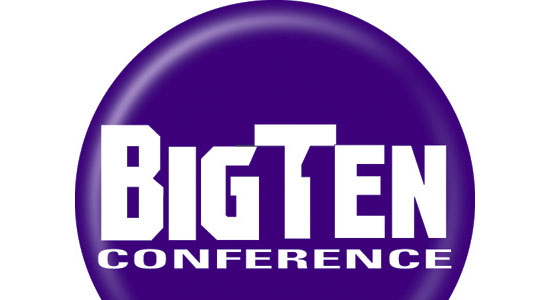 The Big Ten Conference is the United States’ oldest Division 1 college athletic conference.
Since Penn State joined in 1990, there have been 11 schools in the Big Ten. They revamped their logo by placing a hidden number 11 on either sides of the letter T to stand for the actual number of schools in the division.
Goodwill
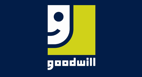 Goodwill is a nonprofit organization that helps disadvantaged people in North America.
The letter G in the logo is a smiling face, conveying the notion that Goodwill provides happiness and relief to those in need.
Sun Microsystems
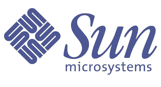 If you look at the diamond icon on the left of the company’s name, you will see that it spells out Sun starting from any corner. It is a wonderful example of symmetry.
Amazon
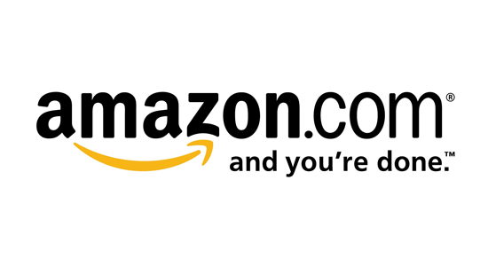 This logo has been around for over a decade, but many people do not know that there’s a hidden symbolism in Amazon’s logo. The arrow from A to Z represents that the website sells everything from A to Z, and doubles as a “smile” to suggest satisfied customers.
Toblerone
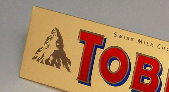 In the company’s logo, you will see a bear hidden in the mountain.
The bear is the symbol of the city of Berne in Switzerland where Toblerone is produced.
Baskin Robbins
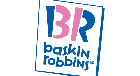 At first glance, this logo looks simply like the initials for Baskin Robins but if you take a second look, you will see the number 31 in the acronym (highlighted in a pink color). This stems from the idea that Baskin Robbins sells 31 types of ice cream, one for each day of the month.
FedEx
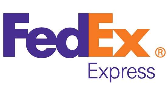 The hidden rightward-pointing arrow in the negative space between the letter E and X conveys the speed and precision of the company’s delivery service.
Hope for African Children Initiative
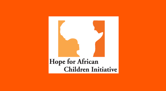 At first glance, this logo looks like a map of Africa, but if you take a closer look, you will see two people facing each other.
Milwaukee Brewers
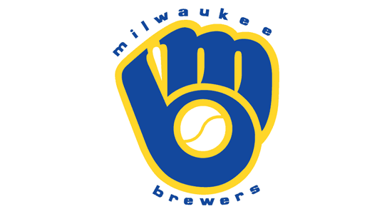 The old Milwaukee Brewers logo uses the team’s initials (B and M) to form a catcher’s glove holding a ball.
Northwest Airlines
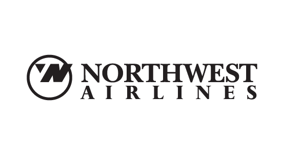 The old Northwest Airlines logo has a very clever icon. Not only does the icon on the left of the text spell out N and W, but the arrow and circle symbolizes a compass pointing in the northwestern direction.
Related Content
-
 President of WebFX. Bill has over 25 years of experience in the Internet marketing industry specializing in SEO, UX, information architecture, marketing automation and more. William’s background in scientific computing and education from Shippensburg and MIT provided the foundation for MarketingCloudFX and other key research and development projects at WebFX.
 -

WebFX is a full-service marketing agency with 1,100+ client reviews and a 4.9-star rating on Clutch! Find out how our expert team and revenue-accelerating tech can drive results for you! Learn more
Make estimating web design costs easy
Website design costs can be tricky to nail down. Get an instant estimate for a custom web design with our free website design cost calculator!
Try Our Free Web Design Cost Calculator
Share this article


Web Design Calculator
Use our free tool to get a free, instant quote in under 60 seconds.
View Web Design CalculatorMake estimating web design costs easy
Website design costs can be tricky to nail down. Get an instant estimate for a custom web design with our free website design cost calculator!
Try Our Free Web Design Cost Calculator


