- Home
- Blog
- Web Design Usability Mistakes to Avoid When Using Photos in Your Website
Usability Mistakes to Avoid When Using Photos in Your Website
-
 14 min. read
-
 Trevin Shirey
 VP of Marketing
- Trevin serves as the VP of Marketing at WebFX. He has worked on over 450 marketing campaigns and has been building websites for over 25 years. His work has been featured by Search Engine Land, USA Today, Fast Company and Inc.

This post was brought to you with help by Depositphotos
Depositphotos is a stock photo agency that provides premium royalty-free stock photos, illustrations, and vector images. Subscribe to Depositphotos for as little as $69 a month. Read about Depositphotos | Posts sponsored by Depositphotos
Mistake 1: Not Choosing the Right Photos
In website design, photos are very powerful tools.
Well-regarded usability expert Jakob Nielsen asserts that “users pay close attention to photos and other images that contain relevant information but ignore fluffy pictures used to ‘jazz up’ Web pages.” Photos are useful only if they’re the right ones to use. In an article on his website, Jakob Nielsen reports on an eye tracking study his company did that highlights how users skipped a photo that didn’t help with the purpose of the web page, which was to outline the steps prospective students need to take in order to apply to the Yale School of Management. 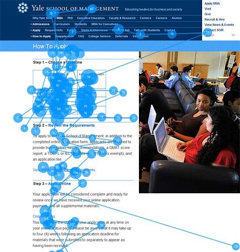 Source: nngroup.com As you can see from the image above, people didn’t look at the photo on the right of the web page, probably because it didn’t serve an important purpose in giving readers any information about how to apply to the school.
However, when photos are chosen purposefully, people tend to look at them more intently. Here’s another eye tracking study that Jakob Nielsen’s company performed on the Pottery Barn website (reported in the same article above): ![]() Source: nngroup.com Because the photos were useful for evaluating the differences between the bookcases being presented in the web page, users spent more time looking at them.
Source: nngroup.com Because the photos were useful for evaluating the differences between the bookcases being presented in the web page, users spent more time looking at them.
How to Choose the Right Photos
So how do you choose the right photos?
What makes a photo usable? James Chudley, UX director at cxpartners and the author of an upcoming book entitled “Usability of Web Photos”, created a framework for evaluating the usefulness of web photos (which he outlines in a presentation done at FOWA). Chudley’s framework, still a work in progress, consists of 4 things to evaluate.
1. Photo fundamentals: This pertains to the basic traits of good photography like image quality, composition, size, exposure, etc. In addition, in the context of website design, web accessibility of the photo — such as a photo’s colors and contrast — can also be a factor in its fundamental usefulness. 2. Effectiveness: How well does the photo create an appealing argument under these 3 characteristics:
- Rational appeal. Is it right for the user? Does the photo show the benefits of the product?
- Emotional appeal. Does the product look good? Does it make the user want the product? Does the user see himself/herself using the product?
- Reputation/brand appeal. Does it fit your brand?
3. Message communicated: Is the photo sending the correct information to its intended audience? 4. Anticipated user response: Is the photo able to change behavior, help in decision-making, create a desire of your product, etc.
Mistake 2: Using Photos as Decorative/Filler Elements
Photos that don’t serve a purpose other than being ornamental components of a web page are obstructions. In discussing an eye tracking study of the home page of a cable service provider, Jakob Nielsen and Kara Pernice wrote that most “people went out of their way to avoid the generic-looking images on the page.” 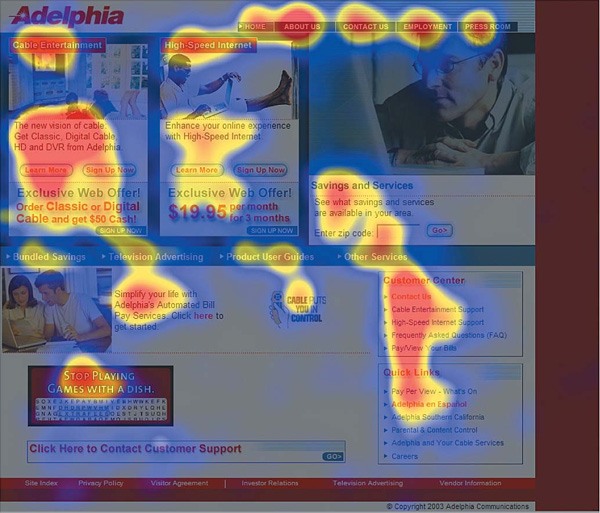 Source: peachpit.com Superfluous images only burden your users by slowing them down.
It’s best to leave these types of photos out of your web pages.
Mistake 3: Not Using Photos to Guide the User
Usability specialist James Breeze did an eye tracking study of over 100 people. He found that people fixated on the eyes of the photo’s model — in this case, a baby — and wherever the baby’s eyes were directed.
When he changed the direction of the baby’s eye gaze towards the text of the web page, more people fixated on the text. In the following image, the redder the spot, the more time spent looking at that area. ![]() Source: usableworld.com.au A similar eye tracking study by THiNK, where they changed the direction of the model’s eye gaze towards the product they were advertising, lead to a 78% increase in people looking at the product.
Source: usableworld.com.au A similar eye tracking study by THiNK, where they changed the direction of the model’s eye gaze towards the product they were advertising, lead to a 78% increase in people looking at the product. 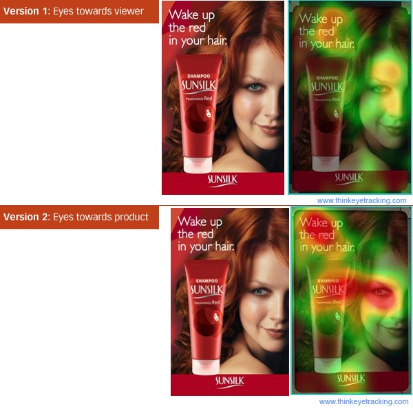 Source: thinkeyetracking.com Check out this concept in action at the neveandhawk website:
 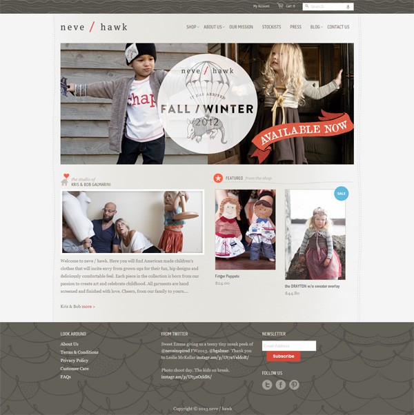 Notice how the direction of the kids’ eyes direct you to the “Fall/Winter” text and the primary navigation menu of the web page.
Mistake 4: Not Using Photos Purposefully
Photos can do many things. One of them is their ability to guide the eyes of your users towards sections of your web pages, as discussed above. They can also give the viewer of the photo important contextual information about its subject, such as how it works, how big it is, what it looks like, etc.
To see the usefulness that a single photo can provide, look at how Square (an app that allows you to accept credit card payments with your mobile device) purposefully uses a photo in their home page:  With a simple photo, users can see how Square works — something that would be hard to achieve as effectively using just text. Square’s photo shows you the following:
- how the mobile card reader attaches to your smartphone
- how big the mobile card reader is
- how you’d swipe a credit card the mobile card reader
- what will appear on the screen of your smartphone when you swipe a credit card
Additionally, the finger pointing to the left pushes your eyes towards their call-to-action (i.e., sign up to get your mobile card reader), much like how a photo subject’s eyes can direct your eye flow towards another section of a web page. Here’s another strategic use of a photo on the Karma site:  The photo shows off their product, the Karma hotspot (as you can see, it’s smaller than your hands so it’s easy to carry) and the photo model’s index finger is angled so that your eyes flow to the Karma hotspot and to their call-to-actions (buy it or learn more).
Mistake 5: Not Optimizing Your Photos’ File Sizes
A website’s responsiveness and speed are critical usability factors.
Jakob Nielsen suggests that a 1-second response time “is about the limit for the user’s flow of thought to stay uninterrupted.” According to the January 15, 2013 data gathered by HTTP Archive, the average web page size is 1.28MB, and about 61.5% of that are images. 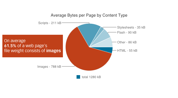 Source: HTTP Archive What this means is that because a web page’s file weight can be largely attributed to images, your photos can pose as a usability issue if they’re too heavy. To improve web performance — and, subsequently, usability — you need to compress the file size of your photos as much as you can to make them download as quickly as possible. To highlight the significant benefits of compressing your photo’s file sizes, let’s do a quick photo optimization.
I took a photo from one of our freebie packs (Pebble: Texture Pack), which I then resized to 200px-wide just to make presenting it in this article easier.  The original file size of the photo after I resized it was 66.5KB. I used Photoshop’s Save for Web & Devices function, which is a convenient feature for quickly saving photographic images taken by high-resolution digital cameras into web-optimized file formats. I used the “JPEG – Very High” preset setting because it didn’t lower the quality of the photo significantly.
The resulting file size was 19.0KB, a 71.4% decrease in file size. To squeeze out unneeded bytes even more (without affecting the image’s quality) I used the free online tool Smush.it that lowered the size to 18.1KB, further decreasing the file size of the already-optimized image by 4.7%. Here’s a side-by-side comparison of the 3 images.
| Original (66.5KB) | Photoshop Save for Web… (19.0KB) | Smush.it (18.1KB) |
 |
 |
 |
As shown above, you can drastically improve the file sizes of your images without taking away from their quality or usefulness. For more tips on image optimization, check out our article on five easy steps to optimize your images using Photoshop.
You can also read Yahoo! Developer Network’s tips on optimizing images.
Mistake 7: You Don’t Use Photos of People When You Should
Paras Chopra, CEO and founder of Wingify (a company that builds website optimization tools like Visual Website Optimizer) wrote about how photos of people can increase the conversion rates of landing pages.
In one A/B testing study he reviewed, photos of paintings were replaced by the headshot photos of the artists. The conversion rate of the web page increased by 95% with this simple change.  Source: visualwebsiteoptimizer.com In another case study he mentioned in the article, substituting a generic icon with a photo of the website’s owner led to 48% more conversions.
 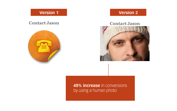 Source: visualwebsiteoptimizer.com One of Paras Chopra’s conclusions based on his research is that using photos of people have positive effects on a visitor’s first impression of the trustworthiness of a website.
Another A/B test, this one by 37Signals, looked at the effects of placing a big, smiling photo of one of their customers as the background of one of their sign-up page designs for their contact management app, High Rise. The company saw a huge 102.5% increase in sign ups for the design featuring a person. 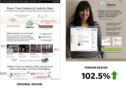 Source: 37signals.com Using photos of people create a positive emotional connection with your users, making them more useful than certain types of photos such as generic icons or decorative images.
Mistake 6: Not Using width and height Attributes on <img> Elements
If you have a lot of photos on a web page, it can take a while for all of them to render. But users don’t have to wait for the entire web page to download. They can start reading text content and then view the photos later on when they’ve finished downloading.
It’s in this scenario that having width and height HTML attributes for all of your <img> elements is important. For clarity, below are examples of HTML markup with and without width and height attributes. Image element with width and height attributes:
<img src="yourphoto.jpg" width="600" height="600" />
Image element without width and height attributes:
<img src="yourphoto.jpg" />
Why are width and height attributes important for usability?
Images that don’t have defined width and height attributes can cause shifting in the position of the web page’s content because the browser doesn’t know how big the images are supposed to be. This shifting can annoy users because they have to reacquire their current position whenever an image is rendered. Below is a side-by-side comparison of one of our web pages with the images’ width and height attributes removed.
When the web page loads all of the images, you can see that the content shifts down — interfering with the user’s reading experience. 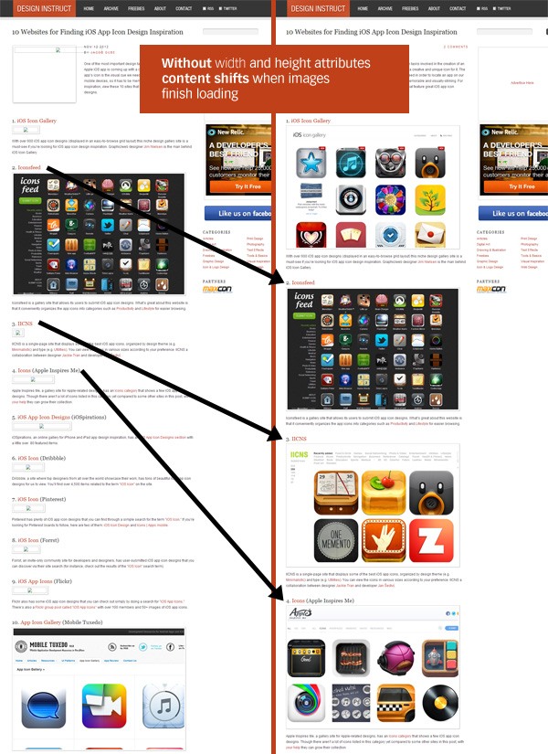 But if you have
 height and height attributes, browsers will know the dimensions of the images that are still downloading, and so they can put a correctly-sized placeholder for those images. This, in turn, avoids content-shifting.
Here’s the same web page, but I’ve put back the height and height attributes. As you can see below, there’s no content-shifting after the web page has fully rendered the images. 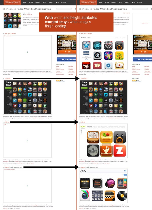
Mistake 8: Your Photos Are Too Small
In another review of a case study by Paras Chopra, this time an A/B test of car manufacturer Hyundai’s landing pages, using a larger photo (among other things like having extra call-to-action buttons and better SEO text) increased conversion rates by 62%. 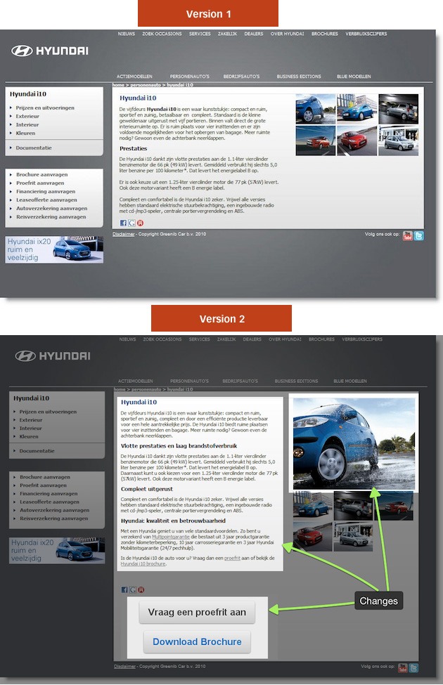 Source: visualwebsiteoptimizer.com An eye tracking study (reported here) by the Nielsen Norman Group similarly revealed that users appreciated larger photos (when they request it).
The image below displays how users scrutinized a larger image of a faceplate from ExtremeTech.com, with the image receiving 12 eye fixations.  Source: nngroup.com As a counter-example, Jakob Nielsen and Kara Pernice found that most of the photos in New York Magazine’s restaurant web page, including the small ones, were largely ignored by its readers (as reported here).
 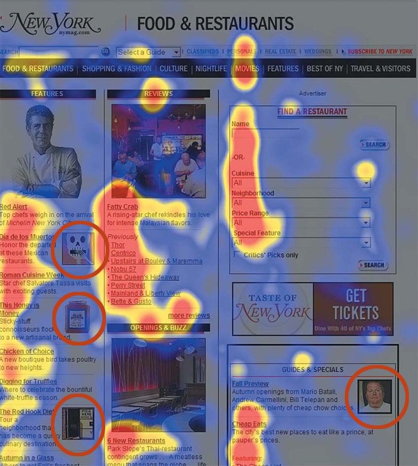 Source: peachpit.com Sufficiently large photos can be more useful because they can convey more information (such as finer details) than smaller, lower-resolution photos.
Your Turn
What are other usability issues of photos? How do you choose what photos to use in your website? Share your thoughts about this subject in the comments below.
-
 Trevin serves as the VP of Marketing at WebFX. He has worked on over 450 marketing campaigns and has been building websites for over 25 years. His work has been featured by Search Engine Land, USA Today, Fast Company and Inc.
 -

WebFX is a full-service marketing agency with 1,100+ client reviews and a 4.9-star rating on Clutch! Find out how our expert team and revenue-accelerating tech can drive results for you! Learn more
Make estimating web design costs easy
Website design costs can be tricky to nail down. Get an instant estimate for a custom web design with our free website design cost calculator!
Try Our Free Web Design Cost Calculator
Table of Contents
- This Post Was Brought to You with Help by Depositphotos
- Mistake 1: Not Choosing the Right Photos
- Mistake 2: Using Photos As Decorative/Filler Elements
- Mistake 3: Not Using Photos to Guide the User
- Mistake 4: Not Using Photos Purposefully
- Mistake 5: Not Optimizing Your Photos’ File Sizes
- Mistake 7: You Don’t Use Photos of People when You Should
- Mistake 6: Not Using Width and Height Attributes on <img> Elements
- Mistake 8: Your Photos Are Too Small
- Your Turn


Web Design Calculator
Use our free tool to get a free, instant quote in under 60 seconds.
View Web Design CalculatorMake estimating web design costs easy
Website design costs can be tricky to nail down. Get an instant estimate for a custom web design with our free website design cost calculator!
Try Our Free Web Design Cost Calculator