
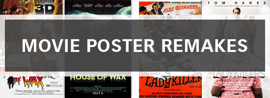
Movie posters have been around for longer than most of us have lived – thus, studying them can give us insights on how design has progressed throughout recent history. They were the main way of advertising film 70 years ago, and although we now have television commercials and the internet, posters are still one of the best forms of advertisement. In this collection, we will look at how poster design has developed over the years, looking at films that have been remade.
Scarface
1932
The original Scarface movie uses some good design techniques such as the silhouette-style shadow and some mid-saturated colors. 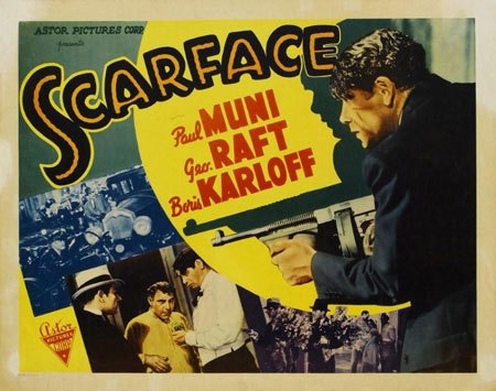
1983
The typography of the 1983 Scarface remake is elegant and easy to read. 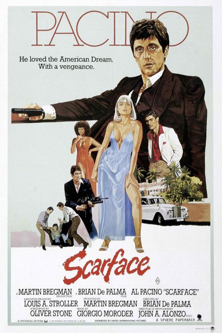
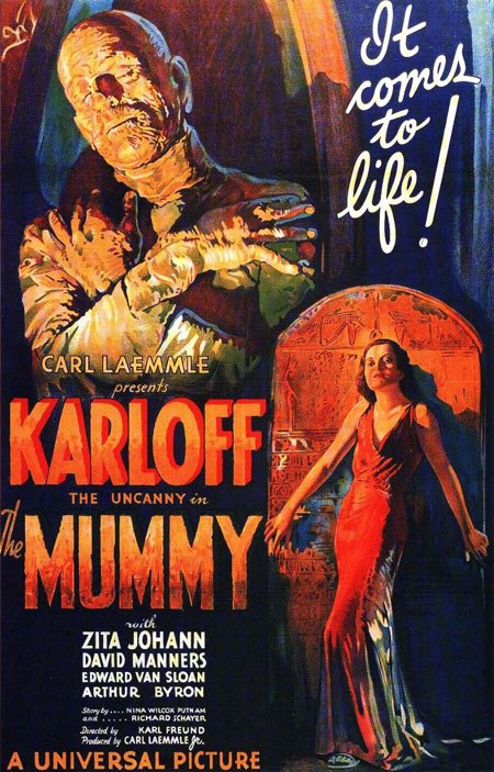
The Mummy
1932
The composition of the original The Mummy movie is great, but it has three-dimensional text that is directly above the 3D text, which seems a bit odd.
1999
The remade movie poster uses superb digital manipulation as well as a great text effect used for the ‘M’ in Mummy. The color schemes for the poster are perfect, reflecting mummies and the desert, a central theme in the movie. 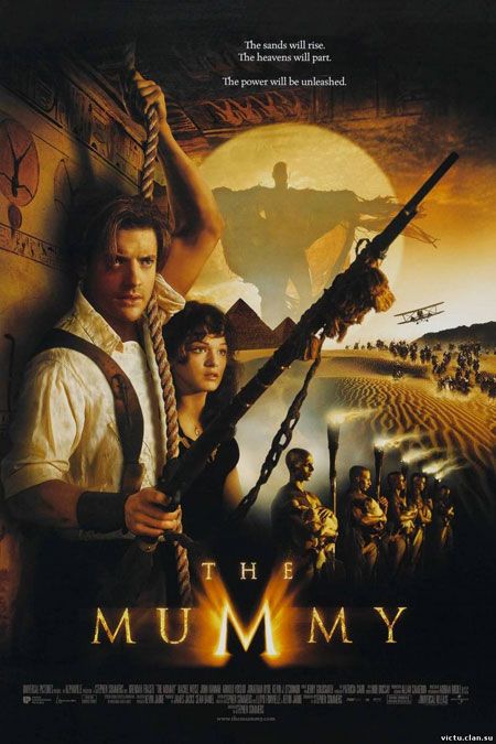
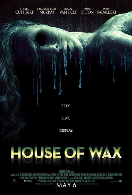
House of Wax
1953
The hand-painted poster combined with neat typography represents the 3D image really well.
The warm and dark color scheme sets the theme for this Technicolor film. 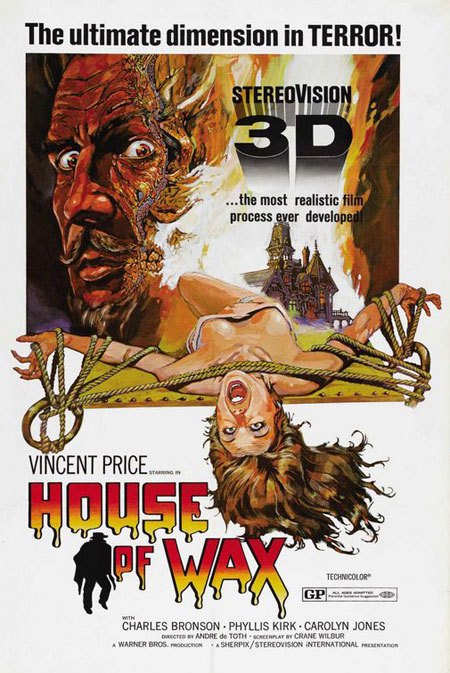
2005
The use of subtle grunge at the top of the post draws your eyes into the incredible manipulation effects used on the portrait. Beneath the movie title, you’ll see a blurred reflection that can really play with your eyes – fitting for a horror movie.
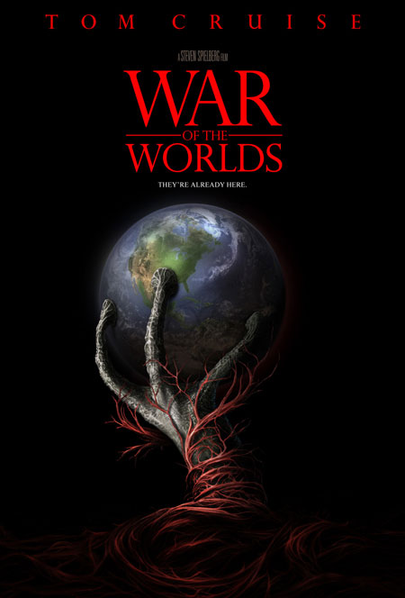
War of the Worlds
1953
This movie poster is simple and colorful and has some great artwork. 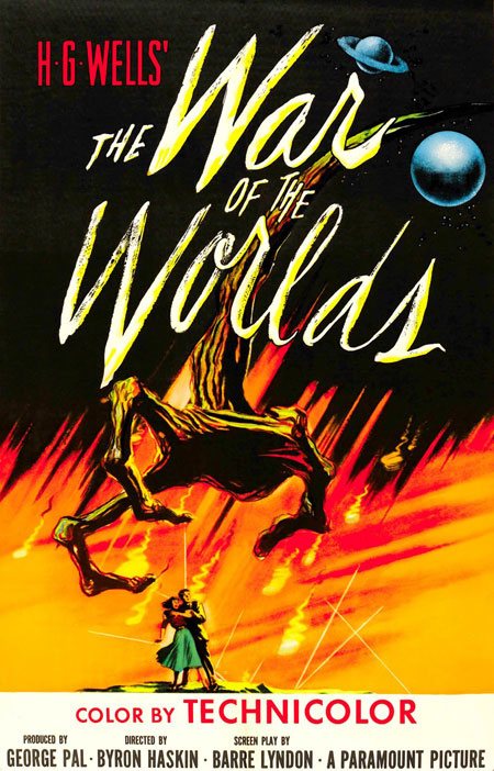
2005
The typography used on this poster is elegant and simple, but it works well for this movie’s theme. The bright red on pure black works great as an eye-grabbing color combination.
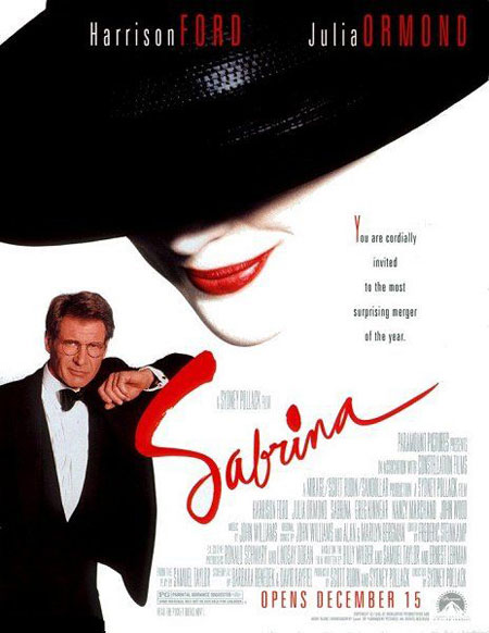
Sabrina
1954
An off-white border, a simple and elegant grid-based composition is the highlight of this poster (and movie). 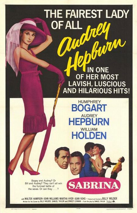
1995
The 90’s probably spurred some of the worst design trends as shown in this poster design. The composition is poor and none of the text in the bottom right can easily be read.
Ladykillers
1955
This hand-drawn poster presents us with a group of rather scary-looking men running away with what look likes heavy-duty steel cases filled with multi-colored cash. It’s a comical and traditional hand-drawn poster (when Illustrator wasn’t in the market yet). 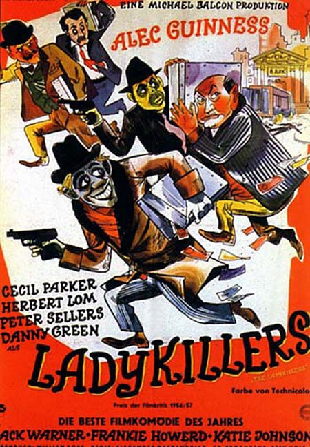
2004
The low-opacity street scene and lights in the background adds a great feel to the overall poster, and the shadows from the four guys in the background adds depth to the poster.
The majority of it is grayscale, followed by neutral browns and beiges, and followed by a great burst of what’s best described as “vintage pink”, bringing your eyes towards the movie title. 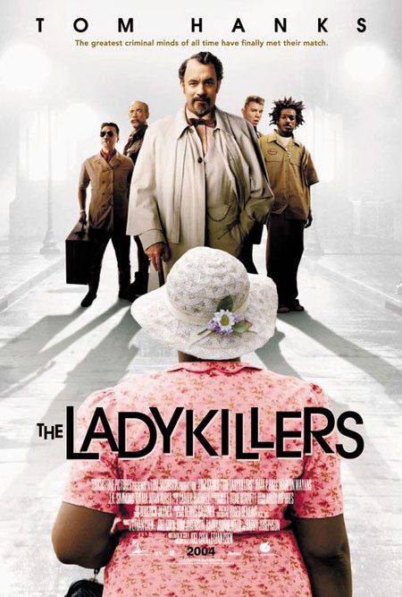
Oceans 11
1960
This poster uses a grid-based layout, a popular technique in the 60’s to convey modernity. The silhouette, vector-style illustration at the bottom of the poster is a great touch.
The typography is superb, standing out well against the warm yellow background. 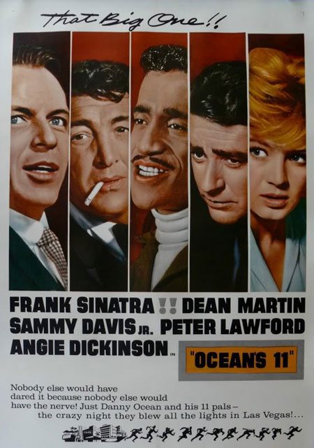
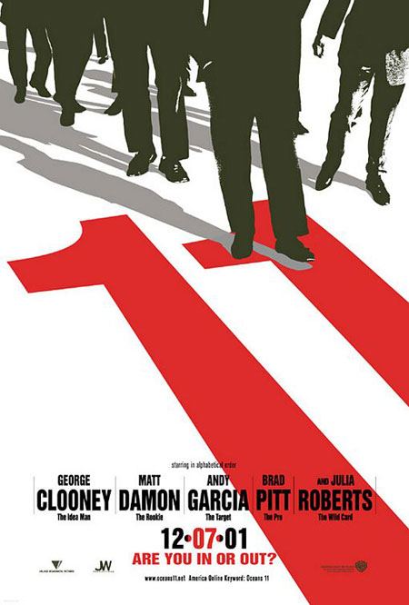
2001
The vector/silhouette style illustration used in the poster is so different to almost any other movie poster made in this millennium, that even today, people still have it hanging on their college bedroom walls. Have you noticed how it doesn’t actually say “Oceans 11” anywhere?
Spartacus
1960
As individual design elements, this poster has some great artwork, such as the drawings, the unique movie title text effect and the duotoned photographs, but the overall composition lacks “oomph”. 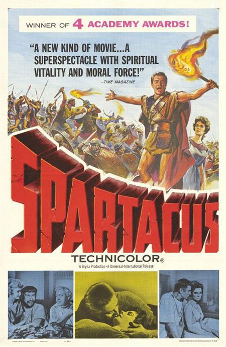
2004
After 44 years, Spartacus was remade. The costume and photography is excellent; the sepia-toned color sets the movie’s time period. 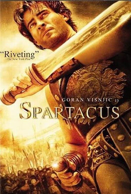
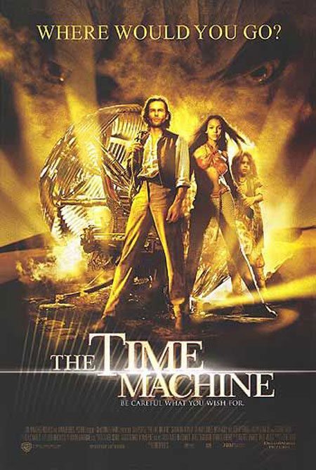
The Time Machine
1960
This poster design is presented on a grid and has the classic white border.
The typography in this poster (especially the headline) is superb and truly unique for this time period. 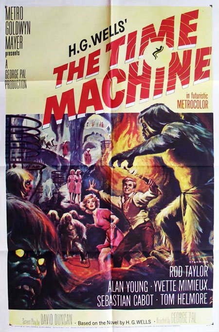
2002
The color scheme of the remake seems off, and in some places, appears to be too bright. There are also some parts of the posters that are too busy.
Last Man on Earth / Omega Man / I Am Legend
1964
“The Last Man on Earth” is the original story of what we now know as “I Am Legend”. The poster is a typical 60’s horror movie poster. The designers used a lovely grid-based composition and a very limited dark color scheme. 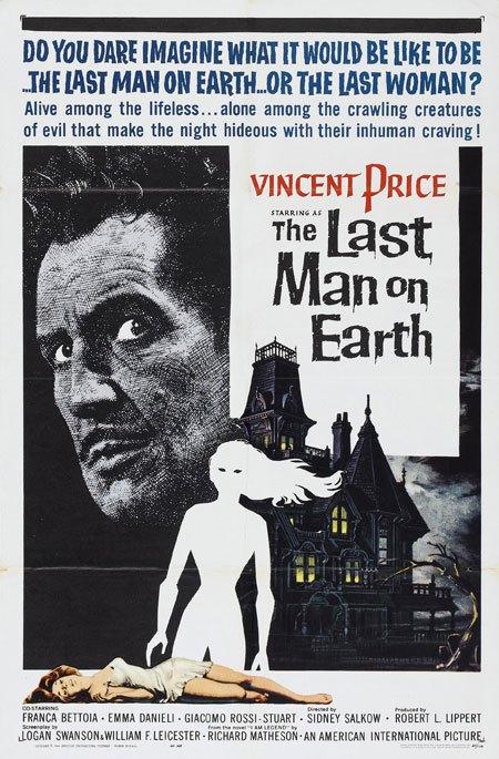
1971
Seven years later, and the film was remade under the name “Omega Man”. They were still using similar techniques to produce posters, and therefore this poster isn’t too different from the original. The color scheme is still very limited to dark colors, which is great for this genre of film. 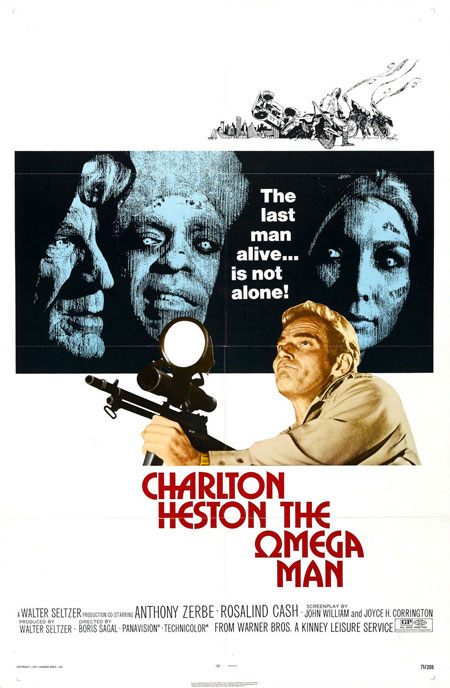
2007
The grungy, noisy and tinted feel to the “I am Legend” poster overall is great.
The modeling work in the background of the scene is superb, and the small centered typography going directly through the middle of the poster adds a great touch to the poster, making it incredibly unique. 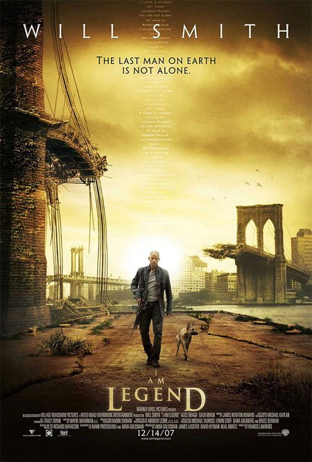
Planet of the Apes
1968
This great poster from the late 60’s perfectly combines the use of a bright and captivating background color gradient against black/white. The warm feel of the poster along with the black and white portrait creates a memorable design.
The films logo was such as a success that it has only seen a few minor tweaks in 40 years. 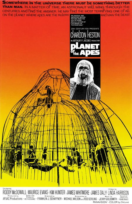
2001
2001 brought us the modern remake of the film, featuring manipulations and montages of several scenes and photographs. The moons in the background tops off the overall feel of the poster.
Notice that the movie title logo is still very similar to the original. 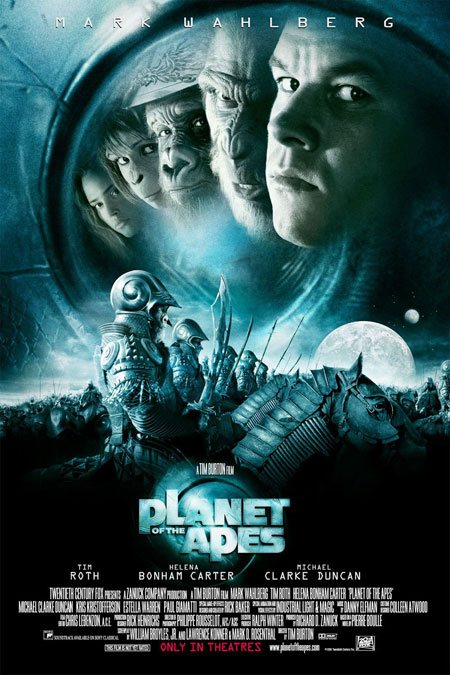
The Italian Job
1969
The artwork in this poster is superb contained in a lovely off-white border. White typography lies on a pure black background at the bottom of the poster, making it easy to spot and read.
This poster suggests the kind of film it is: business, violence, jokes and getaways. 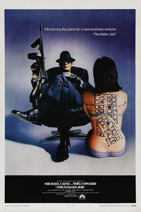
2003
This poster goes for a cast shot and features some great photography, photo manipulation and type alignment. 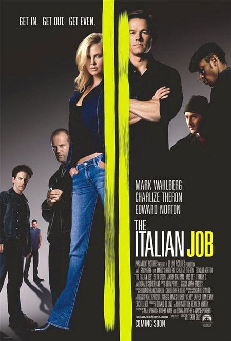
Wickerman
1973
This movie poster features a bright color scheme.
The typography is simple but does its job well. 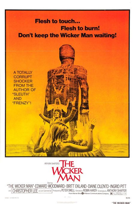
2006
The composition of this poster is great, however,the movie slogan “Be careful what you search for…” is difficult to read against the cloud background even with a prominent dropshadow text effect. 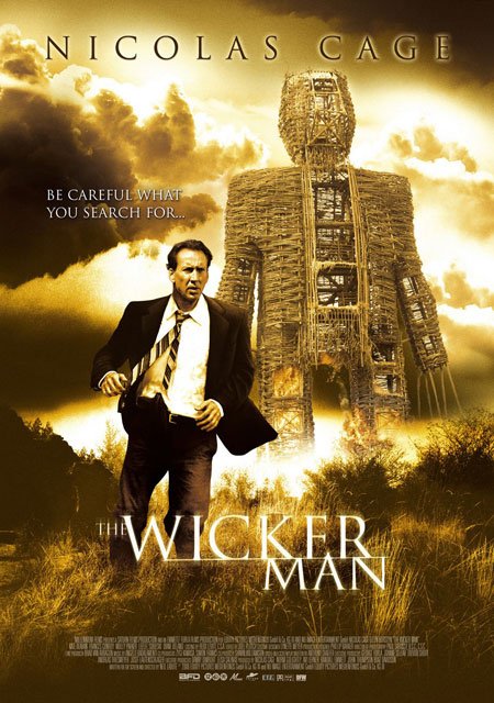
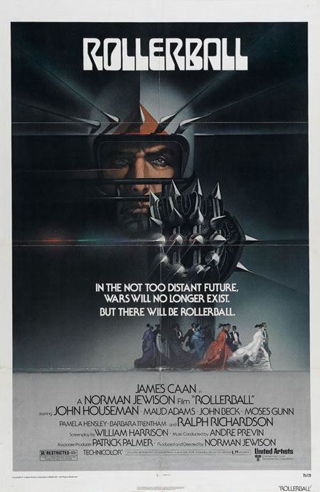
Rollerball
1975
The Rollerball poster has smooth glows, dark shadows, some well-placed blurs and an overall aged/worn effect.
2002
This poster design of the Rollerball remake in 2002 doesn’t do the actual film any justice. There are proportion inaccuracies with the characters versus the background, making it clearly obvious that the shot was taken in front of a green screen; the proportion and angle of the floor and their feet just doesn’t match up. 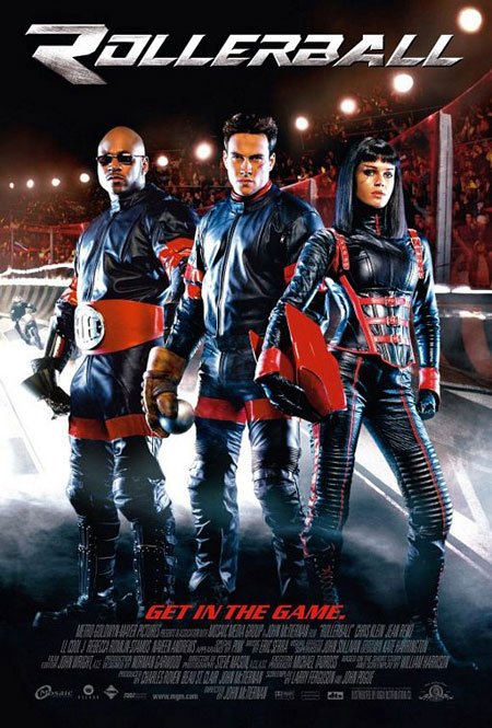
The Omen
1976
Other than the excellent sketch, you can’t get much more simplistic than this poster!
The typography is simple yet elegant, easy to read, and the use of red for the movie’s title is a great way to make it unique, memorable and slightly scary. 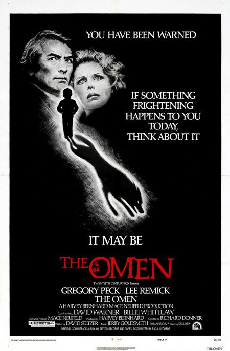
2006
The typography ruins the poster of The Omen remake, but the color theme used effectively sets up the eerieness of the movie’s plot. 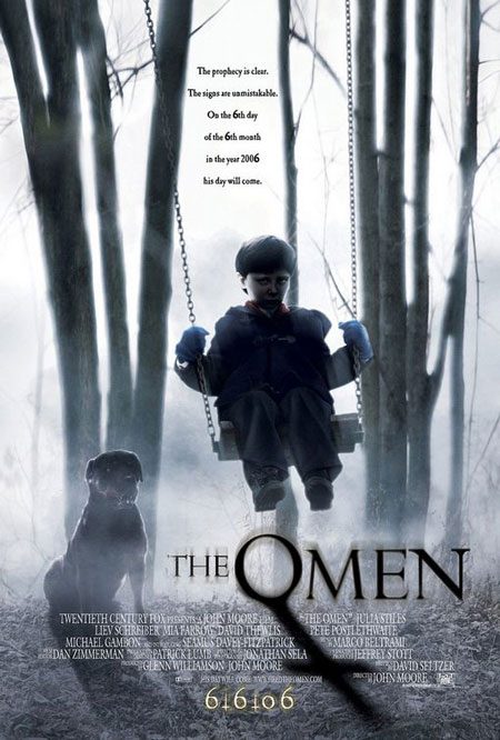
The Hills Have Eyes
1977
Good typography, a lovely border, and a great scene in the background are the highlights of this poster design.
The overall color scheme would have easily attracted people walking past the poster. 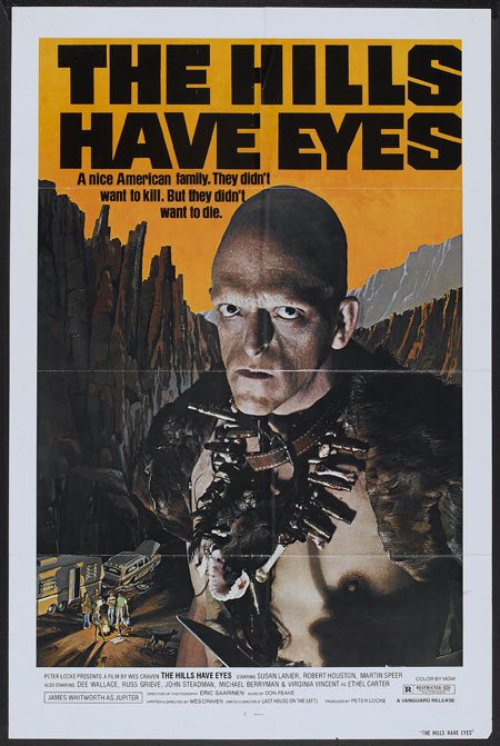
2006
The blurs, noise and texture combined makes for an excellent poster; this poster design is probably something you can’t miss from a mile away. 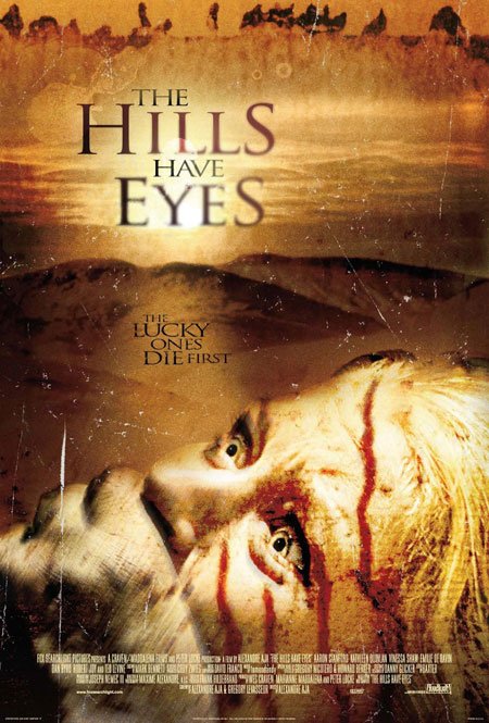
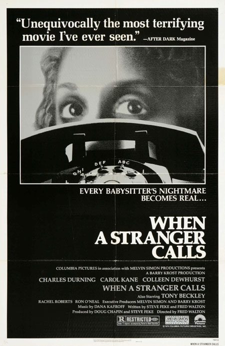
When A Stranger Calls
1979
The poster is purely grayscale and used a magnificent macro still shot and some incredible typography.
2006
The movie remake’s poster stuck with the original design concept. The design uses a lot of dead space, leaving you in suspense as to what the movie is about. 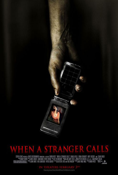
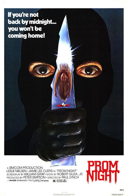
Prom Night
1980
That dark silhouette, the glowing eyes, the reflection on the knife, the detail of the glove and the magnificent minimalistic typography on a white background makes for an eye-grabbing design.
2008
The ‘smashed up’ feel of the poster, the subtle grunge feel to the otherwise clean, elegant text and the overall tinted-blue effect all help set the mood of the movie. The noise on that portrait is a brilliant detail. 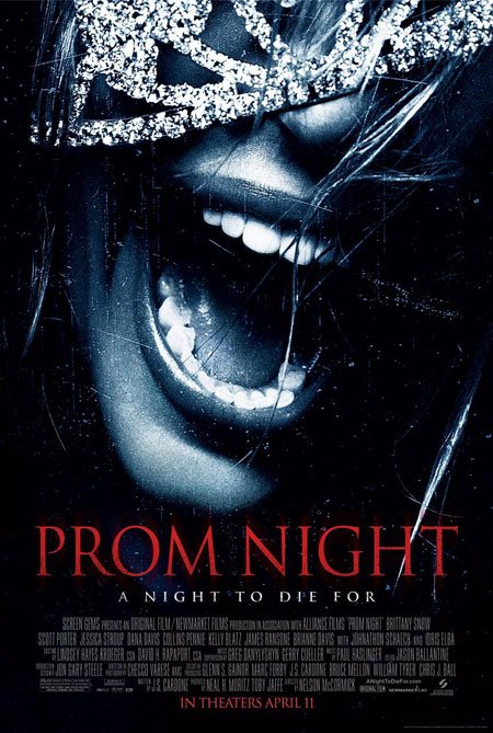
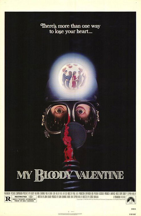
My Bloody Valentine / My Bloody Valentine 3D
1981
This dark-themed poster of My Bloody Valentine creates an eerie look and feel that sets the tone for the movie.
2008
This poster has dark, grungy and noisy elements, again, to set the tone of the movie. The red color works well against the dark background, making the title of the poster pop. 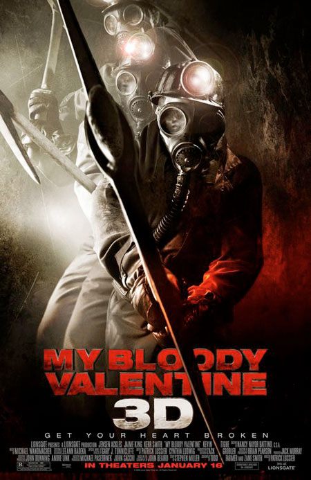
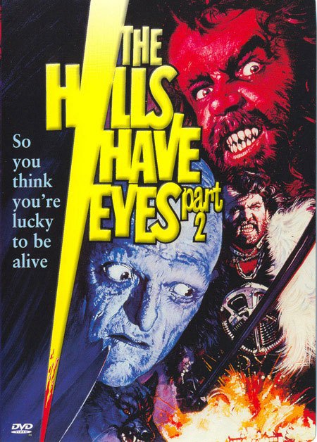
The Hills Have Eyes 2
1985
Although the artwork is quite interesting and eye-catching, that bright yellow blade and beveled typography completely ruins the design (at least for me).
2007
The creators of the remade “The Hills Have Eyes” liked the outcome of their first poster and decided to stick to the same style with the sequel. The dark edges on both the left and right side of the poster really draw your eyes into the main focal point of the poster; the unlucky human being dragged through the desert. 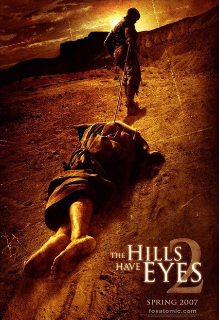
Your thoughts on movie posters
So, what do you think?
Many people say remakes of movies always turn out worse, but is it the same case when it comes to the poster and artwork redesign? Share your thoughts on this subject in the comments.
Related Content
-
 President of WebFX. Bill has over 25 years of experience in the Internet marketing industry specializing in SEO, UX, information architecture, marketing automation and more. William’s background in scientific computing and education from Shippensburg and MIT provided the foundation for MarketingCloudFX and other key research and development projects at WebFX.
 -

WebFX is a full-service marketing agency with 1,100+ client reviews and a 4.9-star rating on Clutch! Find out how our expert team and revenue-accelerating tech can drive results for you! Learn more
Make estimating web design costs easy
Website design costs can be tricky to nail down. Get an instant estimate for a custom web design with our free website design cost calculator!
Try Our Free Web Design Cost Calculator
Share this article


Web Design Calculator
Use our free tool to get a free, instant quote in under 60 seconds.
View Web Design CalculatorMake estimating web design costs easy
Website design costs can be tricky to nail down. Get an instant estimate for a custom web design with our free website design cost calculator!
Try Our Free Web Design Cost Calculator


