
Preview
Here is what we’ll be constructing in this tutorial. Click on the image below to see it in full scale. 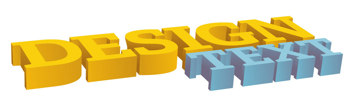
Step 1: Adding the Text
We are going to start off by typing out some text.
Click on your Type Tool (T), click and drag a box on the artboard for your text, then type out “DESIGN TEXT” in two lines. This will give us the shape we are looking for. You can adjust the size of the text by opening up the Character Panel (Window > Type > Character or press Ctrl/Cmd + T).
The font I am using is Adelle Basic Bold, but you can use another similar font if you prefer. 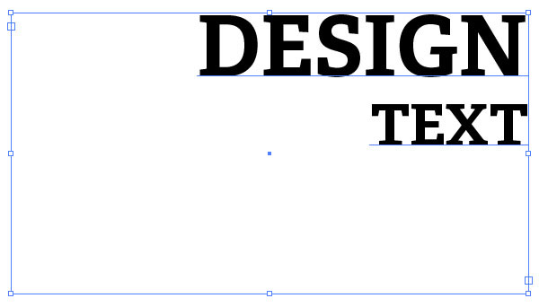
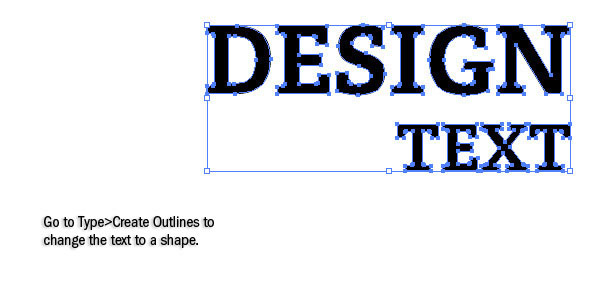
Step 2: Convert Text to Paths
Now we are going to covert the text to shapes so it will be easier to work with. Using your Selection Tool (V), click on the text and then go to Type > Create Outlines (Shift + Ctrl/Cmd + O).
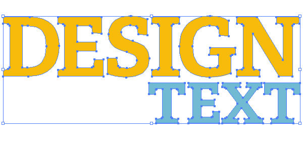
Step 3: Adjusting the Kerning and Leading
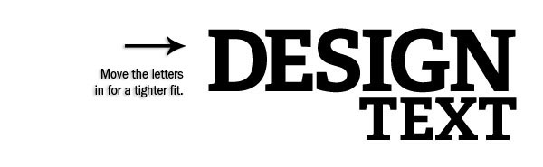
The kerning (space in between the letters) and leading (space in between the top word and bottom word) of the text should be adjusted to make everything fit tighter. First, we need to ungroup the text, so go to Object > Ungroup (Shift + Ctrl/Cmd + G). This will make it so we can click on each letter on its own.
Click and drag a box around “TEXT” with the Selection Tool (V) to select just that word, and then move it up closer to “DESIGN”. 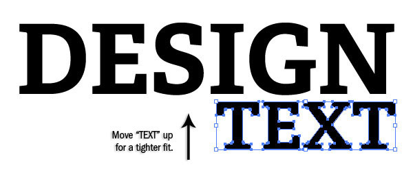 To fix the kerning of “DESIGN”, we want to drag a box around “DESIG” — excluding “N”, the last letter — with the Selection Tool (V). Since we want the “N” of “DESIGN” and the “T” of “TEXT” to stay lined up, move the slected letters in towards the right by a space or two. Repeat this with “DESI”, “DES” and so on until the text is tightened up evenly.
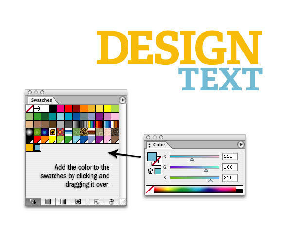
Step 4: Adding Color
Since it will be easier to see the sides of the 3D text, we are going to add color to the letters. First select all the letters of “DESIGN” and fill it with a yellow. Note: If you don’t see the Color Panel open, you can go to Window > Color (F6).
And if you don’t have RGB set up as your color mode, you can click on the arrow at the top right of the Panel, then click on RGB in the options. 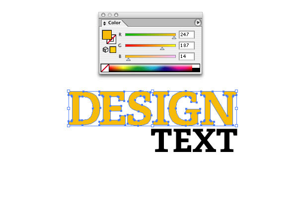 We are going to do the same with the “TEXT”, but it will be a light blue.
 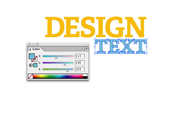 You can put the colors in your Swatches Panel (Window > Swatches if you don’t see it) by simply clicking and dragging your color into it from the Color Panel.
Step 5: Adjusting Size
We can start working on the 3D text now. First, though, we should make the text fill up the artboard a little bit more. Select both words, hold down Shift (to keep the text from distorting), and then drag a corner anchor out to make it larger.
Step 6: Getting into the 3D Text
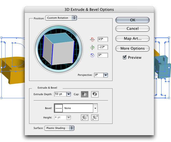
Let’s start working on the 3D text. First, group the letters by choosing Object > Group (Ctrl/Cmd + G) so that when we make our text three-dimensional, the letters stay as one shape instead of becoming individual 3D shapes. 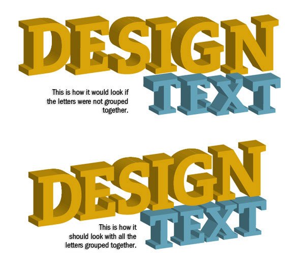 Next, choose Effect > 3D > Extrude & Bevel, which will open an Options dialog window.
In the 3D Extrude & Bevel Options dialog window, click on the Preview option check box to see how the text is going to look. These are your default settings whenever you open up these options. 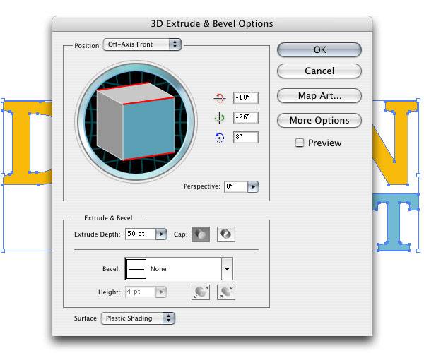
Step 7: Adjusting the 3D Text
Let’s start playing around with the 3D Extrude & Bevel options.
The blue square on the 3D box in the options dialog window is the face of the text. You can click and drag each edge of the cube and see how they change your 3D text. For our text, we want to make the words look like they are lying down on the ground, so tweak the Position options in such a way that your text looks like it’s flat on its back.
Step 8: Adjusting Perspective
The top right corner of “DESIGN” looks out of place and not really within the perspective. To fix this, we can adjust the Perspective to about 50o for our text. 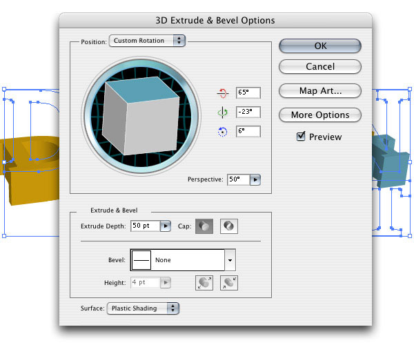

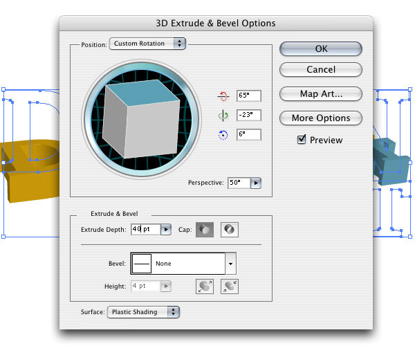
Step 9: Adjusting Height
Finally, we are going to adjust the height of the sides of the text with Extrude Depth to make them slightly shorter (to 40pt).
 For our purposes, those are the only options that we need to change on the text, so push OK to commit the settings.
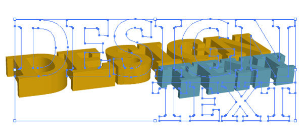
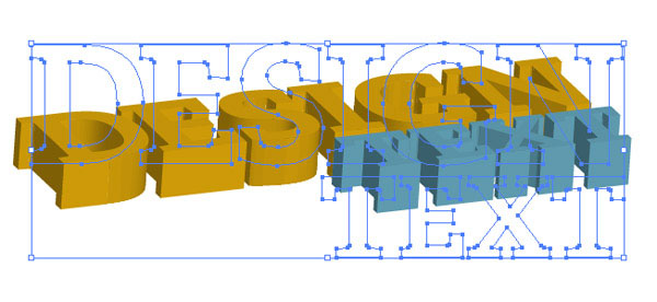
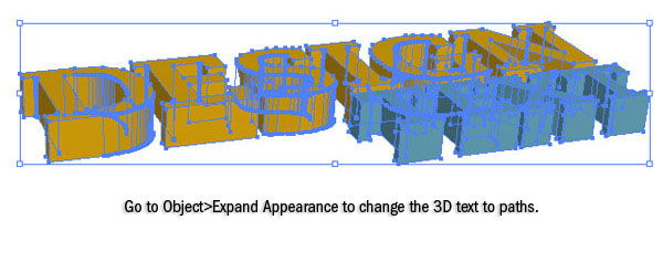
Step 10: Converting the 3D Text to Paths
The text looks OK: it has some basic shading, but overall, it’s pretty dark and pretty bland. Besides, we want to add some stylized shading onto it to make it more interesting.
To start editing the text, go to Object > Expand Appearance. This will take the 2D text and make paths for the 3D text. We need to ungroup the text so we can start working on different parts of it.
Tip: Grouping and ungrouping objects are two common Illustrator commands. I suggest getting used to the keyboard shortcuts for them — Ctrl/Cmd + G (Group) and Ctrl/Cmd + Shift + G (Ungroup). In this instance, the keyboard shortcut will be easier because we are going to have to ungroup quite a few times to make sure everything is ungrouped.
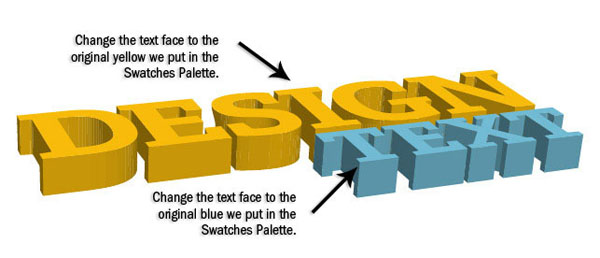
Step 11: Adjusting the Text Face Color
Select the face of the “DESIGN” letters by clicking on one face, holding down Shift, and clicking on the others to select them all at once. To apply the color, click on the yellow swatch that we put into the Swatches Panel. Do the same with the “TEXT” and the blue color we chose.
Step 12: Creating the Shadow Colors
To shade the sides of the text, we need to create more colors. We want to have two more yellows: a dark one and a darker one. To make the other two yellows, click on the original yellow color that we used for the “DESIGN” face in the Swatches Panel and subtract 40 from R and G (e.g.
247, 187, 14 becomes 207, 147, 14). Click and drag this yellow into the Swatches Panel and create another yellow by subtracting another 40 from R and G so it becomes 167, 107, 14. These will be our 3 yellows. Repeat this for the blues as well, subtracting 40 from G and B so it becomes 113, 146, 170 and 113, 106, 130. 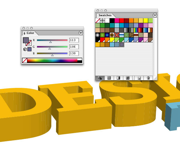
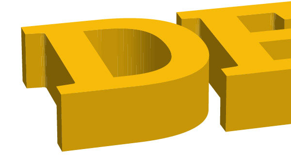
Step 13: Simplifying the Curves
You’ll notice that when you click on some of the curved shapes, they are split into two pieces. We want to make these two pieces into one, so open up the Pathfinder Panel if you don’t have it open (Shift + Ctrl/Cmd + F9). Click on one part of the side, and then holding down Shift, click on the other one.
Click the Unite command in the Pathfider Panel, then click Expand. 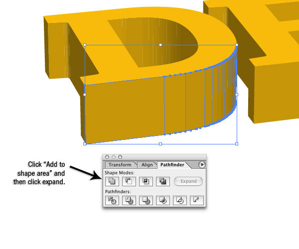 This will combine the two shapes into one. Do this with all of the curved shapes that are separated.
Step 14: Adding Dark Shadows
Now we need to decide which sides are going to get our light source and which sides aren’t. Since the light source is already set up on the right, we’ll use that. Therefore, the bottom parts of the text and the left sides of the text are going to be the dark yellow, with the left sides the darkest.
So let’s use our darkest yellow and blue on the left edges of the text. 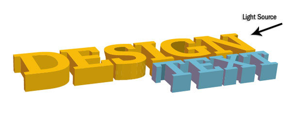
Step 15: Adding Lighter Shadows
Use the middle blue and yellow shades on the rest of the sides of the text. Now, we can stop here and stay with this block shading, or we can go a step further and add some color gradients to make the shading richer.
For this tutorial’s sake, let’s go ahead and add in some gradients. 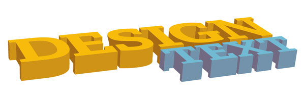
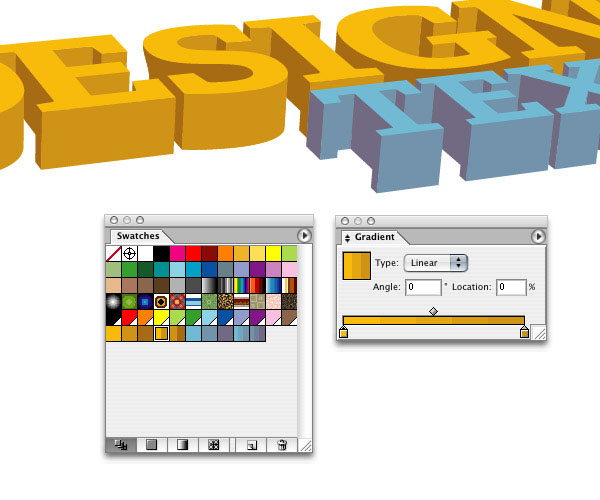
Step 16: Creating Shadow Gradients
Let’s create some gradients now. Open up the Gradient Panel (Ctrl/Cmd + F9) if you haven’t already.
Click and drag the brightest yellow color swatch to the left side of the gradient, and the second yellow to the right side of the gradient. Now click and drag the gradient into the Swatches Panel. Create a gradient the same way as the first one using the middle yellow and the dark yellows.
You should now have two yellow gradients. To apply the gradients to particular pieces, you just select that piece and click on the gradient color swatch. Repeat this with the blue gradients.
Step 17: Adding Gradients to the Lighter Shadows
Now, remember our light source is coming from the right, so the shapes are going to cast a shadow from right to left. With that in mind, click on the lighter text sides and then click on the lighter gradient. To adjust the gradient, click on the Gradient Tool (G) from the Tools Panel.
You can click and drag across the shape to adjust the gradient. 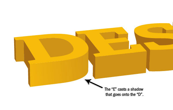
Step 18: Finishing Up the Lighter Shadow Gradient
Continue adding a gradient to the lighter areas of both the words. There is no exact science to the way we’re adding in the color gradients, it’s just a matter of getting a difference in color between the different pieces, making things stand out more, and giving them subtle variations in lighting.

Step 19: Adding the Darker Shadow Gradients
Repeat what we did with the lighter areas and add dark gradients to the darker areas. The darker areas are going to be lightest at the top and darkest at the bottom (where there is the least amount of light). 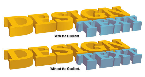
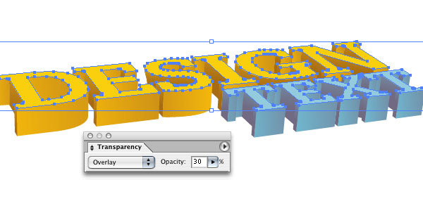
Step 20: Lightening the Text Faces
We can call it good as-is, but if we want to make the text faces a little more visible, we can click on each letter face (holding down Shift to select the invidual pieces together), then Ctrl/Cmd + C (Copy), and then Ctrl/Cmd + F (Paste in Front).
Fill these copied letters with white. Open up the Transparency Panel (Shift + Ctrl/Cmd + F10). Change the Blend Mode to Overlay and the Opacity to 30%.
Tutorial Summary
That’s it folks. This tutorial went over some techniques for making great 3D text with accurate shadings. We didn’t use 3D-rendering software — just Illustrator.
The great thing about constructing 3D objects in Adobe Illustrator is that you can adjust the size of the lettering so that it can be as big or as small as you want (because it is, after all, a vector object) and import them easily into other Adobe Creative or Production Suite software as well as third-party products.
Download Source Files
- 3d_text_illustrator (ZIP, 0.69 MB)
-
 Trevin serves as the VP of Marketing at WebFX. He has worked on over 450 marketing campaigns and has been building websites for over 25 years. His work has been featured by Search Engine Land, USA Today, Fast Company and Inc.
 -

WebFX is a full-service marketing agency with 1,100+ client reviews and a 4.9-star rating on Clutch! Find out how our expert team and revenue-accelerating tech can drive results for you! Learn more
Make estimating web design costs easy
Website design costs can be tricky to nail down. Get an instant estimate for a custom web design with our free website design cost calculator!
Try Our Free Web Design Cost Calculator
Table of Contents
- Preview
- Step 1: Adding the Text
- Step 2: Convert Text to Paths
- Step 3: Adjusting the Kerning and Leading
- Step 4: Adding Color
- Step 5: Adjusting Size
- Step 6: Getting into the 3D Text
- Step 7: Adjusting the 3D Text
- Step 8: Adjusting Perspective
- Step 9: Adjusting Height
- Step 10: Converting the 3D Text to Paths
- Step 11: Adjusting the Text Face Color
- Step 12: Creating the Shadow Colors
- Step 13: Simplifying the Curves
- Step 14: Adding Dark Shadows
- Step 15: Adding Lighter Shadows
- Step 16: Creating Shadow Gradients
- Step 17: Adding Gradients to the Lighter Shadows
- Step 18: Finishing Up the Lighter Shadow Gradient
- Step 19: Adding the Darker Shadow Gradients
- Step 20: Lightening the Text Faces
- Tutorial Summary
- Download Source Files
Share this article


Web Design Calculator
Use our free tool to get a free, instant quote in under 60 seconds.
View Web Design CalculatorMake estimating web design costs easy
Website design costs can be tricky to nail down. Get an instant estimate for a custom web design with our free website design cost calculator!
Try Our Free Web Design Cost Calculator


