
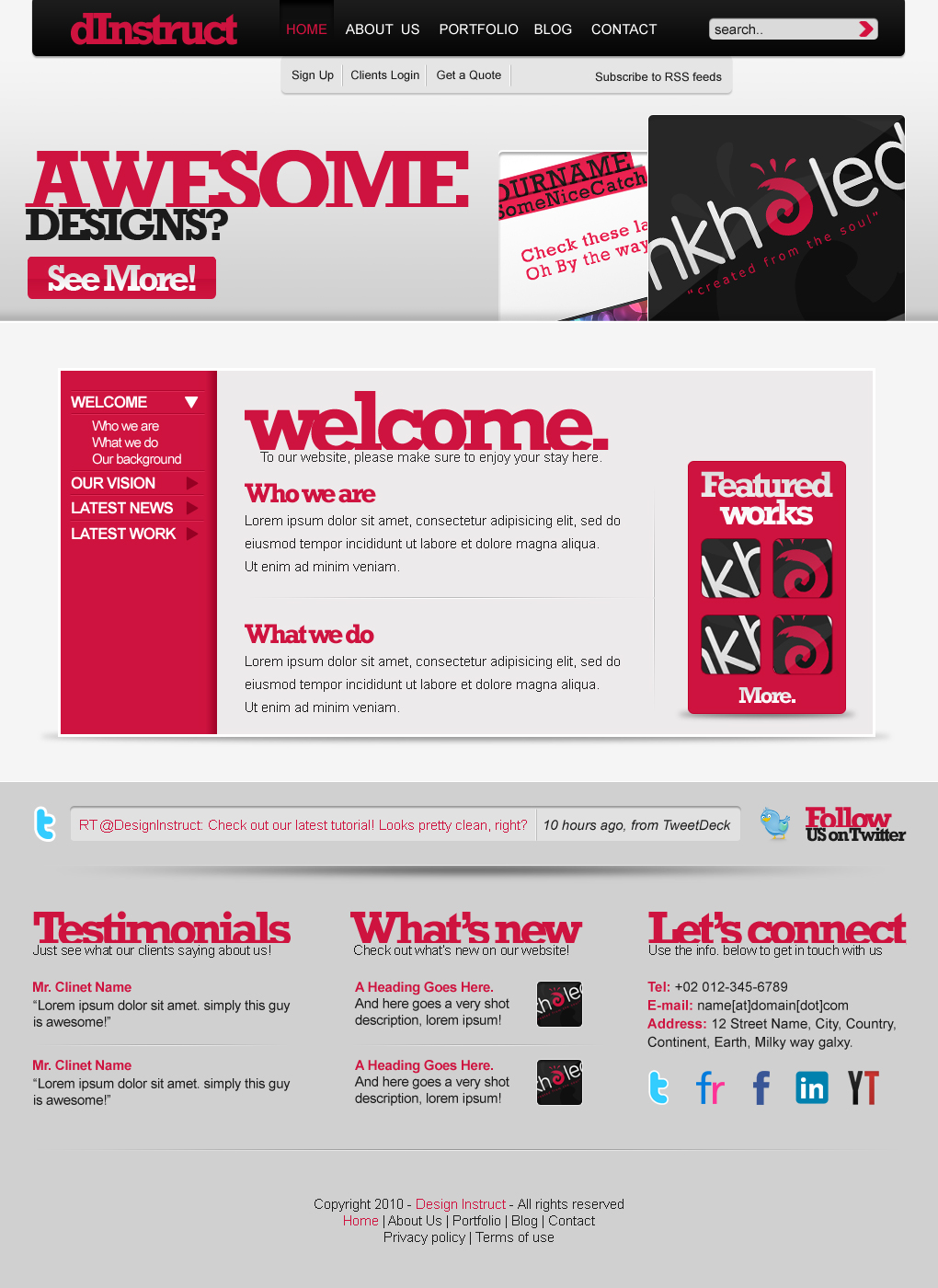
Preview
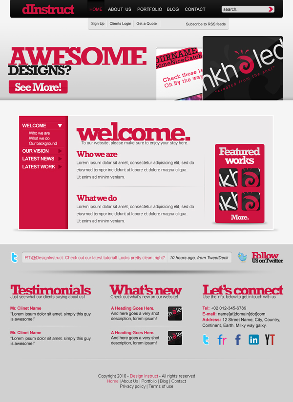
First, take a peek at what we’ll be creating together by clicking the preview image below to enlarge.
Resources
- Function Free Icon Set by WeFunction
Step 1: Setting up a new document
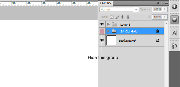
In order to keep everything aligned and well-organized, we’ll be using the 960 Grid System: Download it here.
Once downloaded, open the Photoshop document called “960_grid_24_col”. That document is the 24-column grid layout template of the 960 GS.
Hide the layer group called “24 Col Grid”.
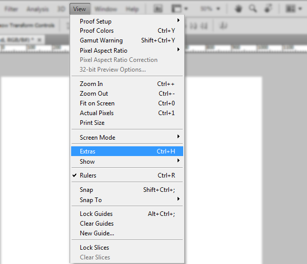
Since we’ll be using guides a lot in this tutorial, our Rulers have to be turned on. Go to View > Rulers or press Ctrl/Cmd + R if your rulers are turned off.
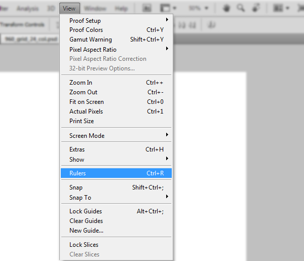
We also need to make sure that guides are turned on. So go to View > Extras.
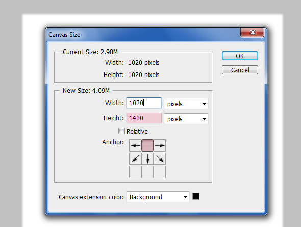
Let’s make our canvas a bit taller.
Go to Image > Canvas Size and enter 1400 for the Height option. Press OK when you’re done.
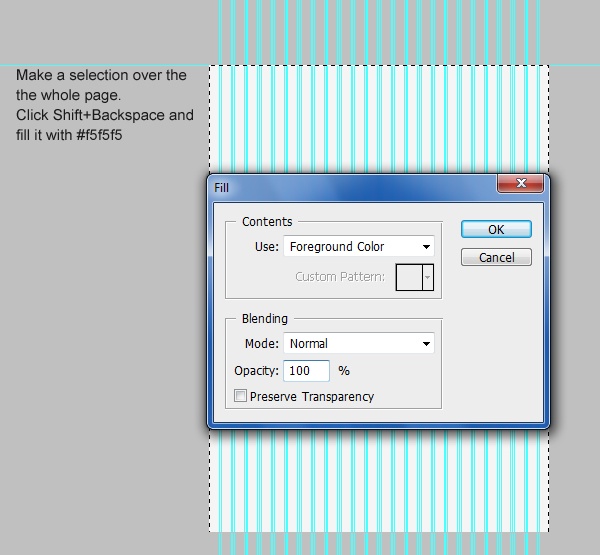
Using the Rectangular Marquee Tool (M), create a selection over the whole canvas (or press Ctrl/Cmd + A to create the selection around the canvas automatically).
Create a new layer, set your Foreground and Background color to #f5f5f5 and press Shift + Backspace to open up the Fill dialog box. Fill the selected area (the entire canvas) with the chosen color.
Step 2: Creating the navigation bar background
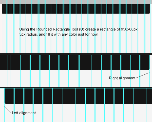
With the Rounded Rectangle Tool (U), create a rectangle of 950x60px with Radius set at 5px.
Align the rounded rectangle shape using the 960 GS guides.
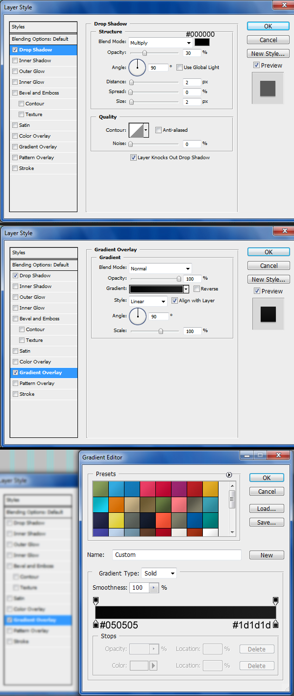
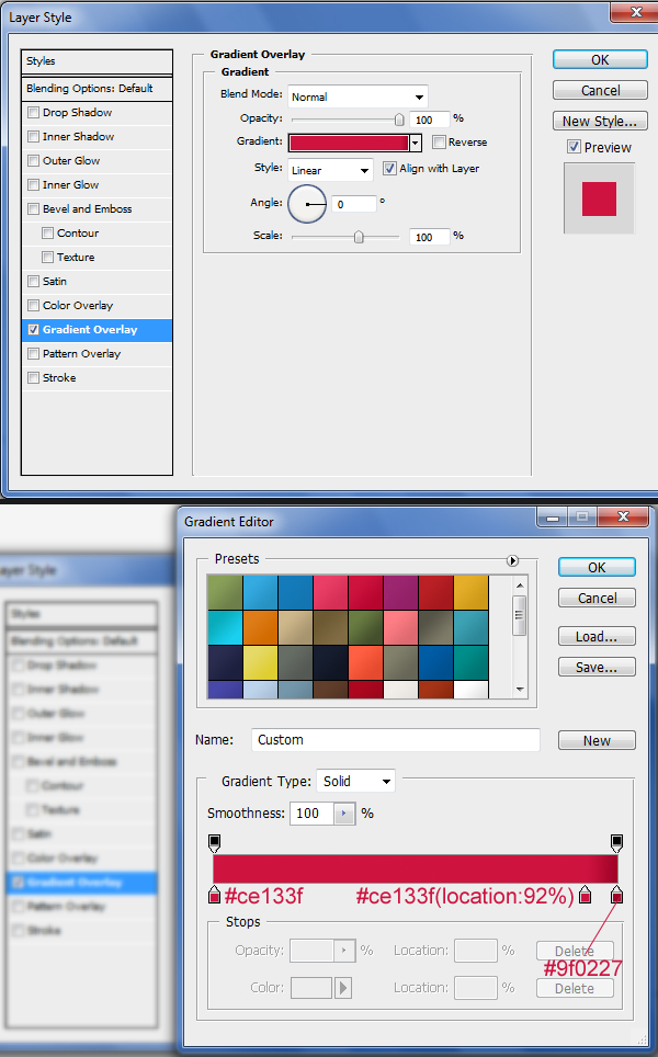
Give the shape a Drop Shadow and Gradient Overlay layer style.
Step 3: Adding website name and navigation text
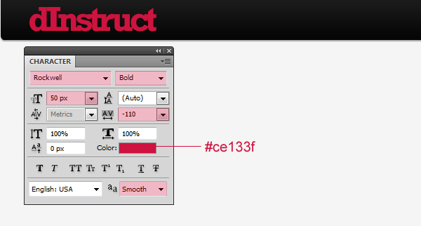
Using the Horizontal Type Tool (T), write your website’s name on the left side of navigation bar.
I used the following settings:
- Font Family: Rockwell
- Font size: 50px
- Font weight: Bold
- Anti-aliasing setting: Smooth
- Color: #ce133f
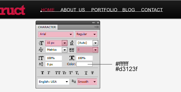
Write the text for your menu links.
I used the following settings:
- Font Family: Arial
- Font size: 15px
- Font weight: Regular
- Anti-aliasing setting: Smooth
- Color: White (#ffffff) and pink (#d3123f)
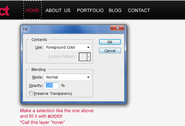
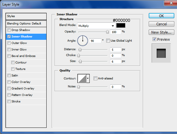
Let’s make the active menu item. Using the Rectangular Marquee Tool (M), create a selection of about 60x60px around the first link item (“Home”) and fill it with a very dark (almost black) gray color (#0f0f0f).
Name this layer “hover” to keep our work tidy.
Add an Inner Shadow the “hover” layer.
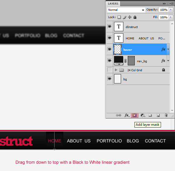
Select the “hover” layer and click on the Add layer mask button (it’s at the bottom of the Layers Panel).
Using the Gradient Tool (G), drag from the bottom to the top of the active menu link with the Black, White linear gradient preset.
Step 4: Creating search bar
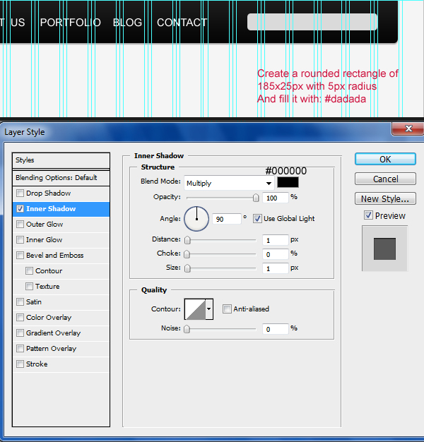
Set your Foreground color to a gray color (#dadada).
Using the Rounded Rectangle Tool (U), create a rectangle with dimensions of 185x25px and Radius set at 5px.
Give the new rounded rectangle shape an Inner Shadow.
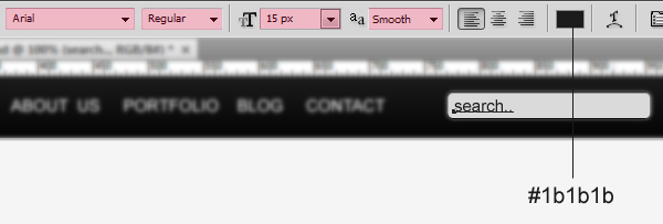
Write the word “search…” inside the search bar with the Horizontal Type Tool (T).
Here are the settings I used:
- Font Family: Arial
- Font size: 15px
- Font weight: Regular
- Anti-aliasing setting: Smooth
- Color: #1b1b1b
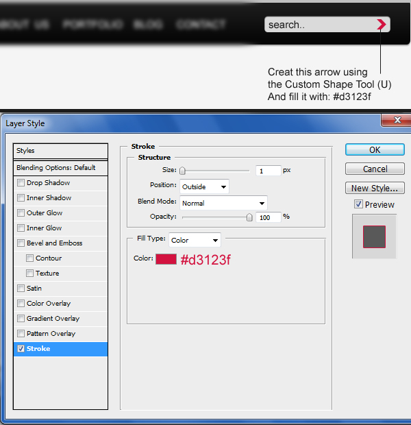
Use the Custom Shape Tool (U) to create an arrow. Under the Shape options in the Options Bar of the Custom Shape Tool, look for the shape called “Arrow 2” or use a shape that you prefer. Set your Foreground color to our pink color (#d3123f) before drawing the shape.
Create the arrow shape on the right side of the search bar.
Give the arrow a Stroke layer style.
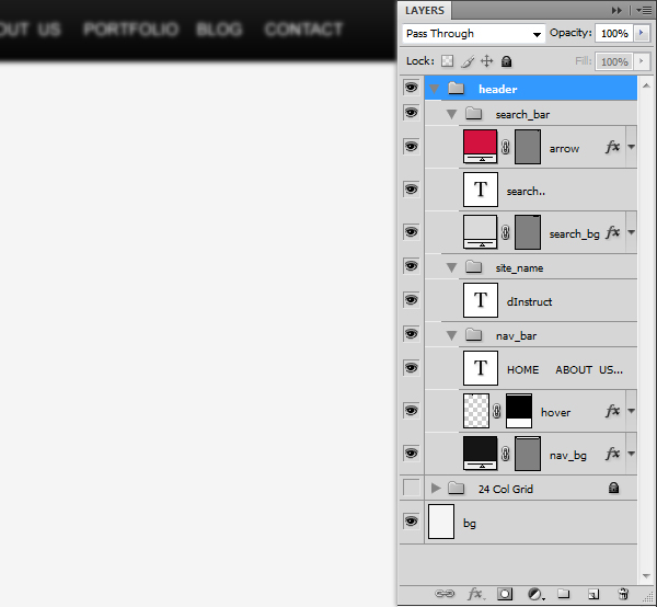
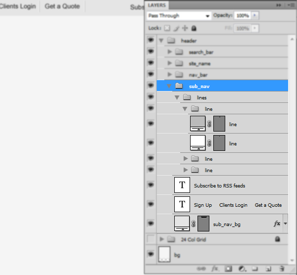
Always make sure to keep your document tidy by organizing your layers and giving them meaningful names.
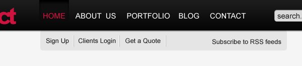
Step 5: Creating the sub-navigation bar
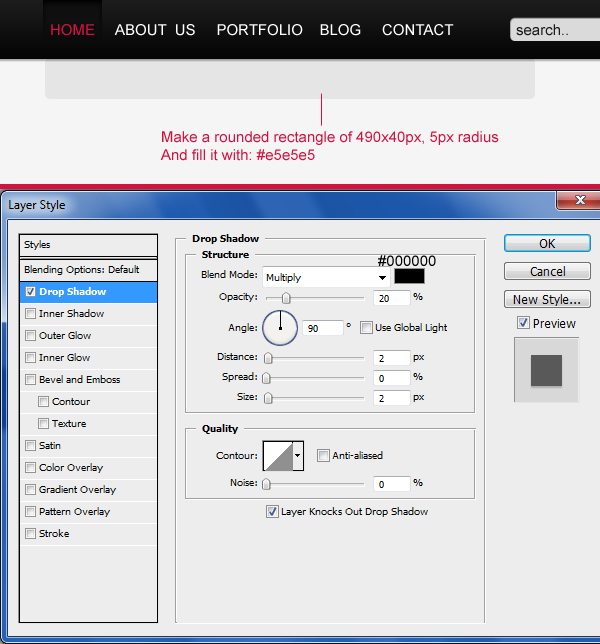
Set your Foreground color to a light gray color (#e5e5e5). With the Rounded Rectangle Tool (U), go ahead and create a rectangle below our main navigation/header sized at 490x40px with Radius at 5px.
Add a Drop Shadow layer style to the sub-navigation bar.
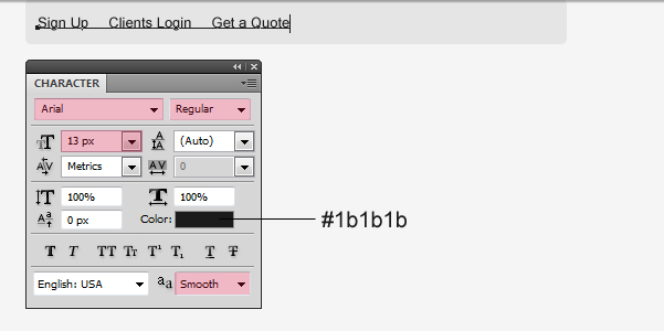
Write some text in your sub-navigation bar using the Horizontal Type Tool (T) that will serve as your sub-navigation links.
I used the following font options:
- Font Family: Arial
- Font size: 13px
- Font weight: Regular
- Anti-aliasing setting: Smooth
- Color: #1b1b1b
We will now create vertical dividers to separate our sub-navigation text. Use the Rectangular Marquee Tool (M) to create two vertical lines 1px apart from each other.
Fill (Shift + F5 or Edit > Fill) the 1px marquee selection. Use white (#ffffff) for the left selection, and then a gray color (#bbbbbb) for the right one.
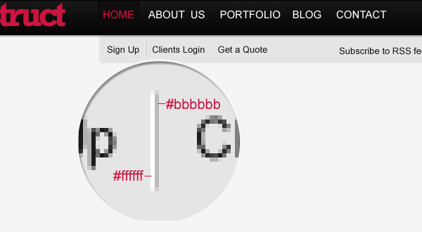
Duplicate this separator twice by selecting its layer in the Layers Panel and pressing Ctrl/Cmd + J twice.
Use the Move Tool (V) to move the duplicated layers to the right side of the other sub-navigation links.
Check back to your Layers Panel and make sure that you have your layers organized.
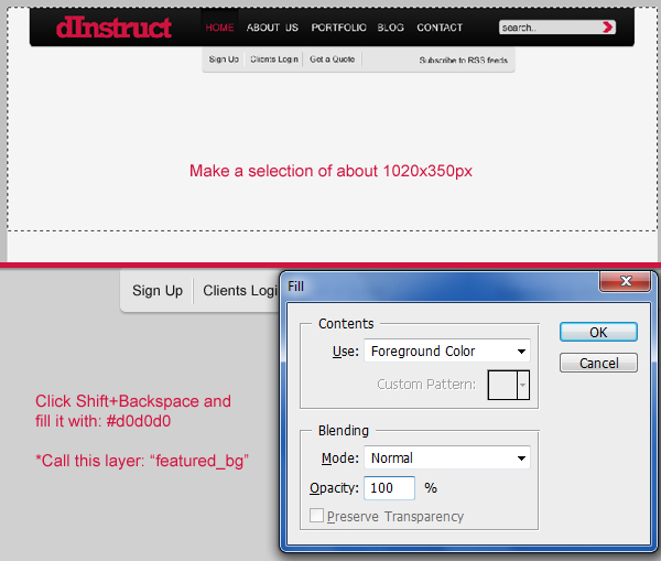
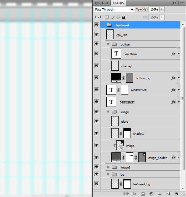
Step 6: Creating the featured area background
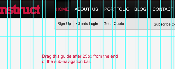
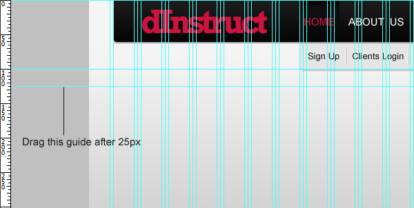
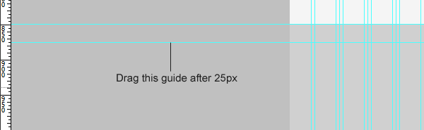
We’ll start by dragging a new horizontal guide from the top ruler to about 25px below the sub-navigation.
Create a new layer.
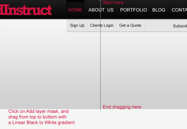
Create a selection of 1020x350px and fill the selection with a gray color (#d0d0d0). Call this layer “featured_bg”.
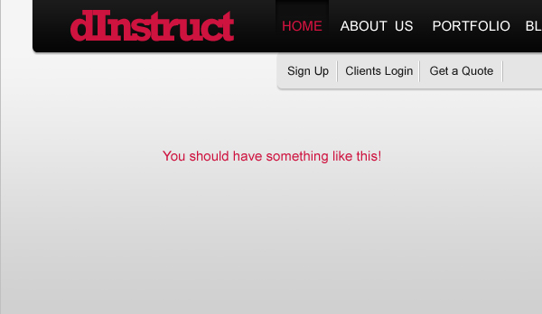
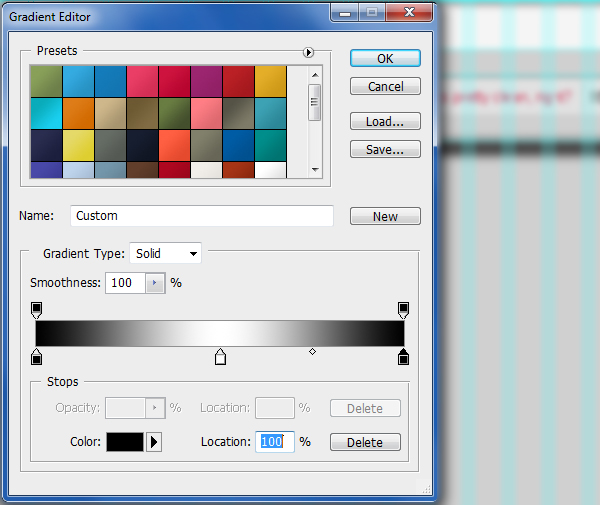
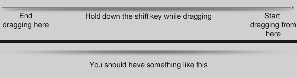
Add a layer mask to the “featured_bg” layer, set your gradient to the Black, White linear gradient preset, and start dragging from the bottom to the top of your document.
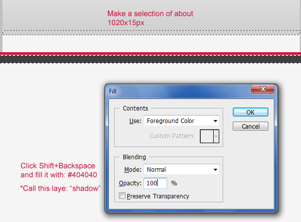
Step 7: Creating the featured area shadow
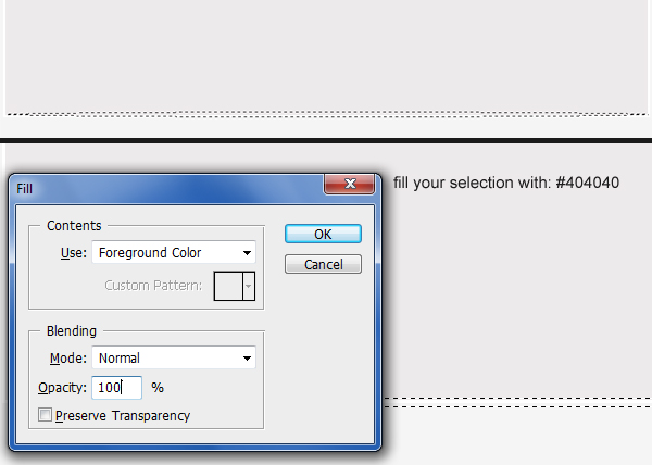
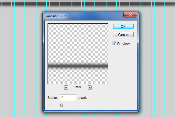
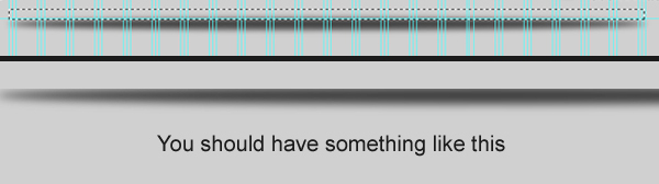
Using the Rectangular Marquee Tool (M), put a selection sized at 1020x15px below the sub-navigation. Fill the selection with a dark gray color (#404040).
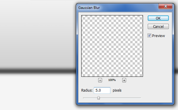
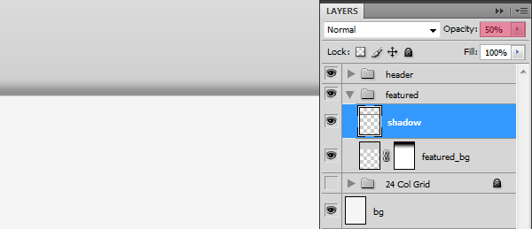
Name this new layer as “shadow”.
Let’s make it a bit blurry! Go to Filter > Blur > Gaussian Blur, set the Radius to 5px and then press OK to apply the filter.
With the “shadow” layer as the active layer in the Layers Panel, use the Rectangular Marquee Tool (M) to create a selection over the lower part of our blurry shadow. Then hit Delete to remove the unwanted area.
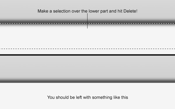
Set the Opacity of the “shadow” layer to 50% to make it blend into the background better.
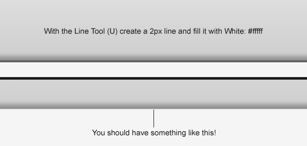
Use the Line Tool (U) to create a white (#ffffff), 2px line.
Note: The layer of this line has to be on top of the rest of the featured area layers.
Step 8: Adding an image of a featured design
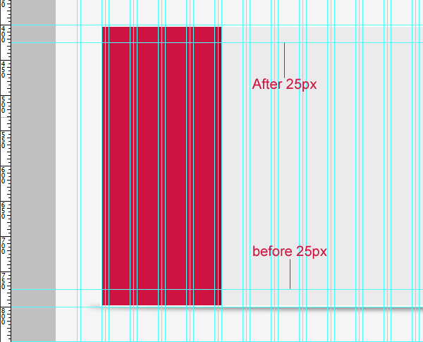
We’ll start this step by dragging a new horizontal guide 25px below our first horizontal guide.
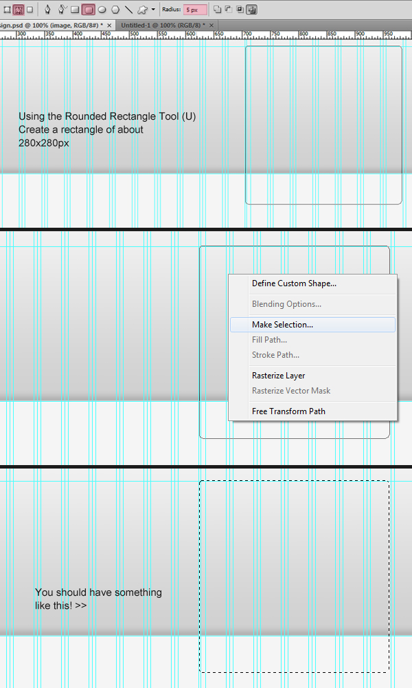
Pick up your Rounded Rectangle Tool (U), set its Radius to 5px and choose Paths as the drawing option.
Create a square rounded rectangle shape sized at 280x280px and place it on the right edge of our layout.
Right-click on the path and choose Make Selection from the contextual menu that appears.
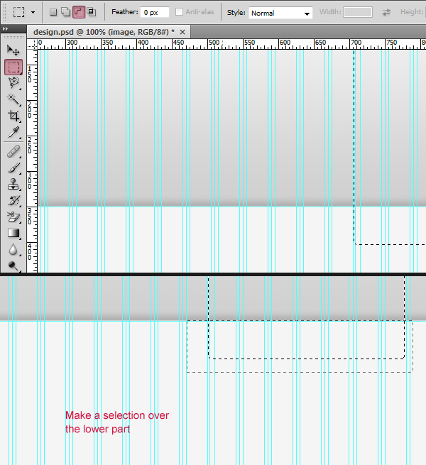
Choose the Rectangular Marquee Tool (M) with its selection type set to Subtract from selection to put a selection over the lower part of our previous selection.
This removes that portion of the selection, giving the bottom of our selection non-rounded corners.
Fill (Shift + F5) your selection with any color.
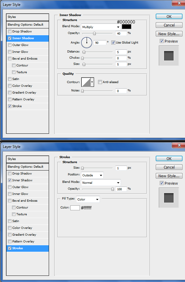
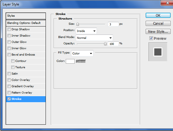
Next, add an Inner Shadow and Stroke layer style. Namel this layer “image_holder”.
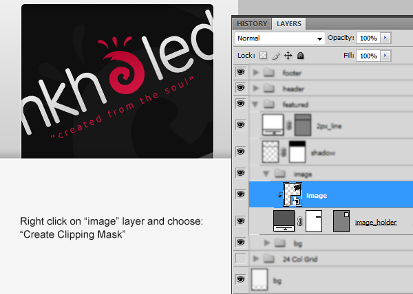
Place any image of your choosing (preferably an image that you’re proud of featuring) in this area. Put the image’s layer right above the “image_holder” layer.
Right-click on the image layer and choose Create Clipping Mask; this will remove excess parts of the image you chose so that it doesn’t spill outside the “image_holder” layer.
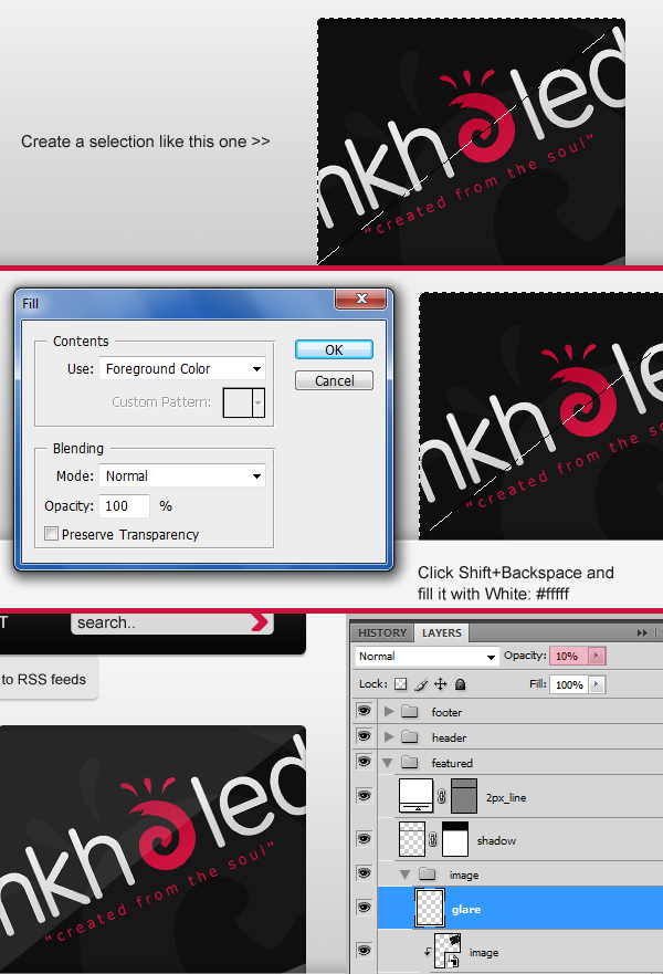
Ctrl/Cmd + click on the “image_holder” layer to make a selection around it.
Use the Polygonal Lasso Tool (L) while holding down Alt/Option to subtract a diagonal triangle from the bottom right of the original selection.
Fill the triangular selection with white (#ffffff) on a new layer and also reduce the layer’s Opacity to 10%.
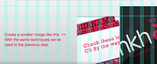
Step 8: Adding a smaller featured design’s image
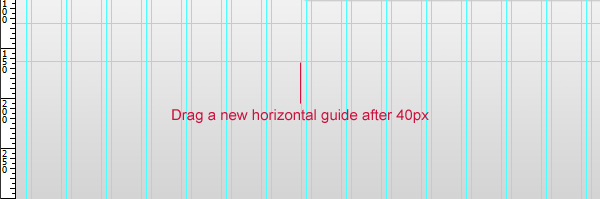
Drag a new horizontal guide 40px below the last one we made.
Add a smaller image of another featured design using the same techniques explained in the previous step.
Step 9: Adding a tagline
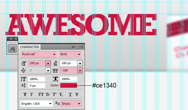
Write your site’s tagline using the Horizontal Type Tool (T). For the purpose of this tutorial, this tagline is just the word “Awesome” in all-caps.
You can use the following font settings:
- Font Family: Rockwell
- Font size: 100px
- Font weight: Bold
- Anti-aliasing setting: Sharp
- Color: #ce1340
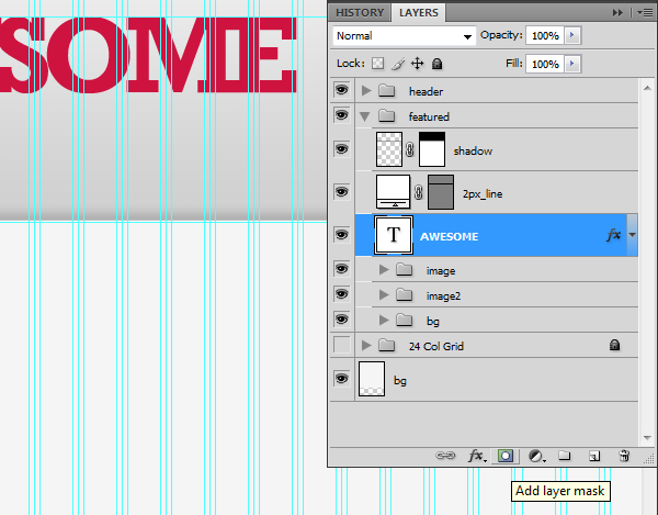
With the tagline’s text layer selected in the Layers Panel, click on the Add a layer mask icon to make a layer mask.
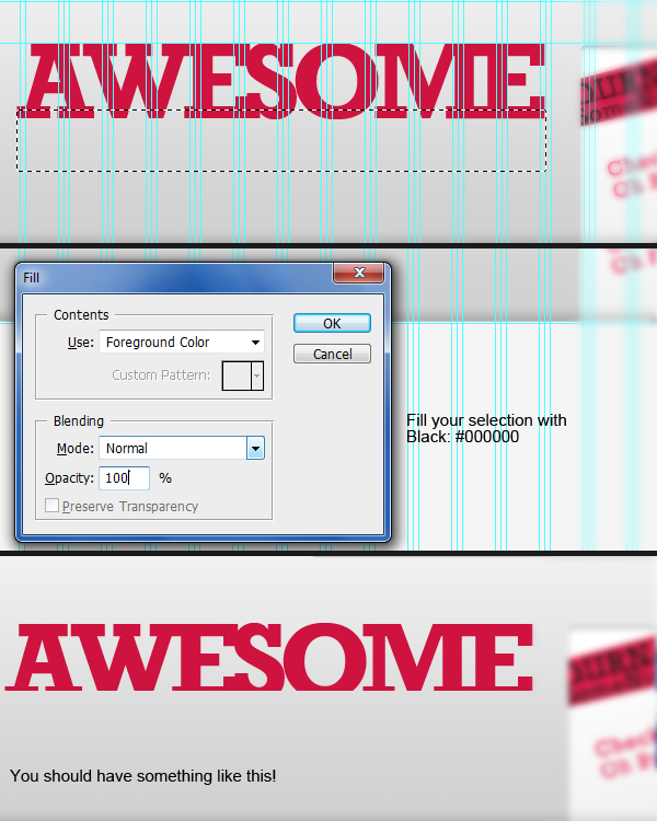
Create a selection over the lower part of your text using the Rectangular Marquee Tool (M) and then press Shift + Backspace to open the Fill dialog window. Fill the layer’s mask with black (#000000). This will result in the lower portion of our tagline being hidden.
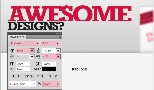
Write another word below the “Awesome” text.
The settings used for this new text is:
- Font Family: Rockwell
- Font size: 50px
- Font weight: Bold
- Anti-aliasing setting: Sharp
- Color: #1b1b1b
Step 11: Creating the “See More!” button
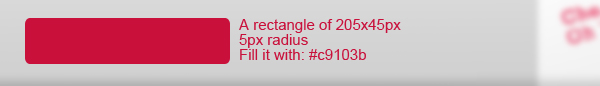
Select the Rounded Rectangle Tool (U) and create a 205x45px rounded rectangle with 5px Radius.
The color of the shape should be pink ( #c9103b).
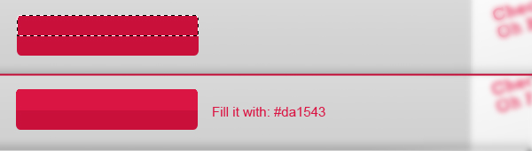
Create a selection on the top part of the button using similar techniques we’ve done. Fill the selection with a lighter shade of pink (#da1543).
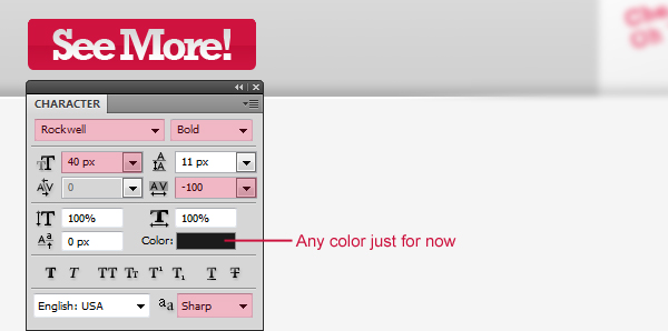
Write the words “See More!” with the Horizontal Type Tool (T) on top of the rounded rectangle shape we just created.
Here are the settings for the “See More!” text:
- Font Family: Rockwell
- Font size: 40px
- Font weight: Bold
- Anti-aliasing setting: Sharp
- Color: Won’t matter since we’ll add a Gradient Overlay
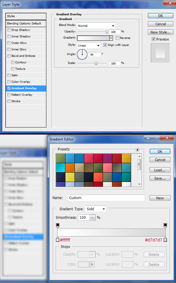
Give your “See More!” text a Gradient Overlay.
This is a good point to check and make sure you’re keeping your layers organized.
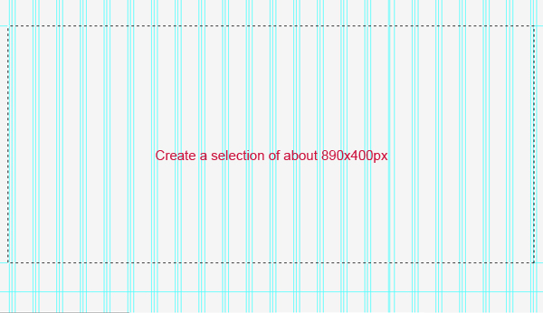
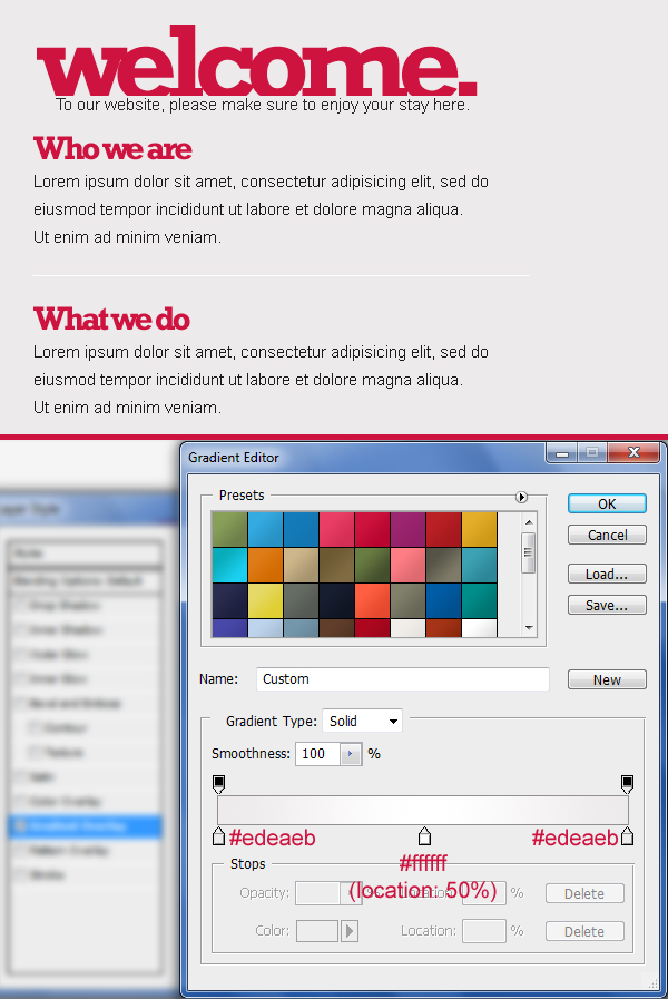
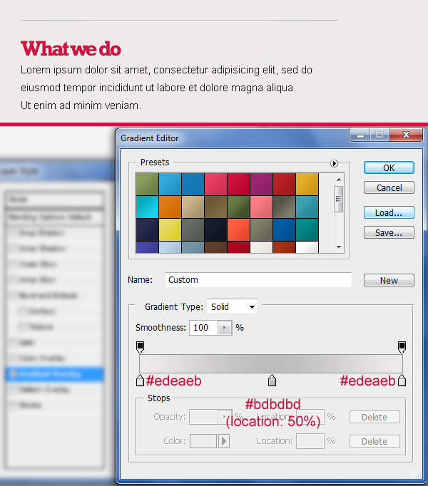
Step 12: Creating the content area background
We’ll start by dragging a couple of horizontal guides to keep everything well-aligned.
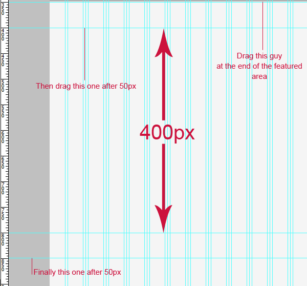
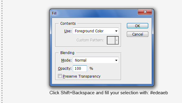
Create a selection of about 890x400px with the Rectangular Marquee Tool (M).
Press Shift + Backspace to open the Fill dialog window; fill your selection with a very light gray color (#edeaeb).
Give the very light gray content area a Stroke layer style.
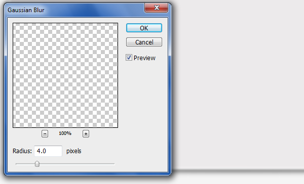
Using the Elliptical Marquee Tool (M), place a very thin elliptical selection at the bottom of the content area. Fill this area with a dark gray color (#404040).
We will make the elliptical shape we just made into a shadow. Go to Filter > Blur > Gaussian Blur, set Radius to 4px, and press OK to apply the filter.
Step 13: Creating the sidebar
Create a selection of 170x395px on the left side of our content area.
This area will contain a navigation menu.
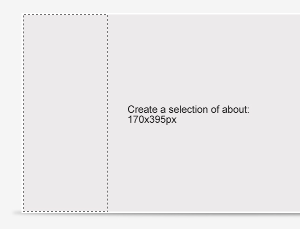
Fill (Edit > Fill) your selection with any color in a new layer.
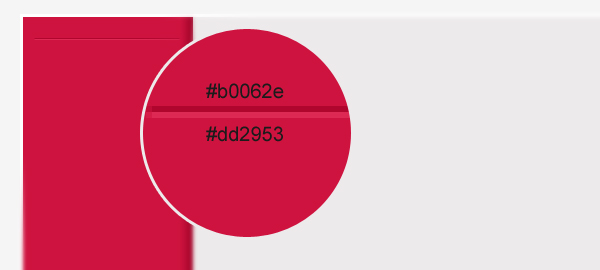
Apply a pink horizontal Gradient Overlay to the sidebar layer.
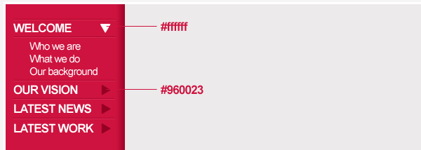
Step 14: Adding content to the sidebar
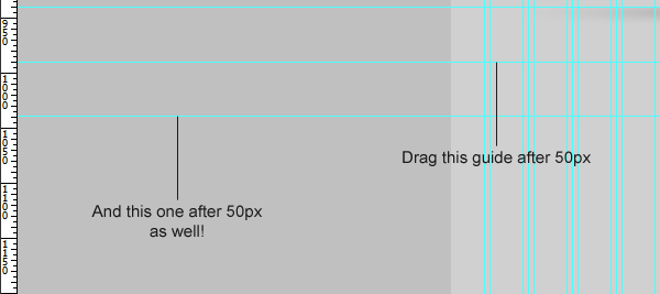
Drag two new horizontal guides to help us keep our content in the sidebar aligned, one near the top, and the other, near the bottom.
Using the Line Tool (U), create two horizontal lines on top of each other. The top line should be a dark pink color, and the bottom, a light pink color. This will serve as horizontal dividers in a consistent style as the vertical dividers we created earlier for the sub-navigation bar.
Write a word such as “Category” using the Horizontal Type Tool (T) towards the top of our sidebar.
These are the font settings for “Category”.
- Font Family: Arial
- Font size: 17px
- Font weight: Bold
- Anti-aliasing setting: Smooth
- Color: #ffffff
Keep adding more categories, horizontal lines and text.
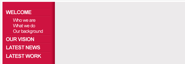
Using the Custom Shape Tool (U), add some arrows on the right side of the menu text. Fill the downward-pointing arrow — which indicates which category you’re on — with white (#ffffff) and the rightward-pointing arrows (inactive categories) with a dark pink/red color (#960023).
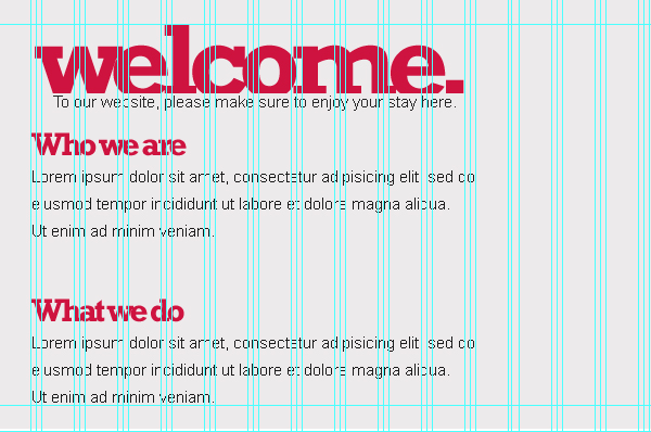
Step 15: Write a heading for the main content area
Let’s move to the main content area again. Type a word such as “welcome.” that will serve as a heading.
Here are the font settings for the word, “welcome.”:
- Font Family: Rockwell
- Font size: 100px
- Font weight: Bold
- Anti-aliasing setting: Smooth
- Color: #ce133f
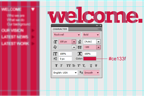
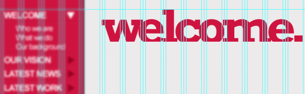
Again, cut the lower part the text using the Add a layer mask technique we covered earlier in the tutorial.
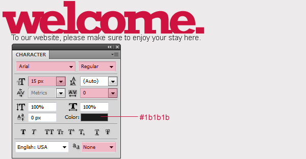
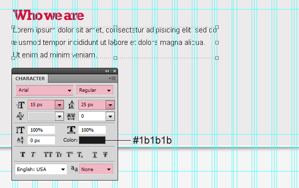
Write some content below the “welcome.” text using the Horizontal Type Tool (T).
The settings used for this text:
- Font Family: Arial
- Font size: 15px
- Font weight: Regular
- Anti-aliasing setting: None
- Color: #1b1b1b
Note: We used an Anti-aliasing value of None to mimic how this text would look like in a web browser that doesn’t support technologies like ClearType that smoothens HTML text.
Step 16: Add the main content
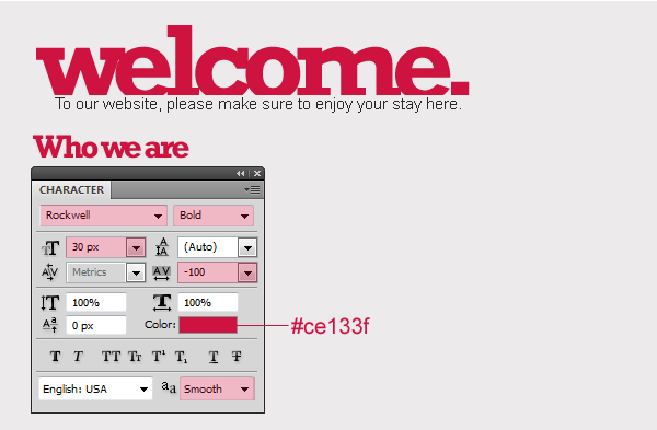
Let us add a smaller heading (the text used was “Who we are”) with the following font settings:
- Font Family: Rockwell
- Font size: 30px
- Font weight: Bold
- Anti-aliasing setting: Smooth
- Color: #ce133f
Add some lorem ipsum text samples (using a nifty tool like this one to generate the text).
The settings used for lorem ipsum text is:
- Font Family: Arial
- Font size: 15px
- Font weight: Regular
- Anti-aliasing setting: None
- Color: #1b1b1b
Duplicate your heading and text layers by selecting them in the Layers Panel and then pressing Ctrl/Cmd + J or right-clicking on them and choosing Duplicate Layers from the contextual menu.
Using the Line Tool (U), create a 1px-thick line (the color of the line doesn’t matter for now). Place the line in between the two content sections.
Apply a Gradient Overlay to the line to give it some color.
Create another copy of this 1px line by duplicating its layer. Change the Gradient Overlay settings of this duplicated line.
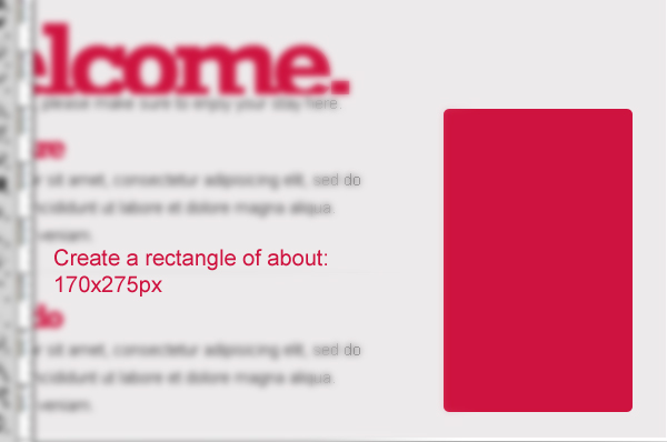
Step 17: Creating the featured work box
Select the Rounded Rectangle Tool (U) and create a rectangle of 170x275px and Radius of 5px on the right side of our content.
The color of this rounded rectangle should be pink (#ce1340).
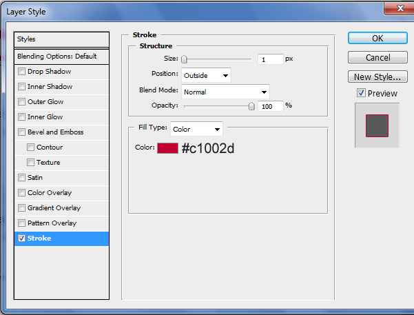
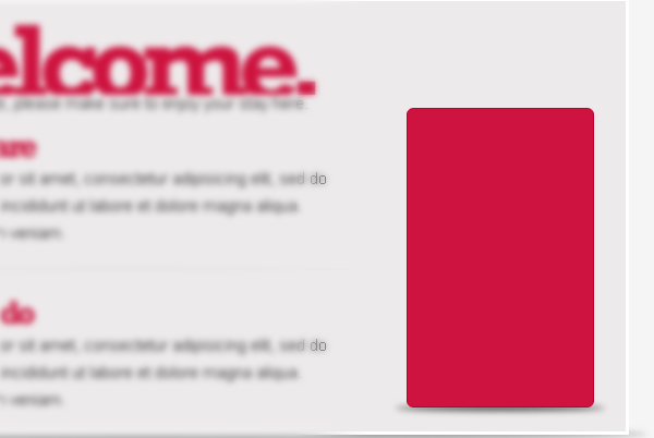
Apply a Stroke layer style to the rounded rectangle.
Use the same techniques I’ve explained in previous steps to create a shadow at the bottom of the rounded rectangle.
Step 18: Adding content to the featured work box
Add some text with the Horizontal Type Tool (T) within the featured work box.
The font settings for the content is as follows:
- Font Family: Rockwell
- Font size: 40px
- Font weight: Bold
- Anti-aliasing setting: Smooth
- Color: Any color just for now
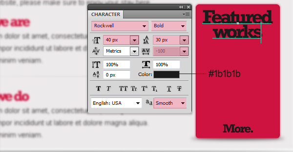
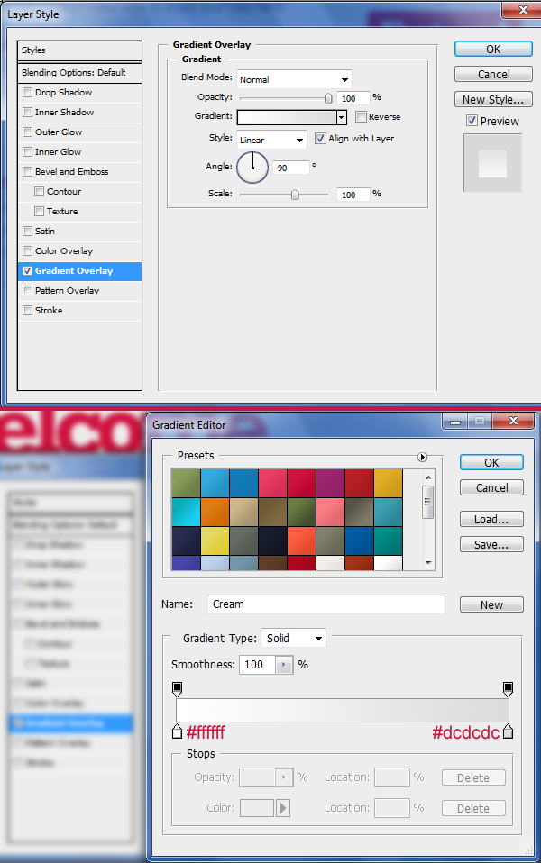
Apply a white-to-gray vertical Gradient Overlay layer style to your text.
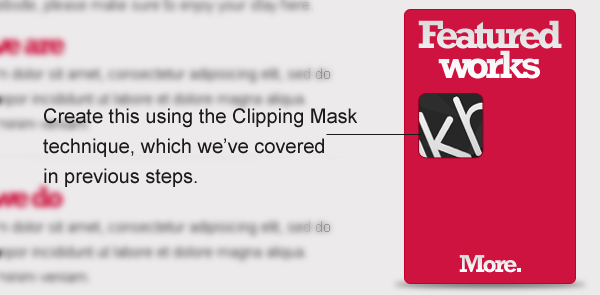
Next up, place a square rounded rectangle selection of 65x65px and Radius of 5px using the same technique we used for the featured area image.
Place an image on top of the rounded rectangle shape layer, right-click on the image, and pick Create Clipping Mask.
Make three more thumbnails.
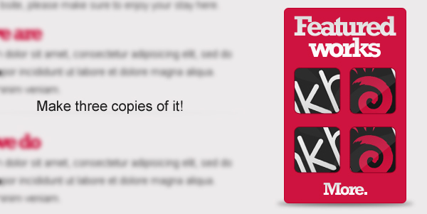
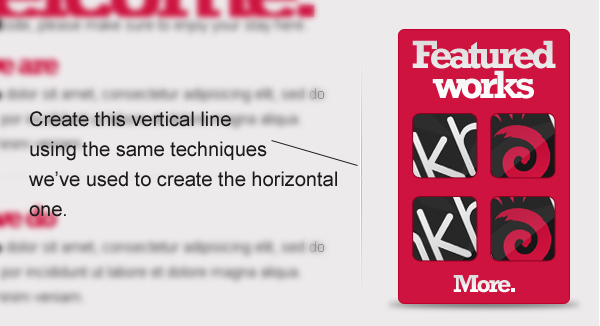
Create a vertical line that separates the content from the Featured works box using the same techniques we’ve used to create the horizontal lines to separate the content.
Step 19: Creating the footer area background
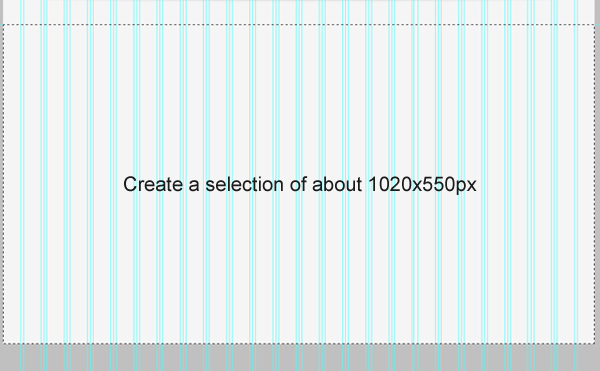
Create a selection of 1020x550px using the Rectangular Marquee Tool (M).
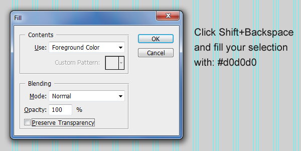
Fill your selection with a light gray (#d0d0d0).
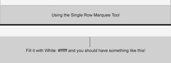
Using the Single Row Marquee Tool, create a 1px selection at the top of the light gray area. Fill this 1px selection with white (#ffffff).
Step 20: Add the Twitter icon at the footer
Start by dragging a new guide 25px below the top of the footer area.
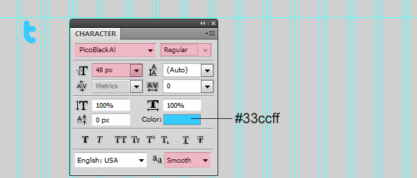
Type the letter “t” using the Horizontal Type Tool (T).
To make the letter look like the Twitter logo, use the following font settings:
- Font Family: Pico Black (get it from here)
- Font size: 48px
- Font weight: Regular
- Anti-aliasing setting: Smooth
- Color: #33ccff
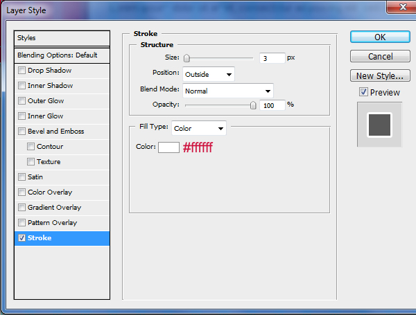
Apply a Stroke layer style to our Twitter icon to finish it off.
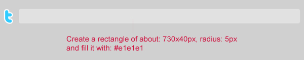
Step 21: Creating the Tweets bar
Using the Rounded Rectangle Tool (U), create a rectangle of 730x40px with Radius at 5px. Fill this shape with a light gray color (#e1e1e1).
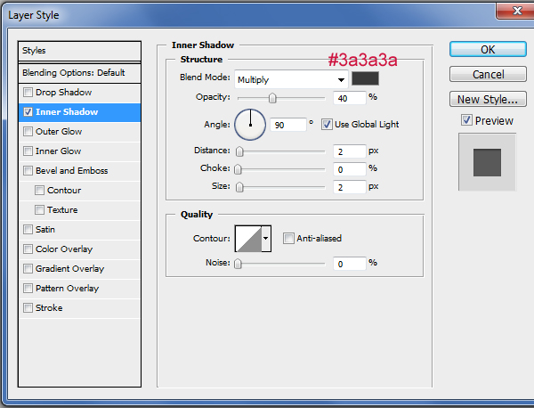
Apply an Inner Shadow layer style to our bar.
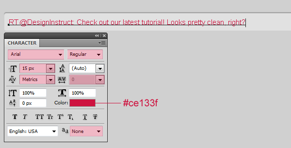
Write some text in the bar using the Horizontal Type Tool (T) and the following settings:
- Font Family: Arial
- Font size: 15px
- Font weight: Regular
- Anti-aliasing setting: None
- Color: #ce133f
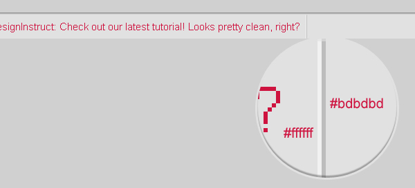
Create two 1px vertical lines 1px apart from each other and fill the left one with white (#ffffff) and the right one with gray (#bdbdbd).
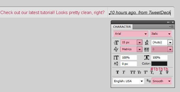
Write some more text using the Horizontal Type Tool (T). The text represents the tweet’s meta information.
The font settings for the meta information is as follows:
- Font Family: Arial
- Font size: 15px
- Font weight: Italic
- Anti-aliasing setting: Smooth
- Color: #1b1b1b
Step 22: Creating the follow us icon
Download the popular Function Icon Set by WeFunction. Find the file called “twitter_48.png” and place it on the right of our Twitter bar.
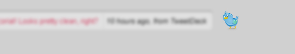
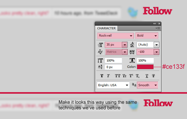
Write the word “Follow” on the Twitter bird’s right.
The font settings for the word “Follow” are:
- Font Family: Rockwell
- Font size: 35px
- Font weight: Bold
- Anti-aliasing setting: Smooth
- Color: #ce133f
Cut the lower part of the word “Follow” using the same techniques we’ve used before for the tagline and other text elements.
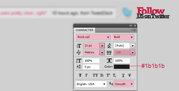
Now type the word “US on Twitter” below the word “Follow”.
You can use the following font settings:
- Font Family: Rockwell
- Font size: 21px
- Font weight: Bold
- Anti-aliasing setting: Smooth
- Color: #1b1b1b
Step 23: Make the separator
Using the Elliptical Marquee Tool (M), create a thin elliptical selection towards the top part of the footer area and fill it with a dark gray color (#404040). Call this layer “separator_bg”.
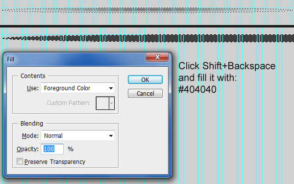
Go to Filter > Blur > Gaussian Blur, set the Radius to 4px, and then apply the filter by pressing the OK button.
Create a selection over the upper part of your blurred shape. Hit Delete to remove the top portion, and you should end up with a straight edge at the top.
Give the blurry shape a Gradient Overlay layer style.
Add a layer mask to the “separator_bg” layer.
Set your Foreground color to black (#000000).
Use the Line Tool, hold down the Shift key to keep your line straight, and create a line at the top of the blurry shape.
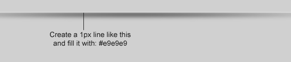
Using the Line Tool (U), create a light gray (#e9e9e9) 1px line on top of the blurry shape.
Again, add a layer mask to the white line, dragging it from right to left with the Black, White gradient preset.

Step 24: Creating the big footer
Drag two new horizontal guides.
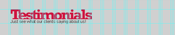
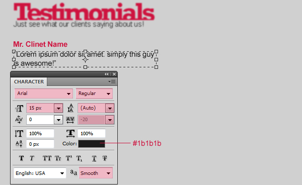
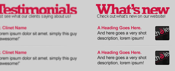
Write a heading like “Testimonials” using the Horizontal Type Tool (T) and the same techniques and font settings we’ve used before. Also add some text below the heading (also in the same way as we’ve done before).
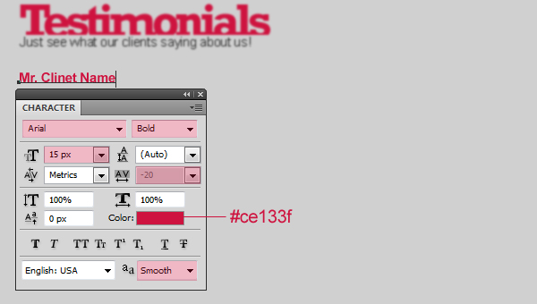
Write a client name (I used “Mr. Clinet Name”) below the “Testimonials” heading.
The font settings for “Mr.
Clinet Name” are as follows:
- Font Family: Arial
- Font size: 15px
- Font weight: Bold
- Anti-aliasing setting: Smooth
- Color: #ce133f
Write some more filler text (lorem ipsum) that represents Mr. Clinet Name’s testimonial.
The font settings for the client’s testimonial text are:
- Font Family: Arial
- Font size: 15px
- Font weight: Regular
- Anti-aliasing setting: Smooth
- Color: #1b1b1b
Duplicate your text layers and create a separating line.

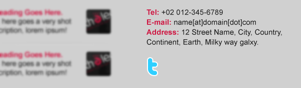
Step 25: Add more footer content
Using the same techniques we’ve covered in this tutorial, add some more content.

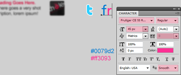
Step 26: Creating social media icons
I’ve showed you how to create this twitter “t” letter: you can duplicate that and place it under your contact information.
Write “fr”, which represents Flickr. To make it look like the Flickr logo, use these font settings:
- Font Family: Frutiger (get it from here)
- Font size: 45px
- Font weight: Regular
- Anti-aliasing setting: Smooth
- Color: #ff3093 – #0079d2
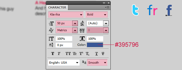
Write a letter “f” for Facebook. To make it look like the Facebook logo, use these font settings:
- Font Family: Kalvika (get it from here)
- Font size: 50px
- Font weight: Bold
- Anti-aliasing setting: Smooth
- Color: #395796
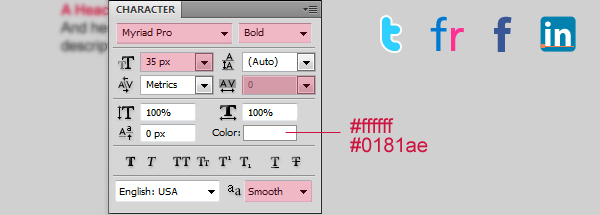
Write the word “in” for LinkedIn. You’ll also need to create a blue rounded-corner square (use the Rounded Rectangle Tool) for its background. Fill the rounded-corner shape with this blue color: #0181ae.
Here are the font settings for LinkedIn’s icon:
- Font Family: Myriad Pro (get it from here)
- Font size: 35px
- Font weight: Bold
- Anti-aliasing setting: Smooth
- Color: #ffffff
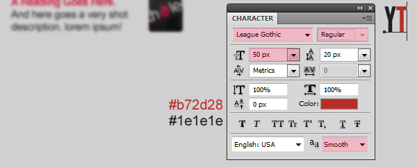
Write the letters “YT” for YouTube. Here are the font settings for YouTube’s logo.
- Font Family: League Gothic (get it from here)
- Font size: 50px
- Font weight: Regular
- Anti-aliasing setting: Smooth
- Color: #b72d28 – #1e1e1e
Step 27: Creating the small footer
Create a separating line at the bottom of the footer.

Write some text in the footer such as your copyright information and links to important pages using the following character settings:
- Font Family: Arial
- Font size: 15px
- Font weight: Regular
- Anti-aliasing setting: None
- Color: #ce133f – #1b1b1b
Tutorial Summary
There we have it! Whew! We’ve created a clean and modern web design with some basic techniques and Photoshop tools, but ended up with a pretty professional layout.
We just used basic tools such as shape tools, clipping masks, layer masks, and layer styles.
Download Tutorial Source Files
- clean_modern_webdesign (ZIP, 6.4 MB)
-
 Trevin serves as the VP of Marketing at WebFX. He has worked on over 450 marketing campaigns and has been building websites for over 25 years. His work has been featured by Search Engine Land, USA Today, Fast Company and Inc.
 -

WebFX is a full-service marketing agency with 1,100+ client reviews and a 4.9-star rating on Clutch! Find out how our expert team and revenue-accelerating tech can drive results for you! Learn more
Make estimating web design costs easy
Website design costs can be tricky to nail down. Get an instant estimate for a custom web design with our free website design cost calculator!
Try Our Free Web Design Cost Calculator
Table of Contents
- Preview
- Resources
- Step 1: Setting Up a New Document
- Step 2: Creating the Navigation Bar Background
- Step 3: Adding Website Name and Navigation Text
- Step 4: Creating Search Bar
- Step 5: Creating the Sub-navigation Bar
- Step 6: Creating the Featured Area Background
- Step 7: Creating the Featured Area Shadow
- Step 8: Adding an Image of a Featured Design
- Step 8: Adding a Smaller Featured Design’s Image
- Step 9: Adding a Tagline
- Step 11: Creating the “See More!” Button
- Step 12: Creating the Content Area Background
- Step 13: Creating the Sidebar
- Step 14: Adding Content to the Sidebar
- Step 15: Write a Heading for the Main Content Area
- Step 16: Add the Main Content
- Step 17: Creating the Featured Work Box
- Step 18: Adding Content to the Featured Work Box
- Step 19: Creating the Footer Area Background
- Step 20: Add the Twitter Icon at the Footer
- Step 21: Creating the Tweets Bar
- Step 22: Creating the Follow Us Icon
- Step 23: Make the Separator
- Step 24: Creating the Big Footer
- Step 25: Add More Footer Content
- Step 26: Creating Social Media Icons
- Step 27: Creating the Small Footer
- Tutorial Summary
- Download Tutorial Source Files
Share this article


Web Design Calculator
Use our free tool to get a free, instant quote in under 60 seconds.
View Web Design CalculatorMake estimating web design costs easy
Website design costs can be tricky to nail down. Get an instant estimate for a custom web design with our free website design cost calculator!
Try Our Free Web Design Cost Calculator