
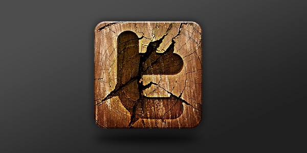
Preview
Step 1: Set Up the Photoshop Canvas
I like working with a canvas that is larger than the final product, so I created the canvas at about 510x510px. I set up Photoshop guides (View > New Guide) for the outer border of the icon. In addition, I also placed a horizontal guide and a vertical guide at the center of the canvas in order to have an idea of where the center is (and conveniently, let items snap to them in place).
I also threw in a simple black-to-gray gradient background to make it easier to see my work. 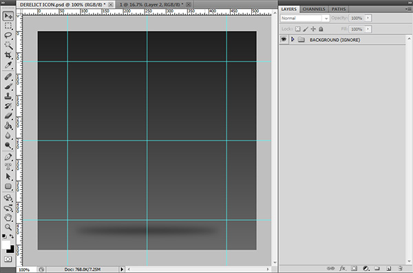
Step 2: Getting Ready for Icon Building
Time to get started! Create a layer group for your icon by choosing Layer > New > Group or clicking the “folder” icon at the bottom of the Layers Panel.
This will create a folder in the Layers Panel that can hold multiple layers; by default, this first layer group will automatically be named “Group 1.” I’ve renamed this group to “DERELICT ICON.” Create a new layer within that group for the icon’s base shape. Use the Rounded Rectangle Tool (U), with the Radius option set to 40px and the Fill pixels option chosen so that it draws the shape in the new layer, to draw a rounded rectangle within the outer guides. In our example, the size of the rounded rectangle shape is 370x370px.
The color doesn’t matter, so I’ve just used the default white color. 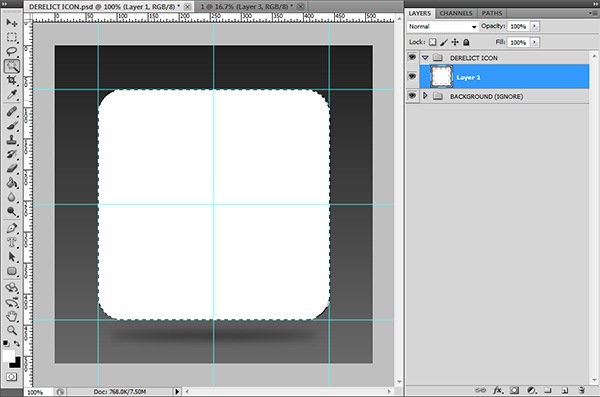 We now need to use the rounded rectangle shape to create a mask on the layer group. First, use the Magic Wand Tool (W) to create a selection around the rectangle.
From there, select the folder in the Layers Panel and then click on the Add layer mask button (it looks like a white circle inside of a gray rectangle) located at the bottom of the Layers Panel. 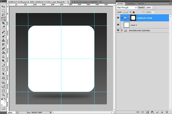 This will ensure that all layers within the folder is kept nicely within the rounded rectangle you made. And better yet, if you want to change that rectangle later on, you’ll be able to do so easily.
You can turn off the white rectangle layer for now, as you’ll need it later.
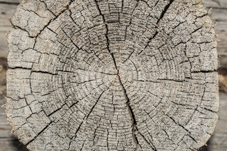
Step 3: Finding a Nice Wooden Texture
Find an image of a good tree stump; some image where the cracks (the technical term of these cracks are “scars”) originate from the center and flow outwards. Don’t settle on the first image that you cross; make sure you find one you’re willing to spend a bit of time on.
Here are some options (from Six Revisions):
- 10 High-Quality Free Tree Bark Textures
- Free High Resolution Wood Textures
- 10 Free and High-Res Grungy Wood Textures
Once you have that image, paste it right into your canvas, making sure it goes inside the layer group we created so that it is affected by our layer group’s mask. Resize the image using Free Transform (Ctrl/Cmd + T) to fit your needs. The layer mask you created before will conveniently keep everything nice and tidy within the rectangle.
I’ve gone ahead and added a Gradient Overlay layer effect, whereby the Blend Mode option is set to Soft Light. 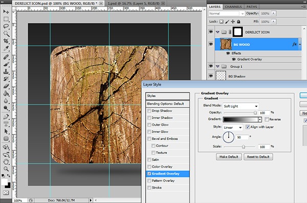
Step 4: Adding Your Social Media Logo
This step is quite straightforward. All you want to do is find a nice high-resolution outline of your logo (maybe try a Google Image search).
It doesn’t matter if the inside is textured as long as the outline is not soft, but rather, hard and crisp. If not, then try seeing if you can correct the sharpness of the edges by using the Sharpen filters (Filter > Sharpen) or experimenting with the layer’s Blend Mode. Paste your social media logo as a new layer into our work and resize it to fit the rectangle.
I used Twitter for this tutorial. ![]()
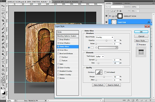
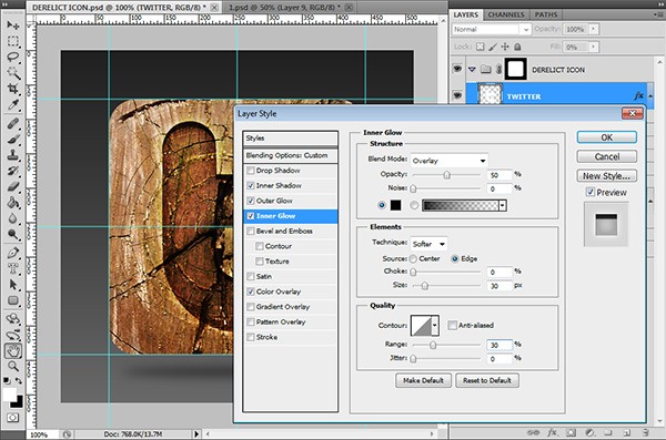
Step 5: Styling Your Social Media Logo
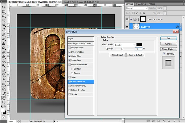
We’re slowly getting to the meat of the design, good job getting to this point! Before giving the logo all the various style bits, first change the Fill of its layer to 0% (you’ll see the Fill slider right below the Opacity slider at the top of the Layers Panel).
Next, you’ll want to customize the layer style. Double-click on the layer to access the Layer Styles dialog window. Then apply the following layer effects:
Inner Shadow

Outer Glow
Inner Glow
Color Overlay
Step 6: Paint on the Scars
This is the part of the tutorial where you’ll need to get creative with your design.
Staying on your Social Media Logo layer, take a small circular or rectangular brush of your choosing (Size: 8-16px) and set it to have some good Hardness value (90%+ is good). Although it doesn’t matter what color you use, I’ve used white just so you can see my brush strokes. Start painting by following the scars in the wood.
You’ll see in the following image at the bottom-left how I’ve done this with one of the scars, keeping it smooth and always a little larger than the scar itself. 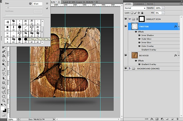 If you’re still not following along, here is the exact same layer, but having changed the Fill back to a 100% for the sake of illustration.
 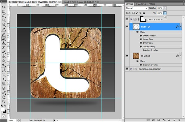 Now continue expanding on the icon until you’ve got an icon that you feel looks like it’s been “cut out” of the wood and then further degraded — that is the feeling you are looking for.
Here’s what I ended up with: 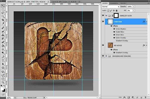
Step 7: Add Depth to the Logo
To further persuade the viewer of the connection between the logo and the scars, we’ll want to add some more depth to the piece. We do this by first duplicating the Social Media Logo layer (Ctrl/Cmd + J) and then removing its current layer style (right-click on the layer and choose Clear Layer Style). 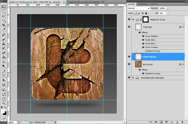 With this blank slate, we’ll then give the duplicated layer a new style, only this time, we will be using the Gradient Overlay layer effect in an inverted manner to the one we did last.
This gives our work a nice contrasting effect and depth. 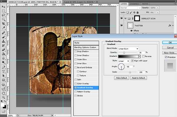
Step 8: Giving It the Final Polish
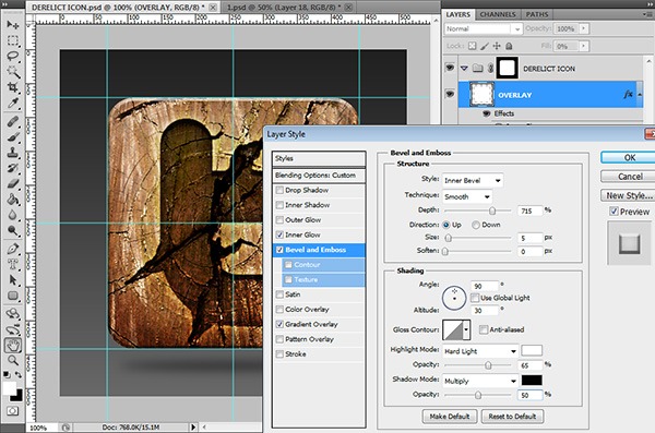
Before we are ready to use our icon, we’ll need to give it one last beauty pass to make sure it’s packing enough “punch.” Drag the original white rectangle layer from Step 2 to the top of your layer group’s stack. Create a layer style for it with these effects:
Inner Glow

Bevel and Emboss
This layer effect will give it a button look.
Gradient Overlay
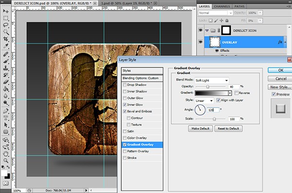 The resulting look is one with strong contrast, good lighting and a well-balanced feel (which is needed for any icon set).
 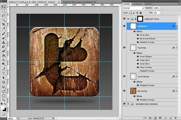 Almost there!
Step 9: Color Boost
The last thing I did was to give the entire design a color boost.
It isn’t much, but by adding a Hue/Saturation adjustment layer on top of all the layers, we can easily achieve this. Add an adjustment layer by going to Layer > New Adjustment Layer > Hue/Saturation or clicking on the Create new fill or adjustment layer button at the bottom of the Layers Panel and then choosing Hue/Saturation from the menu. I only pushed the Saturation slider up by +15, leaving the other values untouched.
The final result is a grungy wooden Twitter social media icon that feels older than the Internet itself (which is what I wanted to achieve). 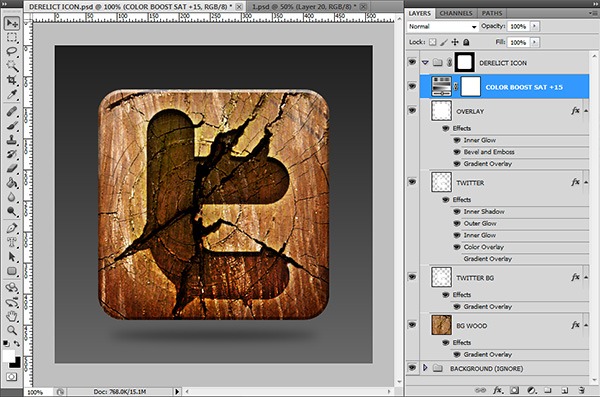
Step 10: Don’t Stop There!
Last but not least, the biggest thing I’d want you to take away from this tutorial is not to stop here, but keep exploring other ideas. I had a look through one of my PSD scrap folders in my computer and found these other ideas that I had also brainstormed at the time.
Just design away, and most of all: Have fun! 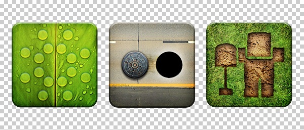
Tutorial Summary
This tutorial showed you a quick and easy way to design a grungy, wooden social media icon using fundamental design techniques in Photoshop. Thank you for following along with this tutorial.
Engage and connect with me on Twitter and leave a comment!
Download Source Files
- wooden_socialmedia_icon (ZIP, 9.26 MB)
-
 Trevin serves as the VP of Marketing at WebFX. He has worked on over 450 marketing campaigns and has been building websites for over 25 years. His work has been featured by Search Engine Land, USA Today, Fast Company and Inc.
 -

WebFX is a full-service marketing agency with 1,100+ client reviews and a 4.9-star rating on Clutch! Find out how our expert team and revenue-accelerating tech can drive results for you! Learn more
Make estimating web design costs easy
Website design costs can be tricky to nail down. Get an instant estimate for a custom web design with our free website design cost calculator!
Try Our Free Web Design Cost Calculator
Table of Contents
- Preview
- Step 1: Set Up the Photoshop Canvas
- Step 2: Getting Ready for Icon Building
- Step 3: Finding a Nice Wooden Texture
- Step 4: Adding Your Social Media Logo
- Step 5: Styling Your Social Media Logo
- Step 6: Paint on the Scars
- Step 7: Add Depth to the Logo
- Step 8: Giving It the Final Polish
- Step 9: Color Boost
- Step 10: Don’t Stop There!
- Tutorial Summary
- Download Source Files
Share this article


Web Design Calculator
Use our free tool to get a free, instant quote in under 60 seconds.
View Web Design CalculatorMake estimating web design costs easy
Website design costs can be tricky to nail down. Get an instant estimate for a custom web design with our free website design cost calculator!
Try Our Free Web Design Cost Calculator


