

 In this article, we’ll talk about the challenges of writing concise and familiar copy for web application user interfaces. We’ll illustrate, with a real case example, how tools like Amazon’s Mechanical Turk can help designers find a common language with their users.
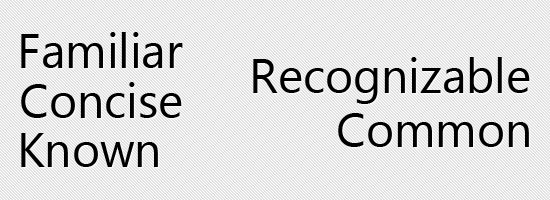
Words Matter
A good user interface needs concise instructions.
When we label interface elements or write instructions for a given task, we aim for clarity and succinctness. 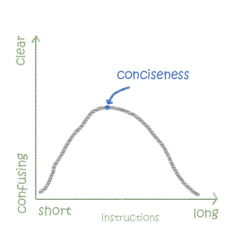 Succinctness is a fairly simple standard to follow. The shorter the better.
Short, familiar labels and instructions are more readable. Long copy can convey more information and may explain things more completely, but designers find long blocks of web copy unwieldy, and for users, mentally taxing (i.e. because people don’t read).
The result is that longer copy generally makes for more confusing interfaces. But a short label must also be clear; and it’s tricky to write copy that’s brief but thorough at the same time. And then what the definition of “clear” is, in the context of your UI, is another (tougher) problem altogether.
We don’t write for ourselves, but for the users, and web users defy categorization and stereotypes. Some are technically savvy, some are less so. Some use their own lingo and some don’t even speak our language.
The Challenge of Finding Common Language
So how do you write succinct instructions in your UIs that are meaningful to your audience? We run into this dilemma regularly with FormAssembly.com. We run a service that lets people build web forms and collect data.
We want to make an inherently technical subject accessible to a general audience. A core principle to boiling down something that’s complex for general consumption is to shy away from technical jargon. That’s why we prefer to talk about “questions” and “responses” instead of “fields,” “labels” and “inputs.” We think that most people can understand what these more familiar terms refer to, even if they might appear a bit unusual at first for the more technically keen crowd.
But finding a common language with your users isn’t always that straightforward. In a recent redesign of the interface of our Form Builder (go ahead and try it out for the sake of our discussion, you don’t need to register or anything in order to use it), we reconsidered how we should label the different types of input our users can place on a form. Here’s our first form element: 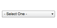 The technical name of this HTML element is “select.” In the office, we usually call it a “drop-down menu,” and from our experience, this is how most English-speaking users refer to it.
In our UI, we call it a “Drop Down.” Next, we have: 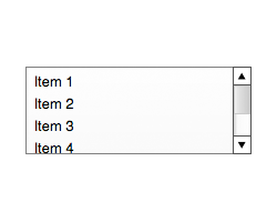 This one is a variant of a
 select element, where more than one option can be selected. This element looks and behaves differently than the one above it, yet it’s technically the same element, a select with a multiple attribute. So what do we call it?
We didn’t feel strongly about it, but we came up with the term, “List” and it seemed good because it was concise. And finally: 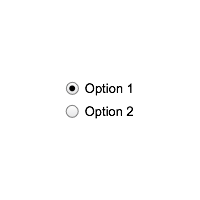 What about the one above? We know it as a “radio button,” and in our interface, it’s simply called “Radio Buttons.” The funny thing is that we weren’t even sure why it was called that way in the first place.
A quick look on Wikipedia answered that for us — it’s a reference to the way buttons used to behave on old car radios. You’d push one button to select a preset station and the other selected button would pop out. But that’s not how modern car radios work anymore.
This is interesting because we can hardly hope that using an outdated metaphor is a good way to convey information. So is there a better way to call it or should we just stick to calling it a “radio button?” We had no clue. It was time to gather some data.
How to Test the Familiarity of a UI’s Copy
Amazon Mechanical Turk is a service that lets you give a simple task to a large number of people very quickly and at a very affordable cost. We devised a short test. We presented the images above and then asked 50 randomly chosen testers what they called each of those form controls.
The Results
In a matter of minutes, we had our 50 responses. Here’s what we learned. 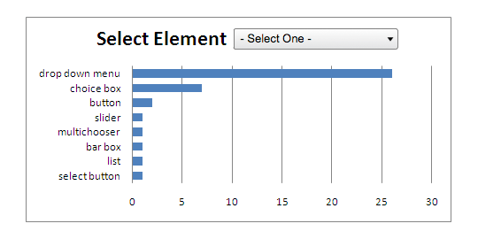 No surprise here.
The majority of the people surveyed called it a “drop down menu” (or a close variation of it). So it reinforced our existing term for this form element. 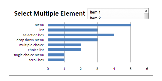 The result above gave our testers the most trouble and we ended up with many exotic names.
We settled on “Selection List.” The terms “menu” and “list” are very similar, but “list” in this case is more distinctive. 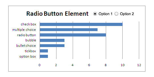 Here, respondents seemed more sure of their answer. Yet, a large segment didn’t make the distinction between radio buttons and checkboxes.
Also “multiple choice” was a fairly popular term. I suspect this shows a US-centric bias in our tester population, as this control looks like the multiple-choice tests that are common in the US education system. Since we didn’t have a clear winner, we decided to stick with the technical term “radio button.” Any other option would be confusing for too many users, or simply inaccurate.
And if we have to teach our users a new term, we may as well go with the flawed but technically correct one.
Testing Your UI’s Language is Quick and Inexpensive
Amazon Mechanical Turk is well suited for short tests involving instant recall, reading comprehension or quick identification. Workers are only paid a few cents per tests so they are not going to spend more than a minute or two on them.
We were able to quickly test and iterate on our user interface’s copy by using Mechanical Turk. First, we were able to verify that a “drop-down menu” is a familiar term, so we stuck with our existing label. It helped us make an informed revision of the term “List,” changing it to “Selection List” as a label for select elements that had a multiple attribute.
The result for radio elements were inconclusive, so we stuck to the technical term for them, “Radio Buttons.” 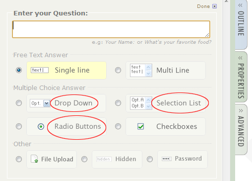 This simple case shows how simple it can be to test the effectiveness of your user interface’s language. In the future, we might consider using this same method to get useful insight to questions like, “What do you think is behind each of these tabs?” or for a paragraph of instructions, “What would you do after reading this paragraph?” A similar site, FiveSecondTest, provides a quick snapshot of viewers’ understanding. Remote user testing can be an effective way to evaluate and improve the clarity and conciseness of web application copy.
Related Content
- Five Simple but Essential Web Usability Tips
- Factors That Affect Usability
- Web Languages: Decoded
-
 President of WebFX. Bill has over 25 years of experience in the Internet marketing industry specializing in SEO, UX, information architecture, marketing automation and more. William’s background in scientific computing and education from Shippensburg and MIT provided the foundation for MarketingCloudFX and other key research and development projects at WebFX.
 -

WebFX is a full-service marketing agency with 1,100+ client reviews and a 4.9-star rating on Clutch! Find out how our expert team and revenue-accelerating tech can drive results for you! Learn more
Make estimating web design costs easy
Website design costs can be tricky to nail down. Get an instant estimate for a custom web design with our free website design cost calculator!
Try Our Free Web Design Cost Calculator
Share this article


Web Design Calculator
Use our free tool to get a free, instant quote in under 60 seconds.
View Web Design CalculatorMake estimating web design costs easy
Website design costs can be tricky to nail down. Get an instant estimate for a custom web design with our free website design cost calculator!
Try Our Free Web Design Cost Calculator


