
The captivating effect of custom die cuts doesn’t end with business cards — it applies to folders, brochures, postcards and any other bit of print media a designer might need to create for a client.
 Source: mbradyclark.com
![]() Source: zychowicz.com
Source: zychowicz.com
However, many designers feel constricted to the standard template and fail to take advantage of the limitless potential of custom die cutting.
To get you comfortable with thinking outside of the box, here are just a few of the many ways you can use custom die cutting to create an unforgettable design.
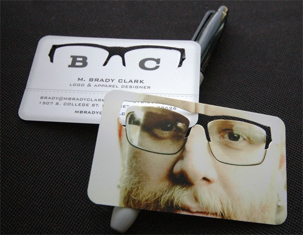
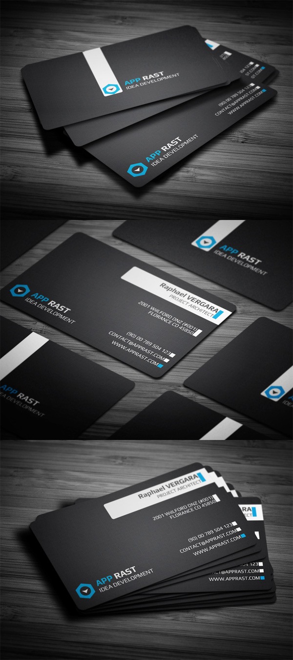
1. Reinforce a Logo
Die cutting acts like a target for your audience’s eyeballs. When a person experiences a piece of die-cut media for the first time, they are automatically drawn to the areas that have been highlighted by the cuts.
And nothing is more deserving of the audience’s attention than your company’s logo.
![]() Source: cardview.net
Source: cardview.net
Die cutting to emphasize a logo helps to show its unique shape and bring it forward so that the audience immediately recognizes it.
It also means that the audience has a chance to experience the logo using their hands, which means a stronger sensory connection to the brand you would like to promote.
There are a number of die-cut techniques that you can use to enhance and highlight your logo.
The most common technique is to cut around the contours of the logo, letting the canvas itself highlight the shape.
You can also cut the logo shape directly into the stock so that the logo is formed through the use of negative space. For multi-page print jobs, you can cut a die cut window on one page in the shape of your logo and use another image on the next page, so that the logo is created from the color showing through, as seen in the example below by Joseph Veazey.
![]() Source: behance.net
Source: behance.net
Don’t underestimate the importance of shape when it comes to branding — after all, the best brands have logos with unique shapes.
Consider the fact that you can know what kind of car someone is driving by the shape of the hood ornament or the laptop they’re using by the shape of the logo on top.
A good and successful logo design considers how the logo will look printed in only one color, which means that many logos strive for a unique shape or silhouette that can be immediately recognized.
If the logo is strong enough to print in a solid color and still retain its effectiveness, then it should easily translate to a successful die cut design. More complex logos, or poorly designed logos, might not work as well.
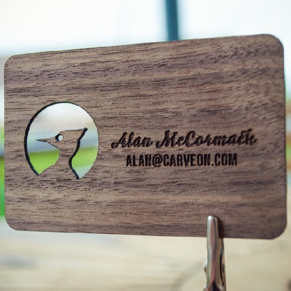
2. Encourage Tactile Interaction
Designers are often so focused on how something looks that they forget about the other senses people use to experience the world around them.
Printed media is physical, so people experience it as much with their hands as they do with their eyes.
 Source: behance.net
When a design affects two senses at once, it creates a stronger memory in the recipient’s brain than if they had experienced it with just sight alone.
You can use custom die cuts to manipulate the way your physical media feels, which creates a stronger sense memory.
When you hand out regular business cards to potential clients, the touch sensation isn’t very strong because the client is most likely used to it; your card may be no different than any other. A die cut business card, on the other hand, will feel different in the customer’s hand, which makes them more likely to hang onto it because it feels more special than the rest.
 Source: carveon.com
However, you do have to be aware of how your die cuts will feel in a person’s hands. For example, you’d want to avoid sharp edges and points on the right and left sides of a die cut presentation folder because it would feel uncomfortable whenever someone tried to hold the folder or open it.
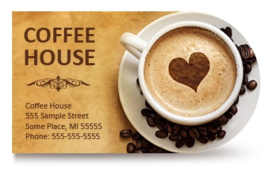
3. Highlight an Image
Die cutting makes it possible to eliminate unnecessary white space, which helps you to highlight pictures and designs more effectively.
Sometimes one single image can sum up a brand’s identity — such as a photo of your product, location or spokesperson — cutting around that image makes it the sole focus of the media.
 Source: wingless730.deviantart.com
It’s not necessary to cut completely around the image — cutting just part of the picture can enhance even the simplest of images. The business card above, for example, has a circular die-cut outlining the cup and saucer, making them look more realistic and life-like.
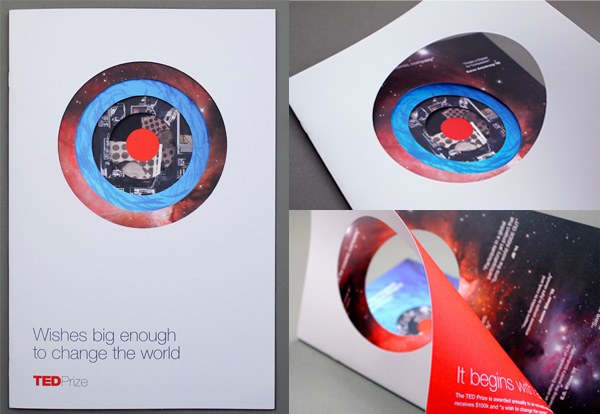
This technique is also especially effective on a brochure, folder or other multi-page project. It allows the image to lead the viewer into the media and forces the reader to touch the shape of the image when they turn the page.
Check out what Jason Lynch did for the 2012 TED prize informational packet below.
 Source: behance.net
Using a die cut on an image also helps to draw focus to the most dominant visual elements.
You might have a design with a lot of visual components, but adding a cut around the most important components allows the design to look less busy and have a natural focus for the eye.
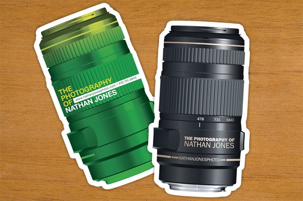
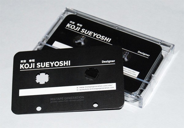
4. Form an Identifiable Object
Sometimes, the shape of your canvas alone can be a strong enough visual to sustain the design. Creating a template in a shape that ties into a brand’s identity gives you something concrete to base the design around.
Consider how little space you have for visual elements when creating a business card or postcard — by transforming the space itself into an interesting visual element, you can make the most of what little you have.
 Source: mixtapegeneration.com
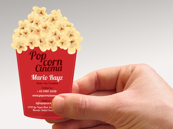
Identifiable shapes can come from any aspect of the brand. The shape can have an associative connection, such as a box of popcorn for a movie theater, or a teddy bear shape for a pediatrician’s office.
 Source: lemongraphic.sg
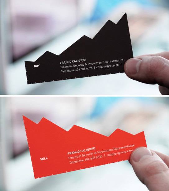
You can create shapes of the actual product that the brand sells, such as a bottle-shaped business card for a brewery.
If you are offering services, such as financial consultancy, you can use a line graph.
 Source: lovelystationery.com
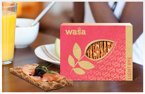
You might even create the shape to tie into a particular marketing campaign — for example, a leaf-shaped business card or package design to show how eco-friendly your business is.
 Source: Alia Serban
5. Use Die-Cutting as Typography
Prominent, creative visuals are not always appropriate for every brand and many clients may prefer designs that are text-based instead of image-based.
Die cutting is a good way to make text-only designs more dynamic. It’s hard for the audience to fully appreciate a design that is purely text, but giving them the chance to feel the shape of that text creates a stronger impression.
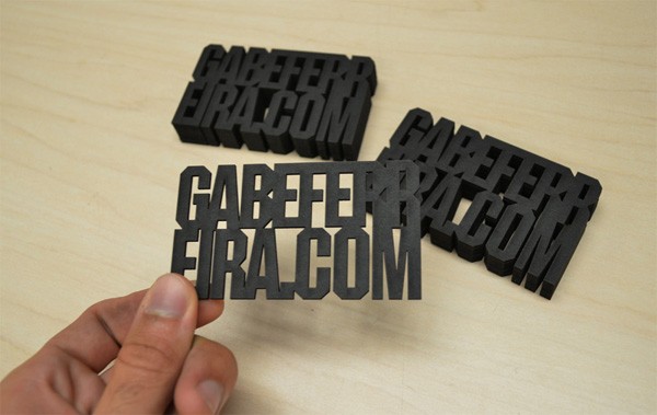 Source: gabeferreira.com
When you trace the outline of a word or message, it creates an effect where it looks like it’s popping off the page.
You can also shape the canvas itself into a word, allowing that word to tie into your brand. For example, you might shape a coffee shop’s print collateral into a word like “Brew” or a phrase like “Cup of Joe.”
You can also create letters using die cut windows, which are internal cuts made in the stock.
In the case of multi-page print collateral, you can put a color, pattern or even an image behind these cut letters to create an interesting visual effect.
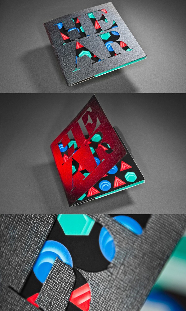 Source: behance.net
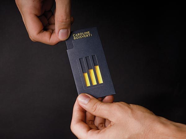
6. Create Functional Die-cuts
Die cuts aren’t just for aesthetics; they can also serve as a functional improvement.
For example, media with rounded corners is more durable because square corners are easily bent and dog-eared. Rounded corners have a practical purpose as well as also adding a unique visual component to the design.
 Source: creattica.com
Functional cuts can also make organization easier for both your client and the customers they want to attract. Custom tabs allow the media to be easily stored in a filing cabinet or drawer.
Die cut business card slits allow your clients to easily create complete marketing kits. And just because these cuts are functional doesn’t mean you can’t also make them look dynamic and memorable.
7. Highlight a Message
The most important aspect of a marketing campaign is a central message that the brand wants to make about itself. Your job as a designer is to create a design that reinforces this message, which is when custom die cuts can really leave an impression.
You can use die cuts to draw attention to a message by cutting around it, cutting the letters themselves or even putting the message behind a die cut window. You can also create cuts that visually tie into the brand’s message — the booklet above places the phrase “Amazing things happening here” behind an arrow-shaped window.
 Source: dot-design.co.uk
This both emphasizes the message and encourages the recipient to open the booklet in search of what those “amazing things” might be.
Making the Cut
Now it’s your turn to talk: What kind of die cuts have you experienced in the past that left an impression on you?
How did the unique shape feel in your hands? Have you ever run across a die cut you didn’t like? We’d love to hear what you think “makes the cut” when it comes to custom die-cut designs.
* Thumbnail image source: Ozan Akkoyun
-
 This article was written by Vladimir Gendelman of Company Folders, Inc.
 -

WebFX is a full-service marketing agency with 1,100+ client reviews and a 4.9-star rating on Clutch! Find out how our expert team and revenue-accelerating tech can drive results for you! Learn more
Make estimating web design costs easy
Website design costs can be tricky to nail down. Get an instant estimate for a custom web design with our free website design cost calculator!
Try Our Free Web Design Cost Calculator
Share this article


Web Design Calculator
Use our free tool to get a free, instant quote in under 60 seconds.
View Web Design CalculatorMake estimating web design costs easy
Website design costs can be tricky to nail down. Get an instant estimate for a custom web design with our free website design cost calculator!
Try Our Free Web Design Cost Calculator


