

 This tutorial is based on a simple animated experiment that showcases just one of the amazing things you can create using CSS. I’ve used no images and no scripting; everything’s done using HTML and CSS. It goes without saying that since CSS3 is still not supported by all browsers, it might not work as intended; but I’ve coded this in such a way that it will degrade gracefully on non-CSS3 browsers, including IE (of course).
Experimenting on cutting-edge standards for the sake of innovation is an attribute that helps us learn, and perhaps by pushing the boundaries, we can improve our knowledge further.
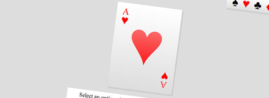
Final Result
You can click on the preview image to see the demo. For optimum experience, use a WebKit browser like Google Chrome or Apple Safari. 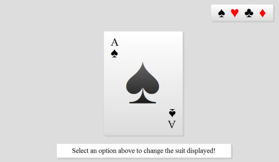 View Demo Download Source
A Primer on Innovation
If you ask any self-taught professional, motivation and willingness to experiment are the two primary skills that feed their passion to becoming better designers and developers.
While memorizing every single element, property, function and attribute for every language is an option, knowing what they can do is even better. Whether you are working out how to fix a browser bug, achieving a complex layout, or if you simply want to play around and see what you can come up with (like this example), the ability to hone your skills to match the situation puts you in a fantastic position for whatever the world may throw at you. Now that the inspiring speech about the justification behind this fun experiment is over, it’s time we begin examining and reconstructing this example to display how everything came together to produce the final result.
Within this experiment we will be taking advantage of some cool CSS3 code (which you can use in other projects) such as border-radius, box-shadow along with the target and checked pseudo classes. Oh, and if that wasn’t enough, we’re even going to use a few WebKit transformations to give Chrome and Safari (they support animations) a progressively-enhanced experience. So what I hope will happen is that by going over the process of creating these CSS3 playing cards, you’ll have fun learning about these new CSS3 capabilities.
Fragments and Fieldsets
Like with all websites, we need to begin right at the beginning with some HTML that lays down the tracks for the experiment.
For the purpose of this example, we’ll keep the CSS and JavaScript used inline inside the document so that you can easily use the View Source feature in your web browser while studying the demo. But in production, I hope you will keep your CSS and JavaScript external. In the code block, you will find:
- An unordered list that will feature the various card suits
- A paragraph of text which simply describes the experiment on the page
- A (very complex) web form that will hold the stylistic variables which make up each of the cards
<!DOCTYPE html> <html> <head> <meta http-equiv="content-type" content="text/html; charset=utf-8" /> <title>Playing Cards with CSS3!</title> <style type="text/css"> </style> <script type="text/javascript"> </script> </head> <body> <ul> <li><a title="Select Spades" href="#spades">♠</a></li> <li><a class="fire" title="Select Hearts" href="#hearts">♥</a></li> <li><a title="Select Clubs" href="#clubs">♣</a></li> <li><a class="fire" title="Select Diamonds" href="#diamonds">♦</a> </li> </ul> <form action=""> <fieldset id="spades"> <input class="card" id="spade" type="radio" name="spade" value="spade" /> <label class="base" for="spade" title="This is the Ace of Spades!"> <span><em>A</em>♠</span><strong>♠</strong><em>A</em>♠ </label> <input id="cancel1" type="reset" name="spade" value="cancel" checked="checked" /> <label class="close" for="cancel1">Spades</label> </fieldset> <fieldset id="hearts"> <input class="card" id="heart" type="radio" name="heart" value="heart" /> <label class="base fire" for="heart" title="This is the Ace of Hearts!"> <span><em>A</em>♥</span><strong>♥</strong><em>A</em>♥ </label> <input id="cancel2" type="reset" name="heart" value="cancel" checked="checked" /> <label class="close" for="cancel2">Hearts</label> </fieldset> <fieldset id="clubs"> <input class="card" id="club" type="radio" name="club" value="club" /> <label class="base" for="club" title="This is the Ace of Clubs!"> <span><em>A</em>♣</span><strong>♣</strong><em>A</em>♣ </label> <input id="cancel3" type="reset" name="club" value="cancel" checked="checked" /> <label class="close" for="cancel3">Clubs</label> </fieldset> <fieldset id="diamonds"> <input class="card" id="diamond" type="radio" name="diamond" value="diamond" /> <label class="base fire" for="diamond" title="This is the Ace of Diamonds!"> <span><em>A</em>♦</span><strong>♦</strong><em>A</em>♦ </label> <input id="cancel4" type="reset" name="diamond" value="cancel" checked="checked" /> <label class="close" for="cancel4">Diamonds</label> </fieldset> </form> <p>Select an option above to change the suit displayed!</p> </body> </html>
Unicode Characters for the Card Suits
While much of the HTML above is straightforward, there is something worth mentioning for its value in our discussion. Within both the list and the form, you will notice that there are a lot of strange Unicode escape characters (such as ♦) which are embedded at various points. When you view the page in your browser, you will notice that these characters represent each suit (spades, hearts, clubs and diamonds) and therefore we can give the cards their appearance without any images.
The list has one mention for each icon, and each form has 3 for each (for the corners and centerpiece).  With the HTML finished, you should see the list, table and text (plus those cool characters).
What’s With The Web Form?
You may be curious about the monstrous HTML web form. The justification for such code is simply due to the way the CSS3 will work with the elements.
While the list element uses simple fragment links (attached to the frameset container for each card), each card — when it appears — contains two input elements with associated labels. The first label contains a mixture of span and em elements (to give the card value in the corners) and a strong element (for the big central character). The second label simply acts as a reset mechanism for the special effects, i.e.
when a WebKit browser is being used.
Laying the Foundations
Now that we have completed the HTML, it’s time to move onto the CSS. To begin, we will add in all the CSS content for the web page; and we also need to give our cards a bit of color. The below code begins our journey into CSS3 by taking advantage of both the border-radius and box-shadow CSS properties (with a few compatibility tweaks).
IE Support
It’s worth noting that the filter property will not validate under W3C CSS standards due to it being a proprietary extension for Microsoft’s Internet Explorer; but as this is just for fun, the validation of the code is less important.
This allows us to support Internet Explorer; that’s a good enough reason to break auto-validation in this case.
body { background: #DDDDDD; overflow: hidden; } body .fire { color: #FF0000; } p { background: #FFFFFF; border: 1px solid #CCCCCC; border-radius: 5px 5px; -moz-border-radius: 5px; -webkit-border-radius: 5px; box-shadow: 5px 5px 5px #CCCCCC; -webkit-box-shadow: 5px 5px #CCCCCC; -moz-box-shadow: 5px 5px #CCCCCC; filter: progid:DXImageTransform.Microsoft.Shadow(color='#CCCCCC', Direction=135, Strength=5); font-size: 25px; text-align: center; height: 30px; width: 600px; margin: -35px -300px; padding: 10px 15px; position: absolute; bottom: 50px; left: 50%; z-index: 99; } Using the above code, you should see a lovely looking paragraph on your page!
Navigation, Simplified!
Next on the list is the navigation. For our playing card experiment, we shall be making use of anchor fragments that will show and hide each of the cards (as required). While the code you’ll see next doesn’t contain the CSS3 that will activate the navigation (we’ll get to that later), you will notice the code that not only floats the navigation to the top-right hand side of the screen, but also adds the same cool border-radius and box-shadow effects.
When you refresh the page after plugging in this code, you should see that the links are now highly visible and make use of our awesome Unicode characters.
ul { background: #FFFFFF; border: 1px solid #CCCCCC; background:-moz-linear-gradient(top, #FFFFFF, #DDDDDD); background:-webkit-gradient(linear,0 0, 0 100%, from(#FFFFFF), to(#DDDDDD)); border-radius: 5px 5px; -moz-border-radius: 5px; -webkit-border-radius: 5px; box-shadow: 5px 5px 5px #CCCCCC; -webkit-box-shadow: 5px 5px #CCCCCC; -moz-box-shadow: 5px 5px #CCCCCC; filter: progid:DXImageTransform.Microsoft.Shadow(color='#CCCCCC', Direction=135, Strength=5); font-size: 50px; margin: 0; padding: 0 15px; position: absolute; right: 20px; top: 15px; z-index: 99; } ul li { display: inline; list-style-type: none; } ul li a { color: #000000; display: block; float: left; padding: 0 10px; text-decoration: none; }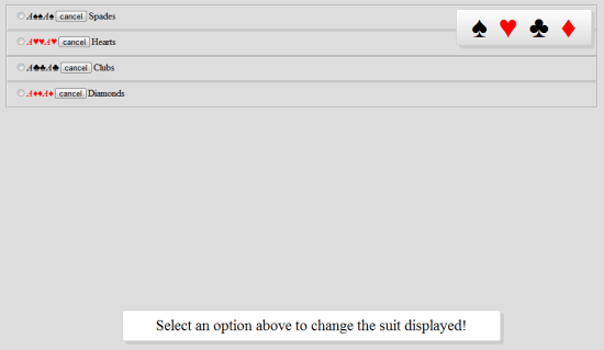 Now we have the list hovering and ready for action (along with that paragraph).
Styling the Aces
The most complicated part of the CSS is making the cards look like, well, like playing cards. Using the code that follows will get you the perfect and progressively enhancing design elements that make the final look possible. Code to pay attention to includes:
- The CSS3 linear gradient that fade the cards
- The reversed gradient using the
mask-imageproperty on the center character (providing an even softer feel) - A span label effect which rotates the bottom right reference to make it upside down (just like real cards)
All simple but very effective.
.base { background: #FFFFFF; border: 1px solid #CCCCCC; color: #000000; background:-moz-linear-gradient(top, #FFFFFF, #DDDDDD); background:-webkit-gradient(linear,0 0, 0 100%, from(#FFFFFF), to(#DDDDDD)); border-radius: 5px 5px; -moz-border-radius: 5px; -webkit-border-radius: 5px; box-shadow: 5px 5px 5px #CCCCCC; -webkit-box-shadow: 5px 5px #CCCCCC; -moz-box-shadow: 5px 5px #CCCCCC; filter: progid:DXImageTransform.Microsoft.Shadow(color='#CCCCCC', Direction=135, Strength=5); height: 360px; top: 50%; margin-top: -180px; width: 260px; left: 50%; margin-left: -130px; z-index: 9; cursor: pointer; font-size: 50px; text-decoration: none; padding: 15px 0 0 25px; position: absolute; } strong { font-size: 250px; position: absolute; left: 50%; top: 50%; margin-top: -160px; -webkit-mask-image: -webkit-gradient(linear, left top, left bottom, from(rgba(0,0,0,0.4)), to(rgba(0,0,0,1))); } em { font-size: 40px; font-style: normal; display: block; margin-bottom: -15px; } label span { -webkit-transform: rotate(-180deg); -moz-transform: rotate(-180deg); -o-transform: rotate(-180deg); filter: progid:DXImageTransform.Microsoft.BasicImage(rotation=2); position: absolute; bottom: 15px; right: 25px; } #spades strong { margin-left: -68px; } #spades em { margin-left: 0; } #hearts strong { margin-left: -70px; } #hearts em { margin-left: 1px; } #clubs strong { margin-left: -80px; } #clubs em { margin-left: 3px; } #diamonds strong { margin-left: -60px; } #diamonds em { margin-left: -2px; }Note: Depending on the browser used, the effects may look different. Chrome, Safari both support all the fancy stuff, Firefox will have the background gradient (but the center character will look strong), and Opera and IE will have no “worn” effects! 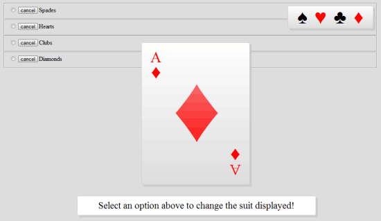 With some clever coding, the playing cards should now look easy on the eyes.
Navigation and Animation
Using the code above, your cards should appear like they come from a proper deck of playing cards. Now that we have the cards, navigation, and paragraphs looking all pretty, it’s important that we get each of the cards appearing on demand. And we should also do something with the cancel and radio buttons that are hovering around behind the scenes.
What happens next is where things get really interesting for you WebKit users.
fieldset { display: none; } fieldset:target { display: block; } fieldset:target .card+label { -webkit-animation-name: scaler; -webkit-animation-duration: 1.75s; -webkit-animation-iteration-count: 1; } fieldset:target .card:checked+label { -webkit-animation-name: effectx; -webkit-animation-duration: 3s; -webkit-transform: scale(0); } .close { background: #DDDDDD; cursor: default; left: 0; top: 0; position: absolute; height: 100%; width: 100%; z-index: 1; text-indent: -999em; } @-webkit-keyframes scaler { from { -webkit-transform: scale(0); } to { -webkit-transform: scale(1); } } @-webkit-keyframes effectx { from { -webkit-transform: rotateX(0deg); } to { -webkit-transform: scale3d(1.2, 1.2, 1.2) rotateX(-90deg) translateZ(500px) rotate(180deg); -webkit-animation-duration: 30s; } }Explaining the above code is very simple. With the anchor links, we are using fragment URLs to navigate between cards in the deck and therefore the target pseudo class hide and show the fieldset as its ID appears. The .close class takes its place behind the card covering the full browser viewport so that upon clicking the page (once the card is hidden), you can restore the item back to its original position.
This is relative to the usage of radio buttons as we shall be using the CSS3 :checked pseudo to animate the content for WebKit browsers depending on the check state. 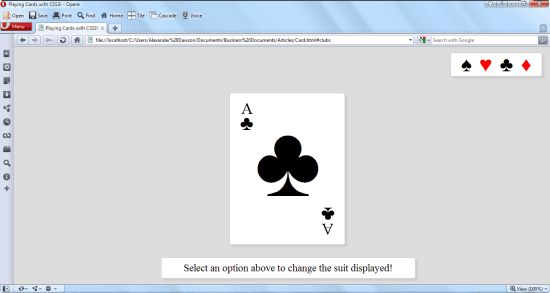 The animation and effects may not show, depending on your browser. The main features that WebKit users will be excited about are the two card classes that trigger either the
 scaler keyframes which will make the card zoom in (from nowhere) or the effectx keyframes that will rotate and flip the card which makes it appear as if it’s being pushed over (and falling off the page). We can also add some simple effects that work alongside the checked property to give some lovely experimental fun stuff that you can interact with (if you use Chrome or Safari).
Other browsers will simply ignore the actions. Note: With most WebKit animations, once the effect has run its course, it will be reset to a default point. Because this example required the effect to remain permanent (until directed by the user otherwise), I made use of the checked state pseudo and radio buttons to ensure the effects were held firmly in place.
Dealing with Internet Explorer
OK, so remember in the beginning when I said I’ve used no scripting?
Well that’s only partially true. Because IE doesn’t yet support all these things, we need to use JavaScript so that at least our IE users will have a decent experience. Of course, if you don’t care about IE — after all, this is an experiment for cutting-edge browsers that support CSS3 — then, yes, this CSS3 experiment uses no scripting whatsoever.
Luckily, because IE — like other non-WebKit browsers — don’t support the CSS3 animated effects, the need to deal with the checked state (in CSS3) is moot since the effect will be non-functional anyway. However, one thing that should be available is the target pseudo so that IE users can change the suit of the playing card. Using a small bit of conditional JavaScript, we can replicate the effect with little impact on the browser.
There’s also a fragment redirect in the script to help browsers load the first card.
function bootup(){ if (location.hash == "") { location.hash="#spades"; } var tds = document.getElementsByTagName("a"); direct(); for( var x=0; x < tds.length; x++ ){tds[x].onclick = function(){setTimeout(direct, 1);};} } function direct(){ /*@cc_on @if (@_jscript_version > 5.6) var counted = document.getElementsByTagName("fieldset"); for( var x=0; x < counted.length; x++ ){ counted[x].style.display = "none" } document.getElementById(location.hash.substr(1)).style.display = "block"; @end @*/ } window.onload=bootup; The example should now be complete and have some neat special effects! While the above code should be enough to get the basic effect working on the latest version of IE, its worth highlighting that I didn’t spend much time attempting to get the effect functional on really old browsers like IE6. Because this is a proof-of-concept demonstration — and because it exists just to play with what’s available in up and coming standards — there was no incentive to try and fire the effects onto every browser. It’s worth saying, however, that if you do intend on using any of this in a production site, you should support the browsers your visitors use.
Playful Innovation
Just a few years ago, the ability to produce such a textured playing card that looks like an image would not have been possible without the use of images. The animation effects, without scripting or Flash, would have been beyond most people’s dreams.
Our proof-of-concept shows the benefits of modern standards, and what the future is for us web designers and web developers. The need to keep innovating and pushing our browsers to the limit is an important part of the web’s evolution. As a web professional, I always try to spend time learning and examining my own abilities to see what unique solutions I can produce.
Ideally, after reading this, you will be inspired to experiment on your own. Good luck and share your own experiments in the comments!
Related Content
-
 President of WebFX. Bill has over 25 years of experience in the Internet marketing industry specializing in SEO, UX, information architecture, marketing automation and more. William’s background in scientific computing and education from Shippensburg and MIT provided the foundation for MarketingCloudFX and other key research and development projects at WebFX.
 -

WebFX is a full-service marketing agency with 1,100+ client reviews and a 4.9-star rating on Clutch! Find out how our expert team and revenue-accelerating tech can drive results for you! Learn more
Make estimating web design costs easy
Website design costs can be tricky to nail down. Get an instant estimate for a custom web design with our free website design cost calculator!
Try Our Free Web Design Cost Calculator
Share this article


Web Design Calculator
Use our free tool to get a free, instant quote in under 60 seconds.
View Web Design CalculatorMake estimating web design costs easy
Website design costs can be tricky to nail down. Get an instant estimate for a custom web design with our free website design cost calculator!
Try Our Free Web Design Cost Calculator