
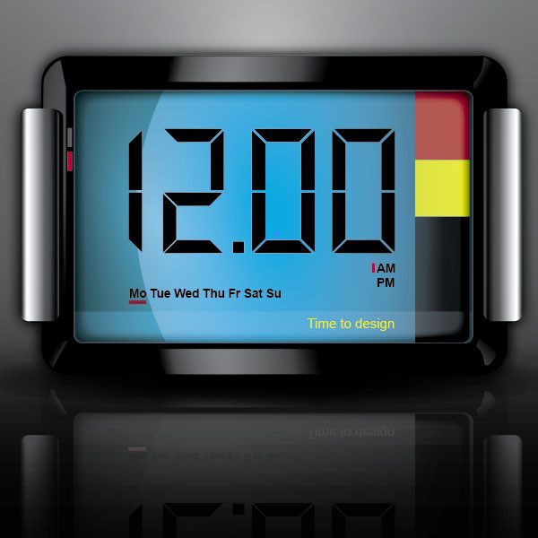
Preview
Step 1: Let’s Get Started
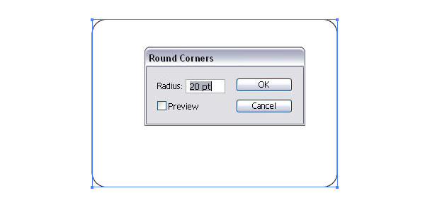
Open up a new document in Illustrator and set the color mode to RGB. Then select the Rectangle Tool (M) and draw a rectangle with width of 346 pt and height of 237 pt. 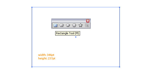 With the rectangle still selected, apply some rounded corners (20 pt) by going to Effect > Stylize > Rounded Corners.
Step 2: An Easy Way to Apply Rounded Corners
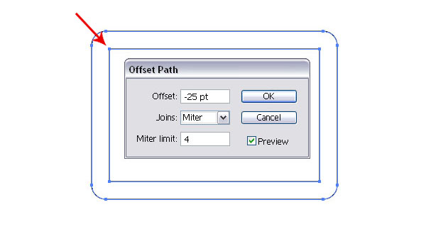
Now we have some rounded corners. We want them to be expanded, so go to Object > Expand Appearance. This will remove the Style.
Select the rounded corner shape and apply an Offset Path to it. To do so, go to Object > Path > Offset Path and enter a negative number (-25pt). This will proportionally shrink the rectangle.
 Once that is done, ungroup the two shapes (Cmd/Ctrl + Shift + G), select the smaller inner rectangle and apply another round corner effect with the Radius of 5 pt. Afterwards, expand the appearance again ( Object > Expand Appearance).
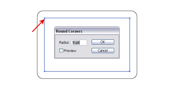
Step 3: Creating the Framework
Now that we have created two rounded rectangles (one smaller than the other) we can fill them both with black.
This is the framework (or base shape) for the digital clock: the outer/bigger shape is the frame and the inner/smaller shape is the clock face. 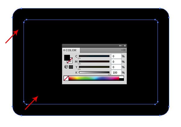
Step 4: Adding Highlights
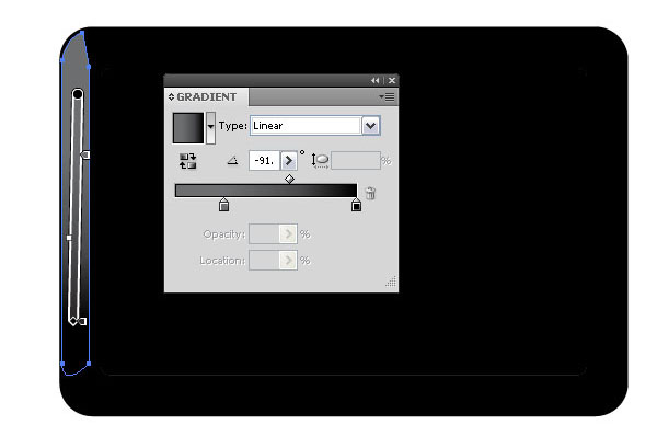
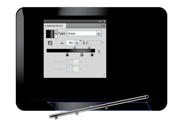
Now, I will show you how a few simple shapes created with the Pen Tool (P) can add a 3D look. Select the Pen Tool (P) and draw a similar shape for the highlight on the left side of the frame.
Leave a small gap between the edge of the rectangle and don’t overlap into the smaller inner (clock face) rectangle. Fill the shape with a black/gray linear gradient with the Gradient Tool (G), oriented vertically. By placing the gradient highlight towards the top and blending into the black color of the frame towards the bottom, the shape will look like it bevels outwards.
 Create a similar shape for the top part of the framework and also give it a linear gradient.
 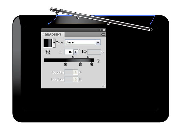 And then create another highlight at the bottom. As you can see, our clock is already coming to life.
 For the corners, create small, semi-rounded shapes and fill them with a gradient.
 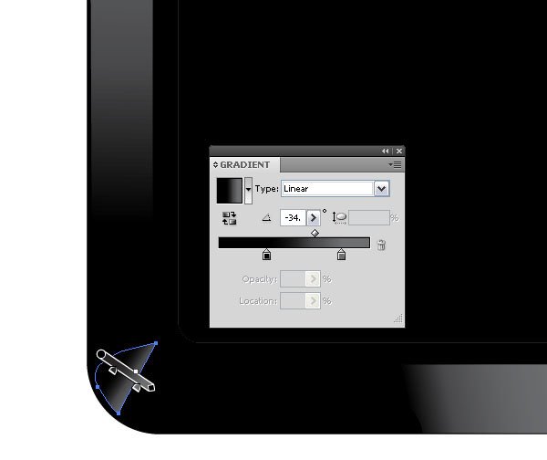 Here is the bottom-right corner.
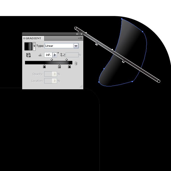
 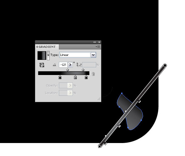 Here’s the highlight for the top-right corner.
 Here is our digital clock icon thus far with all the gradients.
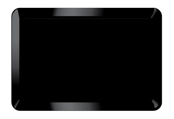
Step 5: Adding Details
Make a copy of the inner rectangle on top by copying it (Cmd/Ctrl + C) and then using the Paste in Front command (Cmd/Ctrl + F). Cut away a big part of the top—you can do so by either using the Eraser Tool (Shift + E) or the Scissors Tool (C).
Then, fill it with a dark teak to light teak color. 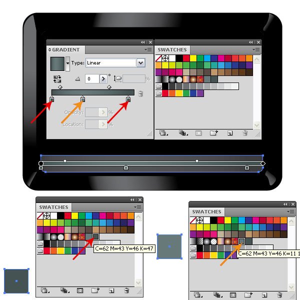
Step 6: Create the Clock Face’s Background
Next, select the inner rectangle (the clock face base shape), add a light gray stroke, and then set the fill to the same gradient as in the previous step. 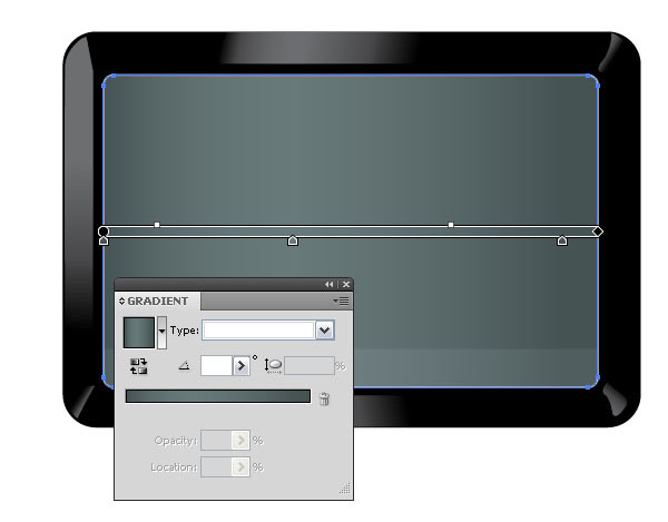
Step 7: Adding Dimension
Now we will add an effect to bring the clock instantly to life.
Select the inner rectangle and add an Inner Glow (Effect > Stylize > Inner Glow). This effect will give the clock face the needed inset look. 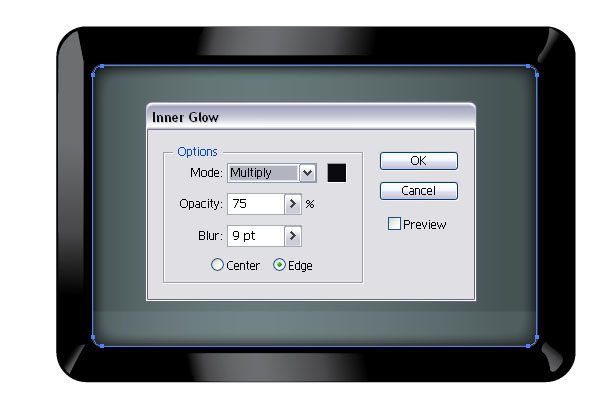
Step 8: Small Details Can Make a Big Difference
Now we are just adding some stylistic elements.
These thing are always optional and you can add whatever shapes, buttons, numbers or text of your liking. I added two small rectangles at the left side of the frame that will serve as controls for the digital clock (maybe they are the snooze and alarm controls – let’s just use our imagination), one in red and one in gray. 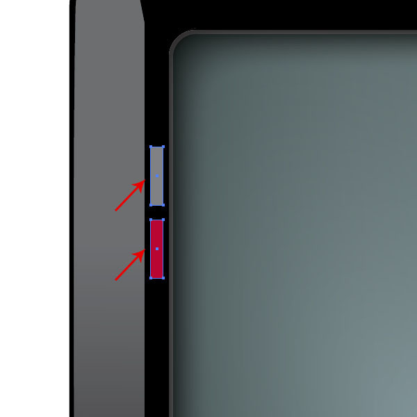
Step 9: Adding the Digital Numbers
A digital clock is nothing without the digital numbers that represent the time!
Add the numbers either with a free font (such as DS-Digital font) or draw them yourself with the Pen Tool (P). Usually digital numbers have cut-off endings in a 45o degree angle. 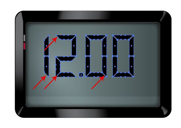
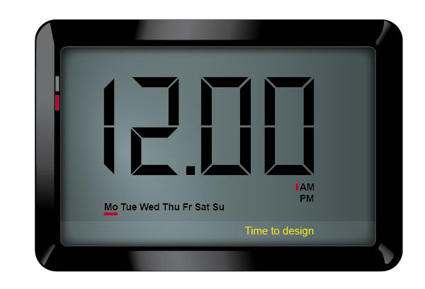
Step 10: Add More Elements to the Clock Face
Here is the clock with numbers, text and some more design elements.
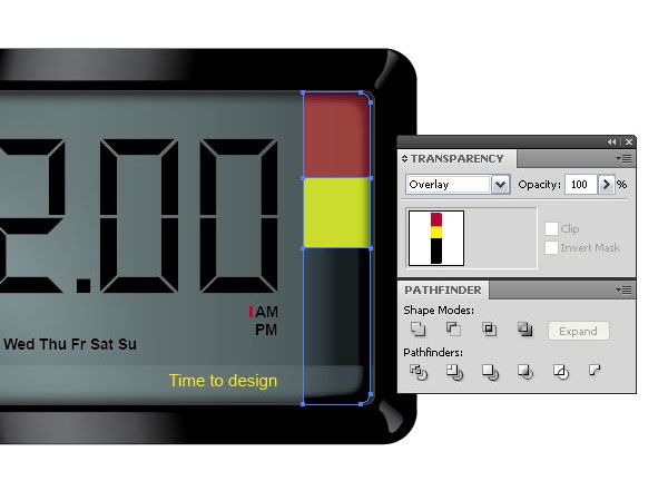
Step 11: Adding Stylized Elements
I thought I’d spice up the digital clock icon with some colored elements. To do so, start by making a copy of the inner rectangle and removing the gradient of the copied shape. Then cut away the left part and slice it into three parts.
You can do so by drawing two lines across the shape, selecting the shape and the lines, and then dividing them with the Divide command in the Pathfinder Panel. Color each part differently by selecting them with the Direct Selection Tool (A) and choosing your colors. Then set the layer mode to Overlay in the Transparency Panel so that the buttons embody the contours of the clock face.
Step 12: Adding Handles
Let’s add some handles to the clock. Create a rounded rectangle and fill it with a white/black linear gradient. 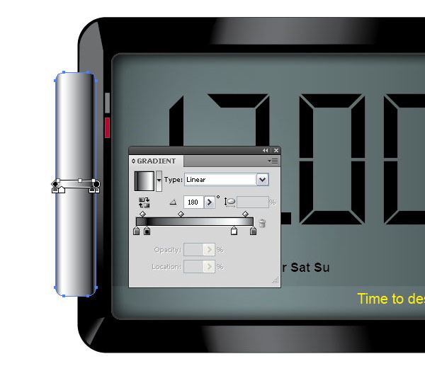 Then make a copy of it below by copying the shape (Cmd/Ctrl + C) and using the Paste in Back command (Cmd/Ctrl + B).
Fill the new shape with black. Move it towards the right and bottom so it sticks out a little. 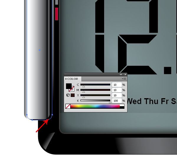 Select both objects, group them together (Cmd/Ctrl + G), duplicate the group by copying it (Cmd/Ctrl + C), paste (Cmd/Ctrl + P) it, and then reflect the duplicated group horizontally by going to Transform > Reflect, choosing Horizontal for the Axis option in the dialog window that appears.
This will be the handle for the other side of the clock, so move it across to the other side. 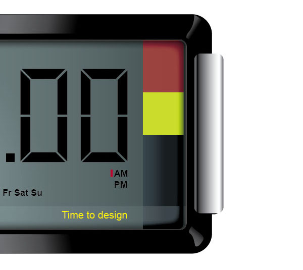
Step 13: Creating a Back Shape for an Outer Glow
Now select all the shapes you have created so far, make a copy and group them. We want to make one solid shape that is the outline of the entire digital clock.
Select the grouped shape and click the Unite button in the Pathfinder Panel. Afterwards, fill the shape with black. 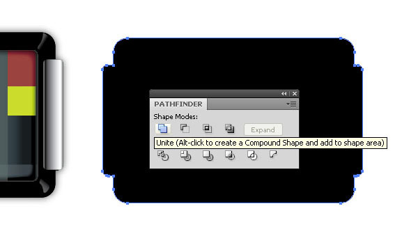
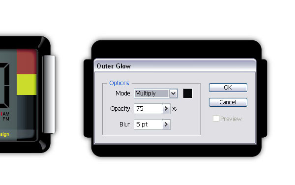
Step 14: Add an Outer Glow to the Back Shape
Add an Outer Glow (Effect > Stylize > Outer Glow) to the back.
 Then place the shape with the outer glow behind your digital clock so that it looks like it’s casting a shadow (you might have to reorder your layers so that the back shape with the outer glow is below all of the digital clock’s parts). Not bad so far, our digital clock is coming along, it’s just a little flat at this point.
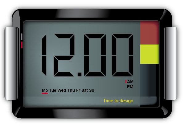
Step 15: Make the Shiny Stuff
Let’s add some shine to our digital clock to make it more interesting.
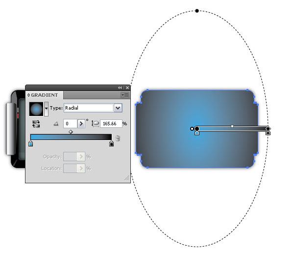
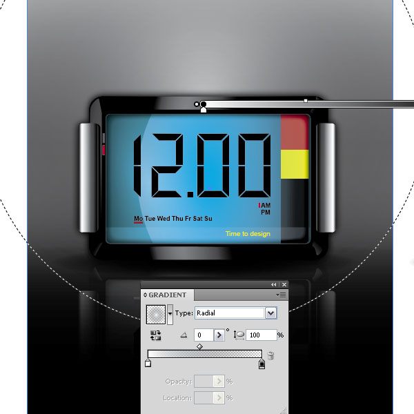
Make another copy of your back outer glow shape and fill it with a light blue/black radial gradient. Edit the gradient so the gradient fill is an ellipse rather than a circle by choosing the Radial for the Type option and then modifying the shape of the gradient to a vertically-oriented ellipse. You can easily change the color of the radial gradient and give the clock a different color shine if you prefer another color over a blue-dominant color.
 Then place the shape on top of all other shapes by selecting it and going to Object > Arrange > Bring to Front (Shift + Cmd/Ctrl + ]). Allow the contours and shapes of the clock face to shine through the shape by setting the layer mode to Overlay in the Transparency Panel.
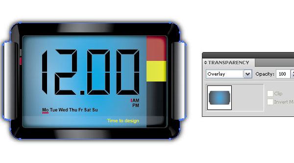
Step 16: Don’t Forget a Light Reflection
A nice shiny object is not complete without a little reflection.
Create a shape similar to the one in the image below. To make the shape, take a copy of the inner rounded rectangle and subtract a large ellipse from it by creating an elliptical shape with the Ellipse Tool (L) and then using the Minus Front command in the Pathfinder Panel. Otherwise, if you have steady hands and a good free hand ability, using the Pen Tool (P) to draw the shape is another (more laborious and probably less accurate) option.
Fill the shape with a lighter teak color and set the layer mode to Multiply. Place it on top of the clock shape, but below the Overlay shape from Step 15. 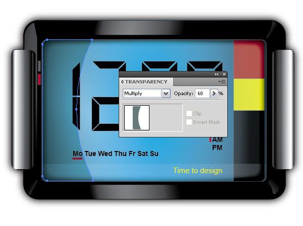
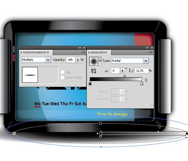
Step 17: Giving the Clock a Shadow
Whenever there is light, there is a shadow of an object. Let’s create one. Select the Ellipse Tool (L) and fill it with a white/black radial gradient.
Place it below the clock shape. 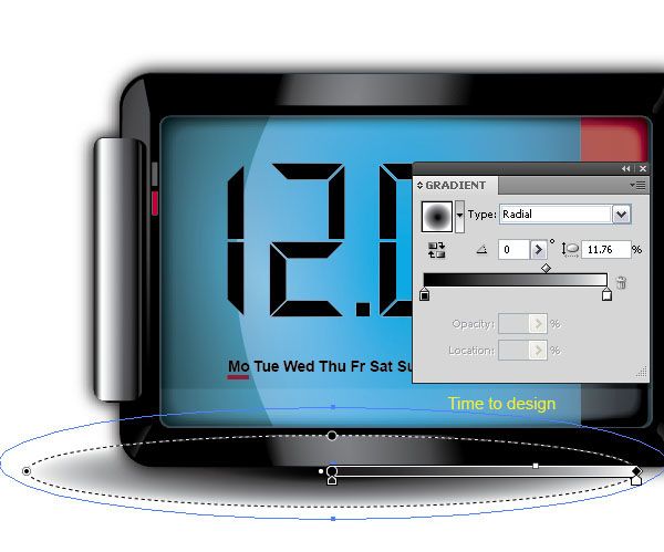 Then make a copy of it and place it to the right. Then set the layer mode to Multiply.
Step 18: Reflection, Reflection, Reflection
Let’s add some more reflective elements to our digital clock. We’ll make it to look as if the clock is standing on a glossy surface. Group all shapes except the shadow parts, make a copy and reflect them vertically by going to Object > Transform > Reflect and choosing Vertical for the Axis option.
Place the grouped, reflected shapes below the clock. Afterwards, set the Opacity to 40%  Once that is done, select the reflected group and apply an Opacity Mask so that the bottom part of it fades away.
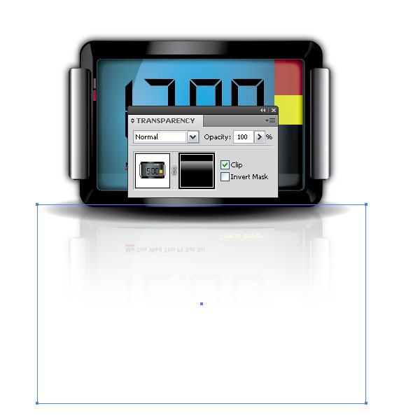
Step 19: Adding a Backdrop
This final step is really optional: We are just going to add a simple background to help frame our subject.
Start by adding a big rectangle behind the clock and filling it with a vertical linear color gradient. 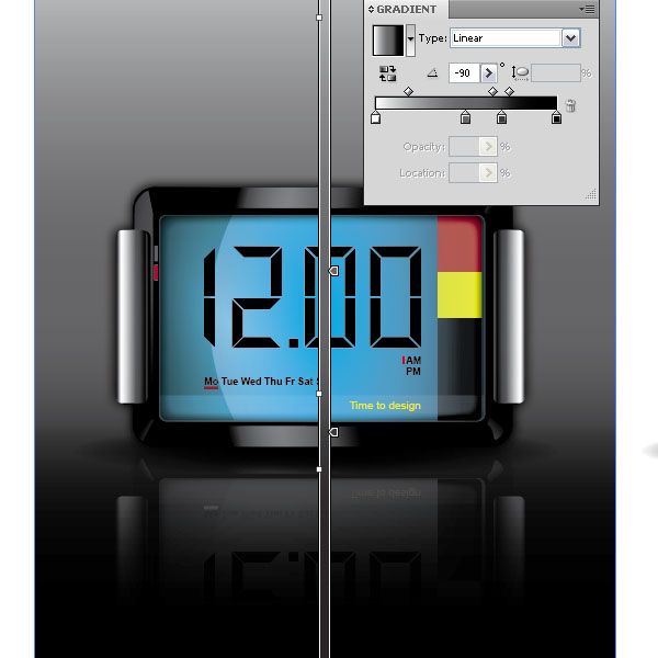 Duplicate the background by copying it (Cmd/Ctrl + C) and then pasting it in front (Cmd/Ctrl + F). Fill it now with a transparent white gradient.
 Set the layer mode to Overlay.
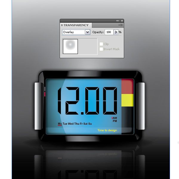
Tutorial Summary
This is it. A glossy digital clock designed solely in Illustrator.Though some might think that Photoshop is an easier way for creating icons with lots of reflective elements and color gradients, I hope this tutorial showed you that Illustrator is not only capable of such design styles, but that it actually does a great and efficient job at it.
Using Illustrator also makes you more flexible as you can increase and decrease the icon’s size without loss of quality. I hope you enjoyed this tutorial.
Download Tutorial Source Files
- digital_clock_icon (ZIP, 1.62MB)
-
 Trevin serves as the VP of Marketing at WebFX. He has worked on over 450 marketing campaigns and has been building websites for over 25 years. His work has been featured by Search Engine Land, USA Today, Fast Company and Inc.
 -

WebFX is a full-service marketing agency with 1,100+ client reviews and a 4.9-star rating on Clutch! Find out how our expert team and revenue-accelerating tech can drive results for you! Learn more
Make estimating web design costs easy
Website design costs can be tricky to nail down. Get an instant estimate for a custom web design with our free website design cost calculator!
Try Our Free Web Design Cost Calculator
Table of Contents
- Preview
- Step 1: Let’s Get Started
- Step 2: an Easy Way to Apply Rounded Corners
- Step 3: Creating the Framework
- Step 4: Adding Highlights
- Step 5: Adding Details
- Step 6: Create the Clock Face’s Background
- Step 7: Adding Dimension
- Step 8: Small Details Can Make a Big Difference
- Step 9: Adding the Digital Numbers
- Step 10: Add More Elements to the Clock Face
- Step 11: Adding Stylized Elements
- Step 12: Adding Handles
- Step 13: Creating a Back Shape for an Outer Glow
- Step 14: Add an Outer Glow to the Back Shape
- Step 15: Make the Shiny Stuff
- Step 16: Don’t Forget a Light Reflection
- Step 17: Giving the Clock a Shadow
- Step 18: Reflection, Reflection, Reflection
- Step 19: Adding a Backdrop
- Tutorial Summary
- Download Tutorial Source Files
Share this article


Web Design Calculator
Use our free tool to get a free, instant quote in under 60 seconds.
View Web Design CalculatorMake estimating web design costs easy
Website design costs can be tricky to nail down. Get an instant estimate for a custom web design with our free website design cost calculator!
Try Our Free Web Design Cost Calculator


