
 Good web design is far more than a beautiful site, it’s where art meets an interactive user interface and where, in my opinion, superfluous aesthetics takes a backseat to usability and the user experience. Ensuring that user interactions are as smooth as possible is good design — don’t ever be satisfied with art alone. Although the design vs. art debate is nothing new, it’s ripe for a revisiting as new CSS3 features and JavaScript (and particularly front-end web development libraries like jQuery) begin to edge their way deeper into our everyday lives. These new capabilities, however revolutionary they may seem, have changed nothing about how we should approach web design in general.
Where Design and Art Clash
Art is a problematically inclusive term; anything in the world can be called “art.” The main difference between art and design, then, is that design is simply more restrained.
Any artist can look at their work and see it as an extension of themselves, but designers don’t have that liberty. As designers, our work has to be interactive, accessible and consistent. In this way, art goes beyond design because no one would expect someone to say that all art has to be consistent and follow a pattern.
That would be absurd! What if cubists set the rules? Our art museums would be terribly dull and without variation.
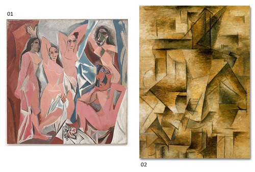 Examples of Cubism, a 20th century art movement. Above: (01) Les Demoiselles d’Avignon and (02) Le guitariste by Pablo Picasso. This is what design is: It’s art with expectations, patterns and consistency. It’s art meeting science.
Yes, it’s limiting, and yes, UI designers have to be trained to think inside the box a little. But get over it. You are a designer, not an artist.
If you want complete freedom and no friction between your creativity and your work, you are working in the wrong field. Artists can work to their whim, eschewing standards and refuting expectations, whereas designers gobble them up and abide by their every word. Market forces and trends influence designers far more than artists (with some notable exceptions like pop singers and freelance illustrators).
With web design, there are so many more things to take account of: your site goals, your brand, your users. These expectations shape every bit of web design, while art remains untouched.
Design and Aesthetics
Another important distinction to make is the difference between design and pure aesthetics.
While all design incorporates aesthetic — and truly, everything in the world has some form of aesthetic — some designs do it better than others. Take a look at Google’s home page: 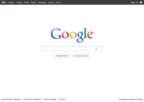 Google has looked like this (with the exception of few small changes throughout the years) since we can all remember. And it’s designed perfectly because it fulfills the expectations of the site’s users.
It looks nice without being obtrusive and obnoxious towards the user experience. Google, throughout all their websites, has mastered the difference between design and aesthetics. Although the term “aesthetics” has broad and varying definitions, I’m using it here to refer to “eye-candy.” Superficial designs that exist for the sake of beauty.
If we were to put it on a scale, I would say most art is near 100% aesthetics (which is not a bad thing, eye-candy can be meaningful too) and Google is somewhere around 5%. Your browser’s default style sheet is 0%. So this is something designers need to keep in mind: balancing form with function.
Function is at the heart of the Web. Almost everything we do online has a purpose and a meaning. We engage with web designs every day, and the good ones are usually more functional than they are beautiful.
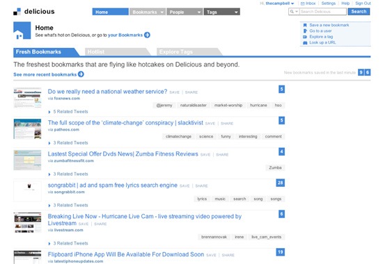
Below are some more designs with minimal eye-candy that are actually designed really well. Delicious does a great job of balancing their layout. Without getting too deep into eye-candy, they make a giant torrent of information manageable.
 Zen Habits has a super minimal site design, but it coincides perfectly with the content’s theme and goals.
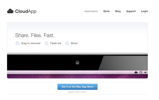
 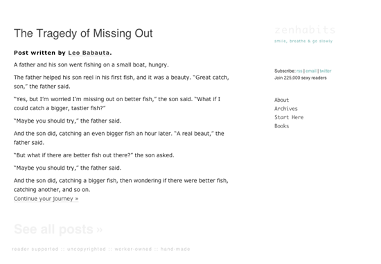 CloudApp is a little more visually exciting than the ones above, but the design is still subtle. This combination of minimalism and great use of visuals reflects the design of their product perfectly.
 These sites probably wouldn’t do so well in your favorite web design galleries. They’re not incredible to look at, and they won’t blow your mind. However, they do exactly what they are supposed to do: they provide their site visitors with tools and specific information in a logical order (using concepts like visual weight and gestaltism) and then they get out of your way.
And that is why they are so well-designed.
Expectations of a Design
The most important user expectation is that design should look like design. Website design should be immediately recognizable as at least one thing: not art.
Look at the screenshot below, taken from a Toyota minisite. 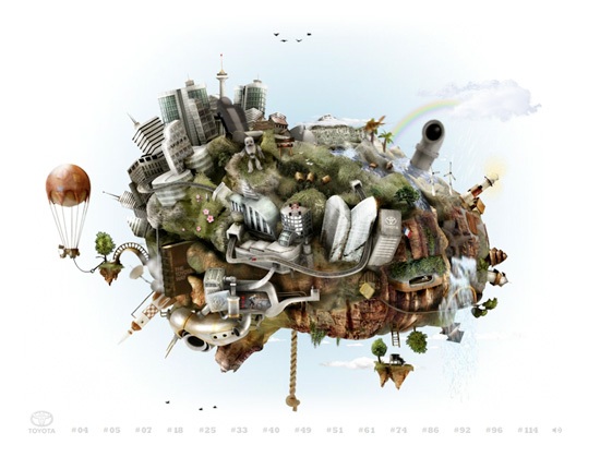 When I first visited the site, I didn’t know what its purpose was. After poking around a bit, it seems like some sort of way to promote new technology from Toyota, but there are a million better ways to do this.
It’s far from user-friendly and my expectations were shattered immediately. These expectations define user interactions on every site. We put site navigation and logos near the top of the design.
We provide common site components like search features, social media integration and web forms in a predictable way. Why? Not because this is an innate human expectation, but because design has evolved in such a way to foster and reinforce these standards.
Art and design aren’t mutually exclusive, even if there’s a clear line between the two. Beautiful sites can still be usable, and they can still surprise us without being disorienting. But there will always be noticeable constraints in web design that are bound by things such as technology limitations, accessibility, usability, site speed, and so on.
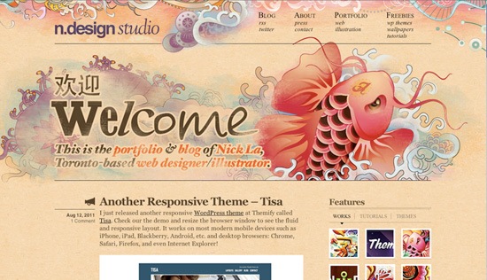 From N.Design Studio.
Objectives of Design
One of the great divides between art and design is the objective. John O’Nolan wrote on Webdesigner Depot:
Typically, the process of creating a work of art starts with nothing, a blank canvas. A work of art stems from a view or opinion or feeling that the artist holds within him or herself.
They create the art to share that feeling with others, to allow the viewers to relate to it, learn from it or be inspired by it. By contrast, when a designer sets out to create a new piece, they almost always have a fixed starting point, whether a message, an image, an idea or an action.
I will have to disagree with O’Nolan here: Artists, just like designers, sometimes start out with a message, idea or an action they want to motivate. Every work of art and design has a message, but each has its own agenda.
Art doesn’t need to be understood — it’s digested and interpreted differently by each viewer (another point O’Nolan brought up in his article, which I agree with). The accuracy of the statement that a piece of art makes is not always so important; artists often leave their work open-ended. On the other hand, design is meant to be understood and interpreted uniformly by everyone.
As I said before, it has to be consistent. Is this too limiting? It really isn’t.
The consistency that design requires is not aesthetic. It’s functional. That’s why it’s not important to have your design display exactly the same in every browser.
Although art is information in itself, web design is a gateway to information. That’s all the user cares about. So the consistency required on a website is only user-specific.
A user is rarely going to use Firefox and Internet Explorer to access the same website and be surprised by the inconsistency. Where the issue of consistency gets interesting is mobile design. But that’s a whole other story for another day.
Evolving from Art to Design
The face of the Web would be interesting if the unrestrained creativity allowed in the art world was also permitted in web design. But this isn’t the case, and as designers, we’re responsible for creating great design that meet user expectations and site objectives. Forget your newfangled CSS3, forget your jQuery for a while and get back to zero.
Here are some tips to separate your design from art:
- Balance usability and content. Although content precedes design, inaccessible content is useless.
- Always write code to a standard and follow best practices. The Web can only advance if we stick together and move forward as a whole.
- Even though the Web is full of limiting technology considerations, we can’t stop being creative. In fact, to push pass these barriers and expectations, we have to be even more imaginative than before.
- Start from scratch and keep it simple. Keep reductionism and minimalism in mind for clutter-free designs.
- And once you’ve mastered good design, keep pushing through and make it great.
Related Content
-
 President of WebFX. Bill has over 25 years of experience in the Internet marketing industry specializing in SEO, UX, information architecture, marketing automation and more. William’s background in scientific computing and education from Shippensburg and MIT provided the foundation for MarketingCloudFX and other key research and development projects at WebFX.
 -

WebFX is a full-service marketing agency with 1,100+ client reviews and a 4.9-star rating on Clutch! Find out how our expert team and revenue-accelerating tech can drive results for you! Learn more
Make estimating web design costs easy
Website design costs can be tricky to nail down. Get an instant estimate for a custom web design with our free website design cost calculator!
Try Our Free Web Design Cost Calculator
Share this article


Web Design Calculator
Use our free tool to get a free, instant quote in under 60 seconds.
View Web Design CalculatorMake estimating web design costs easy
Website design costs can be tricky to nail down. Get an instant estimate for a custom web design with our free website design cost calculator!
Try Our Free Web Design Cost Calculator


