- Home
- Blog
- Web Design Factors That Affect Usability
Factors That Affect Usability
-
 8 min. read
-
 William Craig
 CEO & Co-Founder
- President of WebFX. Bill has over 25 years of experience in the Internet marketing industry specializing in SEO, UX, information architecture, marketing automation and more. William’s background in scientific computing and education from Shippensburg and MIT provided the foundation for MarketingCloudFX and other key research and development projects at WebFX.
If trending topics surrounding design blogs are any reflection of trends in design, then usability is what coffee is to freelancers. Usability is a study of human-computer interaction that helps designers analyze our users’ patterns as they use our creations. While we cannot fully predict our users’ interactions, we are able to brace for them through how we style and place elements on our page.
 We are able to study these different patterns through our analysis of usability tests. Both qualitative (“word-based”) and quantitative (“number-based”) tests reveal to us that while users are concerned about design elements, they also want to get what they’re looking for quick. The more mistakes we let them make in the process, the more frustrated they get and less time they spend on our website.
As designers, we need to figure out what makes people stay on our websites, and more importantly, what makes people leave. Usability is a lot more than just using grid systems and focusing on what’s above the fold – there are sets of factors that play into how users will interact with websites, and today we’re here to analyze them and find out ways we can improve.
Page load time
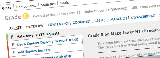 As one of the gurus of usability, Jakob Neilson, said in an interview, there are three rules for response times based on common human characteristics: “If it is faster than one tenth of a second, you don’t feel like you are waiting at all.
If it is more than one tenth of a second, you can tell you are waiting, but up to one second, it still feels like smooth navigation. Between one and ten seconds is the limit for your attention.” Web development has changed a lot even within the last ten years. There are more and more methods for us to cut down on page load times even for slower internet connections. Through using sprites, optimizing our images for the web, and reducing the amount of HTTP requests, we can greatly reduce our page load times and aim closer to that one-second mark.
Resources:
- Best Practices for Speeding Up Your Web Site – Yahoo! Developer Network
- CSS Sprites: Image Slicing’s Kiss of Death – A List Apart
- Clever JPEG Optimization Techniques – Smashing Magazine
- Yslow FireFox Extension – Yahoo! Developer Network
- 10 Ways to Improve Your Web Page Performance – WebFX
- Website Features That You Can Easily Offload – WebFX
Don’t judge a book by its cover…
 … doesn’t apply to web users. If anything, what’s above the fold of a website will greatly dictate whether a user ventures further.
While it’s proven that users are comfortable with scrolling down through pages to find out more about them (even long pages), make sure you cut off elements to remind them that there is more to see. Be clear with the purpose of your website, not only in your design, but also in your content. In fact, use Krug’s third law of usability and cut your content in half, then do it again.
Make sure your words are just as powerful as your design.
Resources:
- Krug’s 3 Laws of Usability
- Minimizing Complexity in User Interfaces (Smashing Magazine)
- The Myth of the Page Fold (cxpartners)
- Clear and Effective Communication in Web Design (Smashing Magazine)
- The Construction of Instruction (24 Ways)
Give users what they expect
While predictable isn’t always what we want to be for ourselves, being unpredictable in design doesn’t often work to our advantage. Stay conscious of where elements are usually placed on pages (search bar top-right hand corner of the page, branding at the top-left of the page, etc.), and try to keep elements in those places. Play on what your clients know, and don’t make them play a guessing game.
Following the norm in icon design is also useful for our users. They want to see the same symbols so they know what each one does. Printers, mail envelopes, and phones have expected results.
Don’t give users what they don’t expect.
Resources:
- Feed Icons
- Consistency in Design is the Wrong Approach – User Interface Engineering
Don’t sacrifice web accessibility
While usability and accessibility are two completely different topics, they often fall hand-in-hand with one another. While we make websites usable for the everyday user, accessibility is making it usable for users that aren’t able to interact with web pages like everyone else does. Some ways you can adhere to accessibility guidelines are through grammar and spell-checking your content, ensuring that this same content makes as much sense being read off the screen as it does being read back to you, not using deprecated tags in your markup, using relative font sizes, and using ALT tags.
Most of the time, when you’re creating accessible websites and following these tips, you’ll also be improving the usability of your website.
Resources:
- Checklist of Checkpoints for Web Content Accessibility Guidelines 1.0 – W3C
- CAPTCHAs: Tough on Sales & Common Way to Test User Tolerance – UX Booth
- An Idiot’s Guide to Accessible Website Design – Web Design Ledger
- 10 Simple Web Accessibility Tips You Can Do Today
Navigation
Navigation is one factor of web design where we can never fully anticipate our users’ reactions. A/B split testing and “Card Shuffle” testing can be very effective ways of analyzing our users’ behaviors and the paths they take to find what they’re looking for. In practice, we should aim to reduce redundancy in our links, create permalinks that are understandable and self-explanatory.
Another vital part to navigating through a website is a search function. If you have a search, make sure it works properly. Some sites have a “Quick Link” button now that works much like Google’s “Feeling Lucky” button, which can be very useful.
Resources:
- 10 UI Design Patterns You Should Be Paying Attention To – Smashing Magazine
Type, Type, Type
 Typography is another growing trend in design. While, of course, type has been along as far back as existence, there has been a lot of focus put on typography and what makes it readable lately. We need to make sure we set focus on some basic typographic elements such as line-heights, letter spacing, and (relative) font-sizes.
While having cool funky fonts is nice, we need to make sure that they’re legible more than anything else. This includes paying close attention to colors as well. We should already know how certain colors (and combinations of them) can attract certain feelings and emotions, however we need to make sure that these colors not only convey the emotions we want, but also make the font readable against what’s behind it.
Using font styles can also be useful in making users interested in reading content. Bolding and italicizing particular key words and phrases can be helpful in catching users’ attentions. Underlining elements should be restricted to links.
Resources:
- 10 Principles for Readable Web Typography – Smashing Magazine
- Type Inspired Interfaces – 24 Ways
- A Guide to Choosing Colors for Your Brand – Usability Post
Rebound from mistakes
As many have said before, the hardest part of our job isn’t designing how something looks when it works, but when designing elements for when they fail miserably. I’m not only talking about when your site has a 404 error, but this also goes for form errors. Make sure that if you made a mistake, you redirect your users to other “safe” places they can go, and if they made a mistake that you show them the problem and tell them how to fix it.
Resources:
- A More Useful 404 – A List Apart
- Effective Maintenance Pages: Examples and Best Practices – Smashing Magazine
- 404 Best Practices – CSS Tricks
Analytics: using it as a tool
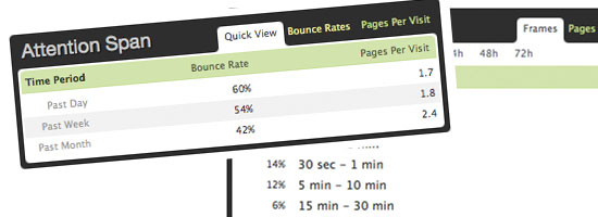 There is a saying that as usability experts, we should Test Early, Test Often (T.E.T.O.). Even if we don’t use one of the multitudes of web applications for usability testing, we can analyze the raw data our users produce for us through tools like Google Analytics and Mint. More importantly, we need to pay close attention to a few key functions that these tools produce for us.
First and foremost to effective analytics is understanding your users’ environment (e.g. what browser they’re using, what operating system they’re using, etc.). Second, pay attention to where your users are coming from.
Jakob Nielson states that there are four sources of our users:
- Low value referrers.
- Direct links from other sites.
- Loyal users.
- Search engines.
We need to analyze all this raw data based on these stats. These different sources will show users interacting with our websites in different, easily distinguishable patterns. While a loyal user will scan through every page and take their time with your website, those referred through search engines will likely be like a one-night stand – once they have what they want, they’ll get the hell out of there.
The trick is, of course, to reduce this from happening.
Resources:
- 5 Articles To Understanding Your Websites Bounce Rate
- Google Analytics
- Mint
Related Content
-
 President of WebFX. Bill has over 25 years of experience in the Internet marketing industry specializing in SEO, UX, information architecture, marketing automation and more. William’s background in scientific computing and education from Shippensburg and MIT provided the foundation for MarketingCloudFX and other key research and development projects at WebFX.
 -

WebFX is a full-service marketing agency with 1,100+ client reviews and a 4.9-star rating on Clutch! Find out how our expert team and revenue-accelerating tech can drive results for you! Learn more
Make estimating web design costs easy
Website design costs can be tricky to nail down. Get an instant estimate for a custom web design with our free website design cost calculator!
Try Our Free Web Design Cost Calculator

Web Design Calculator
Use our free tool to get a free, instant quote in under 60 seconds.
View Web Design CalculatorMake estimating web design costs easy
Website design costs can be tricky to nail down. Get an instant estimate for a custom web design with our free website design cost calculator!
Try Our Free Web Design Cost Calculator