

A fixed navigation bar, also referred to as a “sticky” navigation bar, is a toolbar that stays in place while the user is scrolling the web page. It’s a commonly-used site navigation design pattern for displaying a site’s main navigation menu, as well as other essential interface components such as a search box, social media buttons, and notifications. The design pattern guarantees that important interface components are easily viewable and accessible regardless of where the user currently is on a web page.
In this tutorial, I’ll walk you through a simple CSS technique for implementing a top horizontal fixed navigation bar.
Examples
Before we get started with the tutorial, it’s probably best if we look at some sites that have fixed navigation bars, just to make sure we’re on the same page, and to show you practical applications of the design pattern. Below are some examples of actual sites. Niice has a fixed navigation bar that contains a search box and the site’s navigation menu.
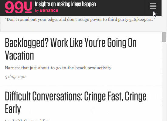
While you’re browsing designs for inspiration, you can rapidly filter them with minimal interruption to your experience simply by using the search box at the top of your screen. 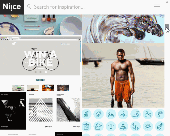 99U, an online publication, has a fixed navigation bar where the site’s navigation menu is seated. This gives users convenient access to the site’s menu at any point in the reading experience.
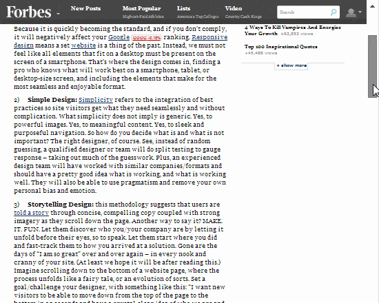
 The Forbes.com site employs a fixed navigation bar to make its menu, search feature, and login widget available anywhere in the reading experience. The fixed navigation bar helps people quickly jump to another article after they have completed reading the current article. The fixed navigation bar can have the potential to reduce bounce rates because users are constantly given a menu of other articles to read.
 As shown in the examples above, the navigation design pattern works well on web pages that have a lot of stuff. A fixed navigation bar is a good way of minimizing the delay and interruption caused by switching to a new task (searching the site, logging in, or moving to other sections of the site). The design pattern, in essence, enhances usability through the application of Fitts’ Law.
Creating a Fixed Navigation Bar
Now that we’ve looked at a handful of real-world applications for the fixed navigation bar design pattern, as well as briefly discussing how it can enhance usability, I’ll now show you a quick and easy implementation method that only requires HTML and CSS.
Here’s a demo page that you may want to explore and review first. 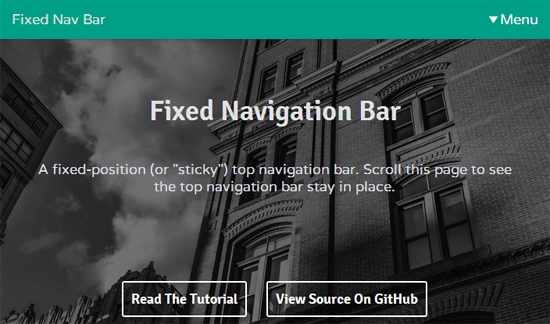 View Demo Download Source from GitHub View GitHub Repository
HTML
The markup required is very minimal, just a block-level element that will hold the contents of the fixed navigation bar.
<nav class="fixed-nav-bar"> <!-- Fixed navigation bar content --> </nav>
For semantics and enhanced interoperability-potential with third-party web services, like search engine robots interested in finding and understanding your website’s IA, a nav element is a good option here. The nav element also happens to be a block-level element by default, which saves us a line of CSS (icing on the cake).
However, if you’d rather not use the nav element, any block-level element will do, whether it’s a natural block-level element like a div or an inline element such as a span that’s assigned a display: block CSS property/value.
CSS
Here’s the style rule that makes the fixed navigation bar stay in place.
.fixed-nav-bar { position: fixed; top: 0; left: 0; z-index: 9999; width: 100%; height: 50px; background-color: #00a087; }Earlier, we gave our HTML element a class attribute of fixed-nav-bar so that we can apply the above style rule to it. The last three properties (width, height, and background-color) are variable; change their values according to your needs. Let’s talk about the four key CSS properties responsible for the magic in greater detail.
position: fixed;
Giving the position property a value of fixed positions the bar relative to the viewport.
This property declaration allows the bar to stay put even when the user is scrolling the document.
top: 0; left: 0; right: 0;
Setting the top, left, and right properties to 0 avoids unintended margins/padding at the top and the sides of the fixed navigation bar. Tip: If you’d rather have a fixed bar that’s persistently at the bottom of the viewport, which is another common design pattern, simply change top: 0 to bottom: 0.
z-index: 9999;
An unusually high z-index value is used to significantly reduce the possibility that an HTML element is rendered on top of the fixed navigation bar, as long as there are no other z-index values higher than 9999. That’s all there is to it.
Note
In the demo, there’s also a very rudimentary CSS-only responsive navigation menu.
This menu is only a proof-of-concept, and it’s not production-ready. Since the focus of this tutorial is on building a fixed navigation bar, which can hold different types of menus and other interface components, I won’t be discussing that portion of the demo. I’ll just let you explore the source code if you’d like to see how that part of the demo works (if you’re having trouble or if you have questions about it, just send me a tweet and I’ll be happy to help out).
Wrapping Up
A fixed navigation bar is simple to implement.
It requires minimal HTML markup and only a few CSS properties that you’re already familiar with. The method discussed in this tutorial has excellent browser compatibility because it only uses tried-and-true CSS, and can thus be rendered properly even in some of the most ancient web browsers. However, if backwards-compatibility is important to your projects, then you may decide to replace the nav element (which is an HTML5 element) to a div.
In the proper context, a fixed navigation bar can improve usability and UX because it reduces the delay between switching to a new task. It therefore increases the affordance of the UI components within it, compared to the traditional top horizontal navigation bar that requires scrolling back up to the top of the web page.
Related Content
-
 President of WebFX. Bill has over 25 years of experience in the Internet marketing industry specializing in SEO, UX, information architecture, marketing automation and more. William’s background in scientific computing and education from Shippensburg and MIT provided the foundation for MarketingCloudFX and other key research and development projects at WebFX.
 -

WebFX is a full-service marketing agency with 1,100+ client reviews and a 4.9-star rating on Clutch! Find out how our expert team and revenue-accelerating tech can drive results for you! Learn more
Make estimating web design costs easy
Website design costs can be tricky to nail down. Get an instant estimate for a custom web design with our free website design cost calculator!
Try Our Free Web Design Cost Calculator
Share this article


Web Design Calculator
Use our free tool to get a free, instant quote in under 60 seconds.
View Web Design CalculatorMake estimating web design costs easy
Website design costs can be tricky to nail down. Get an instant estimate for a custom web design with our free website design cost calculator!
Try Our Free Web Design Cost Calculator


