

One of the first design considerations a web designer has to make is the resolution that the project is going to be built in. Will the site be optimized for 800×600 systems? 1024?
Will the width be fluid or fixed? Will it work for mobile devices? There are certainly a lot more screen resolutions to consider now than there were just a few years ago.
There are quite a lot of articles written about designing small for mobile devices, but what about the largest common resolution; High Definition (commonly referred to as HD or High-Def)? This article is going to show you a process for making your site work for multiple resolutions by using a real-world case study: Debut Creative. Granted, you can use this without dealing with HD resolutions, but why not go extreme?
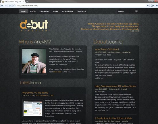
Debut Creative was recently designed to work in HD.
Introduction
HD has been getting more consumer use over the last couple of years with the ever-decreasing price points of Hi-Def television sets.
They are not only easy to hook up to HD-capable computers, but also, modern gaming devices like the Wii, Playstation 3, and Xbox 360 also have internet-enabled browsers which can be used to browse the web. The time has come to consider designing for this popular format. As over-the-top as HD web design seems, I recently designed my site, Debut Creative, for 1920×1080 viewing (currently the site layout is actually optimized for 1024, but the background frames it nicely for HD).
There are a few serious considerations to make before building a site for 1920 screen resolutions, even if it is just the background.
Some Issues with supporting HD
File sizes is a major consideration. By the very definition of an HD site, any background image that spans the full 1920×1080 will be massive (two megapixels by definition). By extension, unless properly addressed, these large sizes could lead to needless bandwidth consumption for users who don’t need the full HD experience.
From a design perspective, I wanted my background gradient to frame the content nicely with the darkest edges coming in around the edge of the full-screen browser. Having one background that frames it in this way for HD would be inadequate for any smaller browser. 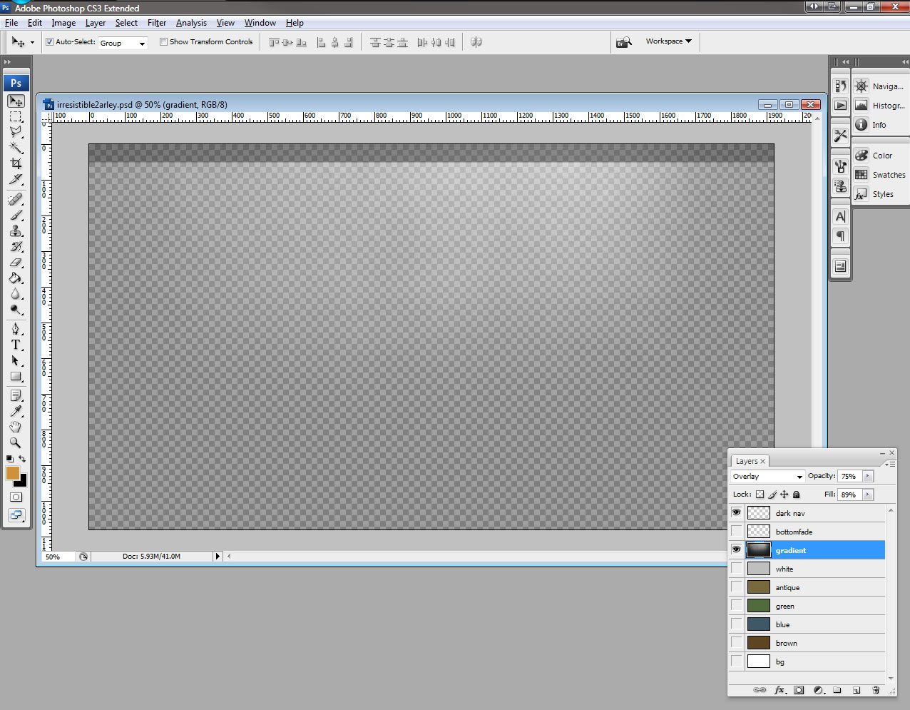
In Photoshop, all that is visible is the gradient layer that we want sized to the edges of different resolutions.
Click on the image to see full-scale version. The solution is simple; a JavaScript resolution sniffer with dynamic background image calls. Before we get to that, let’s talk about preparing images for HD.
The Image
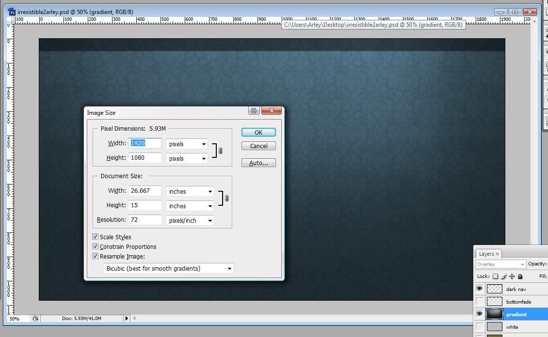
The first step is preparing your background image in Photoshop (or an equivalently capable image editor). I began with an HD background (1920x1080px).
In addition to my framing gradient, I added a layer of a heavily feathered brush stroke to make certain the background pattern faded to solid nicely so my pages background color can take over where this image ends. When you have your background ready for HD: save it (and maybe make a backup copy). We’ll soon be cropping and removing lots from it!
HD Resolution at 1920x1080px. Click on image to see full-scale version. To save web and mobile device optimized images, Photoshop has a feature called Save for Web & Devices (Ctrl+Alt+Shift+S). I played with the settings here to optimize this huge image as best as I can.
I settled on saving it as an optimized JPG with quality at 53%, and I was able to get the image down to 111KB. This would be a painful 21-second download for a typical dial-up connection (for just the background image), but a manageable 5 seconds for the average DSL user. I’m OK with that.
Give your file a meaningful name like bg1920.jpg. 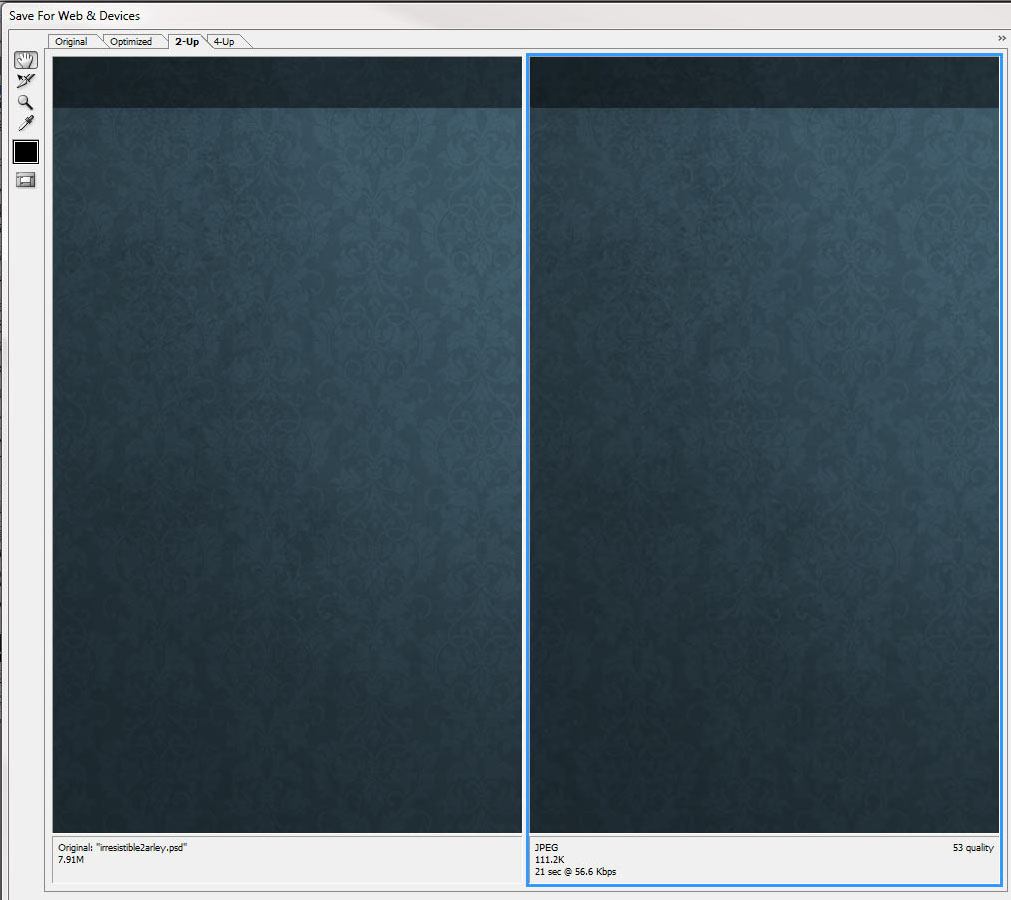
Save for Web & Devices optimization allows you to compare compression sizes. Click image to see full-scale version. Now we’re going to repeat the steps for the other common resolutions.
This is a great time to get into some keyboard shortcuts to blaze through the process. Here’s my play-by-play sequence for Photoshop for this example (some of the more ingenious designers out there may consider recording Photoshop Actions to streamline this process). You’ll note I use Canvas Size to alter only the width.
Changing the height as well would cause my navigation bar to become too short. Depending on your layout you maybe want to do Image Size which scales the image entirely (Ctrl+Alt+I).
First, I click on my gradient layer (the layer I’ll need to adjust with every resolution size). Then it’s a simple process of:
#1 – Ctrl+Alt+C to open the Canvas Size option box
#2 – Tab twice to get into the Width field
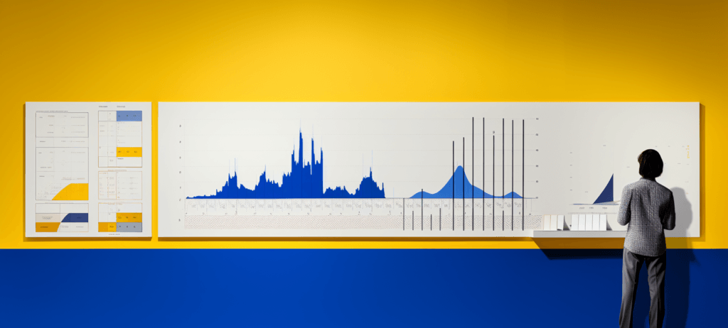
#3 – Enter the width (widths the resolution sniffer will use include 1920, 1600, 1440, 1280, 1152, 1024, 800, 640. For common mobile resolutions, check out the List of common resolutions on Wikipedia.
#4 – Press the Enter key twice to confirm cropping and close the Canvas option box
#5 – Ctrl+T to activate the Free Transform feature for the active layer.
#6 – Hold down Alt and horizontally resize the edge of the gradient in to the new edge: Holding Alt makes the resize mirrored. It should snap to the edge of the document.
#7 – Press the Enter key to finish and render the transformation.
#8 – Ctrl+Alt+Shift+S to open the Save for Web & Devices option
#9 – Press the Enter key (the settings should be the same as last time) to save.
#10 – Name the file in the same convention used for your first file.
#11 – Press the Enter key to finish saving the file
Repeat!
You should now have a snazzy folder full of images. Since my web layout is set for 1024, I’m not going to use the smaller files; however, I am going to make a bg0.jpg that is a gradient-less and tile-ready version of my background that is a few hundred pixels square.
This may be useful for mobile surfers. 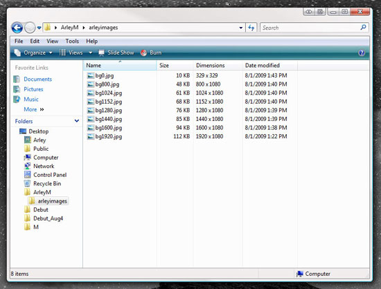
When finished, you should have a folder of well named images of various size.
The JavaScript
Now that we have all of our images, we are ready to call them dynamically into our site. The following script works well with multiple monitor systems as well.
Usually when it gets the screen.width value, it is detecting the width of your primary browser, not the resolution of your entire desktop. Some browsers may detect the screen that it is in. Place the following call to the JS file after the <body> tag (placing it in the head will call the background before your CSS which may cause it not to render).
<script src="http://yourdomain.com/scripts/sniffer.js" type="text/javascript"></script>
Or if you’re using a theme like WordPress:
<script src="http://yourdomain.com/wp-content/themes/themename/sniffer.js" type="text/javascript"></script>
Now, naturally you’ll need the JavaScript.
What the JavaScript resolution sniffer does is detect the screen.width and apply the appropriate CSS image backgrounds.
Some notes
I use “greater than or equal to” (>=) conditional operator to cover strange resolutions that might come across the site/ There is a “less than or equal to” (<=) operator for resolutions less than 799px. This should cover some netbooks and mobiles with smaller resolution. This example just switches the HD background for my 1024px ready site – however, you could modify the code to call completely different stylesheets to change even the layout to work in different resolutions.
The code
/* Resolution Sniffer / Dynamic CSS Loader - HD | via Arley McBlain */ /* Common Computer Screens: 640,800,1024,1152,1280,1440,1600,and HD 1920 */ // File path to background images folder var bgFolder = ''; if (screen.width>=1920){ document['body'].style.backgroundImage='url('+bgFolder+'bg1920.jpg)'; document['body'].style.backgroundRepeat='repeat-x'; } else if (screen.width>=1600){ document['body'].style.background='url('+bgFolder+'bg1600.jpg)'; document['body'].style.backgroundRepeat='repeat-x'; } else if (screen.width>=1440){ document['body'].style.background='url('+bgFolder+'bg1440.jpg)'; document['body'].style.backgroundRepeat='repeat-x'; } else if (screen.width>=1280){ document['body'].style.background='url('+bgFolder+'bg1280.jpg)'; document['body'].style.backgroundRepeat='repeat-x'; } else if (screen.width>=1152){ document['body'].style.background='url('+bgFolder+'bg1152.jpg)'; document['body'].style.backgroundRepeat='repeat-x'; } else if (screen.width>=1024){ document['body'].style.background='url('+bgFolder+'bg1024.jpg)'; document['body'].style.backgroundRepeat='repeat-x'; } // Optional/* else if (screen.width>=800){ document['body'].style.background='url('+bgFolder+'bg800.jpg)'; document['body'].style.backgroundRepeat='repeat-x'; } */ else if (screen.width<=799){ document['body'].style.backgroundImage='url('+bgFolder+'bg0.jpg)'; document['body'].style.backgroundRepeat='repeat'; } else { document['body'].style.backgroundImage='url('+bgFolder+'bg1024.jpg)'; document['body'].style.backgroundRepeat='repeat-x'; }The CSS
Finally, you might need to tweak your CSS.
Simply forcing the background image to change might make your background color change to white automatically. Adding !important to your background classes that you don’t want to include in your JS file will force them to work.
body { background-color: #1a1c1c !important; background-position: center 0 !important; }Testing
So is it working? Change your desktop resolution and refresh your site.
If you have a multiple monitor system you’ll only have to change the resolution of the primary monitor to test, regardless of what monitor the browser is in. If you want to test it on an HD set that is hooked up to your computer you may have to set this as your primary monitor.
Download
Download the script used in this article below and feel free to use on your own sites (you’ll have to modify it).
- sniffer.zip (1KB, ZIP)
Summary
We certainly have some time before HD websites become something in demand. It’s kind of rewarding being on the bleeding edge though right?
Related Content
-
 President of WebFX. Bill has over 25 years of experience in the Internet marketing industry specializing in SEO, UX, information architecture, marketing automation and more. William’s background in scientific computing and education from Shippensburg and MIT provided the foundation for MarketingCloudFX and other key research and development projects at WebFX.
 -

WebFX is a full-service marketing agency with 1,100+ client reviews and a 4.9-star rating on Clutch! Find out how our expert team and revenue-accelerating tech can drive results for you! Learn more
Make estimating web design costs easy
Website design costs can be tricky to nail down. Get an instant estimate for a custom web design with our free website design cost calculator!
Try Our Free Web Design Cost Calculator
Share this article


Web Design Calculator
Use our free tool to get a free, instant quote in under 60 seconds.
View Web Design CalculatorMake estimating web design costs easy
Website design costs can be tricky to nail down. Get an instant estimate for a custom web design with our free website design cost calculator!
Try Our Free Web Design Cost Calculator