
When someone signs up on your website, or downloads your software, or installs your mobile app, it doesn’t immediately mean the person has already decided to use it. You have a small window of opportunity to quickly introduce your app’s key features and teach a first-time user how the app works. The process of familiarizing a new user to your app is called onboarding. Onboarding accomplishes these two things in the most efficient way possible:
- Present the key benefits of using the app (the app’s value proposition)
- Teach the app’s main features so new users can use the app immediately
General Onboarding Concepts
- Onboarding generally starts as soon as the new user launches the app.
- The onboarding process should be short because you want the user engaging with the app as quickly as possible.
- Onboarding should only focus on the most important characteristics of the app.
Next, I will go over four common techniques used in onboarding and discuss some real-world examples that employ each technique.
Onboarding Technique: Tutorial
A common technique used in an onboarding process is presenting a short tutorial before bringing the new user into the app’s UI. The tutorial is generally a sequential flow of static screens displaying the app’s key features and benefits.
Examples of the Tutorial Technique
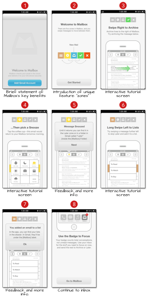
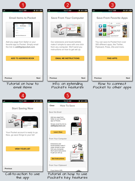
Mailbox Mailbox uses an interactive tutorial for the onboarding process so that new users can rapidly see the app’s unique features and learn how to use it.  Notice how the onboarding process doesn’t go into every single detail of the app; it only highlights and teaches you the app’s core benefits and features. Pocket Pocket’s onboarding experience is a series of static screens that demonstrate how to use the app.
Onboarding Technique: Walkthrough
Walkthroughs ensure that you avoid the blank slate problem by prompting users to fill out some necessary information in order for them to start using the app. The downside with walkthroughs is that they are generally very rigid. The user can’t explore the interface without first completing the walkthrough.
Thus, walkthroughs should conclude quickly or else you risk the possibility of having the user walk away from the app.
Examples of the Walkthrough Technique
Tumblr Upon first interacting with Tumblr, the new user is prompted to input important information to ensure a customized user experience. 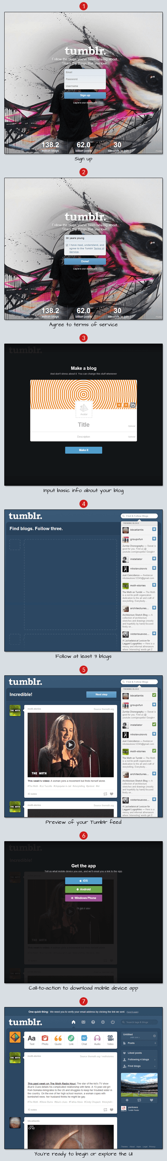 Pulse Pulse has a shorter walkthrough than Tumblr because it only needs new users to choose their interests.
After the walkthrough, you’re free to explore the app by yourself. 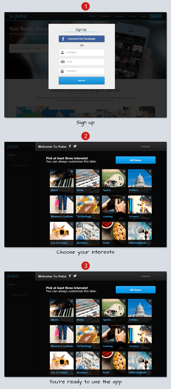 What’s important to note is that the walkthroughs above are as short as possible; they only gather information that’s needed.
Onboarding Technique: Screen Overlay
Another popular technique used in the onboarding process is to draw attention to a key element of the UI and then providing helpful information about it. The rest of the UI is deemphasized so that the focus is on the particular element being highlighted.
Related article:The Art of Distinction in Web Design shares concepts and strategies for drawing the user’s attention towards certain elements of a web page. Unlike the tutorial or walkthrough techniques, screen overlays allow you to get users immediately inside the app after they sign in without having to present any preliminary screens. With screen overlays, you can guide the user’s attention to the most important features, but you can also give them the option to explore the app on their own.
Example of the Screen Overlay Technique
Fitocracy Fitocracy is a community-oriented app that helps you track your workouts.
Though there are a lot of features in this app, the onboarding experience focuses only on a handful of key features, leaving it up to the user to discover everything else later on. 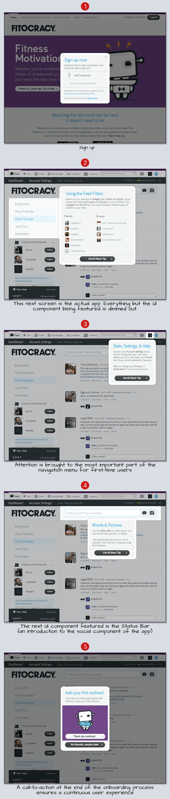
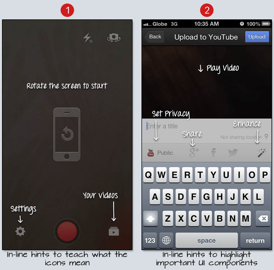
Onboarding Technique: Inline Hinting
Another technique you can use when onboarding a new user is to display hints while the person is exploring the app. When they reach something that deserves more explanation, they are presented with useful information about it — a concept called progressive disclosure. Inline hinting can give your users freedom to explore the app on their own and is not as obtrusive as other onboarding techniques.
Example of the Inline Hinting Technique
YouTube Capture The onboarding experience of YouTube Capture starts with a quick tutorial. Then it uses inline hints to teach you the app’s UI. It’s a simple app and so progressive disclosure works very effectively in this case.
Conclusion
It’s important to note that you can use a combination of these techniques to craft your onboarding process. For example, you can start with a tutorial and then proceed to screen overlays and inline hinting when the user starts exploring and interacting with the app. Onboarding is not always necessary. Many apps are so simple that an onboarding process is a burden for the user.
Take for example a flashlight app: 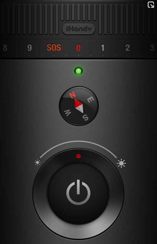 The flashlight app above has only one function and one major UI element (a really big on/off button). Thus, an onboarding experience will only serve to slow down the user’s experience in this instance.
Other Articles on Onboarding
- Onboarding Examples (uxarchive.com)
- Onboarding: Designing Welcoming First Experiences (uxmag.com)
- Principles of Onboarding (slideshare.net)
- A Lesson in Gradual Engagement (uxbooth.com)
- Onboarding: The First, Best Chance to Make a Repeat Customer (justin-singer.com)
- Dropbox’s Onboarding Brilliance (theindustry.cc)
Related Content
-
 President of WebFX. Bill has over 25 years of experience in the Internet marketing industry specializing in SEO, UX, information architecture, marketing automation and more. William’s background in scientific computing and education from Shippensburg and MIT provided the foundation for MarketingCloudFX and other key research and development projects at WebFX.
 -

WebFX is a full-service marketing agency with 1,100+ client reviews and a 4.9-star rating on Clutch! Find out how our expert team and revenue-accelerating tech can drive results for you! Learn more
Make estimating web design costs easy
Website design costs can be tricky to nail down. Get an instant estimate for a custom web design with our free website design cost calculator!
Try Our Free Web Design Cost Calculator
Share this article


Web Design Calculator
Use our free tool to get a free, instant quote in under 60 seconds.
View Web Design CalculatorMake estimating web design costs easy
Website design costs can be tricky to nail down. Get an instant estimate for a custom web design with our free website design cost calculator!
Try Our Free Web Design Cost Calculator


