- Home
- Blog
- Web Design Pastel Colors in Stationery Designs Look Fantastic
Pastel Colors in Stationery Designs Look Fantastic
-
 7 min. read
-
 Trevin Shirey
 VP of Marketing
- Trevin serves as the VP of Marketing at WebFX. He has worked on over 450 marketing campaigns and has been building websites for over 25 years. His work has been featured by Search Engine Land, USA Today, Fast Company and Inc.
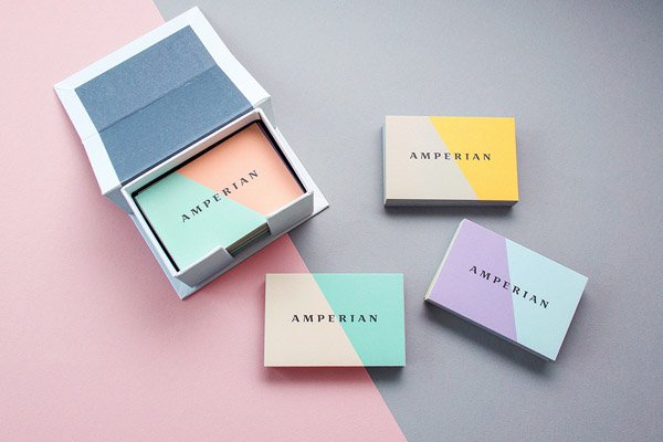
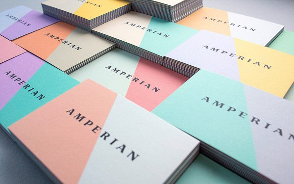
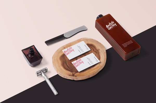
Pastels are often seen as milky or desaturated and has a soft contrast. These properties often gives designs an ethereal and soft aesthetic that is very difficult to schieve in fully saturated color palettes. Pastels are subtler and softer and quieter.
Have a look at some great stationery designs we found by some great designers. You might find these inspiring for your next design projects.
Amperian by UFHO
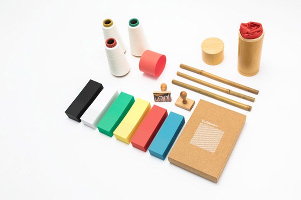
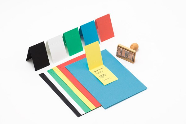
Badaboom
Leader Branding and Identity by Lotta Niemenen
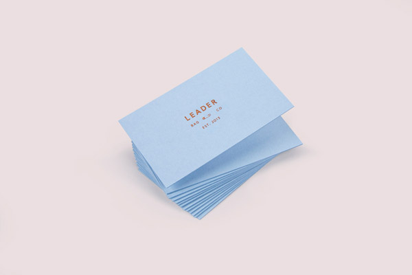
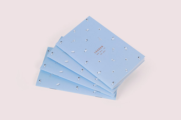
La Plata by Anagrama
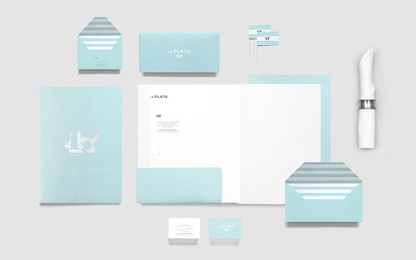
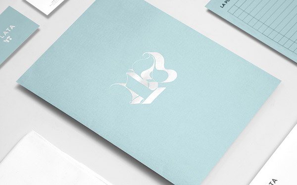
Capicua Branding and Identity by Anagrama
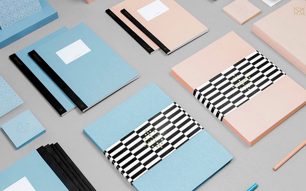
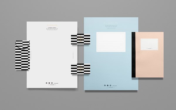
Maeven by Lotta Niemenen
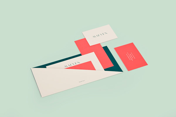
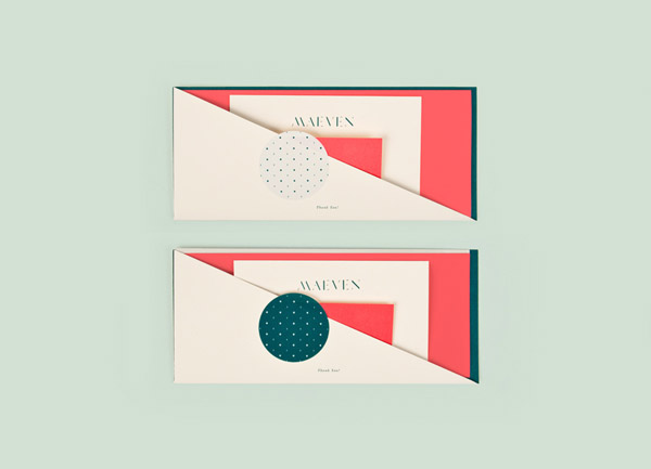
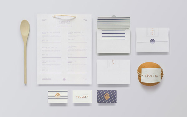
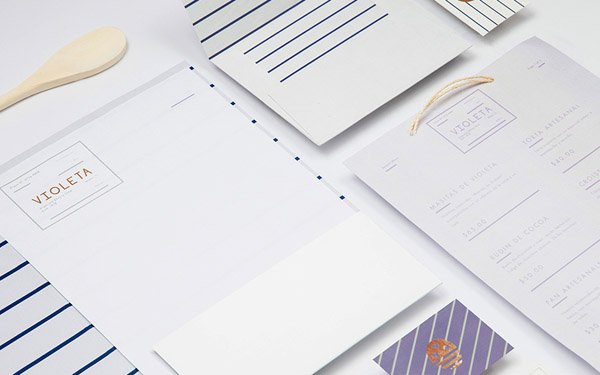
La Violeta by Anagrama
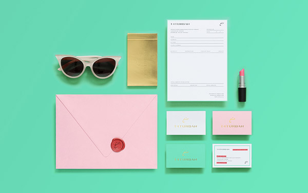
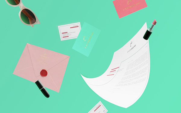
T4 Turban by Anagrama
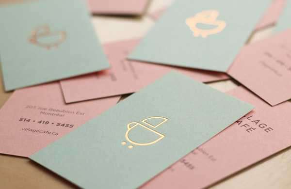
Village Coffee by Studio Caserne
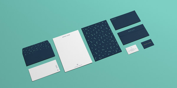
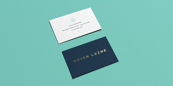
Woven Laine by Studio Mast
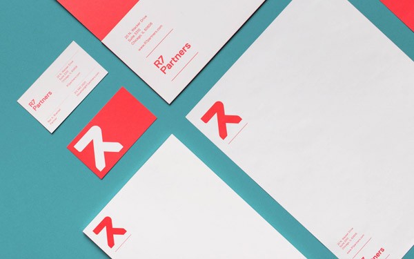
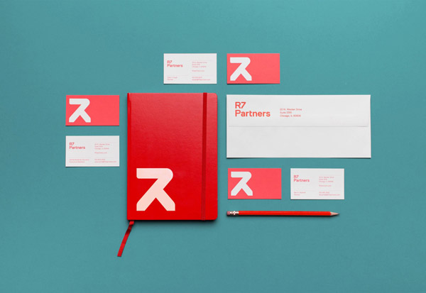
R7 Partners by Studio Mast
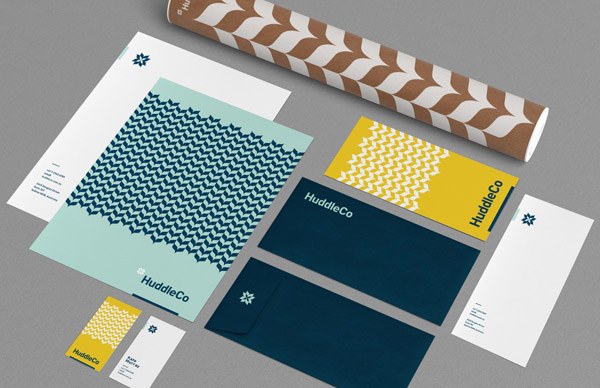
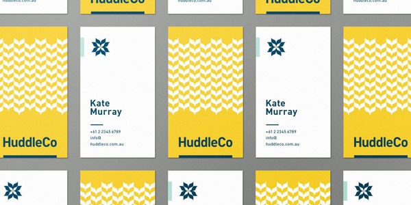
Huddle Co by Studio Mast
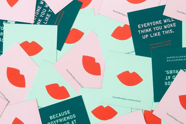
Beautified by Lotta Niemenen
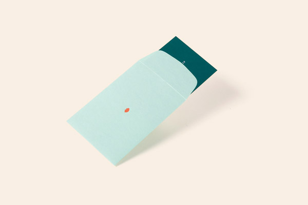
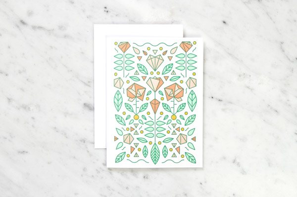
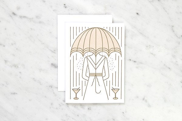
Chippd Greeting Cards by Verena Michelitsch
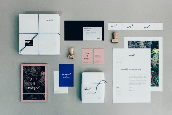
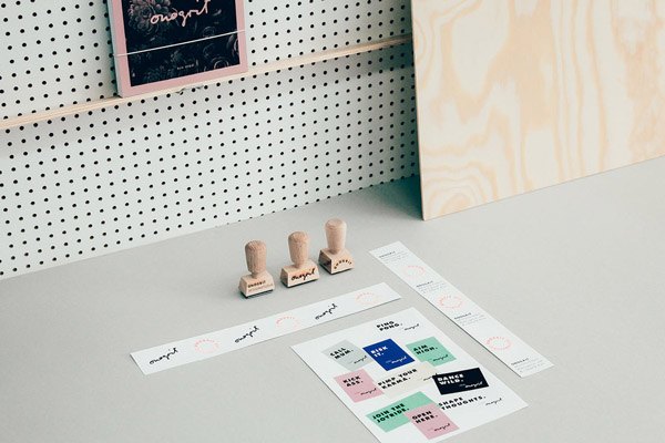
Onogrit Branding and Identity by Onogrit
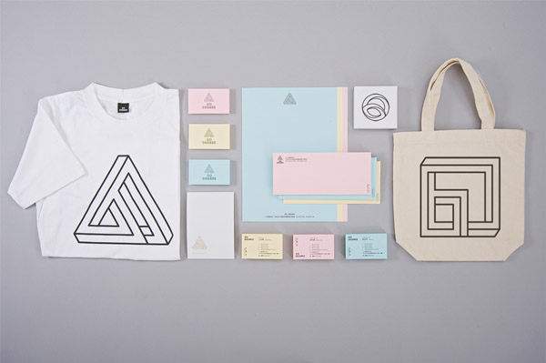
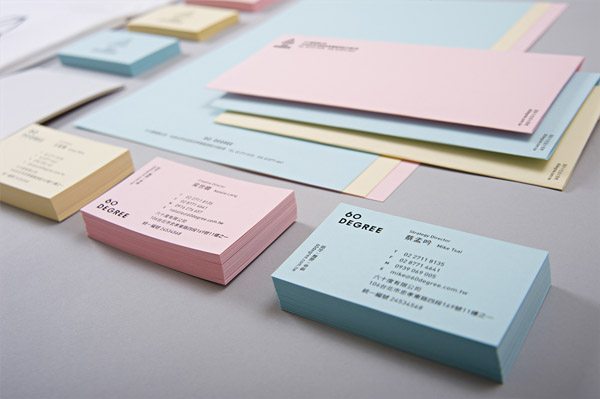
60 Degree
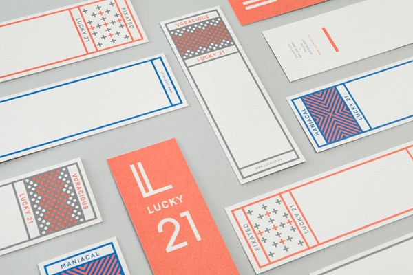
Lucky 21 by Blok Design
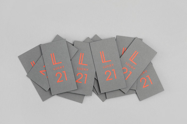
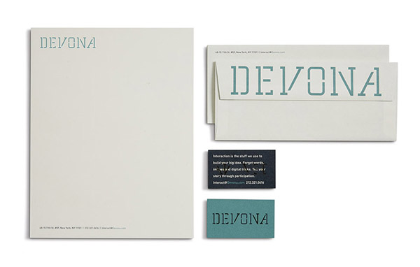
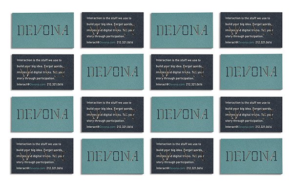
Devona by Hinterland
Holiday Cards by Joseph Veazey
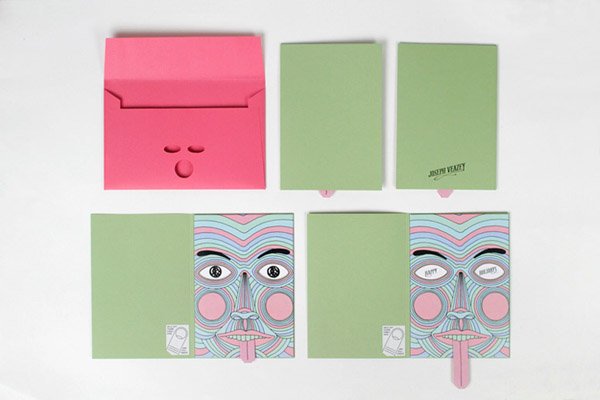
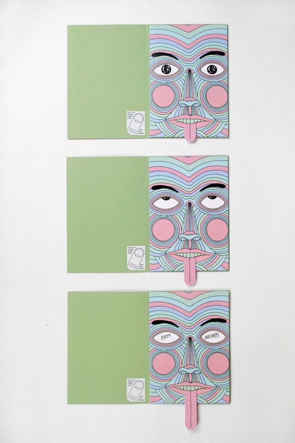
Andree Daisley by Sebastian Bednarek
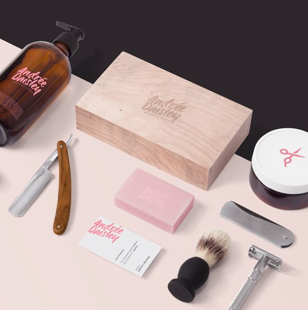
-
 Trevin serves as the VP of Marketing at WebFX. He has worked on over 450 marketing campaigns and has been building websites for over 25 years. His work has been featured by Search Engine Land, USA Today, Fast Company and Inc.
 -

WebFX is a full-service marketing agency with 1,100+ client reviews and a 4.9-star rating on Clutch! Find out how our expert team and revenue-accelerating tech can drive results for you! Learn more
Make estimating web design costs easy
Website design costs can be tricky to nail down. Get an instant estimate for a custom web design with our free website design cost calculator!
Try Our Free Web Design Cost Calculator
Table of Contents
- Amperian by UFHO
- Badaboom
- Leader Branding and Identity by Lotta Niemenen
- La Plata by Anagrama
- Capicua Branding and Identity by Anagrama
- Maeven by Lotta Niemenen
- La Violeta by Anagrama
- T4 Turban by Anagrama
- Village Coffee by Studio Caserne
- Woven Laine by Studio Mast
- R7 Partners by Studio Mast
- Huddle Co by Studio Mast
- Beautified by Lotta Niemenen
- Chippd Greeting Cards by Verena Michelitsch
- Onogrit Branding and Identity by Onogrit
- 60 Degree
- Lucky 21 by Blok Design
- Devona by Hinterland
- Holiday Cards by Joseph Veazey
- Andree Daisley by Sebastian Bednarek


Web Design Calculator
Use our free tool to get a free, instant quote in under 60 seconds.
View Web Design CalculatorMake estimating web design costs easy
Website design costs can be tricky to nail down. Get an instant estimate for a custom web design with our free website design cost calculator!
Try Our Free Web Design Cost Calculator

