
This web design tutorial will show you the process of developing a PSD mockup of a clean and simple blog layout. We will be creating the design of the front page of the blog. The next part of this tutorial will walk you through coding the PSD to HTML/CSS.
Elegant and Simple Blog Web Layout Tutorial Series
This tutorial is the first part of a two-part tutorial series.
This part (Part 1) deals with how to build the mockup in Photoshop, while in the next tutorial (Part 2) you will be shown how to create an HTML/CSS web template for the PSD design.
- Part 1:Make an Elegant and Simple Blog Web Layout Using Photoshop
- Part 2: PSD/HTML Conversion: Elegant and Simple CSS3 Web Layout (*coming soon)
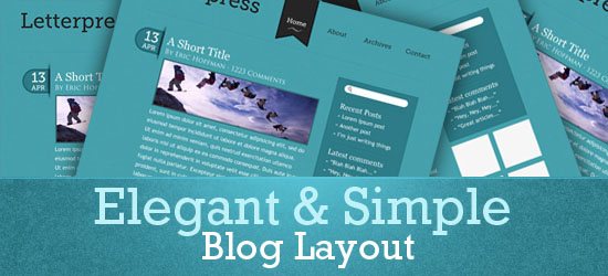
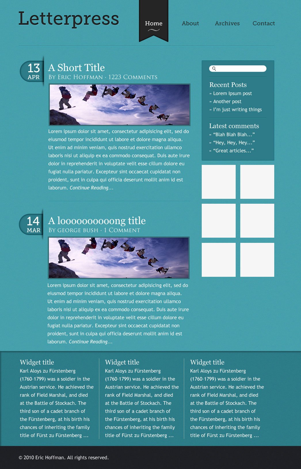
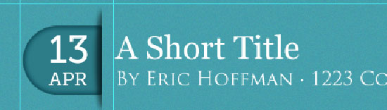
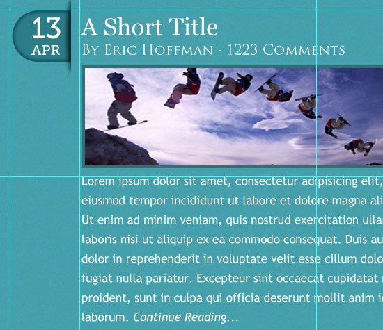
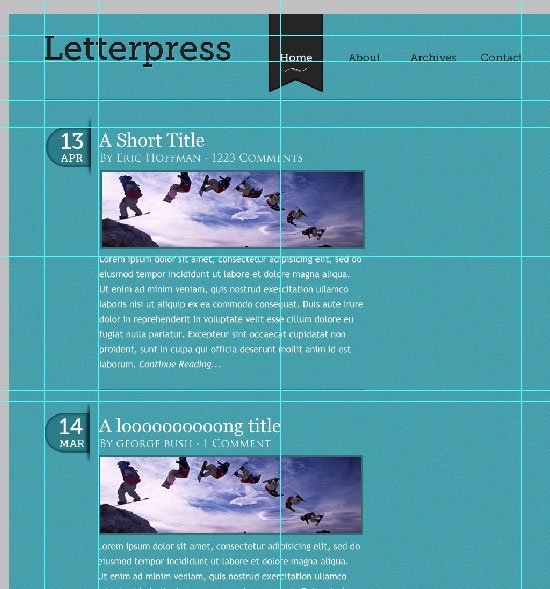
Final Result
Click on the image below to see the work in full scale.
Create a New Photoshop Document
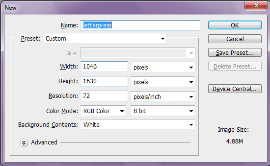
1 Let’s get straight to work. First, open Adobe Photoshop (quite obviously). I’m using CS4, but other CS versions will work just fine.
Begin by creating a new document (Ctrl/Cmd + N); make the document 1046px by 1630px with a white background.
Create the Background
2 The default Background layer of your new Photoshop document will be locked and un-editable; we need to do something about that. Double-click on the Background layer’s thumbnail in the Layers Panel; this will open the New Layer dialog window, just press the OK button to make the layer editable.
3 Now Ctrl/Cmd + click on the Background layer’s thumbnail (by default, Photoshop renames it to Layer 0) in the Layers Panel to place a selection around the canvas.
4 Set your Background color in the Tools panel to a blue color (#45a0ac) and press Ctrl/Cmd + Backspace, which is the keyboard shortcut for filling a selection with the Background color.
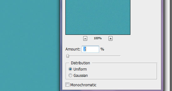
5 Your background layer should now be a dark shade of blue. Choose Filter > Noise > Add Noise while the Background layer is still selected.
Change the Amount to 2% and then apply the filter.
Set Some Initial Photoshop Guides
6 To help keep our work aligned, set three vertical guides (View > New Guide) at the following locations: 60.5px, 505px and 955px.
Tip: Toggle the visibility of your Photoshop guides on and off by pressing Ctrl/Cmd + ;.
7 Also set a horizontal guide at 40px.
Add the Blog Name
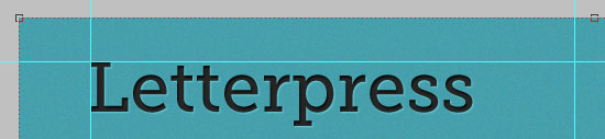
8 Select the Horizontal Type Tool (T) in the Tools Panel, then type your blog’s name on the top left side. In this case, I used the Museo Slab 500 sized big at 65pt. The text color should be a dark gray (#252525) to create a good but subtle contrast with our dark blue background.
By the way, you can set all these type options in the Options Bar when you have selected the Horizontal Type Tool.
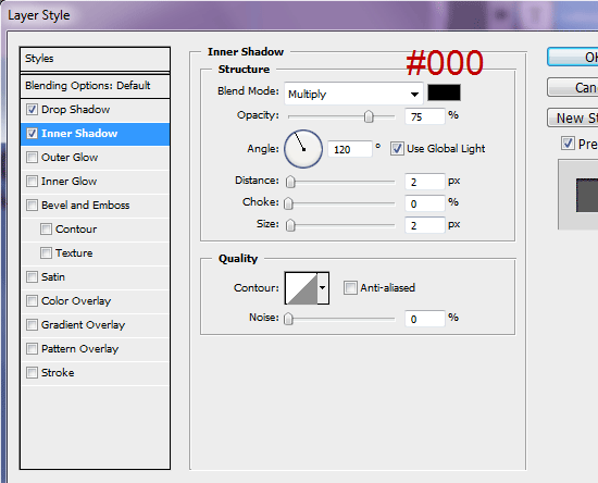
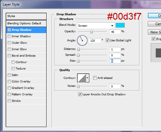
9 Double-click on the type layer of your blog’s name in the Layers Panel to access the Layer Styles dialog window. Apply a Drop Shadow layer style and Inner Shadow layer style to give the text a letterpress/inset typography look.
Change the drop shadow’s color to light blue (#3f9cb0), the Blend Mode to Screen, and the Distance and Size to 1px.
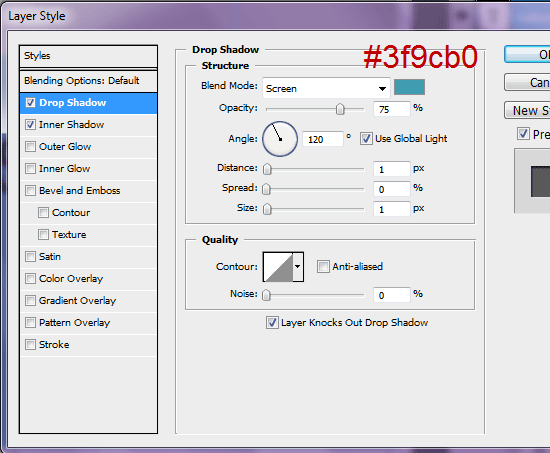
Change the Inner Shadow’s Distance and Size to 2px.
10 Align the text to the guides as I have done using the Move Tool (V) to position your text.
Add Main Navigation Menu Links
11 Using the Horizontal Type Tool again, create four (separate) navigation bar links using the same font as before, but this time, reduce the font size to 20pt. Type them out in separate layers. In this tutorial, the menu items are “Home”, “About”, “Archives”, and “Contact”.
12 Align the 4th navigation bar link (“Contact”) with the guide to the far right, and the first navigation bar link (“Home”) with the guide right of the blog name.
The other two links should be somewhere in between them.
13 To align them perfectly, select all 4 layers in the Layers Panel. Then choose Layer > Align > Vertical.
14 To make the navigation bar links have equal spacing in between them, select all 4 layers in the Layers Panel and then choose Layer > Distribute > Horizontal Centers.
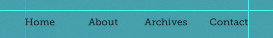
15 Add a Horizontal guide (View > New Guide) at 88px and move the links with the Move Tool (V) so that the text rests on the guide.
Create the Active Navigation Menu Link Background
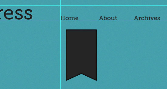
16 We will highlight the page the user is on with a different background, text color, and shape. The background will be shaped sort of like a “bookmark” (which gives our layout some form of visual semantics).
I’ll show you how to create this “bookmark” shape. First, create a new layer (name the layer as “linkbg”). Select the Rectangular Marquee Tool (M) from the Tools Panel.
In the Options Bar of the Rectangular Marquee Tool, change the Style option to Fixed Size and then set the Width option to 100px and Height option 148px. Place your marquee selection on the canvas somewhere around our navigation menu bar.
17 Change your Background color to our dark gray (#252525) and press Ctrl/Cmd + Backspace to fill the rectangular shape.
18 Now select the Custom Shape Tool (U) and set the Shape option in the Options Bar to Arrow 2 (which is a prepackaged custom shape that comes with Photoshop).
19 Draw the arrow on your canvas with the Custom Shape Tool and then select its layer in the Layers Panel so that you can rotate it to point up (Edit > Transform > 90o CCW).
20 Right-click on the arrow layer and choose Rasterize Layer to convert it to a normal layer.
21 In the Layers Panel, modify the layer stacking order and make sure that the arrow layer is above the gray “linkbg” layer.
22 Select both the arrow layer and “linkbg” layer in the Layers Panel, then choose Layer > Align > Horizontal Centers.
23 Ctrl/Cmd + click on the thumbnail of the arrow layer in the Layers Panel to place a selection around the arrow, switch to the “linkbg” layer, and then press Backspace or Delete to delete the area below the arrow selection.
After this, you don’t need the arrow layer anymore, so you can delete the layer.
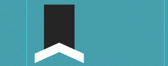
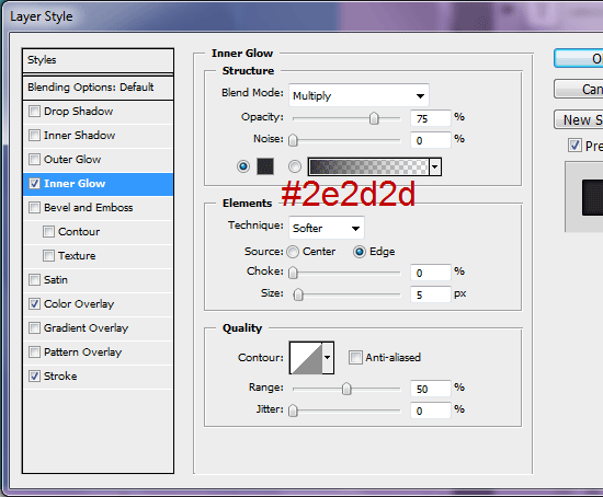
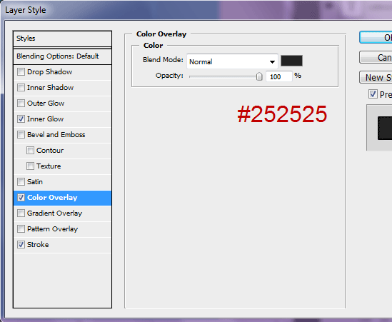
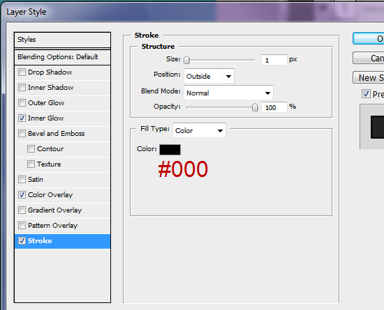
24 Now what you should have is the background for the active navigation menu link, which looks sort of like a bookmark. Let us style this layer to match the look and feel of our logo by applying an Inner Glow, Color Overlay, and Stroke layer style.
The inner glow color should be a dark gray (#2e2e2e2).
The color overlay should be our dark gray again (#252525).
You don’t necessarily need this layer style since we already filled it with this color earlier on.
The stroke color should be black (#000000).
This is how our “bookmark” active link indicator should look like now:
Stylize and Position the Navigation Menu Links
25 It’s time to give our menu bar links some styles. First, add a Drop Shadow layer style to the other three non-active links (“About”, “Archives”, and “Contact”).
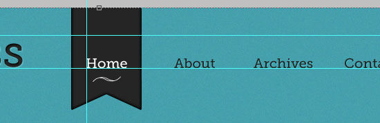
26 Next, change the text color of the first link (“Home”) to white (#ffffff) using the Horizontal Type Tool (T).
27 Align the first link horizontally with the bookmark shape using Layer > Align > Horizontal Centers. I’ve added a little swoosh vector shape that I created in Adobe Illustrator just below the “Home” text, but feel free to skip that.
Create a Horizontal Inset Divider
28 Add another horizontal guide at 160px.
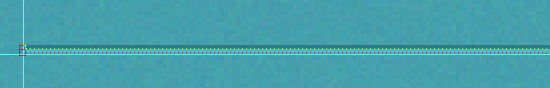
29 Select the Rectangular Marquee Tool (M) and create a 890x1px thin, rectangular selection.
30 Add a new layer (name it “dividertop”), and in the new layer, press Ctrl/Cmd + Backspace to fill the rectangle with any color.
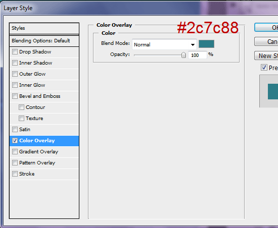
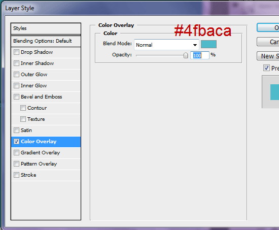
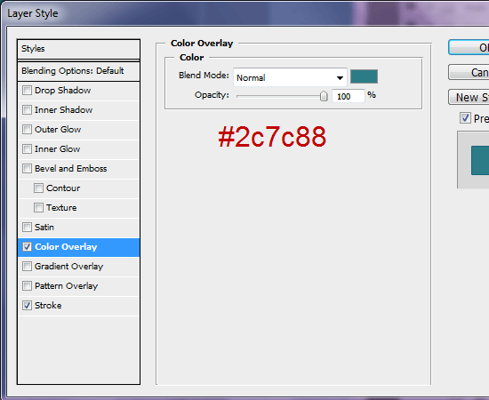
31 Apply a Color Overlay layer style to the “dividertop” layer so that the rectangle is slightly lighter than our dark blue background’s color (#2c7c88).
32 Align the rectangle to the left and the top guide using the Move Tool (V).
33 Duplicate the layer and move it right below the original rectangle.
Rename the layer to “dividerbottom”.
34 Give it a light blue Color Overlay layer style (#4fbaca).
Link the “dividertop” and “dividerbottom” layers by selecting them simultaneously in the Layers Panel, right-clicking on one of them, and then choosing Link Layers from the contextual menu that shows up. This will keep them together so that if we need to move them, both layers will move together.
Designing the Post Date Background
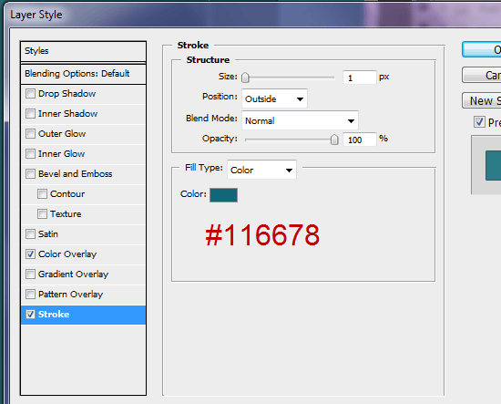
35 We’re now finished with the header area of our layout. Let’s move on to the main content area, starting with the first blog post entry’s date.
First thing’s first: we need to add another horizontal guide at 210px.
36 Select the Rounded Rectangle Tool (U) in the Tools Panel, and in its Option Bar, change the Radius to 10cm.
37 Create a 75x150px rounded rectangle with the Rounded Rectangle Tool.
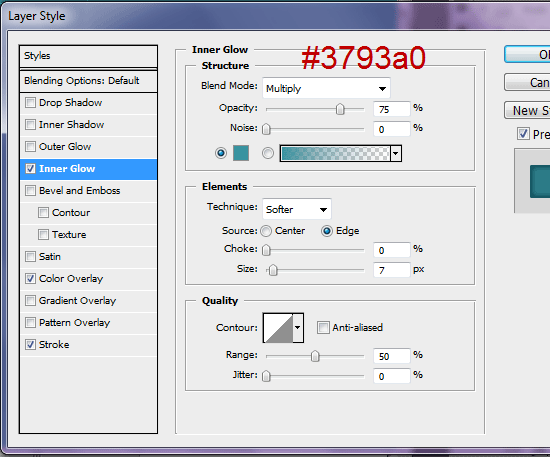
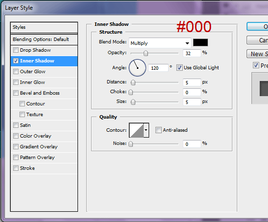
38 Apply an Inner Shadow layer style to the rounded rectangle shape layer, with the inner shadow’s color set at blue color (#3793a0).
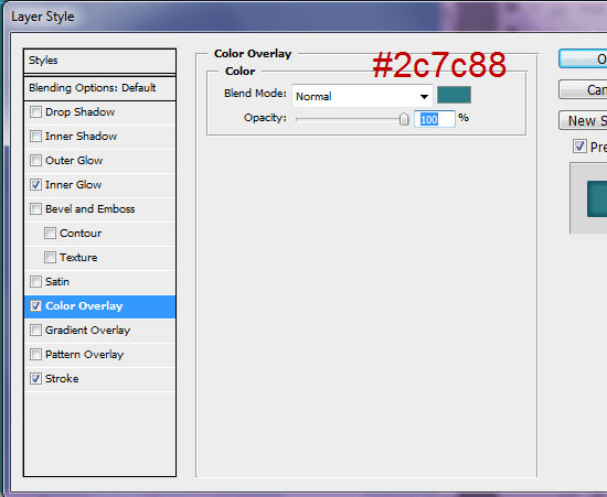
39 Apply a Color Overlay layer style as well that is set at a darker blue than the inner shadow (#2c788).
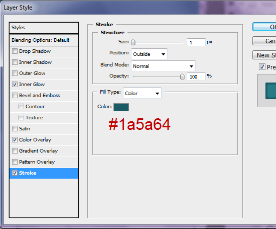
40 Give the shape a stroke by applying a Stroke layer style with a stroke color a darker blue (#1a5a64) than the inner shadow’s color.
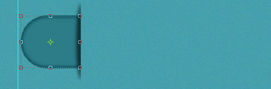
41 Rename the shape layer to “datebg” (which stands for “date background”) to keep your work organized, and then Rasterize the layer (right-click on it, then choose Rasterize Layer).
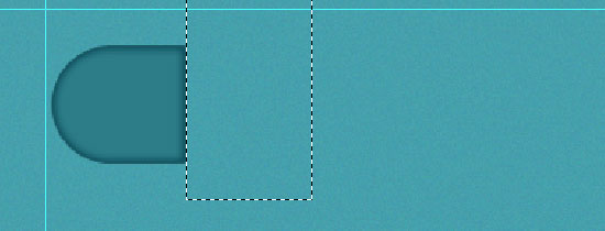
42 Using the Rectangular Marquee Tool, select about 1/3 of the right side of the shape, and then delete that selected area.
43 Still on the “datebg” layer, add a noise filter via Filter > Noise > Add Noise; use 2% for the Amount option.
Create the Vertical Shadow of the Post Date
44 Now create a new layer for the shadow of the date’s background. Using the Elliptical Marquee Tool (M), make an oval about 17px wide and 100px tall; the most accurate way of doing this is to use Fixed Size as the Elliptical Marquee Tool’s Style option and entering the dimensions for the Width and Height.
45 Place the selection on the right side of the date background. Fill the selection (Shift + F5) with black (#000000) and rename the layer to “shadow”.
46 Apply a Gaussian blur (Filter > Blur > Gaussian Blur) onto the “shadow” layer, setting the Radius option to 3px.
47 Using the Rectangular Marquee Tool, select the right half of the blurred oval shadow, and then delete that half by pressing Backspace or Delete.
48 Finish off the shadow by lowering the layer’s Opacity to 55%.
Add the Date Text, Blog Post Title, and Metadata
49 With our date background finished, it’s time to add the date of when the blog entry was posted.
Get the Horizontal Type Tool (T) from the Tools Panel and write your date using Museo Slab 500. The numerical day should be around 42pt font size, and the month–which is on a new line below the numerical day–should be at 20pt. I chose to write “13 APR” with APR on a new line.
50 Align the half-oval shadow (“shadow” layer), the date background (“datebg” layer) and the date type layer text correctly using the Move Tool and Layer Alignment commands we’ve used earlier on.
51 For the title of the post, I chose the Georgia typeface set at 35pt font size. For the meta data (author, number of comments), I used Trajan Pro at 20pt; you can find the middle dot/Georgian comma that I used to separate the author name and number of comments here–just copy and paste it into Photoshop. Also, adjust the leading/line-height of the text to 28px. You can do this in the Window > Character Panel.
Here’s our date, blog post title, and blog post metadata now.
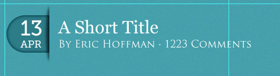
52 Add a vertical guide at 165px. Align the text with the guide you just created and the date.
Add the Blog Post Lead-In Image
53 Using the Rectangular Marquee Tool (M), create a 480x150px rectangle (the height depends on the image size you will use, but our max width is 480px for this template).
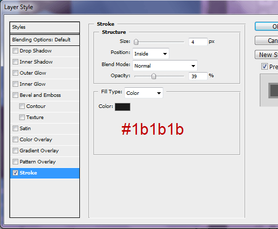
54 Fill your selection with any color on a new layer and then apply a Stroke layer style that will represent our image’s border.
The color of the border is a dark gray (#1b1b1b).
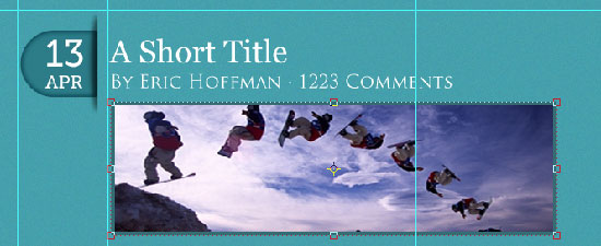
Add and Position the Content of the Blog Post Entry
55 Find an image of yours and paste it into your Photoshop document. I used a photo of a snowboarder, but it doesn’t really matter which image you choose; it’s just for eye candy in our PSD mockup. Adjust the size of your image with Free Transform (Ctrl/Cmd + T) so that it fits within our rectangle.
56 Switch to the Horizontal Type Tool (T) and paste in some text below the image.
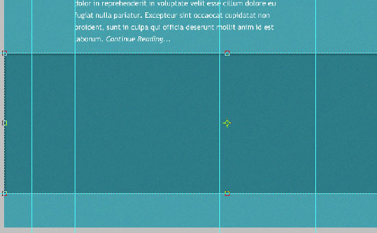
You can use a Lorem Ipsum generator tool like this one to generate some text in a jiffy, but it’s never a bad idea to use real web copy to make the mock-up look as accurate as possible. My font of choice for the text content is Trebuchet MS at 17pt font size and with the leading/line-height at 28pt.
57 Select all the blog post design elements in the Layers Panel and align it with the shadow using the guides we created as reference.
58 Add a new horizontal guide at 450px. Align the text with the left guide and the new guide.
59 Select all the blog post layers in the Layers Panel (“datebg”, “shadow”, “date”, the blog post title text, metadata text, the background of the image, the image, and the blog post text) and group them together by going to Layer > Group Layers (Ctrl/Cmd + G), which will place all of the layers in a folder. Name the layer group “Post 1”.
Add an Inset Horizontal Divider at the Bottom of the Blog Post Entry
60 Add another horizontal guide at 700px.
Duplicate the divider we created before and rename the layer to “dividerpost”.
61 Resize the width of the divider with Free Transform so that it’s the same as the lead-in image’s width. Then move the divider using the Move Tool (V) so that it is placed on the horizontal guide we just created.
Add Anther Blog Post Entry
62 Duplicate the “Post 1” layer group and rename the duplicate as “Post 2”.
63 Add a new horizontal guide at 720px and align the shadow of the date box (of Post 2) with the new guide.
64 Change the elements in the “Post 2” layer group so that it looks different from the first blog post; for example, the comment number, the date, and the blog post title can be changed.
Build the Sidebar’s Background
65 Create a 250x350px rectangle using the Rectangular Marquee Tool (fill the rectangular marquee selection with any color on a new layer called “sidebar”). This rectangle is our sidebar’s background.
66 Align the sidebar to the horizontal guide at 210px and the vertical guide at the far right that we created before.
67 Give the sidebar’s background a Color Overlay layer style; the color of the color overlay should be a dark blue (#2c7c88).
68 Also, give the sidebar background a Stroke layer style with the stroke color being a darker blue (#116678).
69 Set up a vertical guide at 730px and one at 930px; we will use these guides to make sure there is some padding inside our sidebar.
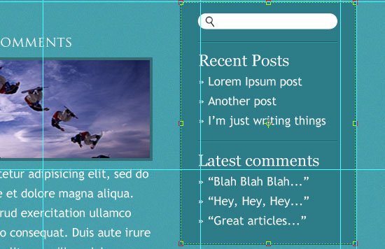
Create the Search Feature
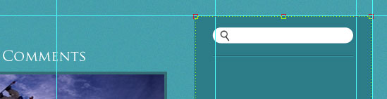
70 Use the Rounded Rectangle Tool (U) to draw a rounded rectangle from the left vertical guide (at 730px) to the right vertical guide; the rounded rectangle should be around 25px high.
Name this shape layer as “searchbar”. Give the rounded rectangle a white (#ffffff) Color Overlay layer style.
71 Find a magnifying glass icon to represent the search button (you can use a web tool like IconFinder to find free icons).
72 Position the icon within the white rounded rectangle (towards its left).
73 Make a horizontal divider just like we’ve done before, spanning from the 730px vertical guide to the 930px vertical guide style. Add a little spacing between it and the search bar.
Add the Sidebar Text
74 Now to the text.
I added a sidebar heading (“Recent Posts”) using the Horizontal Type Tool (T) set at Georgia font and font-size of 23pt. I’ve listed three of the most recent blog posts using Trebuchet MS font at 17pt and leading/line-height, again, at 28pt. Call this text layer “recent posts”.
75 Duplicate the horizontal divider from above and move it so it’s at the bottom of the “recent posts”.
76 Create another text layer the same as before, but this time for the recent comments.
77 Align both text blocks to the left guide.
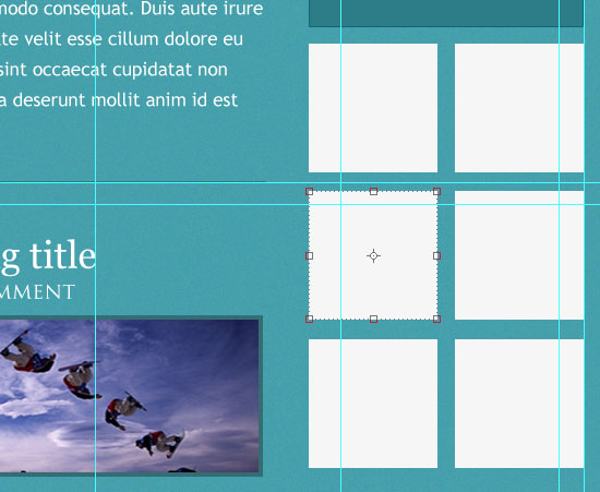
Design the Sidebar Ad Units
78 Draw a couple of 118x118px squares using the Rectangular Marquee Tool. Hold down Shift to keep your box proportionally equal in height and width.
79 Align one square on the right (to the right guide) and the other one on the left (to the left guide).
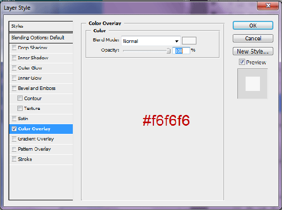
80 Fill both squares with a gray color (#f6f6f6) using a Color Overlay layer style.
This gives us a place to add banner advertisements on our blog.
81 Duplicate the two gray boxes a couple of times or more depending on how much ad space you’d like.
Sidebar Housekeeping
82 Group all the sidebar element layers and name the layer group as “sidebar” to keep our mockup organized (if you work with a front-end developer who has to convert your PSD to HTML/CSS for you, he/she will love you for it).
Lay Out the Main Blog Footer
83 Make two new horizontal guides: one at 1220px and the other at 1550px.
84 Using the Rectangular Marquee Tool (M), draw a rectangle across the whole width of the web layout between the two new guides at the bottom of layout where our footer will be. Fill this rectangle with a dark gray (#2c7c88). This is our footer’s background.
85 Apply a noise filter on our footer’s background (Filter > Noise > Add Noise) using 1% for the Amount value.
86 Apply a black (#000000) Inner Shadow layer style to the footer’s background.
87 Now create three text columns of equal size, all with the same width.
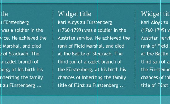
In this case, I copied some interesting text off Wikipedia to give me some real web copy for the footer text. The title (“Widget title”) is set at 23pt Georgia and the normal text is Trebuchet MS at 17pt. Don’t forget to change the leading/line-height to 28pt!
Create the Main Blog Footer Column Dividers
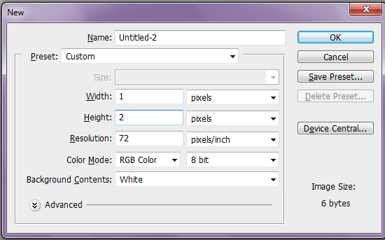
88 For the white vertical dividers in between the footer text columns, we’ll use patterns. First step is to create a new Photoshop document (Ctrl/Cmd + N) with Width of 1px and Height of 3px.
89 Zoom in really close so you can see you work (using the Zoom Tool).
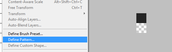
90 Color the first pixel (top) black (#000000) using the Rectangular Marquee Tool and Edit > Fill.
91 Select around the canvas (Ctrl/Cmd + A) and then choose Edit > Define Pattern.
Name your pattern something logical like “Vertical Dots”.
92 Switch back to our main Photoshop document.
93 Make vertical rectangular marquee selection (1x280px).
94 Add a new layer and press Shift + F5 to see the Fill dialog window. In the Use option drop-down menu, find the pattern we made (“Vertical Dots”) from the list and press OK to fill our rectangular marquee selection with it.

95 Duplicate the layer with the dashed vertical divider and place them between the three footer columns.
96 Group the text columns in their own layer groups. Align the text column layer groups vertically.
97 Add a white Color Overlay layer style to both dashed vertical dividers so that they appear white.
Create the Secondary/Auxiliary Footer
98 Create a short rectangular marquee selection at the very bottom of the layout and fill it with a dark gray (#1f2024).
99 Apply a Noise filter with the Amount set at 1%.
100 Type some text such as your copyright information using the Trebuchet MS font at 17pt font size.
Align the text horizontally with the background place it on the far left guide.
Finished!
We’re done! Wasn’t that easy?
Elegant and Simple Blog Web Layout Tutorial Series
- Part 1:Make an Elegant and Simple Blog Web Layout Using Photoshop
- Part 2: PSD/HTML Conversion: Elegant and Simple CSS3 Web Layout (*coming soon)
Download Source Files
- simple_elegant_bloglayout-psd (ZIP, 1.61 MB)
Related Content
-
 President of WebFX. Bill has over 25 years of experience in the Internet marketing industry specializing in SEO, UX, information architecture, marketing automation and more. William’s background in scientific computing and education from Shippensburg and MIT provided the foundation for MarketingCloudFX and other key research and development projects at WebFX.
 -

WebFX is a full-service marketing agency with 1,100+ client reviews and a 4.9-star rating on Clutch! Find out how our expert team and revenue-accelerating tech can drive results for you! Learn more
Make estimating web design costs easy
Website design costs can be tricky to nail down. Get an instant estimate for a custom web design with our free website design cost calculator!
Try Our Free Web Design Cost Calculator
Share this article


Web Design Calculator
Use our free tool to get a free, instant quote in under 60 seconds.
View Web Design CalculatorMake estimating web design costs easy
Website design costs can be tricky to nail down. Get an instant estimate for a custom web design with our free website design cost calculator!
Try Our Free Web Design Cost Calculator


