- Home
- Blog
- Web Design Smarter Web Designs: Responsive and Customizable
Smarter Web Designs: Responsive and Customizable
-
 11 min. read
-
 William Craig
 CEO & Co-Founder
- President of WebFX. Bill has over 25 years of experience in the Internet marketing industry specializing in SEO, UX, information architecture, marketing automation and more. William’s background in scientific computing and education from Shippensburg and MIT provided the foundation for MarketingCloudFX and other key research and development projects at WebFX.
 The way we design websites has changed profoundly in recent years. We have more information on how web users interact with user interfaces, we have developed many testing methods for evaluating usability, and we now build sites with great emphasis on user-centered design. In addition, research in the fields of psychology, sociology and usability has enriched our understanding of our site visitors.
Yet, while methods of designing for devices, the choice of browsers, and user demands all have increased, designers still tend to shy away from providing users with an experience that suits the ideology of truly responsive design — smart designs that fits the unique personal traits and preferences of a user.
Intuitiveness: The Double-Edged Sword
If you’ve ever conducted a usability research study, you’ll be well aware of the issues people face when presented by an out-of-the-box UI that don’t abide by conventions or trends. The truth is that knowledge — and more specifically, the ability to recognize common objects and their function (such as a button or hyperlink) — is the root of the issue.
Knowledge is easy to come by, but it takes time to instill. Every experience comes with a learning curve. 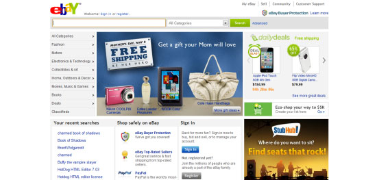 Designing for navigation, links and content is a non-stop juggling act, as shown at eBay. On the other hand, an intuitive design also empowers users.
The user feels that they have the ability to understand the environment and deduce things for themselves. Empowering users is a critical part of the web designer’s role. We can only hope that users know which links are clickable and what button to press to submit a web form.
So, here we are in this position: Many users struggle with the usability of our websites, and we do all we can, generally, to accommodate everyone’s needs. Nevertheless — and all too often — little is done to level with individual users because of the up-front costs of building flexible, customizable interfaces. At least, that’s what used to happen.
These days, we invest time and money in building smartphone apps, we build dedicated websites for portable devices, and some of us still provide support for Internet Explorer 6. Yet, when it comes to interaction, we let our standards slide; we don’t seem to put enough effort into crafting them for the site audience’s needs.
Design Smart, Not Static
If we’re trying to learn what our users want, we should leave customization in their hands.
There are all sorts of general usability tests, but we need to consider which users to include, what to improve, how to implement it, and much more. To put it simply, users know when something isn’t right about their experience, and even if they have the time to bother telling you about it, they don’t always know what they want or how to express it in a way that would make sense to others. They know there’s a problem, but they may not know how to solve it.
Visitors idealize. They aren’t trained designers and are liable to request solutions for what may not be problems in the first place, yet we are the ones who make the final decisions. Design is less about fighting fires and more about empowerment; and smarter web designs are becoming increasingly aware of that.
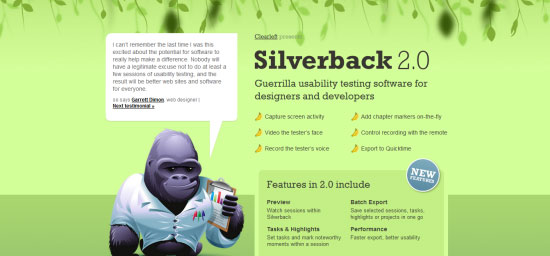 Usability testing isn’t bullet-proof, but it helps users help us to help them! Shown above is the Silverback usability testing software. In the movie 10 Things I Hate About You, there is a wonderful quote that sums up our frequent attempts to use our psychic powers to build the perfect website for the default user: “You’re 18. You don’t know what you want. And you won’t know what you want ’til you’re 45. And even if you get it, you’ll be too old to use it.” If we base design decisions on assumed knowledge of what users want, we can’t empathetically suit our websites to each user’s needs. However, add responsiveness and customization to the mix, and our designs will become easier to use. They’ll become smarter.
Responsive and Suggestive Methods
Users don’t necessarily understand what they need, and designers typically aim to please the masses. We need to remedy that. Design patterns and techniques exist to help us interact with our users and make our work truly responsive to an individual’s needs.
We know that behavioral engineering is powerful and that user-centric design aids usability. We also know that every user has different requirements or preferences for an interface. We already create responsive web designs that change depending on whether they’re being viewed in smaller screens (like mobile devices) or bigger screens.
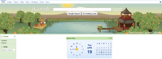
The next logical evolution of Web Design is being able to predict what users want and to allow users the ability to customize their experience. 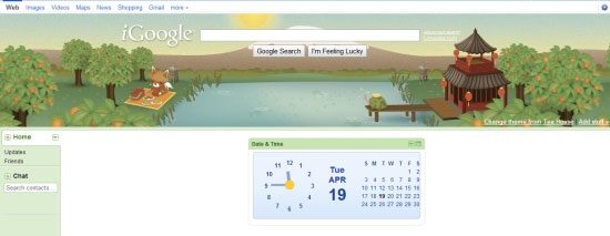 Smart designs are customizable and useful to visitors and they’re built with efficiency in mind, as shown by iGoogle. Building smart web designs — in concept, but not necessarily in implementation — is simple. Look beyond aesthetics, and think about how users want to interact with your site.
Personalize the content. Enhance the user experience based on user activity. Observe what users do on the website, and try to provide useful signposts and suggestions in the interface.
Presenting Related Content
Knowing what interests the user is half the battle in design. If visitors read and enjoy an article, they might be open to visiting something else that’s equally good. 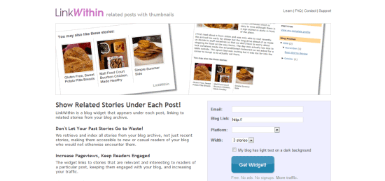 Links to related material serve as incentives for users to continue their journey on your website.
LinkWithin is a tool for showing related posts. Provide calls to action that direct visitors to the latest content, and provide links to useful material on the same subject. Show keyword tags (or categories and keywords) to identify similar places of interest. Every little bit helps.
Relative Navigation
This is important for users entering your website from another website (such as a search engine or social news aggregator); it helps them find their way around with as few clicks as possible. Offer human-friendly site maps, with helpful directions. Provide useful error messages, and offer breadcrumb navigation for content categories.
Content Customization
Many users don’t want to view our websites in the way we present them. Users expect to be able to format your work to their taste and, in that way, they can have a personalized site experience. Allowing your content to be viewed through RSS, for example, is a simplistic example of allowing your users to access content through their preferred means.
Smarter Search Features
The search box is the most recognizable way to help refine what users want to see. Allowing advanced searches could help users find what they’re looking for quickly. Don’t be afraid to include auto-completion or to suggest corrections of search terms to respond to errors.
Customization Methods
The second type of enhancement we can provide helps to create dynamic websites. With it, we can offer user-specific customizations. When someone signs up for a service, they expect it to be personable and meet their needs.
Each of us consumes web content in our own way. Basic ways to create smarter designs include offering custom themes or multilingual translations and allowing panels to be moved around the page (or added or removed entirely).
Profile Personalization
If you have a system in place that allows for user accounts, allow them to go wild with customization.
Greet users by name, show them what has been updated since their last visit, offer subscription-based email or RSS notifications, and allow them to modify the site layout (as above) in their account as a “saved” state.
Provide Opportunities for Contributing
This technique is widely used in content management systems and social networks. Get users to contribute by recommending articles to them, inviting them to post follow-ups or comments, and offering customizable widgets or visual shortcuts (based on their preferences).
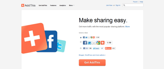 AddThis lets users recommend your work on the social network of their choosing.
Some Responsiveness and Customizability Ideas
Finally, there are “in the future” solutions that could increase the chances of our websites becoming more responsive (even to the point of being self-correcting). By taking advantage of scripting and by monitoring our users’ actions autonomously, we could make websites smarter and more malleable.
Variable Designs
We could build a responsive framework to analyze what devices visitors use and then provide suitable environments for them.
We are seeing it begin with CSS media queries and platform-unique layouts. But have you considered blending the techniques by scripting “detect and redraw” (rather than “redirect”)?
Layout Profiles
Another technique for personalizing the experience is to allow users to build a visual profile.
That is, let them choose what appears on the screen, and where. Then let them save it, and save it publicly, so that all can see — which will enable users to share and apply one another’s themes and gain unique tailor-made layouts.
Customize Content Presentation Based on User Activity
Here’s the most radical idea for smartening up your designs: you could write a script that monitors user interactions — such as what links they click on and how they flow through the site — but use that data to identify what content to show the user, and redraw the layout so that useful content becomes more visible.
In effect, the website will train itself to become more useful for its users. 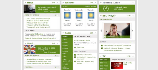 The BBC offers a powerful “launch pad” platform for visitors who want to read its content.
The Smart Website
Behavior is a powerful indicator of the user’s process and progress of negotiating through a website. We place increasing emphasis on studying patterns and adjusting our pages for a variety of devices.
Strangely enough, for all the energy we put into testing and site improvements, we don’t create scripts and frameworks that empower users, whether empowering by recognizing their habits and adapting accordingly to make the experience easier or to increase returning visits, or by letting them change things themselves. 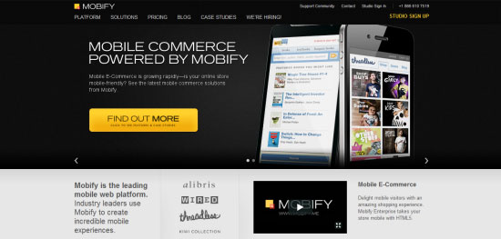 Mobile browser detection isn’t the limit of our ability to improve designs for users. Shown above is Mobify, a mobile web platform. We live in a paradoxical environment: every user is different (and wants something specific from an interface), yet often, the changes we implement resort to cycles of iterations (human-powered tweaks).
No silver bullet exists to get our websites to do all of the hard work. But isn’t this odd: social networks are among the most highly customizable and flexible infrastructures, yet few websites follow their lead and let users decide what works best for them. As we move into the future, user expectations will only increase.
We’ve had it easy as an industry so far — users have just accepted the way things are. But as users gain knowledge of the Web and what it’s capable of, they’ll question the validity of the one-size-fits-all model. They’ll want compatibility and the ability to customize.
Personalizing designs is a challenge, but one worth taking on.
Related Content
-
 President of WebFX. Bill has over 25 years of experience in the Internet marketing industry specializing in SEO, UX, information architecture, marketing automation and more. William’s background in scientific computing and education from Shippensburg and MIT provided the foundation for MarketingCloudFX and other key research and development projects at WebFX.
 -

WebFX is a full-service marketing agency with 1,100+ client reviews and a 4.9-star rating on Clutch! Find out how our expert team and revenue-accelerating tech can drive results for you! Learn more
Make estimating web design costs easy
Website design costs can be tricky to nail down. Get an instant estimate for a custom web design with our free website design cost calculator!
Try Our Free Web Design Cost Calculator


Web Design Calculator
Use our free tool to get a free, instant quote in under 60 seconds.
View Web Design CalculatorMake estimating web design costs easy
Website design costs can be tricky to nail down. Get an instant estimate for a custom web design with our free website design cost calculator!
Try Our Free Web Design Cost Calculator


