- Home
- Blog
- Web Design The Wabi-Sabi Aesthetic
The Wabi-Sabi Aesthetic
-
 21 min. read
-
 William Craig
 CEO & Co-Founder
- President of WebFX. Bill has over 25 years of experience in the Internet marketing industry specializing in SEO, UX, information architecture, marketing automation and more. William’s background in scientific computing and education from Shippensburg and MIT provided the foundation for MarketingCloudFX and other key research and development projects at WebFX.
 When I was in school, I fell in love with the same girl twice. Her name was Frances, and she looked something like Hillary Duff, only with short hair, less eye makeup, and more class. I’m not sure she ever knew I existed.
I developed a massive crush on her in eighth grade, followed her around the halls between classes (“She takes English! She must really be smart!”), and never, ever told my friends about her. That would have spoiled it.
Some time during the year, she disappeared — moved away, dad relocated, I didn’t know — and that was it for that, I thought. In my eleventh grade year, she reappeared, and I fell for her again — not realizing it was the same girl I had such a crush on three years before. In my defense, she was older, and I was just as clueless, so it’s somewhat excusable that I didn’t realize 11th grade Frances was the same lovely lady as 8th grade Frances.
Other things hadn’t changed, either; I didn’t dare speak to her that year, either. The thing I remember best about her was her radiant and engaging smile. She had great teeth, except for one front tooth, which had a little chip in it that gave her just that little touch of “snaggletooth-ness”. That one flaw in an otherwise perfect smile was what I found attractive. So, in a sense, this article is all about Frances’s chipped tooth. Keep that in mind as you read.
Wabi-Sabi: Defining the Indefinable
I’ve often thought the perfect design for a large wall, say in my living room, was having it as an unblemished expanse of pristine white (or a light, light gray), punctuated by a single perfectly centered piece of incredibly colorful, natural artwork, such as one of Georgia O’Keeffe’s poppies. 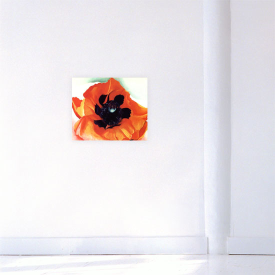 Does this idea fall under the rubric of wabi-sabi? It may, but since the idea of an aesthetic concept is viewed differently by different people, your opinion may vary.
It certainly appeals to me. Web designer Steven Bradley of Van SEO Design retells what may be the quintessential wabi-sabi illustrative parable:
“Sen no Rikyu desired to learn The Way of Tea and so visited the Tea Master, Takeno Joo. As a simple test of whether to accept Rikyu or not Joo ordered him to tend the garden.
Rikyu raked the garden until the ground was in perfect order. When he had finished he surveyed his work. He then shook a cherry tree, causing a few flowers and leaves to fall randomly on the ground.
At that moment Takeno Joo knew Sen no Rikyu would be one the greatest example of wabi-sabi way of life.”
Note that in the parable, the apprentice rakes the garden floor until it is perfect, then sprinkles a few natural, colorful elements — in this case, cherry blossoms — over the perfectly arranged background, deliberately adding color, asymmetry, and an organic flow to the “canvas”. In an article for THE Magazine, Drs. Tim Wong and Akiko Hirano explained, “What is wabi sabi? Ask a Japanese this question and there will likely be a long silence.
Pose the same question to an American, however, the answer will often be quick and sure: ‘It’s beauty of things imperfect!’ Why do the Japanese struggle for an answer to the meaning of wabi sabi that seems to come easily to Westerners? Could they be searching for a different answer altogether?” According to Dr. Wong, the concept is easily misunderstood, especially for us attention-deficient Western folks.
In a telephone conversation, Dr. Wong told me that most Japanese don’t discuss the concept of wabi-sabi, they simply recognize it when they see it. Wong and Hirano wrote: “Westerners tend to associate wabi sabi with physical characteristics — imperfection, crudeness, an aged and weathered look, etc.
Although wabi sabi may encompass these qualities, these characteristics are neither sufficient nor adequate to convey the essence of the concept.” Apparently, an innate recognition of the aesthetic only comes after years of exposure to classical Japanese culture, including literature, art and poetry. That makes it tough for me, with my Western sensibilities, to grasp the concept myself, much less explain it. I’m as impatient as the next Westerner; I just want to know what something is, slap a label on it, and move on to something else.
Years of contemplation aren’t in my makeup, and while I love Japanese brush painting, I don’t pretend to understand the depths and nuances of what I see. But maybe I can illustrate wabi-sabi with a couple of personal stories. Remember Frances?
I may be wrong, but I think my feelings for her bordered on the concept of wabi-sabi as it applies to human relationships. I was powerfully attracted to her on a physical and aesthetic level, and that wonderfully imperfect chipped tooth just sealed the deal for me. But the feeling was a lot more that just “Oooh, pretty, me want!” For a youngster, I experienced a powerful mixture of emotions regarding her — longing, physical and emotional desire, aesthetic gratification, despair at knowing how unattainable she was, loneliness, melancholy at realizing I’d never summon up the courage to approach her, curiosity and wonder at my own inexplicable mélange of feelings.
If we could tease out and set aside the usual boyish feelings of romanticism and desire, I think perhaps some of what remained might have constituted an example — imperfect and incomplete as it may be — of wabi-sabi. Wong and Hirano wrote that wabi-sabi is constituted of “a deeply personal aesthetic consciousness, a bittersweet mix of loneliness and serenity, a sense of dejection buoyed by freedom from material hindrance.” As frustrating as it was for me never to work up the nerve to speak to Frances, there was a certain freedom involved in knowing that I would only admire her from afar. It heightened the appreciation, so to speak, without adding in all the panic-inducing possibilities that might incur if I ever summoned up the courage to say hello.
Or maybe I could use my wife’s powerful affinity for the Victorian-inspired “shabby chic” design aesthetic as an example. 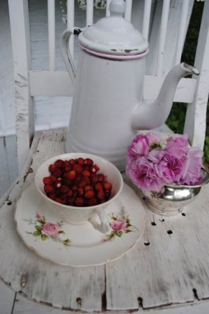 Source: Sandy Foster. My wife took me on a whirlwind tour of Sandy Foster’s “shabby chic” website when I was writing this article, and after clicking through dozens of photographs, I found the one shown above. I love the juxtaposition of the weathered, “chippy white” chair serving as the base for the grouping of three objects: the equally weathered and chipped porcelain coffee pot, the berries in the quintessentially Victorian cup and saucer, and the beautiful flowers in the silver bowl.
It works very well for me, both as an illustration of one aspect of wabi-sabi (though perhaps not one a Japanese artist would have chosen), and as an aesthetically appealing construct on its own. My wife grew up in rural Kentucky, surrounded by once-elegant white frame houses and red-roofed barns slowly falling into disrepair, with peeling paint, cracked glass, and creaky wooden floors, all floating in a huge expanse of wild greenery and pops of natural colors — wildflowers, honeysuckle, blackberry bushes, and the like. The older women of the area’s families liked to design using the antebellum Southern aesthetic, derived strongly from Victorian England, and they made do with the paint-chipped, age- and water-warped barnwood they often had to use.
Naturally, they used lots of fresh flowers and local fruits and vegetation to liven up the “distressed” materials they used to decorate their homes. Decades later, my wife uses the “shabby chic”, quasi-Victorian aesthetic of her childhood to redecorate our merely-shabby home. Not only is the design aesthetic itself appealing, using reclaimed, distressed wood painted “chippy white” and paired with natural and artificial flowers, fruits, and leaves, but it holds a deeper meaning for her.
Hers was a difficult childhood, but the “shabby chic” design aesthetic evokes some of the bittersweet memories that she has of that time of her life. Another way to explore the concept of wabi-sabi is through a children’s book, Wabi-sabi, by Mark Reibstein, which tells of a cat named, appropriately enough, Wabi-sabi, and her quest to learn the meaning behind her name. One haiku from the book might serve to illustrate the concept:
A warm heavy bowl comfortable as an old friend — not fine, smooth china.
Here are a few shots I snapped on a recent visit to Southport, North Carolina, one of the loveliest old beach towns on the American southeast coastline, and to Kure Beach, a few miles up the shore.
I believe they illustrate one aspect or another of the wabi-sabi aesthetic. 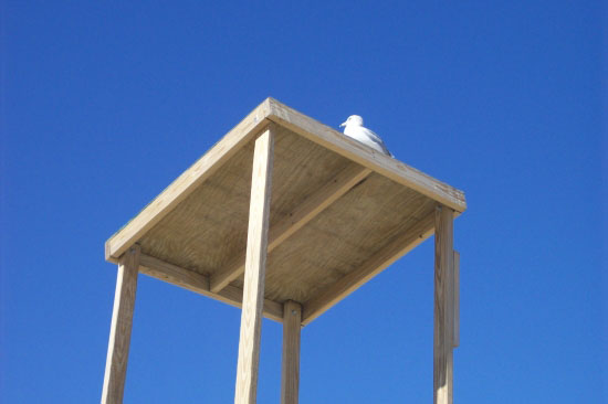 A seagull perched atop a lifeguard tower in Kure Beach.
 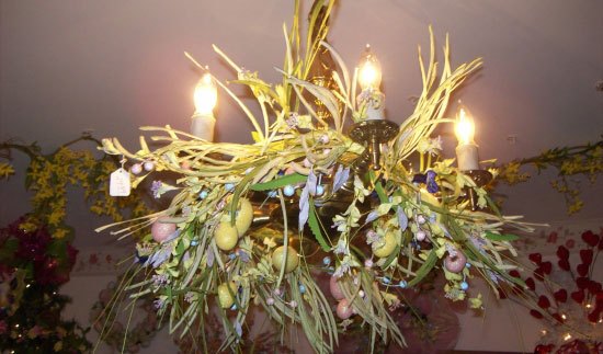 A chandelier made with live and faux foliage, used courtesy of The Christmas House in Southport.
 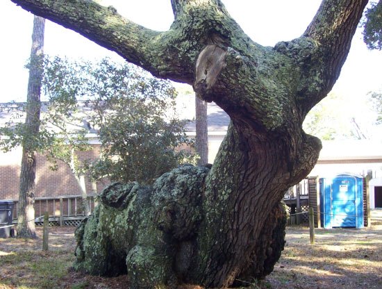 A massive live oak tree in Southport’s Keziah Square, estimated to be up to 800 years old.
  A boat-tailed grackle perched on the rail of the Southport-Fort Fisher ferry. Wabi-sabi is where you are, and wherever you find it; you could easily find examples on a New York subway, in a Japanese flower garden, or on a street of shops in Slovenia.
Wabi-Sabi in Design
All this philosophical maundering is well and good, but we need to get down something usable.
What constitutes the aesthetic of wabi-sabi in design, and how can we use it in our work? “Wabi is the kind of perfect beauty that is seemingly — paradoxically caused by just the right kind of imperfection, such as an asymmetry in a ceramic bowl which reflects the handmade craftsmanship, as opposed to another bowl which is perfect, but soul-less and machine-made,” wrote Leonard Koren in the book, Wabi-Sabi: For Artists, Designers, Poets & Philosophers. “Sabi is the kind of beauty that can come only with age, such as the patina on a very old bronze statue”. In a Resurgence Magazine article, Koren wrote a passage that I think can serve as a guide for our design approach: “The main strategy of this intelligence is economy of means. Pare down to the essence, but don’t remove the poetry. Keep things clean and unencumbered, but don’t sterilize.” “Usually this implies a limited palette of materials.
It also means keeping conspicuous features to a minimum. But it doesn’t mean removing the invisible connective tissue that somehow binds the elements into a meaningful whole. It also doesn’t mean in any way diminishing something’s ‘interestingness’, the quality that compels us to look at that something over, and over, and over again,” Koren wrote.
Garr Reynolds, associate professor at Kansai Gaidai University, extends the explanation to include the idea of a design being “earthy organic, free from clutter and chaos, and somehow quite beautiful in its simple presentation.” In simpler terms, designs adhering to the wabi-sabi aesthetic are:
- clean yet warm
- minimalist yet not bare and sterile
- conceptually unified
- visually interesting without being florid and overdone
Every element is well-chosen, and the sense of “clutter” or “busyness” is entirely avoided. There is an overall sense of harmony, even if there is imbalance. Some may not see this as including the Victorian “shabby chic” that I used as an earlier metaphor, but all that means is that the concept is quite flexible and inclusive.
It’s an aesthetic approach, not a rigid paradigm. And, as so many things philosophical, there is a certain level of individual belief and preference. What constitutes a fine example of wabi-sabi for one person might not work for someone else.
It is true that when taken too far, the Victorian “shabby chic” aesthetic can produce overly florid, cluttered designs that overwhelm the viewer with too many flowers, too many pieces of battered furniture, and too many shades of pink and purple. Like anything, you can take it too far. Subtlety is a key element of wabi-sabi-driven design.
Wabi-Sabi as a Design Philosophy
In an article, Reynolds talks about wabi-sabi and visuals for presentations: “A graphic, for example, may be mostly ’empty’ except for 2-3 elements, but the placement of the elements within that space form a powerful message.” “The emptiness is a powerful design element itself. In this case, the more we add, the more diluted and less effective the design of our graphic becomes,” Reynolds wrote. Reynolds notes that Steve Jobs uses wabi-sabi in his famously minimalist yet highly effective graphics in his presentations, whether intentionally or by accident.
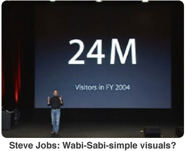 Source: Garr Reynolds. Wabi-sabi is not a foreign design concept; we may have used elements of it in our designs for years without knowing we were following some of its parameters.
Is Wabi-Sabi Possible in Web Design?
In an A List Apart article, Web designer David Sherwin said that creating a website that functions as a pure embodiment of wabi-sabi is impossible, because websites are functions of logic (i.e. code).
However, the author wrote, creating a site with the idea of wabi-sabi as a design aesthetic helps bring a warmth and a natural, organic feel to what is, at its essence, a creation of electronic ones and zeroes. “In small doses, wabi-sabi thinking can provide a counterpoint to our modernist tendency to refine things within an inch of their life, bringing a measure of grace to what would otherwise be a conglomeration of rigidly spaced pixels on a screen,” wrote Sherwin. The paradigm of wabi-sabi should encompass all aspects of a site’s design, from its conception as a site designed to perform a particular function to its final tweaks before launching it.
Wabi-Sabi Isn’t Just a Design Element
A few years ago, I was with my wife as she watched one of her favorite television shows, Project Runway, which pits amateur fashion designers against one another in a competition for big bucks and career success. One designer, named Joe, created a truly awful concoction; while my wife and I watched in increasing disbelief, he took his creation through one step after another, piling on the errors and the miscalculations, ending up with a uniquely hideous “dress”, all done with the same smug, supercilious assumption that he was designing something lovely. Towards the end of the process, he talked about how he had dropped a series of design elements into his creation, and finished by saying something along the lines of (in my own paraphrase): “And of course, I added the ‘wow factor.’” What exactly he thought the “wow factor” was in his design, I’m not sure, but it wasn’t something he could just drop in to an almost-finished design like an olive into a martini.
Neither can you as a designer decide to “drop in” some wabi-sabi into your design as an afterthought. Wabi-sabi isn’t the design equivalent of sprinkles on ice cream. It’s something that must infuse a design from its conception all the way through to its conclusion, and even beyond.
Examples of Wabi-sabi in Web Design
Many web designers have begun to embrace the ancient Japanese concept of wabi-sabi as a design aesthetic. Here are a handful web designs that exhibit wabi-sabi (whether by intent or not).
Far Coast
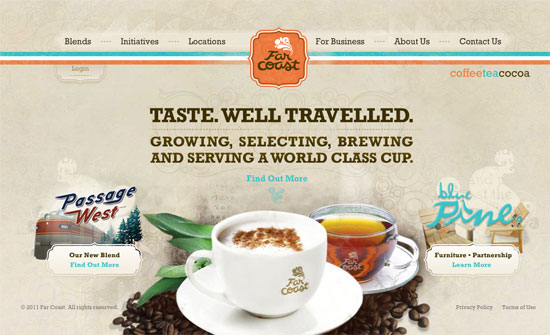 Far Coast, a coffee distributor, has a site that’s probably a bit “busy” to serve as an exemplar of wabi-sabi, but the background imagery, a combination of khaki and tan images that together give the impression of raw muslin, and the earthy yet bright color scheme, go a long way towards achieving the aesthetic.
On the other hand, the entire site is in Flash, which bothers me on some obscure aesthetic level. This site pushes the boundaries of wabi-sabi, perhaps too far. But it is a lovely and usable site, not a claim all Flash-driven sites can claim.
Build
 The wabi-sabi aesthetic of Build comes in the typography. Build employs a Typekit-served slab serif called FF Tisa Web Pro to give a warm, almost chunky feel to an otherwise cool, modernistic design. The yellow-green color against the dark gray background and the black-and-white photography also give a natural, earthy tone.
And because the site promotes periodic web design conferences, by definition its content is organic and impermanent.
Wearable Print
 The Wearable Print design elements work in harmony to produce a lovely, functional site. This site is a masterpiece of texture and color.
Like Far Coast (featured above), it uses a muted textured background to give the idea of a raw muslin canvas. The quiet, textured blues of the three center panels, which slide down to provide a glimpse of the products being offered, pair well with the similar yet darker blue of the simple logo. On the whole, the quiet yet strong textures work in concert with the muted color scheme to give a natural, organic feel — appropriate for a site that advertises itself as a textile provider.
Think Up
 Think Up designs educational and training programs. Their site is simple, understated, and functional, driven by an earthy, papery color scheme and held together by the visual metaphor of a folder with various Post-It notes sticking out (the navigational links, which turn a variety of colors on hover). The search box is particularly noteworthy, adding some artful “rips and tears” in the “cardboard” background.
So is the “handwriting” and the “stamping” used in the home page’s lettering. This site is a marvel of understated yet sophisticated technique. It’s worth perusing the portfolio of the site designer, Sennep, for more examples of wabi-sabi in their work.
“The Original” (CSS Zen Garden)
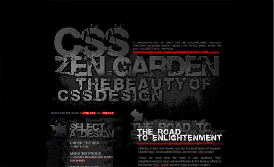 Wow, no bonsai trees here! Instead, designer Joachim Shotter has given us a metal-grunge design with stamped, industrial lettering, lots of realistic distress, and slashes of brilliant reds contrasted against the metal grays. The look of aged, weathered, pitted metal, and the evocation of rust in the use of the reds, works to give this site a Machine Age “wabi sabi” aesthetic.
“Icicle Outback” (CSS Zen Garden)
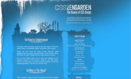 Ah, nature in all its chilly glory. Trees and bushes struggle to stay alive while the ice encroaches from the top and sides in this design by Timo Virtanen. The lettering shows signs of weathering and distress, appropriate for something supposedly weathering the predations of ice and time.
The rough lines of the bordering “ice” are counterpointed by the stiffly vertical images of what I’m guessing are either smokestacks or telephone poles. A different body font choice (Arial and Helvetica, the antithesis of wabi-sabi) would have made this a near-perfect example of the wabi-sabi design aesthetic.
“Dark Rose” (CSS Zen Garden)
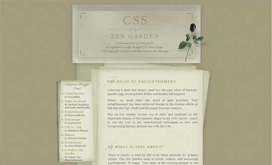 The Victorian lovers would swoon; “Dark Rose” by designer Rose Fu makes excellent use of negative space, and perfectly centers the antique nameplate header graphic, rendered accessible in the best tradition of wabi-sabi by that off-center, titular dark rose lying artistically on the right side.
Touches like the rose and the small, aged book that serves as the link to the site’s archives (scroll down) save this site from being sterile and glossy, as do the translucent “onionskin paper” used as background for the main content.
Jon Tan
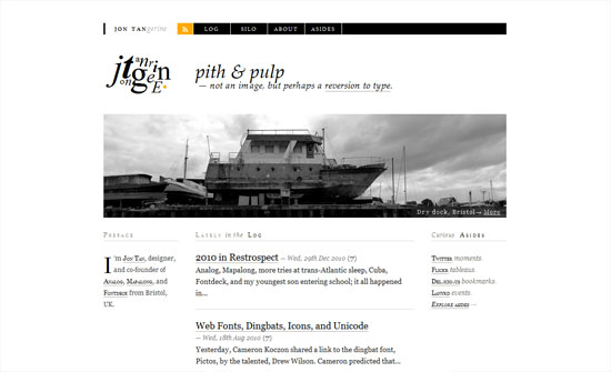 Let’s end the showcase with a site many designers know very well. Jon Tan, who designed and operates the Jon Tangerine website, is an icon among designers, both for his POSH coding and his groundbreaking use of typography as a design element.
Tan’s site also demonstrates a subtle grasp of the wabi-sabi aesthetic. Most people view Tan’s site as cool, clean, and modernistic — and they’re right, it is. Cool and modernistic is almost the antithesis of wabi-sabi.
So how can Tan’s site be both? In my view, Tan incorporates the wabi-sabi aesthetic in his use of natural, warm typography (relying on Georgia with a subtle salting of Baskerville), minimalistic use of color (orange highlights against a black, gray, and white color scheme), and black-and-white photography, usually of natural elements. He transcends the usual parameters of cold, clean-lined modernism to incorporate elements of natural warmth and elegant beauty that recall the wabi-sabi aesthetic — no mean feat.
Some Parting Words
Every web designer — like everyone else who studies the wabi-sabi aesthetic and attempts to incorporate it into their lives — is going to interpret the idea of wabi-sabi differently. Certainly my interpretations are in no way definitive — I have no doubt that someone more conversant in the aesthetic will look at some of the examples I’ve given and shake his or her head at my mistakes. But what I hope to have done here is to have sparked some thought and design inspiration.
Creating a design inspired by the wabi-sabi aesthetic doesn’t mean your site has to look like a bonsai farm exploded on your monitor. It doesn’t have to look like your backyard garden, a National Geographic magazine layout, or a pile of rusted metal. It should find beauty in simplicity.
It should incorporate organic, naturally derived elements. It should be warm and inviting. It should celebrate its mutability and impermanence instead of standing like a changeless monument.
Life moves forward in an endless cycle of birth, growth, decline, death, decay, and rebirth — and so do your websites. That is something I’ve learned from my (brief) studies of wabi-sabi. And if anyone runs across Frances in their daily journeys, tell her I said hi.
She’s probably gotten that tooth fixed by now, which would be a pity.
Sources and Further Reading on Wabi-Sabi
- Wabi sabi as a user experience design approach for Web 2.0 (visual)
- Wabi Sabi: Natural Simplicity In Web Design
- Wabi Sabi and Zen Aesthetics in User Interface Design
- Wabi-sabi and simplicity
- Wabi-Sabi: For Artists, Designers, Poets & Philosophers
- Wabi Sabi – Learning to See the Invisible
- Wabi-Sabi and Presentation Visuals
- The Elegance of Imperfection
- Wabi-sabi (Wikipedia)
Related Content
- Reductionism in Web Design
- Negative Space in Webpage Layouts: A Guide
- Gestalt Principles Applied in Design
-
 President of WebFX. Bill has over 25 years of experience in the Internet marketing industry specializing in SEO, UX, information architecture, marketing automation and more. William’s background in scientific computing and education from Shippensburg and MIT provided the foundation for MarketingCloudFX and other key research and development projects at WebFX.
 -

WebFX is a full-service marketing agency with 1,100+ client reviews and a 4.9-star rating on Clutch! Find out how our expert team and revenue-accelerating tech can drive results for you! Learn more
Make estimating web design costs easy
Website design costs can be tricky to nail down. Get an instant estimate for a custom web design with our free website design cost calculator!
Try Our Free Web Design Cost Calculator


Web Design Calculator
Use our free tool to get a free, instant quote in under 60 seconds.
View Web Design CalculatorMake estimating web design costs easy
Website design costs can be tricky to nail down. Get an instant estimate for a custom web design with our free website design cost calculator!
Try Our Free Web Design Cost Calculator


