- Home
- Blog
- Web Design Designing a Website’s Introductory Text: Tips and Examples
Designing a Website’s Introductory Text: Tips and Examples
-
 18 min. read
-
 William Craig
 CEO & Co-Founder
- President of WebFX. Bill has over 25 years of experience in the Internet marketing industry specializing in SEO, UX, information architecture, marketing automation and more. William’s background in scientific computing and education from Shippensburg and MIT provided the foundation for MarketingCloudFX and other key research and development projects at WebFX.
 Many websites choose to display a short explanatory text in a prominent position of their web page layouts to inform visitors what the purpose of the site is. This introductory text, when crafted well, can help users quickly decide whether they’re in the right place or not. A website has mere seconds to let visitors know that they’ve found what they’re looking for, and your site introduction is your brief elevator pitch towards that.
We’ll explore the use of website introductory text in various types of websites to gain a better understanding of trends and techniques for effectively designing them. At the end of this article, there’s also a showcase of some excellent web designs that have great website introductory text for our further exploration of the topic.
Design Goals
There needs to be a purpose for every component of a website.
They each have to support the goals and purpose of the site. In this way, a thoughtful approach to the design and the copy of your website introductory text is important. The goals of your site introduction are:
- To let the visitor know, as quickly as possible, what the website is about.
- To give hints as to what action (or actions) they can take immediately (call to action).
- To provide contextual information regarding what to expect should the visitor decide to spend more time on the site.
What follows are some design considerations congruent to the three goals above.
The Text Should Be Concise and Useful
Your copy should be clear and succinct — 1 to 3 sentences should suffice — akin to the abstract of a scientific paper or an excerpt of a blog post. Short intro text improves usability by giving the web page some context, but if it’s too long, users tend to skip it according to an article by leading usability expert, Jakob Nielsen.
A thoughtfully designed and informative introduction helps first-time site visitors swiftly determine what the site is about. A well-crafted site introduction text is actionable. The example below from Polecat is an example that highlights the importance and effectiveness of being concise.
In only five words, the site intro text successfully encapsulates what the site is. Despite the brevity of the copy, it clearly informs visitors that it’s the site of iOS developers. 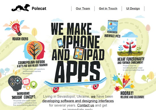
Show Off Your Company’s Personality
Since a site’s introductory text is commonly the first thing a new site visitor will see when they land on your web pages, it’s a great chance to display your company’s personality, just like how your website’s design theme (e.g.
dark, clean, grunge, minimalist, etc.) embodies your company’s personality. Below is friendly duck’s site introduction: It’s short, simple, catchy and written with personality. 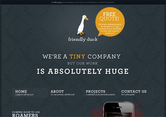
Be Direct
Internet users don’t have a lot of time; they want to know as quickly as possible why they’re on your site.
You can do this by being clear and to-the-point with your message. For example, the introductory text of FreeAssociation tells visitors who they work with and what they do. 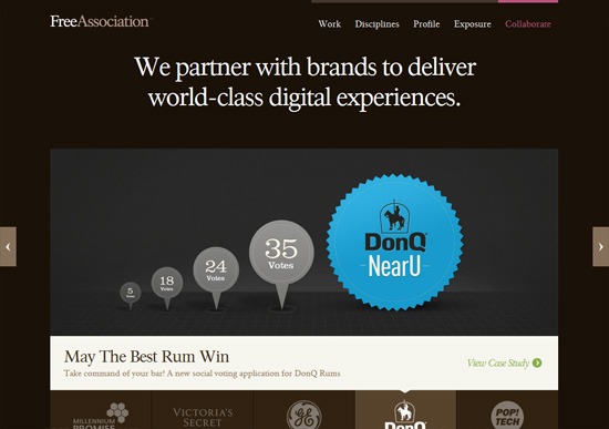
Offer Your Value Proposition
Informing visitors what you have to offer is a good idea.
This is referred to as your value proposition. What value do you provide your customers? What makes you unique?
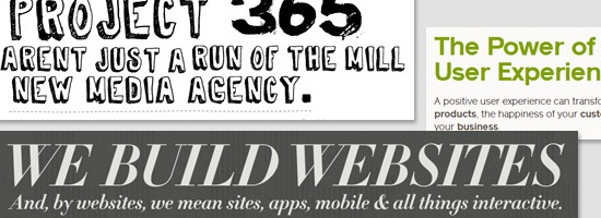
The Project365 site, for example, promises their customers that they’re not an ordinary new media agency and that they can deliver clever designs that attract visitors to their clients’ web properties — a promise not all design agencies can confidently make. 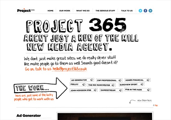
Place It in a Distinctive Layout Position
The site introductory text is something you’d want your visitors to see immediately. Typically, the goal is to have it be seen first.
Distinctive Design Techniques
There are many distinctive design techniques you can employ to draw the user’s attention. You can apply methods related to visual weight, visual hierarchy, negative space and even the Figure-Ground Gestalt principle. Additionally, you can use a tool like Google’s Browser Size to determine what percentage of the Internet population will see your site intro text on the initial page load.
Top Left
One technique that will almost always work is placing the site intro text at the top of the layout. Whether by ingrained Internet convention or actual human tendency, web users look towards the top of web page layouts when they’re in search for important site components such as primary navigation menus and search features. The top-left of a web page’s layout, according to an eye-tracking study done by Jakob Nielsen, is a prime location because user attention leans to the left.
Notice how the Campaign Monitor site has their site’s introductory text at the top-left of the layout. They use other distinctive design techniques such as spacing (its distance away from other design elements enhances its distinctiveness), a unique type treatment and visual hierarchy. 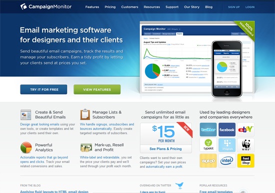
Top Center
Another prominent location is top-and-center.
The Fork website shows how placing your site’s intro text at the top-center of the web page layout helps to garner it attention. 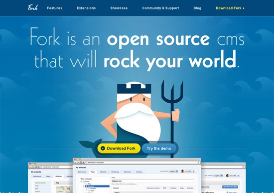
Leverage Surrounding Visuals
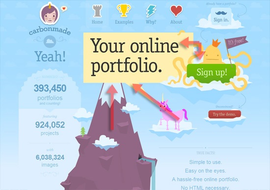
Another way you can grab the eyes of site visitors is through the use of surrounding visual elements that reinforce and direct the eye gaze towards your message. Notice the three illustrations that all help to reflow your eyes towards the site introductory text on Carbonmade‘s home page.
Draw User Attention Using Typography Techniques
There are several typography composition techniques you can employ to further enhance the attractiveness of your site’s introductory text. Let’s discuss a couple.
Typography Size
One typography styling technique is size. Bigger objects are easier to get to (according to Fitt’s Law) and the Gestalt principle of Similarity indicates that if an object is significantly bigger than other objects around it, it will stand out as a distinct object.
Notice how big the site intro text is on Teehan+Lax. Regardless of its low contrast versus its background and the vividness of surrounding areas, it still manages to attract your attention due to its relative scale. 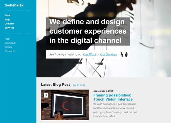
Text Styling
A unique text effect that has a high contrast against its background can also go a long way towards a site intro text being able to garner attention.
Notice the simple gradient text effect on the Great Bible Tales site and how it’s able to help draw your eyes toward their site’s value proposition. 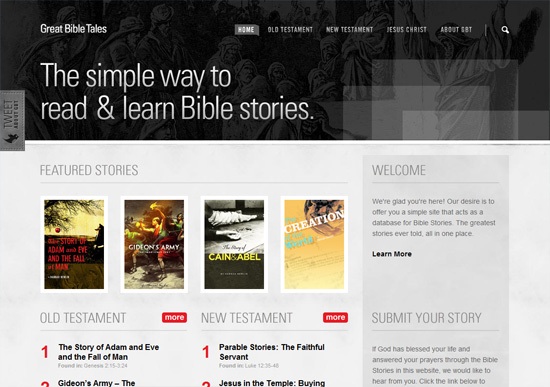
Consider Using a Short Heading
Some messages need further explanation. A popular strategy in this situation is to use a brief, keyword-rich heading followed by a short paragraph.
Twitter demonstrates this technique with a big, bold heading followed by a short sentence. 
Close Proximity to Calls-to-Action
The worst thing that can happen after reading a site’s intro text is to fail to realize what the next potential action can be. Decrease the chances of the site visitor hitting their browser’s back button by having relevant calls-to-action close to your message.
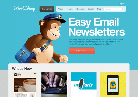
As shown below, Clearleft gives you the link to their About page through a call-to-action (“See what Clearleft can do for you.“) immediately after their site’s intro text. 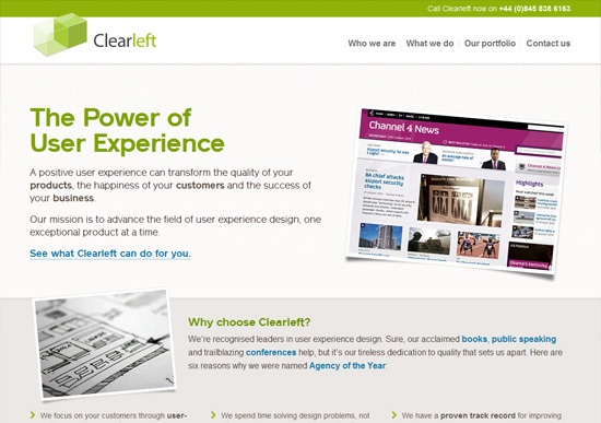 MailChimp does the same by providing an eye-catching call-to-action button that you can click on to register an account with their web service.
Showcase of Introductory Text in Websites
Let’s look at how the design goals, trends and techniques we’ve discussed above are applied to other websites by dissecting other real-world examples of well-designed site introductory text.
Bellstrike
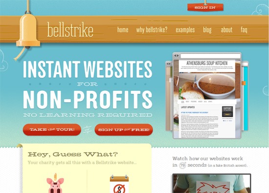
A succinct, direct-to-the-point site intro text can be found on the Bellstrike website. The text styling is unique and the font size is huge — two popular visual design strategies to achieve distinctiveness, like we talked about earlier. Two beautiful call-to-action buttons sit ready and waiting at the foot of the introductory text once the site visitor has finished reading.
The content is useful, offering the site’s unique value proposition of quickly providing websites to non-profit organizations. Positioned at the top-left of the layout, the site intro text is guaranteed not to be missed by incoming site visitors. Also, notice the surrounding visual — the hanging bell on the left of the site logo — that helps direct eye flow downwards toward the text.
Square
Square’s site introduction is a concise value proposition: you can start accepting credit cards using your mobile device if you use their service. The text is situated at a visible top-left position in the layout using a big, striking font style. A convenient call-to-action web form for signing up for a free account below the site’s intro text makes it easy to take action.
Take note of how the surrounding visual — the index finger and thumb points to the left — redirects your eye flow to their sign up web form and site intro text in case it strays too far to the right. 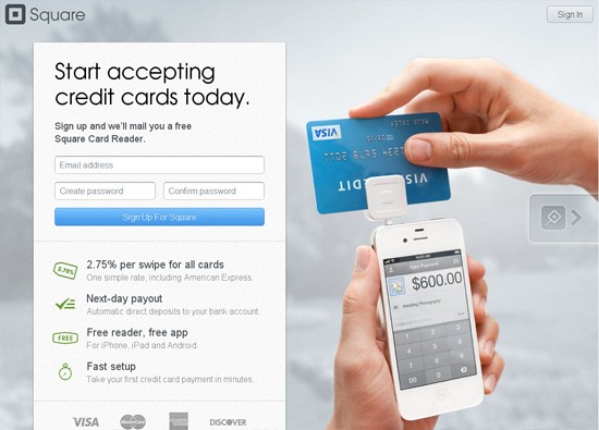
Fish
This site has the introductory text on the left of the layout (a prominent location since, as stated earlier, our attention leans to the left of web pages). The introductory text is short, concise and useful, with the value proposition of combining and reimagining French and Asian cuisines.
Below the introductory text, you can find a call to action enticing you to view the restaurant’s menu. 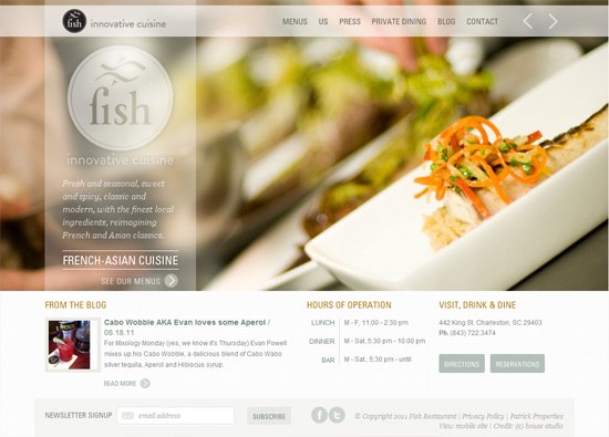
Fatburgr
Fatburgr uses a captivating headline that utilizes a simple but effective gradient text style as well as a large font size. The headline is followed by a short and personable sentence describing what Fatburgr does as well as proposing their value to the customer (“Do you know the nutritional content of what you’re ordering?
…Fatburgr gives you nutritional information…“). Two huge call-to-action buttons can be found in an eye-gaze-drawing location at the foot of the site intro text. 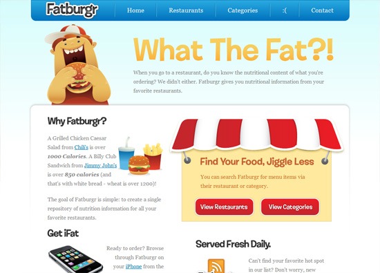
31Three
31Three’s value proposition is that it offers creative services to developers.
We can see the site intro text positioned at the prominent top-left of the layout, using a large font size as well as more-than-ample empty space surrounding the message. 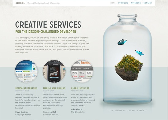
CulinaryCulture
The site intro text of this site is concise and useful. Within 10 words, they’ve managed to describe what the site is and for whom the site is for.
The short intro text is followed by a three-column thumbnail gallery that outlines some of the things you can do on the site (such as sharing and reviewing your favorite eateries) followed by a call-to-action link to sign up for an account on the site. Aside from that, we can see the use of a beautiful, eye-grabbing text effect, the use of a large font size and a placement for the text in a distinctive layout position, top-and-centered. 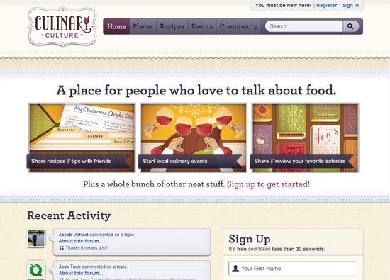
Blue Pixel
A three-word heading using a big, bold font style is followed by a one-sentence value proposition in this site’s intro text.
Notice how the surrounding visual, an electric guitar, is angled in such a way as to aid eye flow towards the site introductory text. ![]()
Web Typography for the Lonely
A simple statement of what the site is serves as this website’s concise site introductory text. 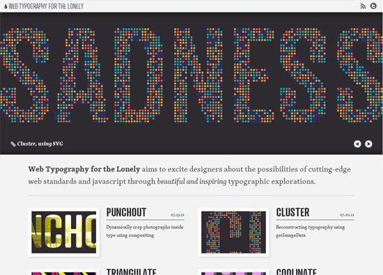
Sunday Best Websites
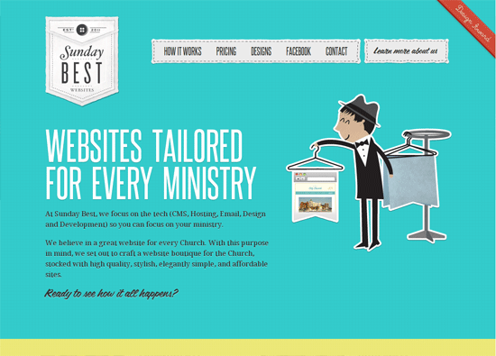
A big and high-contrast headline contains the value proposition of Sunday Best Websites.
Two paragraphs follow the headline describing in greater detail what service they provide and what their design style is like. The site’s intro text, as can be seen in many of the examples we’ve already talked about, is followed by a call-to-action link that describes their project methodology. The use of a surrounding visual helps direct eye flow to the left, with the arms of the illustrated gentleman outstretched, serving to place the attention back towards the text.
Vegas Uncork’d
The site introductory text of Vegas Uncork’d, a website aimed at promoting a Las-Vegas-based wine and food festival, has a captivatingly big headline, followed by a two-paragraph description. The headline features a distinctive text style, making it very attractive to the eyes relative to its surrounding elements. 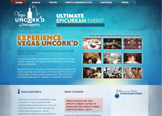
Igor Zagnienski
A concise introductory text written in the first-person voice is situated on the top-left of Igor Zagnienski’s site layout.
The introductory text’s high contrast against its background as well as plenty of space surrounding it makes it eye grabbing. 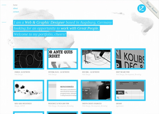
Electric Pulp
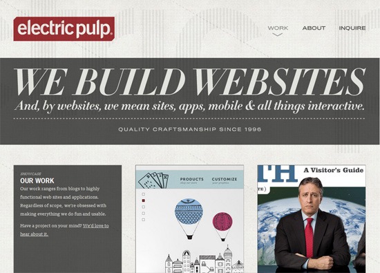
It’s hard to miss the site intro text in this website: it’s humongous and has a high contrast against surrounding elements. The site’s intro text is personable and, most importantly, concise; in three words, new site visitors already know what the company does.
Assistly
Assistly summarizes their value proposition in 9 words with the emphasis on what they do, which is to provide users with the facility to manage their customer support department. A large font size, the use of a drop-shadow text style and a prominent top-center location serves to attract the user’s attention. 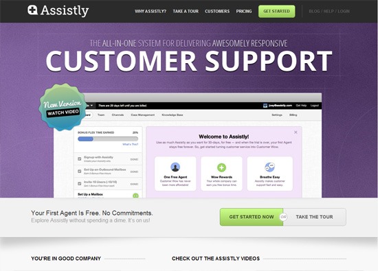
Bitfoundry
A big, eye-grabbing heading styled uniquely and attractively, followed by a two-sentence intro paragraph describing who, what and where Bitfoundry is, serves as this site’s introductory text.
The text is placed at the top-center of the layout. Space, a high-contrasting color and size is used as visual design devices to provide the text some distinction against surrounding elements. 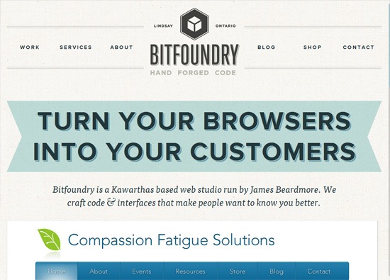
N.Design Studio
Nick La’s design blog uses big, bold fonts in its site intro text.
In a handful of words, the intro text manages to answer who the site owner is, what the purpose of the site is and where the site owner operates from. He uses a surrounding visual of a koi fish to anchor the message to an attractive image. 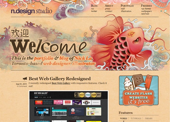
iSaidWhat?!
There are a ton of mobile apps out there, and thus, an iOS app’s website needs to get to the point quickly or risk the user looking elsewhere.
At the top-center of iSaidWhat’s mobile app website is a short intro text detailing the value proposition of the app. 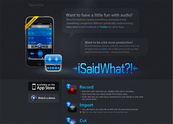
Kickoff
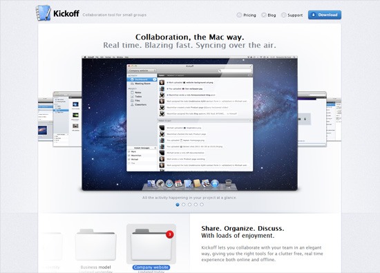
Here you can see this web-based collaboration tool’s simple site introduction located at the top-center of the web layout. The surrounding image below it helps focus your eyes towards the center of the page layout.
Blue Sky Resumes
At the center of this site’s layout, you can see the Blue Sky Resume’s site intro text. It consists of a captivating heading that plays on the wants of potential clients to be one-of-a-kind (the site’s value proposition), followed by a short paragraph describing what they can bring to the table if you choose to hire them. The text has big fonts and a drop-shadow text style to give it prominence.
The surrounding visual of a cookie helps ensure that the intro text is anchored with a distinctive image that will help bring the text attention. 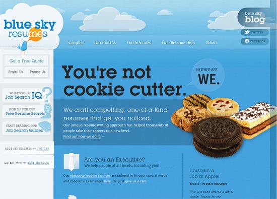
Analog
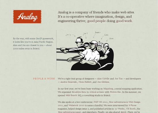
Positioned at the top-center of Analog’s web layout is a concise site intro text outlining what they do for their clients. Space surrounding the text is an effective tool for gaining a viewer’s attention.
co: collective
The site intro text here is short and to-the-point. A more-than-ample amount of whitespace surrounding the text, the top-center text placement as well as the web page layout’s visual hierarchy arrangement serves to give the text block its distinctiveness. 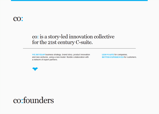
Conclusion
Designing your site introductory text, if you choose to have one, is important because it’s one of the first things visitors will see when they visit your site.
Using succinct copy, placing the intro text in a highly visible position, using common typographic styling and leveraging surrounding visuals to your advantage are among the popular trends used in today’s site introductory text.
Related Content
- Smarter Web Designs: Responsive and Customizable
- Situational Design for the Web
- Symmetry in Design: Concepts, Tips and Examples
-
 President of WebFX. Bill has over 25 years of experience in the Internet marketing industry specializing in SEO, UX, information architecture, marketing automation and more. William’s background in scientific computing and education from Shippensburg and MIT provided the foundation for MarketingCloudFX and other key research and development projects at WebFX.
 -

WebFX is a full-service marketing agency with 1,100+ client reviews and a 4.9-star rating on Clutch! Find out how our expert team and revenue-accelerating tech can drive results for you! Learn more
Make estimating web design costs easy
Website design costs can be tricky to nail down. Get an instant estimate for a custom web design with our free website design cost calculator!
Try Our Free Web Design Cost Calculator


Web Design Calculator
Use our free tool to get a free, instant quote in under 60 seconds.
View Web Design CalculatorMake estimating web design costs easy
Website design costs can be tricky to nail down. Get an instant estimate for a custom web design with our free website design cost calculator!
Try Our Free Web Design Cost Calculator