
Looking for website navigation examples? Like a travel map, each section of a website’s layout must guide users from one page to the next. Without proper instruction and structure, a website can seem confusing.
Users might leave before reaching their destination and miss out on what could’ve been a fantastic experience.
Keep users on course by reviewing these well-structured website navigation examples and learn how to create an effective navigation for your site.
7 of the best website navigation examples to inspire your design
We rounded up the best website navigation examples from top brands! Find out the best practices that make their navigation structure effective.
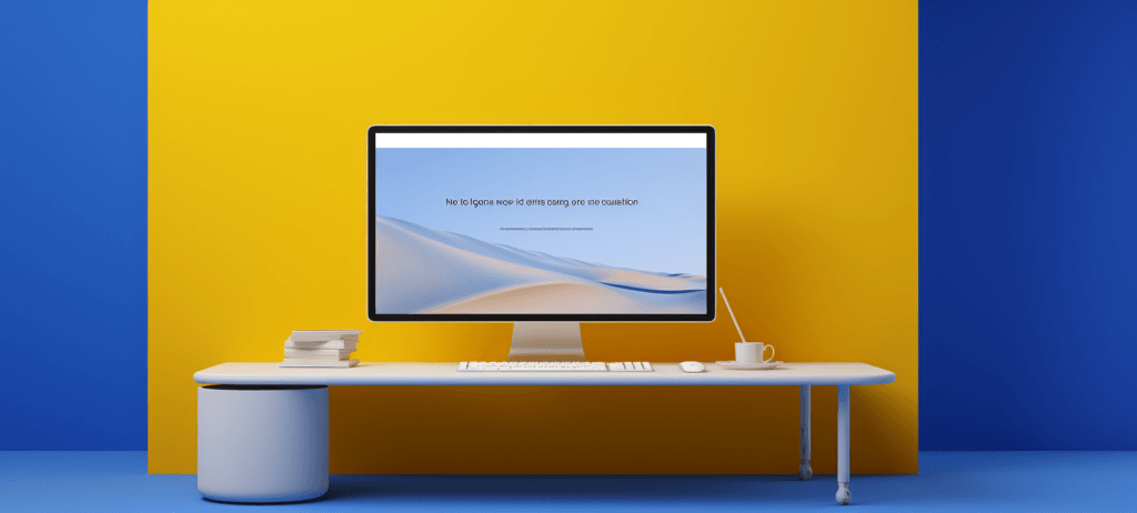
1. Terra Outdoor
Terra Outdoor uses moving graphics on its homepage, separate from product images and non-distracting. The page uses white space to spotlight and separate furniture options. It has minimal text and a visual dropdown menu highlighting the main furniture categories.
The page has a search function and bold, clickable text leading to their sales page.
2. Patagonia

Patagonia’s web design prioritizes intuitive hierarchy and consistent placement with a vertical sidebar menu, showcasing product options under different headings. Users can scroll horizontally through product options conveniently. The homepage has white spaces between product graphics, spotlighting the other options.
It also has a pink header, drawing users’ attention to the top menu.
3. Nike
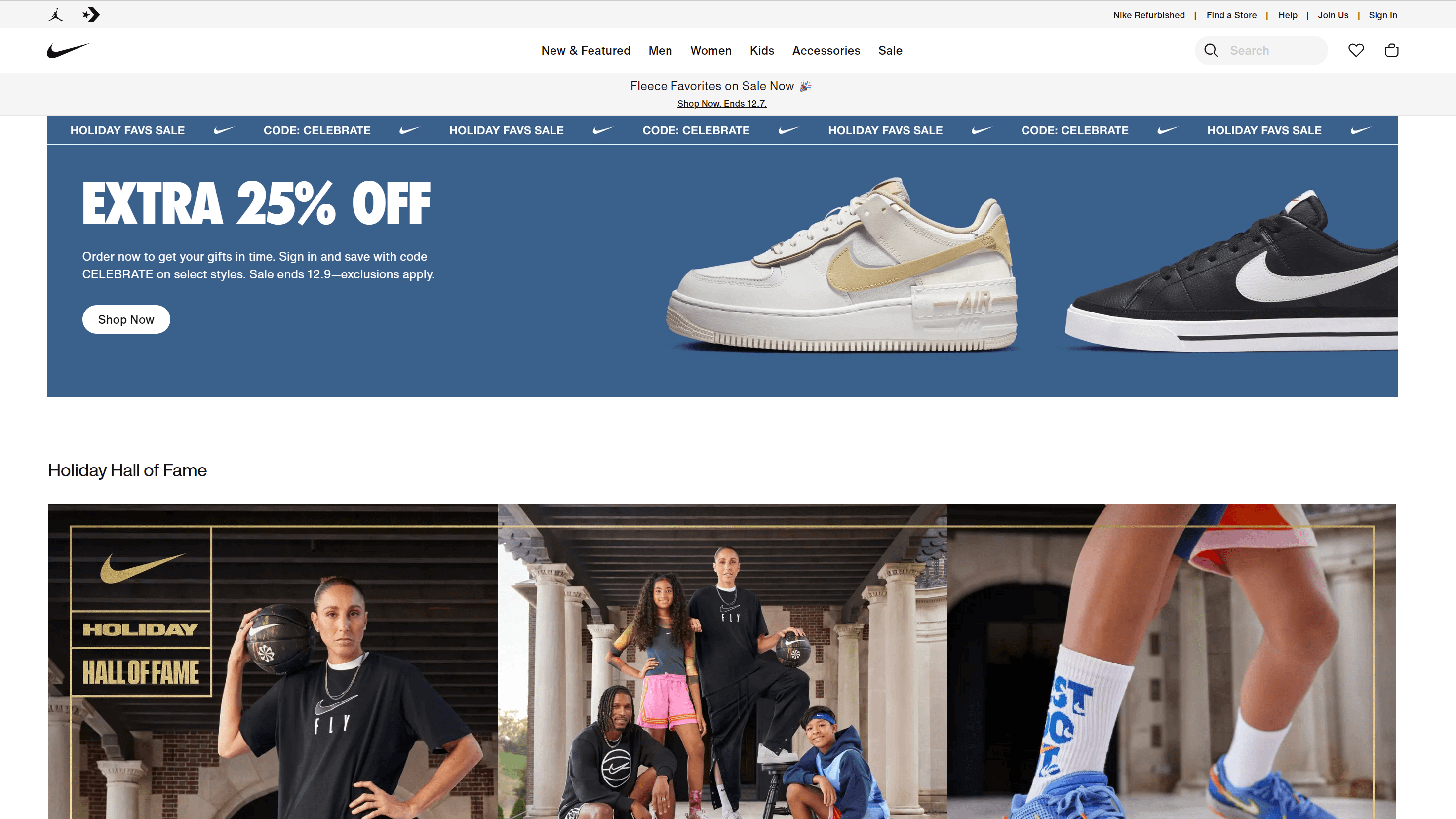
Nike uses a clean, white, minimalist background, amplifying product graphics on the homepage. The product pages’ breadcrumb navigation helps users browse product varieties and return to the main product. The top center mega menu gives users a full view of products under different categories like women, men, and accessories.
4. Rapha
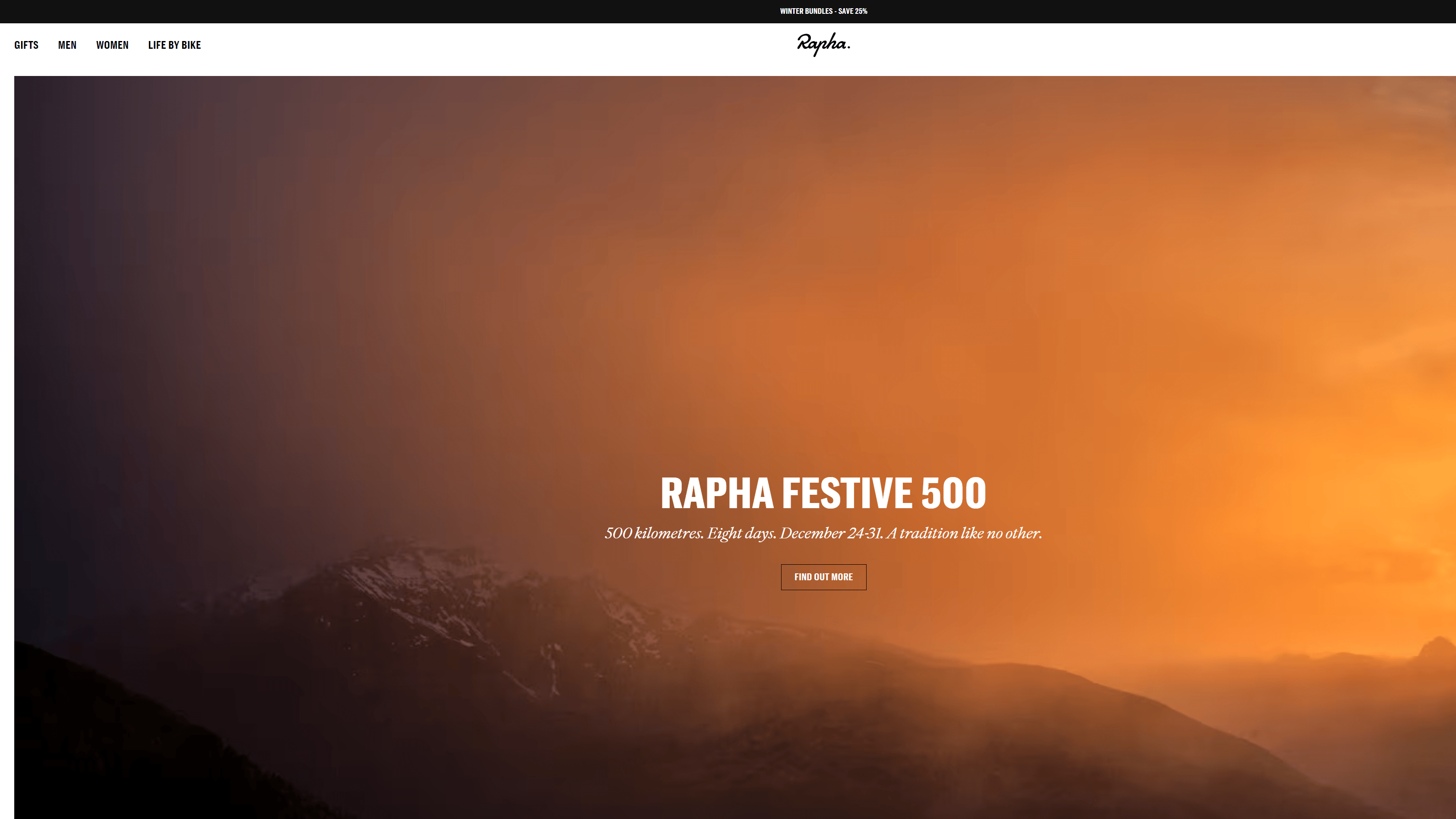
Raphas’s layout structures product collections strategically, leading users through the main categories. The big and bold visuals accentuate the clear and concise white hyperlinked headings, leading users to shop now and browse sales. The design offers a visible search function and a prominent navigation menu on the top right of the screen.
5. Mercedes Benz
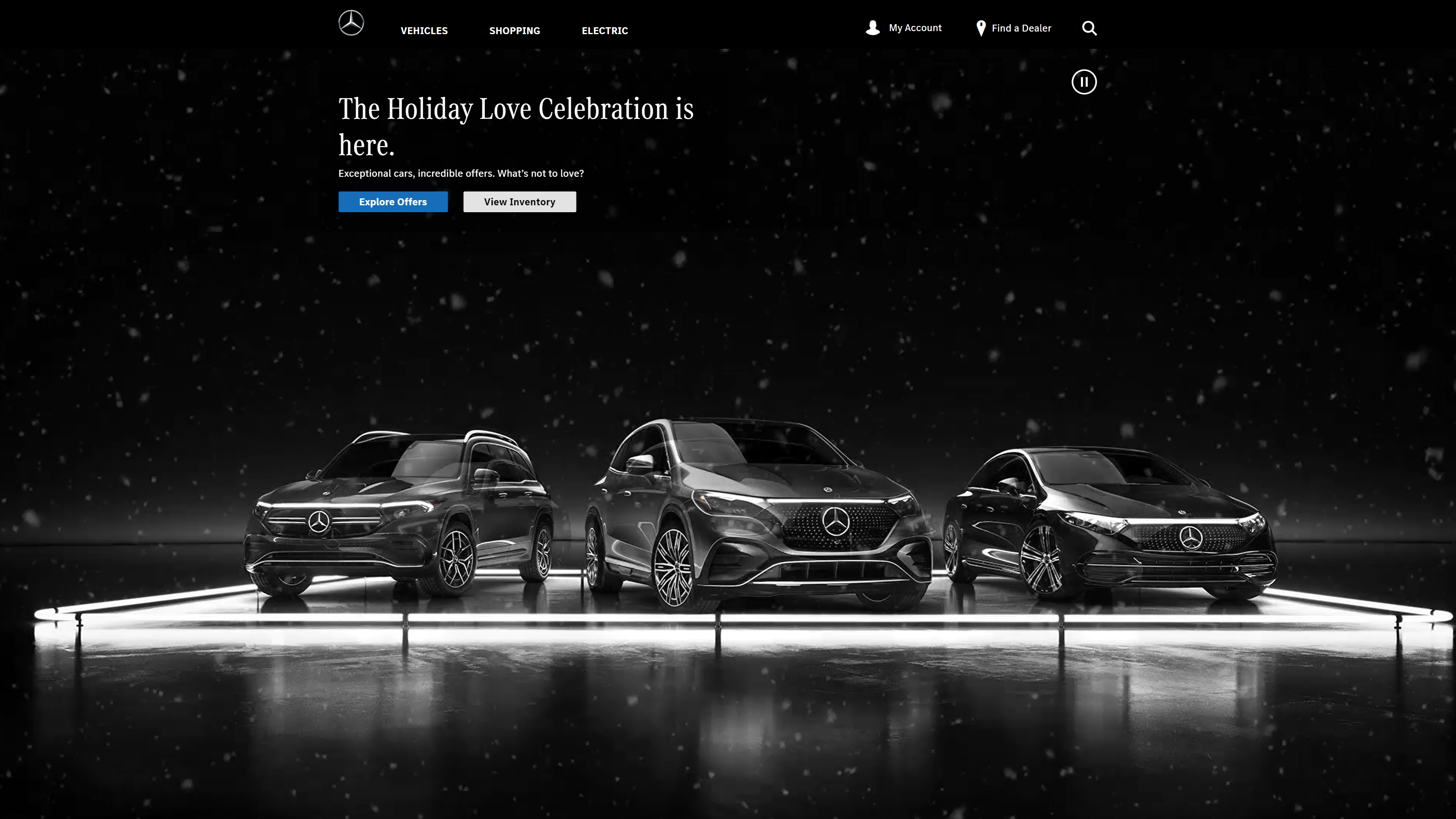
Mercedes Benz uses a visual dropdown menu to help users explore different car models. The website design has a search function, and menu tabs are accessible with a keyboard and mouse. The design is subtle, highlighting the main features.
It has a detailed footer menu with clear and concise text.
6. What Is Missing

What is missing offers multiple visual cues like hover effects. Users can navigate between tabs or icons and zoom in and out. The black background enhances the white text and colorful graphics.
The menu spans the whole page. The category options are visible, and users can click on the three lines on the top left page to return to the start. The website is responsive and has quick load times.
7. Cartier Time Project
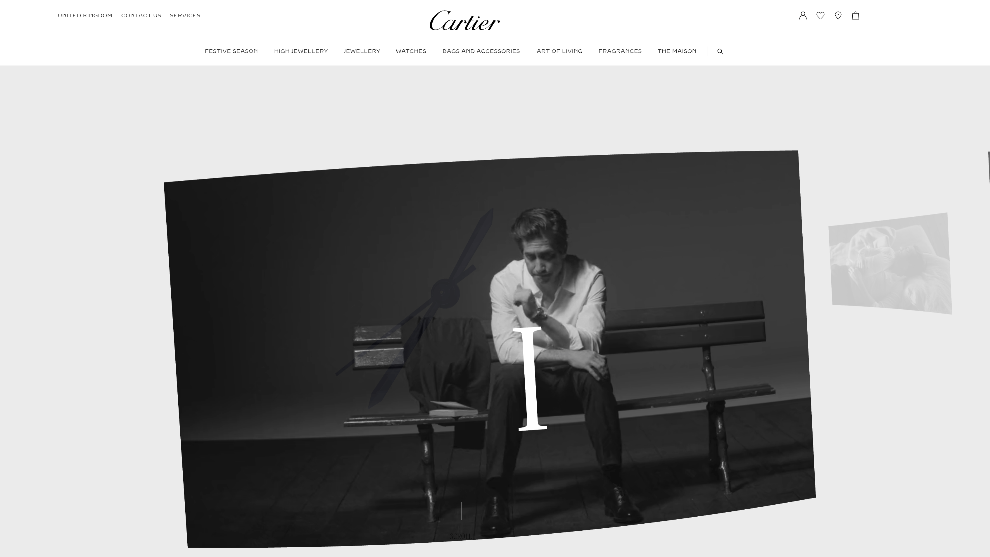
Cartier’s time project page is responsive, concise, and accessible. Users can toggle through products and return to the homepage using the hover top navigation menu. The minimalist video background uses little text, color, and movement.
The enter button directs users to multiple video shorts where they can select and skip video chapters with their keyboard.
Website navigation menu best practices
Here are some best practices as seen on our website navigation examples.
Draw User Attention
When users land on your website, they have a purpose in mind. They might search for information on a product or service, browse items and services, learn about your company, purchase an item, leave a review, or contact you. Helping users find what they need quickly is essential for a great user experience.
Drawing their attention to menus and text is one of the best ways to help them achieve their objective quickly and effortlessly.
You can make navigation menus a different color from the background and use white space to separate them.
Next, highlight essential information so that it is eye-catching. Use bold, clickable buttons for cues like, leave a review, shop now, learn more, contact us, and browse our collection.
Optimize your layout design for all screens
People appreciate when they can access a website on any device. It makes their lives easier and allows them to interact with your webpage wherever and whenever they like.
The most crucial factor is that your website is easily accessible and responsive on multiple devices.
Slow load speed, text that gets cut off, and incompatible screen resolution can affect user experience. Adjusting your website layout for tablets, computers, and other platforms enhances your website navigation and usability. You can get inspo from these UX design examples.
Guide users through your web pages
People might click on multiple tabs while browsing your website.
For example, a user clicks on a category, a subcategory, a category product, product information, or related products. In minutes, they’ve forgotten where they began and what they were looking for.
You can use smart navigation techniques to help users return to their initial search or starting point. Breadcrumb navigation helps users identify where they are on your website and helps them get back to the start.
It can also make browsing your site convenient and satisfying.
Use a less is more approach with menu items
If you’ve ever ordered food off a complex restaurant menu, you know how overwhelming it can be. It’s the same with website menus. Looking for specific items on a lengthy nav menu can feel overstimulating.
Users might get despondent and click off your website.
Consider a minimalist approach to navigation menus. Add menu options strategically and sparsely to help users instantly spot what they’re looking for. For example, instead of adding all your service options in one menu, create separate category menus on your top navigation with fewer options under each title.
Focus on data-driven design
One of the best ways to improve your website navigation for your audience is by using user activity data to improve your website design and layout.
With tools like Google Analytics heat map, you track and identify a user’s browsing patterns and journeys. Heat maps help you identify pages and tabs users navigate first and frequently.
Use tracking data to optimize your webpage design and make it more accessible and convenient for users. For example, if your About page gets the most attention, you can move the About Us tab to the top of your menu or the first option in your top navigation, making it more visible and easily accessible.
FAQs about website navigation examples
Here are some frequently asked questions on website navigation.
What is website navigation?
Website navigation refers to guiding users through a website with features like layout, design, graphics, icons, text, menu, and buttons.
These characteristics help users access and move through different pages, products, and services. For example, a top navigation menu has icons or text displaying the website’s primary products and services. With visible icons, users can navigate to a specific page and find what they want.
What are the types of website navigation?
Here are common types of website navigation design:
Header horizontal navigation bar
The horizontal navigation bar is one of the most common navbar examples.
It displays website pages or categories horizontally in the top header. The page name appears next to each, often including titles like About Us, Sign Up, and Contact Us. The Navigation bar highlights the primary or popular website pages, helping users navigate them quickly.
Vertical sidebar
A vertical sidebar navigation menu is often on the left-hand of a webpage.
They give websites more space to list their content options vertically. While vertical sidebar navigation can work for various sites, it is most suitable for websites with a high number of navigation links. Other design types can be ideal for websites with fewer links.
Drop down navigation menu
The dropdown navigation menu expands from the top of the page, displaying website information and product and service options.
Users can hover over dropdown navigation menus and fully view the items under a specific website page or category. Dropdown navigation menus are excellent for websites with multiple pages and content pillars.
Hamburger menu
A hamburger menu lists page content vertically on a mobile device and horizontally on a computer. When a user clicks on the three-line hamburger icon, often at the top of a page, a dropdown menu displays a content list.
Content headings can have arrows leading to subcategories. Hamburger nav menus are great for condensing content and saving space.
Footer navigation menu
A footer navigation menu is a common navigation menu example. It is the menu at the bottom of a website.
The footer navigation menu often offers a broader selection of content options. It’s an excellent way for users to find and navigate to different pages without scrolling back to the top.
Ready to design your website navigation?
Excellent website navigation is key to improving user experience. If you’re looking for website design services to improve your conversion rate and maximize return on investment, then we can help.
WebFX is a full-scale digital marketing agency.
We understand the importance of creating a website that benefits users and your business.
We use data-driven digital marketing to design and optimize your website navigation. Our designers are experts in their field and have extensive knowledge in creating responsive, accessible, and user-friendly website design and layout. Contact us today to learn how we can help you create a winning website.
-
 Macy is a marketing writer with over five years of experience creating content for dozens of industries including food and beverage, home services, and education. She also specializes in creating SEO and PPC content. Her work has been featured by Search Engine Journal, HubSpot, Entrepreneur, Clutch, and more. In her free time, Macy enjoys trying new crafts and reading comic books.
 -

WebFX is a full-service marketing agency with 1,100+ client reviews and a 4.9-star rating on Clutch! Find out how our expert team and revenue-accelerating tech can drive results for you! Learn more
Make estimating web design costs easy
Website design costs can be tricky to nail down. Get an instant estimate for a custom web design with our free website design cost calculator!
Try Our Free Web Design Cost Calculator
Share this article


Web Design Calculator
Use our free tool to get a free, instant quote in under 60 seconds.
View Web Design CalculatorMake estimating web design costs easy
Website design costs can be tricky to nail down. Get an instant estimate for a custom web design with our free website design cost calculator!
Try Our Free Web Design Cost Calculator


