The state-by-state search data that we collected is fascinating to look at. But we decided to take it to the next level: why do certain states use Bing more? What is about the deep south that likes Yahoo! so much?
These are all questions that are extremely tough to answer at scale, but we decided to have some fun and do a bit of research by examining what state-by-state data sets strongly correlated with our state specific search data.
We pulled a bunch of data on the 50 states and ran it against our original data set. We looked at factors that we initially thought would correlate well with search usage (age, education, Facebook usage, etc). We also looked at some out-of-the-box factors, some of which correlated extremely well with search engine usage.
All of this data comes with the disclaimer that correlation does not equal causation. Having positive correlations between two sets of numbers doesn't equal proof that one strongly influences the other, but it is interesting to look at and can provide some insight into the psychology behind search.
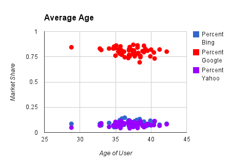
Average Age |
|
| Bing | 0.089337442354868 |
| Yahoo! | 0.145356492976564 |
| -0.269122946695566 |
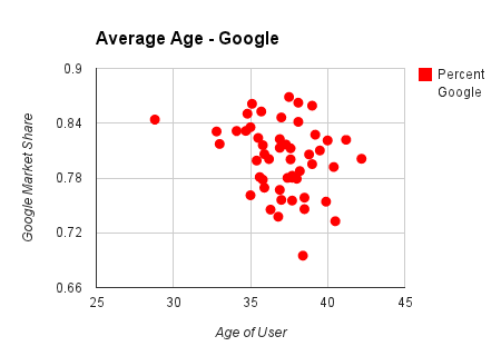
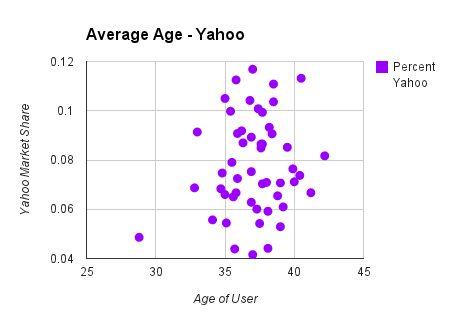
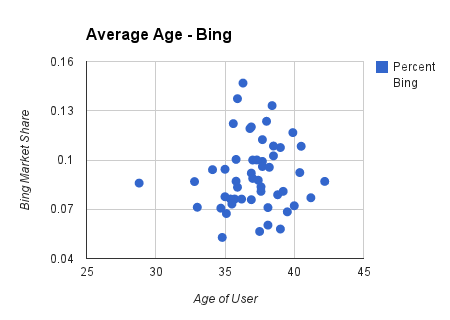
Correlations between the average age of a state and the use of our three major search engines vary, but none are strong.
Bing had a slight positive correlation, as average age increased, so did Bing�s market share. Yahoo! also had a similar, yet larger, positive correlation. However, Google�s negative correlation shows that the older the average age was, the least market share it had. Perhaps Google is a younger generation search engine?
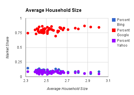
Average Household Size |
|
| Bing | -0.471202207228802 |
| Yahoo! | -0.266492068846383 |
| 0.423296775554897 |
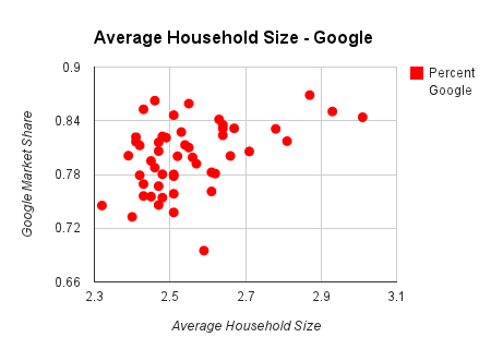
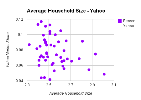
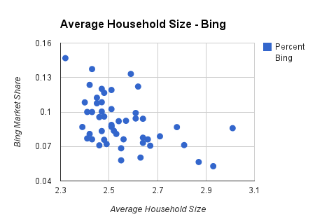
Larger average households prefer Google over Bing and Yahoo!
With a correlation of 0.423, the larger the household average, the more Google users. Bing and Yahoo! both have fairly strong negative correlations.
Percentage of 25-34 year olds with postsecondary degree |
|
| Bing | -0.138799334117713 |
| Yahoo! | -0.454153701196173 |
| 0.306405416335862 |
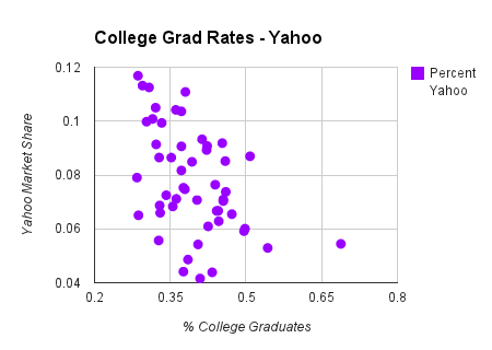
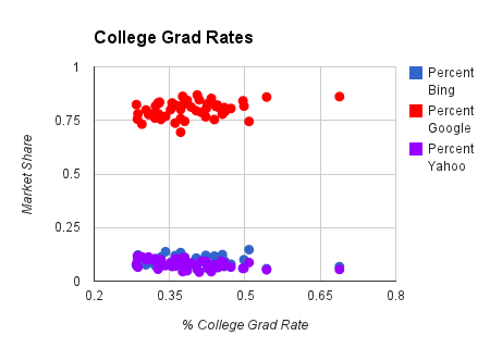
College graduates appear to prefer Google and rarely use Yahoo! to search.
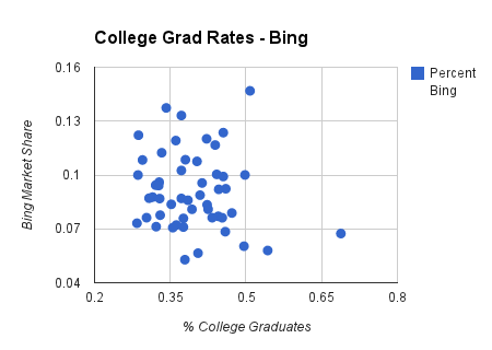
There are two strong correlations between populations with higher percentages of college graduates and Google and Yahoo! usage. Bing usage, on the other hand, has no signifiant correlation.

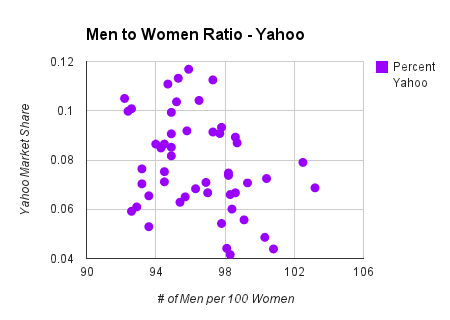
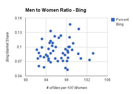
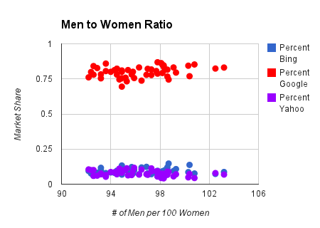
Men Per 100 Women |
|
| Bing | 0.089436208534241 |
| Yahoo! | -0.323280526349536 |
| 0.279582598583727 |
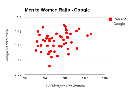
There are no strong correlations with gender and search engine usage
Though a negative correlation may exist between Yahoo! usage and areas with more men, none of the major search engines had noteworthy numbers when it comes to gender.
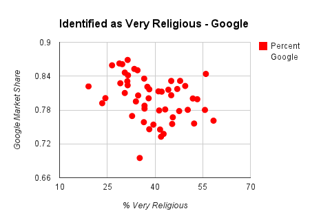
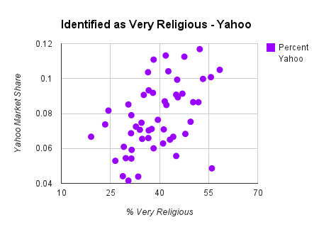
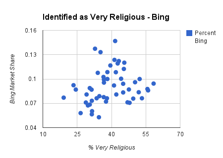
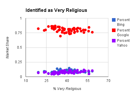
Self-identified as very religious |
|
| Bing | 0.208423504479413 |
| Yahoo! | 0.466367647168989 |
| -0.32622560303025 |
Yahoo! usage is higher in states with more people who identify as "very religious."
One of our strong correlations was Yahoo! usage in areas where many people identify as being very religious. This is particularly the case in the southern United States. Google has a negative correlation, meaning usage is higher in areas where less people identify as very religious.
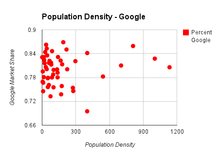
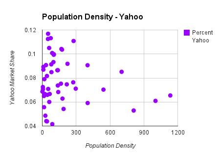
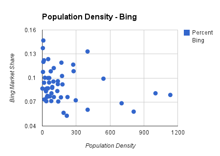
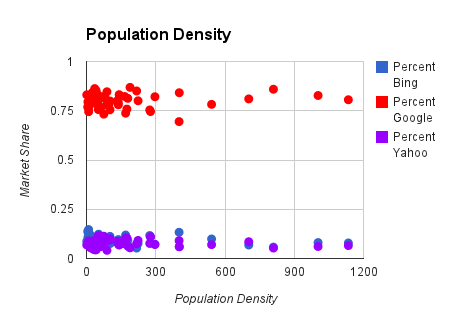
Population Density |
|
| Bing | -0.270797507463075 |
| Yahoo! | -0.153363187111179 |
| 0.09006476685544 |
While certain geographic areas prefer different search engines, there is no significant correlation with population density.
While this is tough to evaluate on a state-by-state level, there's no large correlation between search engine usage and population density. Bing has the strongest data, with a negative correlation of -0.2707.
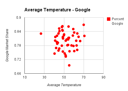
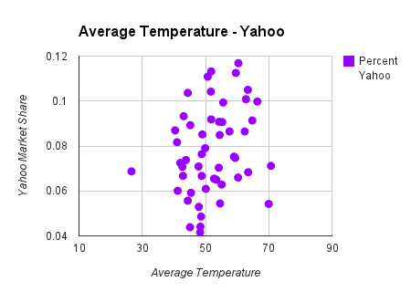
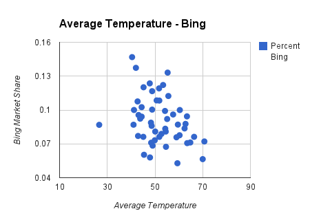
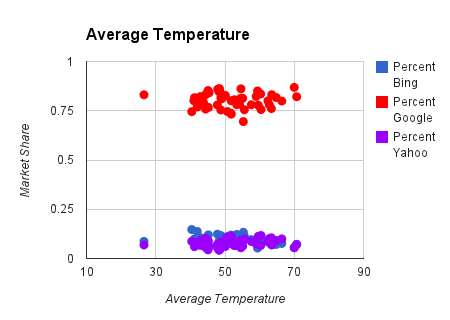
Average Temperature |
|
| Bing | -0.334372811370088 |
| Yahoo! | 0.250985941708864 |
| 0.024988646344311 |
Bing usage seems to be higher in colder states.
Bing usage in colder states is higher than in warmer regions. Data on Yahoo! shows the opposite effect: usage appears to increase in warmer states. Google shows no correlation.
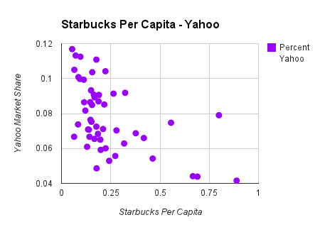
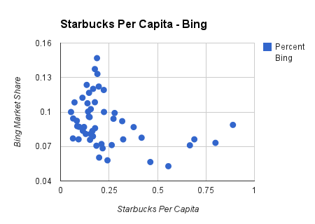
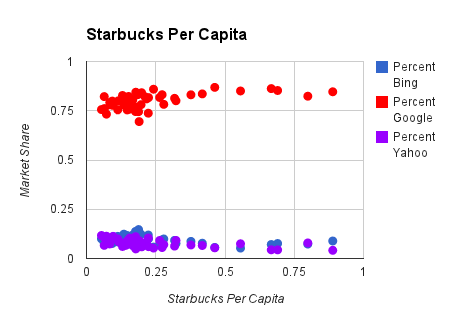
Starbucks Per Capita |
|
| Bing | -0.339417034258359 |
| Yahoo! | -0.529667640644466 |
| 0.538734140198358 |
States with a higher percentage of Starbucks prefer Google, dislike Yahoo!
While population density has no strong correlations, the number of Starbucks per capita produces a few interesting ones. Yahoo! has a sharp negative correlation at -0.529, while Google is their counterpart with 0.538. Bing falls on the Yahoo! side of things, though not as strongly negative.

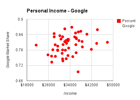
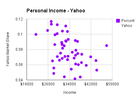
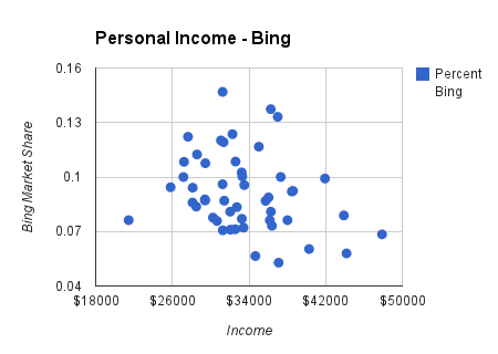
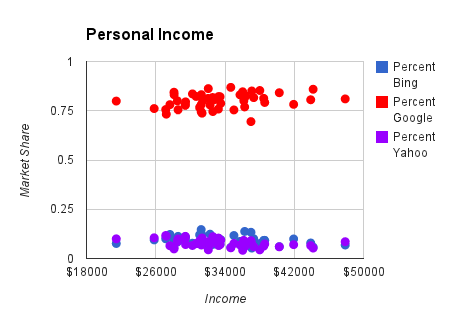
Average Personal Income |
|
| Bing | -0.261729173724645 |
| Yahoo! | -0.406724437433324 |
| 0.274980605709583 |
Yahoo!'s market share is higher in areas with lower average personal income.
With Bing slightly negative and Google slightly positive, Yahoo! steals the show with a strong negative correlation of -0.4.
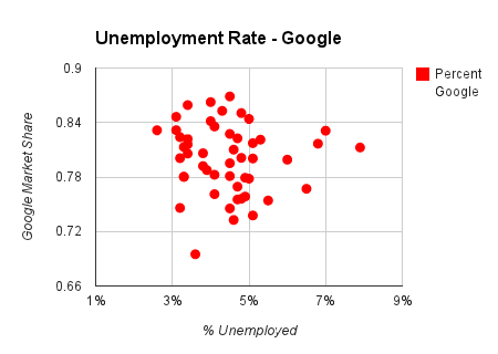
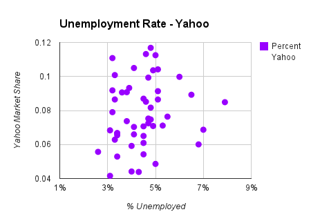
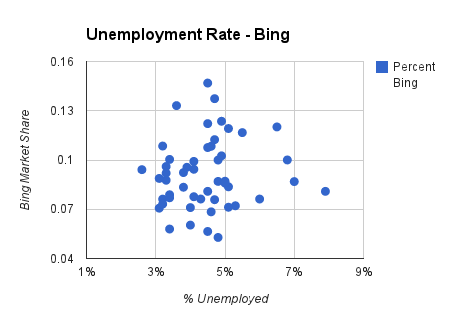
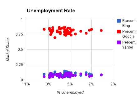
Unemployment Rate |
|
| Bing | 0.112375392951814 |
| Yahoo! | 0.155098692105641 |
| -0.076569240707891 |
Unemployment rate doesn't correlate with state-by-state search engine usage data.
Unemployment rate didn't show any noteworthy trends or correlations with our data on search engine usage.
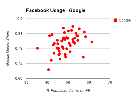
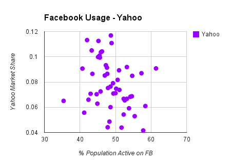
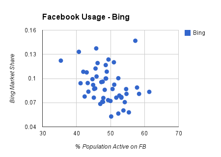
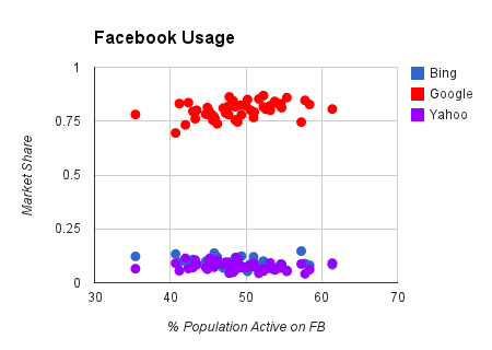
Facebook Usage |
|
| Bing | -0.31960667393748 |
| Yahoo! | -0.267531060399001 |
| 0.402299979554233 |
Despite Bing's partnership with Facebook, states with the highest percentage of active Facebook users prefer Google.
Facebook and Google might be rivals but users of Facebook seem to prefer Google over other search engines. States with larger percentages of their population active on Facebook have a correlation of 0.402. Both Bing and Yahoo! show slightly negative correlations.
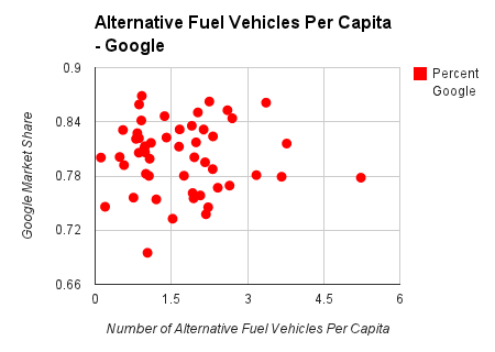
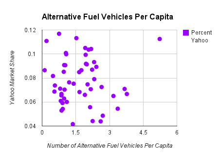
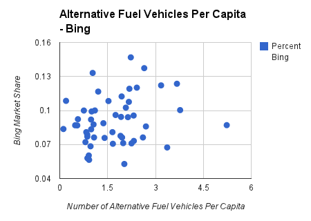
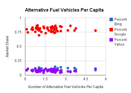
Alternative Fuel Vehicles Per Capita |
|
| Bing | 0.222001239215267 |
| Yahoo! | -0.021154092969287 |
| -0.008636181240946 |
No significant correlation exists for alternative fuel vehicles and search engine usage.
As the number of alternative fuel vehicles began to increase, we looked for trends between states with higher number of new-age vehicles and search engine usage. No strong correlations existed, however.
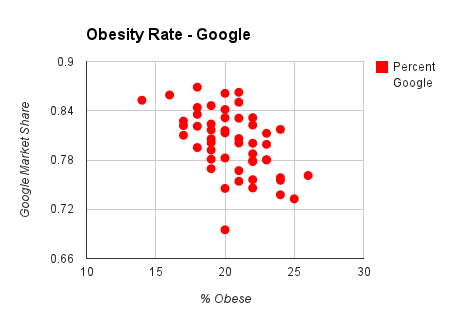
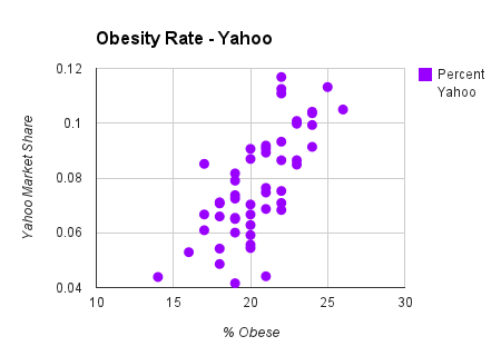
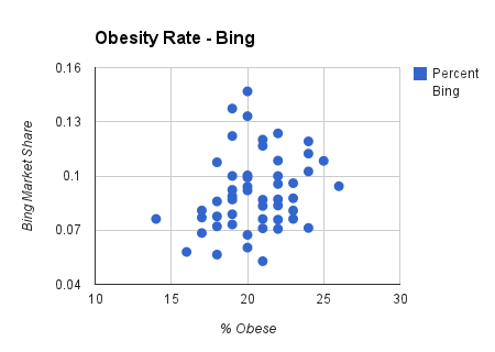
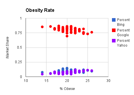
Obesity Rate |
|
| Bing | 0.243563629684568 |
| Yahoo! | 0.714469601270466 |
| -0.519429721752099 |
Yahoo!'s correlation with obesity rate was the strongest out of any data we calculated.
Yahoo! has a striking 0.714 correlation with obesity rate. States with higher obesity rates very much prefer Yahoo! over others. Data on Google usage shows the opposite, with a strong negative correlation.
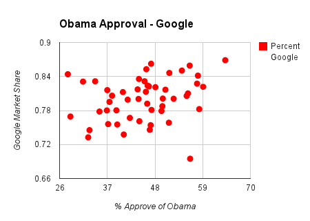
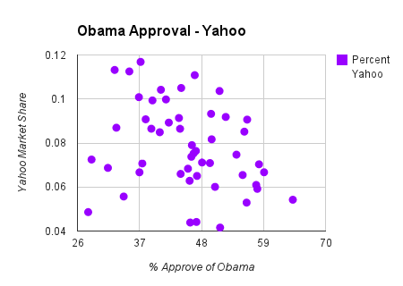
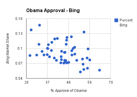
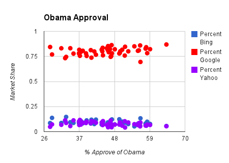
Approval Rating of President Obama |
|
| Bing | -0.416802994648692 |
| Yahoo! | -0.28775551255438 |
| 0.265423483017484 |
States with higher percentage of Bing usage don't approve of President Obama.
While Yahoo! and Google cancel each other out with slightly negative and positie correlations, respectively, Bing rises above with a strong negative correlation of -0.416. States in the central region that use Bing more frequently have a lower approval rate of the president.
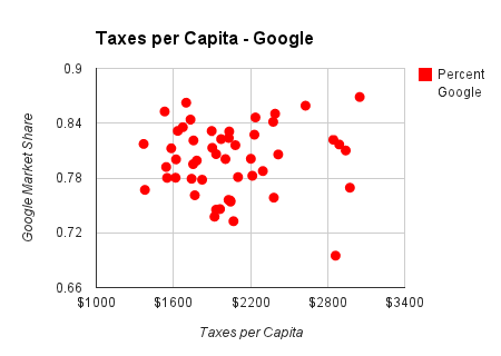
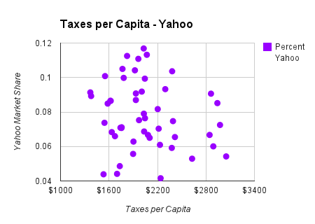
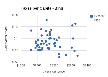
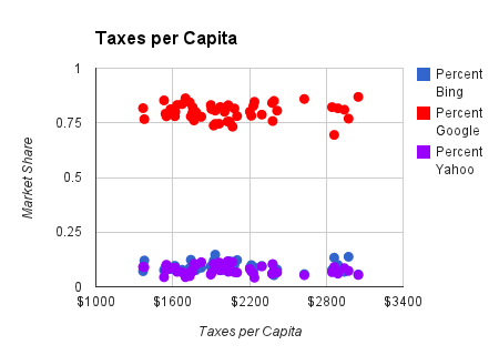
Taxes Per Capita |
|
| Bing | -0.01556690560195 |
| Yahoo! | -0.170942494621309 |
| 0.025799889334182 |
No correlation exists between state taxes and search engine usage.
No correlations can be found when comparing taxes per capita and search engine usage in the United States.
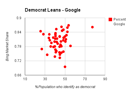
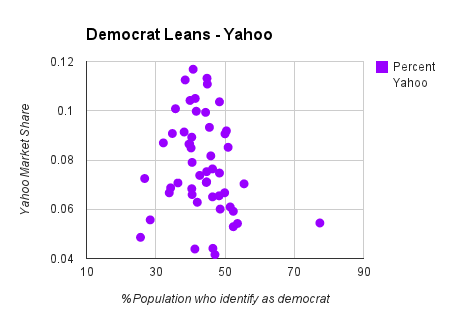
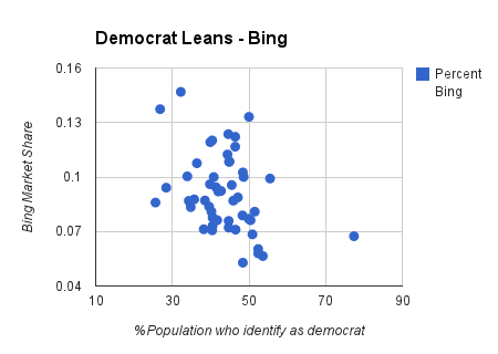
Self-identify as Democrat |
|
| Bing | -0.345295957009271 |
| Yahoo! | -0.169361733080103 |
| 0.191743838221467 |
Bing usage is lower in states that lean Democratic.
Much like the Obama approval rating correlation, Bing-heavy states are less likely to lean Democratic. Both Yahoo! and Google have insignificant correlations.
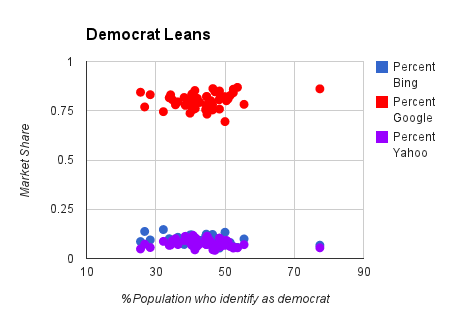
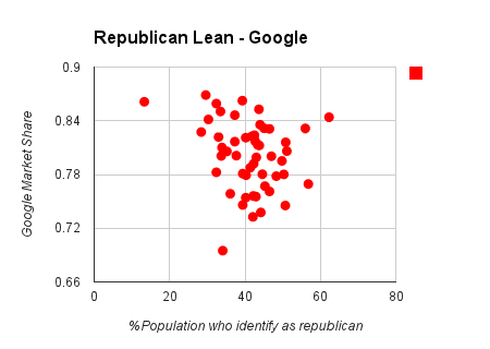
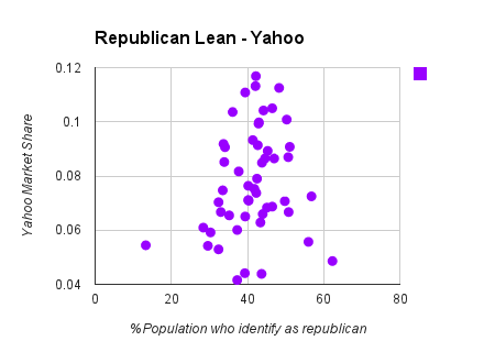
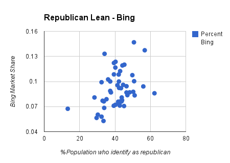
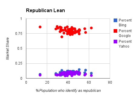
Self-identify as Republican |
|
| Bing | 0.380638931072356 |
| Yahoo! | 0.182166018854801 |
| -0.222353782533312 |
Bing usage is higher in Republican-leaning states.
Ever the political junkie, states with higher Bing usage positively correlate with Republican-leaning areas. Yahoo! and Google do not have a noteworthy correlation with states that tend to lean to the right.