- Home
- Blog
- Web Design
- 10 Usability Tips Based on Research Studies
10 Usability Tips Based on Research Studies
-
 14 min. read
-
Summarize in ChatGPT
-
 William Craig
 CEO & Co-Founder
- President of WebFX. Bill has over 25 years of experience in the Internet marketing industry specializing in SEO, UX, information architecture, marketing automation and more. William’s background in scientific computing and education from Shippensburg and MIT provided the foundation for RevenueCloudFX and other key research and development projects at WebFX. View full profile
 We hear plenty usability tips and techniques from an incalculable number of sources that are to improve your marketing and advertising online. Many of the ones we take seriously have sound logic, but it’s even more validating when we find actual data and reports to back up their theories and conjectures. This article discusses usability findings of research results such as eye-tracking studies, reports, analytics, and usability surveys pertaining to website usability and improvements. You’ll discover that many of these usability tips will be common sense but are further supported with numbers; however, some might surprise you and change your outlook on your current design processes.
1. Forget the “Three-Click Rule”
The idea that users will get frustrated if they have to click more than three times to find a piece of content on your website has been around for ages. In 2001, Jeffrey Zeldman, a recognized authority in the web design industry, wrote that the three-click rule “can help you create sites with intuitive, logical hierarchical structures” in his book, Taking Your Talent to the Web. Logically, it makes sense. Of course, users will be frustrated if they spend a lot of time clicking around to find what they need. But why the arbitrary three-click limit? Is there any indication that web users will suddenly give up if it takes them three clicks to get to what the want? In fact, most users won’t give up just because they’ve hit some magical number. The number of clicks they have to make isn’t related to user frustration. A study conducted by Joshua Porter published on User Interface Engineering found out that users aren’t more likely to resign to failure after three clicks versus a higher number such as 12 clicks. “Hardly anybody gave up after three clicks,” Porter said. 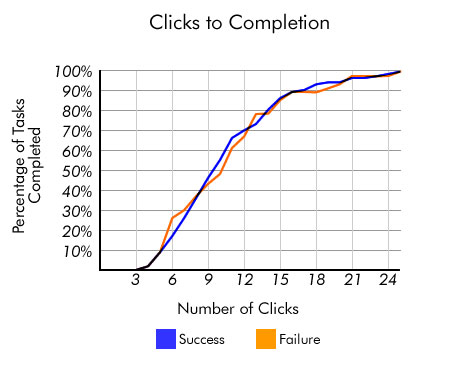 Source: User Interface Engineering The focus, then, shouldn’t be on reducing the number of clicks to some magically arrived number, but rather on the ease of utility. If you can construct a user interface that’s easy and pleasurable to use, but takes like 15 clicks (e.g. 5 times more than the three-click rule) to achieve a particular task — don’t let the arbitrary three-click rule stop you.
Sources and Further Reading
- Testing the Three-Click Rule
- Breaking the Law: The 3 Click Rule
2. Enable Content Skimming By Using an F-Shaped Pattern
Dr. Jakob Nielsen, a pioneer in the field of usability, conducted an eye tracking study on the reading habits of web users comprising of over 230 participants. What the research study displayed was that participants exhibited an F-shaped pattern when scanning web content. 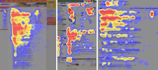 Source: Alertbox A similar study, by search marketing firms Enquiro and Did-it in collaboration with eye-tracking research firm Eyetools, witnessed a similar pattern when they evaluated Google’s search engine results page with an eye tracking study that included 50 participants. Dubbed the “Google Golden Triangle” because the concentration of eye gazes tended to be top and left, the results are congruent with the F-shaped pattern seen in Nielsen’s independent research.
 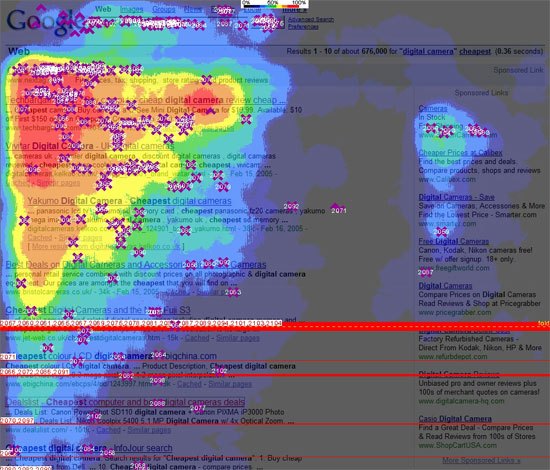 Source: Clickr Media For designers and web copywriters, these results suggest that content you want to be seen should be placed towards the left, and also that the use of content that fits an F-shaped pattern (such as headings followed by paragraphs or bullet points) increases the likelihood that they will be encountered by a user who is skimming a web page.
Sources and Further Reading
- F-Shaped Pattern For Reading Web Content
- Google Golden Triangle – Eyetracking How People View Search Results
3. Don’t Make Users Wait: Speed Up Your Website
We’re always told that our users are impatient: they hate waiting. Well, that’s logical — who likes waiting on purpose? But is there any proof outside of anecdotal evidence that people actually don’t like waiting and that page performance affects website users? Bing, Microsoft’s search engine, conducted an analysis to see if there are any correlations between page speed versus numerous performance indicators such as satisfaction, revenue generated per user, and clicking speed. The report showed that a less than 2-second increase of delays in page responsiveness reduced user satisfaction by -3.8%, lost revenue per user of -4.3% and a reduced clicks by -4.3%, among other findings. For a company as large as Microsoft, even a 4.3% drop in revenue can equate to multi-million-dollar losses in profit. 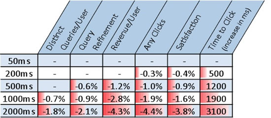 Source: O’Reilly Radar So users, in fact, are impatient: They’re less satisfied and will reduce their number of clicks if they wait too long. This is great to know when for tracking user experience and for large sites in industries with high competition such as secondary education. And if you care about search engine ranking, then the incentive to improve page response times is even greater since Google now factors page speed in their search ranking. What can you do to improve page performance? Use tools that will help you find performance bottlenecks, use CSS sprites to improve page speed, and utilize benchmarking tools like YSlow to quickly see where you can make quick front-end optimizations.
Sources and Further Reading
- Bing and Google Agree: Slow Pages Lose Users
- Selfish, mean, impatient customers: New Thinking
4. Make Your Content Easily Readable
Internet users don’t really read content online, at least according to a study by Dr. Nielsen on reading behaviors of people on his website. His analysis shows that people only read 28% of the text on a web page and decreased the more text there is on the page. 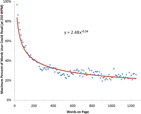 Source: Alertbox To increase the likelihood of your readers getting the most out of your content, utilize techniques for making content easier to read. Highlight keywords, use headings, write short paragraphs, and utilize lists.
Sources and Further Reading
- How Little Do Users Read
- Block Reading: How We Read on the Web
5. Don’t Worry About “The Fold” and Vertical Scrolling
There has long been a myth that all of your important content should be above “the fold,” a term borrowed from newspapers that refers to the area of a web page that can be seen without having to scroll down — first proposed by Jakob Nielsen. So, are long pages bad? Should we cram everything at the top of our web layouts because people won’t ever read anything below this fold? The answer is “No” according to a report by Clicktale, a web analytics company. Their results showed that the length of the page has no influence in the likelihood that a user will scroll down the page. 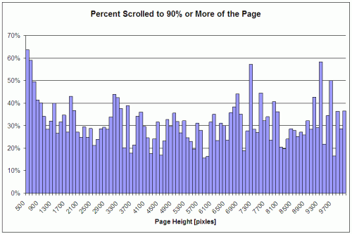 Source: Clicktale A study reported by Joe Leech of CX Partners, a user centered design agency, indicated that less content above the fold even encourages users to explore the content below the fold.
 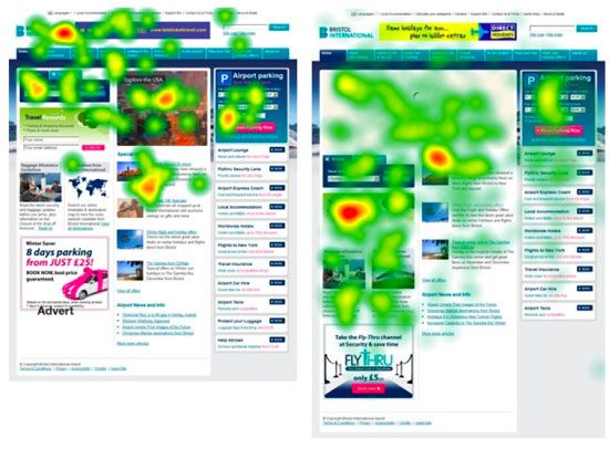 Source: cxpartners The main point to take away here is that you shouldn’t stuff all your important content at the top because you fear that users won’t be able to find them otherwise. Use visual hierarchy principles and the art of distinction to prioritize and infer the importance of various elements in your pages’ content.
Sources and Further Reading
- Unfolding the Fold
- The Myth of the Page Fold: Evidence from User Testing
- Blasting the of the Fold
- The Impact of Paging vs. Scrolling on Reading Online Text Passages
6. Place Important Content on the Left of a Web Page
People brought up in cultures where language is read and written from left to right have been trained early on in life to begin at the left of a page, whether in writing or reading a book. This can be the reason why many web users spend a majority of their attention on the left side of a web page — as much as 69% of the time, according to Dr. Nielsen’s eye-tracking study that involved over 20 users. 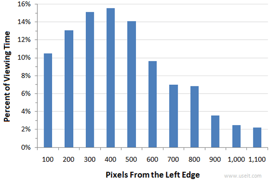 Source: Alertbox The same results were reflected on websites whose language were read from right to left, such as Hebrew and Arabic sites, with the results inverted (higher attention on the right side versus the left). There are two things to take away from this result. First, the language of your site matters when thinking about layout considerations; when designing websites you should consider cultural design considerations. Secondly, for sites that are traditionally read from left to right, placing important design components at the left is a good idea; vice versa for sites whose language is read from right to left.
Sources and Further Reading
7. Whitespace of Text Affects Readability
Easy readability of text improves comprehension and reading speed as well as enhancing the likelihood that a user will continue reading instead of abandoning the web page. There are many factors that influence ease of readability, including font choices (serif versus sans-serif), font-size, line-height, background/foreground contrast, as well as spacing. A study on readability tested reading performance of 20 participants by presenting them with the same text blocks having different margins surrounding the text as well as varying line-heights (the distance between lines of text). It showed that text with no margins was read faster, however, reading comprehension decreased. Faster reading speeds when the text had no margins can be explained by the text and paragraphs being closer together, resulting in less time needed to move the eyes from line to line and paragraph to paragraph. 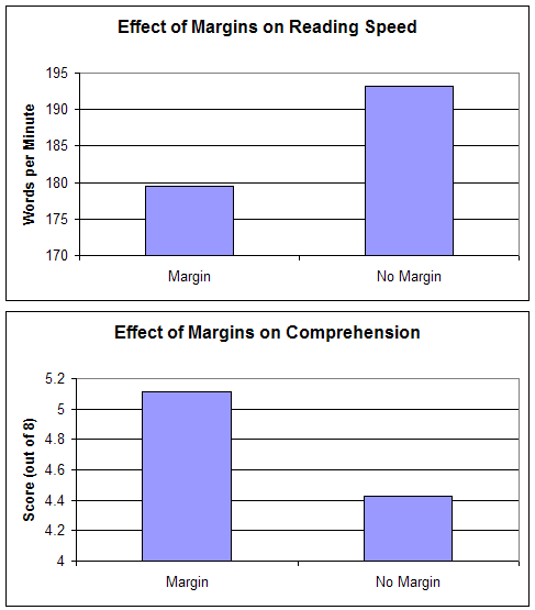 Source: Software Usability Research Laboratory As this particular study shows, the way we design our content can greatly impact the user’s experience. Be wary of the details: color, line-heights, tracking, and so forth and be mindful of sound typography principles for the web to ensure that you’re not discouraging your users from reading your content. Furthermore, study the effective use of negative space in web design.
Sources and Further Reading
- Reading Online Text: A Comparison of Four White Space Layouts
8. Small Details Make a Huge Difference
Too often, we look at the big picture when creating a web design and ignore the little things when we’re in a time crunch. We forego any thought put into the wording of something, or the design of a single button on a form if time and resources are limited. There are so many other things we need to think about that it’s often easy to let go of the small stuff. But something as small as a form’s button can affect the success of a site, at least according to user interface design expert Jared Spool, who wrote about a case on how removing a button and adding a clear error message to avoid user errors in a checkout process increased revenue by $300 million in just a year. The first month witnessed a 45% additional sales attributed to the revision of the checkout process. This attention to detail being important is echoed by Flow, a user-centered design firm. They found that by revising their error page so that it contained useful help text improved completed checkouts by 0.5% per month, which if extrapolated, could mean an additional quarter of a million pounds annually for the particular site. The message they used? A polite two-sentence message instead of a cryptic 404 error: “We’re sorry, we’ve had a problem processing your order. Your card hasn’t been charged yet. Please click checkout to try again.” 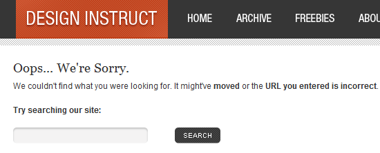 Pay attention to the details. Use A/B split testing to test your hypothesis and find out what is the most effective design that achieves better results. Set goals using analytics software to benchmark results of design tweaks in relation to site objectives.
Sources and Further Reading
- The $300 Million Button
- Myth #10: If your design is good, small details don’t matter
9. Don’t Rely on Search as a Crutch to Bad Navigation
Users expect navigation to be easy to use and well organized. Even with an excellent site search engine, users will still turn to primary navigation first. According to a task test conducted by Gerry McGovern, over 70% of the participants began the task he gave them by clicking on a link on the page as opposed to using the search feature. This result is similar to a test by UIE of 30 users that tracked e-commerce tasks. The research analysis concluded that “users often gravitated to the search engine when the links on the page didn’t satisfy them in some way.” Thus, search is most often utilized only when the user has failed to discover what they were looking for in the current page. The lesson to be gained here is clear: Don’t rely on site search to remedy poor content organization, findability issues, and bad information architecture. When users are unable to navigate to what they are looking for, attention should be diverted to layout, navigation, and content organization improvements, with improving search functionality as the secondary priority.
Sources and Further Reading
- Navigation is More Important Than Search
- Are There Users Who Always Search?
- Myth #16: Search will solve a website’s navigation problems
10. Your Home Page Isn’t As Important as You Think
Visitors to your website are less likely to land on your home page. Search engines are a big factor here, as they’ll link to whatever page is relevant on your site. Links from other websites are also likely to link to pages beyond your home page if that’s where the relevant information is. According to an analysis by Gerry McGovern, page views sourcing from the home page of websites is decreasing dramatically. He witnessed a drop from 39% from 2003 to only 2% in 2010 of page views coming from the home page of a large research site. This trend was doubly confirmed on another site he studied, where page views sourcing from the home page halved in just two years (from 10% in 2008 to only 5% in 2010). McGovern’s results indicate that traffic, more and more, is coming from external sources — search engines, social media sites such as Twitter, and content aggregator services such as AllTop — rather than from the front page of a website. Therefore, a higher focus on landing pages versus your home page can get you more bang for your buck in terms of conversion and user-retention opportunities.
Sources and Further Reading
- The Decline of the Home Page
- Is Home Page Design Relevant Anymore?
- Myth #17: The homepage is your most important page
Related Content
- Factors That Affect Usability
- Five Simple but Essential Web Usability Tips
- Four Aspects of a Usable Modern Web Interface
- Related categories: User Interface
 Cameron Chapman is a professional web and graphic designer with over 6 years of experience in the industry. She’s also written for numerous blogs such as Smashing Magazine and Mashable. You can find her personal web presence at Cameron Chapman On Writing. If you’d like to connect with her, check her out on Twitter.
-
 President of WebFX. Bill has over 25 years of experience in the Internet marketing industry specializing in SEO, UX, information architecture, marketing automation and more. William’s background in scientific computing and education from Shippensburg and MIT provided the foundation for RevenueCloudFX and other key research and development projects at WebFX. View full profile
 -

WebFX is a full-service digital marketing agency delivering revenue-driving strategies across online advertising, SEO and AI search optimization, and digital marketing. Backed by 1,100+ client reviews, a 4.9-star rating on Clutch, and proprietary revenue-tracking technology, our team helps businesses grow visibility and revenue across platforms, from Google to ChatGPT to LinkedIn. Discover how our expert team and revenue-accelerating tech can drive results for you. Learn more
Make estimating web design costs easy
Website design costs can be tricky to nail down. Get an instant estimate for a custom web design with our free website design cost calculator!
Try Our Free Web Design Cost Calculator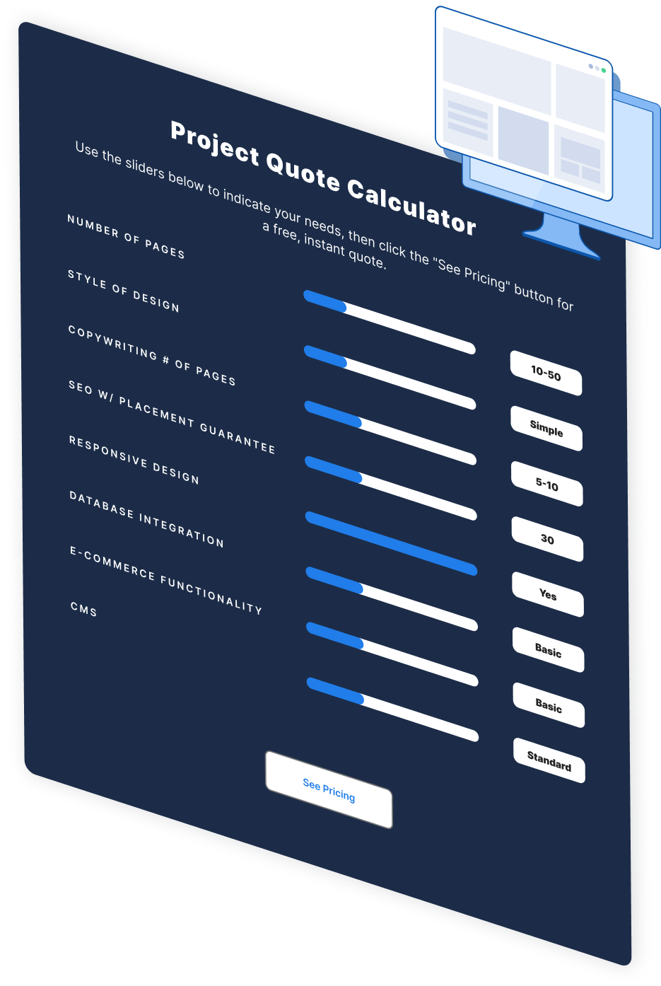


Web Design Calculator
Use our free tool to get a free, instant quote in under 60 seconds.
View Web Design Calculator
Proven Marketing Strategies
Make estimating web design costs easy
Website design costs can be tricky to nail down. Get an instant estimate for a custom web design with our free website design cost calculator!
Try Our Free Web Design Cost Calculator
What to read next


