- Home
- Blog
- Web Design 10 Infographics That Will Teach You About Typography
10 Infographics That Will Teach You About Typography
-
 4 min. read
-
 Trevin Shirey
 VP of Marketing
- Trevin serves as the VP of Marketing at WebFX. He has worked on over 450 marketing campaigns and has been building websites for over 25 years. His work has been featured by Search Engine Land, USA Today, Fast Company and Inc.
Click the Go to Source link under each infographic to navigate to the source of the infographic and to see the larger version provided by the creator of the infographic.
1. Bold & Justified: The Huge World of Typography Infographic
Did you know that Israel is the source of the most expensive typefaces? Or that Helvetica has 111 different styles?
 This information-dense infographic reveals a ton of interesting facts about typography.
2. A Quick and Comprehensive Type Guide
This beginner’s guide to type shows you some popular font categories (like monospaced fonts and script fonts), the anotomy of a typeface, a few typography principles, and more. 
3. What’s Your Typeface?
This infographic starts by disambiguating the terms “typefaces” and “fonts”, and then concludes with the top five most-used typefaces in graphic design, journalism, and academia. 
4. Timeline of 10 Famous Fonts Infographic
This infographic shows you the year in which 10 popular fonts were created, along with some popular logos that use each of the featured fonts. 
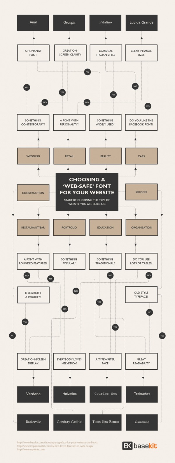
5. Choosing a Web-Safe Font for Your Website
Because using web fonts is now a widely supported technique for displaying any font on your website (as long as you’re allowed to use the font), limiting your web designs to only using web-safe fonts isn’t necessary. But if you need to use web-safe fonts for some reason, this flowchart infographic will help you pick one. 
Go to Source
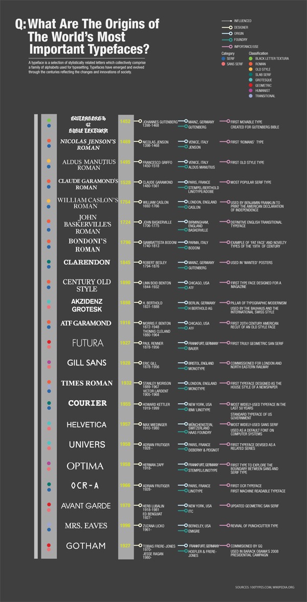
6. What are the Origins of the World’s Most Important Typefaces?
This infographic contains a timeline of when the most important typefaces in history were created and includes the designer, country of origin, and historical significance of each typeface. 
Go to Source
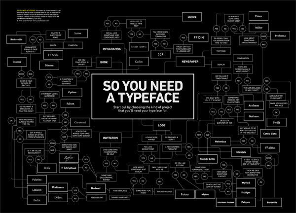
7. So You Need a Typeface
This is really a flowchart and cheat sheet with graphic designer Julian Hansen’s suggestions on how to pick a font for a design project, but it does embody the essence of what an infographic is: to present useful information in a visual way. 
8. A History of Western Typefaces Infographic
In this infographic, you’ll see a timeline of important milestones in the evolution of typefaces along with some trivial information (such as the fact that the film poster of the movie The Social Network uses Futura). 
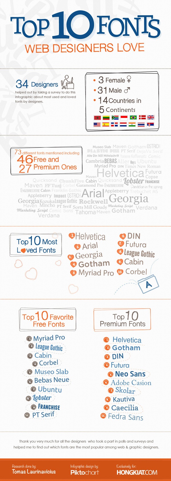
9. Top 10 Fonts Web Designers Love Infographic
This infographic presents data gathered from a survey of 34 designers, so it’s no surprise that Myriad Pro — the default font of Adobe Creative Suite software like Photoshop and Illustrator — is the top most favorite “free” font. 
10. A Brief Introduction to Typography
Because of the title of this infographic, you might get the impression that its content is for beginners. But this infographic goes as deeply as illustrating how the Frutiger Numbering System works and the anatomy of glyphs. 
-
 Trevin serves as the VP of Marketing at WebFX. He has worked on over 450 marketing campaigns and has been building websites for over 25 years. His work has been featured by Search Engine Land, USA Today, Fast Company and Inc.
 -

WebFX is a full-service marketing agency with 1,100+ client reviews and a 4.9-star rating on Clutch! Find out how our expert team and revenue-accelerating tech can drive results for you! Learn more
Make estimating web design costs easy
Website design costs can be tricky to nail down. Get an instant estimate for a custom web design with our free website design cost calculator!
Try Our Free Web Design Cost Calculator
Table of Contents
- 1. Bold & Justified: the Huge World of Typography Infographic
- 2. a Quick and Comprehensive Type Guide
- 3. What’s Your Typeface?
- 4. Timeline of 10 Famous Fonts Infographic
- 5. Choosing a Web-Safe Font for Your Website
- 6. What Are the Origins of the World’s Most Important Typefaces?
- 7. So You Need a Typeface
- 8. a History of Western Typefaces Infographic
- 9. Top 10 Fonts Web Designers Love Infographic
- 10. a Brief Introduction to Typography


Web Design Calculator
Use our free tool to get a free, instant quote in under 60 seconds.
View Web Design CalculatorMake estimating web design costs easy
Website design costs can be tricky to nail down. Get an instant estimate for a custom web design with our free website design cost calculator!
Try Our Free Web Design Cost Calculator


