


Marketing
Enhance your online presence with these marketing strategies.
"*" indicates required fields


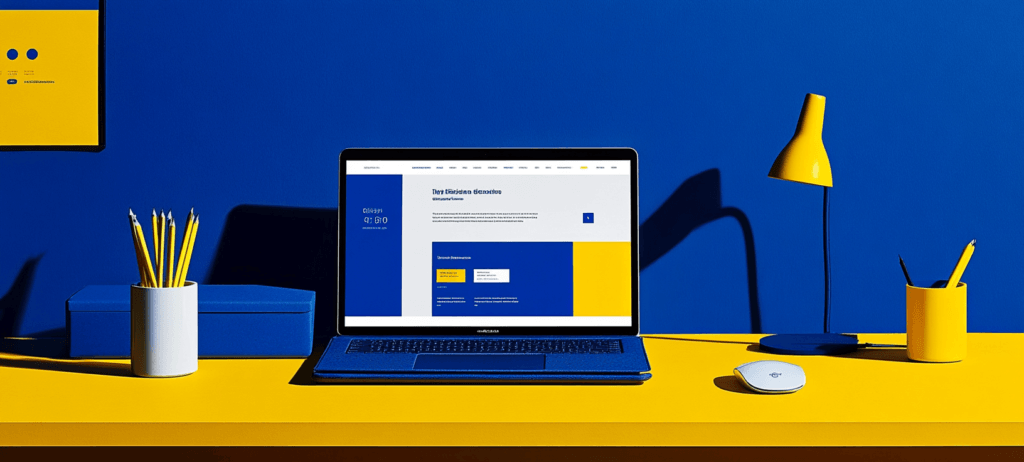
Looking to design a website that converts? High-performing sites guide users with clear value propositions and engaging design. Some of the best examples of websites that convert Mint, Discord, RealSpace, Rookwood, and Skillshare, each using CTAs, trust signals, and […]

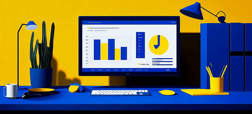
Planning a web design budget is essential to creating an effective website. Whether you want to revamp your site, build a new one, or just maintain your online presence, you need funds to do that. That’s where outlining your spending […]
3 min watch

8 min watch

5 min watch


Website design costs can be tricky to nail down. Get an instant estimate for a custom web design with our free website design cost calculator!
Try Our Free Web Design Cost Calculator
Enhance your online presence with these marketing strategies.
Improve your website’s ranking with these simple SEO techniques.
Level up your PPC skills and dominate the online market.
Boost your engagement game with our Social Media tips.
Scale your business faster with these simple AI techniques.
Stay in the loop with the latest WebFX scoop.
Our free Ecommerce Marketing Plan Template helps you organize your ecommerce marketing strategy to ensure you implement the best campaigns to fuel business growth.
Our Website Optimization Checklist guides you through essential web design optimizations that help boost your site’s rankings in the search engine results pages.
When you download our free Web Design RFP template, you’ll receive an actionable template for ensuring your RFP contains all the essential information you need.