Retention Rate
Industry average: 50%
WHY IS OUR RETENTION RATE SO HIGH?
Scalable solutions
Industry specialists
Proven results
CLIENT SATISFACTION SCORE
Industry average: 72%
WHY IS OUR SATISFACTION SCORE SO HIGH?
Project management
ROI tracking
Diverse skillsets
“I have 16 years of industry experience, and WebFX is the best agency I’ve ever worked with.”
 Flavia A, Review from Clutch.co
 Rated 4.9/5 stars on G2
Rated 4.9/5 stars on Clutch
Rated 4.9/5 stars on G2
Rated 4.9/5 stars on Clutch
Digital Marketing Awards
From SEO awards to web design awards to B2B services awards, our digital marketing agency has won several awards for the digital marketing strategies we manage for clients.
Driving $10 Billion in Revenue for Brands Worldwide
Award-Winning Digital Marketing Services That Deliver 20% Higher ROI
More leads. More sales. More revenue. That’s what happens when expert digital marketing services meet proprietary technology. WebFX combines 750+ in-house specialists with RevenueCloudFX — our AI-powered revenue platform — to build, manage, and optimize omnichannel marketing strategies that move the metrics that matter most to your business.
The Omnichannel Marketing Services Powered by 750+ Experts and Proprietary AI
With our full-service digital marketing services, you’ll get everything you need for your digital marketing campaigns, from the strategies to the specialists. Browse our digital marketing agency’s most popular online marketing solutions below, or contact us online for a custom proposal!
- Overview
- Search engine optimization (SEO)
- Pay-per-click (PPC)
- Social media marketing
- Email marketing
- Content marketing
- Web design and development
- Conversion rate optimization (CRO)
- Amazon marketing
- Programmatic advertising
 Overview
Overview
Get everything you need with our comprehensive digital marketing services for businesses, which include:
- Dedicated account manager backed by a team of digital marketing specialists.
- Client-exclusive revenue platform powered by IBM Watson to deliver actionable insights.
- Custom digital marketing strategy tailored to your business, industry, and goals.
- First-party data activation developed to accelerate your marketing ROI by 20% or more.
- Full-funnel ROI tracking, delivered via convenient dashboards for easy monitoring.
 Search engine optimization (SEO)
Search engine optimization (SEO)
Rank higher in the organic search results on Google, Bing, and other search engines with WebFX. By leveraging strategic search engine optimization, you can enhance organic traffic, elevate visibility, and gain a competitive edge. Get a custom strategy from our award-winning digital marketing company and start driving revenue today.

 Pay-per-click (PPC)
Pay-per-click (PPC)
Reach and convert high-value consumers and business buyers into clients with Google Ads, Microsoft Advertising, and other effective ad networks. Request a proposal today and discover what PPC from WebFX can do for your company.

 Social media marketing
Social media marketing
Explore social media as a digital marketing channel to build brand awareness, customer loyalty, and client satisfaction. From increased engagement to targeted reach, we specialize in optimizing every facet of your social strategy.
Organic social media management
Elevate your brand presence, build engagement, and create connections with your customers through consistent posting on Facebook, Twitter (now X), Instagram, LinkedIn, and more.
Paid social advertising
Increase reach, engage and re-engage your audience, and drive revenue from Facebook, LinkedIn, YouTube, and more, with paid social media ads.

 Email marketing
Email marketing
Our dedicated email marketing team can help develop targeted, engaging email campaigns that increase open rates, click rates, and conversion rates to drive revenue for your business.
Explore Email Marketing Services

 Content marketing
Content marketing
As a full-service digital marketing agency, we provide the copywriting talent and data technology that your business needs to make content marketing a revenue driver for your business.
Explore Content Marketing Services

 Web design and development
Web design and development
Stop your business from losing valuable clients, leads, and revenue to the competition with a professional web design or redesign that follows best practices for search engine optimization and conversion rate optimization.

 Conversion rate optimization (CRO)
Conversion rate optimization (CRO)
Maximize your traffic potential with conversion rate optimization. By combining user research, website analytics, and A/B testing, our dedicated CRO team can help improve the user journey and take your website to the next level.

 Amazon marketing
Amazon marketing
Place your brand in a position for success with Amazon marketing services, which include Amazon SEO and Amazon PPC. Accelerate your sales, growth, and success with services built for driving results.
Explore Amazon Marketing Services

 Programmatic advertising
Programmatic advertising
Leverage the power of automation to target your audience more effectively and increase ad efficiency with our custom digital marketing services for businesses. Powered by our proprietary AdTechFX technology within our RevenueCloudFX platform that supports all digital marketing efforts.
Explore Programmatic Advertising


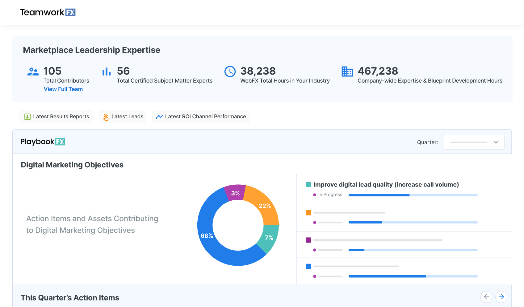
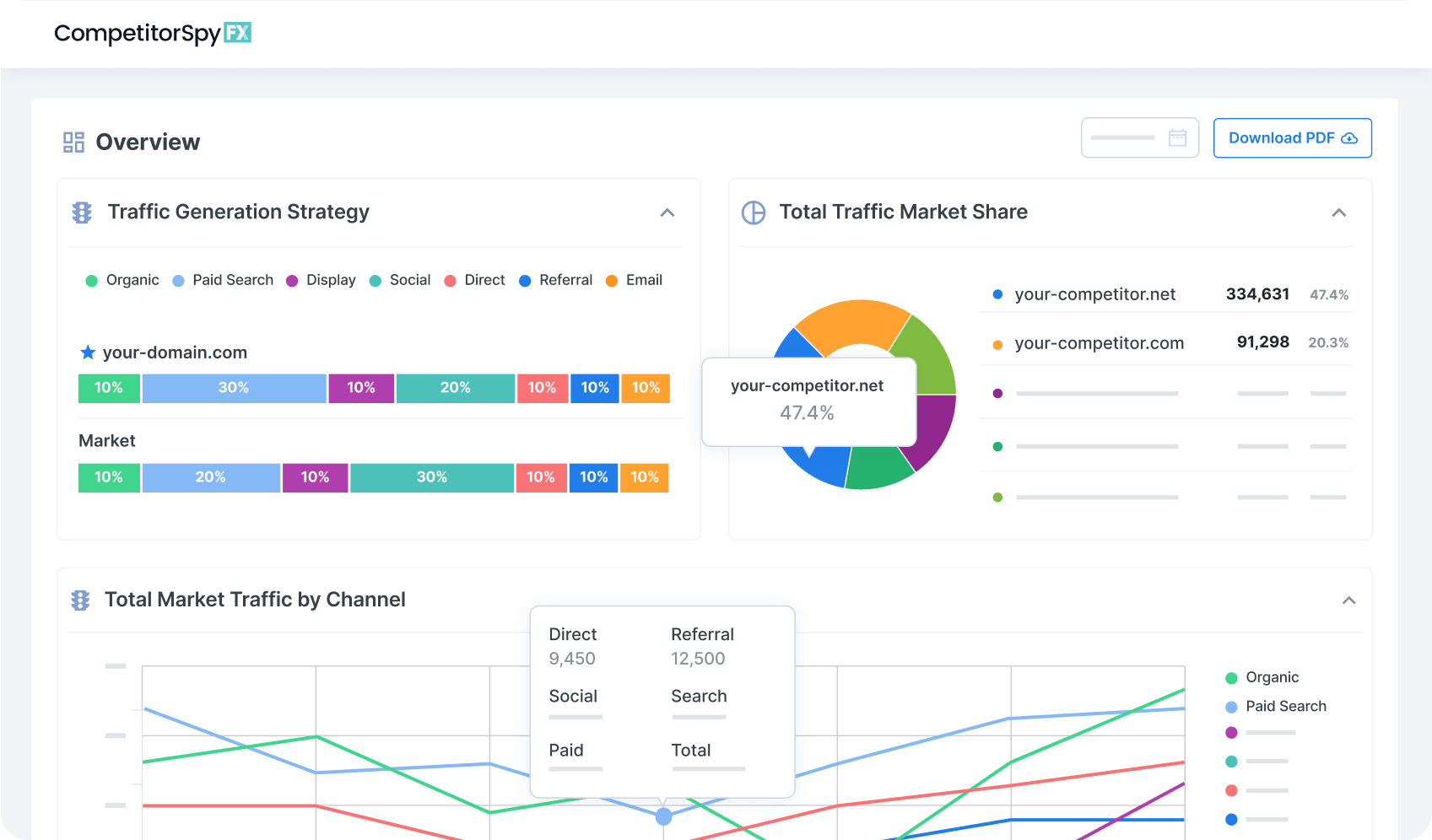
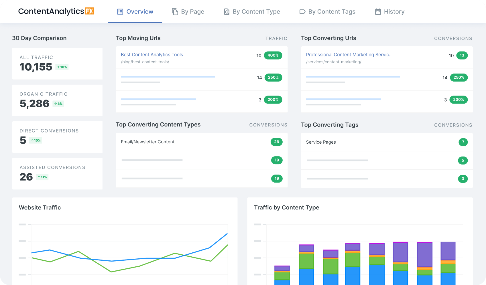
Advanced Technology to Support Digital Marketing Decision Making
RevenueCloudFX is our proprietary marketing software built to enable our client’s website strategies and digital campaigns.
Clients and FXers alike use this platform to track performance, make strategic investment decisions, and drive results.
“My advice to WebFX would be to communicate their marketing cloud and analytics tools more to clients. It’s one of their selling features and competitive advantages.”
– Deanna H, Marketing Manager (review from Clutch.co)
20%
$500K+
1+ billion
20%
$500K+
1+ billion
Transparent Digital Marketing Pricing
A copy-and-paste approach to digital marketing isn’t our style — or how we’ve driven $10 billion in revenue for our clients in just the past five years. Instead, we build online digital marketing services for businesses based on your company, industry, and goals. Browse our digital marketing agency’s pricing plans below!
CUSTOM DIGITAL MARKETING PLANS
Starting at
$3,000 / month
How we determine your custom strategy
 Your Industry
With expertise in 200+ industries, we have the data to know what strategies will generate the best ROI for your business. We’ll also consider where your competitors are that would make sense for you to invest in.
 Your Business Goals
We’re not going to just recommend the same strategies for every business. Your business growth goals will determine what channels your WebFX strategist will recommend investing in.
 Additional Support Needs
WebFX is a full-service digital marketing agency capable of supporting with website redesign services, consistent content marketing, complex data analysis, conversion rate optimization, and more. You can discuss these additional support needs with your WebFX strategist.
INCLUDED IN ALL PLANS:
- Expert advice on-demand from a team of over 750 strategists
- Data-backed campaign optimizations and improvements
- AI-powered strategy recommendations
- Closed-loop ROI and customer journey tracking
- Access to our in-house revenue acceleration platform, RevenueCloudFX
- Nutshell CRM access
- Marketing and sales data unification
- Monthly campaign measurement, analysis, and revenue reporting
- In-depth competitor and industry research
- Continuous strategy management and improvement
Trust the Company That’s Driven $10B in Revenue for Clients in the Last 5 Years
Ready to Drive Results? Connect with our strategy team to get a custom project quote for your business.
Your search for Internet marketing services ends here
When your company partners with WebFX, you:
Reclaim your work day
You only have so many hours in the day. Make the most of them with WebFX, which provides you with a marketing team that includes a dedicated account manager, SEO expert, web designer, web developer, and all the other skillsets you need to deliver great digital marketing campaigns.
Set your involvement level
Looking for a hands-free solution? Want to brainstorm new marketing initiatives? Prefer to implement site changes yourself? No matter your preferred level of involvement, you can customize our website marketing services to meet your unique needs.
Get your expert advice on-demand
With more than 750 in-house experts and 30 years of experience, our digital marketing company has the knowledge you need to navigate market changes, research marketing channels, and alleviate data silos. Access business consultants, digital marketing experts, SEO specialists, web developers, and more with WebFX!
Accelerate your marketing ROI
Increase your marketing ROI by 20% or more with RevenueCloudFX, the revenue marketing platform you won’t find anywhere else. With RevenueCloudFX, you can collect, store, and activate your first-party data to create hyper-targeted, super-effective marketing campaigns that deliver massive ROI.
Track your ROI by channel, strategy, & more
Get the answers you need with RevenueCloudFX’s full-funnel ROI tracking. Understand which channels, strategies, and URLs contributed to offline or online sales. With our built-in CRM (or one of our CRM integrations), you can finally bridge the gap between marketing and sales data.
Deliver bottom-line growth
Contribute to your organization’s biggest goals, from increasing market share to launching new product lines, with our online marketing services. With our award-winning Internet marketing agency and tech, we’ll help you use digital marketing to create, build, and implement strategies that deliver bottom-line growth.
Scale your strategy
Whether you want to try a new strategy or expand an existing one, WebFX’s team of 750+ specialists can meet your growing needs. So, say goodbye to the hassle of switching agencies and hiring freelancers because, with our digital marketing company, you have everything you need to grow.
Outperform your competition
Let competitors take second place with website marketing services that have helped businesses like yours adapt to change for over 30 years. From market disruptions to industry changes to marketing shifts, we can help your business turn challenges into opportunities.
Streamline your marketing
With WebFX, you don’t have to work with a list of agencies. As a full-service digital marketing services company, we can build, implement, and manage your omnichannel marketing strategy — and save you the headaches of working with and coordinating between multiple agencies.


Unmatched Digital Marketing Expertise
to Help Your Business Drive Revenue
- Dedicated account manager, interfacing with a team of 500+ digital marketing experts
- RevenueCloudFX access for optimizing, measuring, and reporting ROI
- In-depth analysis of your business goals, industry, and competitors
- In-house project management software, 24/7 help desk, and direct client phone line
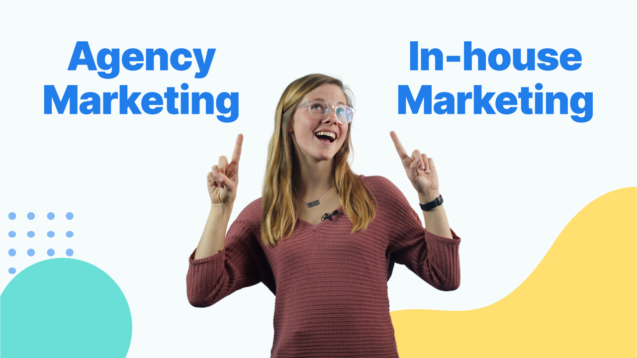
In-House Marketing
- One or two team members trying to keep up with fast-paced marketing advancements
- Analytics suite for measuring and improving campaign performance
- S.M.A.R.T. goals, but limited resources needed to execute
- Reporting roadblocks leading to project delays and wasted spend
Typical Marketing Agency
- Dedicated account manager responsible for strategy, but will need your help implementing solutions
- Third-party tracking and analysis with subscription costs passed to you
- Cookie-cutter checklists and solutions for optimizing your campaigns
- Regular, but unreliable support when issues arise with your account
Why should you use professional digital marketing services?
So, how can digital marketing services help your business? With the right digital marketing partner, you can successfully launch a strategy that earns a high ROI, drives revenue, and grows your bottom line. Here’s how:
- Extend your team while saving money
- Get more bang from your marketing budget
- Get more time back in your day
Extend your team while saving money
Extend your team while saving money
Partnering with an agency gives you access to a team of industry experts. At WebFX, you’ll extend your existing marketing team with over 750 award-winning specialists to support on all of your strategies while implementing new ones.
You won’t need to worry about staying up to date with the latest trends or finding the time to manage and monitor your campaigns, your agency will take care of all that for you. Plus, you won’t need to worry about shelling out the costs it takes to run the same sized team in-house.
It’s no secret that digital marketing takes a lot of work, and you need a team of experts to pull it off. But in-house marketing costs aren’t cheap. Salary costs, software and tools, and employee benefits can start to stack up. Not to mention you’d need to hire A LOT of team members to launch, manage, and optimize multiple digital marketing strategies.
Well, you can kiss all those costs goodbye with an agency.
Get more bang from your marketing budget
Get more bang from your marketing budget
Internet marketing services from an agency also help you earn a higher return on investment (ROI) from your marketing budget.
Your marketing agency will work day in and day out to monitor your marketing results and implement ongoing optimizations to ensure you consistently drive the most revenue for your business.
At WebFX, your dedicated specialists and our in-house software will help you track the sources of your leads and revenue, so you can funnel your budget to the channels that consistently grow your bottom line.
Get more time back in your day
Get more time back in your day
Let your digital marketing agency handle the heavy lifting when it comes to your strategies, while you and your team focus on your other tasks and running your business.
When you access online marketing services from an agency like WebFX, you’ll work with a team who:
- Tracks your competitors
- Researches the latest marketing trends and implements them
- Tracks your results and sends reports
- Analyzes your marketing data and reports
- Optimizes your strategies based on your data
- Gives you access to and helps you used our in-house software and tools
FAQs about online digital marketing services
How much do digital marketing services cost?
Prices for digital marketing services depend heavily on the number of services, as well as the service plan you choose. On average, however, small-to-midsized businesses will invest around $51 to $10,000 per month on professional Internet marketing services.
How do I choose a digital marketing agency?
You can help your business hire the best digital marketing agency by following these tips:
- Outline your goals (or what you want to accomplish) with online marketing
- Compile a list of the services you need
- Determine your monthly budget for online marketing
- Generate a list of agencies that meet your budget and provide the service you need
- Review every qualifying agency’s reviews, testimonials, and case studies
- Research how the agency measures and reports client success
- Chat with the agency one-on-one to see how they blend with your business
- Look into the agency’s growth and successes through online marketing
Overall, you want to hire a professional digital marketing company that is:
- Transparent
- Trustworthy
- Reliable
- Client-focused
- Successful
- Knowledgeable
When you choose an agency that embodies those traits, you work with an agency that’s an extension of your team, like WebFX. You get a partner that values your business. They respond to your questions, structure your strategy for success, and help your company grow.
Why outsource to a digital marketing agency?
In-house marketing departments can add perks to your business, but hiring a larger entity can pack a bigger punch with less of an investment. So, why should you hire a digital marketing firm?
At the end of the day, it’s all about finding the ideal partnership to accomplish your business goals.
Website marketing companies dedicate themselves to consistent learning and industry study, but they ultimately practice the actions it takes to see improvement and a return on investment (ROI).
Here are three reasons you should hire a website marketing company.
1. Increase qualified traffic
The heart of website marketing — the website — can’t thrive if it’s not getting exposure. Site optimization and additional tweaks help put more eyes on your products, services, and brand.
The type of traffic you want flocking to your site also needs to match your goals. With the assistance of a web marketing company, you can arrange your pages to draw in qualified traffic — visitors interested in what you offer.
Whether you’re getting search or referral traffic, you can maximize the best sources for your business and incite a reliable flow that continues to help your company run.
If you want to see the numbers change in site traffic reports, website marketing companies can help people notice your pages. Namely, with professional SEO methods and targeting certain consumers, you can put your site in front of a suitable audience.
2. Boost conversions
To develop positive and profitable relationships with visitors, you need clear interactions with your site. Conversions — these all-important actions — mark the movement of users toward the end of the sales funnel.
Since bolder actions, like making a purchase, aren’t immediate, website marketing companies can help you set up smaller conversions to strengthen your site. Small actions — micro conversions — can nudge users to get to know your brand and eventually buy one of your products or call you for your services.
Conversions on any scale have certain advantages, and a digital marketing company lets you know what suits your target audience and business. Should you set a conversion for someone making an account or for someone signing up for a newsletter?
Once you have chosen conversions, Internet marketing companies also watch your conversion rate and reorder your site to improve the conversion elements. If your CTAs are lacking or need a different level of urgency, the website marketers can find a renewed strategy for you.
3. Generate revenue
Because all digital marketing efforts have the ultimate motivation of more revenue, it’s also the focus of many website marketing agencies. If your campaigns aren’t actively turning opportunities into dollars, there’s little room for growth for your business.
As you pour money into your website and marketing channels, you expect to see money coming back in. With certain Internet marketing moves, it can take longer to observe heightened revenue to cover your costs.
Website marketing companies can combine marketing methods to generate as much revenue as possible for your business. In order to select the marketing path that can start earning real capital, the expertise of professionals is essential.
Would my business benefit from digital marketing?
Internet marketing services can unlock many benefits for your company. Here are just a few of the benefits you can enjoy from investing in digital marketing:
- Reach: Worldwide, billions of people use the Internet. With the Internet’s reach, your business can reach the right people at the right time with the right message. The result? Your marketing campaigns perform better, resulting in more revenue for your business.
- Targeting: Digital marketing offers immense targeting options, from demographics to behavior. With these targeting capabilities, your company can optimize its marketing spend, focusing on the users most likely to become customers.
- Tracking: Digital marketing’s performance is easy to track. That makes answering questions about key performance indicators (KPIs) like conversions fast and easy. Plus, with RevenueCloudFX, you can instantly track each channel’s contribution to your bottom line.
- Customization: Everything about digital marketing is custom, including which strategies you use. Compared to traditional marketing, your business can instantly adjust its strategies and campaigns, preventing wasted spending.
- Effectiveness: With its reach, targeting, tracking, and customization capabilities, digital marketing is highly effective. Companies investing in website marketing services can accelerate its effectiveness, too — as demonstrated by our clients experiencing a 20% greater marketing ROI.
If you’re looking to learn more about digital marketing’s benefits, read our Digital Marketing Guide!
What can Internet marketing services help with?
Internet marketing services can help solve several problems, including:
- Growing website traffic, like through search engine optimization
- Creating content, like blog posts, sales copy, ebooks, and more
- Managing paid media campaigns on places like Google Ads
- Establishing a digital presence, like with a website and social media profiles
- Building a digital strategy for different channels, like search and paid
- And more
What can a professional digital marketing company can do for you?
Check out the following seven ways a digital marketing agency works with you to maximize your site.
1. Audit your current website condition
Just like a doctor completes tests before giving a diagnosis, website marketing companies need to evaluate the shape of your website practices before they can fix anything or deliver results.
A website audit — whether with design or SEO as the focus — is the first step toward a healthy site. Website marketing companies sift through your linking, coding, content, page load time, SEO rankings, and more.
For example, experts can review your site’s content to see what keywords you target, what subjects you address, and how thorough the resources are. If they find that you don’t use keywords enough, that will be a concern moving forward in your campaign.
After the allotted time, they have a better grasp on your strengths and weaknesses, which offers a complete picture of your starting place.
Since users expect certain features from your site and search engines like Google have a heap of ranking factors, it’s helpful to have a website marketing agency that can cover a long list of website elements during a website audit.
2. Develop tailored strategies and campaigns
Each business has a particular goal that determines their strategies for website marketing. From the beginning, you and your website marketing partner need to choose a clear trajectory to propel your website growth.
Website marketing companies take your business goals and align your Internet marketing actions with them. For example, if you have an ecommerce website, your marketing campaign will concentrate on pushing online sales, which makes transactional avenues like Google Shopping and Amazon ads a priority.
Receiving a tailored campaign and strategies rather than generic ones can better fit your budget and abilities. Website marketing agencies vary the level of plans and extent of customization to help you find an appropriate option.
A campaign with your desired outcome at the end is easier to get behind and more lucrative for your business.
3. Perform industry, market, and consumer research
Sizing up the competition in your industry is necessary to climb through SERP rankings and generate sales, but the online market works differently than you might think. Website marketing companies learn the ins and outs of your industry through in-depth research to give you an edge over fellow businesses.
A significant part of industry research is gauging what users want when they search for related keywords, visit your site, or browse other places on the Internet. Whether you’re in a booming niche or a lesser known one, you can locate the right keywords and content with the help of experts.
Getting to know your audience allows you to reveal and solve their pain points, which increases your chance at continued earnings. It also helps you know what to expect from typical buyers.
You can pick a website marketing company that works exclusively with one industry, like web marketing agencies for insurance companies. You can also select a marketing agency that delves into numerous industries, like WebFX. We’ve served a wide variety of industries and managed profitable website campaigns for 20+ years.
4. Set up tracking and monitor progress
Website marketing isn’t a one-time remedy for your business — it’s an unfolding journey. If you want to fully leverage your site for business development, tracking is pivotal.
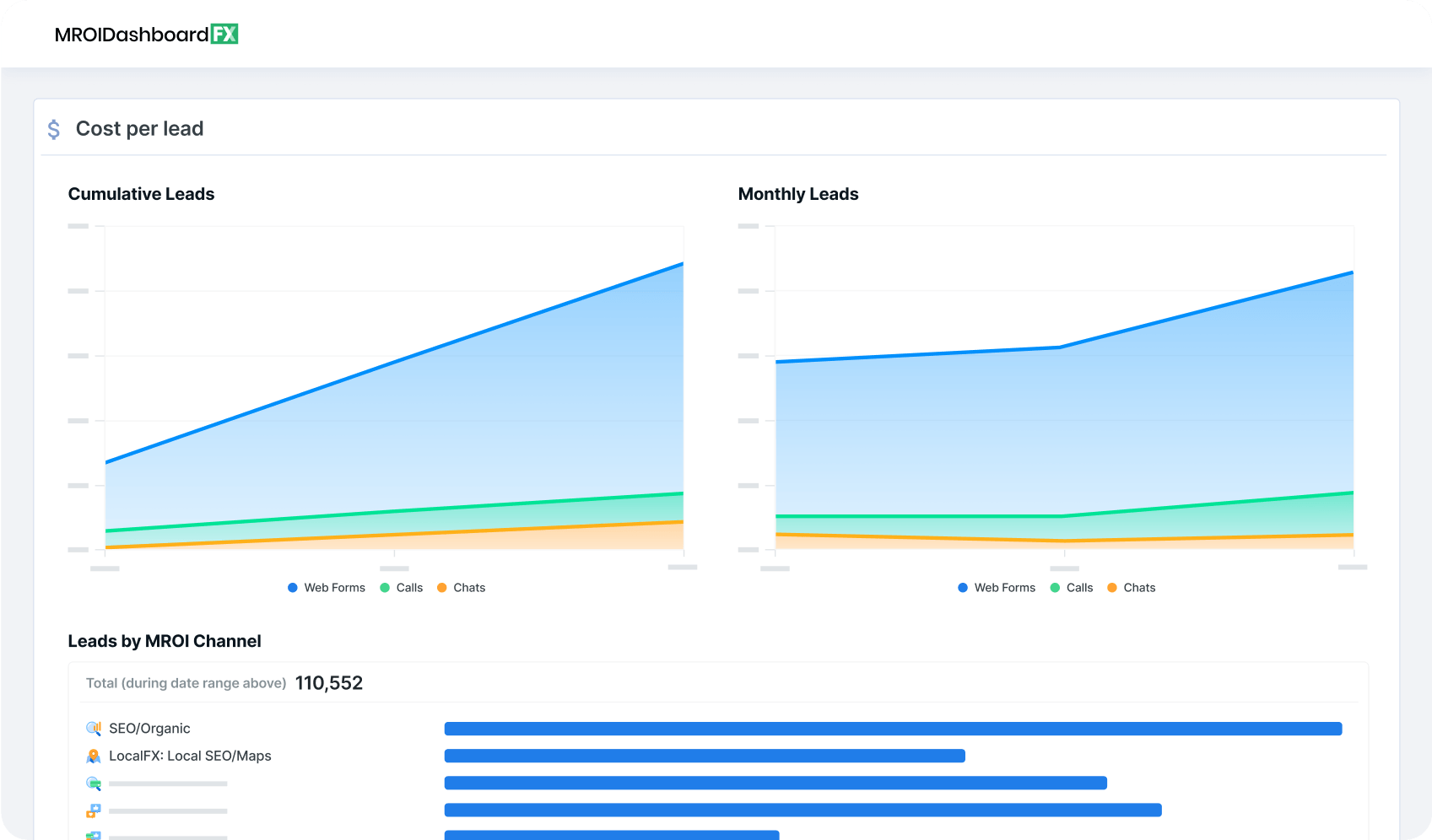
Google Analytics records the most important metrics for website marketing, and it’s a viable tool for alerts, too. Website marketing companies can set up Google Analytics and structure your dashboards to monitor meaningful data and behavior on your site.
![]()
If you have surprising dips in traffic or low performing pages, experts can monitor them and stay aware in order to make proper changes for your campaign.
Tracking also communicates which strategies produce positive results so you can continue financing them. Your website marketing agency can redistribute funds into the productive areas of Internet marketing to boost your site’s performance.
5. Send ongoing reports
Beyond tracking, website marketing agencies deliver reports about variations. Since you hire a company to generate results, you need to get periodic updates on the outcome of the campaign.
Whether you get these weekly, monthly, or quarterly, marketing agencies aim to pass on information about the current state of your site. With the right software, you can view real-time reports to get actionable intel about your site in an instant.
The best marketing agencies remain transparent about their modifications to your campaign, so you can keep tabs on your marketing spend.
WebFX’s tracking and reporting software, RevenueCloudFX, helps you see your site’s progress in a central location and gain insight on your performance. Powered by IBM Watson, this tool pumps out applicable data in an easy-to-read format — did we mention it’s free to our clients?
6. Analyze data
When your site’s metrics rise and fall, it’s not enough to track and report — you need someone who knows why the site’s engagement is low and how to get it back on track.
Through analysis, website marketing companies discover the shortcomings of your site and transform them into takeaways and answers. They can flesh out the root cause of your site trends.
For example, if you’re not seeing many conversions, website marketers can hone in on the drop-off points on your site. By looking at landing pages and call-to-actions (CTAs), they can help you reorient your messaging and design to restore your site and drive traffic.
With informed and experienced experts, you can make decisions instead of guesses about what part of your site is faltering.
7. Offer resources
Adding services from a website marketing company means you get to enjoy their prior knowledge, software, and connections. Technology is an obvious benefit from website marketing, and as advances happen, it’s vital to apply the latest tools to your campaign, like machine learning.
The available software for website marketing can be overwhelming for businesses, but you can eliminate the trial period with these tools by gaining the input of trusted marketing professionals.
Not only do you have access to programs and software, you have a team of experts to handle your site design, advertising campaigns, copywriting, and data. Teams of website marketing professionals generally include PPC and SEO specialists, a marketing manager, website developer, website designer, and content marketer.
Where can I find a trusted digital marketing agency?
You can find a trusted digital marketing agency via:
- Referrals, like through your professional network
- Review sites, like Clutch and G2
- Search, like through Google or ChatGPT
- Online marketplaces, like Fiverr and Upwork
What are the best digital marketing agencies?
The best digital marketing agencies are:
- WebFX
- The SEO Works
- Strike Digital
- Tokyo Marketing
- Midsummer Agency
What are digital marketing services?
Digital marketing services, also called online marketing services, use digital channels to promote and connect brands with potential clients. Digital channels used by online marketing services include search, email, paid, and social media. On average, these services cost $51 to $10,000 per month.
What are the different types of digital marketing services?
The types of digital marketing include the following:
- Search engine optimization
- Pay-per-click advertising
- Social media marketing
- Content marketing
- Email marketing
- Marketing analytics
- Affiliate marketing
- Mobile marketing
- Conversion rate optimization (CRO)
- Web design
What is digital marketing?
Digital marketing, also called online marketing, is the promotion of a brand across digital channels to connect with potential and current customers. Digital marketing channels include search, social, email, and paid.
What does a digital marketer do?
A digital marketer spends their days helping businesses, or their company, drive more revenue with digital marketing strategies. When you invest in Internet marketing services from an agency, you’ll work with a digital marketer to plan, execute, and manage your strategies.