Help! My WordPress Site Looks Different on Mobile
However, even if your WordPress website is responsive, it can still display differently from what you intended on mobile. Read on to discover five common reasons behind why your WordPress site could look different on mobile.
What is responsive design?
Responsive design became significant as soon as devices other than desktop came on the scene. Web developers needed a way for websites to look natural on mobile devices and tablets — in other words, devices with smaller screens.
Responsive design optimizes your site, so it looks its best on each device it appears on. With a responsive design, your WordPress site scales its content and adapts to fit the different dimensions of each device screen.
When you have a responsive WordPress site, you’ll reduce unnecessary resizing, scrolling, zooming, and panning that users otherwise experience when they navigate an unresponsive site. It also eliminates the need for separate websites built for different devices.
Much of why your site’s WordPress mobile version doesn’t match the desktop version stems from the responsiveness of your website.
If your site is entirely unresponsive, well, it will look exactly like your desktop, but you’ll have usability issues that will prevent mobile users from sticking around. Users are 52% less likely to engage with a company with a lousy mobile version of their site.
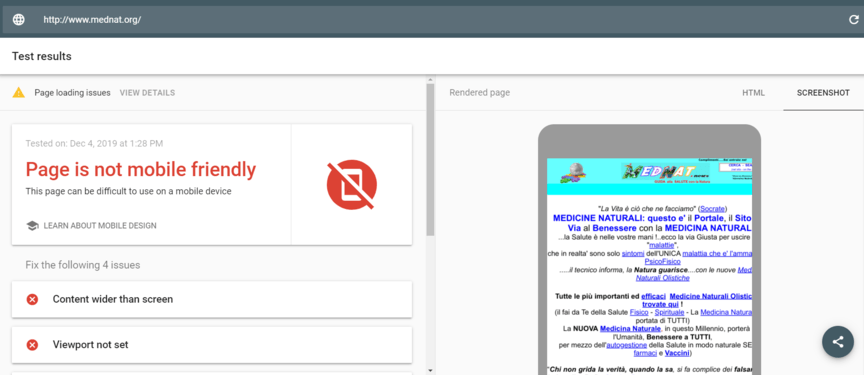
So first, test your site to make sure it’s responsive.
Why does my theme look bad on mobile?
Ask yourself these questions to find out:
- Do you have a responsive theme?
- Does your media scale?
- Are you using accelerated mobile pages (AMP)?
- Are you using mobile theme plugins?
Several things could cause your WordPress website to look different on mobile versus desktop, even if you do have a mobile-responsive site.
If you find yourself asking “why does my theme look bad on mobile,” here are four questions to ask yourself to find out why, along with how to make your WordPress site mobile more friendly.
Do you have a responsive theme?
If you don’t have a mobile-responsive WordPress theme, it’s important that you get one. Your WordPress theme is the simplest way to convert a WordPress website to mobile.
An unresponsive theme will show your site exactly as it is on your desktop, to mobile users. This may not sound bad until you think about the dimension difference between your desktop screen and your mobile screen.
Your horizontal desktop setup doesn’t translate too well to a vertical mobile screen. And because of the size difference, your site will appear tiny on mobile, which severely affects your site’s user experience (UX).
And while a mobile-responsive theme won’t look 100% the same on both desktop and mobile since many elements get shuffled into a single column, the change is valuable because it improves your site’s UX on mobile. This means your viewers will have a more accessible and more engaging time perusing your site on any device.
How to make your WordPress site mobile friendly with a responsive design:
- Preview Theme Responsiveness: When browsing themes on WordPress, preview the template and drag the edge of your browser to check if the theme is responsive.
- Inspect in Developer Mode: View your site in developer mode using Ctrl+Shift+I or by right-clicking and selecting “Inspect.”
How to inspect your website - Update Unresponsive Themes: If your theme is not responsive, find and update your site with a responsive theme.
- Check Plugin Responsiveness: Ensure your plugins are responsive.
Replace Unresponsive Plugins: If any plugins are not mobile-responsive, replace them with responsive plugins that accomplish the same task.
Does your media scale?
If the media on your site doesn’t scale, it can make the mobile version of your WordPress site look clunky.
What this means is that images and other elements won’t fit the screen when viewed on different devices. Non-scaling media will often sit much wider than the mobile screen, interrupting your site’s UX and making your WordPress site look messy and unprofessional.
When the media on your site is appropriately scaled, you boost the UX and appeal of the mobile version of your WordPress website, and you’ll increase your leads and sales.
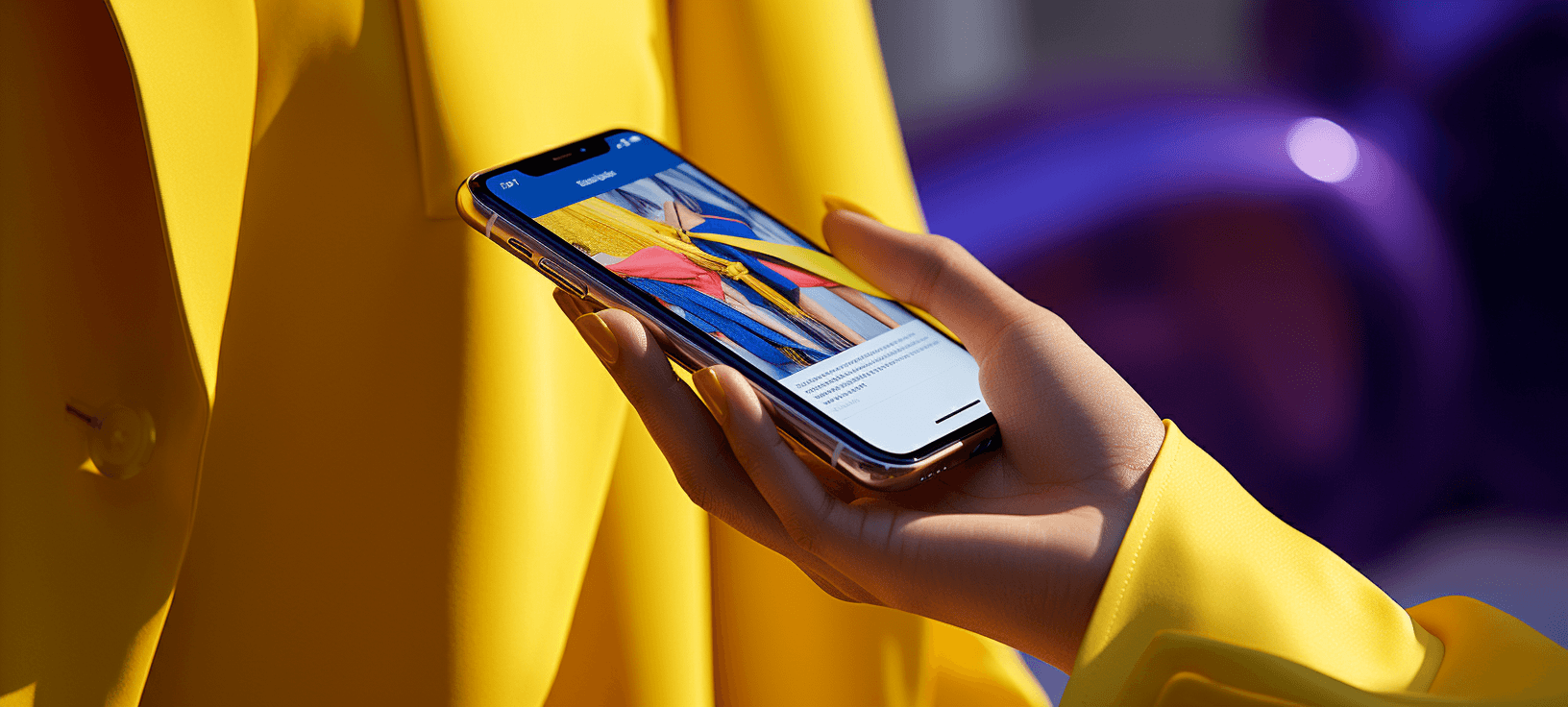
Check out this men’s outfitter ecommerce company, Stag Provisions, looks on mobile.

How to make your WordPress site mobile friendly by making content scalable:
- Check Media File Sizes: Ensure your media files aren’t too large, as they can slow down loading speeds, especially on mobile devices.
- Compress Media Files: Use tools like Kraken.io or ShortPixel (both offer WordPress plugins) to compress your media files. This will improve page speed on both desktop and mobile.
- Hide Non-Essential Media: If certain media elements aren’t crucial for the mobile design, use the WP Mobile Detect plugin to hide them using shortcodes. This can help clean up your mobile site.
Does your media scale?
AMPs are cached pages of your site shown on mobile. The cached pages are stripped down to only the essential elements and code, creating a light page that loads quickly on mobile.
Including accelerated mobile pages in your WordPress site is optimal for good viewing experience on mobile, and it provides optimization options for desktop as well. But, it does mean that your WordPress site will look different on mobile, having a sparser layout and design.
Creating AMP caches for your page will:
- Rank your page higher on Google’s search pages
- Provide a faster load speed on mobile and desktop
- Give users a better experience
So, it’s worth it to implement for your WordPress website.
How to make your WordPress site mobile friendly by using AMP:
- Implement AMP (Optional): Consider using plugins like the official AMP plugin for WordPress or the AMP for WP plugin to implement AMP on your site.
- Disable AMP Plugins (If Needed): If you prefer the full-form mobile version of your site, disable any AMP plugins you’re using.
Are you using mobile theme plugins?
The Jetpack plugin is a free WordPress security plugin by Automattic. It does more than just secure your website, it also helps you optimize your page for SEO and create compelling content.
But it could also cause your mobile theme to appear different from the one you have set up for your desktop version. Jetpack has a mobile theme module that overrides your desktop theme, and it’s quite common for this to cause your mobile and desktop sites to look completely different.
Jetpack has this module to let your site work correctly on mobile, making your site mobile-responsive if your theme doesn’t have it built-in. But because most themes currently are built to be mobile-responsive, you won’t need this module enabled.
Additionally, some plugins, like WPtouch, work similarly to Jetpack’s mobile theme module. The WPtouch plugin creates a separate theme for your site’s mobile version, so if you have this plugin enabled, your mobile and desktop versions will look different.
Disable the plugin if you want to use the same theme for both.
How to make your WordPress site mobile friendly by disabling Jetpack:
- Navigate to Jetpack Settings: In your WordPress dashboard, go to
Jetpack > Settings > Writing tab. - Scroll to Theme Enhancements: Scroll down to the “Theme enhancements” section.
- Disable Mobile Theme: Turn off “Enable the Jetpack Mobile theme.”
- Check Mobile Site: After disabling, check your site on a mobile device to ensure it now displays the same theme as your desktop version.
Get a Custom Web Design Quote From WebFX
How much does it cost to build the website of your dreams?
Use our FREE website design cost calculator to get an idea!
Web Design Cost Calculator

When WebFX designs your website, we make it responsive from the get-go. Just check out our award-winning portfolio of over 1,058 websites we’ve designed for clients like you!
We place each element on your page with responsiveness in mind. We make sure that your website looks exactly how you want it on every single device.
If something isn’t working correctly on your WordPress website, we’ll troubleshoot it for you so that you never have to wonder “Why does my WordPress site look different on mobile” ever again.