

When it comes to analyzing data, charts are a business’s best friend. You probably already use countless charts in your marketing, from bar graphs to pie charts.
The type of graph we’re here to tell you about is the waterfall chart. Waterfall charts are some of the most useful marketing resources out there, which is why you can benefit from learning about them!
So, what are waterfall charts? How can you make them, and what can you learn from them? We’ll answer all three of those questions below, so keep reading to learn more. Then subscribe to Revenue Weekly — our email newsletter — to get more digital marketing tips from the experts!
What are waterfall charts?
Waterfall charts — also called cascade charts or bridge charts — are organized data sheets used to measure gains and losses over time. Those gains or losses can be from revenue, leads, or something similar.
Waterfall charts are a type of bar graph that can begin and end at different places, unlike standard bar graphs that always start from zero and move upwards.
What do bridge charts show?
To the unfamiliar eye, waterfall charts can look like a series of random bars hanging in the air. However, there’s nothing random about the data they show.
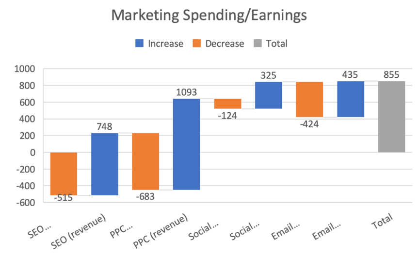
Each bar on a cascade chart represents either an increase or a decrease. Color coding is generally used to indicate whether a given bar is going up or down. In either case, each bar is measured relative to the bar that comes before it.
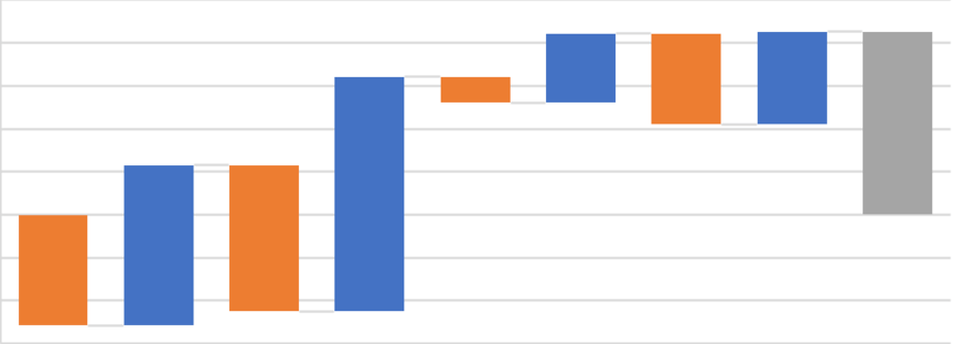
The first bar starts at zero. Each subsequent bar will start where the previous bar ended, as you can see in the image above (alternating going up and down). Usually, waterfall charts also feature a final bar that indicates the total loss or gain.
What you can learn from cascade charts
At this point, you may wonder why you should use bridge charts. What do they offer that you couldn’t get from a regular bar graph?
The point of these graphs is to give context to your data by showing individual gains and losses, which isn’t easy to see with regular bar graphs.
For example, maybe your total earnings come out to $100 for a given campaign on a given day. You could look at that number, say, “Good! A profit,” and leave it at that. But then you wouldn’t know what was happening behind the scenes.
In contrast, a waterfall chart might show that your actual revenue from that campaign comes out to $1000, but that your expenses for that campaign total $900. In other words, your expenses are so high that they canceled out 90% of your would-be-profits.
That information might lead you to change to your spending and adjust your campaigns. For example, the chart might help you realize that you’re spending a huge portion of your budget on two tools that do exactly the same thing.
By cutting one of those tools, you increase your total profits in the future. Whereas if you’d only looked at the total, you’d never have known to do that.
How to make an Excel waterfall chart
Now that you understand what waterfall charts are and why you need them, it’s time to talk about how to make them.
There are numerous programs you can use to make waterfall charts, but one of the simplest and most widely used platforms is Microsoft Excel.
Here’s how you can make an Excel waterfall chart:
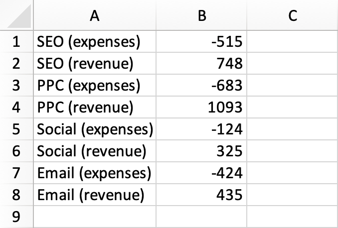
1. Input your data
Use the first two columns in Excel to plug in your data. Column A translates to the x-axis, while Column B translates to the y-axis. So, put the data names into Column A and the data itself into Column B.
For any decreases, put a minus sign (-) before the number to make sure Excel knows it’s negative. If you want a “Total” column, include that at the end as well.
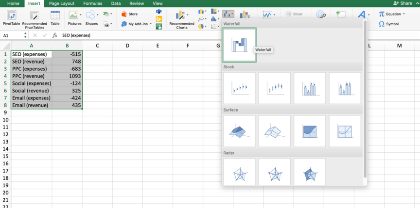
2. Create the chart
Go to the “Insert” tab in the ribbon and click the “Waterfall” option in the charts and graphs section. This will open a drop-down menu, where you can select the first option.
3. Tweak as needed
You’ll see that Excel generated a chart based on the data you created.
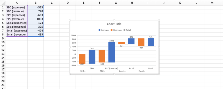
However, it isn’t yet complete — you’ll want to make some adjustments. To start, give your chart a title.
Next, adjust your “Total” column. You’ll notice that Excel doesn’t mark the “Total” column as being the total — it just counts it as another increase. To fix that, follow these steps:
- Double-click the chart. This will open the “Format Data Series” sidebar.
- Single-click the final column to highlight it. The other columns fade.
- Go to the “Series Options” tab in the sidebar and check the box that says “Set as total.”
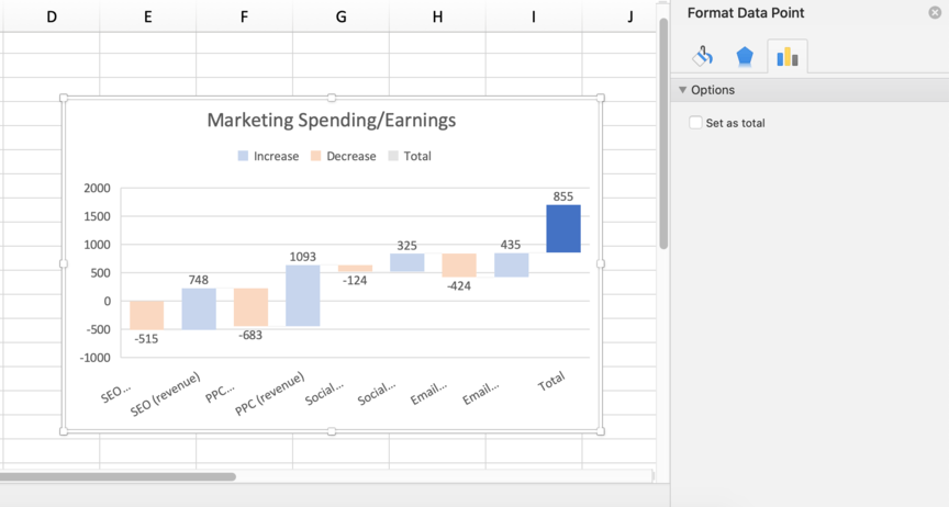
The final column should then switch to match the color scheme of the “Total” key in the chart and start from zero. At that point, you’ll complete your Excel waterfall chart!
You’ll notice that in the above example, the “Total” column does start from zero, but it doesn’t start at the bottom of the chart. That’s because the first data point is negative, so the chart extends below zero. If you don’t want your chart to do that, adjust your data so that the first data point is positive.
Subscribe to Revenue Weekly for more digital marketing tips
Looking for more information on how to improve your marketing efforts? If so, you’ve come to the right place. At WebFX, we have more than 30 years of experience in digital marketing, so we know all the best ways of optimizing campaigns.
We don’t keep that information all to ourselves, either — if you sign up for our email newsletter, Revenue Weekly, you can have valuable marketing tips sent straight to your inbox.
If you have questions or are interested in partnering with us, you can call us at 888-601-5359 or contact us online today!
-
 Matthew Gibbons is a Senior Data & Tech Writer at WebFX, where he strives to help businesses understand niche and complex marketing topics related to SEO, martech, and more. With a B.A. in Professional and Public Writing from Auburn University, he’s written over 1,000 marketing guides and video scripts since joining the company in 2020. In addition to the WebFX blog, you can find his work on SEO.com, Nutshell, TeamAI, and the WebFX YouTube channel. When he’s not pumping out fresh blog posts and articles, he’s usually fueling his Tolkien obsession or working on his latest creative project.
 -

WebFX is a full-service digital marketing agency delivering revenue-driving strategies across online advertising, SEO and AI search optimization, and digital marketing. Backed by 1,100+ client reviews, a 4.9-star rating on Clutch, and proprietary revenue-tracking technology, our team helps businesses grow visibility and revenue across platforms, from Google to ChatGPT to LinkedIn. Discover how our expert team and revenue-accelerating tech can drive results for you. Learn more
Try our free Marketing Calculator
Craft a tailored online marketing strategy! Utilize our free Internet marketing calculator for a custom plan based on your location, reach, timeframe, and budget.
Plan Your Marketing Budget
Share this article

Try our free Marketing Calculator
Craft a tailored online marketing strategy! Utilize our free Internet marketing calculator for a custom plan based on your location, reach, timeframe, and budget.
Plan Your Marketing Budget