Average Lift in Conversions
At WebFX, we develop custom CRO strategies tailored to your unique company’s goals and target audience to ensure you maximize your revenue and grow your bottom line.
CLIENT SATISFACTION SCORE
Industry average: 72%
WHY IS OUR SATISFACTION SCORE SO HIGH?
Project management
ROI tracking
Diverse skillsets
“WebFX improved our online performance by over 500% year over year.”
 Tony P., Review from Clutch.co
 Rated 4.9/5 stars on G2
Rated 4.9/5 stars on Clutch
Rated 4.9/5 stars on G2
Rated 4.9/5 stars on Clutch
HIGHER NPS® SCORE THAN
Industry average: 16
WHY IS OUR NPS SO HIGH?
Turn-key solutions
Real business results
Consistent communication
Conversion Rate Optimization Services That Convert the Right Visitors
Every visitor your site fails to convert is revenue lost. WebFX’s conversion rate optimization services dig into your funnel, copy, usability, and design to turn your best visitors into customers. Request a proposal to get a tailored strategy, transparent pricing, and a clear path to higher ROI.
What do your conversion rate optimization services include?
Our conversion rate optimization services include the following areas of analysis:
- Usability analysis
- Internet marketing conversion analysis
- Conversion funnel analysis
- Website copy analysis
- Aesthetic analysis
- And more!
 Usability analysis
Usability analysis
Confusion is the number one reason people leave websites. If your site has a difficult-to-use interface, or isn’t accessible on mobile devices, many visitors will become frustrated and leave.
A website redesign from our conversion optimization agency can boost conversions from qualified visitors without making any modifications to Internet marketing plans.

 Internet marketing conversion analysis
Internet marketing conversion analysis
Even if your site is extremely easy to navigate, your traffic quality may be too poor to encourage conversions.
Your website should be written and designed to attract qualified leads, or visitors that are likely to convert. If your Internet marketing campaign brings unqualified traffic to your site, your conversion rates will be lower.
An in-depth analysis of your Internet marketing campaign can help you attract the right visitors to your site, and cater your content to the ones that are likely to become customers.

 Conversion funnel analysis
Conversion funnel analysis
Conversion funnels are the paths through your site that visitors follow before converting.
Each page between an entrance page and a conversion page is an opportunity for your visitor to become distracted and leave. If your conversion funnels are too intricate, potential conversions will leave the path and that conversion will be lost.
Our website conversion optimization services include conversion funnel analysis, which helps ensure that qualified visitors stay on the right track to conversions.

 Website copy analysis
Website copy analysis
All too often, website copy is written from the perspective of the company, and doesn’t adequately address visitors’ questions and concerns.
Professionally written website copy provides the information vital to understanding each product or service, while also persuading qualified customers to convert.
A tweak to the tone and content of your website copy can transform interested visitors into conversions.

 Aesthetic analysis
Aesthetic analysis
Website visitors expect a uniform and professional look across all pages of a website.
If any of your pages take a departure from the look of your site, visitors may become confused and leave. Abandonment also occurs because of other issues like broken links or complex navigation bars.
Ensuring all the pages of your site conform to your brand and no that aesthetic errors are present will increase the time visitors spend on your site, greatly enhancing your opportunities for conversions.

 And more!
And more!
Learn more about what our website conversion optimization include in this video:


Data-Powered CRO Strategies
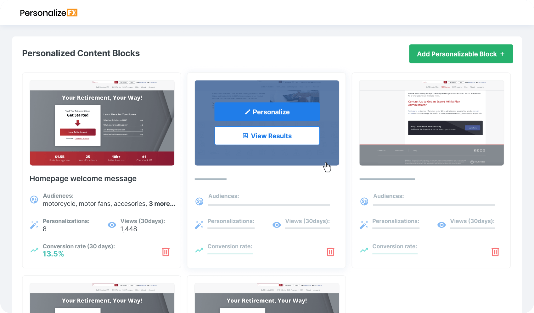
RevenueCloudFX is our proprietary marketing software built to enable our client’s website strategies and digital campaigns.
Access in-depth insights into your website visitors, monitor conversion results, implement personalized messaging, and optimize your website all in one platform powered by your audience’s behavior.
11%
100%
$500K+
11%
100%
$500K+
Transparent CRO Pricing
Tailored to Your Business Goals
When you invest in conversion rate optimization services, you’re investing in a strategy dedicated to driving ROI across your omnichannel digital marketing strategy. Talk to our strategy team to see how CRO can help grow your business!
Essential CRO

Custom CRO

Enterprise CRO

Our CRO Experts Delivered 2,247 Assets for Clients Last Year
Get expert help improving your website conversion rate and start increasing your ROI from inbound marketing experts. Connect with a WebFX strategist to see how CRO can help you reach your business goals in 2026!
Your search for the right conversion rate optimization agency ends here
When your company partners with WebFX, you:
Get a dedicated, long-term partner
When you work with us, you’ll get a dedicated account manager who will take the time to learn about your business and goals. We partner with you and strive to act as an extension of your internal team.
Receive a custom strategy
We always create custom strategies for our clients, and we never use generic, cookie-cutter marketing plans. We’ll learn about your business and goals and research your industry so we can devise the perfect digital marketing plan for you.
Deliver bottom-line results
We focus on driving results that have a real impact on our clients’ most important goals and improve their bottom line. Over the past five years, we’ve generated over 24 million leads and $10 billion in revenue for clients, and we’d love to help grow your business too.
Stay ahead of the competition
We have a team of more than 750 digital marketing experts who specialize in various areas and are constantly working to improve their skills. When you partner with our conversion rate optimization company, you have one of the best digital marketing teams in the world on your side.
Pricing custom to you.
Starting at $1,500 per month.

Solving key challenges for businesses

When Merrimack Valley Psychological Associates wanted to help more clients, they turned to WebFX. Learn how our partnership expanded their reach and results.
“My practice has grown quickly and improved our accessibility to those we serve or hope to serve within our community. WebFX is directly responsible for our growth and the fact that we have more than doubled our revenue in six months.”
![]()
Net Friends turned to WebFX to help them boost their presence in search engines to attract qualified traffic and leads for their business.
“Web traffic is up well over 100% and our marketing qualified leads are more than double what they were before our WebFX engagement.”

Hurst Pediatric Dentistry wanted more clients to find their kid-friendly dental office. Here’s how our partnership helped them serve up more smiles!
“Rather than pushing us to make changes on our website that would make it more similar to so many other websites, WebFX offers suggestions for simple tweaks we can make to get the results we want, while still allowing our personalities to shine through.”


Unlock a 11% increase in conversions with WebFX’s award-winning CRO team
- Dedicated account manager, interfacing with a team of 500+ digital marketing experts
- RevenueCloudFX access for optimizing, measuring, and reporting ROI
- In-depth analysis of your business goals, industry, and competitors
- In-house project management software, 24/7 help desk, and direct client phone line
In-House Marketing
- One or two team members trying to keep up with fast-paced marketing advancements
- Analytics suite for measuring and improving campaign performance
- S.M.A.R.T. goals, but limited resources needed to execute
- Reporting roadblocks leading to project delays and wasted spend
Typical Marketing Agency
- Dedicated account manager responsible for strategy, but will need your help implementing solutions
- Third-party tracking and analysis with subscription costs passed to you
- Cookie-cutter checklists and solutions for optimizing your campaigns
- Regular, but unreliable support when issues arise with your account
Why choose WebFX for CRO services?
WebFX is a top conversion rate optimization agency. Here are a few of the benefits of choosing us as your CRO company.
- Make decisions faster with transparent pricing and deliverables
- Get a vetted partner with 1,100 reviews
- Streamline marketing initiatives with supporting services
Make decisions faster with transparent pricing and deliverables
Make decisions faster with transparent pricing and deliverables
We’re transparent about our pricing and post it right on our website. You’ll never have hidden fees or unexpected costs. Our commitment to transparency extends throughout your partnership with us. We provide you with access to data about your campaigns and regular reports on their progress.
Get a vetted partner with 1,100 reviews
Get a vetted partner with 1,100 reviews
If you want evidence of the results we drive and how our clients feel about us, you don’t have to look far. We have an extensive portfolio and over 1,100 client testimonials on our website. You can also read reviews about us on sites like Clutch and UpCity.
Streamline marketing initiatives with supporting services
Streamline marketing initiatives with supporting services
WebFX is a full-service digital marketing company, which means we offer everything you need to take your online marketing to the next level. In addition to CRO, we offer:
FAQs about CRO services
Is conversion rate optimization worth it?
Yes, conversion rate optimization is worth it! With an effective strategy, you can turn your website traffic into conversions and revenue for your business, helping you earn a higher return on investment (ROI) and grow your bottom line.
How much do conversion rate optimization services cost?
Prices for website conversion optimization services depend on several factors, including how many tests you run and what CRO agency you work alongside. Typically, businesses will pay $800 to $10,000 per month for CRO services. For the most accurate pricing, though, request a custom quote.
What do conversion optimization services include?
Conversion optimization services test and optimize elements on your website to increase conversions, like purchasing a product or downloading a guide. Most CRO services will include audience research, heatmaps, visitor recordings, and experiment implementation.
What are the advantages of CRO services?
Choosing to invest in CRO services offers your company several advantages, including:
- Make informed and data-backed decisions about your website’s design
- Get real insight into site strengths and pain points
- Improve contact form completions
- Increase online orders and appointment scheduling
- Decrease abandoned shopping cart rates
- Accelerate website-generated revenue
- Maximize site design for optimum user experience and conversion rates
When you invest in website conversion rate optimization services, you also partner with an agency that is experienced with CRO, like WebFX. With our decades of expertise, plus advanced artificial intelligence and machine learning software, our conversion optimization company can help your site become a revenue-generating machine.
What are examples of conversion rate optimization strategies?
A few examples of common CRO strategies include:
- A/B testing
- Improving website user experience (UX)
- Optimizing landing page design and layout
- Enhancing and optimizing calls to action (CTA)
- Utilizing user feedback and behavior
- Implementing personalization across web pages
What’s the difference between conversion rate and click-through rate (CTR)?
Conversion rate refers to the rate at which users take a specific or desired action, like filling out a contact form or making a purchase. On the other hand, Click-through rate refers to the rate at which users click on something on your site or marketing message. For example, they may click on your contact form but not finish completing it.
A good CTR indicated shows that users are engaging with your site, while conversion rate shows that users are taking the actions you want them to, like becoming a customer.
What is conversion rate optimization?
Conversion rate optimization is the practice of testing and updating elements of your website to maximize the percentage of website visitors who take actions that lead to them becoming customers. CRO services help you leverage website traffic for a positive impact on your company’s bottom line.
Why is CRO so important?
Every website has a unique set of goals. An industrial website generates leads, an ecommerce store sells products, a blog converts visitors to subscribers.
Unfortunately, many site owners don’t pay as much attention as they should to how well they’re reaching those goals, and many marketers measure success in terms of traffic and rankings instead of conversions.
But these metrics are “vanity metrics” — they look good on paper, and it’s nice to be able to report having a certain number monthly visitors. But, in the long run, what would you prefer: 10,000 website visitors per month and $1,000 in sales, or 1,000 visitors per month and $10,000 in sales?
For most marketers, that’s an easy question to answer, but achieving that number would require maximizing conversions — and measuring the right conversion rate metrics.
If you’re unfamiliar with the term, a conversion is essentially any action that moves a site visitor towards becoming a customer, and your conversion rate is the percentage of visitors who make a conversion.
So if your company overlooks conversion rate optimization, you’re missing out on the opportunity to make the most of your website as a marketing and sales tool.
It’s easy to get caught up in measuring metrics like traffic and rankings, in part because Internet marketing is so data-driven. But monitoring and improving your conversion rate is more effective for driving the metrics that really matter, like sales and revenue.
That’s why conversion rate optimization, or CRO, has become so important — it gives you the power to identify what isn’t working, why, and how you can fix it.
Your entire sales process, from generating interest to convincing potential customers they need your product or service, to finally to closing the sale, is known as your sales funnel. And identifying “leaks” in this funnel can have a serious impact on your site’s performance.
For example, you may have 1,000 potential new customers enter your sales funnel at the beginning — but maybe only 5 customers end up actually paying for your product or service. This translates to a 0.5% conversion rate, and (depending on the industry and several other factors) indicates that your sales funnel needs to be patched up.
With our conversion analysis process, we’ll go through and identify weak points within your sales funnel. Maybe your landing pages need redesigned, or maybe you need to test new copy for your call to action buttons. Or maybe it’s something less obvious, and you need to present a better representation of your products.
It could be any number of things, and our job is to identify and fix them.
View all deliverables in our conversion rate optimization packages
Learn more about our conversion optimization services, plans, and pricing.
| Features | Aggressive | Market Leader | Enterprise |
|---|---|---|---|
| Initial CRO campaign (First month) CRO & UX Hours | 20 hours | 40 hours | 50 hours |
| Monthly Ongoing CRO & UX Hours | 10 hours | 20 hours | 50 hours |
| Dedicated UX project manager | |||
| Monthly user experience reporting | |||
| 750+ SMEs behind campaign driving results | |||
| Online project management scheduling | |||
| Custom initial user experience testing strategy | |||
| Conversion tracking code setup | |||
| Confirmation/thank you page setup | |||
| Goal Funnels Setup – Initial Analytics + Reporting | |||
| Initial Conversion Audit – What Portions of Site to Test/Optimize for Conversions + Optimization Suggestions | |||
| VisitorRecorderFX – Web video capture of all converted leads (available for 60 days) | |||
| CRO & UX Optimization Consist of: | |||
| Use of Google Optimize for A/B testing (Client Google Analytics access is required) | |||
| Raw Heatmap Data Provided | |||
| ROI & split test reporting schedule | |||
| Creative design for A/B testing | |||
| Market research | |||
| Conversion strategy | |||
| Conversion best practices documentation | |||
| Static calls to action design | |||
| Lead form setup/modifications | |||
| Navigational modifications | |||
| Multivariate conversion testing | |||
| USP and headline copywriting | |||
| Setup of auto responders | |||
| Incoming traffic reporting and recommendations | |||
| Conversion path implementation | |||
| Lead forms integrated into supported CRMs (ex. Salesforce.com, Microsoft Dynamics, Sugar CRM, etc) | |||
| Performance test reporting | |||
| Conversion reporting | |||
| RevenueCloudFX setup & included | |||
| Incoming traffic analysis | |||
| Ecommerce websites | |||
| Shopping cart abandonment testing | |||
| Google Ads landing page conversion audit (one-time) | |||
| Landing page creation | |||
| Custom UX design and development projects | |||
| Conversion Funnel Report | |||
| CRO Page Heading Analysis | |||
| Conversion Analysis by Traffic Source/Medium | |||
| Basic ADA Compliance Analysis | |||
| RevenueCloudFX Personalization Strategy | |||
| Initial Setup Month 1 | $3,600 | $7,200 | $9,200 |
| Conversion Rate Optimization Ongoing Investment | $1,800 | $3,600 | $9,200 |
| Need more information? Call Us: 888-601-5359 | GET STARTED | GET STARTED | GET STARTED |
Our conversion analysis and CRO plans include landing page designers, website funnel analysis experts, talented copywriters, and experienced SEO campaign managers. Our team will work together to analyze and take advantage of the conversion potential of your traffic, and look for ways to convert more of your traffic into customers.
WebFX has thousands of reviews praising our transparency, communication, and results.
WebFX Agency Rating

4.9/5
based on over 550 third-party reviews