-
 9 min. read
-
 Trevin Shirey
 VP of Marketing
- Trevin serves as the VP of Marketing at WebFX. He has worked on over 450 marketing campaigns and has been building websites for over 25 years. His work has been featured by Search Engine Land, USA Today, Fast Company and Inc.
With advancing technologies, people can access your site at any time, from any location. As a result, Google started to adapt their algorithm for people searching on devices like smartphones and tablets. This push for smoother Internet experience changes how search engine optimization (SEO) strategies work.
When you consider that 70% of all Internet time is spent on mobile, you can see the impact mobile has on search engines like Google. Since mobile is so important, Google set mobile-first indexing as a priority to rank highly in search results. So, what’s the difference between mobile SEO and desktop SEO?
Keep reading to learn the differences between these two types of SEO and sign up for our newsletter, Revenue Weekly, to get the latest SEO tips!
What’s the difference between mobile SEO and desktop SEO?
If you’re wondering “What’s the difference between mobile SEO and desktop SEO,” here are some major differences that you need to account for when building your SEO strategy:
Search results
Because of mobile-first indexing, search results for mobile vs. desktop will be similar, but not necessarily the same. Google shows results based on user expectations, which changes depending on the device. It’s important to know the difference between desktop and mobile in search, so you have the best foundation for creating different strategies for desktop SEO and mobile SEO.
The biggest difference between desktop and mobile search results is how text results appear.
Mobile
Mobile text results are generally larger since mobile places more emphasis on visuals. In many cases, images or videos will appear with listings. Mobile results are set up as cards, containing a border around the result, which takes up more room.
As such, in most cases, mobile will fit two to three listings on the screen at once. Mobile users have to swipe multiple times to go through the search results because each of these swipes is short. Since each swipe is shorter, it takes users longer to get to the bottom of the search results.
As such, they’re more likely to choose the first few results they come to rather than continue scrolling down. 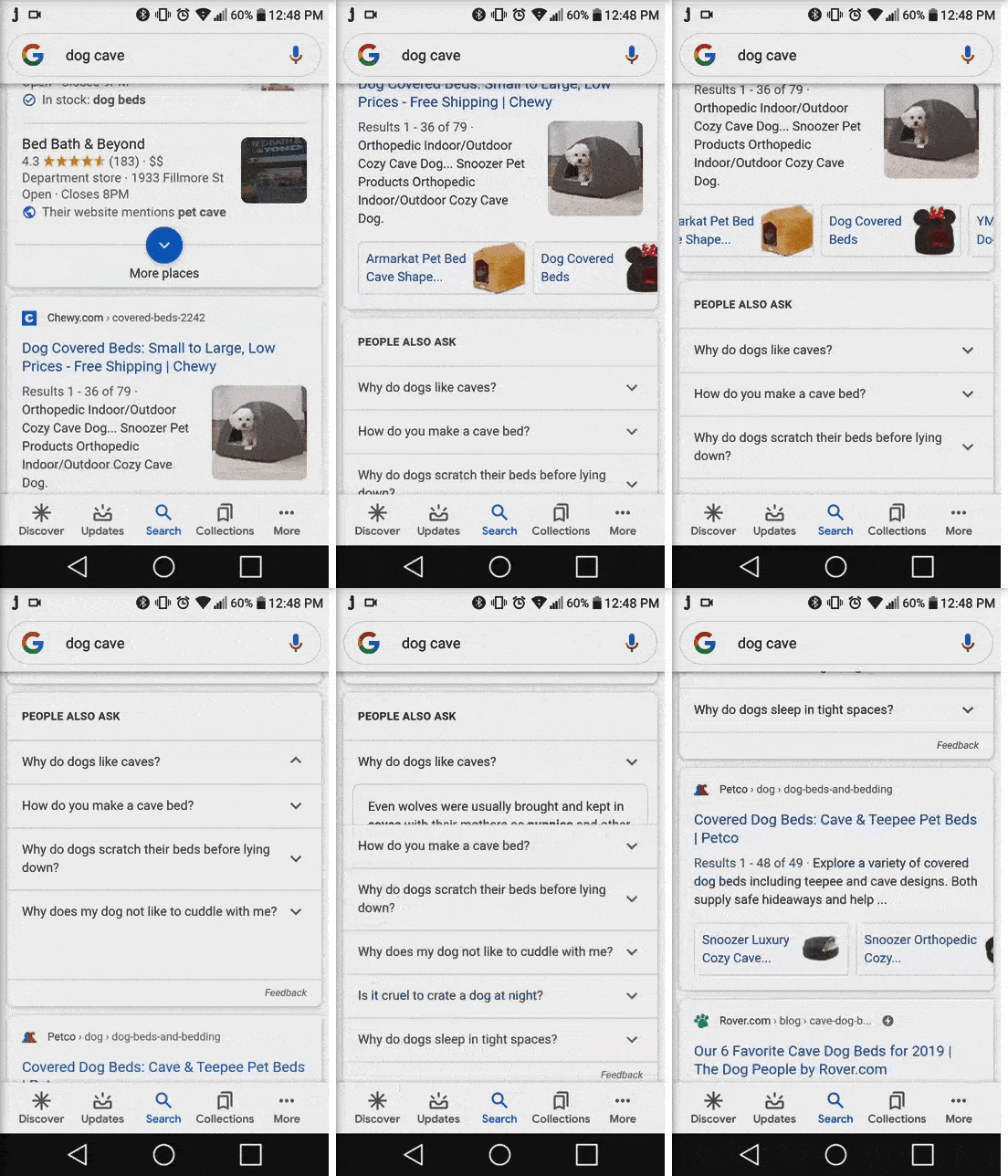
Desktop
Most desktop screens can fit up to five text results on the screen at one time. Since you see more listings at one time, it’s easier to scroll through the results.
Users can reach the end of the search page in a few scrolls. 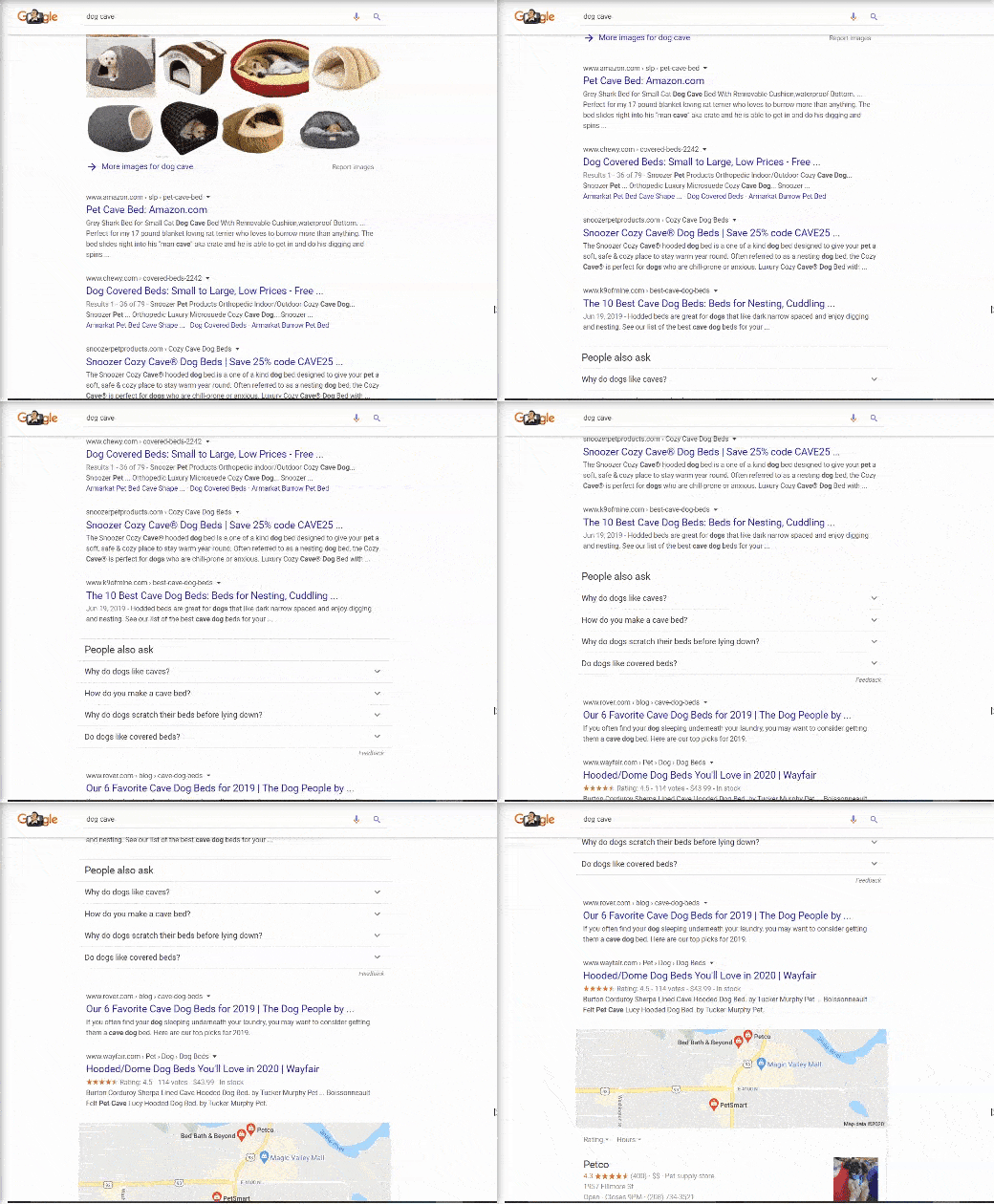
Click-through rate
Where your search results appear in search pages is the main focus of SEO, so it’s important to note how that can affect the importance of ranking in the top three.
Mobile
When you look at the click-through rate (CTR) between mobile and desktop, you’ll find that the click-through rate for mobile drops significantly less than on desktop. On mobile, the CTR for the first position is 24%, compared to 14% for the second position.
This CTR continues to drop with each position, until position five. From position four to five, the CTR jumps from 6.8% to 9%.
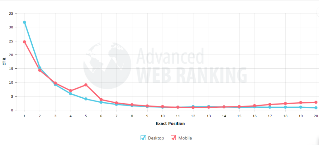
So, why does the CTR drop less for mobile? Some may attribute it to the individualized cards for each listing.
Since each listing is clearly sectioned off, it’s easier to look at individual listings. Additionally, having photos in listings could explain why the drop is less significant. Mobile users may click on other listings because of a visually appealing photo or thumbnail for a video.
Desktop
Due to the desktop’s wider, landscape-oriented screen, search results have more space.
You can have multiple results visible at one time, and even have multiple sponsored ads and search features appearing to the side of results. The CTR on a desktop for position one falls at 31% but drops significantly down to 15% for the second position. This drop may be due to the number of listings that fit on one screen.
Since users can see up to five listings on one page, they go with the first one instead of vetting through the other listings.
Search layout
The differences in search layout changes due to screen space for desktop and mobile can also affect how people view your website.
Mobile
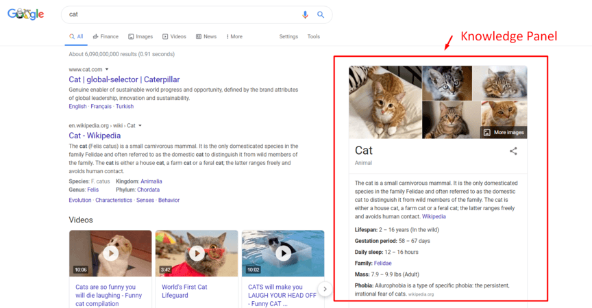
Mobile device screens are vertical, not to mention much smaller than desktop screens, which means that search results have a fraction of the search real estate that desktop contains. Google also lays out their search results differently for mobile than for desktop (often containing a picture and generally taking up more room), it means that searches typically provide only one or two results at one time. The features that show up on search also can differ between desktop and mobile, so it’s important to identify what features impact mobile vs. desktop. Mobile often shows more features in results than desktop, and the features that show up can look different. For example, knowledge panels, which generally appear to the right on desktop, appear at the top of the page for mobile.
They also take up more room, which pushes the results further down the page and leads to longer scrolls and more swiping.  Mobile also has some exclusive features that don’t show up on desktop results. One is the Interesting Finds snippet, which uses Google’s algorithms to show somewhat relevant web pages that Google thinks users might find interesting.
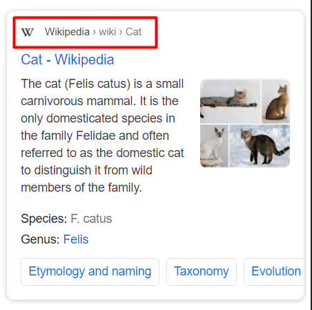
 In addition, if you look above the title of the search result, you’ll see the site path. On mobile, you see the website’s name with a favicon (the website’s icon), rather than a URL, followed by the path (for example: “Petfinder > Cats”).
Desktop
Generally, desktop has a wide variety of features, many of which appear on mobile as well.
They include but aren’t limited to, featured snippets, knowledge panels, People Also Ask sections and local 3-packs. These features push organic results down the page, but the outcome isn’t quite as drastic as with mobile.
Why is Google search results different on mobile?
Now that you know the difference between mobile and desktop searches, you’re probably wondering why Google search results are different on mobile. While the websites ranking in the search results don’t change much, the appearance changes significantly.
So, why are Google search results different on mobile? The main reason Google search results differ from desktop to mobile is because the experience is different. On mobile devices, users want information fast.
As a result, Google breaks up listings more, with features like images, to make it easier for users to browse the search results. Desktop searchers, on the other hand, have more time to browse. As a result, the listings are more text-based because users have more time to look through the different listings and read the information.
Desktop and mobile SEO strategies
Once you know the difference between mobile SEO and desktop SEO, you can start building your SEO strategies for desktop and mobile.
For your SEO for desktop and mobile, its best to combine them in one comprehensive SEO strategy and optimize for both device types through one strategy.
Adapting your SEO to respond to any device will increase the chance of ranking higher and pulling in more traffic.
When building an SEO strategy, make sure that you:
- Optimize for local SEO: Ranking well for local searches helps with both your desktop and mobile SEO strategies, so make sure you’re targeting local “near me” keywords. You can also claim your free Google My Business (GMB) listing and optimize it for local SEO.
- Create user-friendly design: For your comprehensive SEO strategy, a user-friendly website means, in large part, incorporating responsive design. A responsive design automatically formats your site to any device size, so you don’t have to worry about optimizing your site according to different devices. Mobile responsiveness also helps with ranking better, so it’s hitting two birds with one stone.
- Craft a fast loading website: To cater to both mobile and desktop users, you’ll need to optimize your site for speed (since mobile needs to be faster than desktop, you may need to trim down on heavy elements for your mobile version).
- Choose the right keywords: Spend time researching and understanding users’ behavior in search. Identify what kind of keywords they’re likely to use on both mobile and desktop. Don’t forget to integrate relevant voice search keywords for your pages targeting mobile users.
Conquer SEO with WebFX!
Ready to get started on your mobile SEO strategy? WebFX can get you up to speed. We’re a top SEO agency, and we’re focused on driving results for your mobile SEO.
When you partner with WebFX, you can take advantage of our amazing responsive web design and page speed optimization services. As a full-service digital marketing agency, that’s not all we can do. We’ll seamlessly integrate mobile into each one of your digital marketing strategies.
Contact us online or call us at 888-601-5359 to talk to one of our talented digital marketing strategists!
-
 Trevin serves as the VP of Marketing at WebFX. He has worked on over 450 marketing campaigns and has been building websites for over 25 years. His work has been featured by Search Engine Land, USA Today, Fast Company and Inc.
 -

WebFX is a full-service marketing agency with 1,100+ client reviews and a 4.9-star rating on Clutch! Find out how our expert team and revenue-accelerating tech can drive results for you! Learn more
Try our free SEO Checker
Boost your site’s search performance with our free SEO Checker. Analyze your website for optimization tips on titles, headers, content, speed, and more. Get a free report now to enhance rankings on Google, Bing, Yahoo, and beyond!


How Is Your Website’s SEO?
Use our free tool to get your score calculated in under 60 seconds.
Try our free SEO Checker
Boost your site’s search performance with our free SEO Checker. Analyze your website for optimization tips on titles, headers, content, speed, and more. Get a free report now to enhance rankings on Google, Bing, Yahoo, and beyond!
