

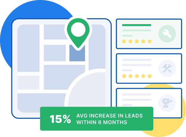
Powered by 48,000+ hours of home services experience
Get more value from construction web design with our award-winning team’s proven tips for construction website design, including using video, responsive design, and interactive elements. Plus, learn how much professional web design costs!
As a construction company, you build everything from office buildings to factories on a regular basis. What you may not be so familiar with, however, is building websites.
In this digital era, it’s essential that your construction company has a website where people can find you. But more than that, with 94% of users’ first impressions relating to web design, having good web design for construction websites is a must. So, how do you do that?
Read on for more information about web design for construction companies, and then take a look at our web design services. With over 1,100 client testimonials, we have the dedication and expertise to optimize your website for maximum lead generation!
Explore WebFX Home Services Marketing Services
5 construction web design tips
There’s an almost endless list of things you can do to improve your construction web design, but you can start off by optimizing some critical web design components.
Below, we’ll go over some basic things to get right on your website and look at some construction website examples that show how to implement them.
1. Navigation
Your website won’t make a positive impression on users if they can’t even find their way around it. One of the first things you need to get right in your construction web design is your navigation.
Good website navigation means clearly laying out the structure of your site for users to see. You can take your design to the next level by adding markers to show them where they are on your site. You can do these things in a few different ways, but one of the easiest methods is to use navigation bars.
Bechtel’s website, shown below, does a great job with this. In addition to a simplified navigation bar at the top of the page, it has a hamburger menu that opens into a side panel showing the full hierarchy of the site.
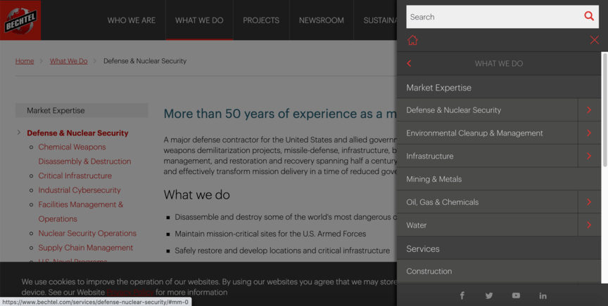
You can also see a breadcrumb navigation trail on the left side of the page, beneath the header, to show you where you are.
2. Principles of design
Web design has plenty of unique attributes, but it also shares a great many things with other types of design. One such shared feature is its adherence to the four visual principles of design: Alignment, contrast, repetition, and proximity.
- Alignment: Lining design elements up in a logical and visually appealing way.
- Contrast: Ensuring that no elements look too similar or clash with each other, particularly in regard to color.
- Repetition: Repeating certain elements to maintain a consistent feel across the space
- Proximity: Establishing connections between different elements by placing them close to one another
When web design for construction companies — or any other business — fails to make good use of these principles, it can make the design harder on the eyes, which in turn can lead to a worse user experience.
To see one example of how design principles can make a difference, we can look at Skanska’s commercial buildings page. This page looks great on all fronts, but pay special attention to the alignment.
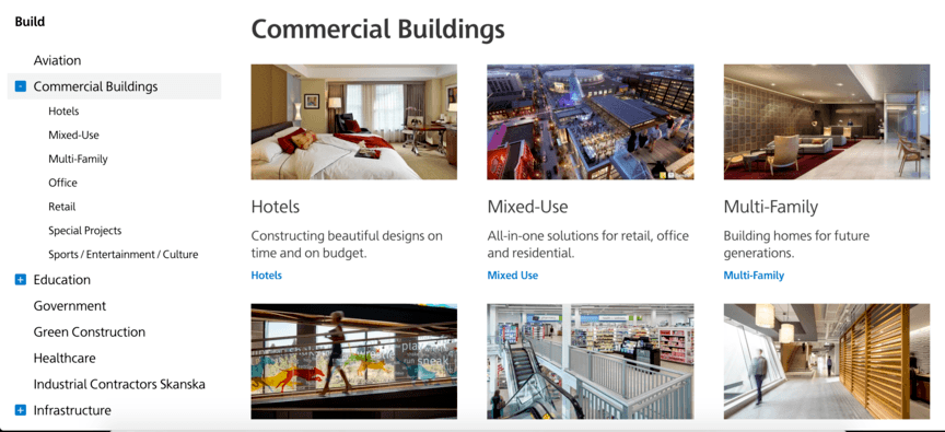
The images in the grid are aligned with each other both vertically and horizontally, and all three lines of text under each image are perfectly left-aligned. The alignment of the text in the side navigation bar, meanwhile, tells us the hierarchy of the pages shown there.
It’s a great example of how the little details can make a big impact on your site’s design.
3. Responsive design
If you’ve done web-surfing on both a phone and a computer before, you may have had a different experience on each device. And in all likelihood, you’ve encountered a few websites that weren’t optimized for responsive design. This means they weren’t optimized to work on both a mobile and desktop format.
With over half of all Internet searches happening on mobile, you can’t afford to have a website that only works on a computer screen. You need to optimize it to work for either format, so customers will get a good impression of you no matter what device they find you on. Responsive design makes this happen.
For an example of good responsive design, let’s take a look at Balfour Beatty’s website. On its homepage, it features a “Trusted Builder” section that displays some of the company’s projects. On the desktop version of the site, it lays out three examples horizontally, with the text appearing beneath each image.
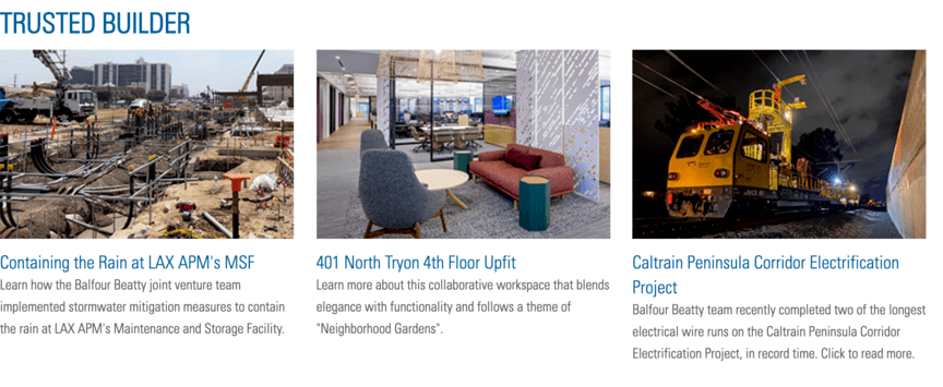
But this arrangement wouldn’t work well on a phone screen. So for the mobile format, the site lists the examples vertically, with the text displayed to the right of each image.
4. Video
One of the best things you can do to keep people on your website is to use some form of video. Videos are incredible at grabbing people’s attention and drawing them in — users spend 88% more time on pages that feature videos!
Your homepage is a great place to place a video.
If the first thing users see when they arrive at your website is a video — preferably one that plays automatically as soon as the page loads — they’ll be much more likely to stick around.
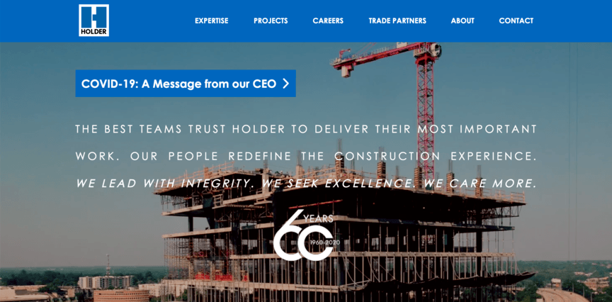
A construction company that does a great job of this is Holder. As soon as you arrive at their homepage, you’re greeted by a full-page background video showing clips of Holder workers in action. The video also shows a timelapse of a building being constructed, providing an example of something Holder built.
5. Interactive content
Web design for construction is a great place to feature moving content in addition to static images and text.
But that doesn’t just mean video. You can go a step further by including content that changes not just of its own accord, but in response to users’ actions.
Interactive content can take plenty of different forms, but the basic idea is that it reacts to what the user does with it.
It can start as simple as having an image that displays hidden text when you hover over it and can range as far as using interactive pricing charts where users can input personalized information to get a quote.
KBR’s homepage is a great example of using interactive graphics On top of the background video like Holder’s, it has a few basic interactive features. As you scroll down the page, you trigger slide animations that display additional content, and several of these change color when you hover over them.
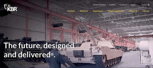
Perhaps the most entertaining element is the grid of yellow dots displayed over the video, which move around when you move your cursor through them.
While these things may not serve any explicit function, the very fact that the interaction is there is enough to draw most users in and get them to engage on the site.
Optimize your web design with WebFX
Not sure how to make these construction web design tips work for you? We can help! WebFX has been working in the digital marketing industry for over 30 years, and our custom construction website services are some of the best you’ll find.
We’d love to help you optimize your website to draw in new clients. To get started with us, just give us a call at 888-601-5359 or contact us online today!
-
 The WebFX team includes 750+ digital marketing specialists across SEO, PPC, web design, analytics, and beyond. Using proprietary RevenueCloudFX technology and transparent, data-driven strategies, we’ve collectively generated $10 billion in revenue and 24 million leads for our clients in the past five years.@webfx
 -

WebFX is a full-service marketing agency with 1,100+ client reviews and a 4.9-star rating on Clutch! Find out how our expert team and revenue-accelerating tech can drive results for you! Learn more
Try our free Marketing Calculator
Craft a tailored online marketing strategy! Utilize our free Internet marketing calculator for a custom plan based on your location, reach, timeframe, and budget.
Plan Your Marketing Budget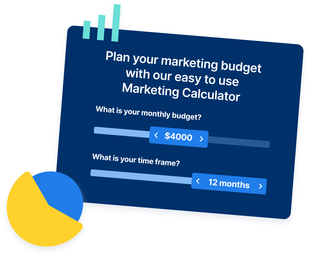
Share this article
Outrank Local Competitors This Season
See how home service pros like you are dominating local Google results and booking more jobs.

Try our free Marketing Calculator
Craft a tailored online marketing strategy! Utilize our free Internet marketing calculator for a custom plan based on your location, reach, timeframe, and budget.
Plan Your Marketing Budget


Solving key challenges for home services companies
Our website isn’t ranking in the search results for home services
When people or businesses need home services in their area, they take to search engines like Google. Ensure your website appears at the top of the results when your target audience needs your services.

We’re struggling to grow our team
Expanding your team and growing your business go hand-in-hand. If you need help growing your team with talented and friendly employees, our recruitment marketing services have you covered.

We’re not generating enough leads
Are people visiting your website but not getting in touch with you? Our expert marketing specialists and web designers can optimize all areas of your website so you can attract and convert more of your target audience to use your home services.

We’re not attracting new customers
Having trouble increasing your online visibility, so you can attract new customers? Our award-winning marketing services get your brand in front of the right people in your local area.
