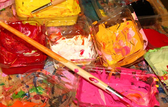
Unarguably one of the most important aspects of any design is its colors.. Designers create the style of a site, as well as the movement it makes, the emotion it creates, and its purpose based largely upon the color choices they make. Colors are powerful tools and an important thing all designers should understand when creating websites. 
Color Terminologies
Many of you may have learned some color basics in school, but let’s quickly review some terminology in order to get a better grasp on colors and how to use them.
Color Wheel Main Groups
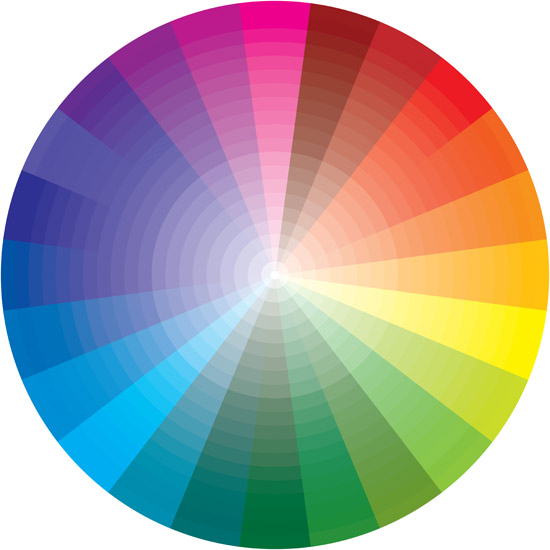 Colors are traditionally shown in a color wheel, and from this wheel, we can separate colors into three main groups: primary, secondary and tertiary. The three primary colors are red, blue and yellow. These colors are the base colors that make up all the other colors on the color wheel. Mix the primary colors together, and you get the secondary colors. These are orange, green and purple. Tertiary colors are comprised of the middle colors like yellow-green and blue-green. They are created by mixing a primary color and a secondary color.
Relationships of Colors
There are plenty of terms to describe colors, which will be helpful to know later on when we discuss colors and their emotional meanings. Complimentary colors are colors that compliment each other well and are located opposite of each other on the color wheel. These are colors like blue and orange, purple and yellow, and red and green. Analogous colors are those located right next to each other on the color wheel, so they usually match fairly well but provide little contrast when used together.
Color Groups Based on Emotions
There are color groups that are associated with emotions: warm, cool and neutral. Warm colors evoke warmth like red, yellow and orange. Cool colors make people think of cool and chilly colors like blue, green and purple. Neutral colors, as the term suggests, don’t create much of an emotion. Colors like grey and brown are neutral colors. The knowledge of all these terms can be used to a designer’s advantage to help create meaning and suggest certain emotions in a web design without words. One important thing to remember though is that with color, you may not always have a choice. Many brands or trademarks such as school’s have specific colors they use, so it is important to use those when doing a college’s web design, or other trademarked company’s.
Types of Color in Design
 There are two different color systems and both are used depending on what you’re designing for. RGB is short for Red Green Blue, which are the three primary colors of the system and is produced with light. RGB is used on televisions, computer monitors, and any kind of screen. CMYK, which is short for Cyan Magenta Yellow and Key (Black) is created by pigments and is used in print. Designs on the web should be created using the RGB system.
Making Wise Color Choices to Convey a Meaning
 Color theory is the practice of using the meaning behind colors to bring about a sensory experience. This practice can be applied to web design with some knowledge and thought. People will often disagree about what certain colors mean and what colors designers should use to implore a certain emotion. However, what can’t be argued is that consumers do have emotional responses to colors. When choosing colors for your designs, be deliberate; don’t use colors without purpose. There is a lot more that should go into choosing a color than just using a random color generator, although sometimes that may be a place to start. Instead, use colors that are appropriate for your target audience, the message that the client wants you to convey, and the overall feeling you want the user to experience on your site. Warm colors will bring about sunny emotions and are wisely used on sites that want to call to mind a feeling of happiness and joy. As a case in point, yellow became a popular color in web design in 2009 when the global economy wasn’t doing very well and companies wanted their customers to feel sunny and comfortable on their site. Cool colors are best used on professional and clean-cut sites to achieve a cool corporate look. Cool colors stir up emotions of authority, establishment, and trust. For example, cool shades of blue are used in many banking sites, such as Chase. It wouldn’t be wise to use cool colors on a site about an upbeat topic because users will get the wrong impression.
What Colors Mean to Users
Most colors can be taken in a positive or negative manner, depending on how it’s used, the other colors surrounding it, and the connotation of the site itself. Here are some general meanings of popular colors.
Red
 Red symbolizes fire and power and is associated with passion and importance. It also helps to stimulate energy and excitement. The negative connotations of red are rage, emergency, and anger, which stem from the passionate and aggressive qualities of red.
Orange
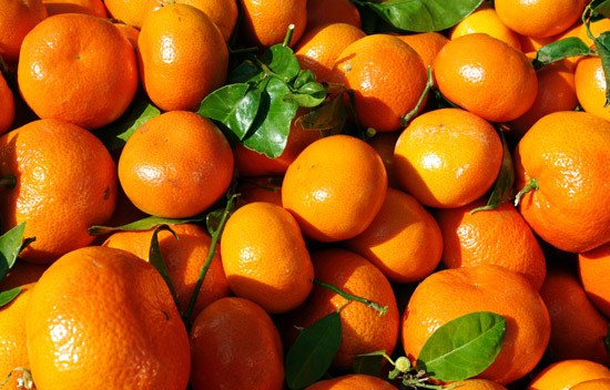 Orange is a combination of its two neighbors on the color wheel, red and yellow. Orange symbolizes happiness, joy and sunshine. It is a cheerful color, evoking childlike exuberance. Orange is not as aggressive as red but takes on some of the same qualities, stimulating mental activity. It also symbolizes ignorance and deceit.
Yellow
 Bright yellow is a happy color representing the positive yellow qualities: joy, intelligence, brightness, energy, optimism, and happiness. A dingy yellow brings about negative feelings: caution, criticism, laziness, and jealousy.
Green
 Green symbolizes nature and has a healing quality. It can be used to symbolize growth and harmony. People feel safe with green. Hospitals often use the color of green. On the other hand, green is symbolic of money, showing greed or jealousy. It can also be used to symbolize a lack of experience or a beginner in need of growth (“green behind the ears”).
Blue
 Blue is a peaceful and calming color exuding stability and expertise. It is a common color used in corporate sites because of this. Blue can also symbolize trust and dependability. A cool shade can bring about the negative side of blue, symbolizing depression, coldness, and passiveness.
Purple
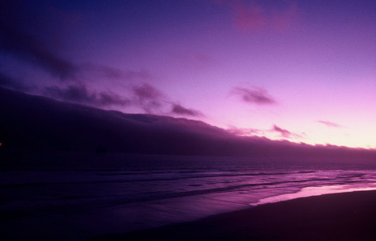 Purple is the color of royalty and sophistication showing wealth and luxury. It also gives a sense of spirituality and encourages creativity. Brighter purples can exude a magical feeling. It’s also great for promoting creativity and feminine qualities. Darker purples can conjure gloominess and sadness.
Black
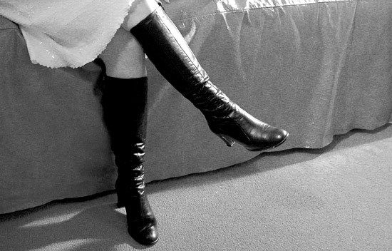 Although black is not a part of the color wheel, it can still be used to suggest feeling and meaning. It is often correlated with power, elegance, sophistication, and depth. It is said that wearing black on a job interview can show that the interviewee is a powerful individual, and the same goes with websites. Black can also be seen negatively because the color is associated with death, mystery and the unknown. It is the color of grief, mourning, and sorrow so it must be used wisely.
White
 White—also not a part of the color wheel—symbolizes purity and innocence. It also shows cleanliness and safety. Conversely, white can be seen as cold and distant, symbolizing winter’s harsh and bitter qualities.
Examples of Colors in Big Companies Sites
We’ll look at some large company sites to get an idea of how they use color and what that color means to their users.
Nike
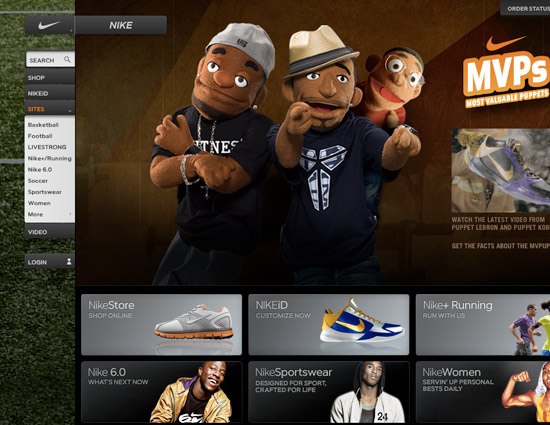 Nike changes their site often, but it is usually dark with mostly black and grey hues. The black shows the power in their product, giving the impression that they sell quality products to sporty people.
White House
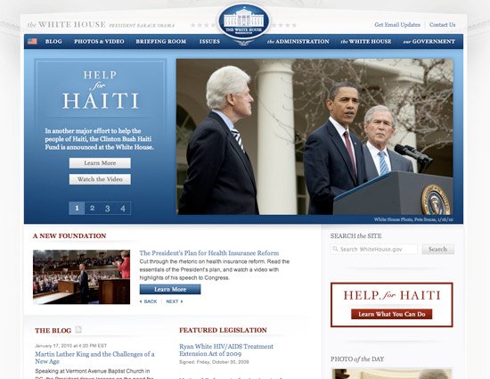 The White House website is mostly white and light grey with some blue and red accents. The white symbolizes hope and freedom, showing a value for safety and purity. The red and blue are of course the other USA colors, but the blue shows stability and peace, while the red shows passion and energy.
Amazon
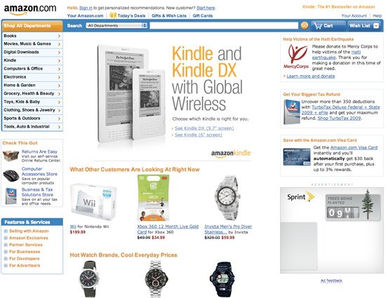 Amazon’s site is mostly white, which is the best color to use for contrast and readability. It also shows cleanliness and helps users navigate the site freely. There are orange and blue accents to help people feel at ease when on the site, as well as excited and hopeful to find their perfect purchase.
Verizon
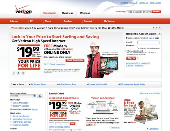 Verizon’s main corporate branding color is red, which is used throughout the site. This helps stimulate the excitement of users, showing a company that sells an exciting and fast-paced product. The white background is used similarly to Amazon, helping users navigate the site by displaying a clean and orderly site.
Best Buy
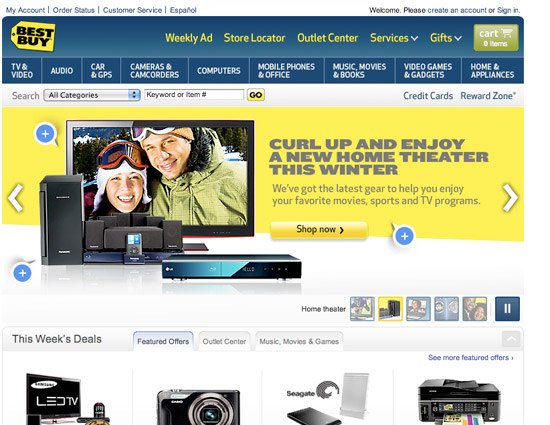 Best Buy’s site showcases dark blue hues, showing their stability and power in the electronic market. Buyers are making large purchases from Best Buy and need to feel secure and peaceful on their site. The yellow emits happiness and helps people feel excited and joyful while making their purchases.
Charles Schwab
 Charles Schwab is an investment company, and in an unstable market, they need to make consumers feel peaceful on their site. They use soft and dark blue tones to achieve this, creating a calming and peaceful atmosphere on their site. The neutral brown is another corporate color and helps neutralize intrepid users’ feelings. The orange accents are used to generate excitement in buying stocks and help bring a happier feel to the site.
Dodge
 Dodge’s site is mostly black which allows their images to pop. They use a bright red for accents. The black gives a powerful quality to the site, showing their products off in a sophisticated and masculine light. Black is a great color to use to make products look expensive and worthy of value. The red shows passion and excitement, as well as the hope to drive consumers to purchase the vehicles from a company that values commitment and quality.
Whole Foods
 The main color used in Whole Foods corporate branding, as well as their website, is green. Whole Foods sells healthy and organic food for a premium price. The green in their site design does well to show their healthful and pure values as well as their nature-loving products. They also use some pale yellow accents that are very complimentary to the green, and it gives a joyful value to the site.
How You Can Use Colors in Websites
 Colors give sites meaning without having to use descriptive words. They create a lot of impact, whether you intend for them to or not. They can help move a user’s eye through your site, creating movement and motion that directs users around a page. As seen in many of the corporate sites, they create emotions and values that help show users what the company is about and what kind of products they are selling. Use colors to your advantage by carefully selecting complimentary colors and ones that showcase the values you’re trying to sell. Pairing colors can help change the meaning of a site altogether. Pair a soft blue site that creates calming qualities with a bright orange, and you could change your site to be more exciting and joyful. Maybe your client thinks the site you’ve designed is too harsh with lots of dark grey hues. Add soft blue colors and your site design could have a more calming and peaceful tone.
Resources for Having Fun with Colors
 Many sites out there discuss color theory and the usage of color in design. Use these helpful resources below to find color matches and infuse more meaning into your site designs.
COLOURlovers
Find complimentary color matches and color palettes with this web-based tool.
Design Meltdown
This site categorizes sites based on different genres, including many color categories.
Find the Perfect Colors for Your Website – Vandelay Design Blog
Lots of color resources and tools are listed on this great post.
JavaScript Color Picker
This fun JavaScript tool can help you pick out the colors you want and help you see how they look together.
References
- Color theory – Wikipedia
- Color Meaning – Color Meanings
- Color Branding: The Meanings Behind Colors – EveryJoe
- Color: Psychology of Color
- Color Scheme Designer 3
Hope you enjoyed this comprehensive post on colors and their vast meanings, please share your thoughts, opinions, and your favorite color tools and resources in the comments below!
Related Content
- How to Use Retro Colors in Your Designs
- 14 Brilliant Tools for Evaluating Your Design’s Colors
- Color: The Next Limited Resource?
- Related categories: Web Design
-
 President of WebFX. Bill has over 25 years of experience in the Internet marketing industry specializing in SEO, UX, information architecture, marketing automation and more. William’s background in scientific computing and education from Shippensburg and MIT provided the foundation for RevenueCloudFX and other key research and development projects at WebFX. View full profile
 -

WebFX is a full-service digital marketing agency delivering revenue-driving strategies across online advertising, SEO and AI search optimization, and digital marketing. Backed by 1,100+ client reviews, a 4.9-star rating on Clutch, and proprietary revenue-tracking technology, our team helps businesses grow visibility and revenue across platforms, from Google to ChatGPT to LinkedIn. Discover how our expert team and revenue-accelerating tech can drive results for you. Learn more
Make estimating web design costs easy
Website design costs can be tricky to nail down. Get an instant estimate for a custom web design with our free website design cost calculator!
Try Our Free Web Design Cost Calculator
Share this article


Web Design Calculator
Use our free tool to get a free, instant quote in under 60 seconds.
View Web Design Calculator
Make estimating web design costs easy
Website design costs can be tricky to nail down. Get an instant estimate for a custom web design with our free website design cost calculator!
Try Our Free Web Design Cost Calculator