
Are you reading this article on your smartphone? If you are, it wouldn’t be surprising — considering in 2019 alone, there were 3.9 billion unique mobile internet users ( were 4,9 billion unique mobile internet users) That’s why, in July 2019, Google rolled out mobile-first indexing — forcing website owners to consider the responsiveness of their sites. So, is your website responsive?
On this page, we’ll go over your extensive responsive design checklist to ensure that you provide the best possible website experience to all users — no matter what device they use. We’ll even cover some tools that you can use to determine the responsiveness of your site. If you’d like to stay up to date with the latest design trends and tips just like the ones on this page, subscribe to Revenue Weekly emails!
What is responsive design?
Before we can jump into our responsive web design checklist, it’s important to talk about responsive design.
Responsive design, or mobile-friendly design, ensures that visitors to your site have a fantastic experience, no matter what device they use.
That means whether they use a desktop computer, a smartphone, or a tablet, your site will look and act the same way.
If you visit a site on your smartphone, and it has the following characteristics, it’s probably not responsive:
- Text is so small, it’s almost illegible
- If you try to fill out a form, it stays small, and you must zoom in to fill it out
- It’s difficult to click on navigation bar elements
- Photos appear out of alignment
- You can scroll left to right on a page
As you can see in the example below, you must scroll from left to right on your smartphone screen to see the entire home page of this salon’s site. That said, this site would be considered unresponsive.  On the other hand, if you visit a site on your smartphone that has the following characteristics, it’s likely responsive:
- Text sections fill the page
- Design modules are aligned and easy to digest
- You don’t have to zoom in to read the menu
- Navigation bars typically take the form of a hamburger menu until expanded
- Forms expand to fill the page, making it easier to fill out on small screens
In the example below, you can see that Swiss Miss hot chocolate has a responsive site. When you switch from looking at the URL on your desktop computer to your smartphone, the website still offers the same great experience. 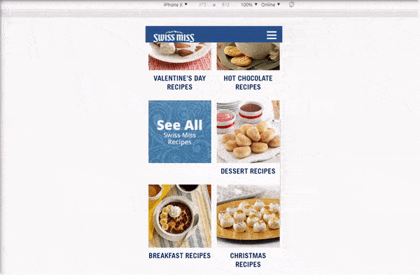 Now that we’ve gone over the difference between responsive and unresponsive sites, it’s time to dive right into our responsive design checklist!
Your complete responsive design checklist
If you don’t want your customers (and Google) to write you off as an authority in your industry, it’s important to have a professional, responsive site.
Here’s how:
Responsive checklist item 1: Test your current website
If you’re not sure if your current website is responsive, you’ll want to test it to find out. You can use a variety of responsive design test tools, including:
These tools will provide insight into how your website looks on different devices. Remember, if your site isn’t responsive, it won’t look the same as your desktop version on smaller devices. When you test your current website on a variety of responsive design test tools, you’ll also want to test them on a variety of devices.
Many responsive web design test tools allow you to see what your site will look like to users on different devices. For example, using Google’s Resizer tool, you can toggle between phone and tablet versions of your website to see what they look like to users. 
Responsive checklist item 2: Determine which elements aren’t responsive and fix them
After using the responsive web design test tools mentioned above, you’ll have a good idea of which site elements are responsive and which are not.
For example, your entire site might look great on mobile, except for your images. After taking note of responsive and non-responsive elements, you can start digging into how to fix them. Some site items to check for responsiveness include:
- Navigation bar
- Images
- Fonts
- Forms
- Buttons
These are some of the most important web design elements that are extremely important to great user experience.
Responsive checklist item 3: Test site speed on different devices
Page speed is a crucial part of providing a fantastic user experience for users. Your site should load quickly on all devices, or you run the risk of users bouncing from your site — which is why site speed is item three on our checklist for responsive design. Eighty-three percent of users expect a site to load in just three seconds or less, so regardless of what device they use, you should make sure that your site loads quickly.
Your site could load slowly for several reasons, including:
- Images are not condensed
- Site elements are not responsive
- Cluttered code
- Too many heavy elements like video
You can use Google’s PageSpeed Insights tool to learn more about what’s slowing your site down. If you’re unsatisfied with your score, you can always turn to a responsive design and development agency like WebFX that offers page speed optimization services!
Responsive checklist item 4: Consider finger taps
When users look at your website on different devices, they could be using different items to tap on your site elements. For example, with smartphones, users are likely tapping site elements with their fingers, but when it comes to tablets, they could be using a stylus.
You’ll want to consider your site elements regarding those different options to ensure that it provides a great experience for whatever “tapping device” a site visitor uses. You should consider things like:
- Are buttons big enough for a stylus on tablets?
- Are buttons big enough for fingertips on smartphones?
- Are navigation bar hamburger menus easy to tap on any device?
- Are forms easy to fill out with finger taps or styluses?
Responsive checklist item 5: Test your navigation
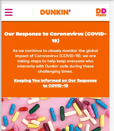
As we mentioned before, on most mobile-responsive web designs, you’ll find the navigation to be a hamburger menu rather than spanning along the top of the page. This keeps users from having to zoom in on your navigation bar to see the options. Below, you can see an example of Dunkin’ Donuts responsive website, and how their navigation menu takes the form of a hamburger menu that expands when users click.
 You’ll want to ensure that your navigation menu works properly on all devices and that nothing gets cut off when users open it. Your navigation menu is an extremely important part of your site since it provides a roadmap for users to find exactly what they want. Without one that works properly, users could bounce from your site.
Responsive checklist item 5: Make popups responsive
The fifth item on our mobile-friendly design checklist is to make your pop-ups responsive, too.
Popups are typically triggered by a specific action. For example, you might visit a site that shows you a popup whenever you try to leave the site to encourage you to stick around. Other actions that might trigger a popup include:
- Making it to the bottom of a page
- Clicking on a specific link
- Staying on the homepage for a certain amount of time
These popups could provide a special offer or encourage users to sign up for a newsletter. In the example below, Bones Coffee provides a popup to users that make it to the bottom of their homepage. It’s a special offer for 10% off your first purchase if you enter an email address.
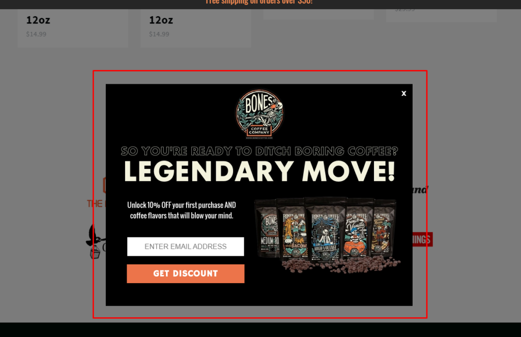 However, if you look at the popup from the perspective of a smartphone, the iPhone 6, 7, or 8, to be exact, you can see that the popup isn’t responsive, and makes it difficult for users to sign up.
  It’s equally important to keep popup responsiveness in mind, since they provide enormous benefits for your business.
Responsive checklist item 6: Make sure your site is visually appealing across all devices
Number six on our checklist for responsive design is making sure that your site is visually appealing on all devices. When you design a site specifically for desktop, it can be difficult to make your site elements look right on other devices like smartphones and tablets.
Even if you make all your site elements responsive, it’s still crucial to make sure every element of your site looks great on every device. You’ll want to make sure that:
- Images don’t take up the whole screen
- Menus aren’t cut off
- Bulleted lists are formatted correctly
- Tables look neat and organized
- Service lists render properly
- Product images and descriptions are formatted properly
- Forms are aesthetically pleasing and effective
- Shopping carts are organized and easy to use
Since it only takes users 50 milliseconds to form an opinion of your website, making sure that it’s aesthetically pleasing across all devices is crucial.
Responsive checklist item 7: Make yourself the site visitor
Now that you’ve followed every step on our responsive web design checklist, it’s time to audit your efforts by making yourself the site visitor. Take a few laps around your site to make sure that you didn’t miss any responsive design elements. For example, you’ll want to:
- Test every step of submitting a form
- Test every step of purchasing a product
- Test navigation bar links
- Test different areas of your site like your blog and your product pages
Putting yourself in the driver’s seat and taking a few spins around your website will ensure that nothing fell through the cracks of your responsive web design checklist.
Finish off your mobile-friendly design checklist by working with WebFX
Making your site entirely responsive to users is a crucial part of your online presence and your company’s success online. With mobile users increasing every day, you can’t afford to have a website that doesn’t respond to every device. If you find that you still need help creating a responsive website, even after following our responsive web design checklist, WebFX is here to help.
We’re a full-service digital marketing agency that offers more than 60 marketing strategies to clients in a variety of industries and locations. We’ve created more than 1,058 responsive websites in our more than ten years of business that help companies just like yours see more site traffic, increase leads, and maximize revenue. If you’re ready to get started, contact us online for a free quote, or give us a call at 888-601-5359!
-
 Sam has been writing for WebFX since 2016 and focuses on UX, crafting amazing website experiences, and digital marketing In her free time, she likes to spend time on the beach, play with her cats, and go fishing with her husband.
 -

WebFX is a full-service marketing agency with 1,100+ client reviews and a 4.9-star rating on Clutch! Find out how our expert team and revenue-accelerating tech can drive results for you! Learn more
Make estimating web design costs easy
Website design costs can be tricky to nail down. Get an instant estimate for a custom web design with our free website design cost calculator!
Try Our Free Web Design Cost Calculator
Share this article


Web Design Calculator
Use our free tool to get a free, instant quote in under 60 seconds.
View Web Design Calculator
Make estimating web design costs easy
Website design costs can be tricky to nail down. Get an instant estimate for a custom web design with our free website design cost calculator!
Try Our Free Web Design Cost Calculator