- Home
- Blog
- Web Design Successful Logo Design: A Branding Perspective
Successful Logo Design: A Branding Perspective
-
 12 min. read
-
 Trevin Shirey
 VP of Marketing
- Trevin serves as the VP of Marketing at WebFX. He has worked on over 450 marketing campaigns and has been building websites for over 25 years. His work has been featured by Search Engine Land, USA Today, Fast Company and Inc.
10 Important Product Specs
- Name of the product/company
- Description or what it does
- Industry
- Company Values
- Brand History
- USP or slogan
- Competitors
- Differentiators
- Target audience
- General mission of the design task
Name of the Product/Company
The name of the company or product will appear in the logo or brand mark more often than not. There are exceptions to this where it is more effective, and an excellent example would be the Nike swoosh. On the other hand, there are logos that do not function without representing the brand names.
A great example is the famous FedEx logo that also incorporates that clever arrow through negative space. But with or without this element the FedEx logo is recognizable through the representation of its name. 
Description or what it does
The designer will need to know basic information about the business and its products.
For some businesses, having their primary product represented in the logo makes sense. Burger King, for instance, has a wide variety of foods and beverages. But the most representative of which, is the burger.
Burger King displays it in the restaurants’ logo. This particular logo explicitly highlights the burger by the buns that sandwich the name of the restaurant, Burger King, which emphasizes the type of products that the restaurant offers. In the case of Burger King, it makes for an easily recognizable and effective design.
The Burger King logo is an example of having both the name and the graphic element that represents their product shaping the logo. 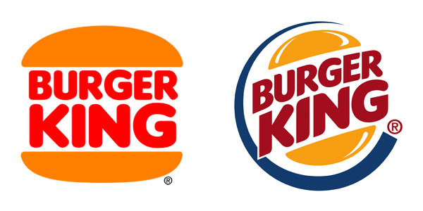
Industry
When dealing with a design project of a product or company that serves abstract goals or one that encompasses more than one product or service, the product/company name and description might not be useful. However, emphasizing the company’s industry can do the job instead.
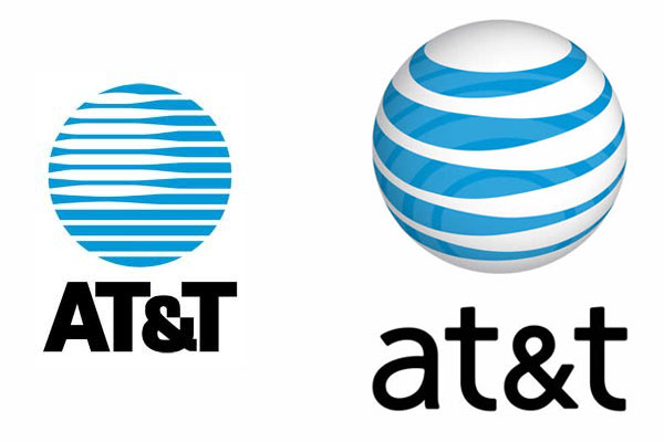
For example, AT&T describes itself as: “bringing it all together for our customers, from revolutionary smartphones to next-generation TV services and sophisticated solutions for multi-national businesses. Our mission is to connect people with their world, everywhere they live and work, and do it better than anyone else.” The creative that will do the job of designing a corporate logo, such as AT&T’s, is not obliged to know details of each industry of every design project he or she will ever be handed. Instead, knowing how to use the design in the industry will lead to a design that works well.
In the case of AT&T, the designer understands the company handles telecommunication that “connects people with their world everywhere.” Therefore, a globe with horizontal blue stripes emerges, which suggests a world being connected. The design could have incorporated a telephone, but that would have limited the message. AT&T doesn’t just offer phone services, so the design needed to incorporate the larger picture of the company’s services and vision.
Company Values
Continuing with the less obvious ways to draw out logo designs, a company’s values can yield a powerful and coherent design. Think about what the client promises to offer his customers. Now, narrow these down to a few key values to be incorporated in the design.
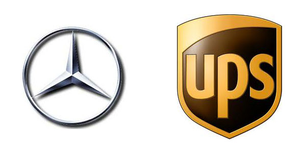
To illustrate this concept, Mercedes-Benz and UPS tell two rather interesting stories through their logos. The star in three corners represents the Mercedes-Benz dominance on land, sea, and air. Over the years, Mercedes-Benz simplified the logo design to empower its message.
Now, the public recognizes Mercedes-Benz’s logo as a symbol of luxury and top tier cars. The UPS logo has known several designs and the most recent one intends to convey an impression of “freshness and excitement” that reflects the company’s new vision of “synchronized commerce.” The new logo draws from the company’s history, leverages its brand equity, and uses its traditional colors to suggest a company that is thinking ahead and is leading the way in package delivery and other businesses. The arc at the top and the use of light suggest energy and forward-thinking qualities on a global scale.
Brand History
The designer may need to consider the “age” of the company or product; more specifically, the experience that the company has with its buyers as well as its market maturity. How does this affect the logo design? In order to answer that question, let’s look at the Quaker Oats Company logo.
Although it has suffered a number of redesigns, it has retained the same central image and qualities that have served it well along the years. The Quaker Oats Company is an American food conglomerate founded in 1901, however, on September 4, 1877 the Quaker Man was America’s first registered trademark for a breakfast cereal. Quaker Mill and his partner Henry Seymour found an encyclopedia article on Quakers and decided that the qualities described — integrity, honesty, and purity— provided an appropriate identity for his company’s oat product.
And since its creation, the Quaker logo has survived over a century, speaking proudly about its origins and longevity in the market. 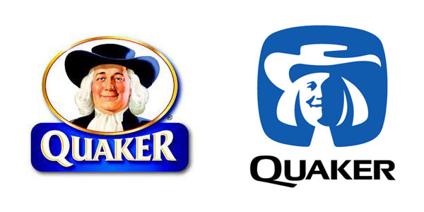
Slogans
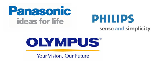
Some clients want their slogans or USPs (Unique Selling Proposition or Unique Selling Point) incorporated. The Panasonic, Philips, and Olympus logos have their brand slogans integrated in the designs below.
These three examples also indicate a general design path for products within the same industry. In this case, all three companies who manufacture consumer electronics, chose simple, yet effective type-based logo designs, sometimes called logotypes. The type used is bold and stands out in the design, and even the colors are similar in the shades of blue, grey, and yellow.
Differentiators
Business thrives when it manages to differentiate itself from competitors. Differentiation, then, can be a major design consideration for the logo. A client often does not want to be mistaken with their competition and will want the design to stand out – this is why it is important to do a little research on the competitors.
One can go wrong when the competition is not carefully studied and/or a client does not articulate the need to differentiate because this can lead to similar designs, copyright problems, difficulties in being associated with a single graphic mark, and lack of coherency in identity. Below are some examples of similar designs. 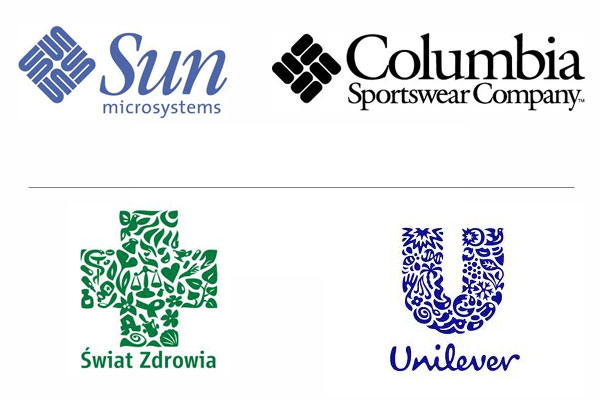
Competitors
On the other hand knowing your competition can work to your benefit.
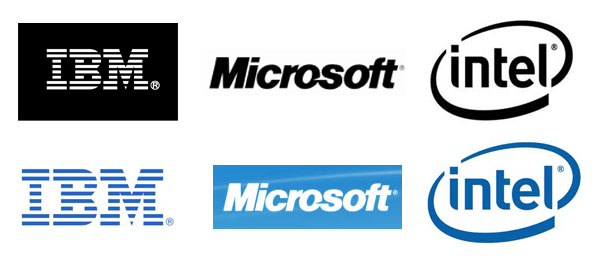
How? By offering a general line in the design direction that competitors have used, the client and the creative can both get an idea of “what works” for a particular industry. For example, Microsoft, IBM and Intel, which are all in the computer industry, showcase austere, simple type-based designs in their logos.
Even the use of colors are similar–either black on a white background, white on a black background or blue. These palettes inspires trust, high-end products with superior performance, and reliability. These are all good qualities that can be associated with any product or service within the same industry.
 The differentiators in logo design can also position the client on a separate rank from their competitors. Morton salt has clearly differentiated itself from all other related salt products from the very beginning, as the company had added magnesium carbonate as an absorbing agent to ensure that its table salt poured freely. This gave Morton the advantage of having free flowing salt, even in the presence of moisture.
The logo design clearly establishes this differentiation by illustrating a young girl walking in the rain with an opened umbrella, and scattering salt behind. 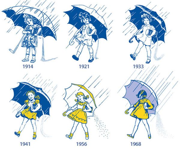 In the case of Heinz products, for some time one could see “57 varieties” written on some of the products’ logos. The story behind this is purely for the scope of advertising.
At the time Heinz had a significant number of products but the actual number was greater than 57. The owner chose the number 57 because it was lucky. Nevertheless, for a good while “57 varieties” appeared in the logo and marked a clear distinction (and a selling point) for all of the Heinz products that displayed it. This is another great example of how a company differentiates itself from competition and translates to logo design.
Heinz also has a number of products that sport the “EST 1869 EST” embellished logo, which was the company’s founding year. Both the “57 varieties” and the “EST 1869 EST” lines work in the design as they speak about the company’s experience, longevity, and create a sense of confidence and pride around the brand’s identity. 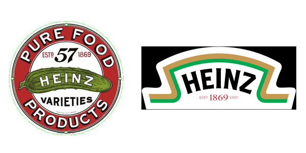
Target Audience
Knowing a company’s target audience can have a significant impact on the business and on the logo design.
Pepsi has always spoken to the younger generation, mainly to teenagers as their marketing positioning seems to be oriented as such. Their logo is no exception. Using two of the most vivid colors in the color spectrum, along with a fresh white waved stripe, targets both female and male genders that are hip and active.
The white wave can embody summer and waves and the circle that encases the design adds the touch of sun as well as sports, representing the various balls. To top it off, drinking Pepsi is the coolest way to cool off, or so they’d like you to think.  Another brilliant and obvious example of how your target audience needs to be known before starting a design is from the Toys R Us logo.
Of course this logo needs to appeal to children and, the way in which almost any logo that addresses this portion of the market does it, is through cheerful, colorful, and playful designs. All these three traits are traced by the Toys R Us logo through its use of multiple bright colors, irregular kerning, the plump shape of the lettering, and the interesting central orientation and form of the letter R. 
Design Mission
The general mission of the design task is extremely important.
Before giving a designer the task of designing something, the client must know why he will be doing it (the scope). One must know where a logo will be used, and if that logo should be designed in order to refresh the product’s look, update it, or draw out some other specific gain. Websites can be created in order to sell or just to inform.
To make this point even more obvious, below are some instances of the Avon logo which have minor differences. 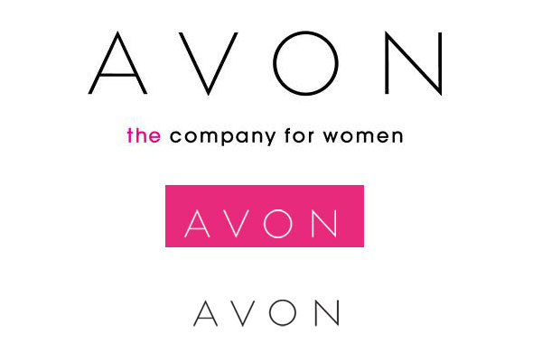 The first logo on top is the Avon logo as it appears on Avon.com, their official homepage. The middle logo is the one Avon displays on its representative webpage and for those that want to enter the Avon business.
The third logo on the bottom is Avon’s online shop website, the one meant for customers that wish to purchase Avon products via the internet. These are only three examples of how a logo can be altered based on the general mission it will be assigned, or the place it will be used. This particular logo can have ten other instances destined for specific use.
And so can any other logo. The general mission of the design task and/ or the place where the design will be used can also indicate whether or not a product’s USP or slogan will be used. As we covered, a company’s logo is not just a pretty picture.
It is their name, their history, their identity, and their values. A designer’s job, therefore, when designing a logo becomes that much more complicated. Experienced designers might have already figured out what kind of information they need before conceiving a design, but in order to ensure the best possible design, these ten product specs are a great place to start when considering how to design a company’s logo.
-
 Trevin serves as the VP of Marketing at WebFX. He has worked on over 450 marketing campaigns and has been building websites for over 25 years. His work has been featured by Search Engine Land, USA Today, Fast Company and Inc.
 -

WebFX is a full-service marketing agency with 1,100+ client reviews and a 4.9-star rating on Clutch! Find out how our expert team and revenue-accelerating tech can drive results for you! Learn more
Make estimating web design costs easy
Website design costs can be tricky to nail down. Get an instant estimate for a custom web design with our free website design cost calculator!
Try Our Free Web Design Cost Calculator


Web Design Calculator
Use our free tool to get a free, instant quote in under 60 seconds.
View Web Design CalculatorMake estimating web design costs easy
Website design costs can be tricky to nail down. Get an instant estimate for a custom web design with our free website design cost calculator!
Try Our Free Web Design Cost Calculator