
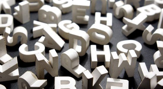
Web design is so important to ensure a site has a good user experience and each aspect of it can have a huge impact on the usability of your site. One of these aspects, Typography is an often overlooked, but integral part of design and something your web design company shouldn’t be overlooking. Think of all the different uses of typography on the web, from large headlines and bold blocks of text to smaller-sized text in body copy, and you’ll soon realize that not only is it a crucial part of a web design, but that it’s a pure combination of art and science.
We’ve come a long way since the start of the internet, but the use of typography is as important today as it was back in the day.
Typography Basics
 Typography is the use of type in a design. Typography seeks to create a greater meaning by thoughtful and deliberate selection font, size, color, layout, alignment, and other factors that affect the design of type on a page. There are two major classifications of fonts to choose from: serif and sans serif fonts.
Serif fonts have serifs or extra embellishments at the end of stokes; some call them feet or tails.  Sans serif fonts are without serifs; no extra details are found on the end of each letter.
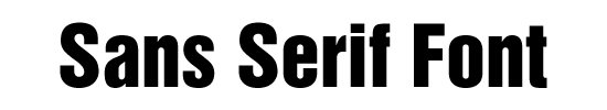
Things to Consider for Typography on the Web
There are many differences in handling type in print versus on the web.
Things to think about with text on the web are contrast, color, readability, and size. Colors on a monitor screen are created by light, and it becomes more important to think about contrast because it’s straining to look at and read text with poor contrast. Black text on a white background is the easiest to read because it provides the most contrast.
Color theory and color choice play an important role in web typography. Sans serif fonts have been proven to be more easily read online in body copy because serifs make it tougher for the eye to follow, while the opposite is true for printed text. Although at an increased size and with more leading—the amount of additional vertical space between lines of type—sans serif fonts can still work fine in body text on the web.
Serifs work great in headlines and headings because they give a special accent to a headline and because serif fonts are easy to read when dealing with smaller quantities of text. Size is an important factor to consider when choosing your font styles. Text that is too small is hard to read, but text that is too big takes up too much space.
Find a size that works well with your design and is easy to read.
Taking Control of Fonts
There are many settings that control the way your font appears on a web page. Font size, as mentioned previously, is certainly important. The three most popular units of measurements are: em, percentage (%), and pixels (px).
Declaring font sizes in CSS is simple, here’s an example of paragraph elements being assigned a unit of 1em.
p { font-size: 1em; }Em is a widely used form of typographic measurement for web designs because it scales well and can give you finer increments of size (i.e. 1.35em). Pixels are measured relative to the screen resolution and give you a bit less control as you can only use whole numbers (i.e.
2px). Many people like using percentages for font sizes because they give the user control of font sizes. The size is determined by their browser’s font size settings.
Kerning and leading can also be controlled with your CSS. Kerning is the space between characters and can be controlled with the letter-spacing property. Leading can be controlled using the CSS property, line-height.
Both are great ways to control the look of your text. Other possible and less popular units of measurements are:
- points (pt)
- pica (pc)
- inches (in)
- centimeters (cm)
- millimeters (mm)
- x space (ex)
Using pt is great for print stylesheets because they are a print unit of measurement. Points shouldn’t be used in your web pages because there are big differences between browsers when using points; Mac OS computers tend to show text 25% smaller than PC computers.
Web Safe Fonts
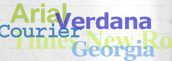 What is a web safe or web standard font? These fonts make up a group of a select few fonts that are available on most computers.
This is what currently limits font choices on the web under CSS2 specifications. Choosing from the web safe fonts available will ensure better control over what your text looks like on all browsers and operating systems. The consensus for the most popular fonts are:
- Arial (Mac OS equivalent is Helvetica)
- Times New Roman (Mac OS equivalent is Times)
- Verdana
- Georgia
- Courier
Other popular fonts:
- Impact
- Lucida Console (Mac OS equivalent is Monaco)
- Lucida Sans (Mac OS equivalent is Lucida Grande)
- Palatino
- Tahoma (Mac OS equivalent is Geneva)
- Comic Sans
- Trebuchet MS
When using any of these fonts—especially the ones from the second list—it’s a great idea to include a few options to fall back on in your CSS, as explained in the following section.
Setting Your Fonts
There are a few methods to choose from to display fonts on your websites. If you’re using a web safe font, you can declare it via CSS, such as in the following example:
font-family: Helvetica, Arial, sans-serif;
It’s important to include several fonts just in case someone doesn’t have your first option. This gives your user’s browser something to fall back on.
This list of fonts is called a font stack.
Redefining “web safe fonts” with CSS3
Current CSS3 specs allow you to choose from any licensed OpenType or TrueType font at your disposal. You can do this by using @font-face, as shown in the following example:
@font-face { font-family: "Journal; src: url(journal.ttf) format("truetype"); } h1 { font-family: "Journal", sans-serif; }Font replacement tools
There are several font replacement methods at your disposal if you are still unsure about using @font-face in your designs.
Cufon
Cufon is a favorite font replacement tool to use because it’s relatively painless to integrate into a website. Plenty of documentation is available on their website, as well as the text generator that spits out code you’ll need.
Although it’s a good, solid solution, it’s not without it’s downsides—currently text rendered by Cufon is not selectable by users. 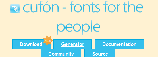
sIFR
sIFR is a Flash-based text replacement method and is just as nice as Cufon. You’ll need Flash to create a font file for your site.
It’s best used on headlines or very small blocks of text because the load time can drag on a bit if you use it extensively on a web page. The downside is that it doesn’t work without Flash enabled in your browser, but the upside of sIFR versus Cufon is that text is selectable. 
Web Typography Mistakes
 Lack of typography consistency is one the biggest mistakes new web designers make.
Font properties are best controlled globally, and it’s good practice to set the font family, size, color, line height and weight for the body element of all your pages through CSS, such as in the following example:
body { font: 1em/1.3em Helvetica, Arial, sans-serif; color: #000; }You should set heading styles globally as well for h1, h2, and h3. Link styles should also be set globally. Choosing fonts that are too similar is not a good choice, and should be avoided by carefully looking at the style of fonts and the design of the site to choose something that is appropriate. Most serif headings pair well with sans serif fonts for body text.
Pairing two sans serif fonts is a bit trickier but is certainly a viable option.
Some Examples of Great Typography in Websites
In this section, you’ll find an array of websites that display effective typography usage.
Analog
The typography choices made here match the theme of the site very well. Type plays a big role in the look of this site, using color, size, font, spacing, and layout to enhance the overall look of the page. 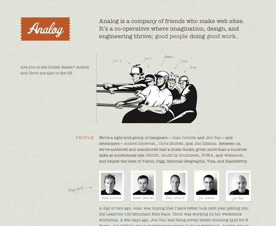
Blue Pixel
Blue Pixel uses Cufon to create bold headlines.
The body font and the headline font are both san serif and go together well. ![]()
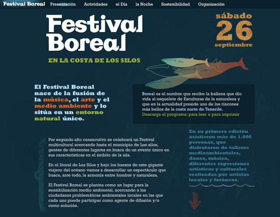
Festival Boreal
Cufon is also used here to add a unique look to the site through typography. Color, different sizes, and a fun asymmetrical layout create a great typographical design.
Go Media Inc
A mixture of a few different font themes creates a great web design here. The navigation is clean-cut with thin, uppercase type that is nicely paired with an italic serif font for taglines and headings on pages. 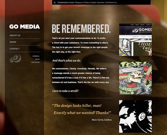
Kari Jobe
Courier—a serif font—is paired with a few sans serif fonts in this design.
The fonts work together with the design to create a look that brings together an old-world style with a new bright and modern feel. 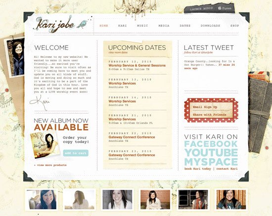
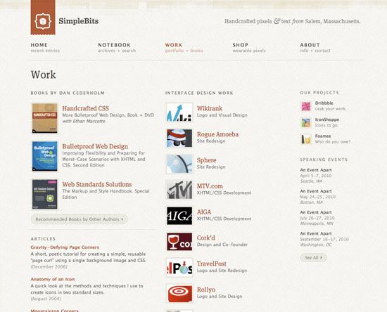
SimpleBits
This site has lots of type and is organized well with set styles that create a user-friendly site. Bold uppercase type in the upper navigation work well with the sans serif body text and red serif headlines.
We Are VI
This blog has several font styles at work and uses typography to their advantage by keeping the site organized and easy to navigate. 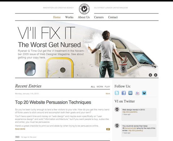
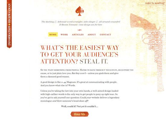
Information Highwayman
Typography is used in the background as a design element, creating a great backdrop that doesn’t distract from the body text. The rest of the text complements the style, with good-sized easy to read body text using a serif font.
 Check out this showcase of 20 websites with beautiful typography for more design inspiration and examples.
Additional Resources on Web Typography
- On Web Typography
- The Elements of Typography Style Applied to the Web
- 101 Typography Resources for Web Designers
- Web Typography Mistakes
- Web Design is 95% Typography
- Typography by Web Page Designer for Designers
I hope you enjoyed this look at typography in web design. Typography is a broad topic but an important concept to understand as a designer of any kind. It’s also vital to understand the them and industry of a site.
For example, if you are designing a site for a realtor, it should look very professional, whereas a site for an artist will have a more laid back and open design. How heavily does typography play into the aesthetics of a web design? How much time should you spend on typography when designing a site?
Related Content
- Beautiful Examples of Inset Typography in Web Design
- Create a Vintage Memorabilia Poster
- Free Vector Infographic Design Template
- How to Create Inset Typography in Photoshop
- 20 Websites with Beautiful Typography
- Related categories: Web Design and Web Development
-
 President of WebFX. Bill has over 25 years of experience in the Internet marketing industry specializing in SEO, UX, information architecture, marketing automation and more. William’s background in scientific computing and education from Shippensburg and MIT provided the foundation for RevenueCloudFX and other key research and development projects at WebFX. View full profile
 -

WebFX is a full-service digital marketing agency delivering revenue-driving strategies across online advertising, SEO and AI search optimization, and digital marketing. Backed by 1,100+ client reviews, a 4.9-star rating on Clutch, and proprietary revenue-tracking technology, our team helps businesses grow visibility and revenue across platforms, from Google to ChatGPT to LinkedIn. Discover how our expert team and revenue-accelerating tech can drive results for you. Learn more
Make estimating web design costs easy
Website design costs can be tricky to nail down. Get an instant estimate for a custom web design with our free website design cost calculator!
Try Our Free Web Design Cost Calculator
Share this article


Web Design Calculator
Use our free tool to get a free, instant quote in under 60 seconds.
View Web Design Calculator
Make estimating web design costs easy
Website design costs can be tricky to nail down. Get an instant estimate for a custom web design with our free website design cost calculator!
Try Our Free Web Design Cost Calculator