Impress Your Prospects With a Modern Manufacturing Website Design Agency
Unlock more RFQs with a precision-engineered website — based on your business and proven best practices — for generating traffic and high-value leads from the web. With our full-service solutions, our manufacturing website design agency makes creating, building, and launching a custom site as easy as reading a digital micrometer. Discover what’s possible by contacting our award-winning team today for a custom quote!

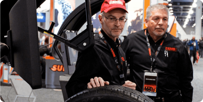
CEMB USA
Award Winning Web Design


Web Design Portfolio: Industrial & Manufacturing Website Examples
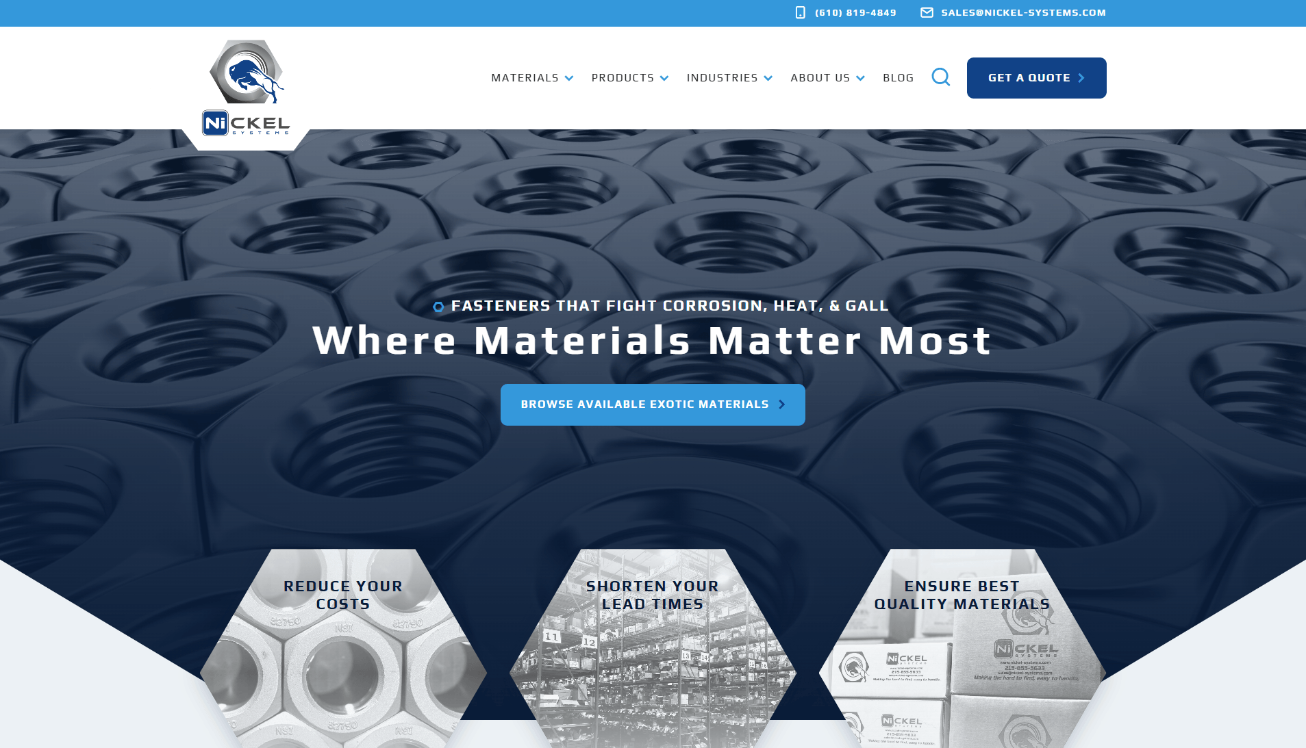
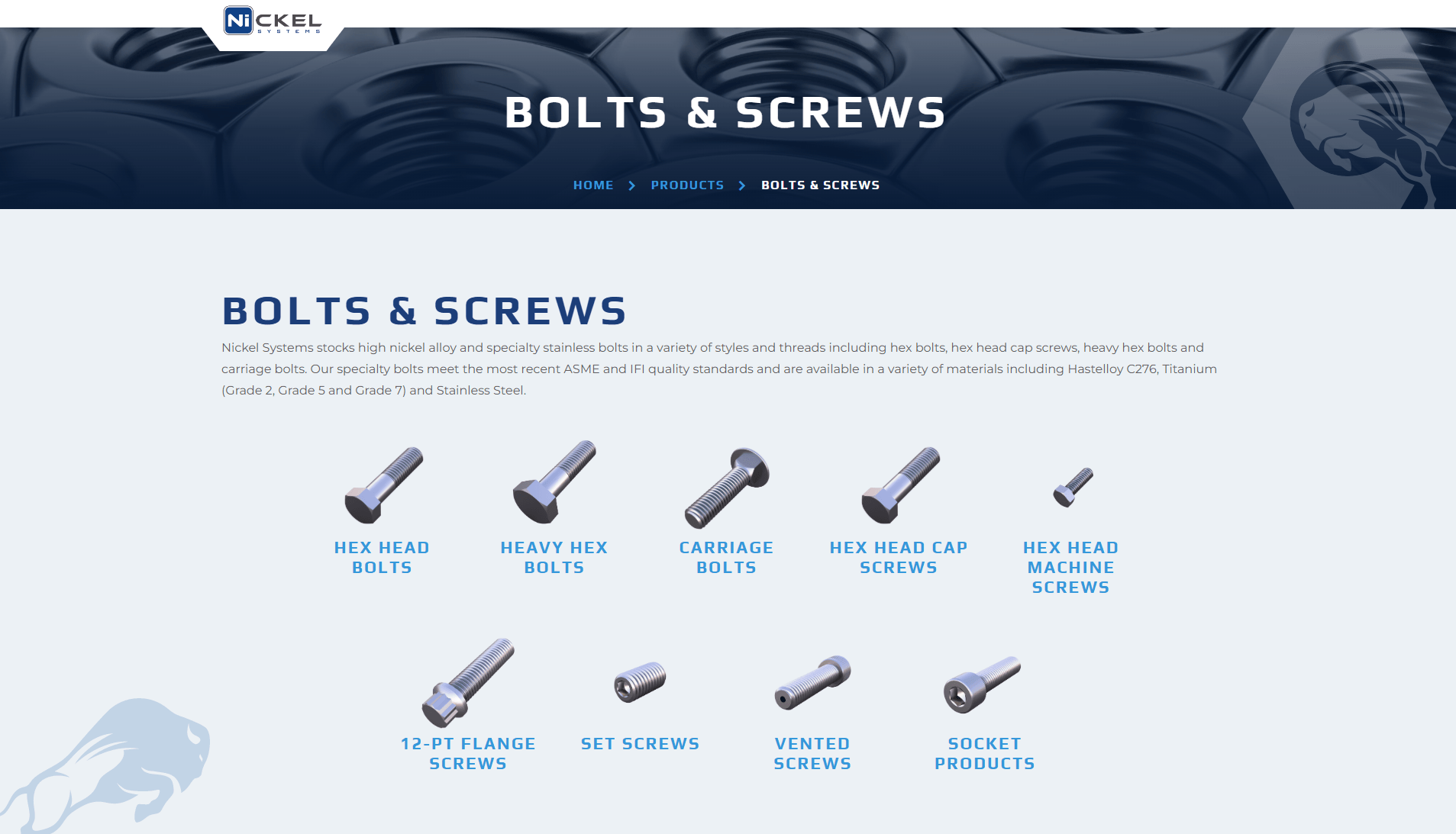
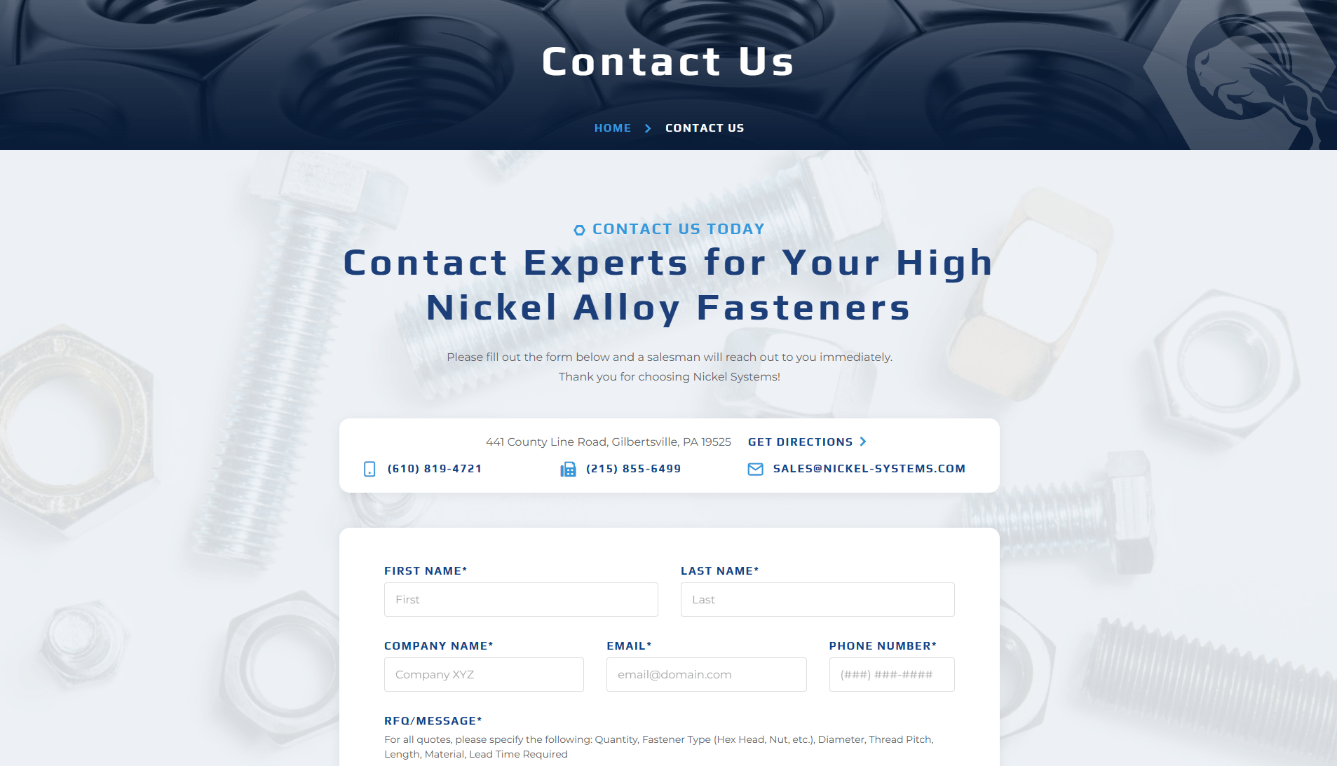
Innovative solutions for your industrial fastening needs. Discover the expertise of Nickel Systems. Contact us today for top-quality products and service.
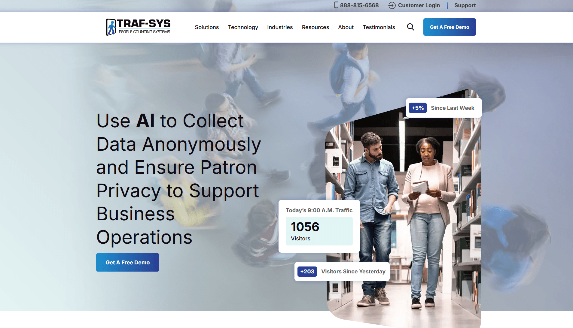
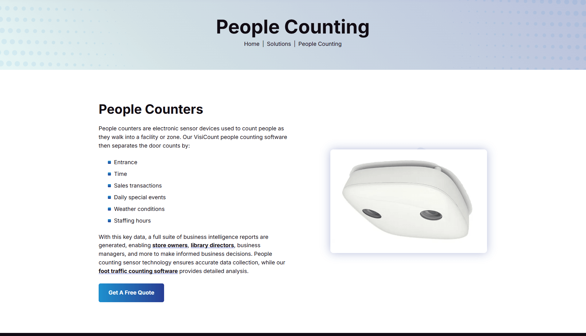
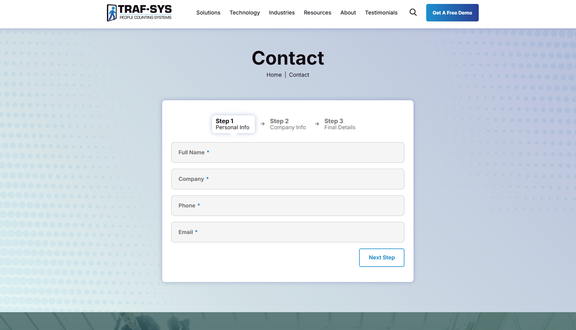
Traf-Sys offers a full range of people counter systems that help organizations collect foot traffic information. Browse our selection of counters today!
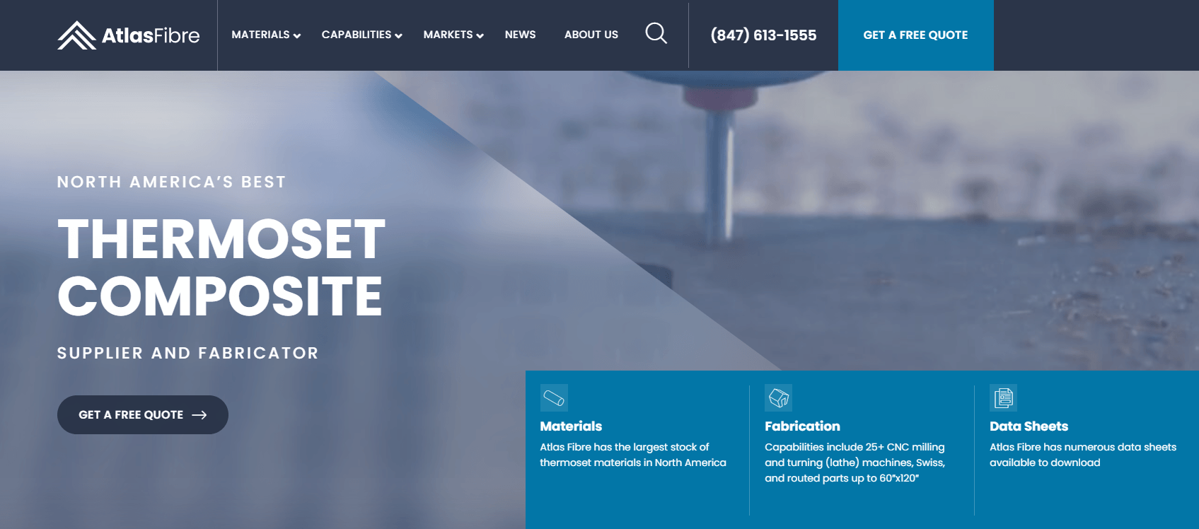
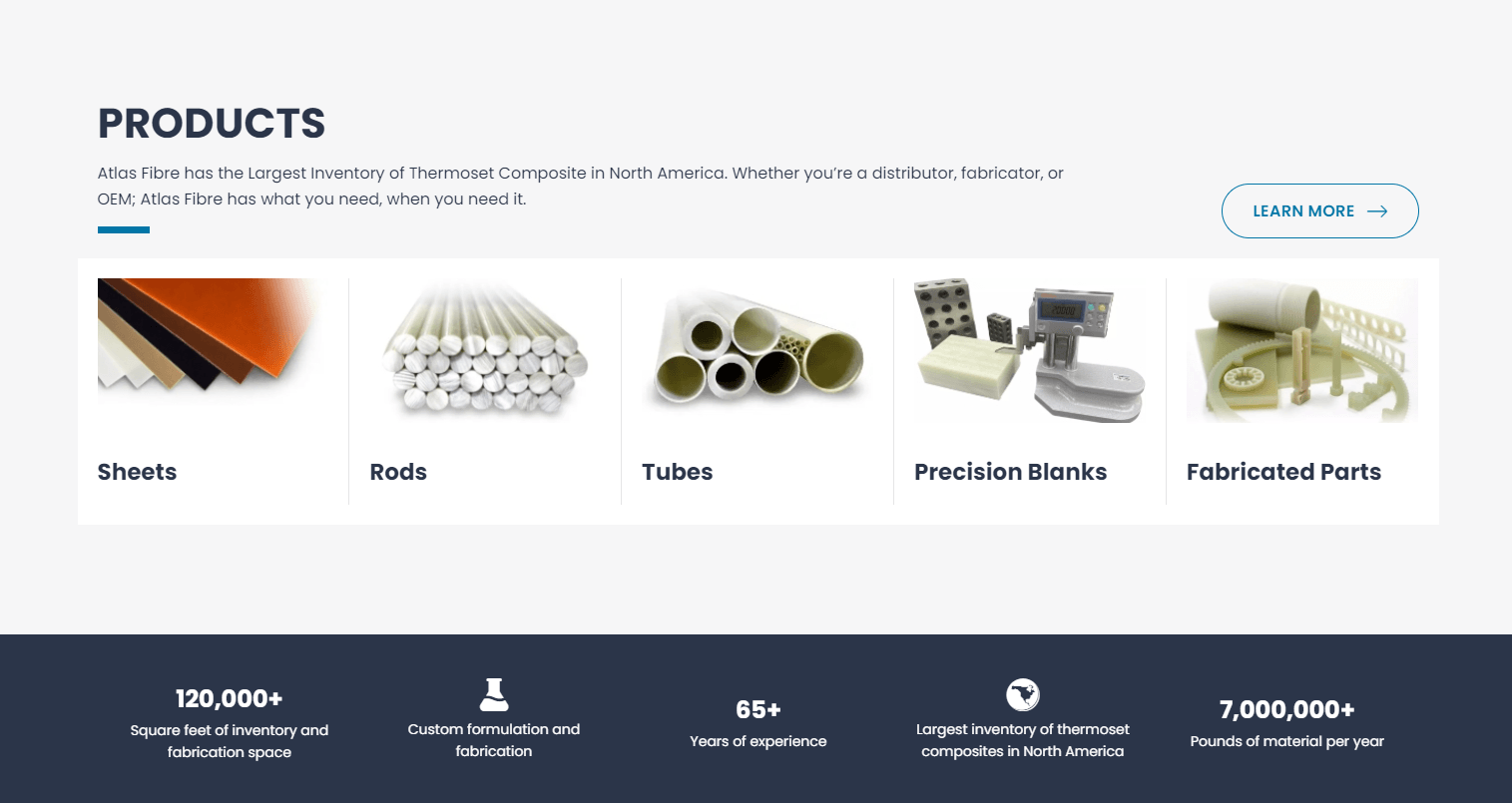
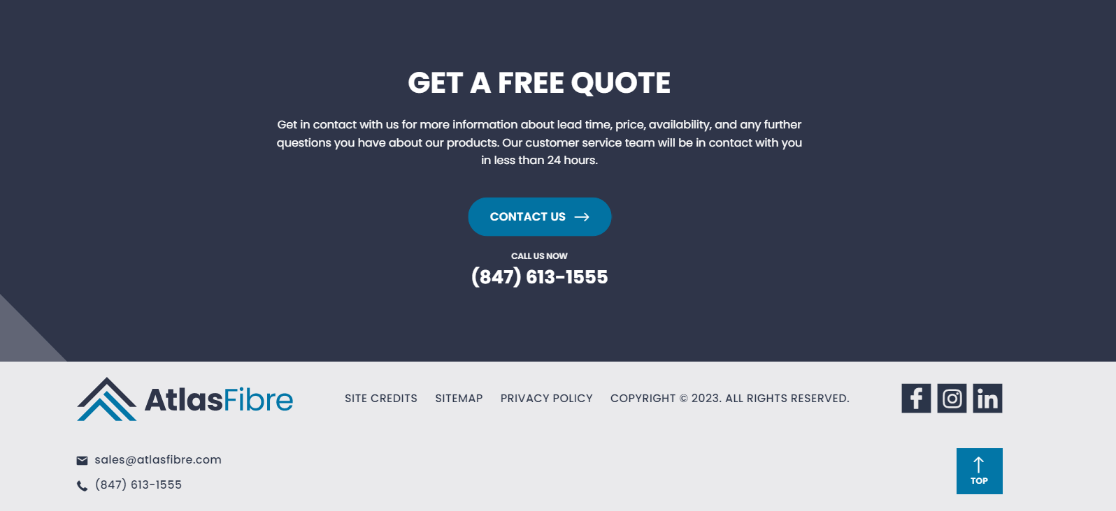
Atlas Fibre
With manufacturing in the United States and India with partners Accurate Composites and Lamtuf, Atlas Fibre is the dominant supplier of Thermoset Composite Laminate in North America.
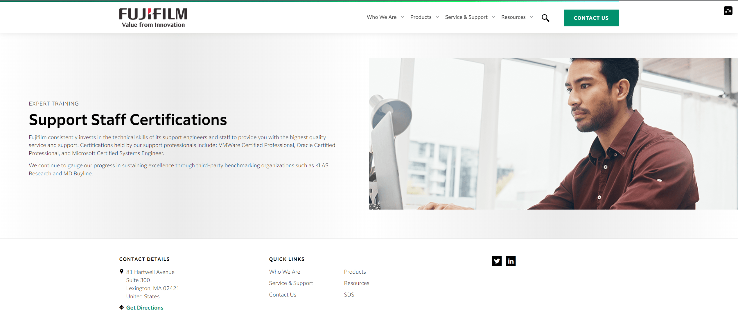
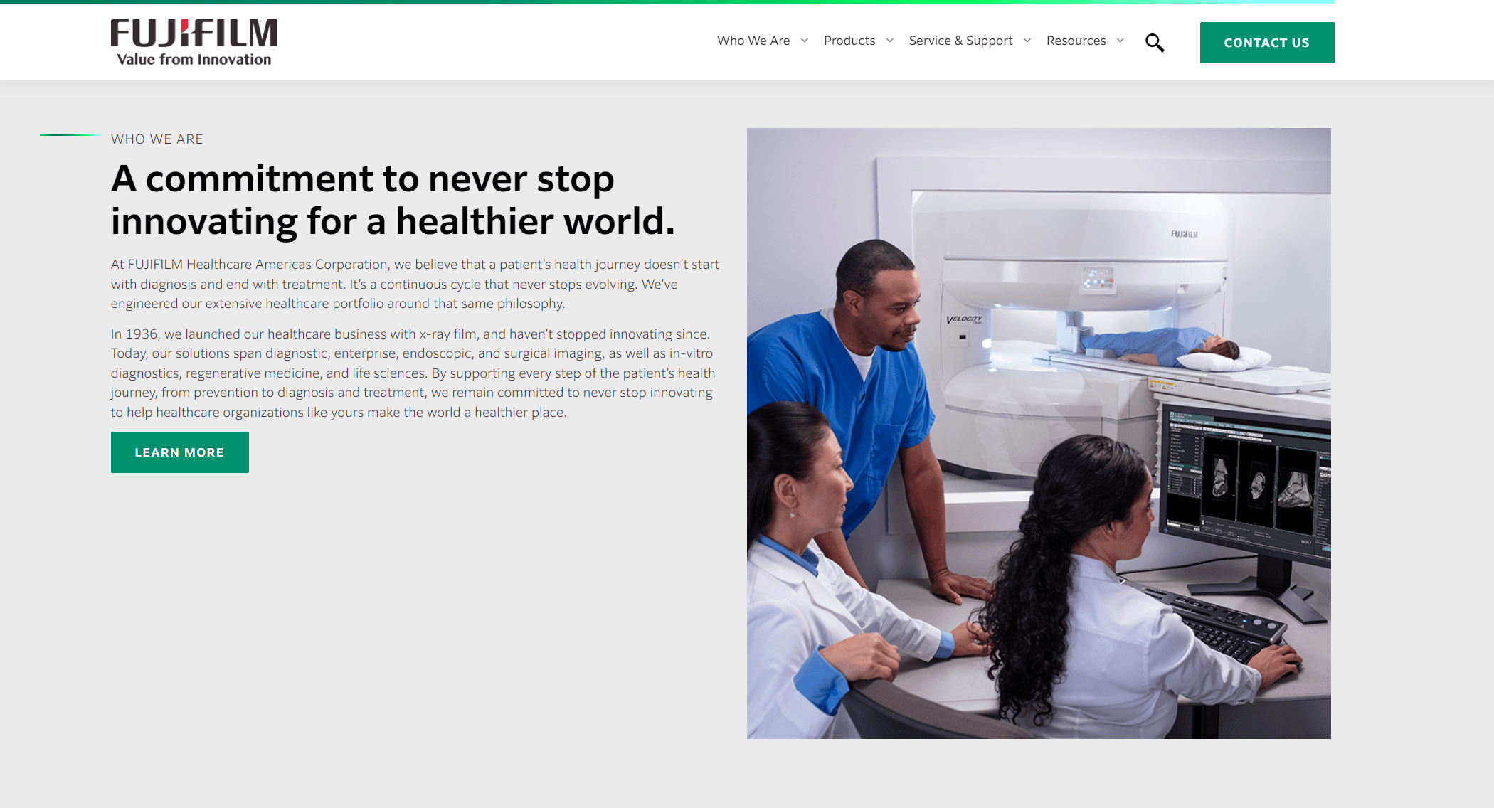
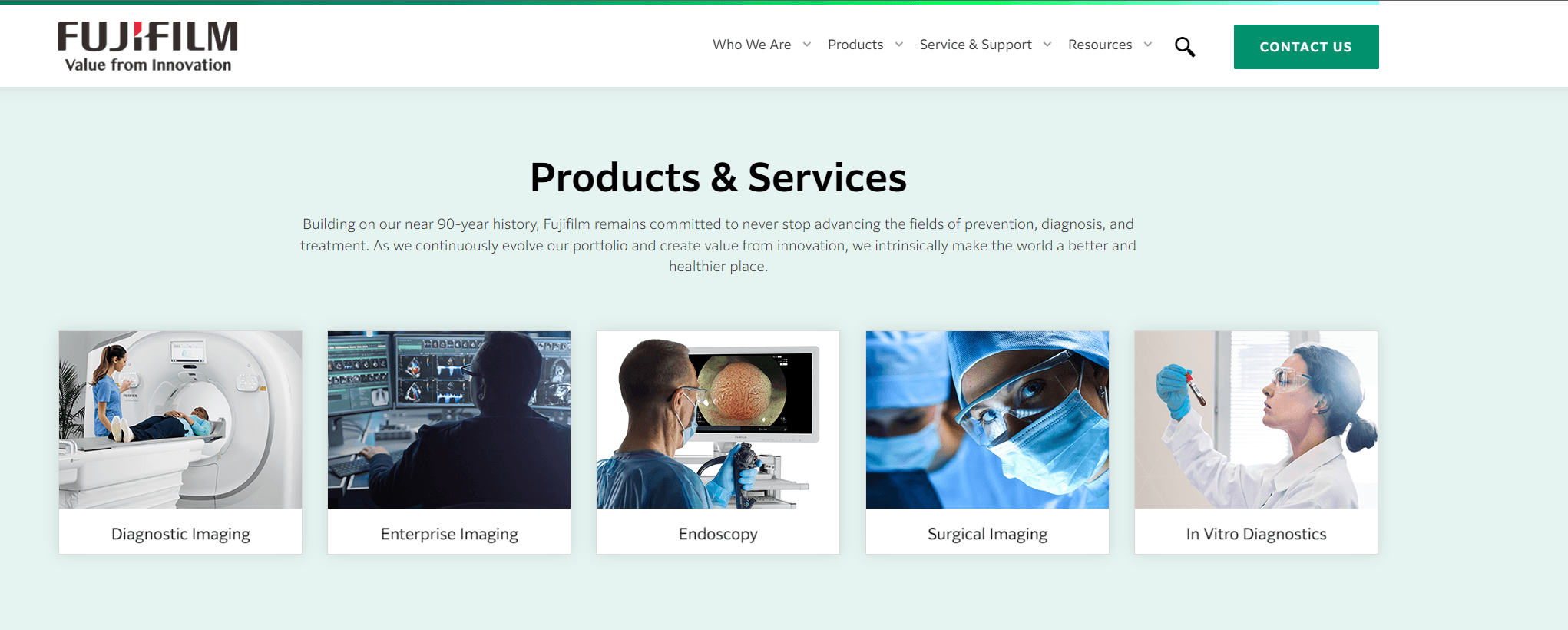
Fujifilm Healthcare Solutions
FUJIFILM Healthcare Americas Corporation is dedicated to advancing the ability of healthcare providers to deliver optimal care, ultimately improving patient outcomes.
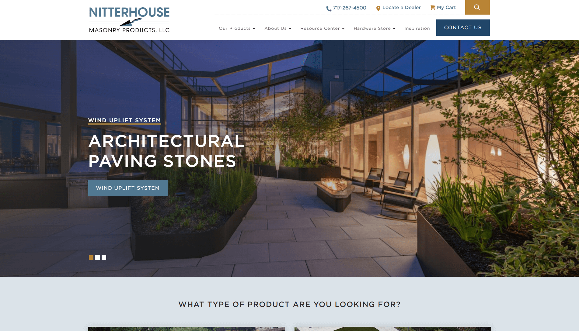
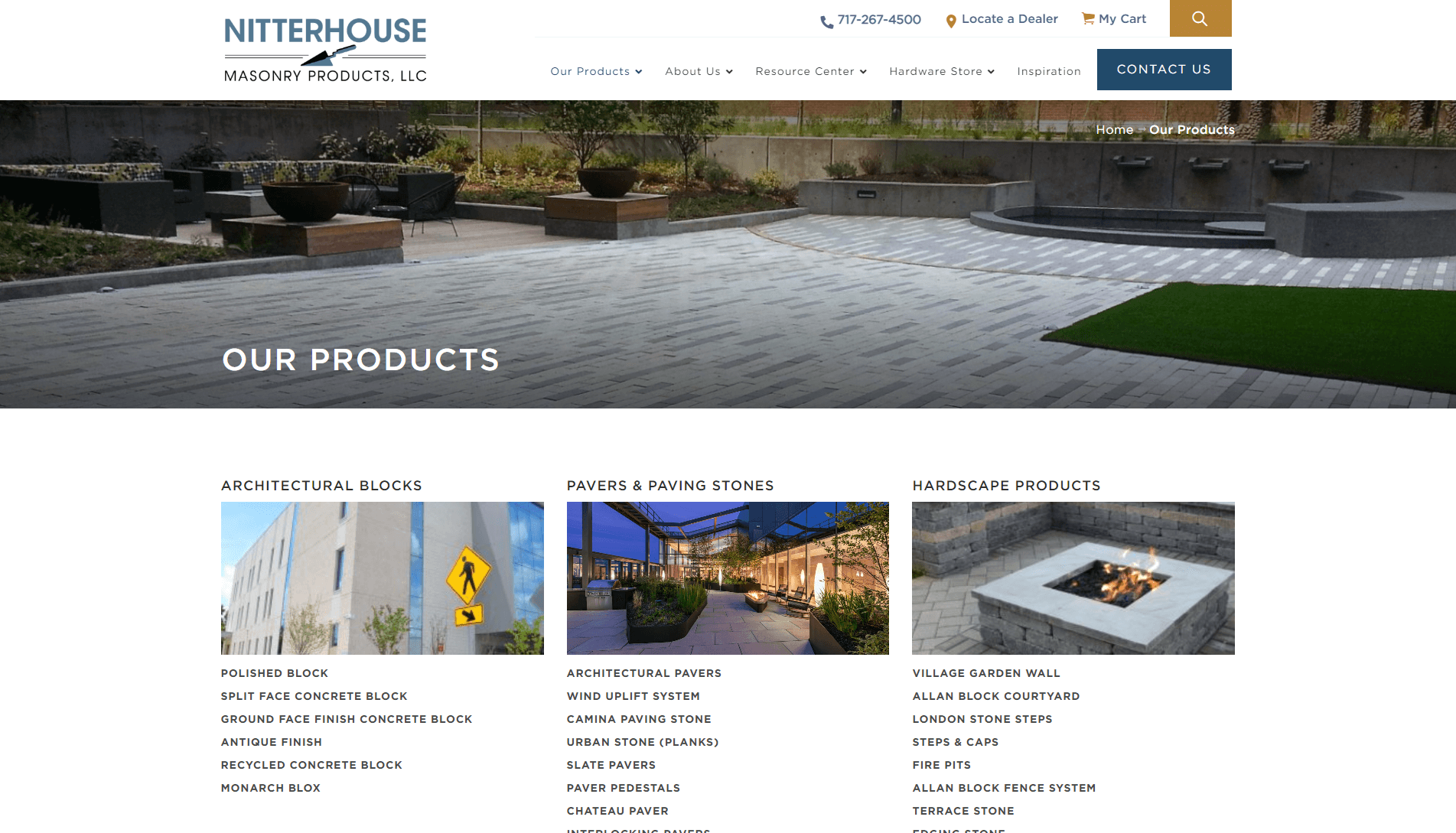
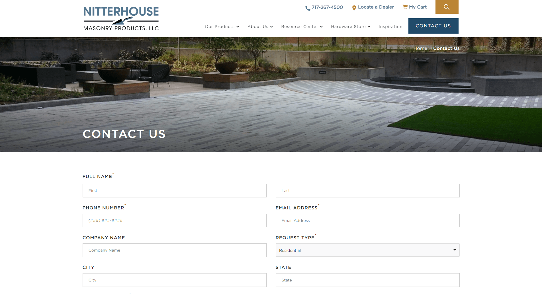
Nitterhouse
Nitterhouse Masonry is a leading manufacturer of masonry products. Including concrete block, retaining walls, hardscape products and more.
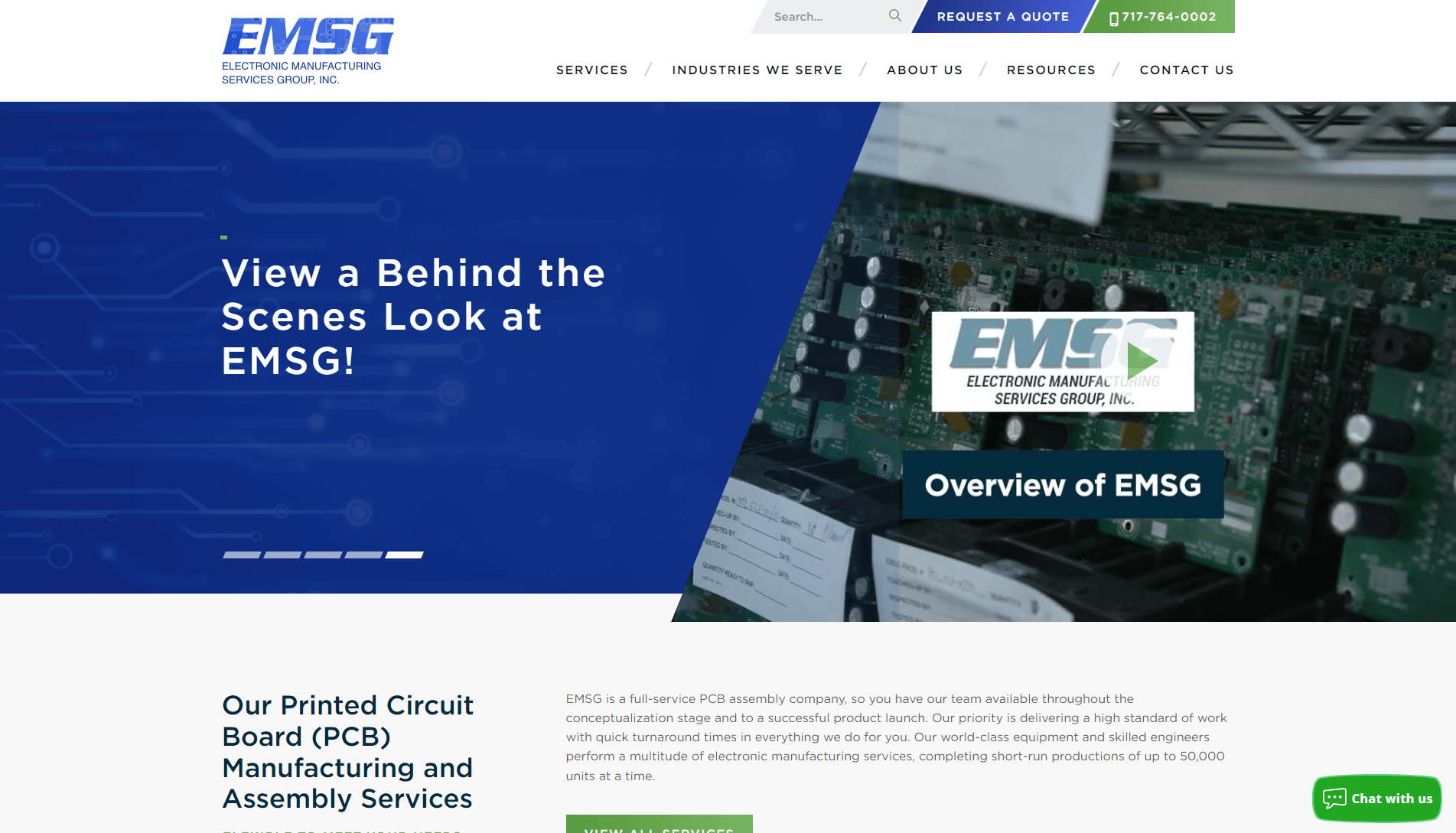
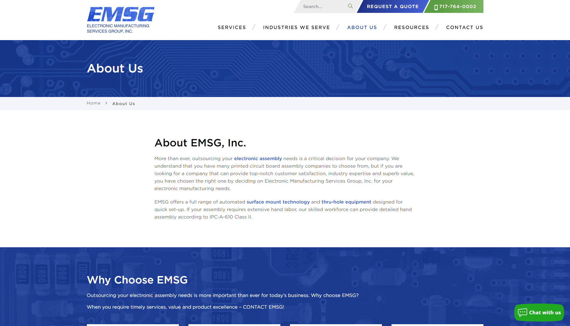
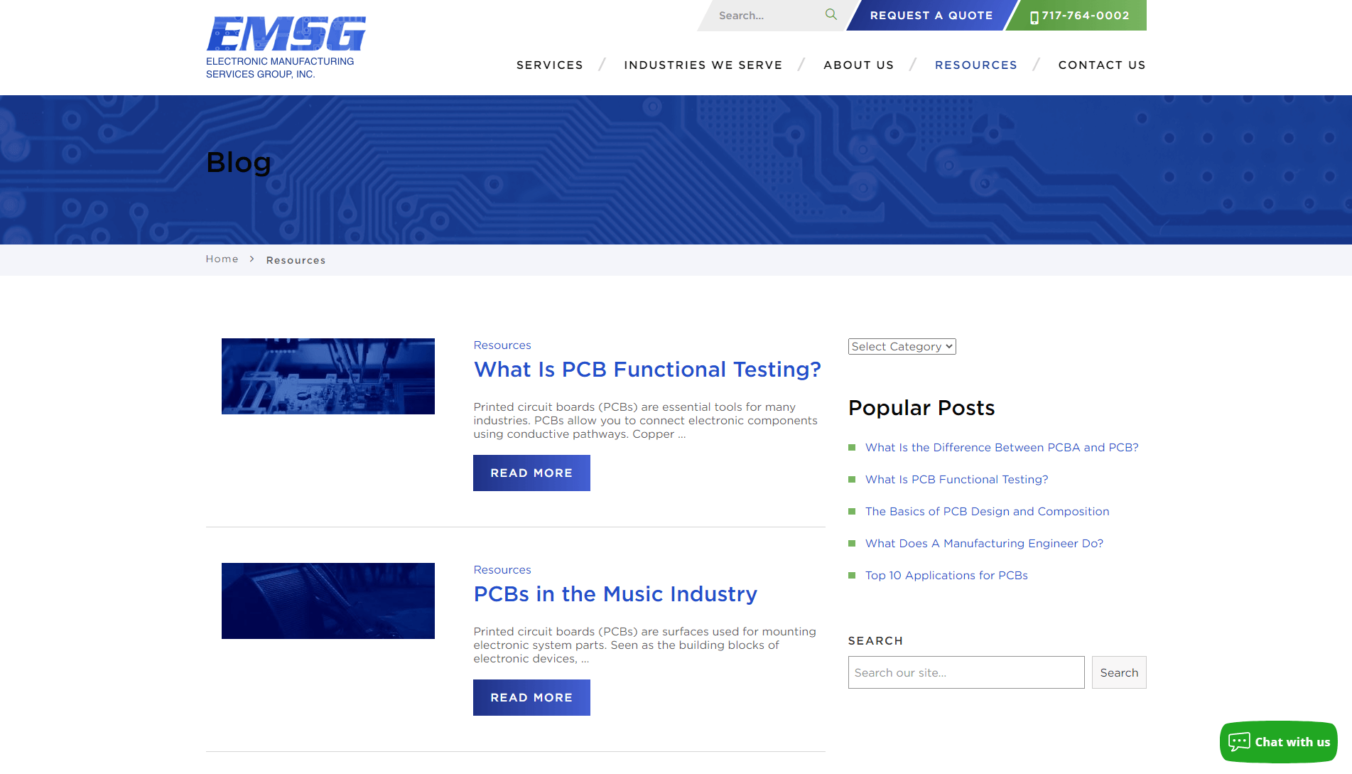
EMSG Inc.
EMSG provides cutting edge circuit board design, manufacturing and assembly. We’re located in York PA and deliver nationwide services.

Showcase Capabilities and Product Expertise
Communicate your manufacturing capabilities and what sets your production facility apart with a website that showcases your equipment, processes, technical specifications, and more to buyers.

Streamline the RFQ and Lead Generation Process
You don’t have to settle for low-quality RFQs, whether for one-off jobs or unrealistic projects. Using design, messaging, and keyword targeting, we’ll help your manufacturing company reach the businesses it wants to serve, like medical device companies.

Build Trust and Credibility for B2B Buyers
Build trust, credibility, and confidence with technical B2B buyers using design strategies that highlight your ISO certifications, quality control safeguards, and case studies from past projects.
Transparent Pricing for Your Manufacturing Website’s Design & Development
You know better than anyone the ins and outs of custom pricing, from considering the materials to the timeline. At WebFX, we focus on the details, too, to provide accurate and transparent website design quotes. Get your own by requesting a quote today or using our free calculator for an initial estimate.

Pricing Starting At
for Manufacturing Companies
- All-in-one design, development, and site launch
- Built-in phone, form, and chatbot tracking
- 360° optimizations for search and answer engines
Unlock Your Competitive Edge
Work with our award-winning agency to design a website for your brand that makes your brand look good and converts more qualified prospects.
Manufacturing Web Design Services for Maximizing Production Schedules
Your production floor doesn’t stop with our manufacturing website design agency. With an emphasis on building websites that match your brand and best practices for traffic and lead generation, we ensure your website delivers impactful results.

-
130%
INCREASE IN TOTAL RANKING KEYWORDS
-
31%
INCREASE IN ORGANIC LEADS
-
30%
DECREASE IN COST-PER-LEAD
Why Manufacturers Choose WebFX
Choosing the right digital marketing partner is crucial for manufacturing companies looking to expand their reach and drive growth. While specialty agencies offer deep niche expertise, a full-service agency like WebFX provides a unique set of advantages designed for comprehensive success.
Manufacturing Specialty Agency
- Often limited service offerings, requiring multiple vendors for a complete digital strategy.
- Typically rely on off-the-shelf marketing tools and platforms, which may offer less customized insights.
- Deep niche expertise, but perspective may be limited to just one industry potentially missing cross-industry innovations.
- May face resource or expertise limitations for growing manufacturing companies.
- Multiple agencies can lead to fragmented strategies and more coordination for manufacturing companies.
- Support levels and reporting depth can vary – higher account loads mean slower replies and less strategic input for your business.
- Full spectrum of integrated services for a single, cohesive strategy across all digital touchpoints.
- Leverages proprietary technology for advanced data analysis and optimized ROI.
- Diverse market exposure fosters innovative, cross-industry strategies.
- Equipped for large-scale operations, strategies scale seamlessly with your business.
- Unified strategy and execution for efficient campaigns and consistent messaging.
- 45% more support than typical agencies—fewer clients per manager for higher client satisfaction.
631
Website Redesign Projects Launched in the Last 5 Years
$4.9B+
Revenue Driven for Manufacturers
237,500+
Hours of Experience with Manufacturing Companies


Work With Our Manufacturing Experts
Just fill in the form, and let our experts handle the rest.

Manufacturing State of the Industry
View ReportFAQs about manufacturing website design
Where can I get an estimate for your manufacturing website design services?
Right here! Use our free calculator below to get an estimate for our manufacturing web design agency’s services.
Keep in mind, this tool provides estimates — for a custom quote, contact us online.
Web Design Services Pricing
Use the drop-downs below to indicate your needs, then click the “See Pricing” button for a free, instant quote.
We estimate your project will cost between and .
Please complete the web form below for an exact project quote from a WebFX website design strategist.
"*" indicates required fields
What should manufacturing website design include?
The best manufacturing web designs stand out because they follow best practices like:
- Delivering a fast experience
- Creating an intuitive experience
- Providing helpful content for learning more
- Loading site content fast
- And more
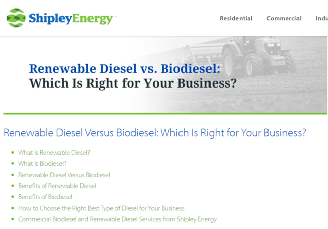
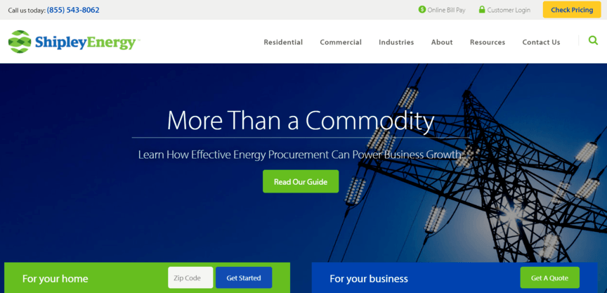
Do you have examples of your manufacturing website design company’s work?
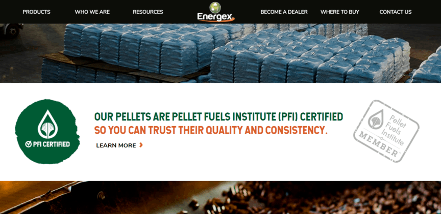
At WebFX, we’ve won more than 220+ awards for our web designs. Below, you can see examples of our manufacturing website designs and how they exemplify essential web design strategies and techniques, like using coordinated colors, trust signals, and more.
Learn more about these designs and concepts now:
#1: Look trustworthy and reliable
When you’re designing the overall look and feel of your website, you should make it reflect your actual business. For example, tattoo parlors can show a lot of color and art. Mining companies can use dark colors that are similar to mines. As a manufacturer, you can use light backgrounds, solid-color text, and the colors of your logo to engage visitors and create a modern, trustworthy appearance.
#2: Use high-quality images
Your website is the perfect place to share photos of your facilities and staff.
The photos don’t have to be anything stunning, but they should reflect your business values — happy workers, efficiency, quality products, customer satisfaction, and more. With the right images in the hands of the right web designer, you can even reinforce the trust that you’ve established with your professional-looking site from the previous step!
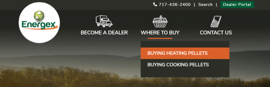
#3: Incorporate easy navigation
Breadcrumbs, links, and sitemaps are all helpful elements of site navigation, and they can make all the difference between keeping a customer on your page and losing them to your competition. To test if you have good navigation, you can ask yourself a couple of important questions.
- Can I return to the previous page?
- Can I go to another relevant page?
- Can I go to the homepage?
If the answer to any of those is “no” on any page, consider fixing it — or find a web designer and developer that can. It doesn’t take long, and it’ll make a world of difference to your visitors.
#4: Design pages for your visitors
While your pages should express the best qualities about your business, you also have to keep your audience in mind when you make them. That means you should target the professionals who are responsible for contacting you on behalf of their companies. That way, you can show them that you understand them as decision-makers, their businesses as potential clients, and your interaction as a business deal.
#5: Make your site load fast
When you’re online, every second counts, and that’s especially true for loading times on websites.
When your site takes too long to load, you’ll lose customers to your competition time and time again. That’s why it’s critical that you make sure every page on your site loads in the blink of an eye — or at least as quickly as possible — to keep potential customers engaged right from the get-go.
#6: Coordinate your colors
Color plays a big role on websites, and you can make it work to your advantage once you understand it. Blue tones tend to reinforce trust and authority, black shows exclusivity, and red evokes emotion while drawing attention. By using even those three colors, you can design every page on your site to properly target, guide, and convert certain visitors to increase your bottom line.
#7: Highlight your call to action
Every page should have a call to action so that it has a chance of converting visitors into customers.
That call to action should also be noticeable and set apart from the rest of the content on your page. By using warm colors like red, simple buttons, and encouraging language, you can make sure every visitor to your site knows how to become a customer. And that increases the chances that, at some point, they’ll convert.
#8: Use negative space
Negative space is actually a positive design quality and many of the best web design companies use it.
Using white space lets you break up text on a page better so that readers can more easily scan the content. That means you can engage readers, keep them on your page, and make sure they have the chance to read as much as they want without being intimidated by a big, gray wall of text. Newspapers have used this strategy for decades — if they didn’t have negative space, nobody would be able to read.
#9: Make choice easy
When you’re laying out the call to action on a page, it’s not just important for it to stick out — it has to be an easy choice. That means your page should only have a couple options for users to click. Your homepage, contact page, about page, and call to action are a winning combination of different choices that a user can make (though the call to action is most important).