
The most anticipated and discussed website launch of 2013 hasn’t been a new photo sharing site or Silicon Valley startup — it’s been HealthCare.gov, the US government healthcare exchange website created as part of the new Affordable Care Act.
Anytime a new service like this rolls out, it makes for a great case study. With such a high demand and large amounts of public pressure, how would we the website perform and function? What conversion paths were built into the website and did they work well?
Let’s dive in and see what lessons HealthCare.gov can teach designers and marketers about their websites.
Showcase Important Information Before Soliciting Signups
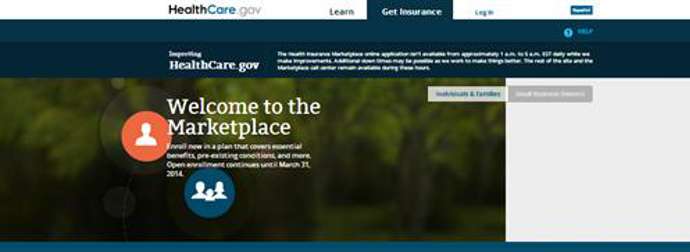
There are some key lessons in usability to be learned from HealthCare.gov. Among other reasons, user experiences on the site were negatively impacted because visitors could not view health plans before undergoing the tedious registration process. Take a look at the image from HealthCare.gov below, and you’ll notice that “Create an Account” and “Apply” come strangely before visitors get to pick an insurance plan.

By providing users with as much information as possible about the product or service they are registering for before making them create an account, we can create a better usability experience for visitors because they will be motivated to register for our product and not view the entire process as a hassle.
Even a simple plan/price check would allow users to access the most crucial information before going through a full registration and application.
Arguably, the single most important aspect of HealthCare.gov is allowing people to quickly and easily compare healthcare premiums for themselves. HealthCare.gov makes you click through 11 pages to actually view pricing.
A better alternative is showcased at HealthSherpa – a free guide that was created online to make it easier to find and sign up for health insurance.

There’s a very simple and direct call to action and you view actual prices after only one click. It’s large improvement over HealthCare.gov’s extremely long and tedious process.
Keep Calls to Action in the Top Half of the Browser Window
Another usability lesson that Web marketers can learn from HealthCare.gov is the importance of placing calls to action (CTAs) above the fold of a webpage. As Jen Cardello from Nielsen Norman Group points out, the most important information for site visitors to find should be presented above the website’s fold point, in the topmost half of your browser screen.
As you can see from looking at the screenshot below, HealthCare.gov features CTA-like commands under “How the Marketplace Works,” but all of these CTAs are located in the bottom half of the webpage.

As a result, visitors to the page have no idea that these important instructions exist, unless they are so inclined to scroll down the page. Instead, all they see when they come to the page is this:
 Doesn’t really give you a sense of direction, does it? By placing our CTAs in the topmost half of the webpage, we can ensure that our visitors can find important and helpful information easily, thus giving them a better experience on our websites.
Update: A different version of the HealthCare.gov homepage has been released and it does a much better job of highlighting two main calls to action: Apply Online and Apply By Phone.
One area that could be improved, however, are the large icons on the homepage that don’t offer a clear explanation of what they are for at first glance. Only once you hover over them do you get an idea of their purpose.

Conversion Rate Optimization
Another area of interest for Healthcare.gov is conversion rate optimization. 99.6% of visitors to the site left without converting (signing up for healthcare coverage).
While this number is likely inflated due to missions of people checking out the website out of curiosity instead of qualified customers, it still points back to a few key issues when it comes to CRO.
Here are a few lessons we can learn from HealthCare.gov in terms of optimizing our websites for conversions:
Move from Broad to Specific Actions
A successful conversion funnel functions in the following way, as described by John Doherty at Moz:

Visitors to a site will move from consuming broad information to gradually more specific information before they make the direct decision to convert into a registered user and then paying customer. In the case of HealthCare.gov, visitors should be able to come to the site seeking broad information about healthcare coverage. They then should be able to view specific information about available healthcare plans.
After reviewing the plans and considering which plan is right for them, they will they convert into registered and paying customers.
In many ways, this topic is related to the usability enhancement I discussed earlier. Because visitors can see all of the information relevant to why they should create an account before registering, visitors who do register are much more likely to convert into customers. The poor usability features of HealthCare.gov therefore serve as a lesson in both usability and conversion best practices.
Test and Double Test Your Conversion Funnel
Some major data from HealthCare.gov that points to poor conversion testing comes from Millward Brown Digital.
Of the 3.72 million visitors who took the initiative to register an account on HealthCare.gov, only 1.01 million completed the registration process. This signals many potential problems: Perhaps the instructions for registering are unclear, maybe the navigation links are flawed or possibly a “Verify Your Account” email is failing to send. Whatever the cause of these problems, they can be addressed and solved with conversion testing prior to launching a site.
For HealthCare.gov, the entire registration process has been plagued with technical issues – something that will obviously have a drastic impact on conversion rates and the overall effectiveness of your website.
Keep the Design Simple and the Information Focused
A final lesson to be learned from the convoluted nature of HealthCare.gov is the necessity of keeping your website simply designed and tightly focused.
For example, I’m not a huge fan of this portion of the website:

Other sections of the page focus explicitly on welcoming visitors to the Marketplace, telling visitors how to use the Marketplace and showing visitors how to learn more about the Marketplace. On the other hand, this small section of the page includes resources for other languages, a blog feed, the number of days left to enroll in healthcare, top content on the site, social media plugins, a number of quick information links and an oddly misplaced email signup box. As a result, this single section of the Web page contains more information than the entire rest of the page combined:

By restricting such versatile content to this small area, it’s very likely that none of this content is getting much attention from visitors.
To get the most out of your web pages, marketers and designers need to make sure that this doesn’t happen on any of their websites. Separate your content so that relevant links are grouped together, and give them some breathing room.
—–
Many of the mistakes made on HealthCare.gov are common issues. On a smaller site, they could be overlooked and not become a large problem.
But when a massively popular site like this needs to function at scale, even a minor problem that impacts 1% of visitors becomes crippling. Be sure to ‘stress test’ your website before launching and also keep usability at the top of mind.
-
 The WebFX team includes 750+ digital marketing specialists across SEO, PPC, web design, analytics, and beyond. Using proprietary RevenueCloudFX technology and transparent, data-driven strategies, we’ve collectively generated $10 billion in revenue and 24 million leads for our clients in the past five years.@webfx
 -

WebFX is a full-service marketing agency with 1,100+ client reviews and a 4.9-star rating on Clutch! Find out how our expert team and revenue-accelerating tech can drive results for you! Learn more
Try our free Marketing Calculator
Craft a tailored online marketing strategy! Utilize our free Internet marketing calculator for a custom plan based on your location, reach, timeframe, and budget.
Plan Your Marketing Budget
Share this article

Looking for More?
Get expert ideas, industry updates, case studies, and more straight to your inbox to help you level up and get ahead.
"*" indicates required fields

Try our free Marketing Calculator
Craft a tailored online marketing strategy! Utilize our free Internet marketing calculator for a custom plan based on your location, reach, timeframe, and budget.
Plan Your Marketing Budget