-
 10 min. read
-
 WebFX Team
 Digital Marketing Agency
- The WebFX team is made up of more than 500 subject matter experts in digital marketing, SEO, web design and web development, social media, and more. Together, they’ve helped WebFX’s clients earn more than $6 billion in revenue from the web — and that’s just in the past five years. @webfx
Ecommerce sites make their money when people hit the checkout button. Your job has an ecommerce manager or marketer is to get as many people to click that button as possible. All of your marketing efforts online point back your calls to action on your website.
With so much weight being placed on a single button, it’s important to spend a lot of time to make sure that your checkout buttons are doing their job and encouraging visitors to proceed through the checkout process.
So how do you do that? The most effective way to optimize your checkout buttons is by choosing buttons with proper size, placement and color. While size and placement are vital in the conversion process, changing the color of your checkout buttons can be a quick adjustment that drastically impacts conversion rates for your website.
Many best practices when it comes to color selection for ecommerce sites are rooted in science. Color psychology studies reveal that certain colors propagate different feelings in consumers. Are your call to action and checkout buttons pushing the right psychological buttons for your customers?
Or are they driving away those valuable clicks? In this post, we’ll explore some common colors for ecommerce buttons, and talk about other ways that you can improve the shopping experience with just a few simple color changes.
Color Psychology
Let’s explore the psychology behind some individual colors, and explore how they might be beneficial to (or may even already be benefiting) your ecommerce store.
Red
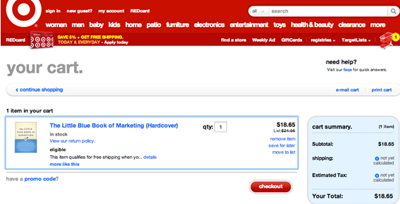
Red is a passionate color and creates a sense of urgency. A great example of this color in use is at Target.
Unsurprisingly, red is the prominent color of their website, as evidenced by the navigation. When viewing your cart, you also see a red checkout button. Urgency is spread throughout the site, right up until the checkout button.
 Another reason you might want to use red is the fact that it invokes hunger in the consumer. Think about some of the largest food chains in America: McDonald’s, Burger King, Wendy’s, KFC, Pizza Hut, In-N-Out, Chili’s, and Applebees. All of these feature branding that is prominently or at least partially red.
In fact, the logo for Chili’s is a large red pepper… how obvious can you get? This is also the approach that Edible Arrangements takes.
They have red sprinkled as the main call to action color on their site, hoping to make the customer crave their products. They’re already pretty delicious looking, but adding this sense of urgency can help motivate the customer to make a purchase now. 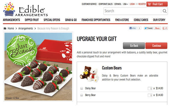
Yellow
Like red, yellow is eye-catching.
But unlike red, yellow offers the customers a sense of cheerfulness and warmth instead of urgency. Yellow is used by sites mainly for two reasons: 1. To Ease Burdens Yellow is seen as a pleasing color. Web designers use yellow for the checkout button to make the consumer feel better about their purchases. You can see this in action on the children’s clothes site Crazy8. Moms who are shopping for their young children are a great market to target with yellow, since it offers them a calm, pleasing feeling as they browse your site. This isn’t something they’re likely to experience at home! 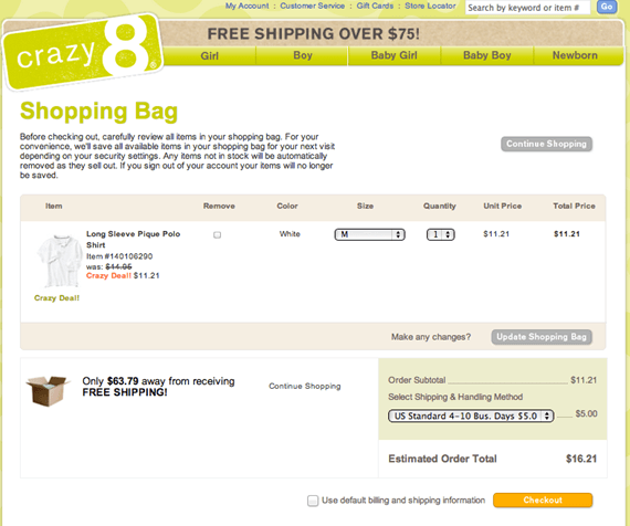 2. To Contrast Yellow is a standout color. It is easily contrasted with just about any other color. The most popular site to use yellow in their checkout button is Amazon.
The website, which is mostly white, adds a splash of color here and there, but it’s the yellow button that sticks out the most! This allows the user to easily find the next step: proceed to checkout. 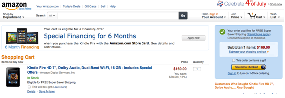 Yellow can be a powerful color if used in moderation.
However, you should use caution: when used excessively throughout the site, it can repel customers. Yellow can be very bright and overwhelming, and we sometimes associate it with being “cautious” (like a yellow light on a stoplight). To successfully use yellow, it should be limited only to specific elements with calls to action.
This is why it is most common for just the checkout button.
Green
Red, yellow, and green. The three colors that are associated with a stoplight. For those designers who don’t want to use red for their call to action button, they will most likely decide on green.
This is because they believe if a user sees red they will “stop.” Green is the colloquial color for go! For that reason green is used as the checkout button of many sites. American Eagle is one of those examples, sporting a lime green button both for “checkout” and the application of coupon codes.
Although some sites prefer to draw attention away from discount codes, AE chooses to make it just as visible as the checkout button, which might help create a sense of loyalty or customer happiness. It’s a well-thought out strategy, though perhaps not for everyone. 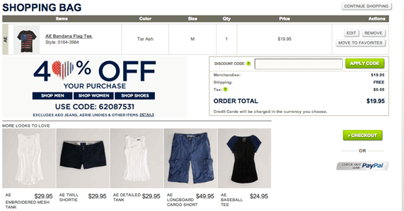 Vitamin retailer Vitacost also relies on green to motivate customers to add items to their cart.
But like AE, they choose to use this vivid color to motivate additional purchases — look for the “buy both together” option in the bottom right. This can motivate customers to bundle products and buy more than before. 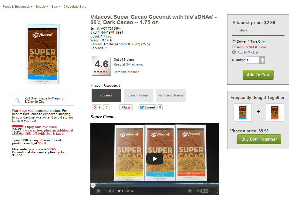 Since green is also seen as a color that symbolizes nature and health, it is commonly used on sites and with brands that offer health benefits, like vitamin retailers, health food stores, and so on.
Green can help you feel good about making your purchase, since you are helping yourself or the environment.
Contrasting Colors and Size
While some sites lean toward red and yellow for the checkout button because of the psychological aspects the color brings, other web designers believe in the art of contrast to the catch the attention of the consumer. A Journal of Product Innovation Management study that revealed that consumers tend to be more quickly drawn to products that stand out from other nearby colors. As it turns out, the same can be said for checkout buttons.
Work with your existing color scheme to come up with checkout buttons that stand out from other elements of your site. Many popular sites use this approach. Amazon and Walmart both go this route with their websites.
For example, Walmart uses large orange calls to action on their website. This drastically contrasts against the blue and white color scheme their brand is known for. 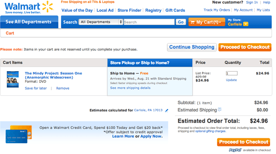 When “Big Box” retailers like Walmart are making contrast a huge focus of their website, it’s something that is definitely working well.
You can see this tactic in action on a large number of other websites, including eBay, American Eagle, Kohl’s, and so on.
“Testing, Testing, 1-2-3”
So you’ve made the changes to your add to cart and checkout buttons, but you aren’t sure if the return is going to be what you’re planning for. How do you check to see which button the consumer favors? Is there any way to really know that your changes are effective?
What about the possibility of actually driving customers away?  Thanks to Google and their infinite numbers of tools, I have an answer for you. Google’s Content Experiments allow you to compare how different web pages perform using a random group of your visitors.
Another site that offers a similar service is Optimizely. By implementing an A/B test through one of these services, you can test your original buttons against the new ones to see how they perform. You can continue testing until you’re happy with the results, and then you can implement the winner.
Unless you test a handful of different button colors on your website, you have no way to know which color will actually perform best. Just because your brand colors are blue and orange, for instance, doesn’t mean one of those will bring in the highest number of conversions. It might actually be green!
Or it could be orange after all. One other way to maximize the impact of color on your site is by using several different colors of checkout buttons and calls to action. For example, you can create several different landing pages for each segment of your email list.
Are you pushing a hard sell for existing customers? Try blue or red. Going after a younger demographic?
Maybe green or yellow will work best for them. Don’t be afraid to experiment with different color choices on each area of your site. Remember: nothing is permanent, and you can always test and make changes on the fly.
So Which Color is Best?
I realize that I haven’t exactly told you which color is the best for your ecommerce site. What I have done, though, is given you the tools to find out which one is the best for your site.
It’s going to take some work, but I’m confident you are a driven individual who wants to make a sale. As a generalization, ecommerce sites that sell food should go with a red checkout button. Kids clothes or cutesy items would be safest with a yellow checkout button.
Those sites that sell most everything else should be able to stand out with a green or even a blue button.  There is no perfect answer for your website, however. Depending on the psychographics of your target market, layout of your website and brand colors, you’ll have to try a number of color combinations to find the one that will convert highest for you.
The answer is different for everyone! Throughout the whole process of designing your checkout and other call to action buttons, remember that these are some of the most important items you’ll have on your ecommerce site! Your entire site is funneling people in to click these buttons.
Follow the guidelines in this article and the suggestions from your company to make them as captivating as possible. What color do you use on your ecommerce site? Have you tested others to see what kind of results you get?
Feel free to leave a comment so we can discuss this interesting topic.
-
 The WebFX team is made up of more than 500 subject matter experts in digital marketing, SEO, web design and web development, social media, and more. Together, they’ve helped WebFX’s clients earn more than $6 billion in revenue from the web — and that’s just in the past five years.@webfx
 -

WebFX is a full-service marketing agency with 1,100+ client reviews and a 4.9-star rating on Clutch! Find out how our expert team and revenue-accelerating tech can drive results for you! Learn more
Try our free Marketing Calculator
Craft a tailored online marketing strategy! Utilize our free Internet marketing calculator for a custom plan based on your location, reach, timeframe, and budget.
Plan Your Marketing Budget

Proven Marketing Strategies

Proven Marketing Strategies
Try our free Marketing Calculator
Craft a tailored online marketing strategy! Utilize our free Internet marketing calculator for a custom plan based on your location, reach, timeframe, and budget.
Plan Your Marketing Budget
What to read next
