

Marketing technology (martech) encompasses any tool that helps your company succeed with your campaigns. Finding the best martech software for 2026 can help you stay on top of the trends while outpacing your competition. If you’re also looking for expert help managing your data, browse our list of top marketing analytics agencies to find the right partner.
To help you get ahead, we’ve compiled a list of the 15 top martech tools for 2026. Let’s break down the following options and some martech tool pricing:
Top Martech Tools for 2026
Want to learn more about martech from an expert? Contact us online to discuss the best options for your business!
Martech tool pricing
Want a quick look at the tools below? Here’s a breakdown of all the tools, prices, and their key features and uses:
| Tool | Price | Features | Details |
| RevenueCloudFX | View pricing | Customer relationship management (CRM), data tracking and analytics, and marketing automation | Learn more |
| GA4 | Free | Marketing analytics, website and app tracking, and traffic measurement | Learn more |
| Optimizely | Free plans available, more pricing and features upon request | Customer satisfaction, A/B testing, and web feature experimentation | Learn more |
| Buffer | Free trial and plan available, as low as $6 a month | Social media management, post scheduling, and audience engagement tracking | Learn more |
| Hootsuite | Free trial available, $90/ month for basic plan | Social media planning and management, social advertising, and post tracking and scheduling | Learn more |
| Nutshell | Free trial available, as low as $16/ user | CRM, pipeline management and storage, and customer data tracking and storage | Learn more |
| Trello | Free plan available | Project management, onboarding services, and task management across teams | Learn more |
| Ahrefs | Starting at $99/ month with different plans available | Search engine optimization (SEO) tools, competitor analysis, and keyword research | Learn more |
| Marq | Free plan, then starting at $10 a user | Branding and design, template creation, and content production | Learn more |
| Criteo | Upon request | Online display advertisement creation, ecommerce advertising, and ad design and integration | Learn more |
| Slack | Free limited plans available, then $7.25 per user per month | Team messaging and meetings, private and group channels, and desktop and mobile messenger access | Learn more |
| Marketo | Upon request | Marketing automation, lead management, and marketing analytics | Learn more |
| Feefo | $119/ month for basic plan | Review generation platform, ecommerce-driven review sourcing, ad review response guides | Learn more |
| Shopify | $39/ month for basic plan | Ecommerce platform, ecommerce automation, and product listing and cross-channel marketing | Learn more |
| Hotjar | Free plan available | User behavior analytics, user feedback generator, and one-on-one user interview capabilities | Learn more |
15 best martech tools for 2026
Now that you’ve had a quick breakdown of our top picks, let’s look closer at the best martech software options for 2026.
1. RevenueCloudFX
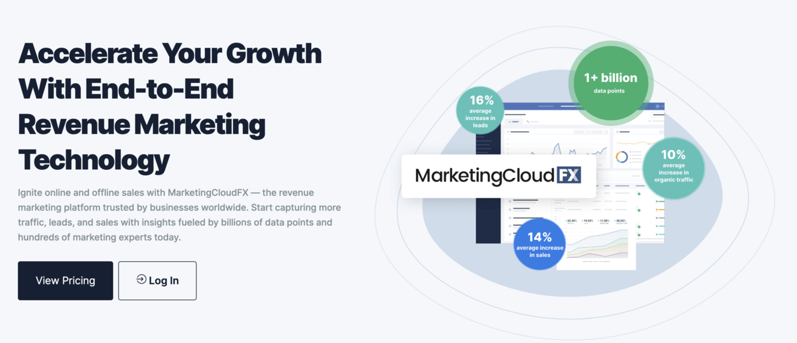
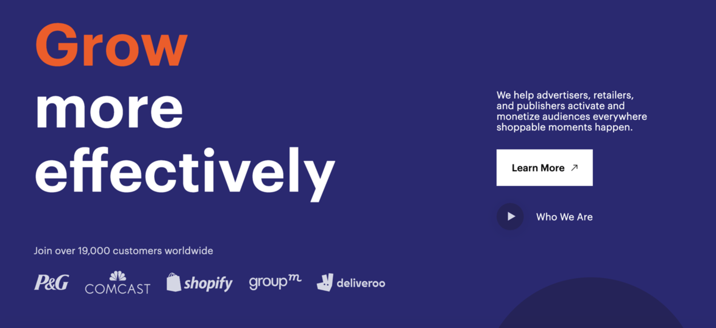
First on our list of martech tools is RevenueCloudFX — the end-to-end marketing platform from WebFX. We didn’t include it in this list for our own benefit. This marketing platform can help businesses of any size, industry, or experience earn more revenue from live data.
RevenueCloudFX is powered by IBM Watson, giving it more power to collect, analyze, and report on customer data for users. You can enjoy features like marketing automation, email and call tracking, and more, all while giving your teams access to unified data.
2. GA4
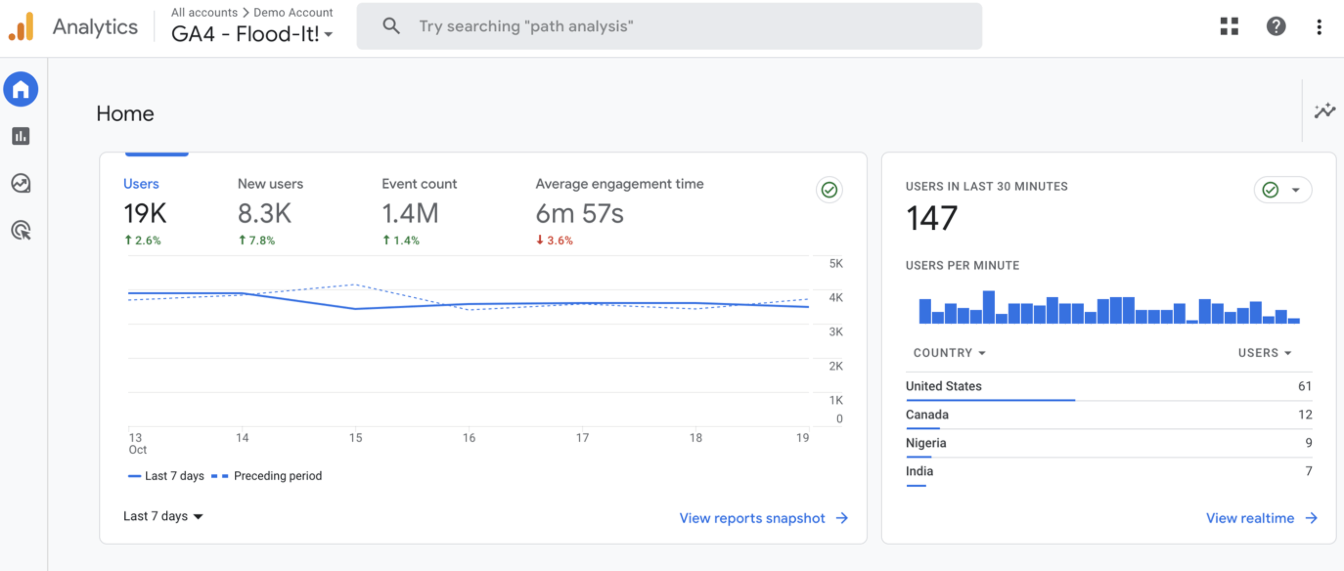
GA4 is Google’s free analytics platform that lets you track key metrics for your website, as well as other channels. Since this tool is free, it’s a great option for companies with a limited budget who are just getting into marketing and analytics.
With the newest version on the rise, GA4 lets you create events, measure conversions, and see what pages are doing the most work to earn your business revenue.
3. Optimizely
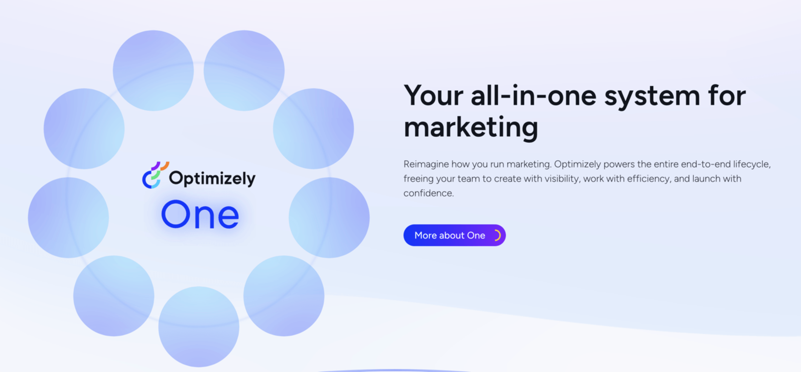
Next on our list of martech companies and tools, we have Optimizely.
Optimizely is a leading customer satisfaction and review tool. With their services, you can create and launch tests to see what customers like — and don’t like — about your website. Use Optimizely to create tests, run experiments, and chat with users about what they want out of your website.
Since reviews are crucial to understanding your audience, a review tool is a must. Optimizely has replaced Google Optimize, becoming the tool of choice for the giant search engine.
4. Buffer
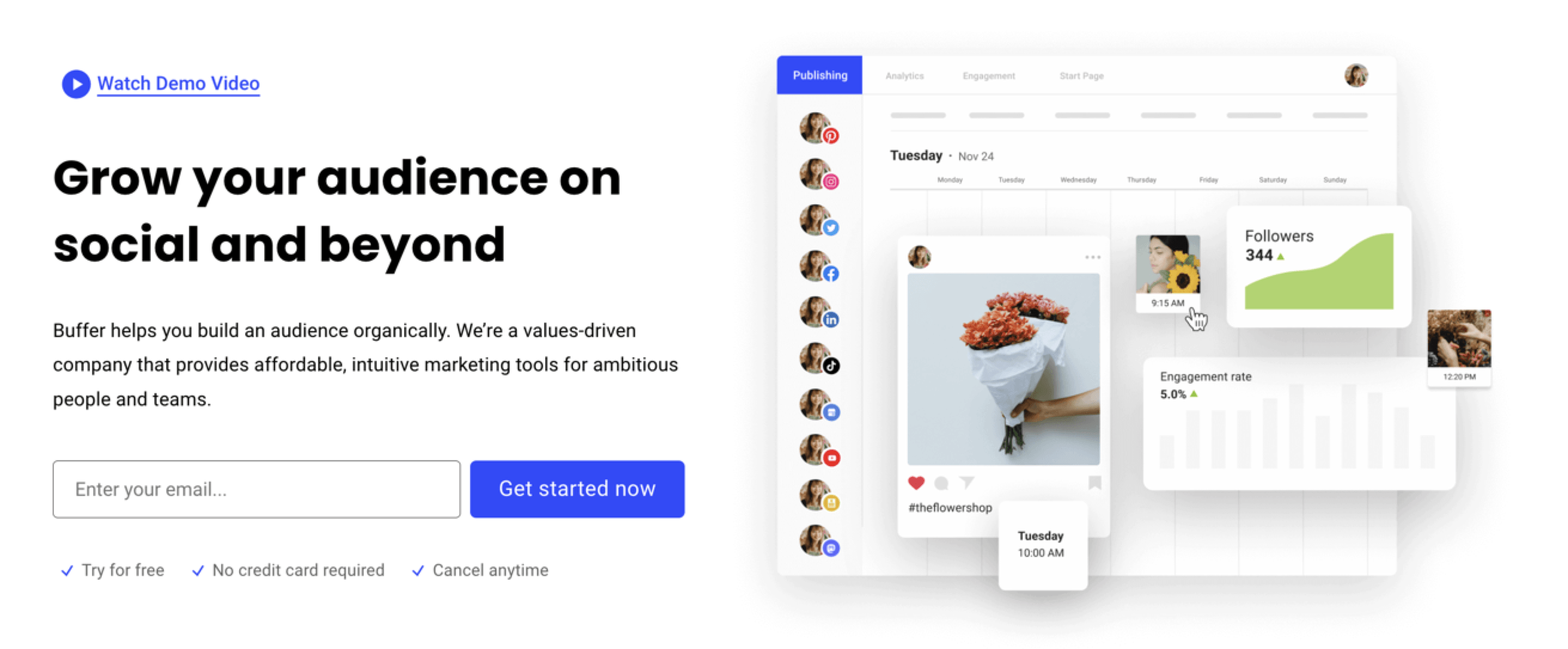
Buffer is a complete suite for those looking to optimize their social media presence.
Buffer helps you build an audience and grow your online presence through services like content publishing and scheduling, social analytics, custom landing pages, and artificial intelligence (AI) assistance.
If you’re looking for an all-in-one social tool, Buffer is a great choice for combining your channels all in one place.
5. Hootsuite
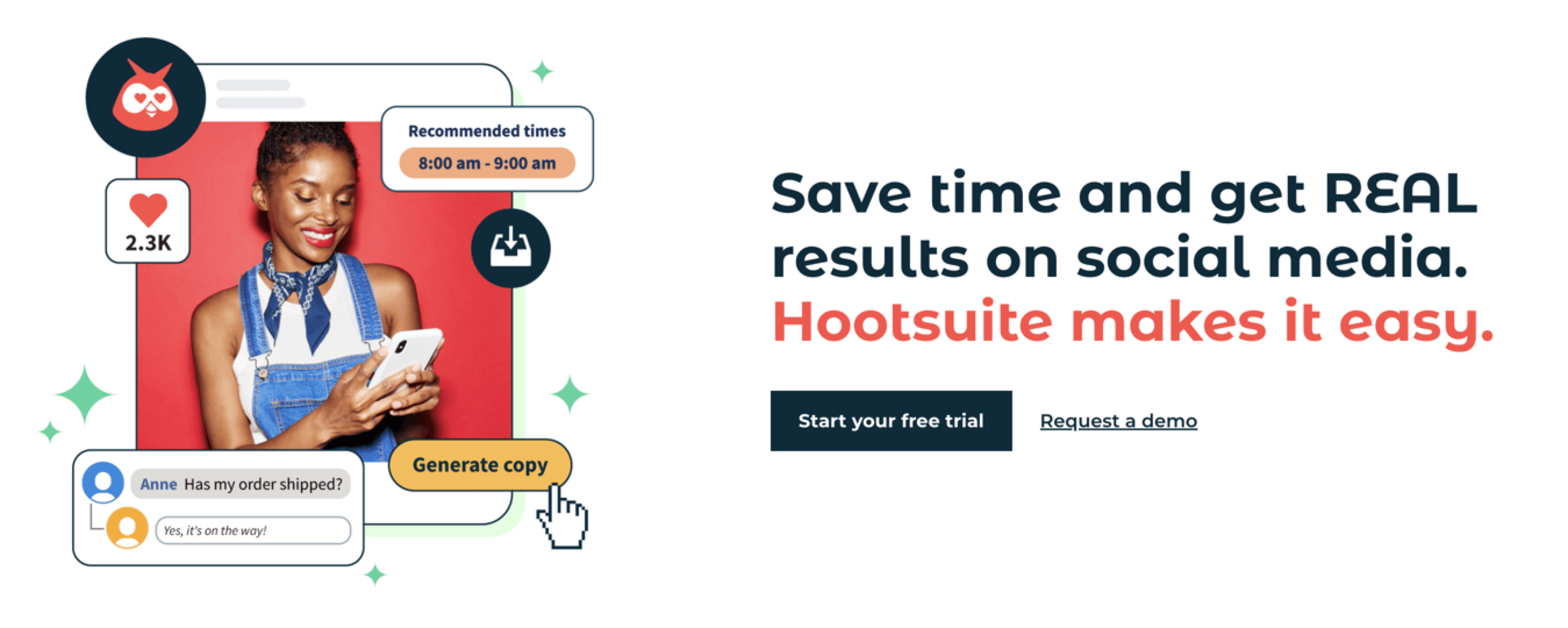
Hootsuite is another social media management platform that lets you combine all your social media tracking, publishing, and analytics in one place.
Hootsuite also lets you create industry-appropriate content and schedule it in advance. They have a special focus for users in health care, education, government, and other related industries. Plus, with AI technology, you can lessen your workload across the board.
6. Nutshell
Next on our list of martech tools, we have Nutshell — a leading CRM platform that helps companies build relationships and manage data efficiently. As an all-in-one CRM, you can use Nutshell for anything you need, including:
- Email marketing automation
- Customer data storage
- Lead tracking
- Conversation updates
- And more!
With Nutshell and RevenueCloudFX, you can overhaul your marketing process, qualify leads, and turn each visitor into a long-standing customer.
7. Trello
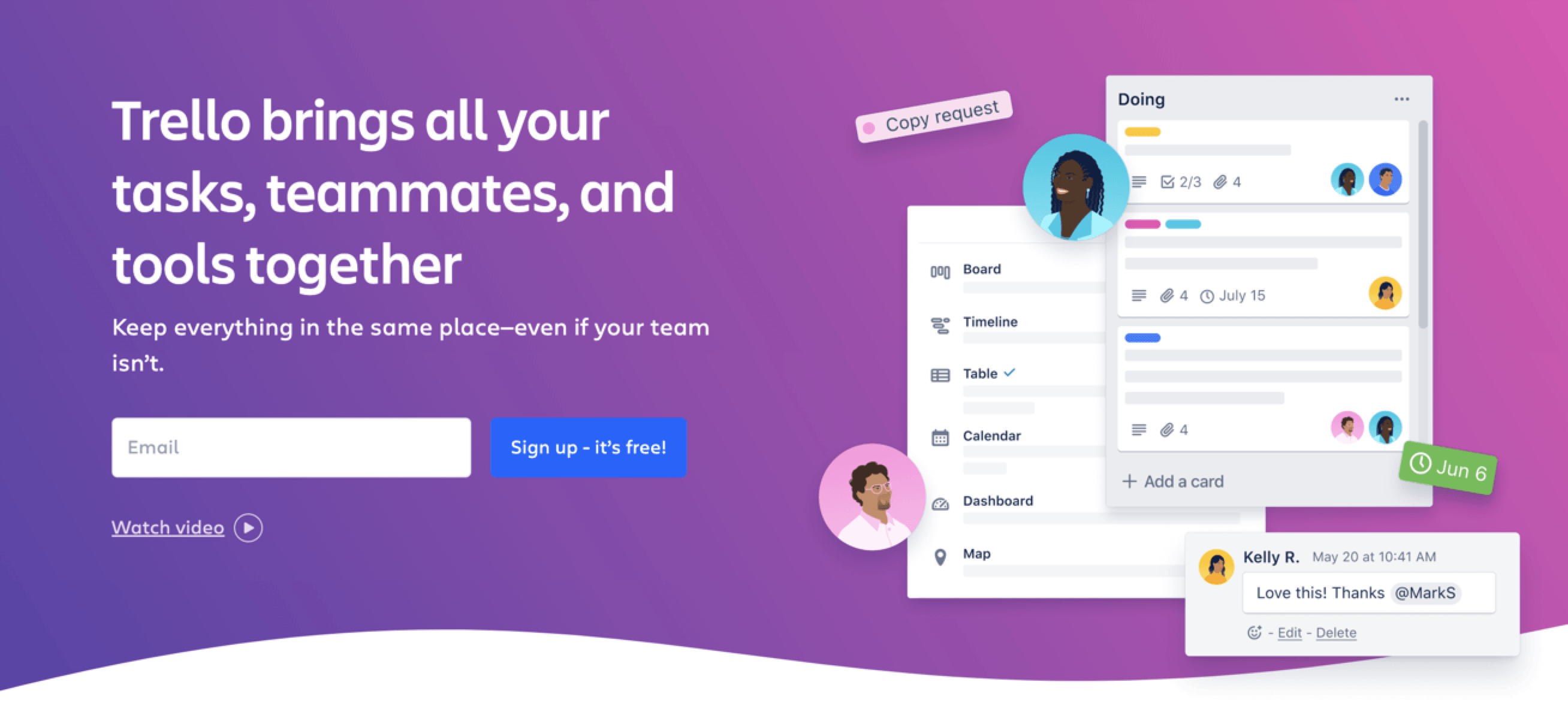
Trello is a content management platform that helps teams unite their workflow. With Trello, you can manage new projects, create boards, assign projects, and organize your workflow so everyone is on the same page.
Whether you work with multiple teams or one, having one platform for all projects will help smooth your operations.
8. Ahrefs

As one of the most well-known martech companies in the industry, Ahrefs offers an all-in-one SEO tool to help with all facets of your campaign. Whether you want to deep-dive into keyword research or do a competitor analysis.
Ahrefs also lets you track your own URLs and manage analytics in the same platform. You can use this tool for all phases of SEO, from research to implementation and tracking.
9. Marq
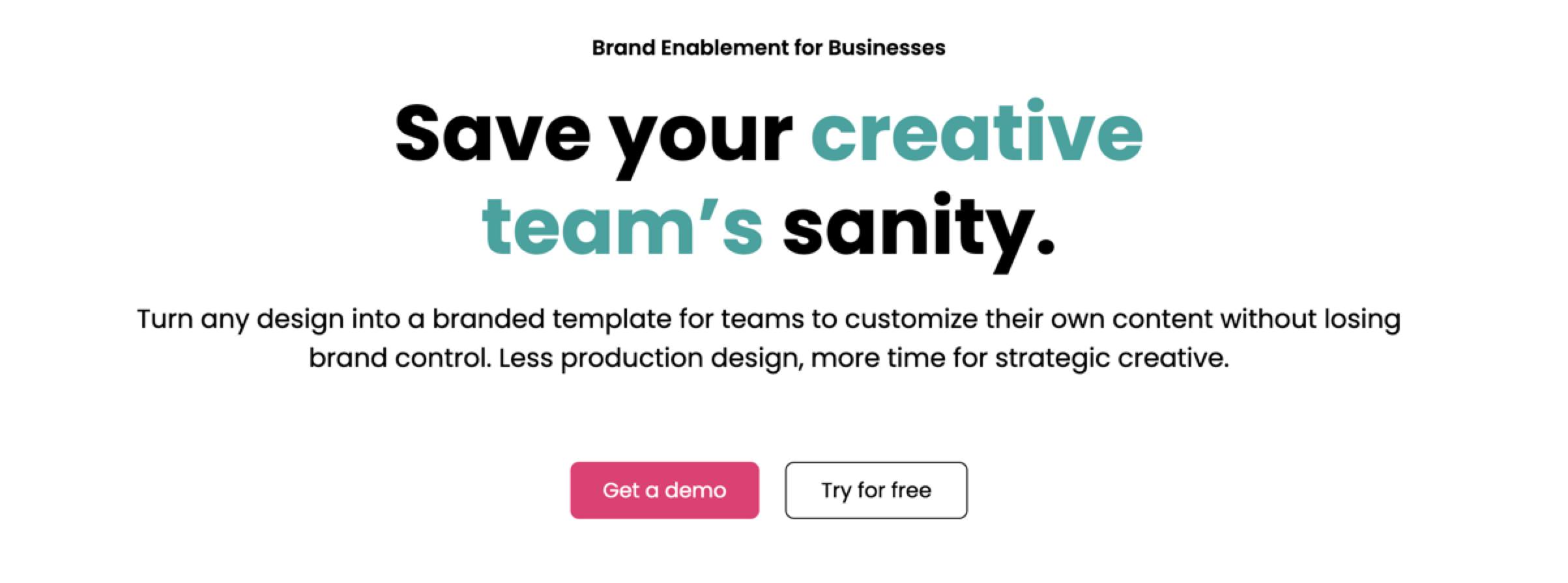
Marq, formerly LucidPress, lets you turn your designs into branded templates for your team to access. If you struggle to create consistent branding on your site, Marq will help you establish a complete vision of what your brand is, as well as giving you actionable tools and materials.
Creating a strong brand presence is essential for your company. Marq is a great option for stepping up your branding and building a solid online presence.
10. Criteo
Criteo lets you create online display advertisements and push them to different channels, all from one platform. Since display ads are an effective way of reaching your audience, having the best tool to create effective options can make all the difference.
Along with display ads, Criteo offers ecommerce services to help you monetize your ads and increase revenue.
11. Slack

Slack is an online messaging platform for professionals. If you want a way to help your team connect, Slack is an excellent option that already serves numerous businesses and teams.
With Slack, you can enjoy private messaging on desktop or mobile phones, as well as video and phone options for teams around the world. If you have a hybrid workforce, Slack is a must for keeping everyone in touch.
12. Marketo
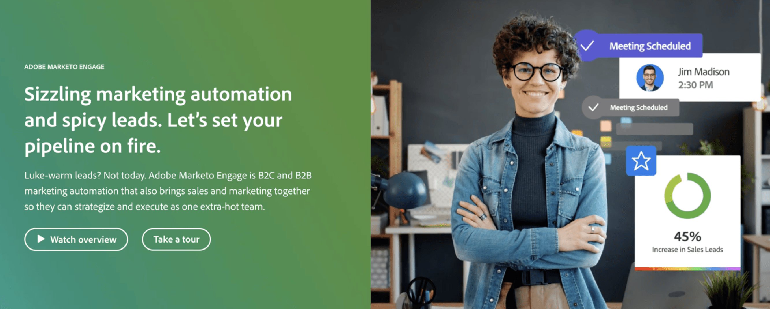
Marketo is Adobe’s marketing software that targets clients all over the market. This software uses marketing and sales automation processes to help businesses get more from their leads, audience, and advertising efforts.
On top of that, they also offer a multitouch marketing approach, which measures checkpoints across the sales funnel for every single lead.
13. Feefo

Feefo is another review tool that helps you gather, evaluate, respond to, and implement reviews on your website. Their advanced analytics help you find trends in your reviews and consolidate data automatically to save time.
If you want more information from your customers without seeking it out manually, Feefo is a great option for businesses.
14. Shopify
Shopify is a popular ecommerce tool that lets you sell goods and services online.
With Shopify, you can integrate your store with other channels and make it easy for users to order from you. You also get access to analytics, marketing tools, branding advice, and more.
15. HotJar

Rounding out our list of the best martech tools for 2026 is Hotjar. Hotjar is another review and testing tool that gives you more insight into your business performance with information that you can’t get from your analytics.
Whether you want to test a new landing page or make sure that customers find your site easy to navigate, you can do so with Hotjar. They also let you connect with users one-on-one to learn what they think of your company.
Measuring the metrics that affect your bottom line.
Are you interested in custom reporting that is specific to your unique business needs? Powered by RevenueCloudFX, WebFX creates custom reports based on the metrics that matter most to your company.
- Leads
- Transactions
- Calls
- Revenue

Discover more top martech tools with WebFX!
Building your tech stack is simple with an agency on your side. If you want professional guidance while selecting, installing, and using your martech tools, WebFX is here to help.
If building your martech stack is part of a larger effort to modernize how your business operates, WebFX’s digital transformation services can help you develop a strategic roadmap that connects your tools, data, and teams.
Aside from being experts at RevenueCloudFX and Nutshell, we can help you leverage marketing technology for the most effective campaigns. Whether you want to optimize your ecommerce strategy or improve your social media campaign, we are here to earn data-driven results.
Want to learn how we generated $10,085,355,239+ in revenue for our clients? Contact us online today!
-
 Abbey is a digital marketer, copywriter, and lead editor. She has worked on over 200 client campaigns and WebFX, and she specializes in marketing strategy analysis and industry-specific digital marketing plans. Outside of writing and editing, you’ll likely find her taking pictures of her cat, making a new playlist, or tending to her houseplants. View full profile
 -

WebFX is a full-service digital marketing agency delivering revenue-driving strategies across online advertising, SEO and AI search optimization, and digital marketing. Backed by 1,100+ client reviews, a 4.9-star rating on Clutch, and proprietary revenue-tracking technology, our team helps businesses grow visibility and revenue across platforms, from Google to ChatGPT to LinkedIn. Discover how our expert team and revenue-accelerating tech can drive results for you. Learn more
Try our free Marketing Calculator
Craft a tailored online marketing strategy! Utilize our free Internet marketing calculator for a custom plan based on your location, reach, timeframe, and budget.
Plan Your Marketing Budget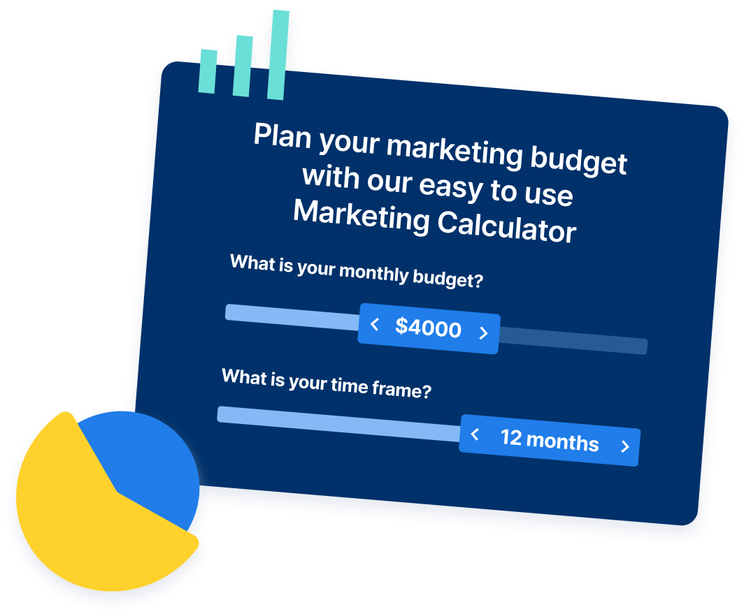
Share this article

Proven Marketing Strategies
Try our free Marketing Calculator
Craft a tailored online marketing strategy! Utilize our free Internet marketing calculator for a custom plan based on your location, reach, timeframe, and budget.
Plan Your Marketing Budget