Last Updated: June 24, 2024
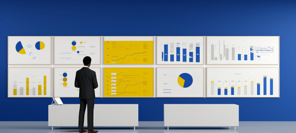
Data is one of the most valuable assets you own. Your data can help you spot trends, better understand your audience, and make money moves that help grow your company. To help you process and understand your data, you’ll want to use top data visualization tools.
The best data visualization tools will help you better understand your data and spot patterns, trends, and gaps that impact your business.
So, what are the best data visualization platforms for your business? On this page, we’ll discuss the 10 top data visualization tools for 2025 you can use to create great visuals for your audience.
Best Data Visualization Tools Shortlist
- Tableau — Best for interactive graphs
- Infogram — Best for linking real-time data
- Qlik Sense — Best for ease of use
- ChartBlocks — Best for importing data from multiple sources
- Datawrapper — Best for personalized data sets
- Google Charts — Best for compatibility with Google products
- Sisense — Best for customer support
- Zoho Reports — Best for big data imports
- Highcharts — Best for customizations
- Fusioncharts — Best for chart building
So, just keep reading!
[Summary] Top data visualization tools
| Name | Price | Star Rating | Best for |
| Tableau | $15 per user per month | 4.6/5 | Interactive graphs |
| Infogram | $19 per month | 4.4/5 | Linking real-time data |
| Qlik Sense | $20 per user per month | 4.4/5 | Ease of use |
| ChartBlocks | Request a quote | 4.5/5 | Importing data from multiple sources |
| Datawrapper | $599 per month | 4.3/5 | Personalized data sets |
| Google Charts | Free | 4.6/5 | Compatibility with Google products |
| Sisense | Request a quote | 4.3/5 | Customer support |
| Zoho Reports | $24 per month | 4.2/5 | Big data imports |
| Highcharts | $168 per seat per year | 4.6/5 | Customizations |
| FusionCharts | $439 per year | 4.4/5 | Best for chart building |
What is data visualization?
Data visualization is the processing of taking a group of data points and turning it into a visual graph, chart, infographic, or other graphic to make the data easier to understand and interact with.
What are data visualization tools?
Data visualization tools are platforms that make it easy to turn your data into beautiful graphics and visual charts. Data visualization platforms typically involve entering or linking your data to the platform, and then choosing a graphic that you like best from a generated list.
The 10 best data visualizations tools of 2025
The top data visualization tools in 2025 are:
1. Tableau


$15 per user per month

Why we picked it
Tableau is a popular data visualization tool used by many businesses. This is a tool that produces interactive visualizations that your audience can interact with.
If you have large data sets, this is the tool for you. Also, if your data is constantly changing, it has the capability to keep up with those changes.
Tableau is a popular choice because it makes it simple for your audience to understand the information by producing charts that are easy to read and understand. If you are looking for a tool that is easy to use, Tableau is a great option.
Pros and cons
Pros
- User interface
- Mobile responsiveness
- Ability to support connectivity with diverse data sources
Cons
- Pricing, which can be slightly on the higher side
- Lack of report scheduling functions
2. Infogram
$19 per month

Why we picked it
Infogram is another great data visualization platform. It has many top-notch features that help you make the most of your data visualization. They offer pre-made templates, for example, that you can customize to fit your business’s brand.
Infogram enables you to create infographics, data visualizations, reports, and more. By using Infogram, you will create more interesting data visualizations for your business.
Pros and cons
Pros
- Link real-time data to the platform
- Personalized features to your visuals
- Implement interactive media
Cons
- You have to upgrade your plan to download your graphics
- You’ll need to have an Internet connection to use the platform
- It’s difficult to create complex visualizations
3. Qlik Sense
$20 per user per month

Why we picked it
Next on our list of the best data visualization tools is Qlik Sense. Qlik Sense includes a wide range of features that help you create more customized data.
This tool has numerous data visualization capabilities for your business, including analytics, business intelligence, and enterprise reporting.
One of the best features of this tool is that you can combine all sources of data. Many tools restrict you to only certain sets of data, but this tool enables you to combine different sets so you can look at all your data together.
Pros and cons
Pros
- User-friendly interface
- Colorful visualizations
- Ability to combine data sources
Cons
- Poor customer support
- Lack of drag and drop features
- RAM limitations
4. ChartBlocks
Request a quote

Why we picked it
If coding isn’t your specialty, ChartBlocks is a great tool for your business.
This data visualization tool requires no coding, which makes it easy to use. ChartBlocks uses databases, spreadsheets, and live feeds to build your visualizations. It takes all this information for you and pieces it all together in the visual.
These charts are a great option for sharing, too, because they are compatible with any screen size. Regardless of the device you use, your chart will adjust to the device and look great.
Pros and cons
Pros
- It requires no coding experience
- You can import data from any source
- You can easily share your visuals
Cons
- Templates can sometimes be hard to use
- It can be challenging to navigate the functions and formatting
- There are limited font selections
5. Datawrapper
$599 per month
Why we picked it
Fifth on our list of the best data visualization software is Datawrapper. Datawrapper is a data visualization tool that is aimed at publishers and journalists, but still poses great benefits for your business.
It has a simple interface that makes it easy for you to upload your information and generate a chart. This tool allows you to personalize your data set for custom layouts, as well.
Datawrapper makes it easy to create visualized data sets and embed your chart into your site. Use this tool to upload your data and create charts and maps that catch your audience’s attention.
Pros and cons
Pros
- User-friendly features and interface
- Data set personalizations
- Ability to easily embed visuals into your website
Cons
- There is limited flexibility when working with visuals
- It can be tricky to customize fonts and colors
- It’s challenging to create maps because you will need to have a little programming knowledge
6. Google Charts
Free

Why we picked it
Google Charts is one of the only free data visualization tools on this list, but it’s a great tool that helps you create charts based on your data. Not to mention, it’s super user-friendly.
The best features of these charts are that they are interactive and zoomable. This is very appealing to your audience because it gives them the opportunity to interact with the data and ultimately keeps them on the page longer.
If you want your audience to interact with your data, Google Charts is a very flexible option for your business. Create engaging data visuals featuring interaction controls and animation with this tool to keep your viewers attentive and happy.
Pros and cons
Pros
- Compatibility with other Google tools and products
- Ability to easily integrate data
- Engaging visual graphics
Cons
- The export feature could use some fine-tuning
- It lacks customization features
- There are inadequate demos for the tools
7. Sisense
Request a quote

Why we picked it
Sisense is an analytics platform that helps you create data visuals for your business. This unique platform is user-friendly, efficient, and creative.
You have full control over the customization of your chart, allowing for maximum efficiency. For example, this tool allows you to easily drag and drop information and data into your chart. You can make your charts as simple or as complex as you would like it because of this effective feature.
If you are looking for a top data visualization tool that gives you more control over your data visuals, Sisense is a great option for your business.
Pros and cons
Pros
- Helpful customer support
- It can handle massive data sets
- Seamless customization
Cons
- It can be tricky to develop and maintain analytic cubes
- Doesn’t support time formats
- There are limited visualization versions
8. Zoho Reports
$24 per month

Why we picked it
Next on our list of data visualization solutions is Zoho Reports, also known as Zoho Analytics. Zoho Reports supports the import of large data sets from major databases and applications, making it one of the most popular big data visualization tools.
Pros and cons
Pros
- It has helpful customer support
- It has plenty of room for large data sets
- It’s easy to create reports and modify them
- It comes equipped with useful features, like report sharing and email scheduling
Cons
- There isn’t much onboarding or training to help you learn how to use the platform
- It’s tricky to understand the dashboard when importing large data sets without experience
9. Highcharts
$168 per seat per year

Why we picked it
Highcharts is another excellent tool to create visualizations of big data sets. It runs on Javascript API and offers third-party integrations to give you easy access to interaction data visuals. It’s one of the top data visualization tools for 2025 because their charting library works with any back-end database or server, making it highly compatible.
Pros and cons
Pros
- Offers lots of customizations
- Provides attractive and engaging graphics
- Simple and easy-to-use
- Offers multiple chart options
Cons
- Isn’t the best for smaller data sets and small businesses
10. FusionCharts
$439 per year

Why we picked it
One of the most popular data visualization tools in 2024 is FusionCharts. FusionCharts boasts an impressive 90 different chart variations that can integrate with third-party platforms, offering you a great range of flexibility and customization.
Pros and cons
Pros
- Lots of customization options
- Handy integrations
- Helpful customer support
Cons
- It can be expensive for some budgets
- It’s difficult to set up
What was our methodology for selecting these tools?
To select our list of the top data visualization platforms, we considered several factors for each tool, including their:
- Features
- Ease of use
- Pros
- Cons
- User interface
- Pricing
- Customer support
We also looked at customer reviews and ratings to gain real-world insights into experience people and companies have had with each tool.
Data visualization FAQs
Get answers to common data visualization questions here!
What is data visualization?
Data visualization is the processing of taking a group of data and turning it into a visual graph, chart, infographic, or other visual graphic to make the data easier to understand and interact with.
What are data visualization tools?
Data visualization tools are platforms that make it easy to turn your data into beautiful graphics and visual charts.
What are the best data visualization tools?
The best data visualization tools are:
- Tableau
- Infogram
- Qlikview
- ChartBlocks
- Datawrapper
- Google Charts
- Sisense
- Zoho Reports
- Highcharts
- FusionCharts
There are other data visualization tools on the market, but these tools offer some of the best features, easiest interfaces, and best price points for budgets.
How important is data visualization?
Data visualization makes it easy to understand complex data sets from multiple sources. As a result, you can easily spot trends and valuable insights that can help you improve your strategies for the future.
What are the different types of data visualization?
The most common types of data visualization are line graphs, heat maps, pie charts, and scatter plots.
What should I look for in a data visualization tool?
When choosing your data visualization platform, it’s essential to consider the tool’s ease of use and whether you can easily understand how to use it. You should also consider your needs and goals and evaluate whether the platform offers everything you need, whether that’s responsive customer support or a specific type of graph.
Visualize a plan with WebFX
Visualizations are a great way to present a large chunk of data to your business’s audience, which is why data visualization is so effective in engaging and converting leads. With these data visualization tools, you can easily present data to your audience.
At WebFX, we know the value of data visualization. We have a team of 500+ experts that will help you create impactful visualizations for your data. Our team will help you create visualizations that engage your audience and get them to interact with your business.
If you are ready to start engaging your leads with data visualization, contact us online or call us today at 888-601-5359 to speak with a strategist!
We look forward to helping your business grow!
-
 Macy is a content marketing consultant with over five years of experience creating content for dozens of industries including home services, recreation, and education. She’s written about every marketing topic under the sun, from SEO to AI to email marketing. Her work has been featured by Search Engine Journal, HubSpot, Entrepreneur, Clutch, and more. In her free time, Macy enjoys crafting, reading comic books, and walking her dog Daisy.
 -

WebFX is a full-service marketing agency with 1,100+ client reviews and a 4.9-star rating on Clutch! Find out how our expert team and revenue-accelerating tech can drive results for you! Learn more
Try our free Marketing Calculator
Craft a tailored online marketing strategy! Utilize our free Internet marketing calculator for a custom plan based on your location, reach, timeframe, and budget.
Plan Your Marketing Budget
Table of Contents
- [Summary] Top data visualization tools
- What is data visualization?
- What are data visualization tools?
- The 10 best data visualizations tools of 2025
- 1. Tableau
- 2. Infogram
- 3. Qlik Sense
- 4. ChartBlocks
- 5. Datawrapper
- 6. Google Charts
- 7. Sisense
- 8. Zoho Reports
- 9. Highcharts
- 10. FusionCharts
- What was our methodology for selecting these tools?
- Data visualization FAQs
- What is data visualization?
- What are data visualization tools?
- What are the best data visualization tools?
- How important is data visualization?
- What are the different types of data visualization?
- What should I look for in a data visualization tool?
- Visualize a plan with WebFX
Share this article

Proven Marketing Strategies
Try our free Marketing Calculator
Craft a tailored online marketing strategy! Utilize our free Internet marketing calculator for a custom plan based on your location, reach, timeframe, and budget.
Plan Your Marketing Budget