- Home
- Blog
- Conversion Rate Optimization
- Important Lessons From 3 Call-to-Action A/B Case Studies
Important Lessons From 3 Call-to-Action A/B Case Studies
-
 9 min. read
-
Summarize in ChatGPT
-
 Trevin Shirey
 VP of Marketing
- Trevin serves as the VP of Marketing at WebFX. He has worked on over 450 marketing campaigns and has been building websites for over 25 years. His work has been featured by Search Engine Land, USA Today, Fast Company and Inc. Read his review of working with WebFX for the last 15 years.
A/B testing is a practice that has rapidly grown over the past decade with the creation of detailed analytics and tracking software. But, in theory, this practice has been around much earlier than the dot-com era. For instance, pirates may have tested the threat of “castaway” or “walking the plank” – determining which is a more effective means of getting the treasure secrets they so desired. Fast forward to the present, the ultimate goal of “gold” hasn’t changed much. It boils down to this:
Does variant B work better than variant A?
We have a control and a treatment, in which the higher-level goal is to choose which results in higher revenue. Simple, right? As we’ll see in the case studies below, the meticulousness of A/B testing can target any element of a webpage.
A/B testing allows websites to create variations of landing pages and increase conversions by choosing which was most effective. We have the opportunity to test the most finite alterations to our Call-to-Actions. The core CTA elements to consider are:
- CTA text, color, font
- CTA placement/navigability
- Button size, color, design
- Associated CTA media (images, videos, flash)
Deciding which of these elements to test should always be based on user research. Sean Ellis (CEO of Qualaroo) affirms, “My biggest improvements tend to come when I truly understand what is preventing conversions and address those issues.” Rather than using intuition to create a CTA variation, try collecting user opinions and reviews with questions directly related to CTAs and their associated conversion funnel paths.
The following are three A/B case studies focusing on CTA variations for conversion increases. These case studies will show:
- what wasn’t working originally
- which changes resulted in positive effects
- follow-ups with the current state of the variant
- actionable tips and takeaways
Case Study #1: The Obama Campaign
Dan Siroker (CEO of Optimizely) was the Director of Analytics for the Obama campaign. He performed A/B tests on the campaign landing page to increase sign-up and donation rates.
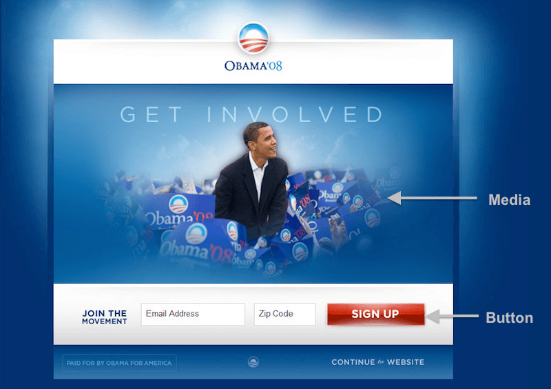
Original Landing Page Properties:
- CTA Button Text (SIGN UP)
- Associated CTA media & copy (Solo picture of Obama & GET INVOLVED)
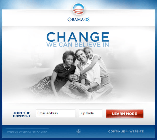
Landing Page Change Result: 40.6% increase in sign-up rate
- CTA Button Text (LEARN MORE)
- Associated CTA media & copy (Obama family picture & CHANGE WE CAN BELIEVE IN)
Ultimately, the 40.6% increase represented an additional $60 million in donations. Siroker affirms this by calculating an average of $21 donation per email sign-up. This $21 was multiplied by the 40.6% sign-up increase (2.8 million additional email addresses).
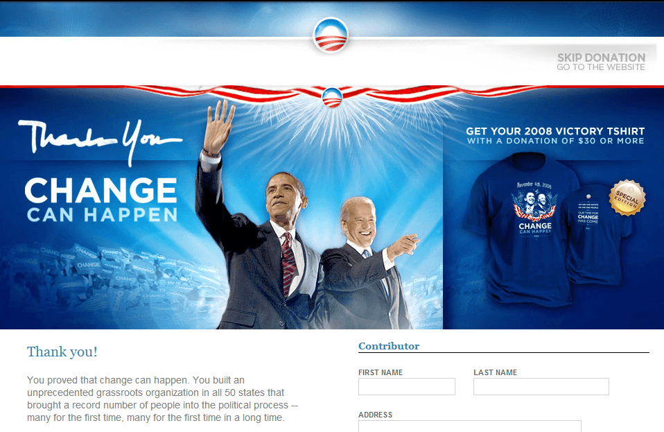
Victory Landing Page
Some important takeaways from Siroker’s A/B test:
Every unique visitor is a fresh chance to convert Multiple variations (not just version 1 and version 2) and combinations (CTA button “A” + CTA image “B”) provide more options and data insights for choosing the best landing page.
Don’t put all your eggs in one basket: Hypothesis based on common knowledge (such as “videos are the best for landing pages”) are too general and weak for variation creation. While they should definitely be included, be sure to balance content variations.
The CTA difference between “SIGN UP” and “LEARN MORE” turned out to be $60 million. Ory Purhonen (Founder of Webics) states, “Split testing is the only bullet proof way of determining which CTA will have the highest number of conversions.”
Case Study #2: Artsy Editor
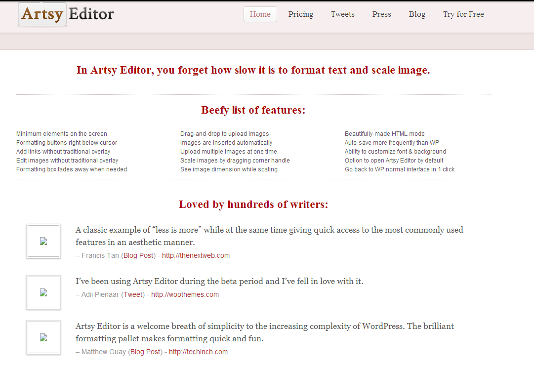
Original Landing Page Properties:
- No CTA above the fold
- Plain text feature list and testimonial quotes
CTA buttons were a full page-scroll below the fold, right above the footer: 
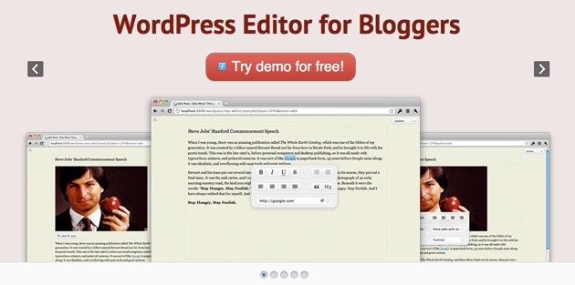
Landing Page Change Result: 47% increase in clickthroughs to pricing page.
- Clear headline description added
- Simple CTA added right beneath headline
- Associated CTA media (image scroll) beneath
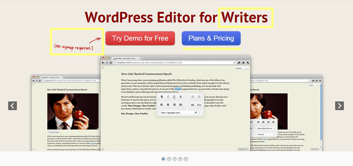
Since this study was performed, Artsy Editor has updated their landing page a bit (or they’re still A/B testing). We can see the headline copy has changed from “Bloggers” to “Writers” which is more inclusive of a broader community. The demo CTA button has removed an exclamation mark, and the “Plans & Pricing” button has been added. Plus, they’ve added associated CTA media: “No signup required.”
Some important takeaways from the Artsy Editor A/B case study:
Determine what your audience wants: for software-as-a-service and similar products, the business model relies on free trials (demos) and various paid plans. This is common knowledge; however, determining which CTA is more important can be the difference between acquiring a new customer and driving them away. In the case of Artsy Editor, stressing the free demo was deemed most important. This means new visitors would try the demo and navigate to the pricing page.
Flexibility makes websites strong: we can see the current landing page reflects a change in thought, positioning the “Plans & Pricing” button directly next to the demo for quicker access.
CTA text choices set the mood: in the variation case study, there were two additional variations using CTA text “Buy now” and “Buy now for $19.99” which are both orders. If you’re site contains CTA text such as “Buy now” or “Purchase product” try A/B testing with:
- Pricing
- Plans
- Plans & Pricing
- Learn more
- Get Started
- Add
- Add to cart
Case Study #3: WriteWork
CTAs are not strictly limited to free trials and purchases. We can A/B test CTAs to increase user engagement too.
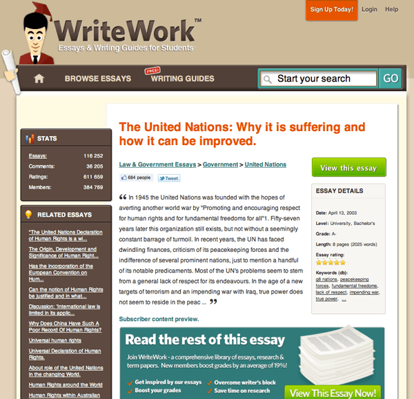
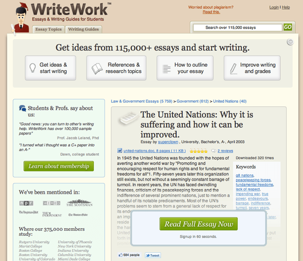
Original Page Properties
- Primary CTA “View this essay”
- Sidebar: Stats and Related Essays
- Two nav-bar tabs and a site search
- Weak CTA: “Sign Up Today!” in upper-right (lacking an urgency such as “and save 20%”
Page Change Result: 144% increase in CTA clicks and 50% increase in sales
- 4 informative CTAs added to the top bar (helps new visitors understand product)
- Sidebar: User Testimonials, Secondary CTA “Learn about membership” and news mentions
- Primary CTA arranged on top of content with added “Signup in 60 seconds”
The results of this case study signified the importance of tempering actions with user research. Prior to the A/B test, hundreds of user surveys were conducted, resulting in new visitor confusion (which explained why conversion rates were low).
The solution was clear: sell what WriteWork can do in four simple points.
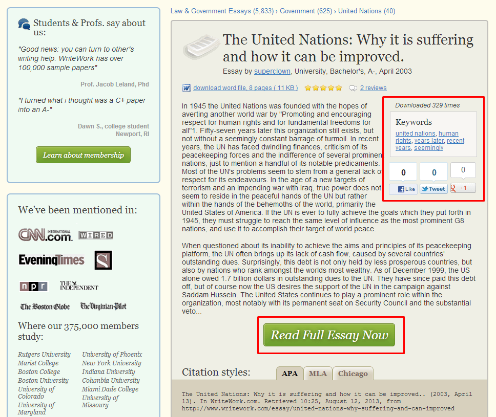
Current Page
Since this case study was performed, the new page reflects a few adjustments. A larger amount of the essay text (100% more) is available on the initial read. The CTA “Read Full Essay Now” has been arranged underneath the text, rather than on top of it, and has been stripped of the “Signup in 60 seconds” and white banner. Lastly, the keyword list on the right side has been shortened with social buttons added underneath.
Some takeaways from the WriteWork case study:
Validation enforces CTAs: this is comprised of competitive product features and benefits, testimonials, social proof, news mentions, and live examples.
Consider all CTA influencers: CTAs should resonate with natural site flow. New visitors read the available snippet (the hook) and want to “read more.” If the CTA said “Buy this essay now” we’d immediately navigate away from the page. Even though we are directed to the Pricing & Plans page, we can comfortably learn about pricing and benefits without having committed any personal information.
Bonus Tips
CTA Words that Work
For Purchasing
- Add, Add to Cart (Basket, Bag), Add to Wishlist (custom list), Place item in eCart, Save, Save item, Save item for later, Save cart for later, Select [product],
- Checkout, Checkout now, Complete order, Finalize , Finalize Order, Done Shopping, Proceed, Proceed to Checkout,
- Download, Download Now, Instant Download, Secure Download
- Limited time discount, 1st Purchase Coupon/Discount
- Save $xx.xx, Save X%, $x off, x% off
For Validation
- Free Trial, Watch Demo, See how it works, Live Demo, Try for free, Try now for free
- Testimonials, Client testimonials, See what our customers have to say
- Pricing & Plans, Pricing, Examples, Case Studies, Benefits, Packages
- Learn More, Read More, FAQ , Features, Support, More Details
- Money Back Guarantee, Secure Payment (with badges)
- [Your Company Name] is Used By Industry Leaders Such as (followed by client logo list)
- Request a Quotes, Request Pricing, Free Quote
For Building a Community
- Subscribe , Subscribe Here, Free Subscription
- Register, Register Now – FREE!, Register for Free, Free Registration
- Sign Up, Login, Signup Free, Login Free, Signup or Login with (Facebook, Twitter, G+)
- Join Now, Get Started, Start Today, Start Now
- Free newsletter, Free downloads (PDFs, whitepapers, images, findings)
- Free Updates, Free weekly/monthly updates
- Chat Now, Click to Call, Talk to someone, Talk to (‘Name’ of CS rep.), Talk to us, Have a question? Help Me, Ask a Question
- Unlimited Content Access
Double Bonus: A/B testing tools
Here are some handy tools for running A/B tests:
- Google Analytics Content Experiments (formerly Google Website Optimizer) (server-side tagging required)
- Adobe Test & Target
- Visual Website Optimizer
- Crazy Egg
- Click Tale
-
 Trevin serves as the VP of Marketing at WebFX. He has worked on over 450 marketing campaigns and has been building websites for over 25 years. His work has been featured by Search Engine Land, USA Today, Fast Company and Inc. Read his review of working with WebFX for the last 15 years.
 -

WebFX is a full-service marketing agency with 1,100+ client reviews and a 4.9-star rating on Clutch! Find out how our expert team and revenue-accelerating tech can drive results for you! Learn more
Try our free Marketing Calculator
Craft a tailored online marketing strategy! Utilize our free Internet marketing calculator for a custom plan based on your location, reach, timeframe, and budget.
Plan Your Marketing Budget

Proven Marketing Strategies
Try our free Marketing Calculator
Craft a tailored online marketing strategy! Utilize our free Internet marketing calculator for a custom plan based on your location, reach, timeframe, and budget.
Plan Your Marketing Budget
What to read next


