Get answers to the most common questions on conversion rate optimization:
Foundations & Strategy
1. What is the difference between CRO and CX?
CRO and CX both turn your website into a helpful tool for educating and converting your users. However, there are a few key differences that can help you differentiate between the two.
| Aspect | CRO | CX |
| Objective | Increase conversion rates and achieve immediate goals | Build long-term satisfaction and loyalty |
| Scope | Focused on specific actions (e.g., clicks, purchases) | Encompasses the entire customer journey |
| Approach | Analytical and data-driven | Holistic and emotionally driven |
| Timeframe | Short-term adjustments for quick wins | Long-term strategy for sustained growth |
The best way to illustrate the differences is through the techniques you use. If your ecommerce site has a high cart abandonment rate, CRO tactics could include simplifying the checkout flow, offering free shipping, or adding trust signals like customer reviews.
However, if you want to enhance CX instead, that may involve creating personalized product recommendations, providing clear onboarding instructions, and ensuring prompt and friendly customer support.
Both strategies improve your website, but they use different techniques and target areas to do so.
2. Do you need both CRO and CX, or can you focus on just one?
Focusing on only one creates a gap that costs you revenue. CRO converts visitors into customers, but without CX, those customers rarely return or refer others. CX builds loyalty, but without CRO, you’re losing potential customers before they ever complete a purchase. The two also feed each other — friction points uncovered through CRO testing often point to broader CX gaps, and CX data can surface the highest-priority areas to test next.
3. How do you implement CRO and CX together?
Start with CRO to remove the most obvious barriers — map your user journey, fix underperforming CTAs, and optimize key landing pages so visitors can convert more easily. Then layer in CX improvements:
- Personalized content
- Intuitive design
- Post-purchase support that keeps customers coming back.
Both strategies require ongoing testing; what works today will need to evolve as customer expectations shift.
4. Should you focus on your product’s features or its benefits when trying to improve conversions?
Benefits convert better than features because visitors want to know what the product will do for them, not how impressive it is. A product description that says “our carpet shampooer has four rotating brushes that remove tough stains like coffee and mud, and comes with a two-year warranty” outperforms one that leads with company accolades and market position — the first shows the customer their life getting easier, the second asks them to take your word for it. The shift is simple: for every feature, ask “what does this mean for the customer?” and lead with that answer.
5. What are the real benefits of conversion rate optimization?
The seven core benefits of CRO are:
- Making website decisions based on data rather than gut feeling
- Getting measurably better results from every change you implement
- Earning more revenue over time through incremental improvements
- Improving your search rankings by reducing bounce rates and increasing engagement;
- Testing changes safely without permanently altering your site
- Taking more calculated risks knowing tests can be reversed instantly
- Learning what your specific visitors actually prefer — which informs every future design, copy, and marketing decision.
The cumulative effect is a site that continuously improves rather than one that was optimized once and left alone.
6. How does CRO affect revenue — and how quickly?
CRO revenue gains are almost always incremental rather than immediate, and that’s by design. Moving a form to a better location on a page might earn two additional leads per month — which sounds small, but at a 10% close rate and $15,000 average customer value, compounds meaningfully over a year. Expecting large revenue jumps in the first week or two leads to disappointment; the better frame is treating CRO as a system that steadily raises your ceiling over months, with occasional tests that produce outsized wins.
7. Can CRO improve your search engine rankings?
Indirectly, yes. When CRO testing improves user experience — keeping visitors on the page longer and reducing bounce rate — it also improves signals that search engines use as ranking factors. Higher conversion rates can also drive more traffic, social activity, and overall site engagement, all of which correlate with improved search performance. CRO and SEO aren’t competing priorities; improvements to one frequently benefit the other.
8. How do you create a CRO strategy?
A solid CRO strategy starts with a website analysis — pull your Google Analytics data to understand who’s visiting, where they’re dropping off, and which pages matter most, then walk through your site yourself looking for UX gaps. From there, layer in real user feedback, a competitor UX review, and a prioritized list of test ideas so you’re always working on the changes most likely to move your conversion rate. The key is treating it as an ongoing process: new ideas should flow in continuously, get prioritized regularly, and never sit untouched for more than six months before you decide to act on them or cut them.
9. What are the most effective ways to boost conversion rates?
The highest-impact conversion tactics fall into a few categories:
- Reducing friction (faster page speed, simpler checkout, mobile optimization)
- Building trust (social proof, data security, clear value propositions)
- Prompting action (strong CTAs, urgency-based offers, A/B testing).
No single tactic works in isolation — the most effective approach combines trust-building with a streamlined path to conversion so visitors both want to act and find it easy to do so. Start by tracking where users drop off on your site, then prioritize fixes based on where the biggest gaps are.
10. What CRO techniques do conversion professionals actually recommend?
The seven tactics CRO pros prioritize are:
- Auditing conversion rates by device and browser in Google Analytics to catch invisible display issues
- Fixing common baseline problems like CTAs below the fold and broken conversion tracking
- Improving page speed sitewide
- Writing CTAs that match what users expect when they arrive on a page
- Concentrating experiments above the fold where everyone sees the content
- Removing on-page distractions that pull visitors away from your CTA
- Pairing concise headlines with strong visuals or video
These techniques are favored because they tend to have sitewide impact rather than improving just one page or one element at a time.
11. What are the most important CRO best practices for improving conversion rate?
The nine fundamentals are:
- Letting well-defined conversion goals
- Communicating product value from the customer’s perspective rather than the company’s
- Running paid ads to reach higher-intent visitors
- Using specific, action-oriented CTAs
- Using heatmaps to understand how visitors actually navigate your pages
- Optimizing form length and field structure
- Adding social proof near conversion points
- Continuously A/B testing every element rather than assuming the first version is the best.
- The practices compound — fixing your CTA language won’t help much if you’re driving the wrong traffic, and social proof won’t land if visitors can’t find the form it’s meant to support.
12. What are some CRO test ideas for SMBs?
Some great CRO test ideas for small businesses are:
- Eliminate unnecessary form fields
- Add social proof to key landing pages
- A/B test CTA buttons, text, and locations
- A/B test page copy
- Conduct focus groups and online tests
For a deeper dive beyond these FAQs, WebFX’s conversion rate optimization services put a dedicated CRO expert in your corner — running audits, A/B tests, and data-driven improvements so you don’t have to figure it out alone.
13. What CRO tests should small businesses run first?
The highest-impact CRO tests for small businesses are ones that require low effort but target the elements visitors interact with most:
- Contact forms
- CTAs
- Landing page copy
- Social proof
- Direct user feedback
A good starting point is simplifying your lead gen forms, testing CTA button text and placement, and adding trust signals like reviews or case studies to key pages. These changes are straightforward to implement and directly affect whether visitors feel confident enough to convert.
A/B Testing Methodology
14. What is A/B testing and how do you do it?
A/B testing splits your website visitors into two groups — a control group that sees the current version of an element and a test group that sees a variation — then compares how each group converts. You can test almost any element that affects conversions: button colors, CTA copy, form length, page layout, link placement, visual design, and even pricing. To run a valid test, you need A/B testing software (Optimizely, VWO, and Google Analytics Content Experiments are popular options), a clearly defined single change to test, enough traffic to reach statistical significance, and enough time — typically at least 30 days — before drawing conclusions from the results.
15. What should you test first in an A/B test?
Start with elements that are directly tied to conversions and easy to isolate — buttons and CTAs are the most common entry points because a single change like color can have a measurable impact. One HubSpot-documented test found that switching a button from green to red increased conversions by 21%. The key rule is to change only one element per test; if you change button color, copy, and placement simultaneously and conversions improve, you won’t know which variable caused it. Test one thing, measure it cleanly, then move to the next.
16. How do you prioritize CRO ideas when you have too many?
The ICE model — scoring each idea on Impact, Confidence, and Effort — gives you a consistent way to compare ideas across teams and avoid letting gut feeling drive the roadmap. High-impact, high-effort items should move forward in parallel with quick wins, not instead of them; knocking out easy changes prevents them from getting permanently shuffled down the list. Revisit and reprioritize your full idea list at least quarterly so nothing goes stale and your strategy stays responsive to what’s actually happening on the site.
17. What are the best CRO tests to run on your website?
CTAs and headlines are the two easiest places to start because they’re measurable, straightforward to vary, and affect users at different stages of the funnel — headlines determine whether someone clicks through from search, while CTAs determine whether they convert once they’re on the page. Specific tests worth running include CTA copy (specific vs. generic instructions), CTA button design and color, CTA placement above and below the fold, adding numbers to headlines, and testing negative framing in headline copy. Because there’s no universal starting point that works for every business, focusing on these high-visibility, easy-to-change elements gives you faster, cleaner data than more complex page overhauls.
18. How many users do you need to test for meaningful UX insights?
You can uncover around 85% of UX issues with just five users — provided they come from your actual target market and you’re asking the right questions. The goal isn’t to redesign your site based on five opinions; it’s to identify the friction points that multiple users hit independently, since those are the issues most of your visitors are likely running into too. Agreement across even a small group is a strong signal of where to focus first.
19. How many people do you need to run an A/B test?
You need at least 1,000 audience members — whether email subscribers or website visitors — to run a valid A/B test. Below that threshold, your sample would need to be such a large share of your total audience that there’s little point in running a test at all; you’d be better off just making the change and observing the outcome directly.
20. How do I calculate an A/B test sample size?
Instead of learning an A/B test sample size formula, it’s a lot easier to use a free calculator to do the work for you.
There are a plethora of handy calculators out there that make determining your sample size a breeze, like this one from Optimizely.
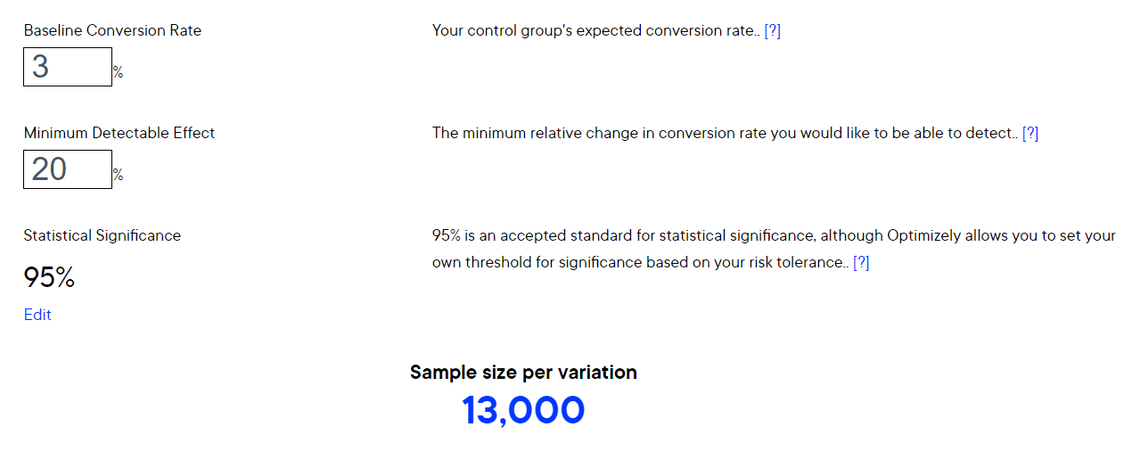
Some calculators will also help you determine the perfect timeframe for your test. Once you’ve found a calculator you like, it’s time to enter some details to get your sample size.
21. How long should an A/B test run?
Test duration depends on what you’re testing and your business timeline. A CTA button change on your website might run for a month or more, while an email subject line test typically wraps up in an hour or two once you have a clear winner to send to the rest of your list. If you’re testing email elements, reviewing your historical open and click data can help you identify when engagement drops off so you can time the winning send for maximum impact.
22. Why should CRO experiments focus on content above the fold?
Everyone who lands on your page sees above-the-fold content — engagement drops off rapidly after that, which means experiments on lower-page elements often struggle to produce statistically decisive results. Above-the-fold tests on headlines, visuals, CTAs, and descriptions tend to affect more visitors and generate clearer data faster. In Google Analytics, you can check your most common screen resolutions under Audience > Mobile > Overview to get a more accurate read on exactly where your fold falls for the majority of your visitors.
23. How do you know when an A/B test has run long enough?
Most tests need at least two to four weeks to produce reliable data, regardless of how quickly one variation appears to be winning. Early results can reflect coincidences or traffic fluctuations rather than a genuine preference, so letting the test “level out” over time matters. When evaluating results, look for statistical significance — a 0.02% difference in conversion rate is probably noise, while a 2% difference on meaningful traffic volumes is worth acting on. Sample size matters as much as duration: a result based on 50 visitors is far less trustworthy than the same result based on 5,000.
Website Engagement & Metrics
24. How do you increase time on page and reduce bounce rate?
The most reliable way to improve both metrics is to publish content that genuinely answers what visitors came looking for, then make it easy to consume — a table of contents on longer articles, clean formatting, and logical structure all reduce the friction that causes people to leave early. Beyond content quality, adding interactivity (like a calculator or embedded video) gives visitors a reason to stay and engage rather than scan and bounce. Because the two metrics are closely linked, tactics that improve one almost always improve the other.
25. Why does Google Analytics show 0 minutes for time on page on some pages?
Google calculates time on page using two clicks — the entry to a page and the exit to another page on your site. If a visitor only views one page and leaves, there’s no second click to calculate against, so the time on page reports as 0 minutes regardless of how long they actually spent reading. This means high-quality content that fully answers a search query can show artificially low time on page and a high bounce rate simply because visitors got what they needed and left — not because the content failed.
26. What actually causes a high bounce rate?
Most true bounces happen when a page doesn’t match what the visitor expected to find — whether that’s a sales pitch where they expected information, headlines that misrepresent the content, or a design that feels off enough to trigger an immediate back-button click. Visitors make that judgment within seconds of landing, so the above-the-fold experience has to immediately signal that they’re in the right place. Misalignment between search intent and page content is the most common culprit and the first thing worth auditing when bounce rate is high.
27. How do heatmaps help improve conversion rates?
Heatmaps show you where visitors actually click, how far they scroll, and where they stop engaging — which often reveals that key elements like CTA buttons are getting missed entirely because of where they’re placed on the page. If your form completion drops off partway through, a heatmap can pinpoint which field is causing abandonment, giving you a specific hypothesis to test rather than guessing at the problem. Pairing heatmap data with session recordings gives you an even clearer picture of the friction points in your conversion path.
28. How do you make a website more engaging?
The 15 core practices for a more engaging website are:
- A simple homepage layout
- Varied page layouts across sections
- Strategic use of white space
- A purposeful two-to-three color palette
- Clean, readable fonts at appropriate sizes
- Mobile-friendly design
- Pyramid-style navigation from general to specific
- Easily findable contact details
- Social media plugins
- Clear and personalized CTAs
- Live chat or chatbot support
- Scannable content with headers, short paragraphs and bullet points
- Internal links to related content
- Relevant multimedia
- Regular testing with tools like Hotjar to identify what’s working.
Pages that combine clean design with scannable content and clear next steps tend to hold visitors longer and convert more of them.
29. How much does page speed affect conversion rates?
A one-second improvement in page speed can lift conversions by 7%, and 53% of visitors will leave a page that takes three or more seconds to load. In Google Analytics, slow pages typically show up as high bounce rate, low time on page, and low conversion rate — and the Site Speed report makes it straightforward to compare individual page load times against your site average. Start with Google’s PageSpeed Insights tool for quick wins like image compression, and bring in a developer for more involved fixes like condensing HTML, JavaScript, and CSS.
30. How much of a difference can a small page speed improvement make?
Even marginal gains add up significantly at scale. Amazon and Walmart have both found that a 100-millisecond delay correlates to a 1% revenue loss — negligible for smaller sites, but millions of dollars for large ones. A more accessible example: reducing page load time from 5 seconds to 2 seconds increased conversions on President Obama’s fundraising campaign by 14%, which translated to an additional $34 million in donations. If conversions are underperforming, running a speed test with a tool like Pingdom and comparing your load time against the 10-second industry median is a practical first diagnostic step.
31. How much does mobile optimization affect website engagement?
People spend 70% of their internet time on mobile devices, and users are 52% less likely to engage with a company after encountering a poorly designed mobile website — meaning a bad mobile experience doesn’t just frustrate visitors, it actively drives them away from your brand. A responsive design that adapts to any screen size, loads quickly on mobile, and keeps CTA buttons large enough to tap is the baseline. Mobile optimization isn’t a nice-to-have; it’s a prerequisite for keeping the majority of your traffic engaged at all.
32. Does adding images and video to a website actually improve engagement?
Significantly — people process images 60,000 times faster than text and are 65% more likely to remember visual content after leaving a page. Video has an even stronger effect: users are 10 times more likely to interact with video than with text alone. The practical application is to use images and infographics to illustrate examples and data, and video for how-to content or process walkthroughs — but only when the multimedia is directly relevant to the content, not added as decoration.
Landing Page Optimization
33. How do you optimize a landing page for more conversions?
The eight core landing page optimization practices are:
- Matching the page content to the ad that sent visitors there
- Keeping branding consistent across all landing pages so returning visitors recognize your business
- Writing a clear, direct headline that immediately communicates what the page is about
- Removing clutter and keeping the page focused on a single goal
- Avoiding walls of text by using bullet points, video, and infographics
- Ensuring fast page load speed
- Demonstrating the specific value of your product or service for that audience
- Including a specific, action-oriented CTA that tells visitors exactly what happens when they click.
Pages that try to do too many things at once tend to convert worse than focused pages that guide visitors toward one clear next step.
34. Why does landing page relevance matter so much for conversions?
When someone clicks an ad about air conditioning and lands on a page about heating systems, they leave — and that click still cost you money. Visitors arrive on a landing page with a specific expectation set by the ad or link that brought them there, and any mismatch between that expectation and what they find creates immediate friction. The fix is straightforward: every ad should point to a page built around the same offer, product, or topic the ad promoted, so visitors immediately confirm they’re in the right place.
35. How much content should a landing page have?
Landing pages should include only what’s necessary to get the visitor to convert — no more. A page about air conditioning systems doesn’t need content about heating; anything off-topic is clutter that splits the visitor’s attention and dilutes the conversion goal. If the information is relevant but dense, break it into bullet points or deliver it through a short video or infographic rather than long paragraphs, since visitors who have to read extensively tend to lose interest before reaching the CTA.
36. Do videos on landing pages actually improve conversions?
Customers are 73% more likely to purchase a product or service after watching a video about it first, according to Search Engine Watch. The key is matching the video to the visitor’s stage in the funnel — broader, educational content for top-of-funnel pages like blog posts or the homepage, and more conversion-focused content for product or service pages where visitors are closer to a decision.
37. How much do videos improve landing page conversion rates?
Adding video to a landing page can increase conversion rates by up to 80%. Video works because it breaks up text, holds attention longer, and communicates product or service value faster than written copy alone — particularly for visitors who won’t read through a full page of content. For landing pages, short product demos or explainer videos tend to perform best since they give visitors the information they need to feel confident converting without requiring a heavy time commitment.
38. Where should CTA buttons be placed on a landing page?:
Every landing page needs a CTA button above the fold — visible without scrolling — and another at the bottom of longer pages so visitors can convert without scrolling back up. Beyond placement, the buttons themselves should use an accent color that makes them pop against surrounding content, be clearly boxed or circled so they read as clickable, and include directional cues like arrows pointing toward them. Avoid crowding CTAs with competing graphics or callouts that draw the eye away.
39. Do negative words in headlines improve click-through rates?
Research from Outbrain found that headlines using negative words like “never” or “worst” outperform those using positive words like “always” or “best” in terms of click-through rate. A practical application is flipping a standard listicle — “the 5 worst CRO mistakes” will often pull more clicks than “the 5 best CRO tips” covering the same ground. It’s counterintuitive, but worth testing, particularly for list-style content where the negative framing creates stronger curiosity.
40. Should you create separate landing pages for different traffic sources?
Yes — visitors arriving from social media, PPC ads, and organic search all arrive with different contexts and expectations, and a single generic landing page can’t serve all of them equally well. Creating customized landing pages for each channel lets you match the message and design to what that specific visitor already knows and wants. It takes more time and budget upfront, but the improved relevance typically produces better conversion rates across every channel.
Calls to Action (CTAs)
41. What psychology makes calls to action work?
Effective CTAs tap into four psychological principles: anticipation (building toward a payoff as the user moves through your content), expectation (visitors assume a CTA will tell them what to do next and feel satisfied when it does), reward (clicking a well-designed button delivers a small but real sense of gratification), and user focus (language that makes the visitor feel in control of their decision). Understanding these principles lets you design CTAs that feel natural rather than pushy — because they’re working with how users already think, not against it.
42. What makes a call-to-action button actually drive clicks?
The strongest CTA examples share a few consistent traits: they use clear, specific language that tells visitors exactly what will happen when they click, they stand out visually from the surrounding page through contrasting color or interactive design, and they’re placed immediately after content that creates the motivation to act. Starbucks uses tailored CTAs like “see our pumpkin drinks” instead of generic “click here” copy; Birchbox uses salmon-colored buttons against a white background so they’re impossible to miss; and Progressive uses animated buttons that catch the eye without cluttering the page. The specifics vary, but the underlying logic is the same — a CTA only works if visitors notice it and understand what they’re getting.
43. Does CTA button design actually affect conversion rates?
Yes — styled button CTAs consistently outperform plain hyperlinks because users have a deeply ingrained association between buttons and clickable actions. Once your CTAs are formatted as buttons, there’s additional room to test color, font, and size combinations, all of which can influence click-through behavior. Color psychology plays a role here, but the right combination varies by audience and page context, which is why testing specific variations against each other matters more than defaulting to any single “best” color.
44. Why do button-style CTAs outperform plain text links?
Buttons trigger a reward response in the brain — people have a deeply ingrained association between pressing a button and getting something they want, which makes them more likely to click. To make that reward feel worthwhile, use action-oriented language like “get,” “start,” or “discover” that creates a sense of excitement, make the button visually prominent and distinct from the surrounding page, and add click feedback so the button visibly responds when pressed. Offering something concrete on the other side — a free trial, a PDF download, a demo — reinforces that the reward is real.
45. What color should a CTA button be?
There’s no single universally correct answer — red, green, and orange are all cited as high-performing options, but case studies show the results vary by site. What consistently matters more than the specific color is contrast: a CTA button needs to stand out clearly from the background and surrounding content, whatever color achieves that. Always A/B test button colors on your own site before committing, since what works on a competitor’s page may underperform on yours depending on your color scheme and audience.
46. What should I say instead of “click here” in a call to action?
“Click here” is generic and tells visitors nothing about what they’re getting or why they should act. More effective alternatives tie the CTA to a specific outcome or incentive — phrases like “try it for free,” “get my free demo,” “save 30% today,” or “learn more” all give readers a reason to click that “click here” never does. The right CTA depends on where the visitor is in the buying journey: early-stage visitors respond to learning-oriented CTAs, while bottom-of-funnel visitors respond better to urgency or discount-driven ones.
47. Why does “try it for free” work better than other CTA phrases?
The word “try” lowers the perceived commitment, which makes visitors more willing to hand over their email address in exchange for a free consultation, ebook, or trial. To make it work, be upfront about the conditions — specify any time limits, what’s included, and relevant cancellation terms — and use the signup as an opportunity to opt visitors into email marketing so you can continue nurturing them even if they don’t convert immediately.
48. Do urgency-based CTAs actually work?
Yes, but they work because of a real psychological trigger: people act to avoid missing out, not just because a button says “limited.” Phrases like “only X left” or “offer ends today” are most effective when the scarcity or deadline is genuine — Apple’s iPhone preorder strategy works because the limited availability is real, which makes the urgency credible. Manufactured urgency with no actual constraint behind it tends to erode trust over time.
49. Should CTA copy use first-person or second-person language?
Use second person (“you”) in your page copy to create a conversational tone, then switch to first person (“my,” “me”) on the CTA itself. Body copy that addresses the reader directly builds rapport and approachability, but CTA language that says “start my free trial” instead of “start your free trial” hands control back to the user — and people are more likely to click when the action feels like their own decision rather than a directive. The shift is subtle, but it creates a meaningful difference in how ownership of the action is perceived.
50. What are the different types of calls to action you can use on a website?
The 11 main CTA types are:
- Lead generation
- Read more
- Social sharing and follow buttons
- Contact information
- Lead nurturing
- Product and service recommendations
- Related content
- Promotions
- Signup or registration
- Surveys
- Downloadable content
Each type serves a different goal and belongs in a different place — lead generation CTAs work best at the bottom of blog posts, contact CTAs belong in headers and footers on every page, and promotion CTAs perform well both on-site and in email. Matching the CTA type to where the visitor is in their journey is what makes the difference between a CTA that converts and one that gets ignored.
51. Can you use two different CTA buttons on the same page?
Yes, and color differentiation is the cleanest way to make it work. Spotify uses two distinct button colors on the same page to help users instantly distinguish between two separate actions — learning more about a plan versus starting a free trial. Without visual differentiation, two CTAs competing for attention can confuse visitors rather than guide them. If your page requires two CTAs, make sure each has a distinct color and that the hierarchy is clear: the primary action should be the more prominent of the two.
52. What is a lead nurturing CTA and where should it be used?
A lead nurturing CTA is designed to re-engage someone after you’ve already captured their information, keeping them moving toward a purchase decision. The most common placement is inside email campaigns — once someone has opted in, these CTAs give them a clear next step and maintain the relationship between initial contact and eventual conversion. Without them, leads that showed early interest tend to go cold before they’re ready to buy.
53. How do downloadable content CTAs work as a lead generation tool?
Downloadable content CTAs offer something of value — a guide, white paper, survey results, or research report — in exchange for contact information, making them one of the more effective lead magnets available. The trade feels fair to the visitor because they’re getting something useful, and it simultaneously demonstrates your expertise and qualifies the lead based on the topic they chose to download. Gating content this way gives you a natural, low-friction entry point into the sales funnel.
54. What’s the difference between a TOFU and BOFU call-to-action?
TOFU (top-of-funnel) CTAs invite visitors to engage without requiring a purchase commitment — things like downloading a free guide, signing up for a newsletter, or requesting more information. BOFU (bottom-of-funnel) CTAs target visitors who are ready to buy, using language like “buy now” or “submit my payment.” Matching the CTA type to where the visitor actually is in their decision process matters: presenting a BOFU CTA to someone still in research mode tends to create friction, while a TOFU CTA on a product page leaves ready-to-buy visitors without a path to convert.
Checkout, Lead Gen, & Trust
55. How many fields should a lead generation form have?
If your form has more than four fields, it’s worth testing a shorter version. The right question to ask is: what’s the minimum information you need to qualify a lead? One quick win is combining separate first and last name fields into a single full-name field — this reduces visual length, especially on mobile where stacked fields make forms look longer than they are.
56. How do you create landing pages that generate leads?:
The five strategies that turn landing pages into lead generators are:
- Providing in-depth, specific information about your product or service so visitors have what they need to decide
- Offering free gated content like guides or downloads in exchange for contact information
- Including a newsletter signup form to build a nurture list
- Sharing free tips that demonstrate your expertise before asking for anything in return
- Making your contact information visible so visitors who are ready to reach out don’t have to search for it.
Pages that combine several of these — a detailed explanation, a content offer, and clear contact info — give visitors multiple low-friction ways to convert at whatever stage of readiness they arrive.
57. What is gated content and why does it work for lead generation?
Gated content is anything valuable — a downloadable guide, a detailed explainer, a template — placed behind a form that requires visitors to submit their name and email address before accessing it. It works because the exchange feels fair: the visitor gets something useful for free, and you get a qualified lead you can nurture through drip email campaigns. A visitor willing to hand over their contact information has already signaled genuine interest, which makes them significantly more valuable than an anonymous page view.
58. Should your landing page show your contact information?
Yes — and it requires almost no effort for a meaningful return. Displaying your company name, phone number, address, and a general or dedicated sales email gives ready-to-buy visitors a direct path to reach you without navigating away. It also helps passively: if someone searches for your company’s phone number directly in Google rather than visiting your site, having that information on your landing pages helps Google surface the correct details. Contact information is one of the simplest lead generation elements to add and one of the most commonly overlooked.
59. What are customer pain points and why do they matter for marketing?
A customer pain point is anything that causes discomfort or annoyance that your business has the ability to solve. They range from large, vocal complaints to dormant frustrations customers haven’t bothered to mention — but both types are worth finding, because addressing them builds brand loyalty and can bring in new customers who share the same frustration. Qdoba’s “extras aren’t extra” campaign is a clean example: by eliminating the near-universal irritation of paying extra for guacamole, they turned a common complaint into a marketing hook that drove new visits.
60. How do you find out what your customers’ pain points are?
The most reliable method is simply asking — through email surveys, online questionnaires, or informal phone calls. Social media monitoring for non-branded mentions can also surface complaints customers aren’t directing at you directly. When analyzing responses, look for consensus: if 30–40% of customers flag the same issue, that’s a strong signal you’ve found a real pain point worth addressing. Avoid yes/no questions — open-ended prompts like “what’s one small thing we could do that would have a big impact?” tend to surface more honest and useful answers.
61. How do you get customers to actually respond to a survey?
Transparency helps — telling customers directly that you’re running the survey because you want to improve tends to increase participation. Offering a small incentive like a discount code or prize entry also works, as does keeping the survey short and stating the length upfront so respondents know what they’re committing to. If you use a pop-up to surface the survey, time it so it only appears for return visitors who’ve spent meaningful time on the site rather than interrupting first-time visitors immediately on arrival.
62. How do you optimize an ecommerce checkout process?
Checkout optimization focuses on removing friction at every step so shoppers can complete their purchase without second-guessing or getting stuck. The highest-impact changes include offering guest checkout, limiting form fields to only essential information, showing checkout progress, asking for payment details last, and reinforcing trust with security badges and social proof. Supporting tactics like mobile-friendly design, live chat, autocomplete, and cross-selling round out the experience and can increase both conversion rate and average order value.
63. Should you require shoppers to create an account before checkout?
No — requiring account creation before purchase is one of the top three reasons U.S. online shoppers abandon their carts. Offering a guest checkout option removes that friction for first-time or one-time buyers. A better approach is to prompt account creation after the purchase is complete, on the thank-you page, when the customer is already in a positive mindset and has less reason to drop off.
64. Why should you collect a shopper’s email address early in checkout?
Capturing the email address early gives you a recovery path if the shopper abandons their cart before completing the purchase — you can follow up with a drip sequence that includes the items left behind, a link back to checkout, and potentially a discount to close the deal. About 54% of shoppers would consider completing an abandoned purchase if offered a discount. Beyond recovery, the email also opens the door for future marketing around related products and promotions.
65. Why do shoppers abandon their carts and how do you fix it?
The six most common reasons shoppers abandon carts are:
- Getting distracted and forgetting to return
- A checkout process that’s too long or complicated
- Being required to create an account before purchasing
- Not trusting the site with their payment information
- Encountering unexpected fees or high shipping costs at the end of checkout
- Not finding their preferred payment method available.
Each has a corresponding fix — recovery emails for distraction, guest checkout for account friction, security logos for trust gaps, upfront cost transparency for hidden fees, and multiple payment options to reduce last-minute dropoff. Checkout process length is worth addressing first since it affects every visitor regardless of the other factors.
66. Do unexpected shipping costs cause cart abandonment?
Yes — discovering that a $19.99 item actually costs $27 after shipping is one of the most reliable ways to lose a sale that was already won. Shoppers feel misled when the price changes between the product page and checkout, even if the fees are technically disclosed. The fix is twofold: display estimated shipping costs or a shipping calculator early in the process so the total isn’t a surprise, and consider a free shipping threshold — Amazon’s free shipping on orders over $25 is a widely cited example — that turns shipping cost from a deterrent into a purchase incentive.
67. How do you build enough trust for shoppers to enter their payment information?
Shoppers on unfamiliar sites are understandably cautious about entering credit card details, and without visible reassurance, many will simply close the tab rather than take the risk. Displaying recognizable security software logos — or at minimum a clear “secure checkout” label — at the point where payment information is requested gives visitors the signal they need to proceed. For smaller or newer ecommerce sites, this step matters more than it does for well-known retailers, since shoppers can’t rely on brand familiarity to fill the trust gap.
68. Do abandoned cart emails actually recover lost sales?
Around 70% of shopping carts are abandoned before purchase, which represents a significant pool of recoverable revenue. Abandoned cart emails work because they reach people who already showed intent to buy — a gentle reminder is often all it takes to push them to complete the purchase. Even recovering a small percentage of those lost carts can have a meaningful impact on overall conversion rates.
69. How effective is email marketing for driving online sales?
Email marketing generates 50% more sales than other lead generation methods, making it one of the higher-return channels available to ecommerce businesses. Beyond promotional sends, automating sequences — like abandoned cart reminders, post-purchase follow-ups, and periodic coupons for subscribers — keeps your brand in front of customers at the moments they’re most likely to buy without requiring ongoing manual effort.
70. What are the most effective ways to increase online sales?
The highest-impact tactics for increasing online sales fall into three buckets: reducing friction (simplified checkout, multiple payment options, fast page speed, easy returns), building confidence (customer reviews, high-quality product photos, clear benefit language), and re-engaging lost opportunities (abandoned cart emails, email marketing campaigns, retargeting through PPC). Supporting tactics like chatbots, reward programs, social media promotion, and responsive design round out the strategy. The biggest gains usually come from fixing the friction points that are actively stopping ready-to-buy visitors from completing their purchase.
71. Can offering too many product choices hurt sales?
Yes — too many options can trigger decision paralysis, where customers become overwhelmed and opt out of purchasing altogether rather than risk making the wrong choice. Limiting the number of visible options and grouping similar products by shared traits makes it easier for customers to browse, compare, and commit. Counterintuitively, a smaller, better-curated selection often converts better than an exhaustive inventory presented all at once.
72. Does adding social proof actually improve conversion rates?
Social proof helps visitors feel comfortable buying from a business they haven’t purchased from before, which makes it one of the more reliable CRO levers to test. The types worth testing include customer testimonials, star ratings, case studies, trust badges, awards, and real-time purchase pop-ups. Adding these to key landing pages — particularly near CTAs or checkout — gives you a clear before-and-after to measure against.
73. How much does social proof affect conversions?
After reading reviews, 90% of buyers are more likely to convert, making social proof one of the most reliable levers for improving conversion rates. The most effective approach is to embed reviews directly on relevant product or landing pages — not just a dedicated testimonials page — so visitors encounter them at the moment they’re weighing a decision. Prompting customers to leave reviews post-purchase is the simplest way to keep that proof fresh and growing.
74. What is an A/B testing timeframe?
A/B testing timeframe is the amount of time your test will run. Like your sample size, the timeframe can also vary depending on the element you want to test.
For example, you might test a new color for your CTA button for a month or longer. On the other hand, you would likely only run your subject line test for an hour or two before sending the winning one out to the rest of your subscribers.
-
 The WebFX team includes 750+ digital marketing specialists across SEO and AI search, PPC, web design, analytics, and beyond. Using proprietary RevenueCloudFX technology and transparent, data-driven strategies, we’ve collectively generated $10 billion in revenue and 24 million leads for our clients in the past five years.@webfx
 -

WebFX is a full-service digital marketing agency delivering revenue-driving strategies across online advertising, SEO and AI search optimization, and digital marketing. Backed by 1,100+ client reviews, a 4.9-star rating on Clutch, and proprietary revenue-tracking technology, our team helps businesses grow visibility and revenue across platforms, from Google to ChatGPT to LinkedIn. Discover how our expert team and revenue-accelerating tech can drive results for you. Learn more

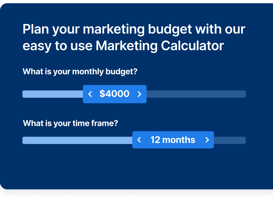
Try our free Marketing Calculator
Craft a tailored online marketing strategy! Utilize our free Internet marketing calculator for a custom plan based on your location, reach, timeframe, and budget.
Share this article

Proven Marketing Strategies
Try our free Marketing Calculator
Craft a tailored online marketing strategy! Utilize our free Internet marketing calculator for a custom plan based on your location, reach, timeframe, and budget.