 In this tutorial, you’ll learn how to create a textured “worn paper” web design theme using some basic Photoshop techniques. The design incorporates some free stock images to let you create a beautiful layout in a jiffy.
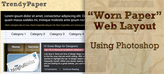
Final Result
Click on the image to view the full-scale final result. 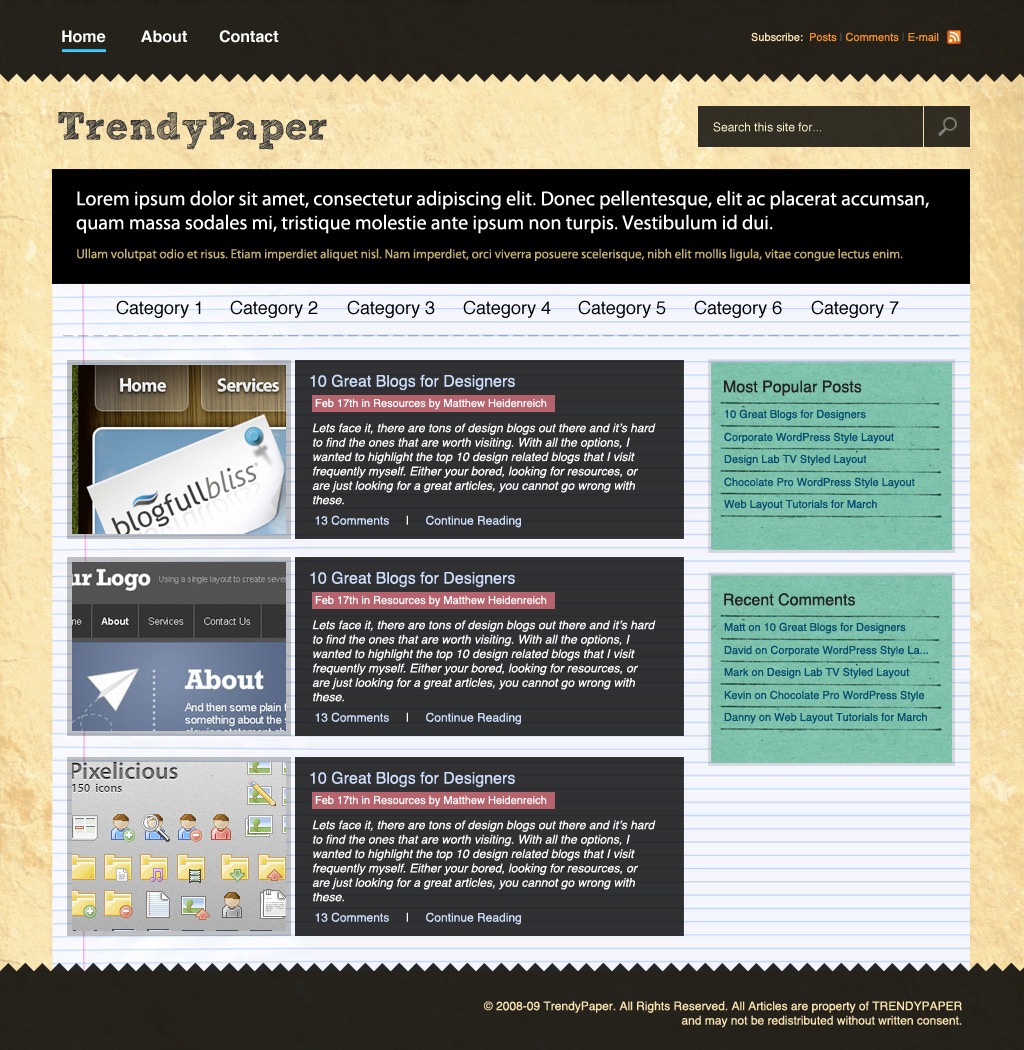
Downloads
You can download the associated source files of this tutorial below.
- worn_paper_web_layout.zip (ZIP, 6.38 MB)
Setting up the Photoshop document
1 The first thing we want to do is create a new document with the dimensions of 1024px x 1050px. 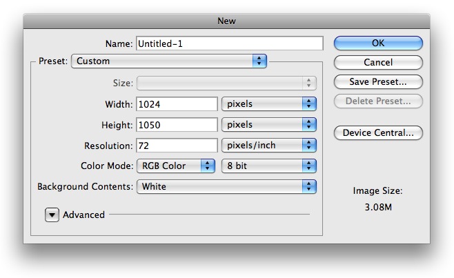
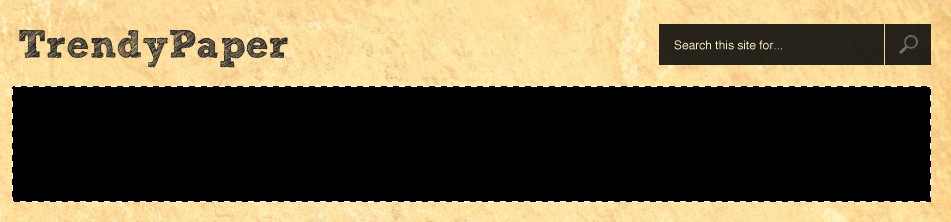
Setting up the background
2 Next, choose your Paint Bucket Tool (G) from your Tools pallete and fill the Background layer with #F9E9BB. 3 Now we want to add a stock photo to our background. I found a great wrinkled paper image over at deviantArt called paper texture by akinna-stock. I resized it for this tutorial to the appropriate size, and you can get it in the source files where it is named worn_paper.jpg. Once you have it opened in Photoshop, move it onto your document and lower the opacity of the layer to 50%. It will look something like the following: 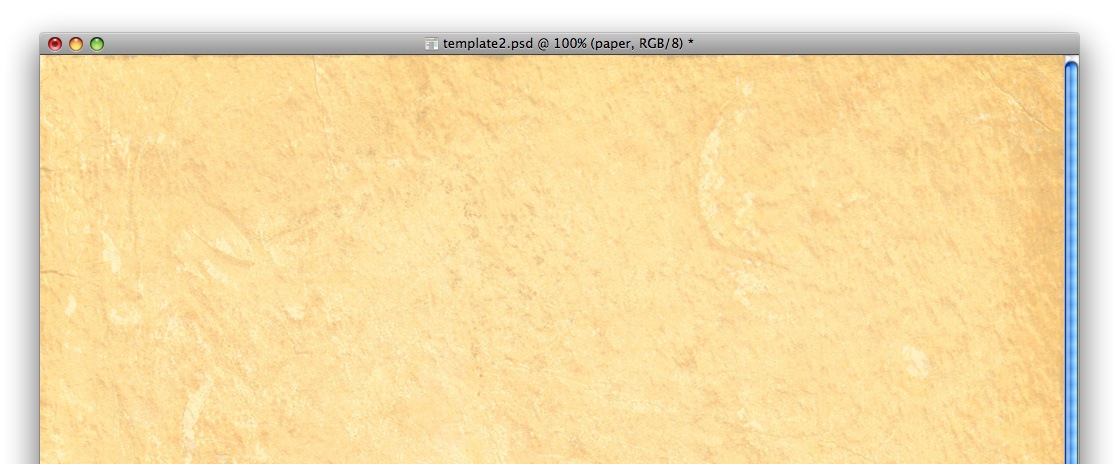
Creating the main navigation
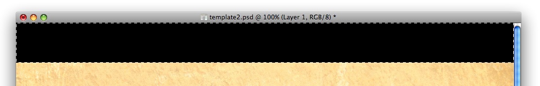
4 Next, we’ll work on our navigation. Using your Rectangular Marquee Tool (M) make a selection similar to the following figure and fill it with #000000.
 5 Now, this part is a bit tricky. Using your Polygonal Lasso Tool (L), make a ridged selection similar to the following across the bottom of your whole navigation. Then choose Edit > Clear to delete the selection, and you’ll have something that looks like this:
 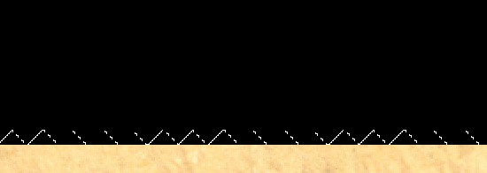 6 Lower the opacity of that layer to 85% so the background will fade through a bit.
 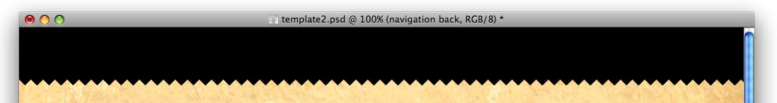 7 Using the Horizontal Text Tool (T), add a few main links in the left section of your navigation. Use the font color #FFFFFF and use a simple font similar to Helvetica.
 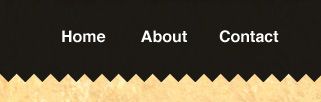 8 Let’s work on displaying the active/mouseover link. Using your Rectangular Marquee Tool (M), make a selection similar to the following and fill it with #FFFFFF on its own layer.
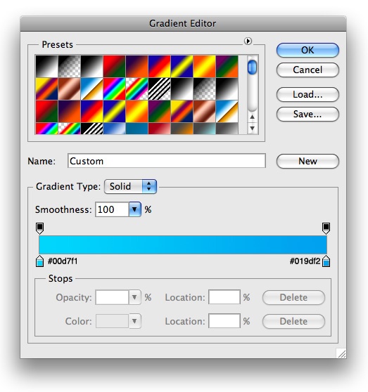
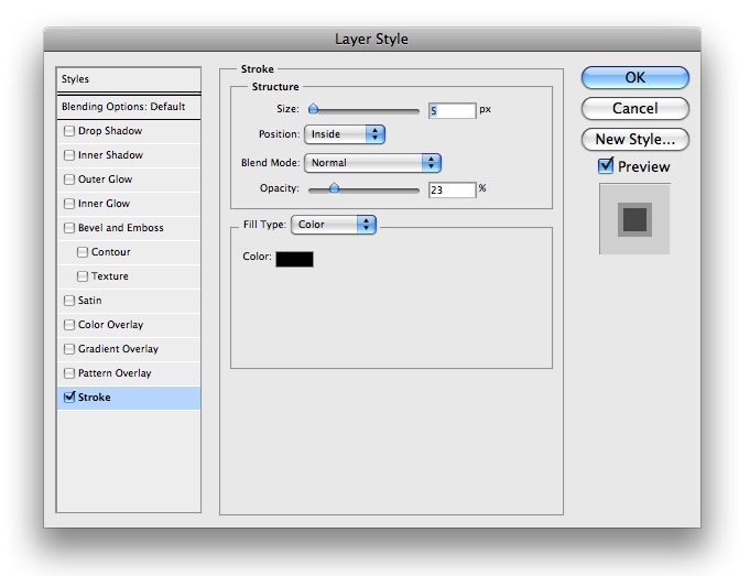
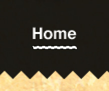 9 On your newly created layer, insert a couple Blending Options. To do so, right-click on the layer and choose Blending Options… from the pop-up menu and use the following Blending Options:
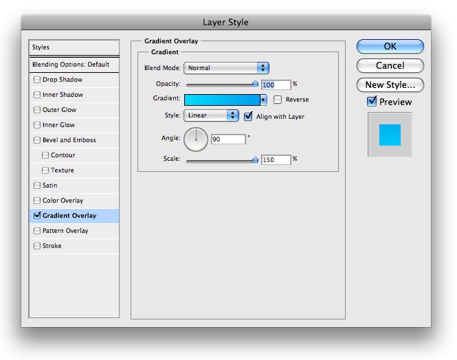
 10 You will have something that looks like this:
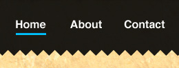
Designing the RSS feed link
11 On the right side of our navigation, we will have a few links for our RSS feed. 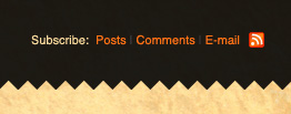 12 Here are the colors for the links: “Subscribe” is #FAE4B3; “Post”, “Comments”, and, “Email” is #F48F32. 13 Download an RSS icon from Feed Icons.
14 This is what your navigation will look like when it’s done: 
The Logo
15 For our logo, I used a great ‘Sketch’ style font. I used the font named Sketch Block with the color set to #323232 and this is what I came up with: 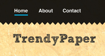
Creating the search box
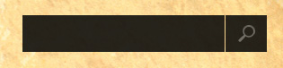
16 Now it’s time to move onto our search box. We will be keeping it simple so it won’t take many steps to complete. Using your Rectangular Marquee Tool (M), make a selection similar to the following and fill it with #000000. 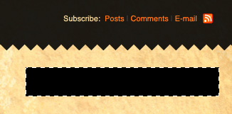 17 Lower the opacity of that layer to 80%, and then make a selection similar to the following (1px wide) to divide the search field from the submit button. Once you have it selected, choose Edit > Clear to delete the selected area.
 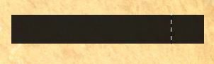 18 For the search icon, all we will use is the default magnifying glass from the Photoshop Custom Shape Tool. Make sure your foreground is set to #FFFFFF and then place it similarly to the following figure. I also lowered the opacity of my layer to 40%.
 19 Add some text inside the search box to let people know where the search field is. I used the color #FAF3CF for this.
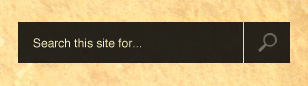
Making the “Intro” box
20 Let’s make our “Intro” box. This can be a place for you to put a little description about your site. So again, let’s pull out the Rectangular Marquee Tool (M) and make a selection similar to the figure below. Fill the selection with #000000.
 21 Lower the opacity of your layer somewhere around 80%. Then using a font with white color (#FFFFFF), put a descriptive sentence about your site.
 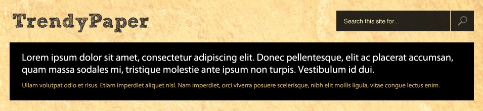 22For the second group of text, use the color #C5AF6F. I just filled it in with some filler text to give you an idea of what it would look like. The font used in this box is Myriad Pro if you were wondering.
The content area
23 The next thing we want to do is work on our content area. For the background of our content area, we will be using a lined paper texture from deviantART, it’s called Textures: Paper by Dioma.
You can find a modified version in the source files named lined-paper.jpg – open it up in Photoshop and place it under your intro box similar to the following figure: 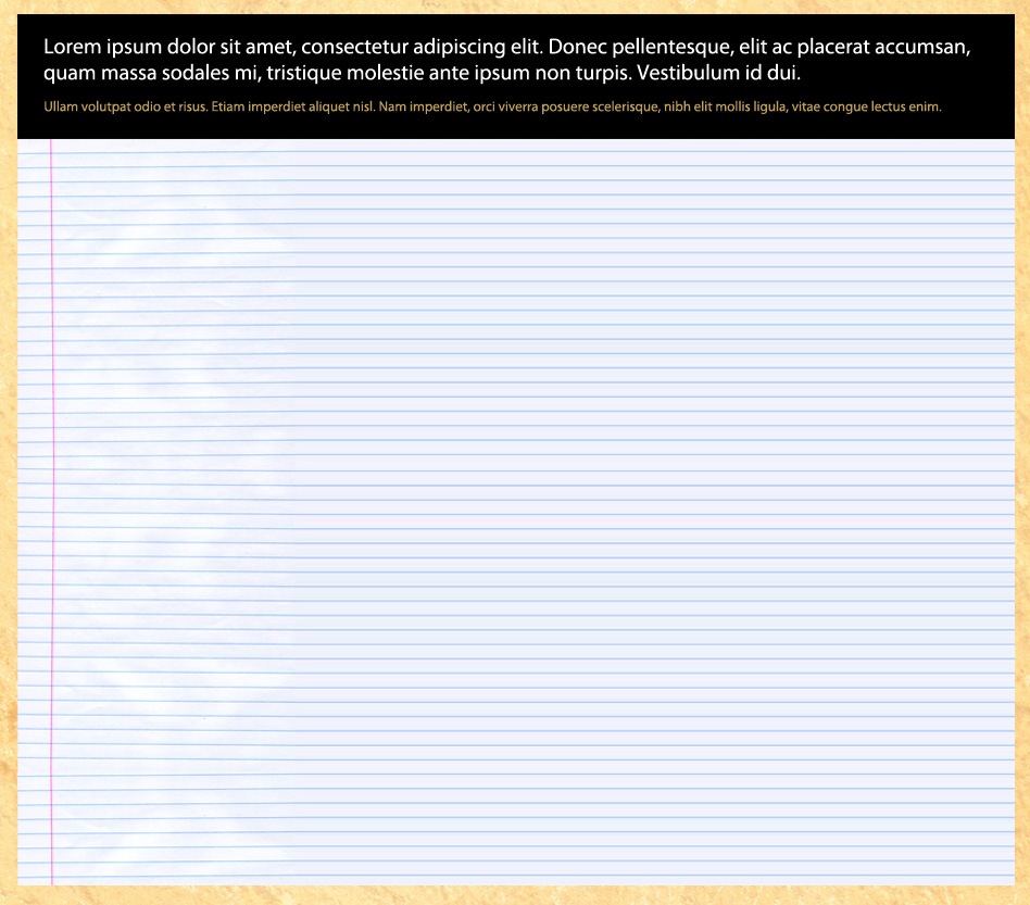 24 Next, we’ll add a place for our category links. Use a font family like Helvetica and set the color to black (#000000). Add some links in a similar way to the following figure:
 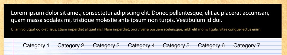 25 Using your Horizontal Text Tool (T), make a new layer and fill the text _ _ _ _ _ _. This is a nifty trick for quickly adding the dividers under the category links. Lower the opacity of your layer to 30% and you will have something that looks like this:
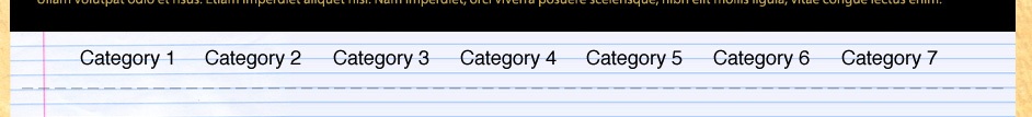
Designing the post teasers
26 Now it is time to work on how our posts are displayed. For my thumbnail, I used an image that is 224px x 79px in dimension and added the following Blending Options to its layer.
 27 Your document will look something like the following figure (I just used a random thumbnail image which you can see on the left):
 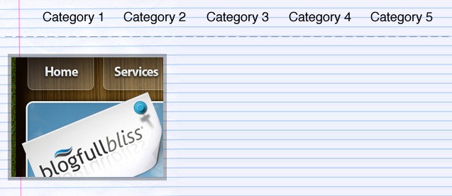 28 Next, make a selection with our Rectangular Marquee Tool (M) similar to the following figure, and fill it with #000000.
 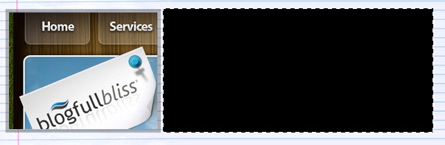 29 Once you have filled your layer, lower the opacity to 80%. Arrange your title, date, and other information in a similar fashion to the following figure. For links, I used the color #CCDDFB, and all other text is #FFFFFF. The background behind the date is #B6636D. Your final post teaser will look like this:
 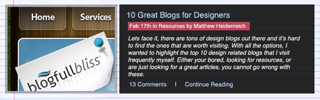 30 Repeats steps 24 through 27 for other post teasers.
Creating the sidebar
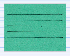
31 Now it is time to move onto our sidebar. We will be using a paper texture out of the same pack as our lined paper texture. I have made a modified version of it that you can find in the source files named green_paper.jpg. Open that up in Photoshop and drag it onto your document. Place it in a similar location to the following figure: 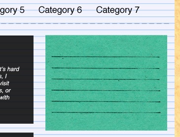 32 Insert the following Blending Options onto the green_paper.jpg layer:
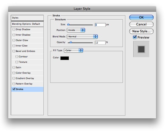
 33 Next, add some text to represent a title, and the links for your “Most Popular Posts” section. For the heading, I used the color #232323, and for the links I used #064E6F.
I came up with something that looks like this: 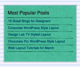 34 Do the same for the Recent Comments box and your sidebar should look something like this:
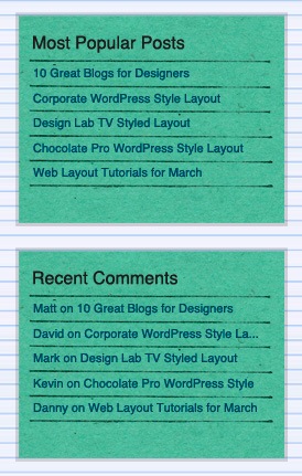
Creating the footer
35 The last thing we’ll do is creating the footer. Go back to the navigation at the top of the site and find the layer that you made the cut edges on. Once you have found it and activated it, go to Layer > Duplicate Layer to make a copy of that layer. 36 Then choose Edit > Transform > Flip Vertical and place it at the bottom of your document similarly to the following: 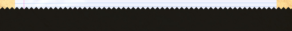 37 Finally, add some copyright text at the bottom with the color #F7E1B0.
Congratulations, you’re done!
If you followed along with this tutorial, you have something the looks like this:
Comments and thoughts?
What did you think about this tutorial? Did you find any place that was confusing?
Did you find a mistake? Please don’t hesitate to ask questions, and we’ll help you figure out your issues.
Related content
- How to Create a Sleek and Textured Web Layout in Photoshop
- How to Create a Slick and Clean Button in Photoshop
- Related categories: Photoshop Tutorials and Tutorials
-
 President of WebFX. Bill has over 25 years of experience in the Internet marketing industry specializing in SEO, UX, information architecture, marketing automation and more. William’s background in scientific computing and education from Shippensburg and MIT provided the foundation for RevenueCloudFX and other key research and development projects at WebFX.
 -

WebFX is a full-service marketing agency with 1,100+ client reviews and a 4.9-star rating on Clutch! Find out how our expert team and revenue-accelerating tech can drive results for you! Learn more
Make estimating web design costs easy
Website design costs can be tricky to nail down. Get an instant estimate for a custom web design with our free website design cost calculator!
Try Our Free Web Design Cost Calculator
Share this article


Web Design Calculator
Use our free tool to get a free, instant quote in under 60 seconds.
View Web Design Calculator
Make estimating web design costs easy
Website design costs can be tricky to nail down. Get an instant estimate for a custom web design with our free website design cost calculator!
Try Our Free Web Design Cost Calculator