Working for Other Creatives
UK-based designer and blogger Chris Spooner was commissioned to design the logo of MediaLoot, a website that provides premium graphic design resources. “In my first concept I aimed to keep the logo simple with basic shapes and sketchy lines, the idea being that designers are adding creativity to the treasure chest,” Spooner says of his initial concept. 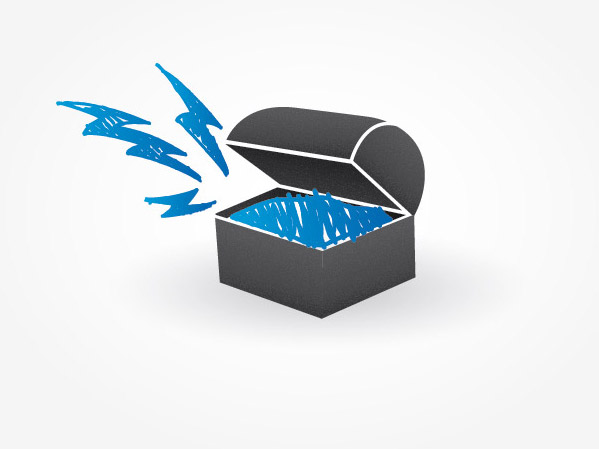 Initial concept for MediaLoot Though his concept was well-liked, he had to tweak the look and feel to match the vibe his clients were going for.
“The clients Jon [Phillips] and Mason [Hipp] loved the idea of the chest with elements flying out of it, but wanted the illustration to have more of a ‘cartoony’ look,” he says. “Plus, as awesome as lightning bolts are, elements relating more specifically to MediaLoot were also desired.”  Final design for MediaLoot Working with people who are familiar with design — or who are designers themselves — is great, and Spooner’s experience with client feedback was a situation to be desired. “With Jon and Mason being freelancers themselves, they were able to provide great critique on the design without giving blatant negative comments or telling me how it should be done,” praises Spooner.
“We’ve all been there with clients that tear a design apart!”
Small Tweaks Make a “Phenomenal” Impact
Grace Smith — owner of a design agency headquartered in Northern Ireland called Postscript5 — points out the importance of color usage and cohesive blending in web designs. A tweak in the way color is used can convert concerned clients to blissful clients. “On a custom WordPress theme I designed recently, the client had serious reservations about the red banner which overlaid the header image.
In their own words they felt ‘there was too much red,” Smith shares. “Along with this they didn’t like ‘the melting between the main image and the red box.’” 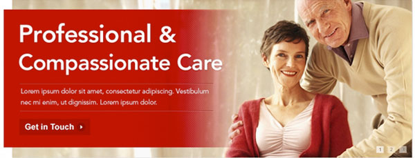 The first version had too much red Smith, unperturbed by the initial anxiety towards her design, sought to perfect it. “It was crucial to get it right.
Looking subjectively at the design as a whole, I completely agreed with the client’s concerns.” “I redesigned this area so as to put the image in the spotlight, removed the block of red and created a design that blended both the image and text together so as to give a more cohesive feel,” she says.  Reduction of color and removing the red linear color gradient was preferred by the clients In the end, Smith was able to satisfy her clients by listening to their concerns and responding to them accordingly. “The issue was quickly resolved and the client called the overall final design ‘phenomenal’,” she concludes.
Working with Multiple Decision Makers Can Be Tough
Brooklyn-based graphic designer Eric Vasquez recited his experience in producing a logo for a local band. To get a concept of where to take the design, he exchanged ideas with his clients. “I went and met up with all of the guys and we had a really good brainstorming session, talking about some ideas that they had, and what they wanted to communicate through their logo.
I found this to be very helpful and I began sketching away immediately,” says the inspired artist. “Some of the things that were discussed early on included giving the logo an organic feel, and that they wanted to play up the pi symbol that would be represented by the double ‘T’ in the name ‘Vinyette’.” 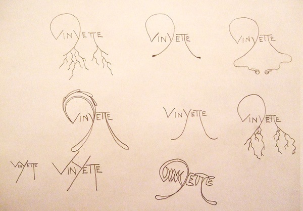 Initial sketches Vasquez underscored some downsides to working in a project with multiple decision-makers. “I showed my initial sketches to the guys and they seemed very pleased with what I had done so far,” he says.
“At the same time, there are about five or six members in the band, so while some of them thought it was good, some of the other guys wanted to see some more options. We had gone back and forth several times, and I think I ended up doing about eight pages of sketches with a whole variety of options before coming to the sketches.” “From here, I began working in Illustrator to further develop the concept, keeping in mind I wanted the mark to feel organic, be unique, and to show the connection of the double Ts as we had discussed,” recounts Vasquez. “At the time I was thinking that I was very close to a final solution for the band logo.” ![]() Digital concepts of the logo created in Adobe Illustrator He worked on several variations of the initial concept, and sent it to his clients.
Digital concepts of the logo created in Adobe Illustrator He worked on several variations of the initial concept, and sent it to his clients.
“They had gotten back to me and said that they liked it, but it wasn’t really what they were looking for,” Vasquez shares in dismay. Dedicated to creating the perfect logo for his clients, he scheduled another meeting with them to talk about other ideas that the group might like. From there, he worked on revising his concept some more.
“Finally, after about two months, I was able to create a custom font for the guys that looked edgy, organic, and unique, and all of the guys were very excited about it,” Vasquez says of the long but rewarding experience. “Since then, I have gotten more work from them and gone to a few of their shows to watch them perform.” ![]() Final version of the logo
Final version of the logo
Starting Anew
There are those rare occasions when we have to start over completely from scratch. It happens to the best of us — even Jan Cavan, a graphic and web designer who’s been awarded recognition for her work through industry-leading magazines such as Web Designer and .NET, as well as becoming an invited speaker at one of the most prestigious web design conferences, Future of Web Design.
“Here is a design for a site for models which was never approved. Our Creative Director liked it, but the company owner, our client, didn’t,” grumbles Cavan. 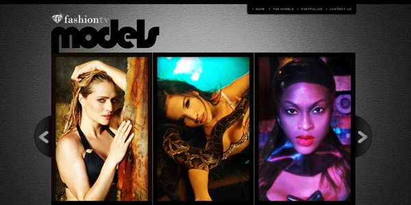 A rejected web design concept What did she have to do to resolve her client’s concerns?
“We had to redo the entire design to fit the owner’s specs,” she says.
Better Safe Than Sorry
Sometimes our creativity and out-of-the-box thinking may be too much for our more cautious clients. Simona Pfreundner, a multi-talented illustrator, graphic designer, and web designer reminisced over an occasion when her clever idea was jettisoned by a client.
“I once had to design a full page ad for promoting a high-end audio receiver,” Pfreundner describes. “I had this idea to pair the receiver with a tomato and ask the question ‘What has a tomato to do with it?’” 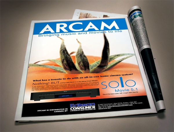 Initial concept of the full page ad “The concept and idea was very well received by one of the clients, but the other guy rejected it purely out of fear that it could stand out too much”, she says, disheartened. “I tried to convince him as best as I could, but in the end he pushed for his idea.” So who had the final say?
“He had the last say,” concedes Pfreundner. “We went with his idea and image.” 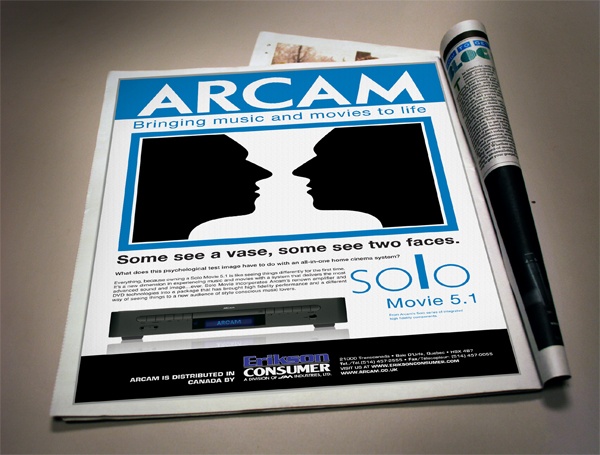 The final full page ad that the client preferred “I believe that most clients lack the inclination for risk taking, unless you are very convincing,” she adds. “I guess in this case I wasn’t.”
-
 Trevin serves as the VP of Marketing at WebFX. He has worked on over 450 marketing campaigns and has been building websites for over 25 years. His work has been featured by Search Engine Land, USA Today, Fast Company and Inc.
 -

WebFX is a full-service marketing agency with 1,100+ client reviews and a 4.9-star rating on Clutch! Find out how our expert team and revenue-accelerating tech can drive results for you! Learn more
Make estimating web design costs easy
Website design costs can be tricky to nail down. Get an instant estimate for a custom web design with our free website design cost calculator!
Try Our Free Web Design Cost Calculator
Share this article


Web Design Calculator
Use our free tool to get a free, instant quote in under 60 seconds.
View Web Design Calculator
Make estimating web design costs easy
Website design costs can be tricky to nail down. Get an instant estimate for a custom web design with our free website design cost calculator!
Try Our Free Web Design Cost Calculator