President of WebFX. Bill has over 25 years of experience in the Internet marketing industry specializing in SEO, UX, information architecture, marketing automation and more. William’s background in scientific computing and education from Shippensburg and MIT provided the foundation for MarketingCloudFX and other key research and development projects at WebFX.
In this tutorial, you will learn how to create a semi-transparent UI button that works really well on photographic background images. View DemoDownload SourceGitHub Repo
Why Semi-Transparent Buttons?
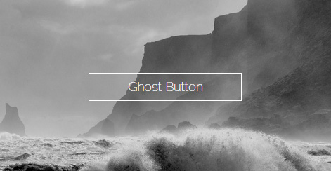
Photo backgrounds are a hot web design trend right now. Alongside this web design trend are ghost buttons, which look like this: Because their background is fully transparent, ghost buttons don’t distract our eyes from the photographic background as much as traditional web buttons that have a solid-colored background.
An issue with ghost buttons is they’re too subtle, especially because they’re competing against a photographic background. Site visitors might not perceive ghost buttons as being important because of their low visual weight. Also, ghost buttons look like highlighted text.
In other words, they might not portray the appearance of being clickable. These are major usability problems. On the other hand, a ghost button looks great on top of photographic backgrounds because of its background transparency.
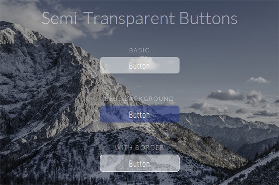
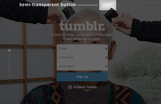
How can we preserve this aspect of the ghost button, while still making sure the button has strong affordance? I came across a good solution on the Tumblr front page. Tumblr has this semi-transparent log-in button set on top of a photographic background: It was an elegant middle-ground between a ghost button and a traditional solid-colored web button.
The semi-transparent background of the button allows some of the photo behind it to come through, which results in an appealing visual effect, similar to ghost buttons. The classic button shape gives the semi-transparent button a strong and familiar visual signal that it’s clickable. Semi-transparent buttons are easy to create.
All we need is a bit of HTML and CSS.
HTML
The markup for this only requires a single HTML element. In this case, an <a> element is used.
You can substitute in another HTML element such as a <button> or an <input>.
CSS
The CSS property that’s responsible for the semi-transparent visual effect is the background property. The background property is assigned an RGBA color value so that we can control its opacity.
The color of the background is white with 50% opacity.
Rounded corners are achieved with the border-radius property
text-align is used to center the button’s label (which is a common trait of UI buttons)
max-width is set to 200px so the button doesn’t become too wide on larger screens
A simple animation effect is triggered when the user interacts with the button by way of the transition property
Additionally, a fallback solid background color using hex color notation is declared for browsers that can’t render rgba() color values (e.g. Internet Explorer 8 and below). To improve the button’s affordance, we need to set an indicative style rule for the :hover, :focus and :active pseudo-classes.
When the user hovers over or activates the button, we transition to a solid-colored background in order to suggest that the button can be interfaced with.
One technique for increasing the semi-transparent button’s visual weight is to utilize a more vibrant background color. Opaque-white is a very neutral color, so in the demo, you can also find a semi-transparent blue button to use as an alternative. The code for a semi-transparent blue background is:
background: rgba(30, 52, 142, 0.5);
Another technique for increasing the visibility of semi-transparent buttons is to give them a solid-colored border.
This can be done quite simply by giving the button a border property.