

Google recently made a big announcement: They’re switching to a “mobile-first” index. This move is very important for a number of reasons, but primarily because it reiterates Google’s push towards mobile as the new standard going forward. Let’s take a look at how this change might affect your web presence, and what you should focus on to keep up with Google.
What exactly is happening?
For some quick background information, Google’s “index” is simply their catalogue of web pages.
If your website is indexed by Google, your content can appear in search results for their users. If it’s not indexed by Google, your content will never appear in the results of a Google search, and you won’t be able to reach users looking for information about your business. Up until this point, Google maintained and used one single index to serve both desktop and mobile search results.
This index is a “desktop-first” index, meaning that Google evaluates your website from a desktop user’s perspective. Now, Google is focused on building up a mobile-first index, meaning that they’ll evaluate web pages from a mobile user’s perspective.  While Google is building up this mobile-first index, there will essentially be two indexes in the interim.
Most users will still see results pulled from the desktop-first index, while a smaller pool of users will see results from the new mobile-first index. As Google tests and becomes more confident in the efficacy of their mobile-first index, it will serve more users these results. Eventually, it will replace the desktop-first index completely.
Essentially, the long-term result of this mobile-first experiment by Google is one single index that will evaluate and serve web pages from the perspective of a mobile user instead of a desktop user.
Why is this happening?
This reshaping of Google’s index is another step towards the Internet becoming more mobile-centric than desktop-centric. 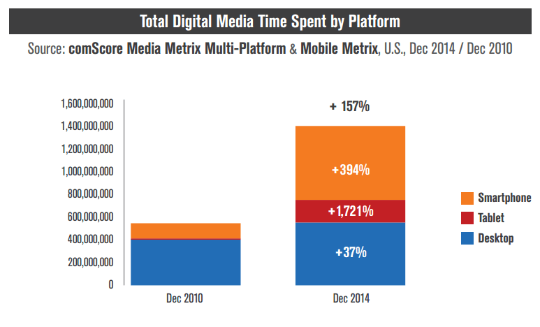 It’s really not a big surprise, seeing as Google announced that mobile search surpassed desktop search for the first time back in May 2015. Those numbers have only tipped more and more towards mobile during the past year and a half. For a more concrete example, think about how Google currently serves websites to mobile users. With the desktop-first index, Google gives mobile users results that are ranked based on desktop browsing signals. This becomes an issue when companies maintain both a desktop website and a mobile website.
Companies usually do this so they can serve mobile users a version of their site that is easier to navigate and read on a mobile device. For example, a very common practice is to serve less content to mobile users than to desktop users to save on-screen real estate and make everything easier to read on a smaller screen. This causes issues because Google suggests pages to mobile users based on the desktop version’s relevancy, even though they’ll see the cut up, abbreviated mobile version of the page instead.
A mobile-first index fixes this by evaluating all sites from a mobile perspective to start with, so there’s not a disconnect between what Google expects the user to see and what the user actually sees.
Who does this affect?
There are three potential categories that you and your website fall into. Let’s go through each one and see if you need to make any changes to your website to prepare for a mobile-first index.
1. You have a desktop-only website
If your site is only designed for desktop users, Google’s new index will still catalogue your website and serve it in users’ search results. However, Google will view your site as a mobile user.
This means you need to be sure your site is functional on mobile devices, lest Google decreases your rankings. If your site is still not mobile friendly, you’re missing out on a ranking boost and should seriously consider a fully-responsive site redesign.
2. You have a responsive/dynamic website
Great news! The mobile-first index change shouldn’t affect you at all as long as your site is 100% viewable and functional for mobile users.
If you want to be sure that this is the case, you can check your pages using Google’s free mobile-friendly test tool. 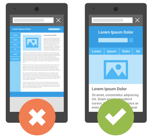
3. You have two websites – one for mobile users and one for desktop users
These are the websites that will be most affected by Google’s shift. Within this category of website configuration, there are two situations that you especially want to keep an eye out for:
- Serving mobile pages with significantly different content than their desktop versions
- Serving mobile pages that are stripped of their structured data markup
Because Google will begin ranking pages from a mobile standpoint, you want to put your best mobile foot forward. If you keep serving mobile pages that have less content or lack structured data markup compared to their desktop counterparts, you will almost certainly see a drop in rankings and overall traffic when Google’s mobile-first index is fully in place. This isn’t necessarily saying you need to switch to another website configuration – if your content and markup are essentially identical across both versions of your site, you could avoid losing search traffic.
If this is the route you choose to stick with, you’ll need to make sure the mobile version of your site is crawlable by Google in the first place. Many companies with this site configuration currently block Google from crawling the mobile version of their sites in the robots.txt file, meaning it won’t rank in search engines at all. That being said, switching to a responsive site is the best long-term solution.
Moving forward with a mobile-first Google
While this is indeed a huge deal in the digital marketing world, there’s no need to do anything drastic immediately.
Google’s Gary Illyes has stated that they’re aiming for a “quality-neutral launch” of the mobile-first index, which means the rollout will be slow so that everyone has time to fix anything that needs fixing:
@denstopa @krystianszastok I think, *think*, we’re aiming for close to quality-neutral launch; ideally there wouldn’t be too much delta
— Gary Illyes (@methode) November 5, 2016
If your head’s spinning a bit, there are really just two things to focus on to prepare for the mobile-first switch:
- Make sure your website is accessible, viewable, and usable for all mobile users.
- Make sure your content and markup is the same from both a desktop and mobile perspective.
If you’re already mobile-friendly with a responsive website, you won’t have to make any changes. Most importantly, keep an eye out for any updates or additional info from Google. They do refer to this as an “experiment,” meaning they’ll be making changes as necessary going forward.
To start, you can check out Google’s webmaster blog for the official announcement.
Are you ready for a mobile-first index?
Let me know how you and your company are approaching the shift towards mobile-first in the comments below!
-
 Ryan is a Lead Marketing Consultant at WebFX. Follow him on Twitter @rmaake107!@rmaake107
 -

WebFX is a full-service marketing agency with 1,100+ client reviews and a 4.9-star rating on Clutch! Find out how our expert team and revenue-accelerating tech can drive results for you! Learn more
Try our free Marketing Calculator
Craft a tailored online marketing strategy! Utilize our free Internet marketing calculator for a custom plan based on your location, reach, timeframe, and budget.
Plan Your Marketing Budget
Share this article

SEO Success with KOA

Try our free Marketing Calculator
Craft a tailored online marketing strategy! Utilize our free Internet marketing calculator for a custom plan based on your location, reach, timeframe, and budget.
Plan Your Marketing Budget