SEO Checker
Get Your Free SEO Report Now!
"*" indicates required fields
Use our free SEO checker to instantly analyze your website’s SEO performance and uncover opportunities to improve rankings, traffic, and visibility. Get a complete SEO report with your SEO score, technical and on-page SEO issues, and prioritized recommendations for what to fix first.
Inside your SEO Checker report, you’ll find:
- Your SEO score, which summarizes the SEO health of your site
- Where your site has SEO issues
- How to fix your site’s SEO issues
- Which fixes to prioritize, based on SEO impact
- Where to learn more about SEO issues specific to your site
Earn higher rankings and more search traffic with a free SEO checker
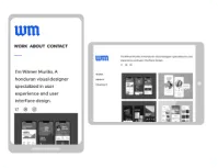
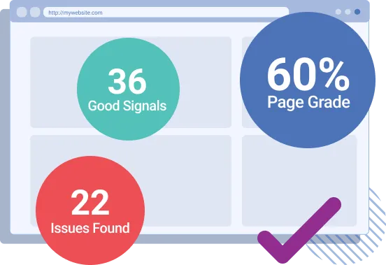
Get a complete assessment of your website’s search engine optimization (SEO) with our free SEO checker, which will conduct an SEO audit of your site and generate a personalized SEO report.
Want an overview of how the SEO Checker works? Watch our video tutorial and keep reading to learn how to read your SEO analysis report and understand the recommendations so you can start ranking higher in search results and earning more traffic!

Inside Your SEO Report
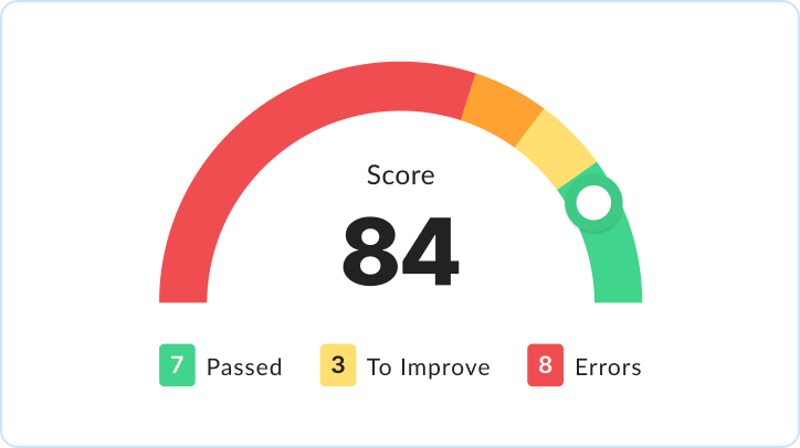
SEO Score
Your SEO score provides immediate insight into the health of your website’s SEO. Scores run from 0-100: 100-70 represents a great score, 69-41 an okay score, and 0-40 a poor score.
Site Speed Analysis
A fast website is a must for a first-page ranking. Does your website make the cut? Get the answer, plus advice for how to make your site that much faster with a free SEO analysis.
URL Optimization Check
A URL influences how search engines and users look at your website. Our SEO checker assesses the format, length, and optimization of your URL for you.
Meta Tag Assessment
Your meta tags can make-or-break a page’s performance. Learn if a page’s meta tags miss the mark and how to make them hit the bullseye with our SEO audit tool.
Content Grade
Content is king in SEO, making user- and search engine-friendly content vital. Get actionable insight into the length, format, and optimization of your content via your SEO score.
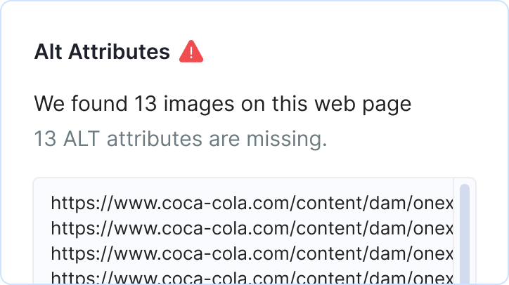
Image Optimization
Unoptimized images provide competitors the chance to push past. Use our free SEO audit tool, and see whether your images need alt tags, SEO-friendly filenames, compression, and more.

Code Analysis
The backend of your site matters as much as the frontend. Is yours optimized for SEO? Find out with our free SEO report, which analyzes the technologies powering your site.
In-Page Link Audit
Internal linking helps users and crawlers explore your site. Learn how well your website links internally (and externally) with the in-page link audit included with your free SEO audit.
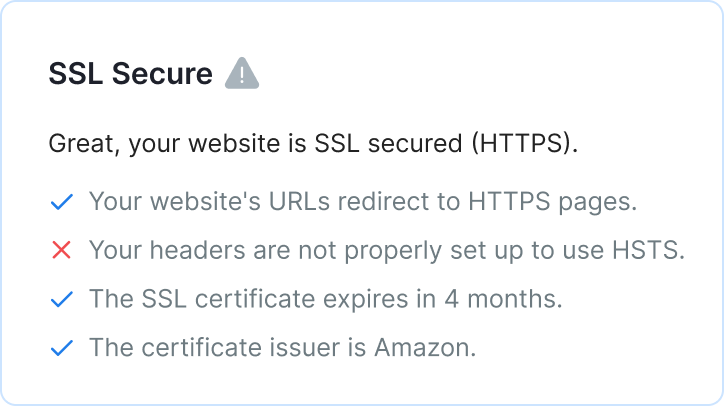
Site Security Score
Having a safe and secure site is essential to ranking higher in search results, as well as earning more leads and sales online. That’s why our SEO analyzer checks your site’s security.
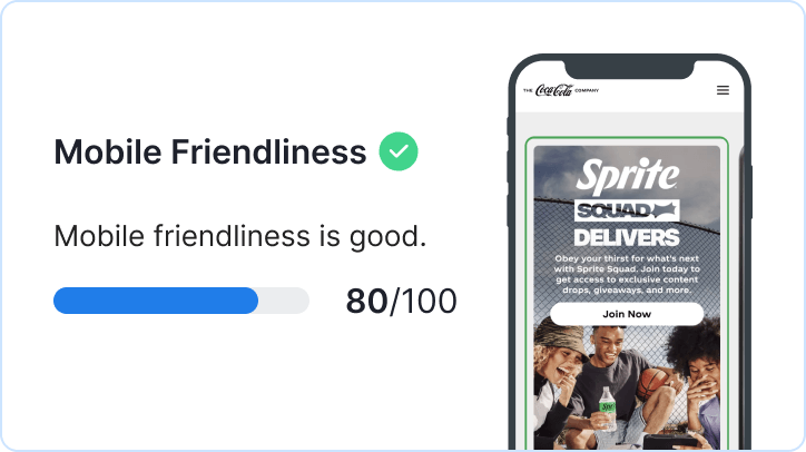
Mobile-Friendly Check
More than 50% of the world’s Internet traffic comes from mobile devices. Does your site deliver? Find out, as our SEO site checkup tool checks and tests your mobile friendliness.
FAQs about SEO Checker
Get quick answers to common questions about SEO prices below:
How do I use your SEO analysis tool?
Get started with our free SEO analysis tool by entering your website URL (or the page URL you want to audit). Then, enter your name and email address so you can receive a copy of your SEO report, which you can then save, share, and view whenever!
What does an SEO analysis tool look at?
An SEO audit tool should look at the critical factors of an SEO strategy and how SEO works, which can include:
- Keyword optimization
- Backlink building
- Image optimization
- Page speed optimization
- And more
Our free SEO checker tool assesses those factors, including:
- Your URL
- Your site speed
- Your page’s title tag
- Your page’s meta description
- Your page’s heading tags
With a website SEO analysis from our tool, you can get actionable advice for how to improve your URL’s SEO rankings.
What does our free SEO Checker check?
Our free SEO Checker offers a comprehensive evaluation of several factors, including:
Page speed
The speed of your website not only matters to search engines but also to users. In fact, more than 80 percent of users expect a website to load in two seconds or less — if the website takes longer, they’ll likely leave, which increases your bounce rate.
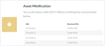
That’s why our SEO site checkup tool tests the speed of your page.
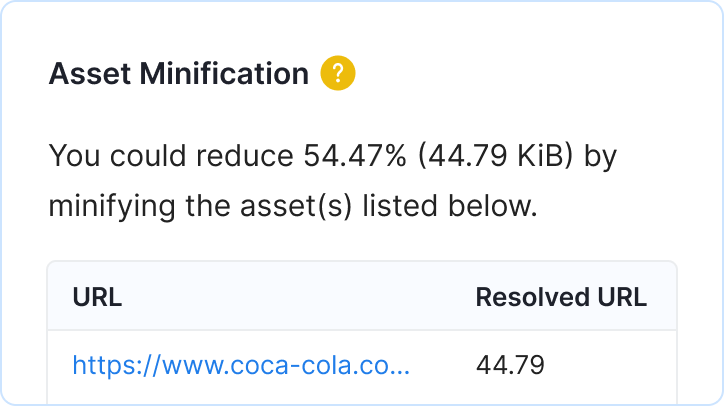
It’ll also look at all your site’s assets, from HTML to CSS to JavaScript. If it spots ways to improve your page speed, like by compressing your image files, it’ll notify you in your free SEO report. The best part? It’ll highlight which files to compress.
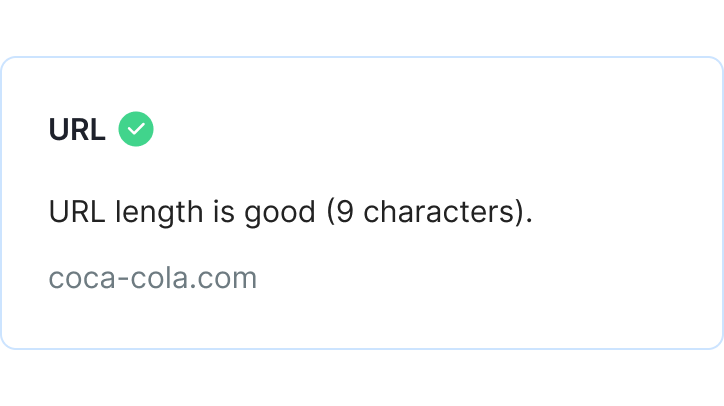
URL
Next, our SEO analyzer tool checks your URL. In this step, our tool looks at the following factors:
- Keyword: When you set the keyword of a page, it’s helpful to include the primary keyword in your URL. It helps improve the SEO strategy of your page, which can lead to a better ranking in search results.
- Underscores: When creating a page URL, it’s a common mistake to separate words with underscores, versus hyphens. That’s why our SEO checker looks for underscores. If it finds any, it’ll notify you in your free SEO report.
- Top-Level Domain (TLD): When registering your domain name, it’s critical that you choose a top-level domain — “.com” is one example. If you’re a non-profit or government organization, however, you may register “.gov” or “.org.”
Based on these factors, our SEO analyzer will determine if your page is SEO-friendly.
Title tag
We then evaluate the title tag of your page — keep in mind, this may differ from the heading of your page. As an example, you could have the title tag, “Holiday Decorating Guide,” but your heading is, “Your Quintessential Holiday Decorating Guide.”
Our free SEO checker looks at the following features of your title tag:
- Length: For the best results, title tags should have 60 characters or less. If they exceed that number, search engines won’t display the excess. Instead, they’ll insert an ellipsis, which can leave your title tag without a hook.
- Keyword: A title tag should also include your primary keyword. While not required, it’s beneficial if your title tag starts with your primary keyword. Our SEO audit tool will let you know if it does.
In most cases, title tags are a quick fix, though they require some brainstorming.
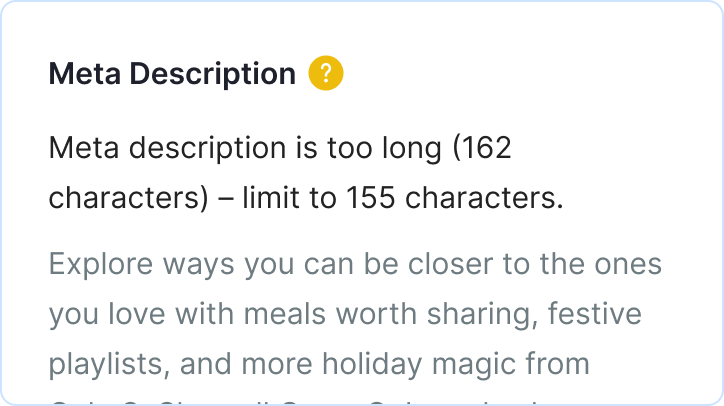
Meta description
Following your title tag, our SEO checker will look at the following features of your meta description:
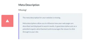
- Length: Like a title tag, a description or meta tag also has character limits. Your description tag should not exceed 160 characters — otherwise, it won’t display in search results. It’s worth noting that in some instances Google will rewrite your meta description.
- Keyword: A meta description should also include your primary keyword — specifically, the exact keyword. That means if your keyword is, “holiday decorating guide,” you want to use that exact keyword and word order, so the phrase, “guide to holiday decorating,” wouldn’t count.
To make your SEO analysis easy to follow, we include your meta description tag in the report.
Headings
After our Google SEO Checker assesses your title tag and meta description, it evaluates your heading tags. These tags feature throughout the content of your page and tend to include the keywords you’re targeting. They’re also helpful for readers, as they divide your content into neat, easy-to-follow sections.
Maximize your SEO strategy by including an H1 tag, as well as H2 tags. Depending on your content, you may also have H3 and H4 tags to make your content even easier for audiences to read. Our SEO checker tool will look for H1, H2, H3, H4, and H5 tags — if you’re missing them, we’ll let you know.
Our tool will also look for your primary keyword in your heading tags. To improve your SEO strategy, you’ll want to include your primary keyword in your heading tags, especially your H1 tag. If your keyword would impact the readability of your H2 and H3 tags, consider leaving it out.
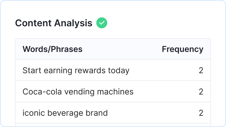
Content
In the online world, content is critical. You need to provide your viewers with original content that offers value, or your pages will struggle to rank. Even worse, users won’t stay on your page or convert, which defeats your overall goal.

That’s why our SEO checker provides a comprehensive analysis of your copy and assesses the following:
- Keyword use: If you’re familiar with search engine optimization, you know keyword stuffing is a black-hat practice. You still want to use your keyword, however. In most cases, use the exact version of your keyword three to four times in your copy.
- Keyword placement: To help search engines understand your content, it’s important that you use your primary keyword within the first 100 words of your copy — so under your H1 heading. Our tool will let you know if you need to add your keyword to that initial copy.
If our tool spots issues with your copy, it’ll include actionable recommendations in your SEO report.
Images
It’s essential to include images in your copy. By including images, whether pictures or graphics, you’re providing readers with a visual that helps them digest your content. If you’re explaining a complex process, for example, a graphic is invaluable.
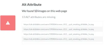
Images are also useful in SEO, which is why our SEO checker tool reviews the following:
- Filename: For your sanity, as well as for search engines, it’s essential you develop a naming system for your image files. Don’t settle for a filename like, “IMG_0001.” Instead, use your keyword — if appropriate — and separate words with a hyphen, not an underscore.
- Alt tag: Since search engines cannot “read” images, it’s critical that you include an alt tag. Create descriptive, no-fluff alt tags that explain what’s going on in your image. If appropriate, you should include your keyword in your alt tag.
Once you develop a process for naming your images and composing their alt tags, it’ll become a habit.
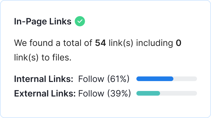
Page links
Another factor our SEO checker assesses is your page links. In search engine optimization, link building plays a critical role. While your content likely includes links to content on your website, you also want your content to earn links from external websites.
That’s a challenge for many businesses, as you need to create content that’s unique and compelling — content that journalists, users, and publishers can’t help but share. Even if you do publish a piece of exceptional content, you often need to connect with publishers to highlight your one-of-a-kind content.
While our SEO analyzer doesn’t provide tips for how to conduct outreach, it does generate a backlink score, based on the number of links you’ve earned, as well as the number of links you’ve earned from unique domains.
For example, if Martha Stewart links to your guide on holiday decorating twice, that only counts as one unique domain. While those shout-outs are wonderful, you want to have a diverse set of links. That diversity indicates that a variety of websites trust yours.
Mobile analysis
With more than 50 percent of all Internet traffic coming from mobile devices, it’s critical that you have a mobile-friendly website. The fact that Google’s adopted a mobile-first index makes it even more of a priority to support a mobile website.
That’s why our SEO checker does a thorough mobile analysis. It’ll look for the following features:
- Mobile sitemap
- Viewport meta tag
- Compression
- Tap targets
Like our tool’s coding assessment, you’ll want to forward this part of the report to your development team. They can often make the necessary changes. If you’re without a mobile-friendly website, however, aim to launch a responsive or dynamic website.
How do I read my SEO report?
Once our SEO checker tool evaluates your website (which happens in 60 seconds or less), it’ll generate your report, which you can then view. We’ll also send a copy of your SEO report to your email address, so you can see it, as well as share it later.
Your SEO report encompasses two tabs:
- On-page SEO
- Off-page SEO
Even though your report breaks down into on-page and off-page SEO, our website SEO checker still analyzes your technical SEO. For your convenience, we’ve included the technical SEO findings within the on-page SEO section.
Each area of the report includes:
|
Overall SEO score |
Represents your site’s overall SEO score on a 0-100 scale. A score between 100-70 is good, 69-41 is okay, and 0-40 is poor. |
|
Score |
Represents whether an element, like your title tag, passed, needs improving, or generated an error. |
|
Impact |
Represents how impactful an element is on SEO. For example, a title tag can have a significant impact. Use impact ratings to prioritize fixes. |
|
Solving complexity |
Represents how challenging an SEO issue is to solve. For example, it’s easy to fix a title tag. Use solving complexity ratings to prioritize fixes too. |
|
Tips |
Shares best practices for optimizing an element, like your title tag, for SEO. |
|
Related articles |
Compiles a list of related articles for different SEO elements. Use these articles to learn more about SEO and how to improve your SEO score. |
Keep in mind that our SEO checker tool generates recommendations, not requirements. Depending on your business and its unique SEO strategy, some suggestions may not apply to your approach or characteristics.
If you need help improving your SEO, you can always contact our experienced strategists.
How many pages can I check at once?
With our SEO checker, you can test one page at a time. If you’re reviewing multiple pages, we recommend creating an Excel or Google Sheet document. Here, you can build a plan for revising your SEO strategy by noting the recommended changes.
What is an organic traffic risk assessment?
An organic traffic risk assessment evaluates the potential traffic loss from AI-powered search results. Companies can use this information to gauge how much traffic, and subsequently, how much revenue they might lose from not appearing in these AI-powered experiences.
What is OmniSEO®?
OmniSEO® is WebFX’s proprietary platform for tracking brand visibility across search platforms — from Google to ChatGPT to Facebook — giving businesses the data they need to expand their inbound channels for traffic, leads, and revenue generation.

Our digital strategists have put together successful Internet marketing campaigns for businesses ranging from local coffee shops to publicly traded companies. They’ll do the same for you. Request a free quote and experience why WebFX is rated as the world’s best SEO agency.
Clients Who Have Used Our SEO Services

Sharretts Plating Co., Inc.

Ocean City NJ

Cleveland Brothers Equipment Company
“We measure our success by how much we WOW our clients.”Bill Craig, WebFX President

Want to speak with an expert? Call us at
888-601-5359