- Home
- Blog
- Web Design
- 20 Logo Designs With Hidden Messages
20 Logo Designs With Hidden Messages
-
 8 min. read
-
Summarize in ChatGPT
-
 Trevin Shirey
 VP of Marketing
- Trevin serves as the VP of Marketing at WebFX. He has worked on over 450 marketing campaigns and has been building websites for over 25 years. His work has been featured by Search Engine Land, USA Today, Fast Company and Inc.
Table of Contents
- 1) 2013 Lions Tour
- 2) British Heart Foundation
- 3) Ecopup
- 4) Brit Awards
- 5) British Blind Sport
- 6) Pinterest
- 7) Gillette
- 8) The Guild of Food Writers
- 9) London Zoo
- 10) Cologne Zoo
- 11) Pittsburgh Zoo & PPG Aquarium
- 12) San Diego Zoo
- 13) London Eye
- 14) The University of Manchester
- 15) Cisco
- 16) Shelter
- 17) Eagle Consumables
- 18) Beats Audio
- 19) Carrefour
- 20) Home Energy Saving Solutions
1) 2013 Lions Tour
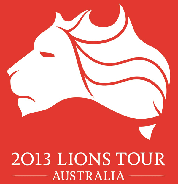 In 2013 Australia welcomed the touring British and Irish Lions rugby union team to their island. This promotional image appears to be a straightforward picture of a lion at first, but it’s actually been designed to resemble Australia itself.
2) British Heart Foundation
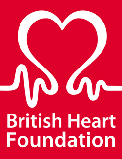 You can clearly see a heart in the British Heart Foundation’s logo, but more significant for a logo representing a charity that funds research to prevent heart disease are the squiggles that make this logo look like an electrocardiogram reading of a beating heart.
3) Ecopup
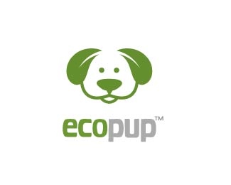 This former logo for the Vancouver based eco-friendly pet retailer EcoPup doesn’t appear to have anything special about it until you notice the dog’s ears are designed to look like leaves.
4) Brit Awards
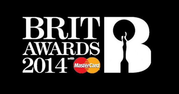 The Brit Awards is a music awards ceremony, and any awards ceremony needs trophies to hand out to winners.
The unmistakable trophy handed to winners is used in the logo to help create a distinctive ‘B.’
5) British Blind Sport
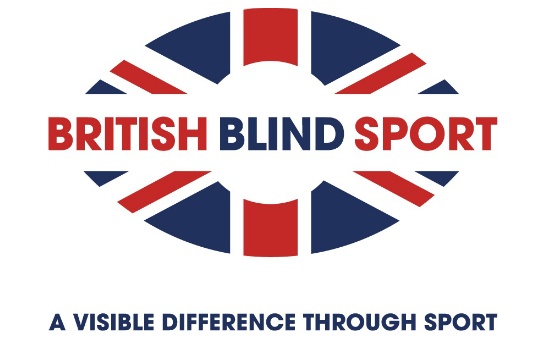 British Blind Sport is a charity that helps blind and partially sighted people enjoy taking part in sport throughout the UK. The logo combines the Union Jack with the shape of an eye, drawing attention to who the charity serves.
6) Pinterest
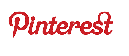 Pinterest users can ‘pin’ snippets they find around the web on their own personal boards to share with followers.
With the focus on pinning, it’s no surprise the logo’s designer chose to incorporate a pin into the letter P.
7) Gillette
 It’s easy to take a quick look at the Gillette logo and not notice anything special – but take another look at the ‘G’ and the ‘i’ and you should be able to see a double razor stack similar to the company’s offerings.
8) The Guild of Food Writers
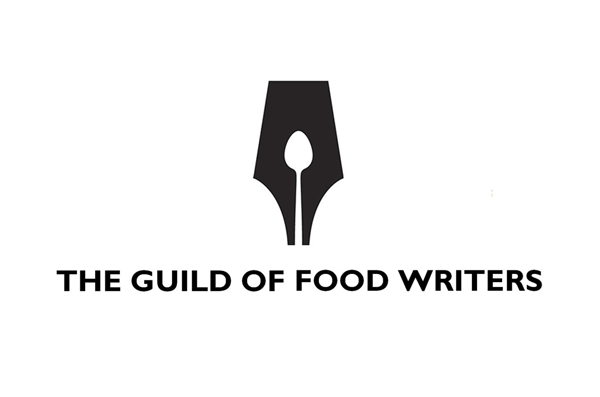 Members of the UK based Guild of Food Writers unsurprisingly write about food.
This logo sums that up simply by creating the image of an ink nib with the aid of a spoon.
9) London Zoo
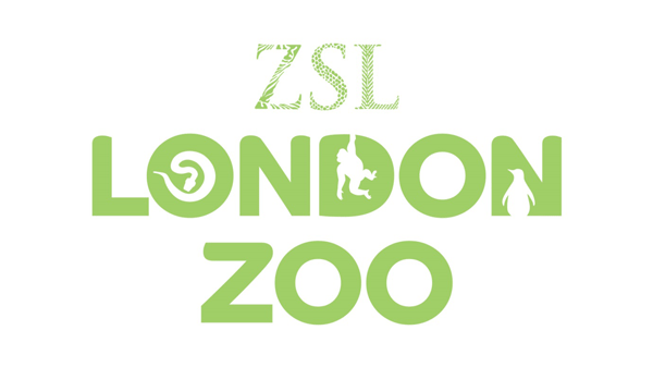 Your eyes will probably immediately notice the snake, monkey and penguin that are incorporated into the London Zoo logo, but did you also notice the different animal prints used to create ZSL?
10) Cologne Zoo
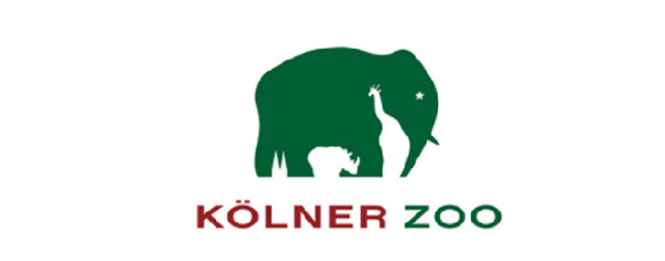 Cologne Zoo in Germany also gets in on the animal action by using a rhinoceros and giraffe to help create the image of an elephant.
You’ll also notice the two spires of Cologne Cathedral, the city’s most recognizable landmark, helping to ensure this isn’t a general zoo logo but specific to the German city.
11) Pittsburgh Zoo & PPG Aquarium
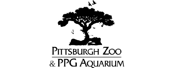 Yes, it’s another zoo logo – but while you’ll no doubt see the gorilla and lion staring at each other, and perhaps even the birds flying from the tree, did you spot the fish at the base of the logo? There’s a lot going on here, but it’s in no risk of becoming chaotic.
12) San Diego Zoo
 The animal link is a lot more subtle in the San Diego Zoo logo, but you should still easily be able to see the paw that helps create the word, ‘zoo.’
13) London Eye
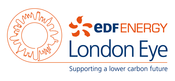 In 2011 EDF Energy began sponsorship of the London Eye and with it unveiled this logo. Outlines of the sights that are visible from the wheel, including the Gherkin and St. Paul’s Cathedral, are used to create a visual representation of an eye.
14) The University of Manchester
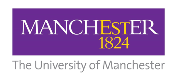 In 2004 two Manchester Universities, UMIST and Victoria University of Manchester merged. Rather than imagine itself as a brand new institution, the English university draws attention to its heritage by highlighting the ‘Est’ in Manchester to show it was established almost 200 years ago in 1824.
15) Cisco
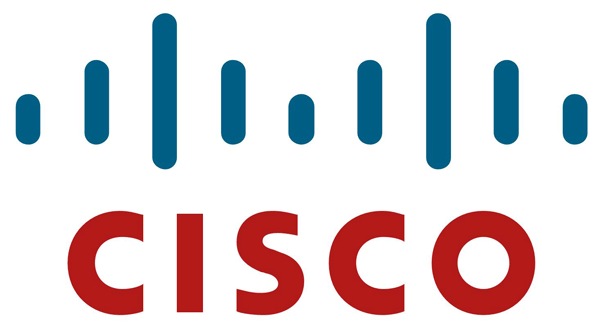 Cisco, the networking experts headquartered in San Jose, was founded in San Francisco, and you can see a reference to their humble beginnings in the logo. The series of lines that represent electromagnetic waves are also a nod to the steel cables holding up San Francisco’s iconic Golden Gate Bridge .
16) Shelter
 Shelter is a British charity that campaigns for an end to homelessness, so it’s no wonder you can find a home right there in the h of the logo.
17) Eagle Consumables
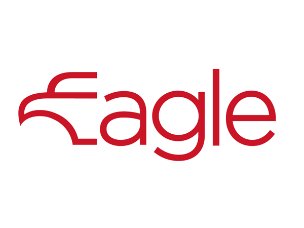 New Zealand based Eagle Consumable sells single use disposable goods such as facemasks and gloves. No points for guessing which letter they’ve made look like the head of an eagle here.
18) Beats Audio
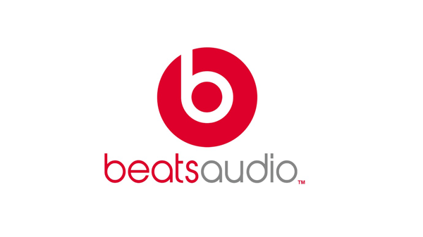 Dr.
Dr.
Dre has managed to turn his headphones into a must-have product by making sure every sport and music star is seen wearing them. You’ll even find the logo wearing the product, as the ‘b’ for beats helps make the red circle look like a person wearing a pair of headphones in profile.
19) Carrefour
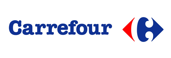 The French hypermarket chain is one of the very largest in the world.
While it’s a global company, the red, white and blue found in its logo is recognition of its French origins. You’ll also find a C made from the negative space between red and blue arrows, which are part of the logo because Carrefour means crossroads in French.
20) Home Energy Saving Solutions
 This logo, created by Cloudburst Design Studio in Colorado uses the image of an energy-saving light bulb to create the E in Energy.
Tell us what you thought of the logos in the comments section below!
-
 Trevin serves as the VP of Marketing at WebFX. He has worked on over 450 marketing campaigns and has been building websites for over 25 years. His work has been featured by Search Engine Land, USA Today, Fast Company and Inc.
 -

WebFX is a full-service marketing agency with 1,100+ client reviews and a 4.9-star rating on Clutch! Find out how our expert team and revenue-accelerating tech can drive results for you! Learn more
Make estimating web design costs easy
Website design costs can be tricky to nail down. Get an instant estimate for a custom web design with our free website design cost calculator!
Try Our Free Web Design Cost Calculator
Table of Contents
- 1) 2013 Lions Tour
- 2) British Heart Foundation
- 3) Ecopup
- 4) Brit Awards
- 5) British Blind Sport
- 6) Pinterest
- 7) Gillette
- 8) The Guild of Food Writers
- 9) London Zoo
- 10) Cologne Zoo
- 11) Pittsburgh Zoo & PPG Aquarium
- 12) San Diego Zoo
- 13) London Eye
- 14) The University of Manchester
- 15) Cisco
- 16) Shelter
- 17) Eagle Consumables
- 18) Beats Audio
- 19) Carrefour
- 20) Home Energy Saving Solutions


Web Design Calculator
Use our free tool to get a free, instant quote in under 60 seconds.
View Web Design Calculator
Proven Marketing Strategies
Make estimating web design costs easy
Website design costs can be tricky to nail down. Get an instant estimate for a custom web design with our free website design cost calculator!
Try Our Free Web Design Cost Calculator
What to read next

